UI Design Case Study: Mobile App for Ordering Burgers
UI Design Case Study: Mobile App for Ordering Burgers The case study shows the creative process for Tasty Burger UI design: check the user experience solutions for food order and delivery mobile app.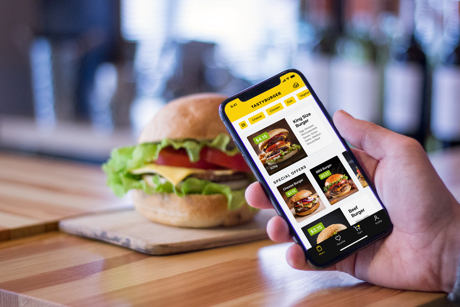
George Bernard Shaw once said: “There is no sincerer love than the love of food”. Perhaps, that’s one of the reasons why food and cooking is the endless source of inspiration for UX designers. Today’s case study from the Tubik team presents the creative flow of interaction design for Tasty Burger, a mobile food ordering app.
Project
Food ordering app UI and interaction design
Process
To design a food ordering app, it’s vital to think over the variety of steps and clear navigation that will enable users to quickly make and get the order under diverse circumstances. Tubik UI designer Anton Morozov working on the project under art-direction by Ernest Asanov and Vladyslav Taran set the goal to make the UI for the Tasty Burger App both intuitive and juicy. Its extended functionality allows users to order a traditional burger from the menu or customize any option for themselves adding or removing the ingredients.
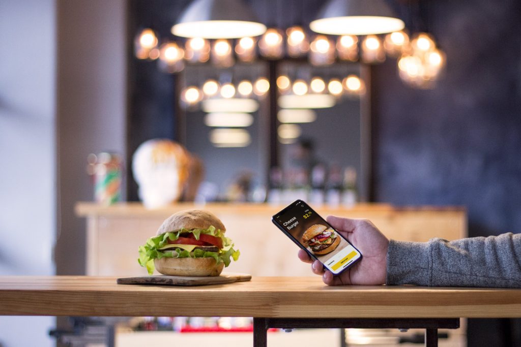
Below you can check the screens showing the user journey. They feature all the flow of choice and customization of a burger as well as the screens for delivery or picking up an order.
Burger Card: Variety of Choices
Choose the Burger
The menu shows actual positions and special offers that the restaurant or service has at the moment. Users may see item photos and basic data on ingredients and weight. Color accents highlight price and calls-to-action for quick scanning. What’s more, the system of filters at the top of the screen enables a user to customize the search and find a needed position faster.
Having chosen a specific position and moving to the product screen, users see the big product photo, core information about pricing and weight and the CTA button enabling to add the position to the cart. It makes the visual presentation emotional and catchy, immediately sets the association with the burger. Also, the screen looks clean – it isn’t overloaded with details about ingredients which isn’t interesting for users who buy this position regularly or don’t care about the details and want to make an order asap.

Customize the Burger
Those who do care about the ingredients or want to customize their burger, use the tab “Ingredients” in the bottom part of the screen. Just pulling it up, they open the tab and check the contents of the burger, organized by categories such as Vegetables, Meat, Sauce, Topping, etc. To make the visual performance of the list effective and appealing, the interface features photos of all ingredients. At any stage of interaction with this screen, users may save the item to favorites just tapping the heart icon in the top right corner. The cart icon features one more important UX affordance: a yellow dot on it gives a quick prompt that it isn’t empty.
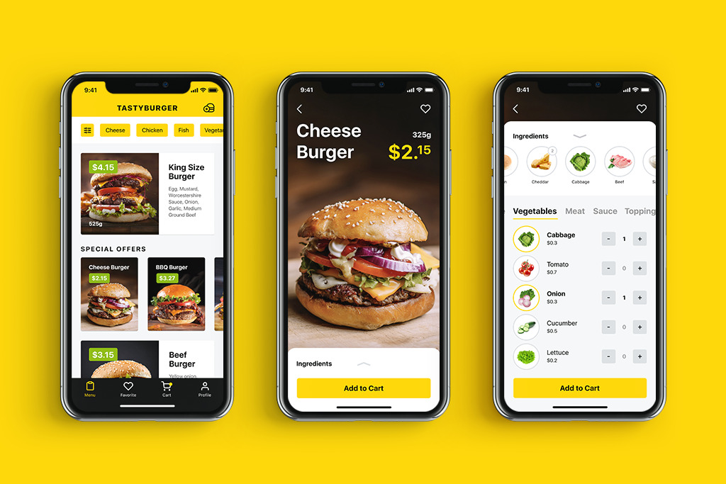
As for the color palette in the app, the designer played with the contrast of backgrounds: interactions zones aimed at reading copy, observing and manipulating positions in the lists are presented on the light background to provide a high level of readability. Still, photo content and tab bar apply a dark background that supports the visual performance, makes the graphics look stylish and elegant. Also, the designer paid deep attention to building balanced and scannable visual hierarchy to make interactions quick and screen scanning easy. Hungry people are definitely not the audience which will want to devote much time and effort to learn how the app works – everything has to be clear in short seconds.
The flow of interactions on customizing the order looks like the following animation.
Create a Burger
A typical food ordering app for restaurants and cafes usually features the meals of the fixed formulation. Tasty Burger app pushes the limits: it suggests users not only customize the existing offers by adding or removing ingredients but also create their own burger from the ingredients in stock. Adding ingredients, users can see how the price is changing relatively.
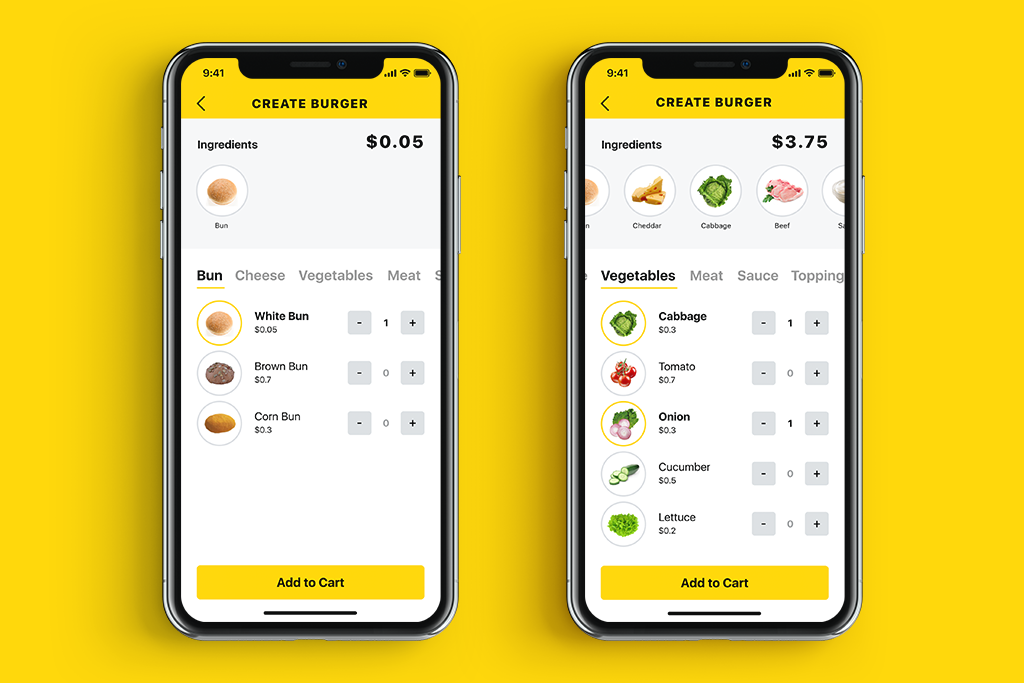
Here’s the animated flow of interactions on creating a burger in the app.
Order and delivery
Having decided on the order, a user is offered two ways to get is: delivered at the particular address or picked it up from the restaurant. Also, a variety of payment methods is presented.
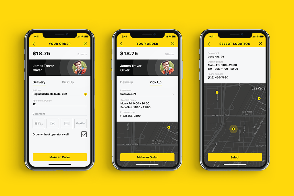
If a user chooses to pick the order, the map helps to choose the best location and shows the route. The color contrast makes the screen clear while carefully selected fonts provide a high level of readability.
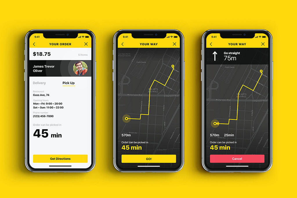
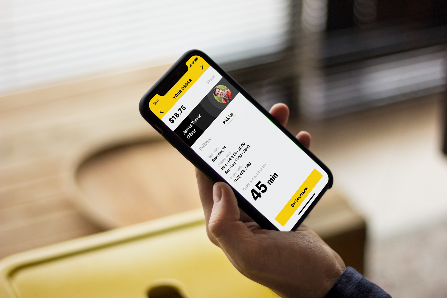
Here’s the interaction flow for the food app design regarding the order and delivery solutions.
Slight and unobtrusive animation applied to transitions and microinteractions made the food ordering app design lively and delicious.
Landing Page
Landing page for the presented app is based on the attractive and catchy animation: fresh tasty burger creates a mouthwatering effect to immediately set the theme and emotional appeal.
Tasty Burger app design process was an exciting creative challenge for the Tubik design team: it was a cool attempt to broaden the horizons of food delivery applications with extended functionality, strong usability, and finger-licking appearance.
More Design Case Studies
If you are interested to see more practical case studies with creative flows for UI/UX design, here is the set of them.
Watering Tracker. Mobile UI Design for Home Needs
Big City Guide. Landing Page Design
Vinny’s Bakery. UI Design for E-Commerce
Health Care App. UI for Doctors
Slumber. Mobile UI Design for Healthy Sleeping
Kubrick Life. Educational Biography Website
Designer AI. Dashboard and Graphics for Fashion Service
Pazi. UX and UI Design for Vehicle Safety Mobile App
CashMetrics. UX Design for Finance Management Service
Originally written for Tubik Blog
- English
- Ukrainian


