Case Study: Step-by-Step Process for Storytelling Illustration Set
Case Study: Step-by-Step Process for Storytelling Illustration Set The case study unveils all the stages of creating the set of narrative illustrations: check the story about a funny dog from the rough sketches to the final artworks.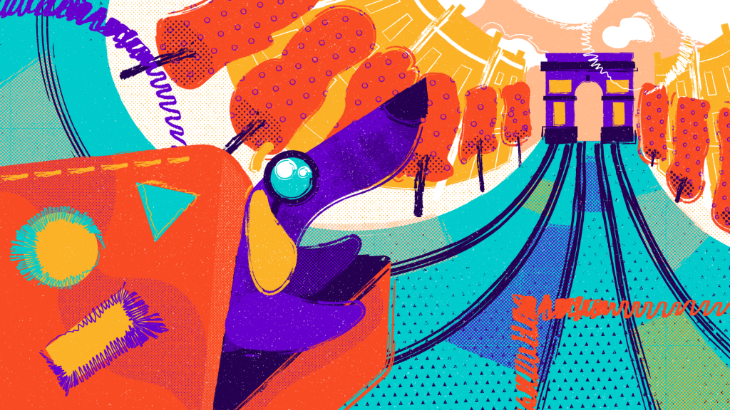
Among all the numerous benefits of illustrations, there is a superpower to tell the story with pictures. In many projects, designers have to create a series of artworks united by a single plot and characters. It demands a complex approach and careful attention to the specific details.
The term “illustration” originates from the Latin “illustrare,” which means to light up, illuminate, and explain. An illustration may serve either as a supplement to the text or as a full replacement. The series of illustrations can tell a small story through visuals. It has to be clear and convey the needed message properly.
To show it in the real project, in this case study, we are unveiling the design process on the narrative digital illustration by Tubik designer Yaroslava Yatsuba. Earlier, we shared her tips on creating flat illustrations and the case study on sports illustration. This time you are welcome to check how the set of narrative illustrations was created for a cartoon “Paris Je T’aime”.
Project
Creating a series of narrative illustrations for the story “Paris Je T’aime”.
Process
Idea
The story features the adventures of the cute and cheerful dachshund Tubik in Paris. The initial volume of graphics set for the project was around 10 digital illustrations.
Stage 1. Rough Pencil Sketch
At this stage, the designer made research, collected references, and analyzed them. The first sketch was made frontal as at this phase it was important to catch the idea, the sequence of scenes, and plot while the composition could be worked out later. In the process, the number of shots was reduced from 12 to 8: the designer left only the most recognizable landmarks and united some illustrations into one.
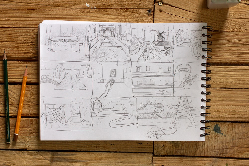
First quick sketch
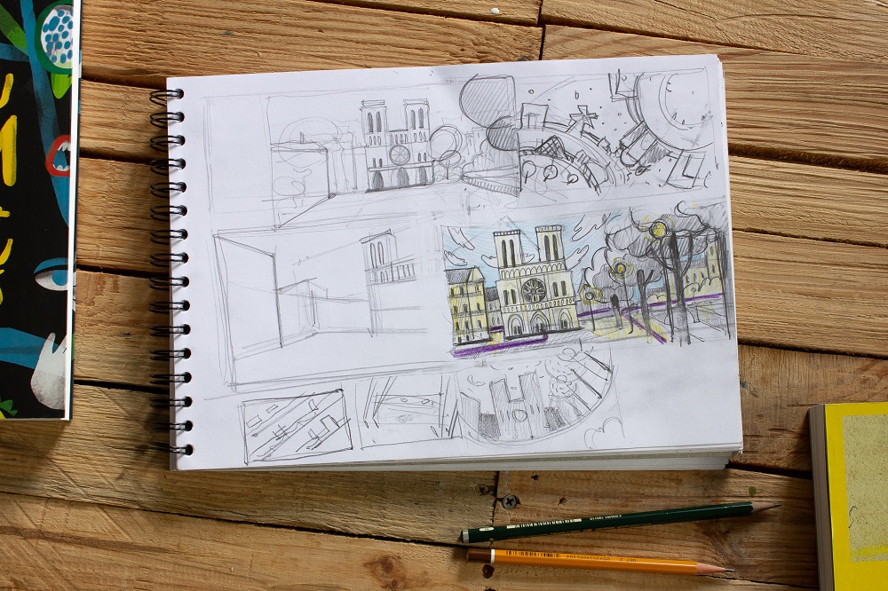
A bit more detailed working out one of the illustrations.
Stage 2. Compositional Sketch
Having developed the draft storyboard, Yaroslava moved to work on the elaborate drawing which will become the basis of the digital illustration. Here she considered the composition of a shot, try interesting perspectives and stylistic effects. So, she redrew the sketch from the perspective of the dog’s eye, added the effect of the Fish-eye lens and made the angle of descent steeper. All that added dynamics, drive, and fun to the illustration.
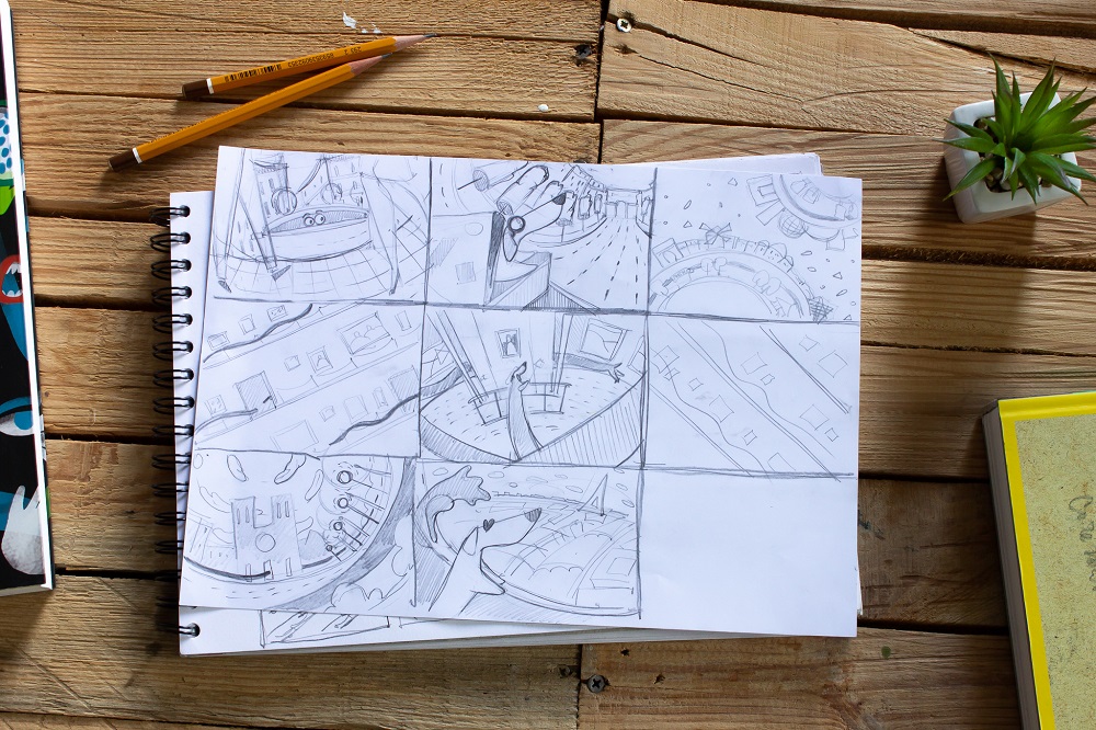
Working out the main character
Together with composition, the designer developed the image of the main character, a funny dachshund dog. First, she drew six different concepts for finding its look.
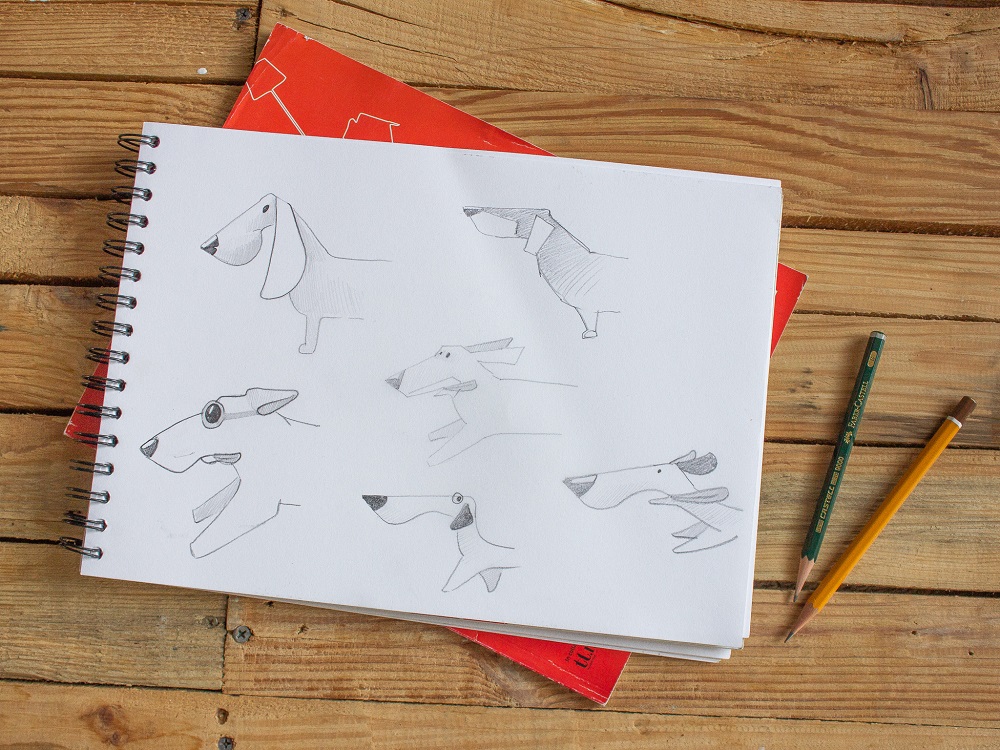
Then she worked out the digital image for the chosen concept.
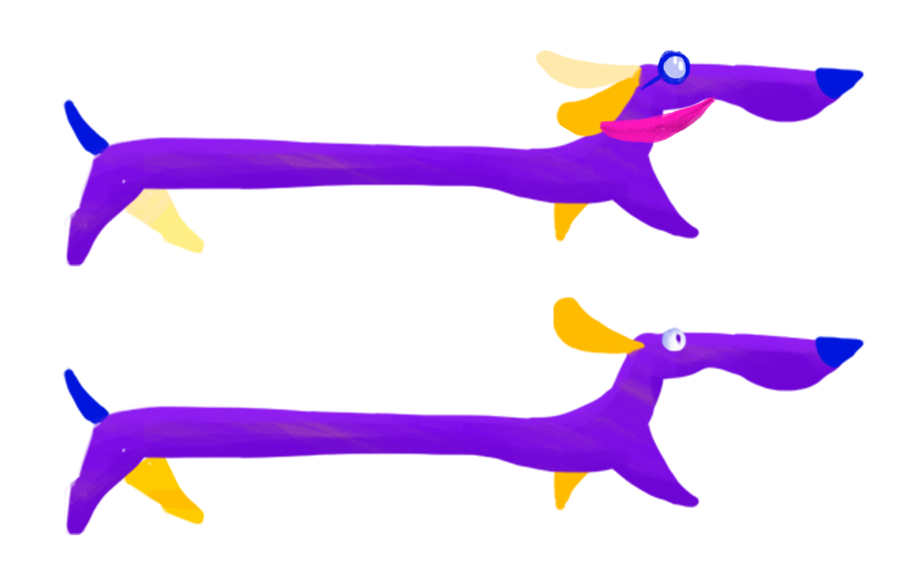
Having made a choice on one of the variants, she worked on the dynamics of its movements as the plot required to show that the dog runs across Paris, twining round it.
Designer’s tip: Study the books on character animation, they teach much about transitions and movements.
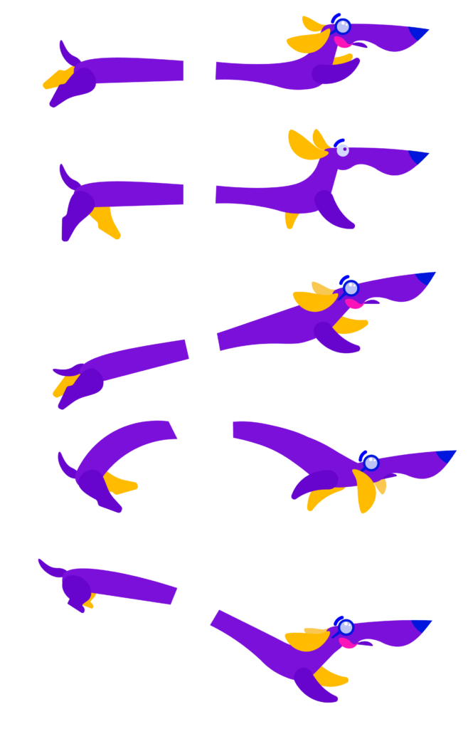
Analysis of dynamic motion of the character

Detalization of the character
Stage 3. Color and Texture
Color
After setting up the composition and appearance of the main character, the designer drew that all in vector and moved to one of the hardest artistic challenges – the choice of the color palette. She wanted to make the illustrations bright and catchy so the choice was made on juicy colors. In the final set, there were 6 colors plus white.
Textures
Textures and ragged edges add originality to illustrations. For this series, the designer used the object’s masks and art brushes for the outline. That added the feeling of hand-drawn book illustrations.
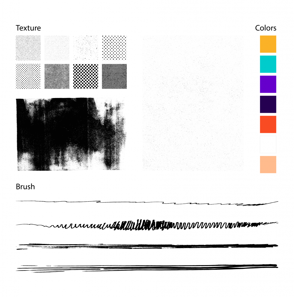
Colors and textures chosen for the series

The elements of composition in one of the illustrations
Final Result
And here are all the shots for the series. Check the story of how a funny dog traveled around Paris and fell in love with the city.
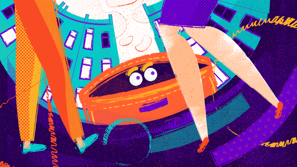
“Err, where am I?”

“That looks interesting, doesn’t it?”
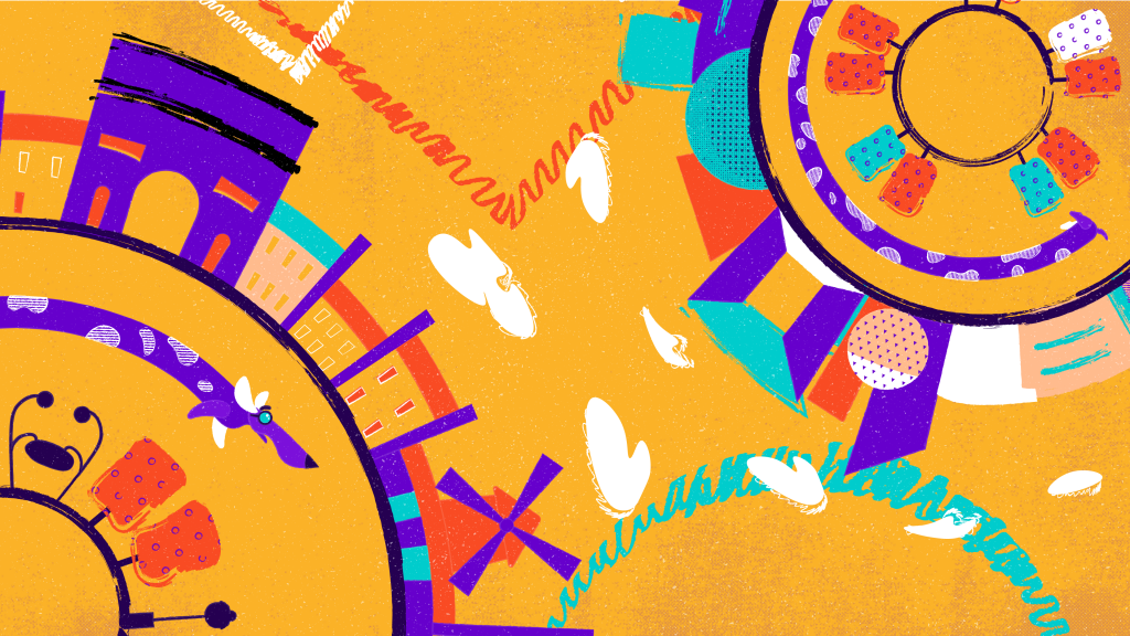
“I must see everything!”

“Unbelievable, so many halls…”
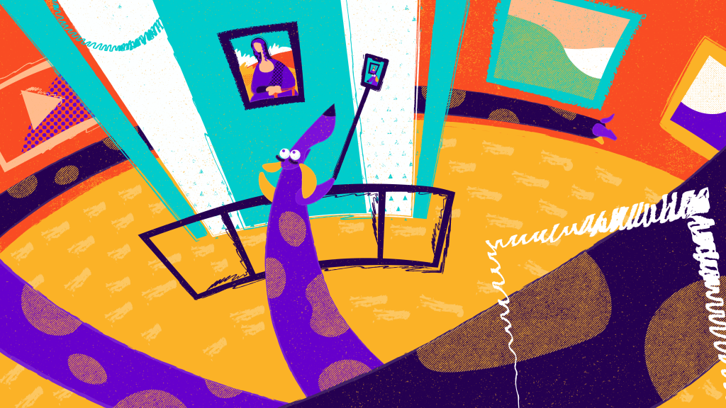
“Selfie with Mona!”
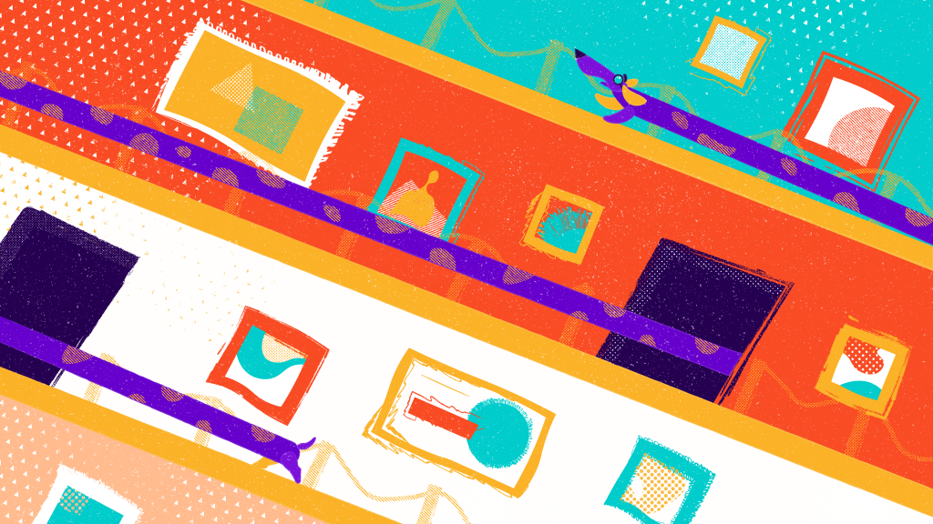
“Hey, guys, where’s the exit?”

“Ah, that’s so beautiful!”

“Paris, I love you!”
Useful Reading
Here’s a bunch of articles and case studies for more reading on graphic design and digital art:
Design Process: How to Create Catchy Flat Illustrations
Winter Olympics Illustration. Step-by-Step Process
Case Study: Creating a Mascot for a Party Game
Case Study: Brand Intro Cartoon for Wedding Dresses Brand
Creative Jobs: What Graphic Designers Do
10 Big Reasons to Apply Illustrations in UI Design
5 Basic Types of Images in Web Design
Hero Images in Web Design: When, Why, and How to Use
Originally written for Tubik Blog
- English
- Ukrainian

