Graphic Design Case Study: Creating a Mascot for a Party Game
Graphic Design Case Study: Creating a Mascot for a Party Game Graphic design case study on the creative process for the logo and mascot made for a funny and entertaining party game Dicey. Check it from sketches to the final graphics.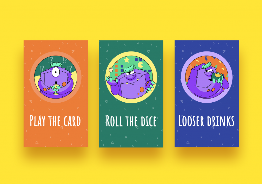
Most of the design case studies in our blog are devoted to creating interfaces, illustrations, and branding for digital products. Today’s case is different: it’s about designing the branding for a real, physical product with the main goal of entertainment and fun. Welcome to check the design story of how Tubik Studio designer Maryna Solomennykova worked on the logo and mascot design for a fun party game called Dicey.
Project
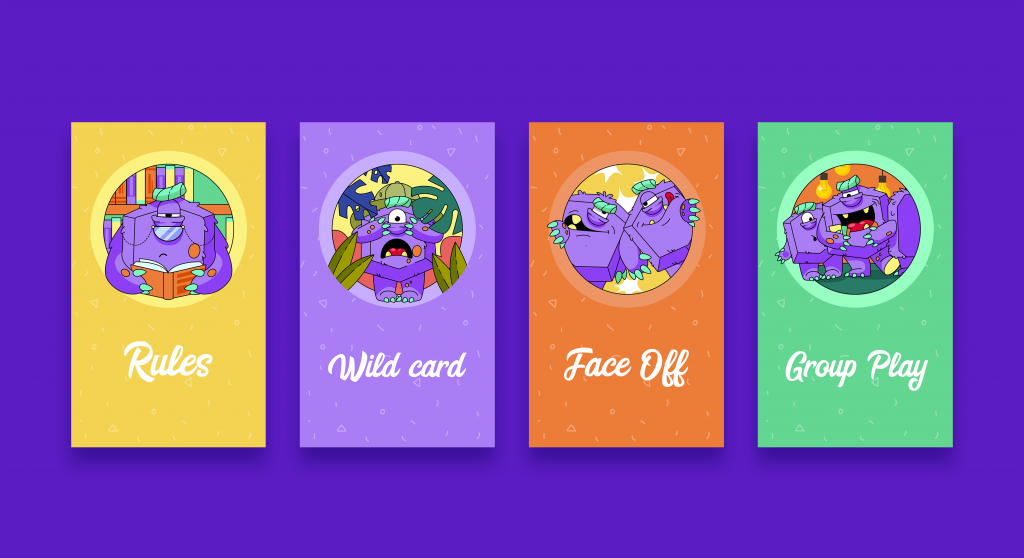
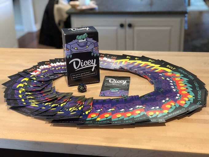
Dicey is a super cheerful and unpredictable party game for adults. As it often happens, creators came up with something for themselves and then shared it with the world: after getting bored playing the same drinking games over and over, they decided to create a new one—something fresh, exciting, and inclusive. So, they developed a simple concept focused around 4 different card categories: Group Play, Face Off, Wild Card, and Rules. Each category contains hilarious minigames designed to encourage creativity and group interaction. So, the target audience of the game is social drinkers of legal drinking age. It was aimed at groups of 4 or more participants and had to create camaraderie through a one-of-a-kind social gaming experience.
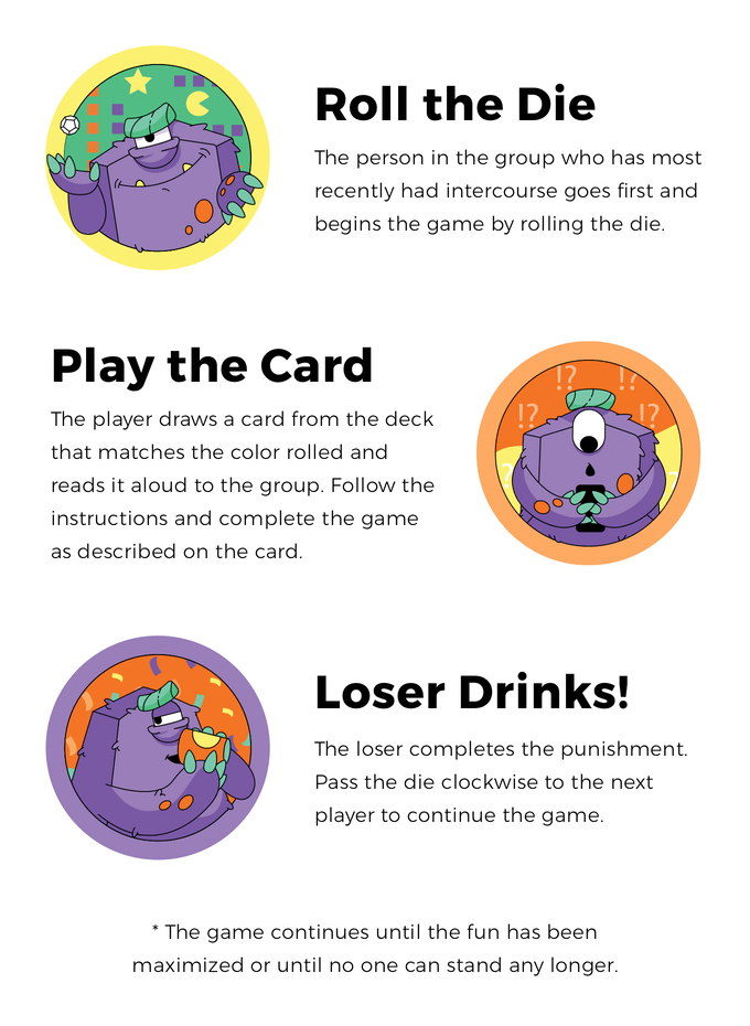
Here’s a quick introduction on how to play:
The task for the designer was to create a logo and a funny character that would catch attention, looked original, created the needed atmosphere and mood. Actually, that was one of the primary reasons for the clients to reach our team: they wanted to build the brand strategy around an illustrated character. As they mentioned in the brief, “the character should be reflective of the game itself—playful, mischievous, and a little bit goofy. Ideally, the character will appear frequently on our social media channels and branded swag.” So, from the start, the designer had to keep in mind that the images obtained as the result of the design process will be used for both print and digital.
The idea of a mascot was totally reasonable for the brand goals. The business practice of successful companies shows that a well-crafted mascot can work even more effectively than product endorsement with the help of a famous person. Mascots can reflect any traits of character, any style needed for product positioning and communicate via a diverse set of visuals. They broaden the horizons of personification. With mascots, designers and marketing specialists can create unexpected and catchy looks or make fantastic characters alive.
Let’s check what we came to.
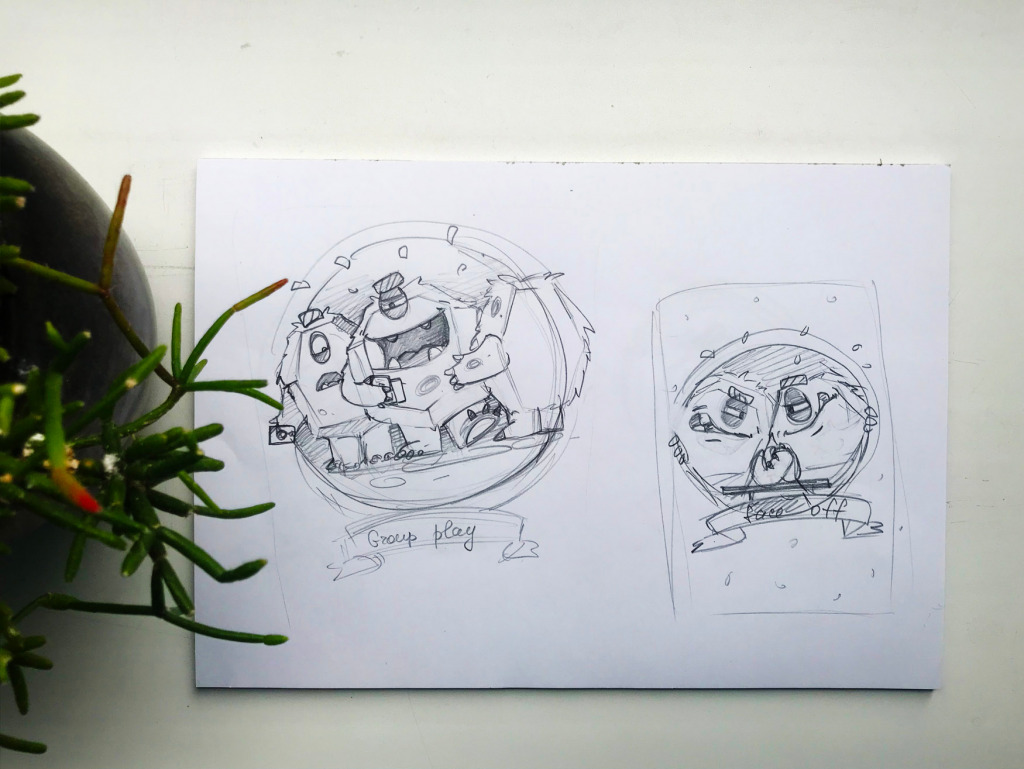
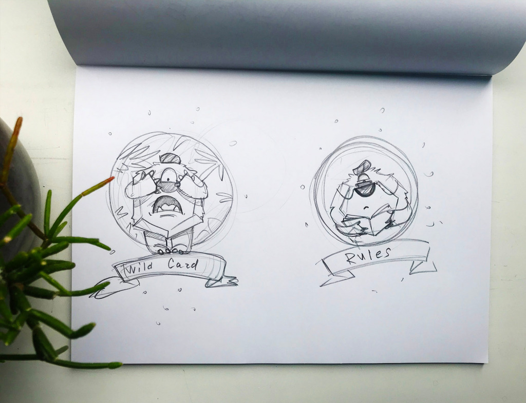
The creative process for this project didn’t get separate parts for logo and mascot character design. Even at the initial stage of pencil sketching, the designers searched for the interaction and composition of both. Below you can see the sketches featuring the stage of the creative process: here the illustrator showed several different stylistic directions for a character and possible style of wordmark to match.
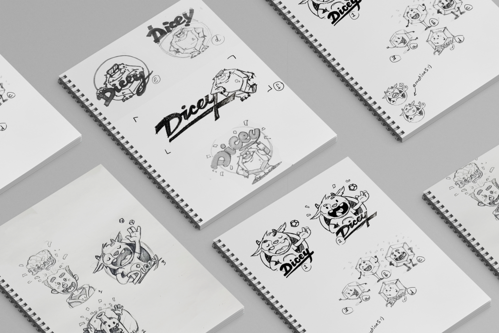
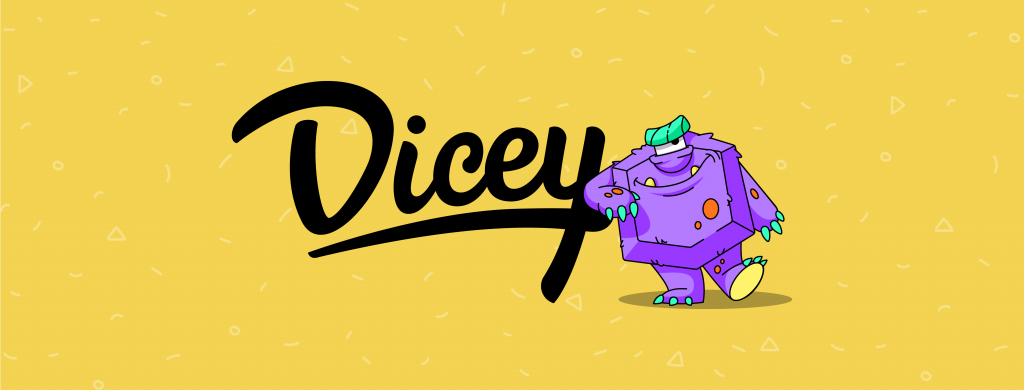
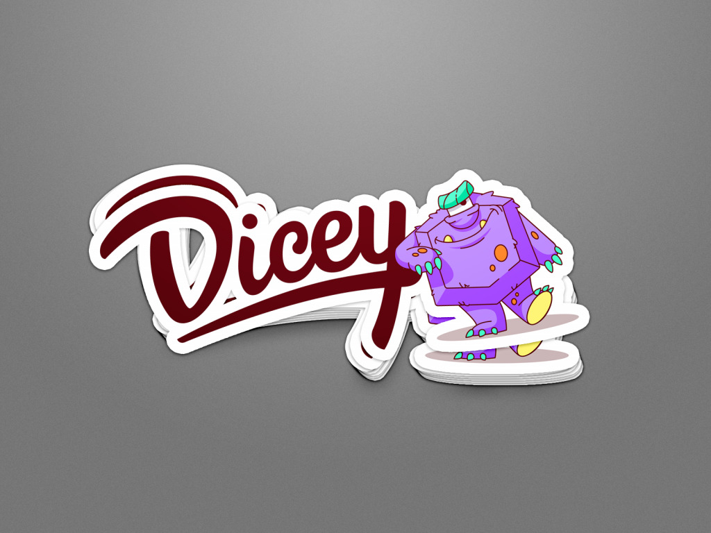
Although all the options were catchy and playful, there wasn’t much discussion about the choice: the variant that transformed a special polygonal dice from the game into the funny character was agreed upon as the best choice. So, the designer moved on to creating a digital version. So, meet Dicey monster, whose motto is “Up to no good”. He is a real symbol of the fun-loving chaos and mischievousness the game brings out.
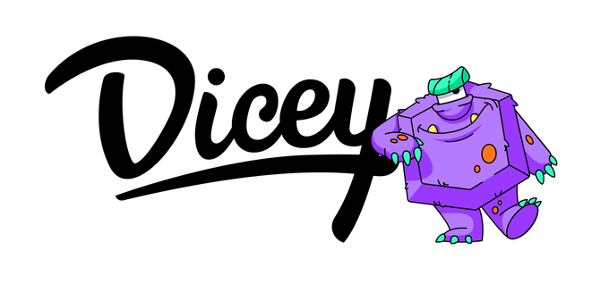
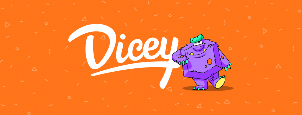
The wordmark uses smooth lines, it’s elegant and stylish but also playful and friendly. Here it is in black-and-white variants.
![]()
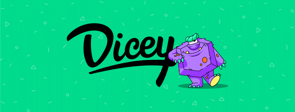
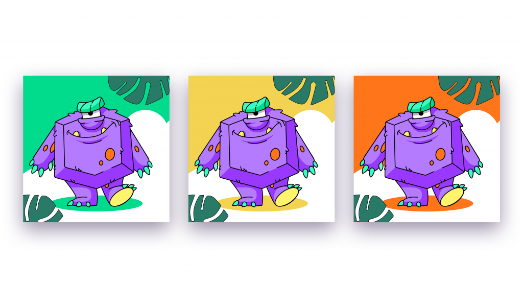
As the brand sign was intended for social media graphics as well, the designer offered several color options for banners, avatars, etc.
The concept of the branded stickers looked like this.
Then the designer worked on the style of the playing cards. Again, it started with sketches to find the compositions that would reflect the key message.
After deciding upon the concept, the designer digitized the mascot illustrations for the play cards and cards of a tutorial with the instructions. Here are two concepts of card design with different typography. What’s more, one version features the text in all caps, while the other uses the title case for the card names. Both fonts look unusual and entertaining. The cards show how flexible is the mascot to show the variety of moods, feelings, situations, and messages to the player.
Would you like to play Dicey with your friends?
Originally written for Tubik Blog
New design case studies are coming soon; stay tuned for new posts.
For more inspiration, check the sets of other posts from our D4U Gallery, where we gather impressive creatives to share their art with you, for example:
- Christmas video production process
- logos and identity design
- Christmas greeting card illustrations
- character illustrations for an educational project
- wildlife-inspired illustration projects
- vibrant digital illustrations collection
- illustration-based packaging for food and beverage
- artistic packaging design for a biscuit brand
- abstract poster designs
- food lovers guide: illustrations and graphic design
- 3D character art projects
- wine packaging design
- captivating 3D animation concepts
- impressive packaging designs
- childhood illustrations
- 3D illustrations
- English
- Ukrainian