Case Study: PassFold. Designing UI
Case Study: PassFold. Designing UI Case study from Tubik Studio. The process of UI design for PassFold project, giving new look and increasing general usability with elaborate design solutions.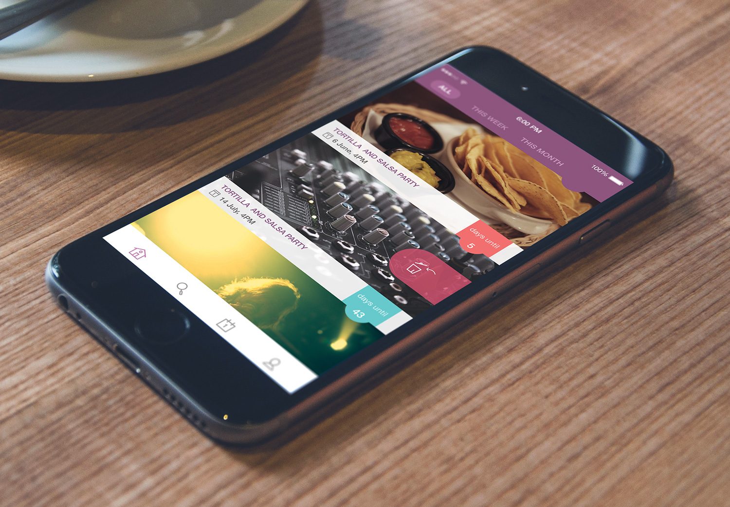
In our earlier case studies, we have already presented some ideas and strategies for the design and redesign of UX/UI (Echo project) and UI (Tracking App project). Today we want to add a new case to this collection and present you one more project on UI design.
Most designers dream to work on the full cycle of product creation and launch, from generating ideas to full UX cycle and then full UI cycle. However, in real life, there are loads of projects in which a designer works only on the UI stage based on existing or already made UX. Mostly, it happens in cases when the product already exists as real and operates successfully, but more trendy looks or more clear and intuitive UI is needed to renovate it and make even more efficient. Somebody might think that this scheme is even easier for a graphic designer as you don’t need to think through all the logic and user behavior, only visualize the given scheme and layout. Nevertheless, in practice it is totally different as efficient UI is always based on polished UX, therefore to keep the consistency, the designer needs to do a considerable job of getting dip into details of the given layout and transitions and sometimes solve some minor UX problems even in the process of UI design. It often happens because new solutions in the user interface will not work on the basis of out-of-date UI.
And this was the issue that Tubik Studio designer Tamara faced working with UI design for the project called PassFold. Let’s get into some details together.
Tubik Studio designer Tamara working on the project.
Task
Redesign of UI for a mobile application for tickets (passes) management on the basis of existing UX/UI.
Tools
Adobe Photoshop, Adobe Illustrator.
Process
The idea behind the application under design was basically very clear and practical: it presented the virtual storage for tickets and passes bought online and gave wide opportunities to manage them.
Although general UX was already given as the basis for UI solutions, the designer analyzed it deeply and discussed it with the customer so that they could make some minor changes or add some functions significant in order to increase the general usability of the application. Among them, there were added notifications about the dates and events which could be set manually, so that users could decide and chose if they wanted to get notifications about all the events they have kept in the storage or only some of them which are, perhaps, the most important.
One more step to the optimization of both UX and UI of the app was to move the items previously placed in side menu to the tap bar. The logic behind this was rather simple as the basic menu doesn’t consist of many options, moving its content to the tab bar makes the user experience more intuitive and comfortable. Previous projects and research prove that tab bar is a great solution for the small set of basic options.
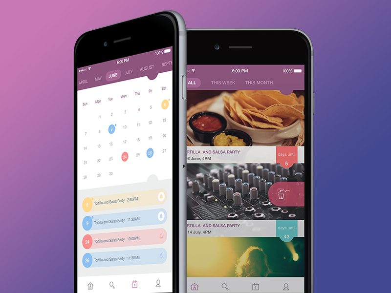
One of the essential requirements from the customer was to use the basic color palette in purple shades, therefore, the designer carefully thought about the right range of colors and shades to make the application screens both bright and clear as well as smart-looking.
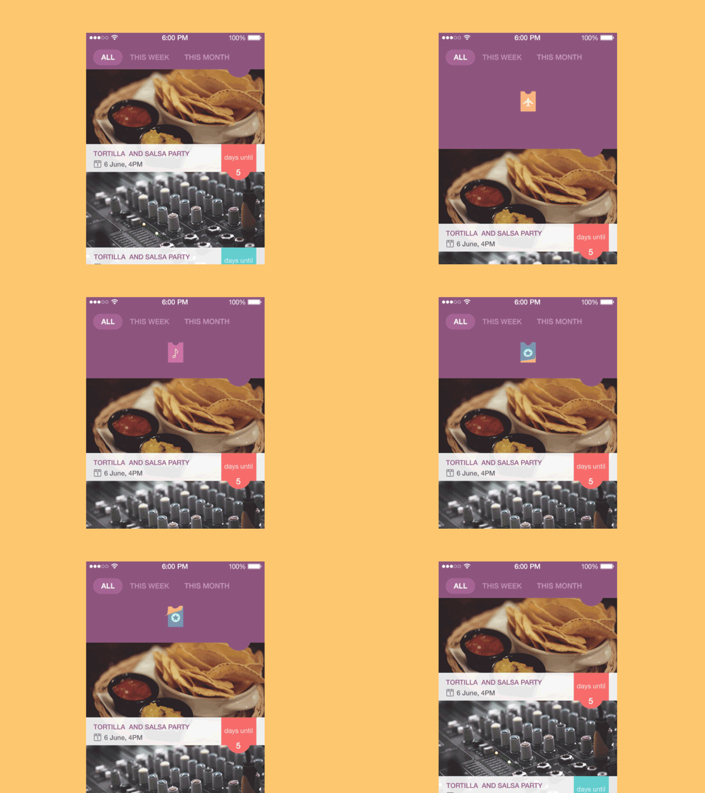
In the first version of UI for the application items in the feed they had no footer and the text with data about the particular event was placed right on the photo used as a background. In this version, the designer offered to change this part of the layout and separate photos from the text making it placed in the footer with the light background. The reason for such solution was simple: the application used the photos automatically linked to the events from the resources where the tickets or other stuff was bought, therefore it was impossible to control the quality of those photos or to change them manually, so in some cases, they could cause illegibility of the text if it was placed right on the photo or picture. This could have a significant influence on users’ perception and make it negative. So, the solution of creating a footer was made to eliminate this risk.
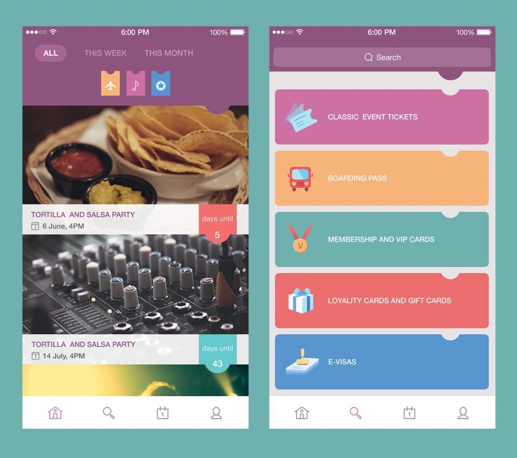
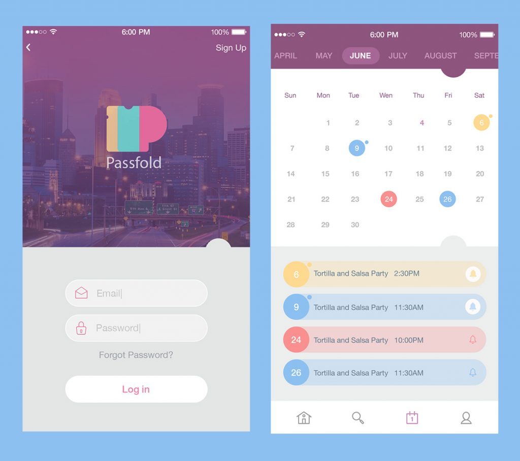
The user interface in the given application also included some conventions used through all the app screens. Conventions are a very important part of positive user experience in the interaction with the product, especially in highly practical applications, whose operations need to be dynamic and not taking too much time or effort. In the PassFold project, the consistent element throughout the screens was the tab showing the number of the days left to the event visualized in the form of tickets of different colors as you can see in the image above. The colors corresponded to the color of the event category in the main menu of the app. They enabled the user to get fast and easy when they need to define the category of any item in the feed. That is even more precious when the person uses the app on the go which often happens with highly practical apps and tools.
Certainly, one of the most important parts of such kind of app is the calendar which represents all the plans according to the tickets and other items stored by the user. The calendar was also solved in a pleasant-looking and clean manner with a light background so that colorful accents showing the dates with planned events were clear and easily seen. The notifications, as it has been usually mentioned, could be added manually by the user, and if he did it, the date on the calendar showed it with the special small round mark both in the calendar and the line with the event description, as you can see in the image below.
It should also be said that one more element influencing the general concept of UI for the application was its logo. It was also created by Tubik Studio designer Arthur Avakyan and it will take the separate case study to present you the full process of its creation, so it will be the next story in our blog coming soon. It was very reasonable to keep the general concept both for logo and UI, so it can be said that their interconnection and interrelation gave the entire unified design feeling. The logo was added to the colors used in the color palette for UI, and UI kept some features and shapes used in the logo, including the form of tickets it visualized.
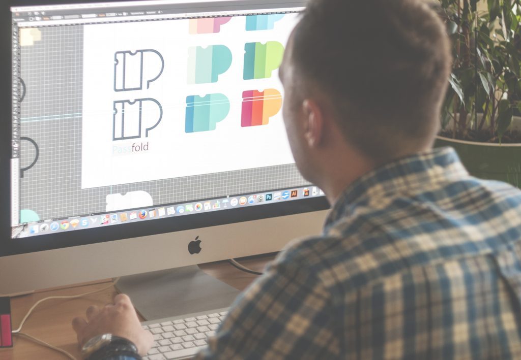
Arthur Avakyan working on PassFold logo.
The designer also paid additional attention to such simple but significant elements of the interface as icons. The customer wanted that UI of the app didn’t look too serious or businesslike, so the icons were not only meaningful elements in the general navigation of the app but also the flavor of entertainment and fun in the also bright and colorful menu.
![]()
One more element of fun was added with the animated pull-to-refresh showing colorful tickets changing.
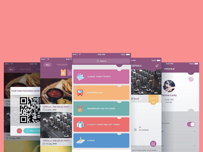
The customer also wanted to enable users to obtain information about events via QR-code, therefore a special pop-up window was designed for this function which the user could see by swipe.
Ticket detail screen as well as the calendar screen, being one of the most informative parts of the app, was also solved in the color scheme with a light background to provide a high level of readability.
This version of the app also added a sharing feature. With special buttons appearing on the long tap the user could share the information about the ticket which was gained with his friends via his social accounts. Moreover, the app also included the feature of sharing the ticket itself via sending it to a friend.
Every screen involved unobtrusive tutorial prompts in cases where some options or actions could be non-obvious for the user.
Here you can see the full scope of UI for the PassFold project.
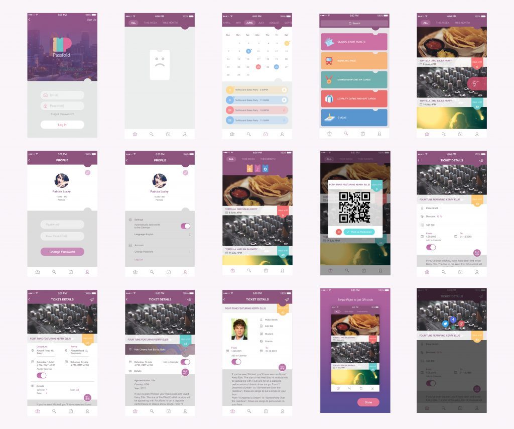
After approving all the screens and UI elements of the app with the customer, the designer also took some time to work on the adaptation of all the solutions to the iPhone 6/6+ and Android that also demanded deep attention to details that have to look perfect in all the versions and resolutions.
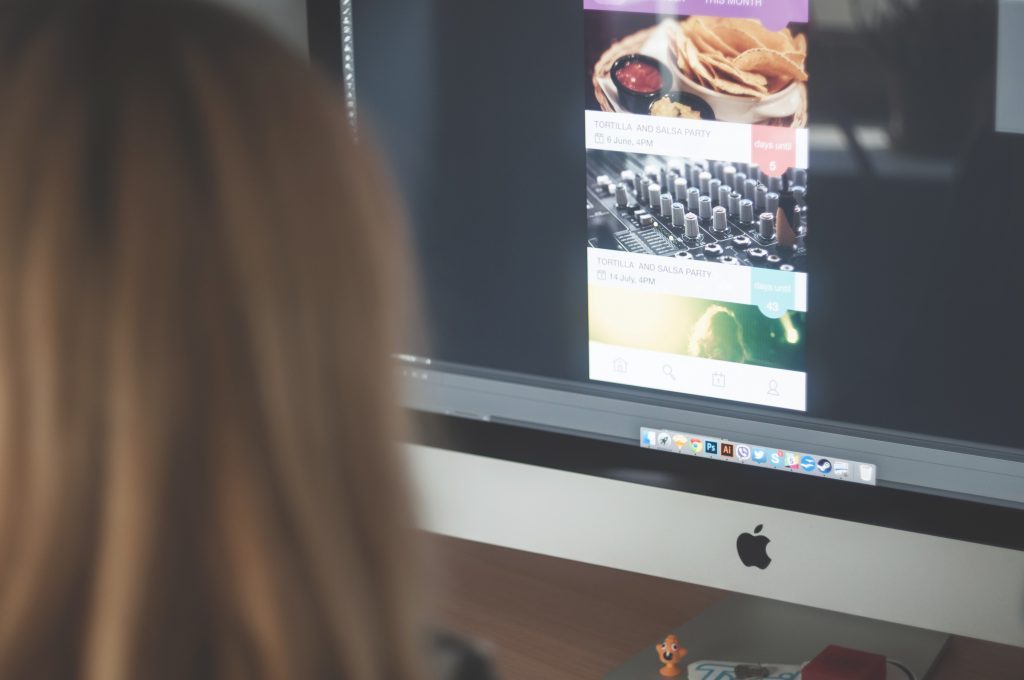
Tamara working on the finalization and adaptation of general UI design
The work on the project was the process full of ideas and inspiration, so many that the project could not include them all. That’s why some of the ideas, inspired by this design task, became the basis for Dribbble shots by Tamara presenting her UI concepts.
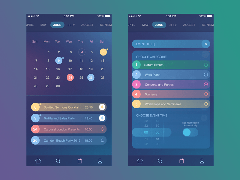
Time management app by Tamara
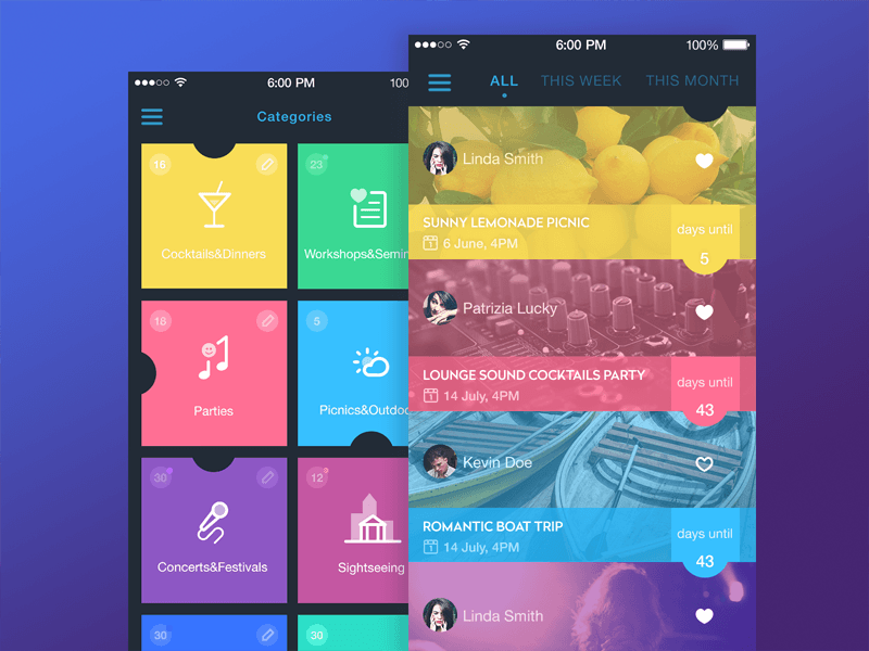
Event App by Tamara
This task has become one more proof to demonstrate how much effort, time and creative job should be done to create the design of the interface that will look and feel simple and cute but at the same time will satisfy multiple needs of users.
Originally written for Tubik Blog
- English
- Ukrainian


