Big Guide to Types of Mobile Applications
Big Guide to Types of Mobile Applications Review the most popular types of mobile applications, their functions, and benefits in perspectives of content and technical realization. Packed with UI examples.
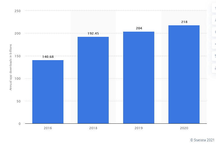
Smartphones are no longer a thing for communication only: today, they cover multiple needs and help us to solve a variety of problems. Mobile applications let us study and entertain, do a lot of basic operations in seconds, calculate and edit, remind and connect us to other people, and so on, and so forth. According to Statista, the number of app downloads demonstrates steady growth from year to year, with about 218 billion apps for iOS and Android downloaded worldwide in 2020 (first-time downloads only are counted).
Not only does the number grow, but also diversity, which is evident in the variety of design projects. Today, we’re going to review the most popular types of mobile applications, their functions, and benefits, with plenty of examples from Tubik designers.
There are two global perspectives for classifying mobile apps: in terms of the content they offer and the technical aspects of their realization. Let’s start with the content.
Content Perspective
Here we classify the applications according to the problems they solve and the functions they offer to users.
Utility Apps
This is the basic and perhaps the most widely used type of mobile applications. These apps let users solve a particular problem or accomplish a task, usually the one we face day in and day out. It’s all about basic problems that should be solved quickly, and this is what apps of this type do, saving our time and effort. Here you will find a variety of calculators from standard to financial and scientific ones, clock and alarm apps, flashlights, barcode scanners, tools for conversion and password management, screen locks, etc. They are little helpers of our everyday life.
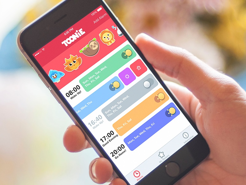
Toonie Alarm
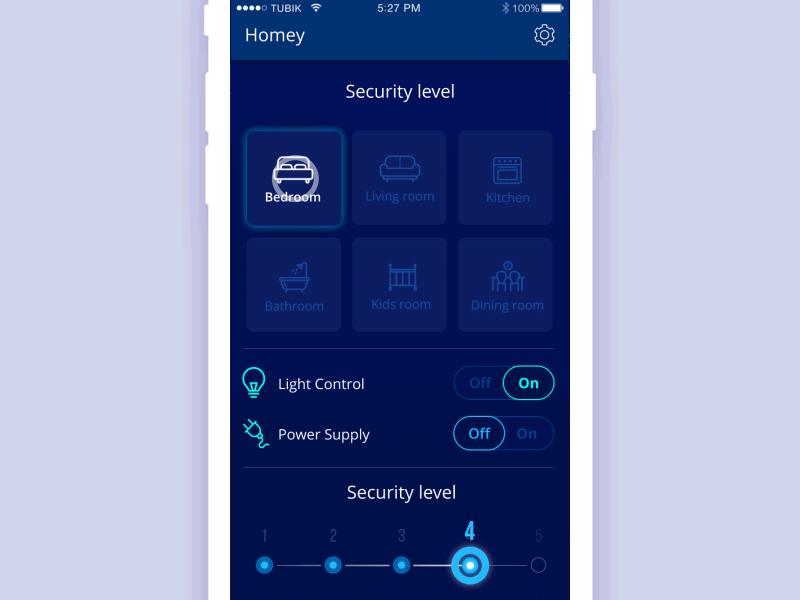
Homey App
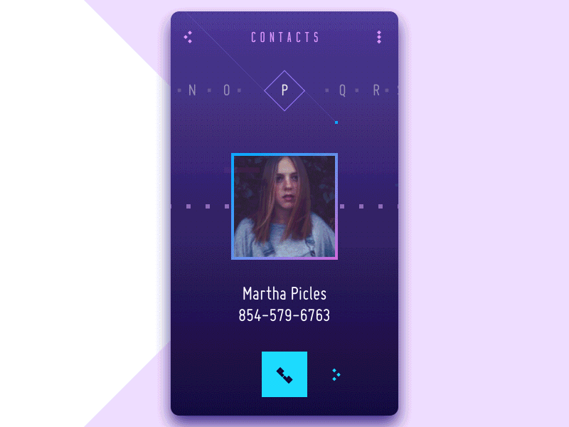
Contact List App
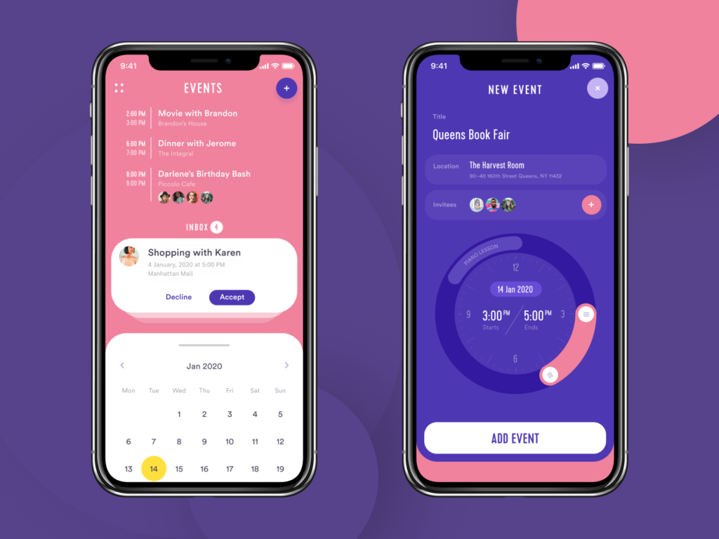
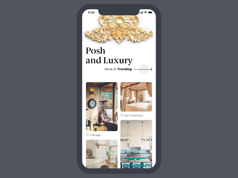
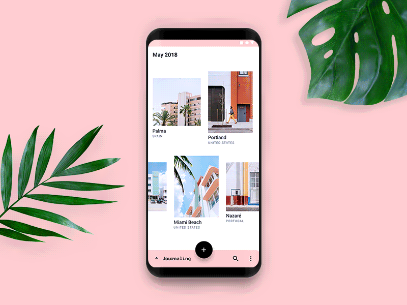
Lifestyle Apps
These apps are connected to various spheres of our activities, connected to lifestyle and life quality. Usually, they cover quite general themes, subjects, and services. These apps help users find and improve their homes and offices, take up hobbies, look good and feel good, etc. If your app is about real estate, fashion, parenting, or hobbies, that’s a category for it.
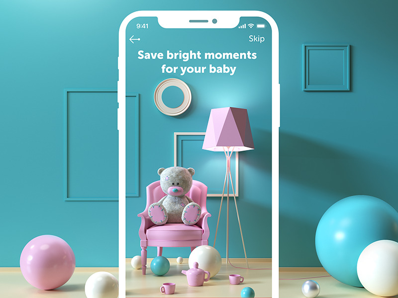
My Baby App
![]()
Watering Tracker App
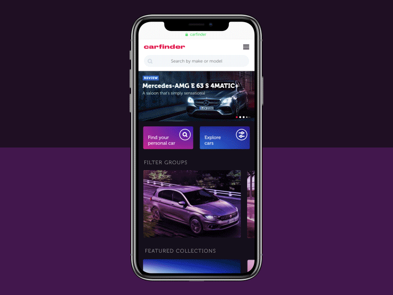
Carfinder App
Navigation Apps
These mobile applications help users to find their way and plan their routes. These are driving and walking assistants, map applications, atlases, public transit maps and fuel finders, pilots and maritime assistance apps, and the like.
![]()
![]()
Dog Tracker App
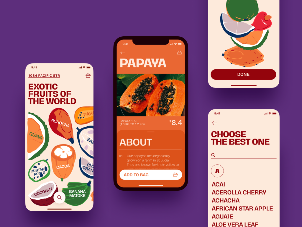
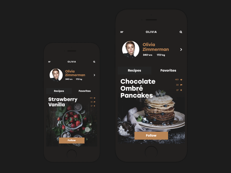
Food and Drink Apps
These apps are all about tasty life, as “there is no love sincerer than the love of food,” according to George Bernard Shaw. Here you will find everything about eating and drinking, cooking, healthy food, eating out, and the like. So, diverse applications offering users recipes and menus, nutrition facts, reviews of meals, beverages, restaurants, and cafes, guides into cuisines of different countries, and all the stuff like that go to this category.
Restaurant App
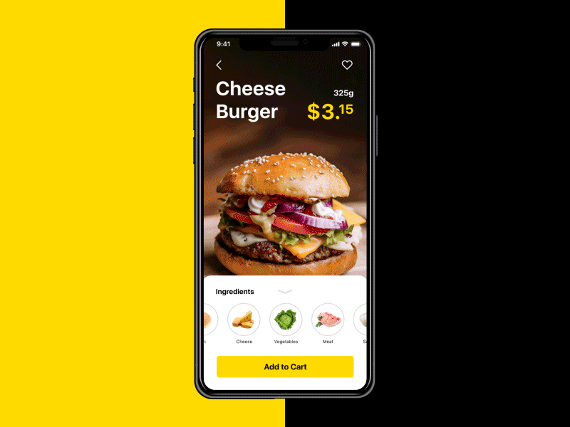
Tasty Burger App
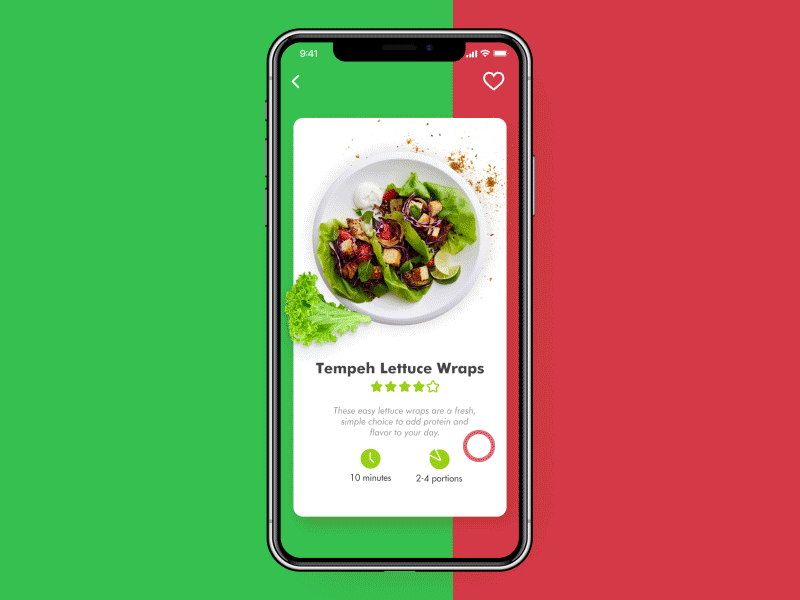
Vegan Recipes App
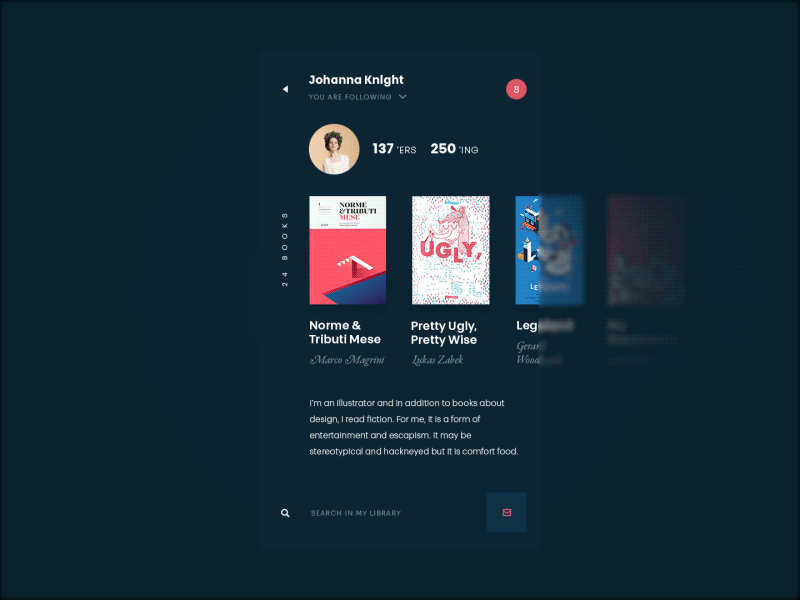
Books Apps
Explanation won’t take long: these are apps for reading or listening to the stuff that was traditionally printed. Here, this content becomes interactive and offers different functionality for user manipulations. Reader apps, interactive ebooks, and comics are found in this category.
ABUK, the mobile application for an audiobook store
Education Apps
The mobile applications of this type are all about learning and teaching: their main objective is to share knowledge in an interactive way. Here you’ll find the apps of different complexity and interactivity levels focused on educational purposes. They may be aimed at different target audiences that determine the approaches to graphics and general concepts of user interface design for every particular case. In this group, you’ll find stuff from basics like reading, writing, phonics, colors, alphabet, vocabulary training apps to specific narrow themes like nature and wildlife, geography and astronomy, languages, test preparation apps, school portals, and educational platforms.
Learn Chinese App
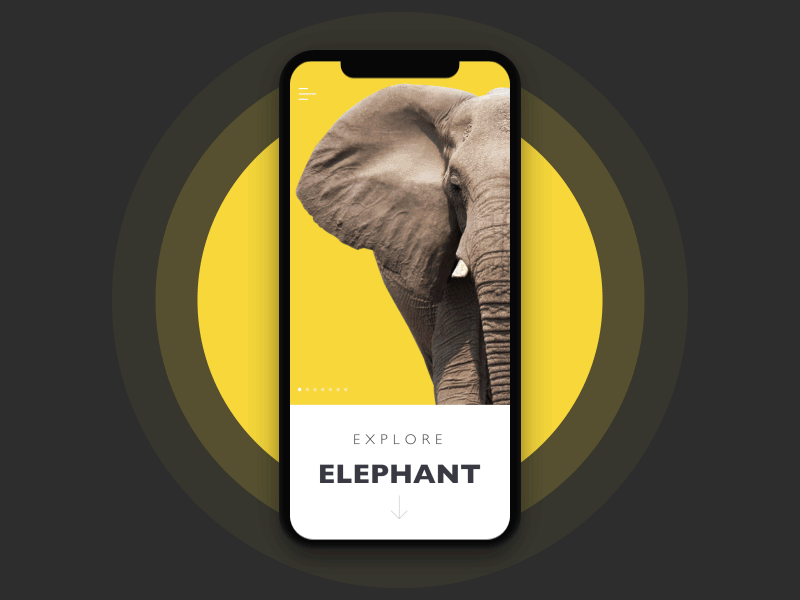
Nature Encyclopedia App
App for Moon Creative, an educational facility for children and teens studying design and animation.
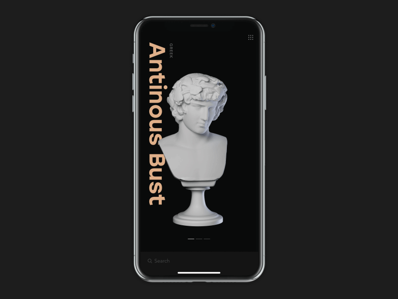
Entertainment Apps
Who works well, has to rest well. Entertainment apps are usually aimed at adding fun to our life. These interactive applications are designed and developed to entertain users with audio, video, graphic, and other content. Here are TV and movie apps, ticketing apps, interfaces for art creation and fun clubs, etc.
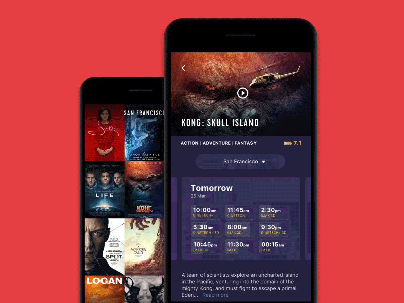
Cinema App
Gallery App
Game Apps
One more group of apps that can serve both entertainment and education is games. Here you’ll get a variety of options, from highly useful intellectual or educational games to time-killers for waiting time. Game applications are perhaps the most diverse in visual styles and layout design.
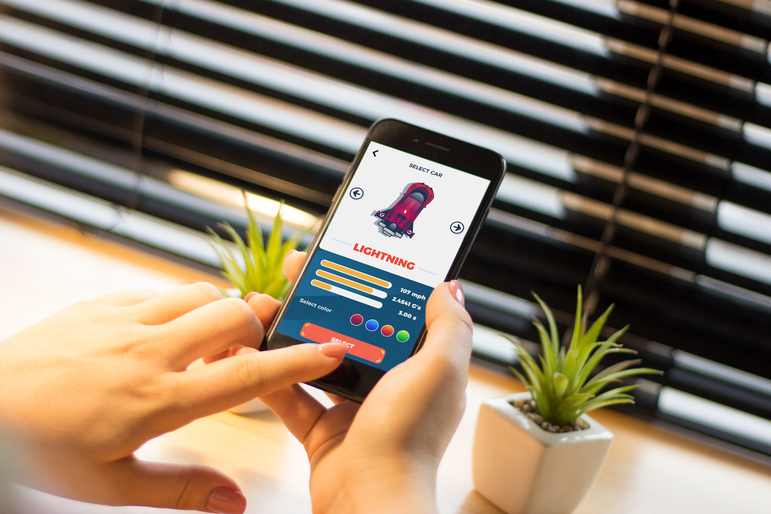
Real Racing Mobile Game
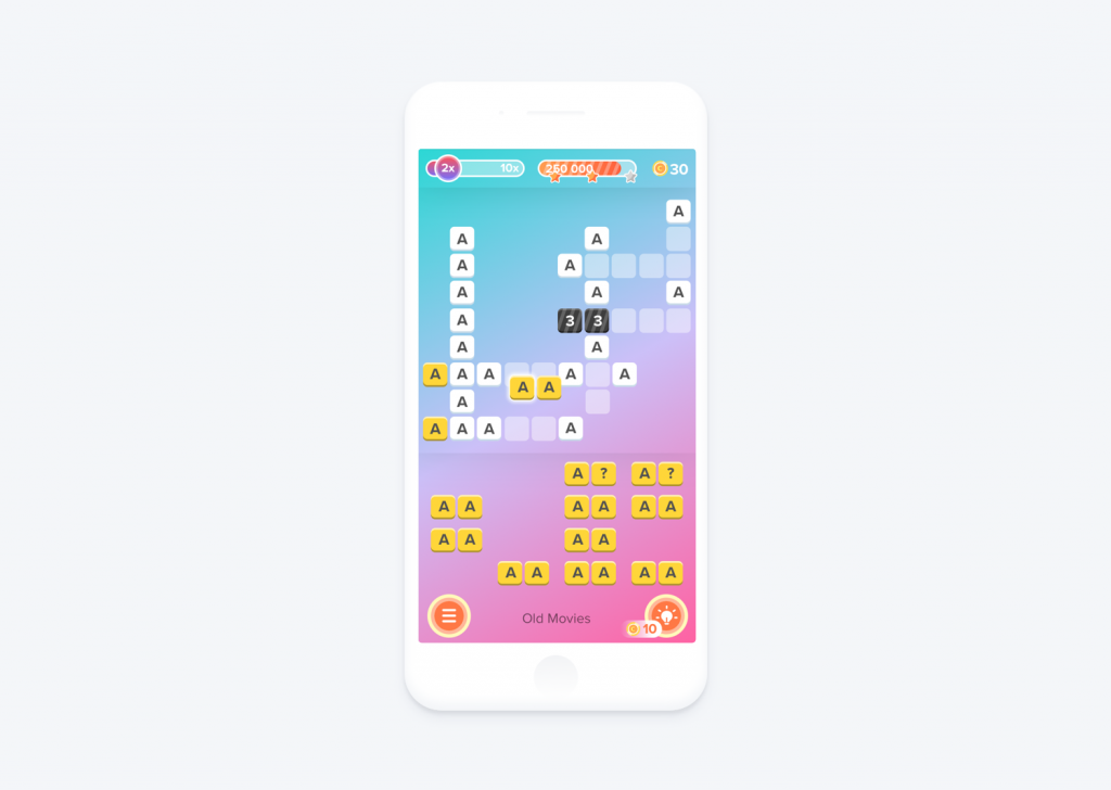
Letter Bounce Game
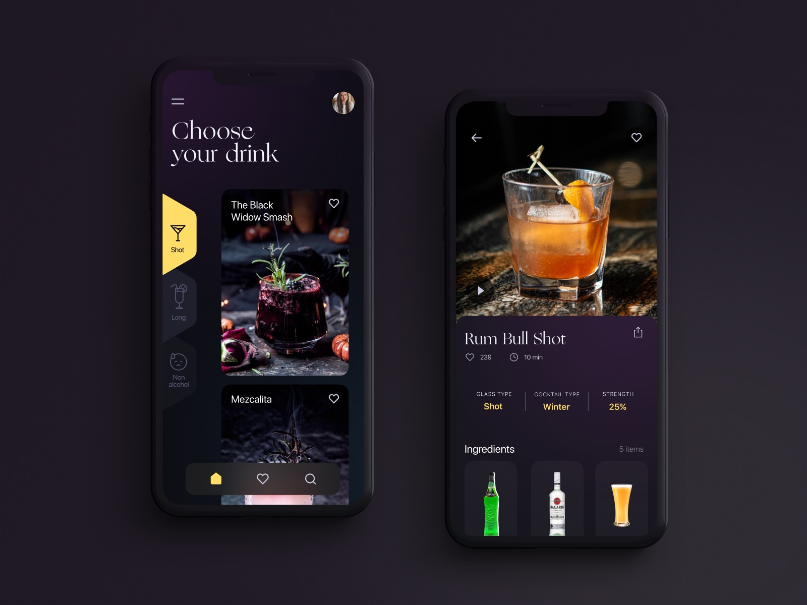
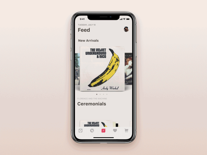
Music Apps
For many users around the world, music is an integral part of life, so the domain of music apps offers a wide variety of options for discovering, listening to, recording, and even composing music. These are not only music players and libraries, but also apps for music creation, education, watching videos and concerts, and even lyrics writing.
Business Apps
These mobile apps support people involved in business activities, helping them track and analyze data, collaborate, manage resources, and plan. Here you’ll also find apps for hiring and job searching, remote desktops, file-sharing apps, and tools that enhance teamwork.
Finance Apps
The apps of this group are about money. They actually perform financial transactions and support the user with the company or personal financial matters. So, here are financial management and budget apps, mobile banking applications, the ones about investment, insurance, and stocks, taxes, and bill reminders.
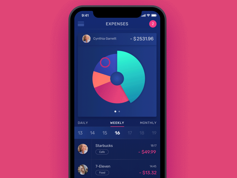
Finance App for collective finance management
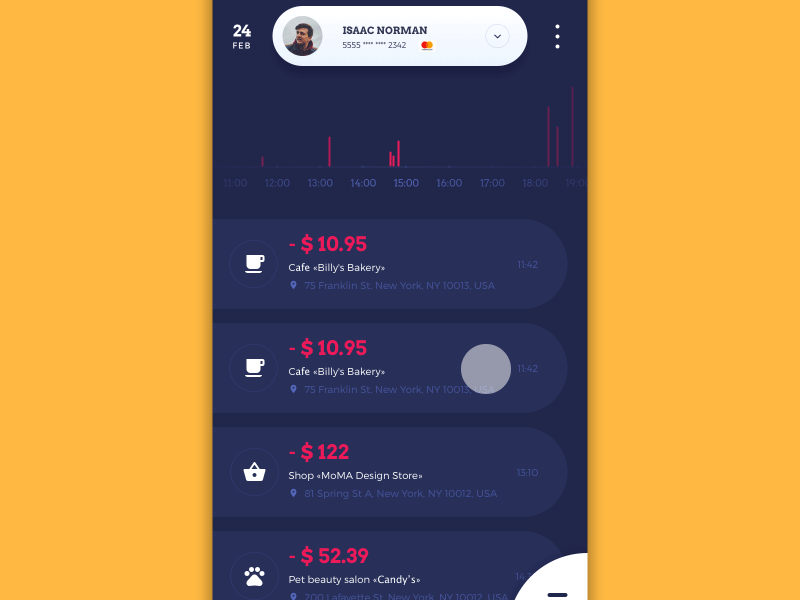
Home Budget app for tracking and analysis of personal financial stuff
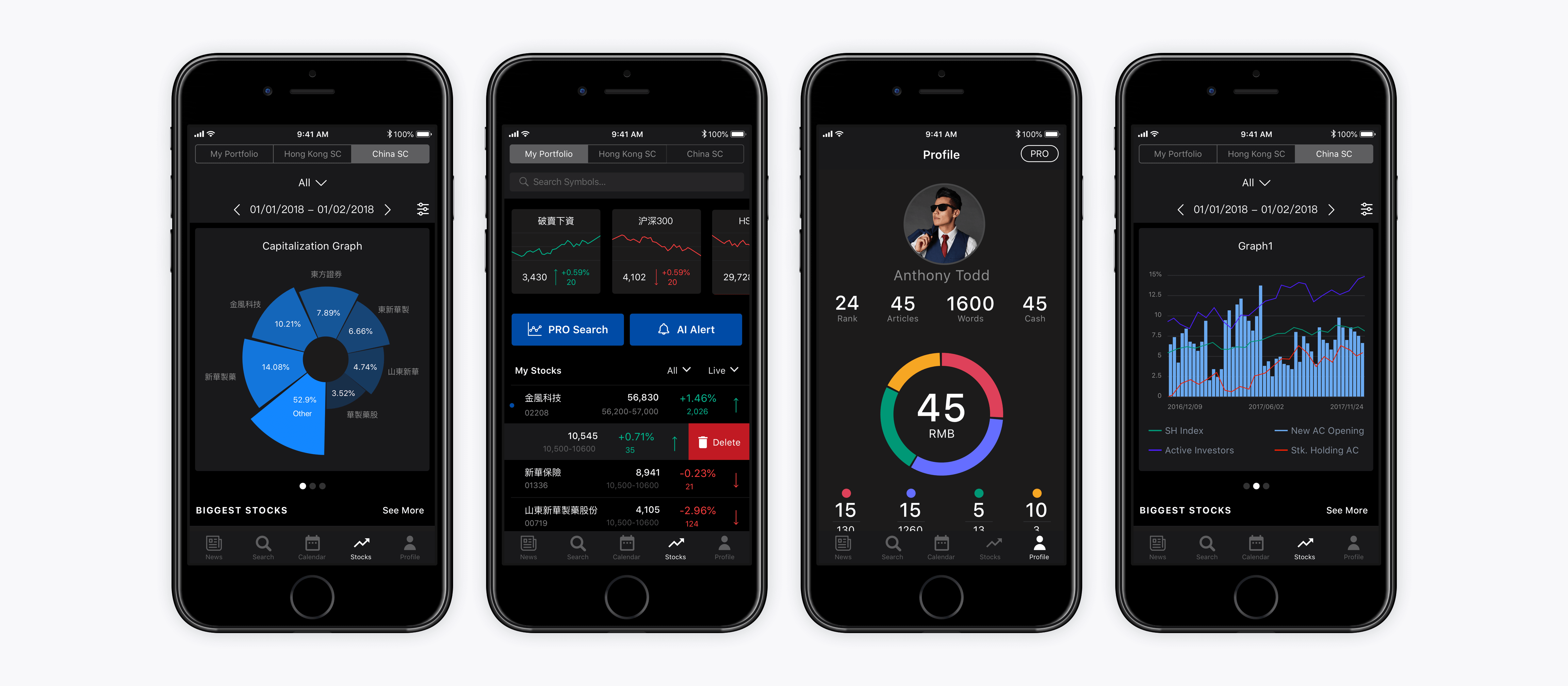
Bitex Stock Analysis App
Sports Apps
The apps in this category are related to all kinds of sporting activities, from professional to amateur, collegiate, and recreational. They may serve for teams, leagues, and sporting events, feature info about athletes, track scores, provide instructions, and sports news.
Health and Fitness Apps
This type is aimed at the user’s healthy living. There can be apps that help to monitor health conditions, track and analyze this kind of data, lose or gain weight, manage stress, do fitness, have active rest, or relax and engage in recreational activities. Workout, running, and cycling trackers, apps sharing programs for weight loss, pilates and yoga apps, pregnancy applications, and all these kinds of useful helpers are found in this category.
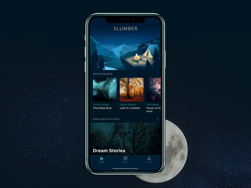
Slumber App
Medical Apps
In comparison to the previous category, these apps are more professional in the aspect of healthcare and medical treatment. They are focused on medical education, management, and health reference for patients and doctors. So, here you’ll come across apps that inform you about diseases and symptoms, help you explore anatomy, and track health conditions more deeply than general health trackers, while also supporting medical records.
Magazines and Newspapers
The name says everything: this category usually features the apps that provide content we typically find in newspapers, magazines, or other periodicals. Usually, the content is automatically renewed and may cover a wide variety of topics. Also, these may be the apps providing the online version of print periodicals or the app may provide news and articles only online without any connection to a physically existing publication.
News Apps
Very close to the previous category, these apps’ goal is to provide users with information about current events in diverse areas of interest, from politics and entertainment to technology, business, science, and others. An app of this kind usually serves content in a newsreader or digest format, or it may be a digital-first media outlet with constant content updates. So, this category offers apps for TV and radio news, RSS readers, news programs, and outlets.
Photo and Video Apps
These apps help to create, manage, store, edit, and share photo and video content. Adding special effects, printing, creating custom greeting cards and social network posts, editing content with adding text, illustrations, masks, making collages, and so on, that’s what you find in this group.
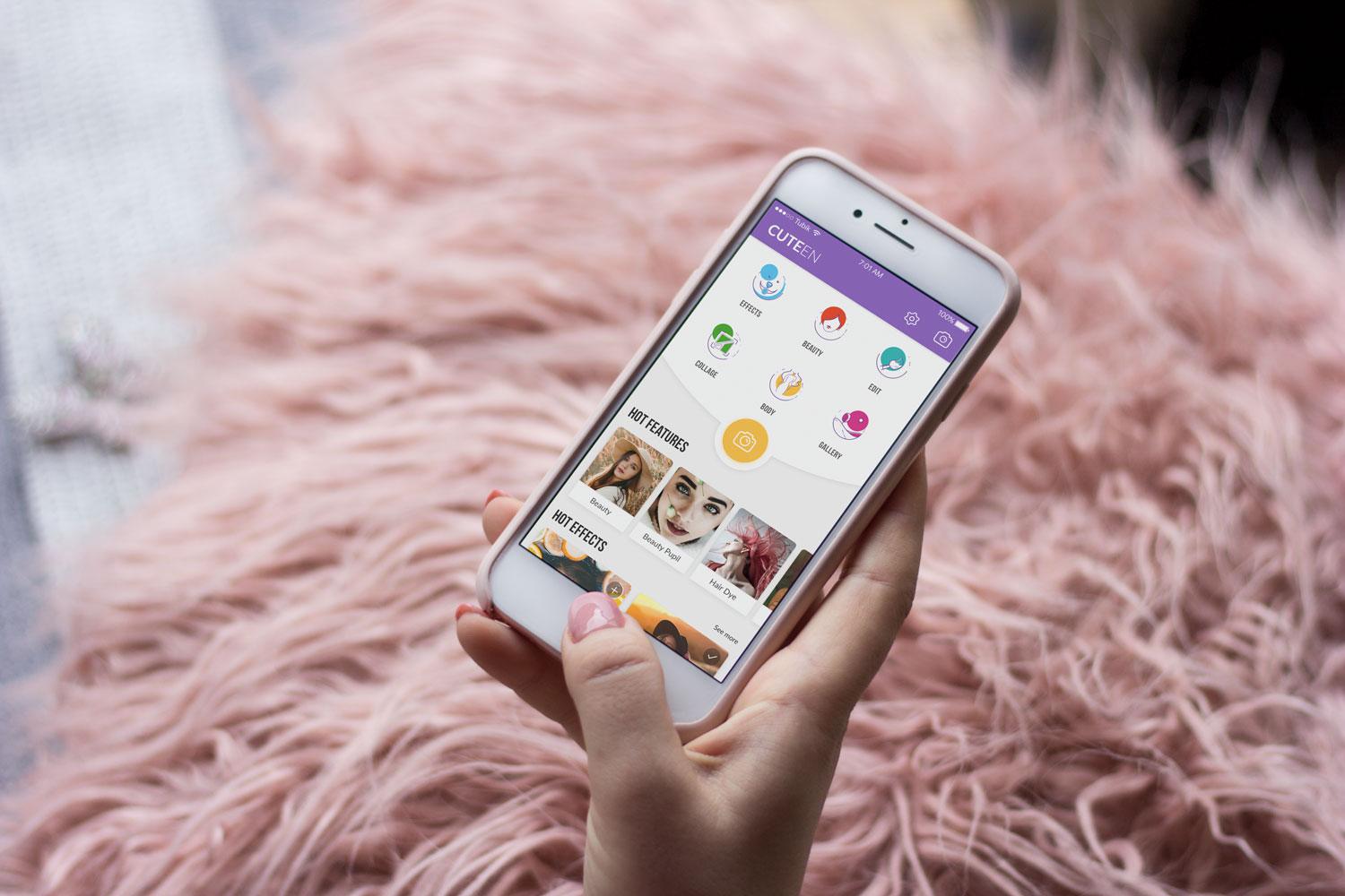
Cuteen Photo Editor App
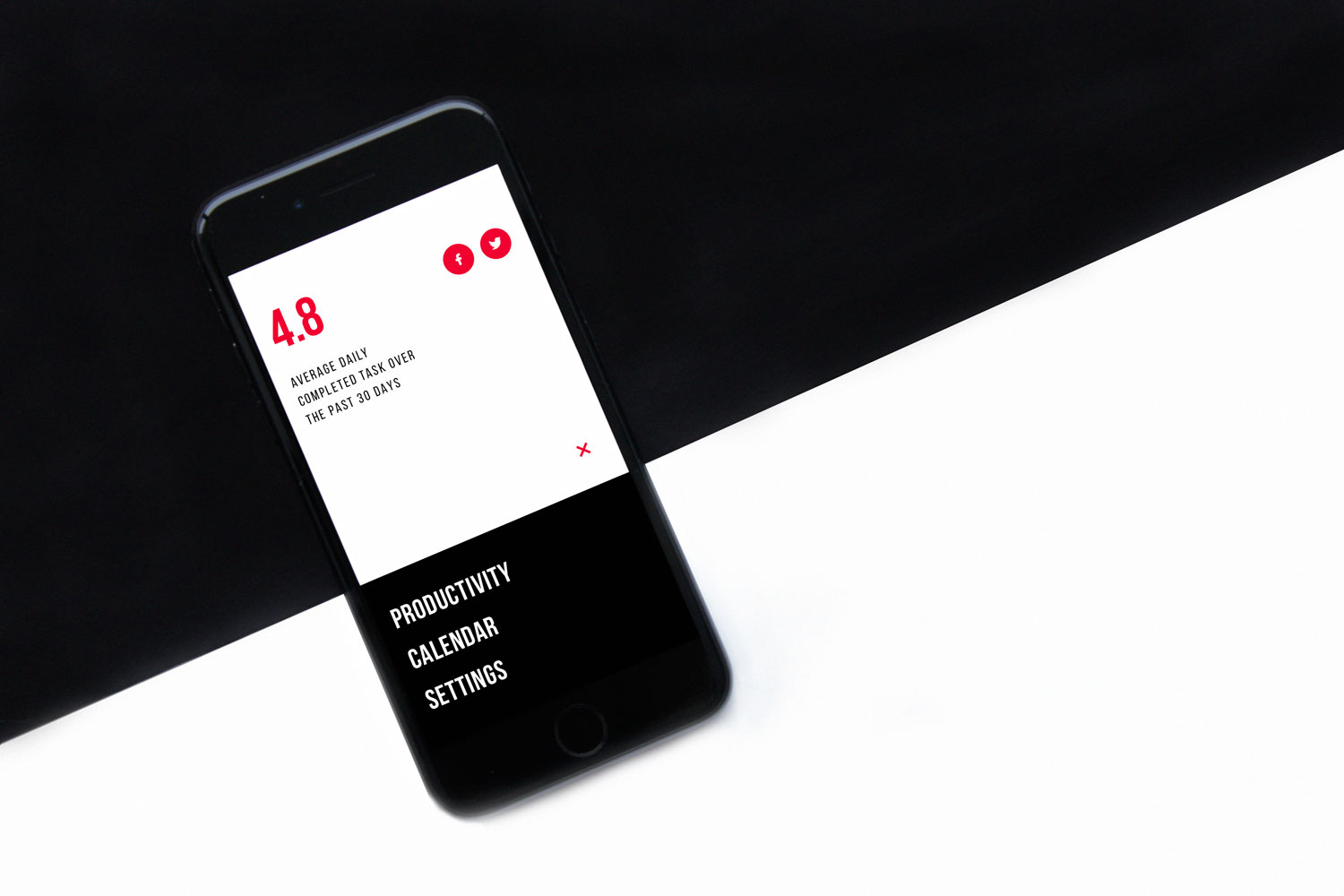
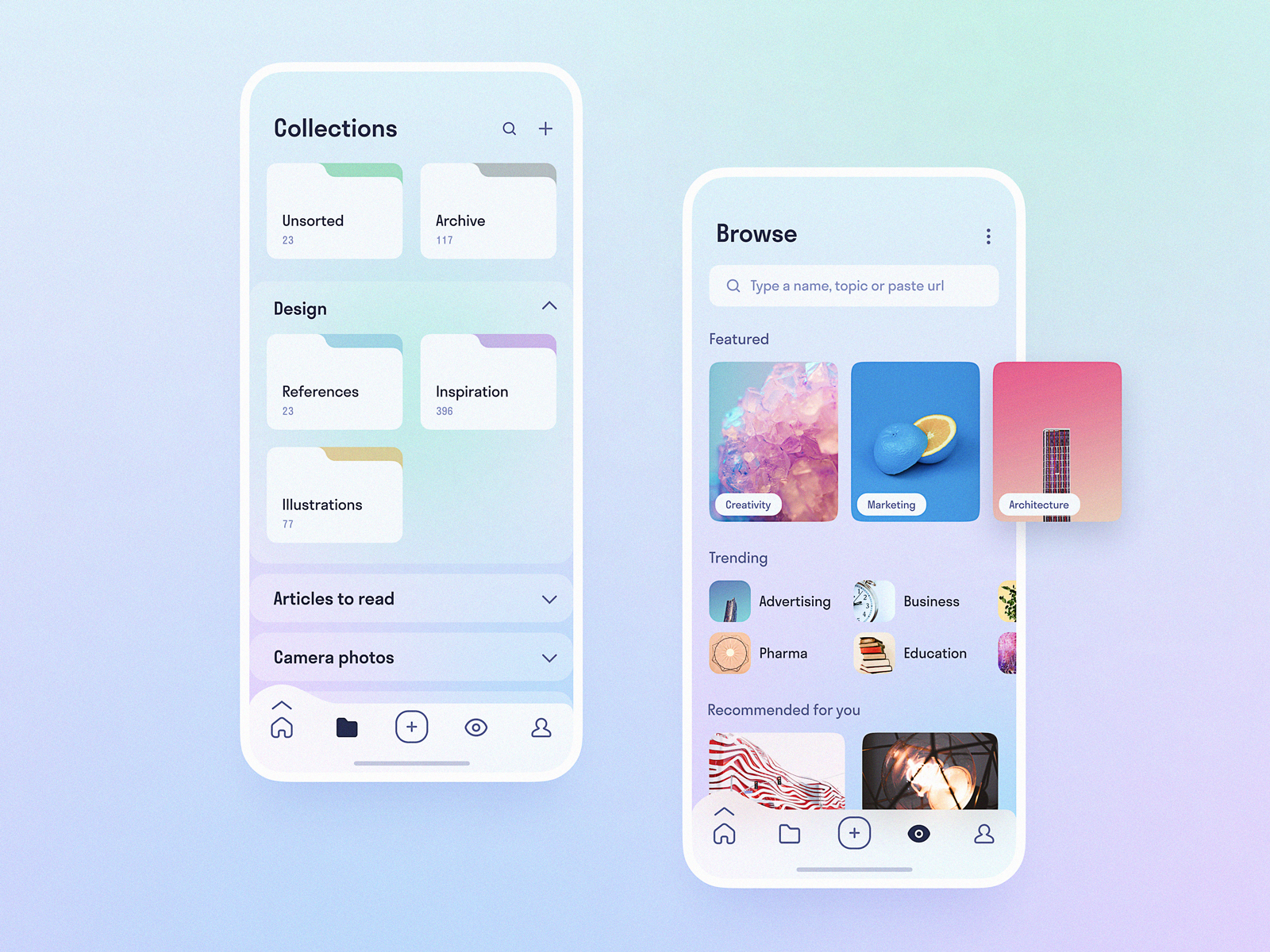
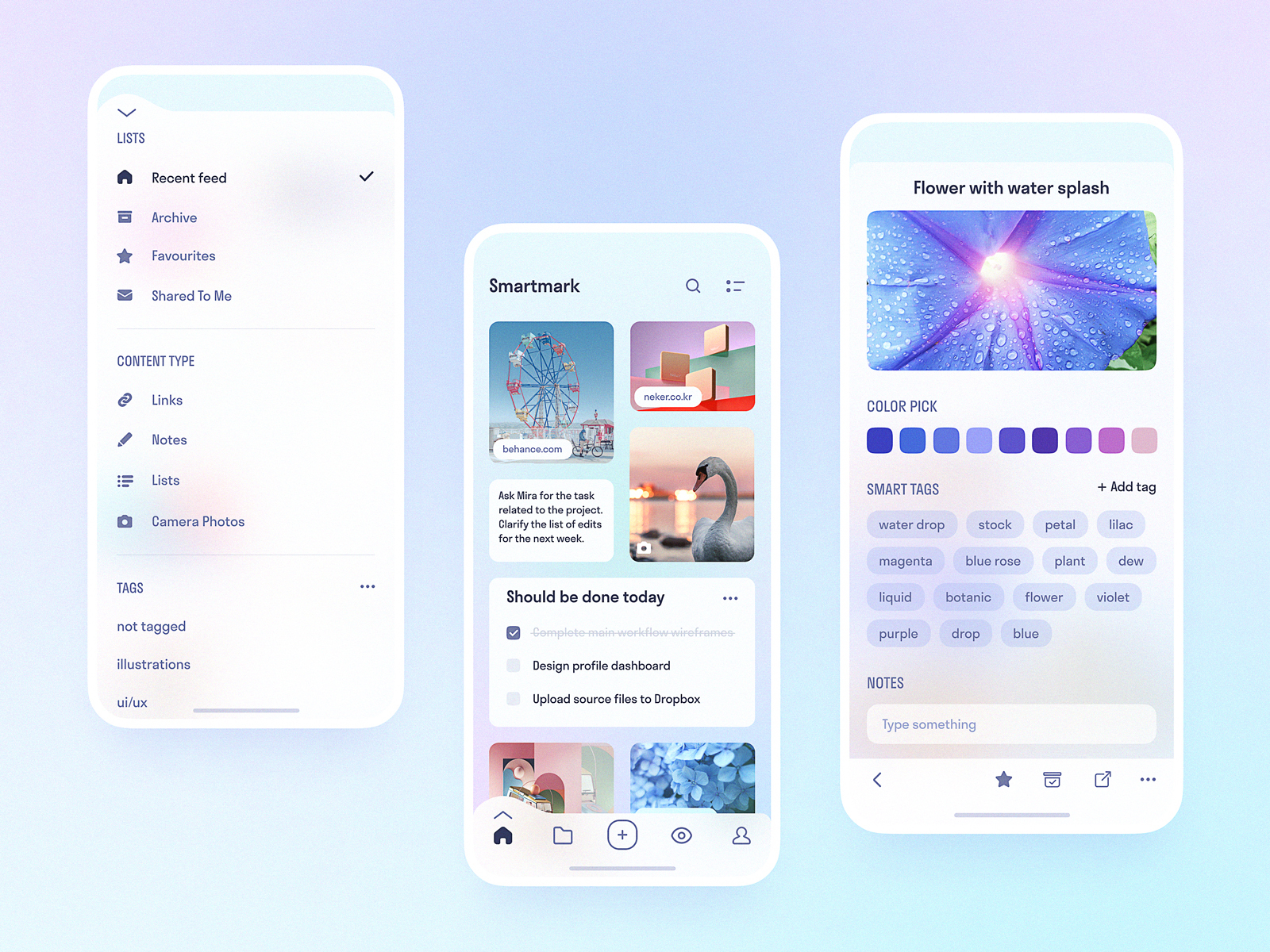
Productivity Apps
The apps here have an objective to organize specific processes and tasks to make them more efficient and save user’s time and effort. As well as utilities, they may be simple but very helpful on an everyday basis, such as task managers and to-do lists, calendar and password managers, chart generators, apps for data viewing, emailing, note-taking, and cloud storage.
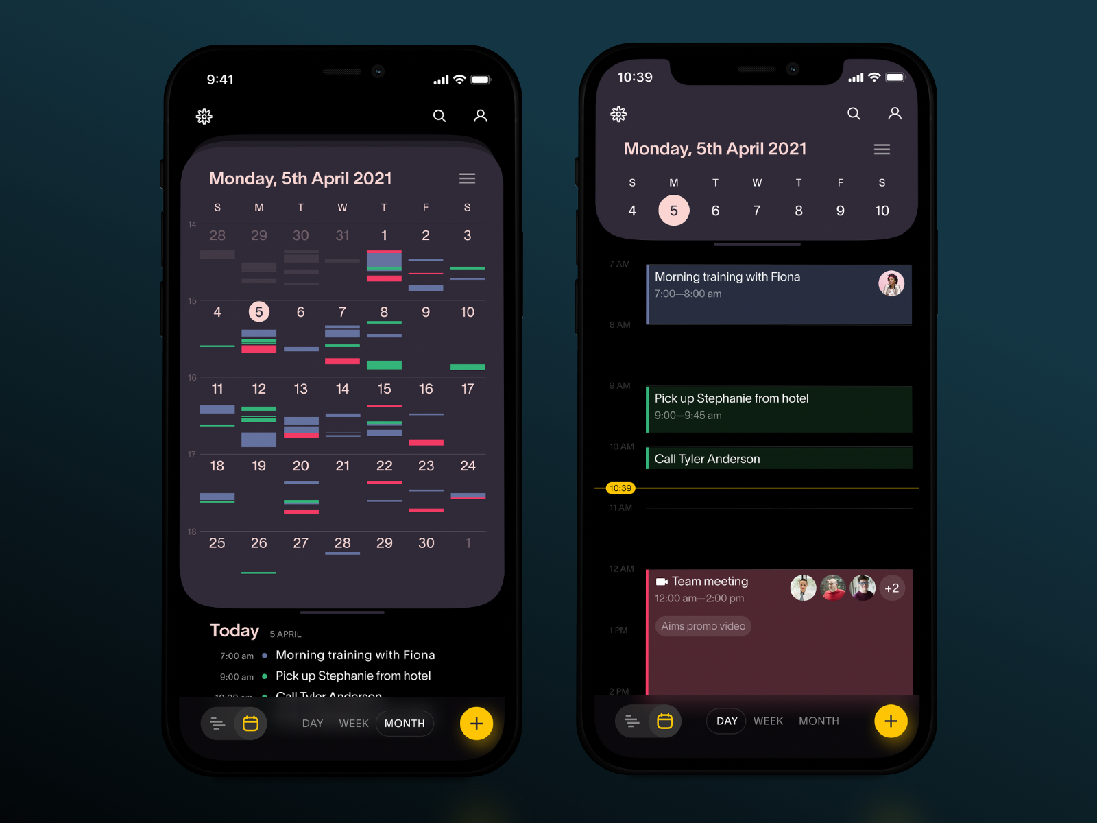
Task Manager App
Upper To-Do App
![]()
Task Tracker App
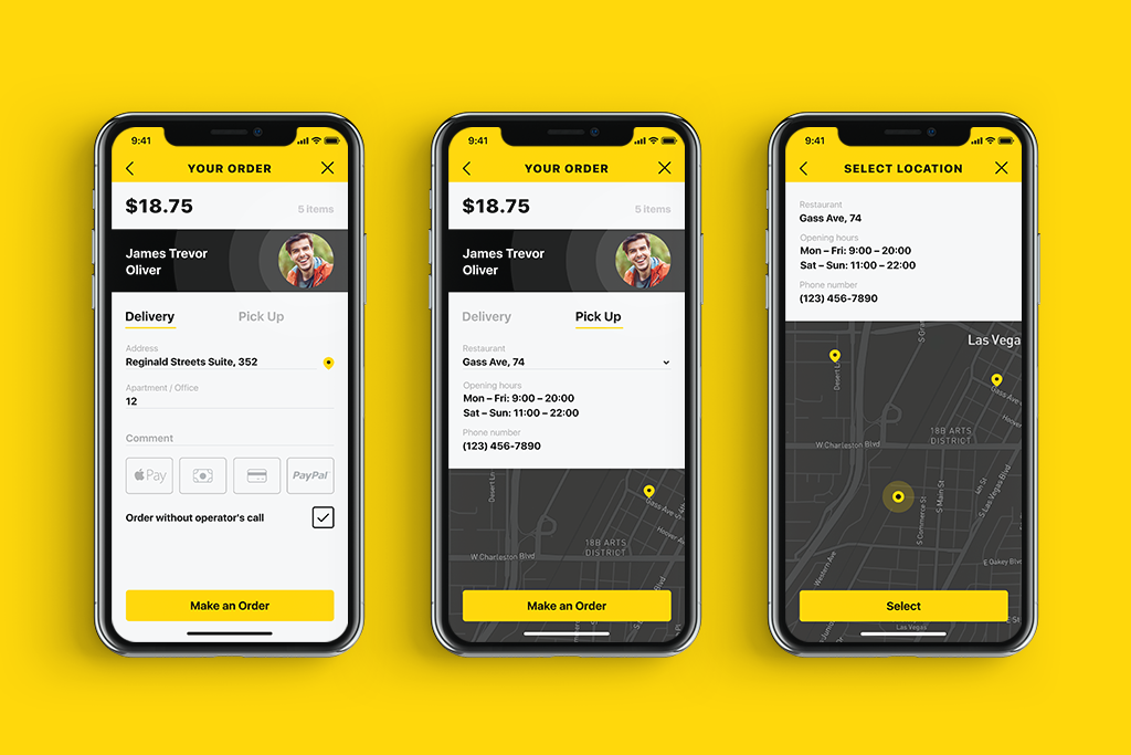
Shopping (E-Commerce) Apps
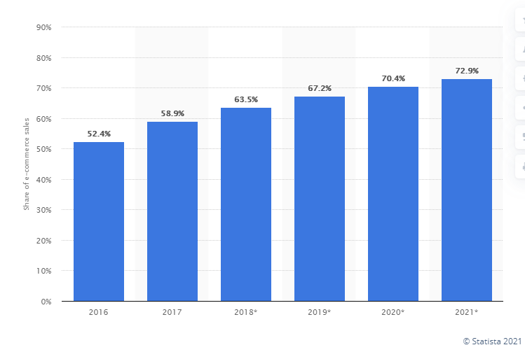
More and more users are doing their shopping online, and a big proportion of them do it right from their smartphone or at least use an app as a way to get the data about the goods quickly and easily. Stats in this sphere are also impressive. According to Statista, In 2021, 72.9 percent of all retail e-commerce is expected to be generated via m-commerce, up from 58.9 percent in 2017. Emerging e-commerce markets in mobile-first economies are a large driver of this trend.
So, not surprisingly, the diversity of e-commerce applications is growing day by day, with a variety of user interface design approaches and tricks. These apps support the full cycle of purchase or enhance the shopping experience at a physical point of sale, for example, making the payment process easier. Marketplaces, coupon apps, and product review platforms are also found here.
Vinyl Store App
Social Networking Apps
These mobile applications are all about communication. They connect people through different content, such as text, photos, videos, and voice. These apps may be aimed at both personal and community connections. So, here you’ll find apps for text and voice messaging, audio and video calls, photo and video sharing, blogs and communities, dating apps, and social networks for special interests.
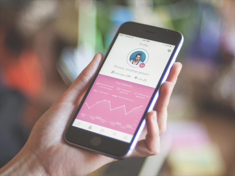
Dating App
Book Swap App, a social network for readers
Buon app, a social network for fans of cooking
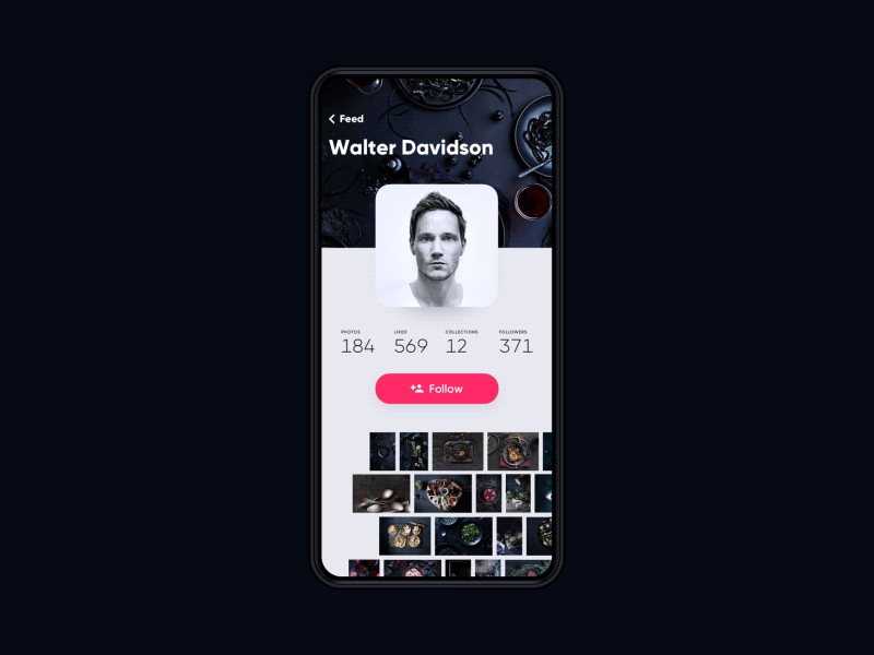
Social networking application for photographers
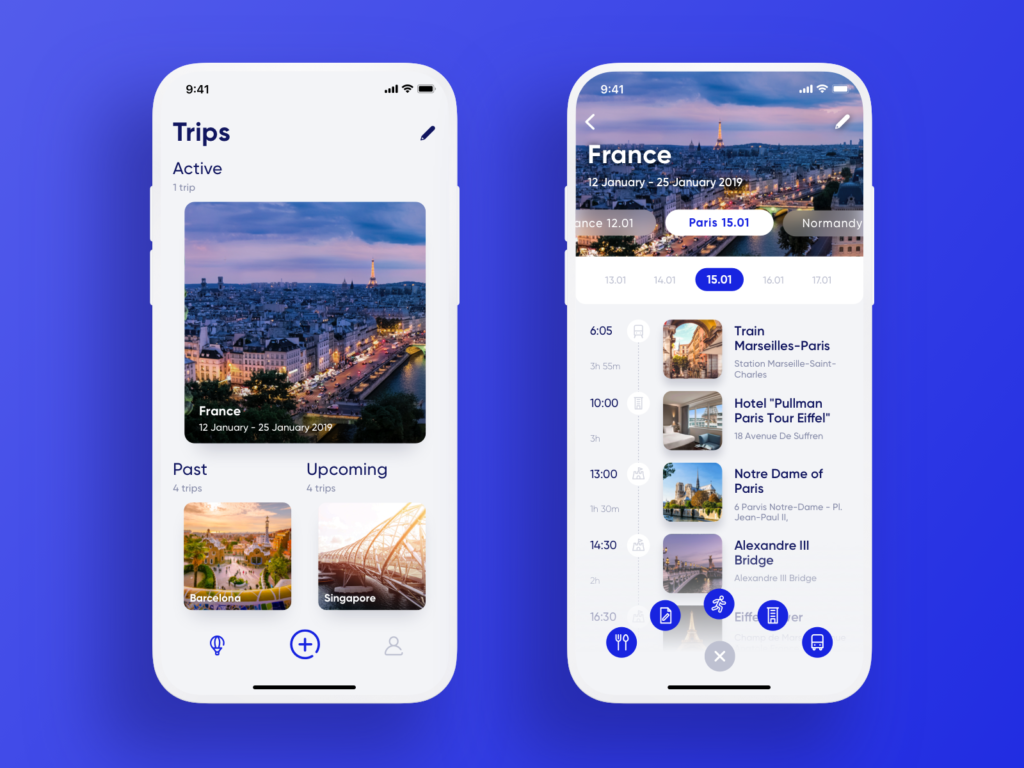
Travel Apps
Everything related to traveling is found in this category: here are the apps that help users plan their journeys, book accommodations, find and buy tickets, and more. These may be flight trackers, apps for hotel and car rentals, holiday planners and city guides, travel tips and rewards, clocks showing the time of different time zones, etc.
Travel Planner App
Lodging App
Museum App
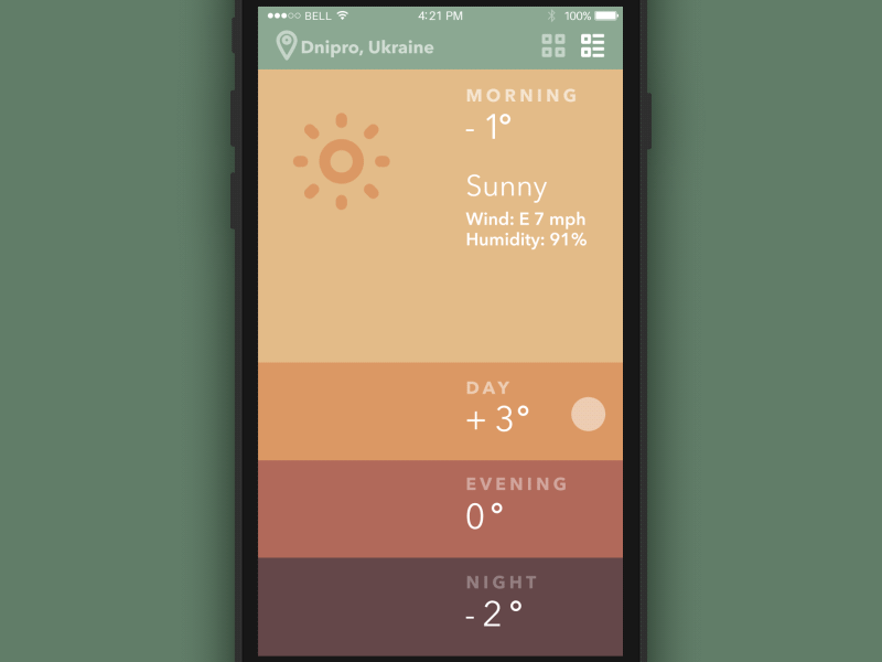
Weather Apps
No need for lengthy explanations: this type of app informs users about weather conditions, from general forecasts to specific data about storms, tides, and specific weather conditions in different locations, etc.
Technical Perspective
In the aspect of technical realization, there are three global types of applications: native, hybrid, and web apps.
Native Apps
These applications are called that way because they are made exclusively for a particular mobile operating system, so they are native to a device or platform such as iOS, Android, Blackberry, Windows Phone, or Symbian. It means you can’t use this app on a different platform except for the one it is aimed at. The benefit of such apps is their high performance and high chances of positive user experience based on native device UI. They have access to different APIs and quickly reached from app stores. The pitfall is that if you want to reach your target audience from different platforms, you have to design and develop a native app for each so it may be rather expensive and time-consuming which in turn may increase the general product cost.
User interface designed for Android
User interface for Tasty Burger app designed for iOS
Hybrid App
These apps are built to be used across multiple platforms using web technologies such as HTML5, CSS, and JavaScript. So, in basic terms, these are mostly web applications that look very close to native. They are pretty fast to develop, which is a definite advantage: a single code base across all platforms reduces costs and makes updates easier. Basic APIs are also available for them, such as accelerometer or geolocation. However, compared to native apps, hybrid apps perform worse in terms of performance, speed, and overall optimization. What’s more, some design requirements can’t be implemented consistently across two or more platforms.
Web Apps
These are software applications that use a browser to run; they are mostly written in HTML5, CSS, and JavaScript. They redirect a user to a URL, and “installation” is, in fact, creating a bookmark to the webpage. The biggest advantage is that, in most cases, they have minimal requirements in terms of device memory and give users access from any device connected to the internet due to saving personal databases on a server. As for drawbacks, a poor internet connection leads to a poor user experience, and API access is quite limited.
So, in any particular case, a client and a creative team make a decision on the type of the app based on budget, time, and numerous factors of target audience needs and behavior.
Useful Reading
If you want to learn more about the best practices of user experience and user interface design for mobile, here are handy articles on the topic.
How to Build a Strong Mobile App Brand
Mobile UX Design: 14 Stylish and User-Friendly App Design Concepts
7 Tips to Improve Mobile Interactions
Step-by-Step Guide to Creating a Mobile Application
Mobile Typography: 8 Practices For Powerful UI
UX Design: How to Use Animations in Mobile Apps
Copywriting for Mobile and Web Interfaces: Types of UI Copy
UI/UX Design Glossary. Interface Navigation
Originally written for Tubik Blog
- English
- Ukrainian