Creative Stages of Efficient Logo Design
Creative Stages of Efficient Logo Design The article continuing the topic of logo design process. Description of creative stages required for making an efficient logo and practical tips on branding signs.
Logos are perhaps as vital and crucial for the marketing success of a brand or company as appearance is important for the first meeting with a client or employer. It’s much easier to get a job you want, make friends or partnerships if you are a person of substance and have something memorable in your identity. The same happens with brands: it takes seconds for them to get lost in the ocean of competitors if they don’t build up a strong image and character via which clients, buyers, or users can get the chance to recognize them.
Logo is the basic mark of brand identity, the most prominent symbol of brand image, and the foundation of an effective marketing strategy, enabling its connection with the target audience. One of the misperceptions in the world of business is that if the product or service is good, it doesn’t need additional investments of time and money into its promotion. However, it doesn’t work like that: without brand identity, even the high-quality product can get lost just because users or buyers won’t get even a slim chance to learn about it or try it. On the contrary, a strong branding strategy sets the immediate connection of the product or company and its essential benefits with the sign that represents it. Brands, products, and companies need their own personalities that will attract people in the way it often happens with a personal relationship.
Showing personality in your app, website, or brand can be a very powerful way for your audience to identify and empathize with you. People want to connect with real people and too often we forget that businesses are just collections of people. (Aaron Walter)
![]()
Worldwide famous designer and artist Karl Lagerfeld once said “Logos and branding are so important. In a big part of the world, people cannot read French or English – but are great in remembering signs”. Knowing how far he went in the sphere of design, it’s really easy to believe he’s right, considering that plenty of big and small companies proved that via their marketing experience.
In our previous article, we looked a bit closer at five types of logos all of which function successfully nowadays. Continuing the topic, today we suggest going deeper into the stages of the creative process in logo design on the basis of extensive studio experience in the sphere.
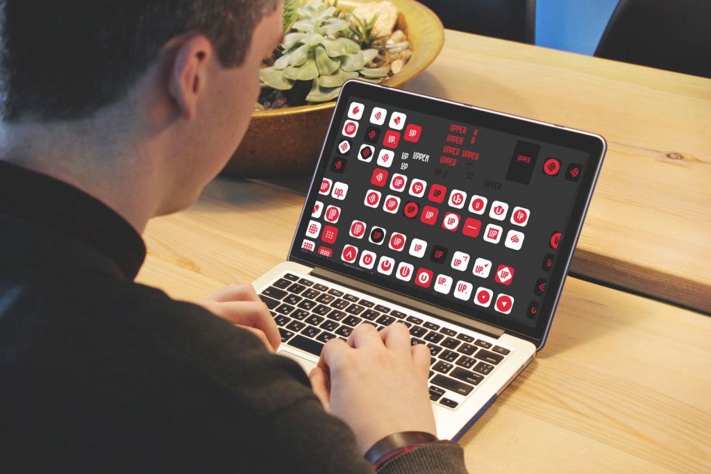
The process of creating a logo for Upper App
Logo design flow
One of the key characteristics of the most efficient logos is their simplicity. On the one hand, it becomes a challenge for a designer to create a sign that is both simple and at the same time recognizable. On the other hand, it can give clients the illusion that logo creation is a sort of simple operation that needs a couple of hours and doesn’t require special skills, too much time or effort. That is quite a mistake and such an approach will bring branding to nowhere.
Efficient logo design is a complex strategy that includes all the stages of design and marketing process such as:
- setting the task
- user research
- marketing research
- creative search
- choice of style direction
- choice of color palette
- testing in different sizes and environments
- creating a style guide, setting right and wrong cases of logo use, etc.
As we can see, logo design is a tricky process: many steps should be done to get an efficient result. That is the reason for plenty of companies including startups, beginning their way in the sphere of business, to trust this essential task to professional designers. Practice shows that the logo, which is thought-out to the slightest details and tested properly, is a worthy investment.
Let’s look a bit closer at each stage.
Setting the task
This stage is the foundation of all the design process. This is the time when the designer should get as much information as possible from the client to mark the right way to the goal. It is well-known that the one who walks without a destination in mind will possibly come nowhere. In design (not only the logo and branding direction) it works the same way: to get the result, you should clearly set the goals from the very starting point. It doesn’t mean that the goals will stay totally the same at the end of the journey: they can modify more or less in the creative process. Still, if the goals are not set at the start, the creative process can easily be transformed into a mess.
That’s the first step to designing anything: ask “Why are we doing this?” If the answer isn’t clear, or isn’t clear to you, or just doesn’t exist, you can’t design anything. Stop working. Can you help set those goals? If so, do it. (Yes, it is part of your job. Anything that helps you do your job is part of your job.) (Mike Monteiro “Design Is a Job”)
Designers should always be ready that clients often don’t know in detail what they want. They just want a beautiful logo that will bring success to their business. That is natural and that is the reason why they hire a designer. In our earlier post devoted to stereotypes about designers, we mentioned: “your customer doesn’t have to know all the nuances and peculiarities of the design process. That is why THEY are customers and YOU are a designer.”
Moreover, in practice, we have found that when communicating with clients, you should not only capture their wishes but also understand the ideas and reasons behind them. If you understand why your customer wants to see particular colors, shapes, or transitions, it will be easier for you (if necessary) to justify other methods of realization for these ideas, which would give the desired result by the customer.
The more information you get from the client, the better it is for setting the right direction. Design briefs, calls, and Skype conferences, chat in Slack, brainstorming sessions, mood boards can all form a good starting line for productive work.
At this stage, it is highly advisable for a designer to get the data about:
- the nature of the product
- the target audience
- geographical targeting (if available)
- the keywords with which the company represents its identity
- preferred color palette
- potential carriers and surfaces at which logo will be used
- the need for consistency with existing corporate identity (if available)
- preferred type of logo
- the necessity of mascot design.
Obviously, the list is not complete; however, it includes the most important positions needed to set a general design goal.
Research
At this stage, based on the established task and objectives, the designer must delve deeper into the environment in which the future branding sign will operate. The research stage usually moves on in two directions simultaneously: user research and marketing research.
User research means getting deeper into details of the core target audience, knowing their preferences and psychological peculiarities, the influence of color and data carrier on their emotions and experience, the sources of information, and creative performance ways that encourage them and make them active.
Marketing research involves exploring market segments, primarily by analyzing competitors’ creative solutions. Logo design aims to create a unique sign that will make the company or brand stand out from the crowd and draw potential customers’ attention. Neglecting the research stage and relying only on their creative intuition and talent, designers risk failing this task as they will not know the conditions of the logo functioning and will not be able to make it efficient and original.
Creative search
This is the stage when armed with loads of data and seeing the path, the designer sets off in the creation process. The aim of this stage is to develop one or several stylistic directions which will allow fulfilling the branding goal and marketing needs. In all fairness, it has to be added that the branding design process like every single personalization activity is very individual in each particular case. Sometimes, the requirements from the customer are so clear, and details are collected so carefully at the previous stages that the logo direction is set during the first iteration and needs only to be polished. In other cases, especially in cases when requirements are unclear or competition in the market segment is really high, various directions should be analyzed and different variants have to be tested to get the one that will be effective and original.
This stage can include the creative outcome of different fidelity levels, from rough pencil sketches to sophisticated digital samples. Any of them can work efficiently; the choice of strategy depends on the designer’s expert decision of a more effective presentation way according to the client’s requirements and the specific type of logo. Speed and urgency of the project, as well as its interconnection with other design processes, such as interface design, can also influence the choice of presentation format. You can observe the variety of creative stages in our case studies on branding.
![]()
Early sketches of the creative search for SwiftyBeaver logo design
![]()
Early sketches of the creative search for PassFold logo design
![]()
A creative search for mascots for Saily App logo
The outcome of the creative search is the selected style and type direction (for example, flat or skeuomorphic, colorful or monochrome, featuring the mascot or not and hundreds of other general stylistic details), color palette, basic shaping and placement of the logo (say, round, square, triangular; using landscape or portrait placement; perhaps setting several variants of shapes and logo elements placement, etc.)
Polishing the details and finalizing the concept
At this stage, the designer develops the chosen direction and works over the slightest details. People staying far from the design process can be stunned by the level of fidelity and sophistication of the image presenting future branding signs. Sometimes, it takes hours of work to develop the variants with tiny changes set in millimeters, which still influence the general harmony. This is the time when designers can experiment with forms and lines, hues, and shades; still, at this stage, they work within the already set general stylistic concept.
![]()
Shades and shaping variations for SwiftyBeaver logo design
![]()
Color combinations for Passfold logo
![]()
Background color options for Saily App logo
![]()
Mascot variations for Andre logo
The outcome of this stage is the final logo visual presentation.
Testing
Designers who believe that preparing final high-resolution logo assets is the end of the journey make a big mistake. As well as for any design task, post-design testing of the created result is a must. For the logo, it is a vital condition of efficiency and success. It should be tested on different surfaces and devices, in a wide variety of settings and environments, with various sizes and resolutions, both alone and surrounded by other logos. If such an option is available, it should be tested by people directly representing the core target audience. Test results should be thoroughly analyzed, as they can significantly influence final logo revisions.
Visual perception and mental associations are deep and vital human elements that significantly impact the effectiveness and appeal of any design element. There are many factors, some subtle and deep, that are impossible for the designer to predict. Among those factors, we could mention:
- geographic location
- color perception
- gender
- age
- religion and beliefs
- level of education
- minor and major disabilities
- psychological peculiarities
- technology awareness.
The list can be continued longer and longer, and amaze designers and customers with its diversity level. To avoid the issues of misunderstanding or misperception, as well as the risk of getting lost in the environment of other logos and icons, testing becomes an integral design process stage.
![]()
![]()
PassFold logo testing
![]()
Saily App logo tested as a game character
Toonie mascot tested on the app screen
Creating a style guide
Last but not least, the designer completes the style guide for the approved, finalized logo. The guide should include clear and informative instructions on the correct and incorrect variations of the logo’s use. It becomes the basis for a brand book and enables customers in the future to inform any sides involved in the creative process, like print shops, for example, to keep the rules of harmonic presentation of the logo.
Features of an effective logo
Whatever the choice of type and style in logo design for a particular brand, any logo should include basic efficiency features:
- simplicity
- originality
- versatility
- recognizability
- consistency of use
- appeal to the target audience
- informativeness
- memorability
- longevity.
Considering that all those traits should preferably be combined in one logo, hiring a specialist for this job is definitely a worthy investment. This approach will cost less time, effort, and money than the profits lost later from poor non-harmonic branding.
![]()
Lion browser logo icon
If you are interested in seeing the full practical path of logo design we keep here in the studio, welcome to look over the case studies of Ribbet, Passfold, Tubik, Saily, SwiftyBeaver, and Andre logos designed by the Tubik team. They include descriptions and illustrations of all stages of the design process.
Recommended reading
Here are some more articles we could recommend for those who would like to get deeper into the topic of logo design:
Identity Design: 5 Basic Types of Logos
Get started with logo design: 10-step guide
Zero to Logo: The Creative Process in 7 Steps
The Logo Design Process From Start To Finish
12 Essential Rules to Follow When Designing a Logo
Originally written for Tubik Blog
Useful Articles
Here’s a bunch of articles to dive deeper into the theme of usability and user experience design.
5 Basic Types of Images in Web Design
The Anatomy of a Web Page: Basic Elements
6 Elements of Efficient Company Website Design
UX Practices on Product Page Design
How to Design Effective Search
Web Design: 17 Basic Types of Web Pages
Guide to 6 Effective Types of Web Animation
Directional Cues in User Interfaces
- English
- Ukrainian