Hot Email Design Trends to Consider for 2020
Hot Email Design Trends to Consider for 2020 An email can capture customers’ attention like nothing else, but only if the email design is well-crafted and on top of design trends. Let's review some.
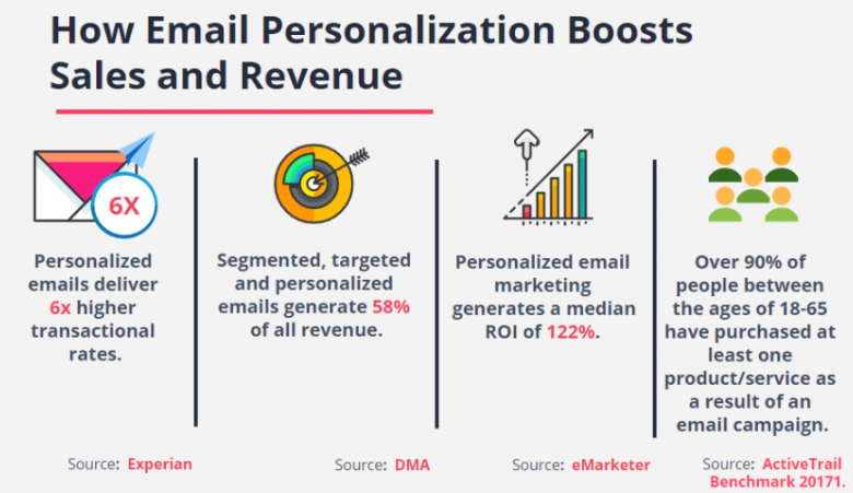
Email marketing is one of the most effective forms of web promotion, and definitely the most cost-effective form of digital marketing, with measurable and high ROI.
The reason behind this is the fact that a well-crafted email can pretty much convince a person to do anything, with less effort than the rest of the marketing channels, and it can be used for any product, brand or service. This is why there are plenty of email marketing and marketing automation platforms, like Moosend, that offer marketing automation for agencies, SaaS platforms, high-end brands, retailers, real estate, any type of product or service one could ever imagine.
By sending an email, you’re essentially knocking on someone’s door and asking them to hear you out. It can capture customers’ attention like nothing else, but only if your email is well-crafted and on top of current design trends. So, let’s go see what those are going to be for 2020.
 Illustration by Justas Galaburda
Hyper-Personalization
It may seem unrelated at first, but hyper-personalization (not simple personalization like we’re used to) has to do with everything email, and that includes email design.
You see, we’re not talking about email segmentation like we know it at this point. Instead, we’re talking about emails that will appeal to each and every person in your audience and will serve a purpose that will be tailor-made and will feel personal. Hyper-personalization is achievable through the use of machine learning and AI technology that will be able to train itself by running through your data and detecting the patterns that are evident in that data.
After that, the machine… Learns. By implementing the patterns, it can distinguish in the data. By learning, the machine enables itself to predict and suggest accordingly, making hyper-personalization possible. So, if responsive design is what got you the most email opens for 2019, or if a specific user is used to not clicking through an email whose dominant color is a pastel one, you’ll be able to recreate it. This will help you deliver results that will get clicked and will appeal to your audience with one-on-one content. And this will, ultimately, help you reach your KPIs in the end.
Interactivity
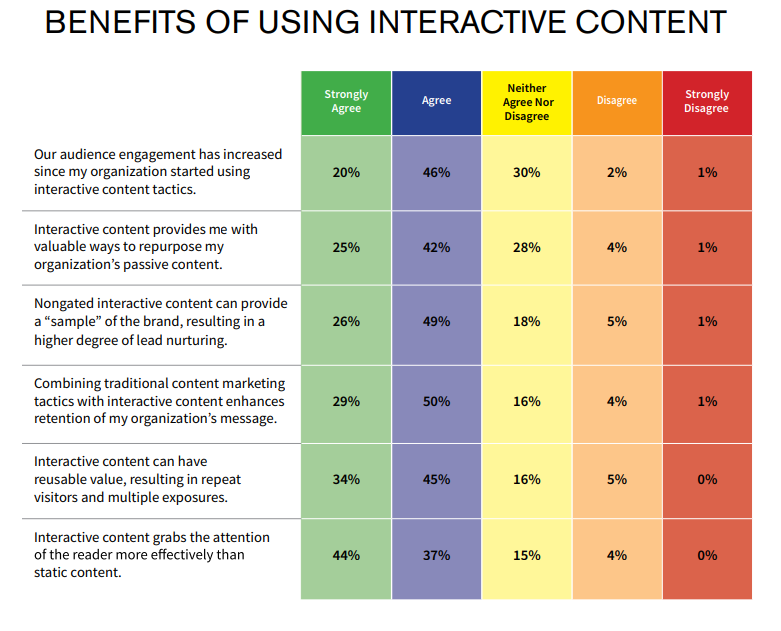
Interactivity is one of the finest ways to draw attention and the more attention your email gets, the more fruitful your efforts at CRO. Your email will need to be something that gets you noticed, that helps the user engage with your brand, and that encourages them to go ahead and click around.
You can use plenty of interactive elements, and there’s bound to be one that’s best for your niche and the reason why you’re sending your email campaign.
For example, sliders will work best for those times when you want to display more than three products, whereas the scratch effect and flip cards will boost engagement when you want to go through with something like recommendations of similar products or discount codes and offers.
There are a whole lot of other options as well, but the point is that interactive emails help engagement rates and “discovering” the content is way more fun than reading about it in the main body of an email.
Just don’t overdo it, as it could get confusing and distracting in the end. You’ll see what I mean below.
Thinking Small
You don’t need too much content. Just the right amount can make the user be convinced and happy with what they’ve found and what they’re willing to do with your product or service. You need small pieces of content that will be memorable, like a punchline, something shareable.
Ultimately, you need something your prospect will remember and that they won’t forget to interact with. Small videos, tidbits of information, bite-sized infographics, anything that will be compact enough, small enough, and also memorable enough is what you need.
Why do you think flip cards are one of the interactive features mentioned above? They’re ideal for breaking content in two, making it appear smaller and helping out with making it memorable.
Social Media Shares and Feedback
In terms of engagement again, social media platforms are what can help you win this game. But not without leveraging email marketing.
You see, you can have the best Twitter header or the most wonderful idea that will help you reach out to social media influencers, and it still won’t matter that much if your email marketing game is not strong. Easily digestible pieces of content can be used to your absolute advantage.
Include a button that will encourage social sharing. It can either be for one small little quotes I mentioned before or a large one like the ones we’ve come to know and love:
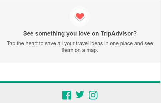
You can create unique buttons to share content, purchases, and so on and so forth. Just make sure to make your button discreet enough for your users not to feel intimidated by it, and you’re good.
And since email marketing is way more than simply promotions and payment receipts, you can design a beautiful email campaign that will have customer feedback as to its main goal.
Feedback is a win-win for both your brand and the customers. On the one hand, you’ll know better than any AI platform can show what your prospects and customers need; on the other hand, you’ll create the type of brand that actually cares. For example, in this email, I’ve got the option of tracking and using the hashtag, and the customer service email is right there for me in case I need it.

However, there’s a fancier way to ask for feedback, and it will rule email design for (at least) 2020. Think about incorporating interactive elements here as well, like check-boxes or quizzes. Whether it has to do with your Net Promoter Score or general feedback of what your users would like to see on your platform, interactive quizzes are a great way to craft a memorable email with ease.
Bold Fonts, Emoji-ed Subject Lines and Muted Colors
This has been going around in 2019, but we will see a great rise in those three elements in 2020. Let’s begin with the emojis in email subject lines:

This image is from my personal inbox, and I dare say it made me click. Emojis are what carry the “feeling” of a message, and it is the equivalent of the use of colors in the main body of an email since it helps convey the tone. Not to mention that messages with an emoji in their subject line are what increases open rates by 56%, according to a report by Experian.
But let’s move on to the fonts. Minimal is making a comeback, and the fonts are expected to be bold, simple and no-fuss, allowing the message to shine through without it being too much:
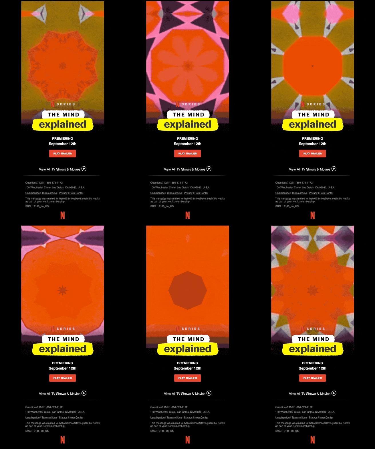
Netflix used this very well, as well as the GIF trend and the small, digestible bits of information. You can see that the font is bold, it’s not too much, and the message is clear: Series premiere is on September 12th, go check the trailer.
This is all the information one may need when it comes to a series anyway, and Netflix didn’t bother with odd details like a summary. That’s all included in the trailer anyway.
And as far as the colors are concerned. There will be a rise in the use of muted colors. Intense colors are now a thing of the past, and the softer, darker colors that are easier on the eyes will see an increase in use.
Two Trends That Are Here To Stay
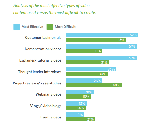
Of course, I’m talking about User Generated Content (UGC) and video email marketing. Those two trends are guaranteed to stay beyond 2020.
Let’s begin with video email marketing. Here’s an example:
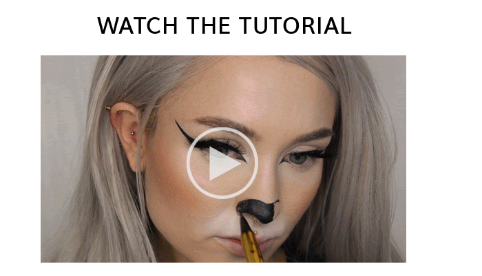
We’re talking about a Halloween makeup tutorial I received in my inbox about a couple of weeks ago. Clicking on this got me to a dedicated page that showed me the tutorial and the products used. And this gave the brand a better chance at conversion:
I saw the products in action, and this was all that I needed in order to be convinced to buy something off an email.
And as far as UGC is concerned, this is a very underrated (so far) but highly effective technique that can drive more engagement.
After all, who doesn’t want to be a marketer, and who doesn’t want to see their content featured in a newsletter? Especially now, with the rapid rise of social media platforms that are centered around UGC, like Instagram or VSCO.
UGC practically leverages the good old word-of-mouth marketing that all consumers trust to this day-hence the rise of influencers-and can work as referral marketing does. Users create content for a brand. The brand trusts users enough to share it without damaging its own image. The users become ambassadors, engage with the brand, and convince their friends to buy as well, and the prospects turn into customers easily, seamlessly, and, most importantly, at a low cost. In fact, 92% of buyers trust in recommendations from people they know.
By incorporating that fact into the design of an email, you’re shooting for maximum engagement, conversions, and shares-who would miss out on a chance to show that their content was actually taken in by their favorite brand?
Takeaway
All in all, email design will appear to be simpler and no-fuss in 2020, but with a lot more complex, interactive elements that will aim for engagement.
This means that we’ll see a huge rise in personalization that will take over email design as well.
Author: the guest post by Téa, a content writer working for email marketing software company Moosend and an obsessive writer in general.
You might also like the review of hot UI design trends, tips on choosing color scheme for user interface and effective design for CTA elements
- English
- Ukrainian


