


Case Study: Good.co. Landing Page Design
Case Study: Good.co. Landing Page Design The case study on UI/UX design of landing page. Analysis of the page functions and practical case featuring different stages of the process.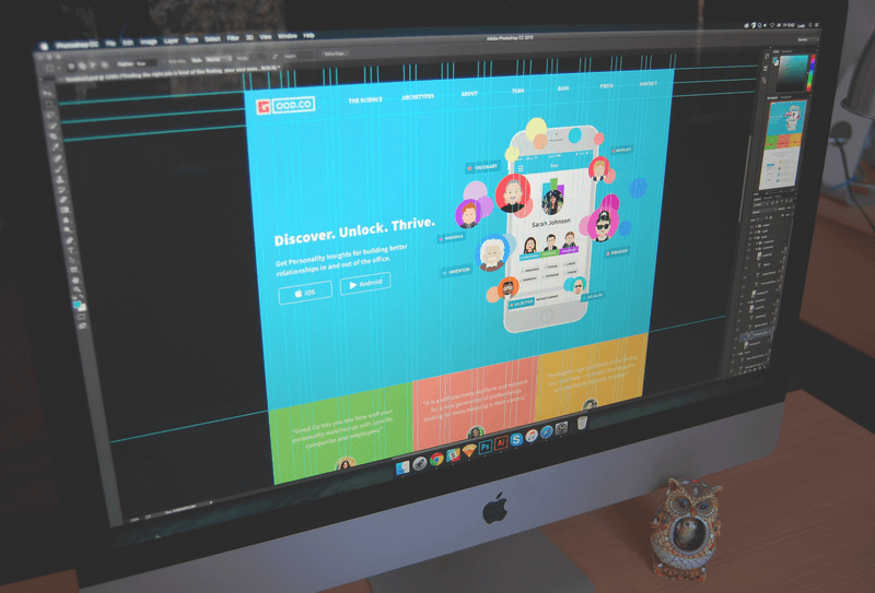
Creating a website or an application, people usually have different and sometimes numerous goals. Some of them in case of conversion give real or virtual money, some provide signups and others persuade your target customer to decide on a free trial. In all cases, nobody starts the venture without any thoughts about what they want to get: money, popularity, pitch for self-expression, power, and so on and so forth. Therefore, in all cases the producers and advertisers of any web and mobile product sell something, although the payment can go far beyond users’ money, concentrating on some other feedback and response. That is why, actually, analyzing the efficiency of a website or mobile app we talk about conversions rather than purchases.
Taking into account fresh trends of the online sphere of communication and trade, it is easy to say that landing pages are growing their popularity fast and steadily. The reason is simple. Potential users of your product are surrounded by a huge deal of informational sources, so that’s really easy to get lost in them. That’s why so many efforts are made to create a strong web presence for any product having a good reputation. Among those efforts, you will find not only each and every step of improving the product itself but also plenty of work to create brand awareness and efficient marketing. And, considering stats and research in this sphere, a landing page can also become a good way to strengthen the product.
The essence of a landing page
Landing page in its basic wide meaning is the term that is used for analytics to describe any page where the user started his or her journey around your site. However, today the other, more specific meaning is used much more often to define a landing page. Behind this term, people understand the special web page created for the presentation of the specific product, service, features, or options so that the visitor could get the necessary information quickly and easily not being distracted by other options. That is why the analysts say landing page is in most cases much more efficient than the home page. The home page can have too many options and getting through all of them to find a particular product the user can be distracted from making the decision, lose interest, or even get annoyed.
Well, it is easy to imagine with a little metaphor. Imagine, you are going to visit, let’s say, New York, to walk around Manhattan. That is the dream of your life. And finally, you find the service which offers to take you to New York City fast and cheap. Great, isn’t it? You pack your bag, you charge your camera, you get up full of admiration as the dream of your life is going to get real. And then you are taken by these amazing people who offered you the realization of your dream to the very starting point of New York City. And they leave you there to find Manhattan or any other place you want by yourself. How do you like it now? Who knows, perhaps you will be not so happy after an exhausting journey around the huge city looking for the place you want. Wouldn’t it feel great to be taken right to the destination, fresh and ready to admire and absorb positive emotions? Wouldn’t you as a customer be happier to reach your goal faster and easier? Sure, yes.
And that is what landing page does. When a person obtains the information from the outer source about the specific product, feature, information or service and clicks through the link to its provider, sure, he or she doesn’t dream to spend a lot of time looking for desired product or page among all the links and information provided on your homepage. The user wants to “land” at that very place which will make possible for him or her to get what they want as fast as possible and getting enough (but not too much) information to support their decision-making process. So, as practice proves, creating a well-thought-out landing page is a really vital thing to strengthen your marketing and increase conversion rates.
As this topic is quite actual today, we have decided to create a new piece for our case study set. This time it will be about the process of creating a landing page by one of Tubik Studio designers Ludmila Shevchenko.

UI/UX designer for Tubik Ludmila Shevchenko
Task
Redesign of a landing page for a self-discovery platform Good.co.
Tools
Adobe Photoshop, Adobe Illustrator, Adobe After Effects.
Process
Good.co is actually the company which, using psychometric and psychological analysis and having broad experience in the sphere of employment and HR, helps people to identify their professional style so that they could fit with their existing and potential employers or teams as effectively as possible.
When the designer was assigned to the project, the company had already had the mobile application available both for iOS and Android. Moreover, it had had the landing page aa well, but the customers decided to renovate it in order to make it more attractive and appealing to potential users.
There were some preconditions from the customer to keep in mind: the customer wanted a landing page to include a specific slogan and specific mascots representing personal archetypes. These mascot images were originally created for the site much before and were promoted by the existing application so they shouldn’t have been anyhow changed. It is easy to think that when a designer is given such a supportive material like ready-made mascots it makes the process simpler and faster; however, these preconditions can sometimes make the job even more complicated and demanding as in this case the designer is limited in stylistic options has to create the general concept of the page corresponding with the given elements.
As usual, the designer started work with sketching, keeping in mind that the landing page needed to have three main parts:
1) The general idea of the application with the call-to-action element. Call to action was to encourage people to download the application from the AppStore or GooglePlay.
2) Testimonials
3) Description of the main features
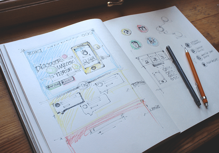
The process of sketching the landing page
As you can see, the designer and the customer agreed upon the efficient scheme of a landing page. The first part mentioned had to capture the user’s attention, convey the general idea of the application, create positive feelings about the products and show the possibilities for the potential action, as this part features the buttons clicking through which the user can instantly download the application. Therefore, the first part of the page in the area seen before scrolling down the page had to be quite informative, but not too much, catchy, and focused on the conversion goal.
The second part of the page was also very important to include. Testimonials are a widely known and highly efficient way of conveying social acceptance and approval of the product, so the landing page is the perfect place for them. The essential thing to do in this part was to make them distinctive from the other content, again catchy and easy to read.
The third part of the page included extended information for those users who got interested in the features of the product before they click through to downloading option. This part included more detailed information about the product and its benefits.
One of the important traits of an efficient landing page is that all the copy needs to look harmonic, clear, and readable. So one more thing to analyze for the designer was fonts and typefaces.
So, after sketching the variants and discussing them with the customer, the designer brought out the first version of the pre-scrolled part of the page designed in general flat stylistic with a relatively neutral color scheme including some bright details. The testimonials were offered to slide onto the screen one after the other.
The first version of the pre-scroll area with a neutral color palette
The customer liked the general concept and layout of the first part of the page but wanted some alterations with the color scheme to make it brighter and catchier. Working out this wish the designer developed the other version.
The second version using a brighter color scheme
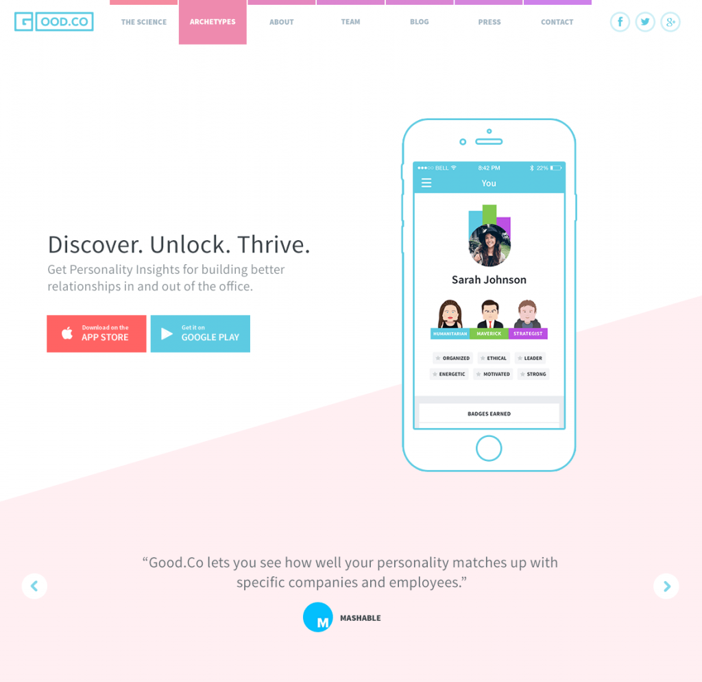
So the designer worked out the versions of the full page, which featured all the changes the customer wanted to see. Finally, after close collaboration with the customer and providing constant updates in the process, she created two variants of the landing page. Comparing them, it is easy to see that the variants have the same general concept and color palette, but they are different in the layout, especially in the parts of testimonials and the product description. The first variant presented a more funny and joyful version while the second one was a bit more formal and business-like.
So, let’s look at the first variant.
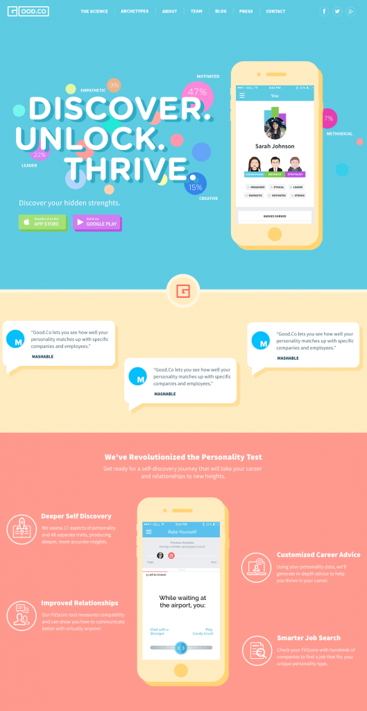
The first version of the full landing page
The first version, shown above, had big lettering for slogan working as a headline of the page and the subheading revealing the main benefit of the product. It also included logo, links to social networks, links to the pages describing some features of the product in detail, and the image reinforcing the whole stylistic decision. The image included original archetypes used in the application and featured the screen of a mobile device so that to immediately convey the understanding that the product is a mobile application. Also, this part of the page included call-to-action elements which were brightly-colored buttons enabling a user to download the application from the source convenient for them. The second part included testimonials looking like speech bubbles with a light background that was made them easy-to-read on the general colorful background of the whole part. The third part in this version featured the mobile device with the other screen in the center and the descriptions of the benefits were placed around it being strengthened with the icons. All the parts had colorful backgrounds.
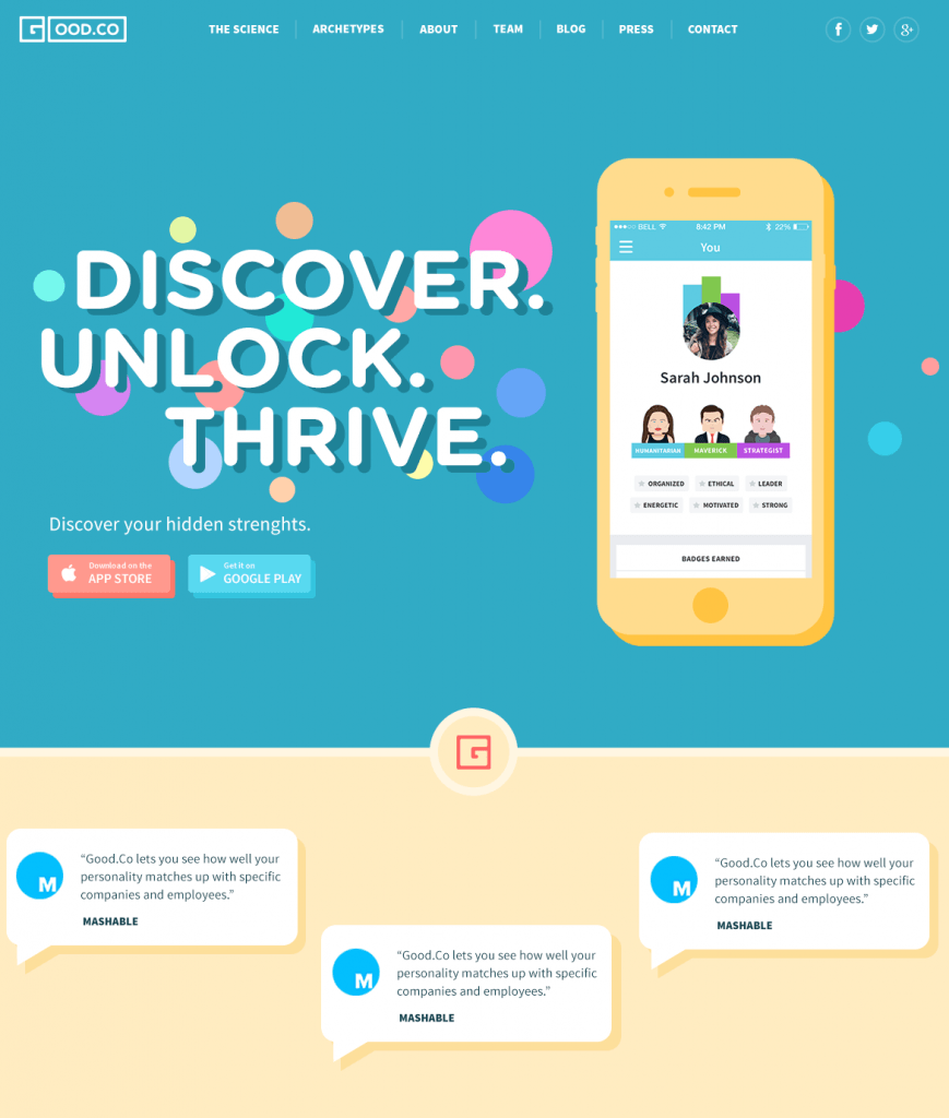
Now let’s see what is different in the second variant of the landing page.
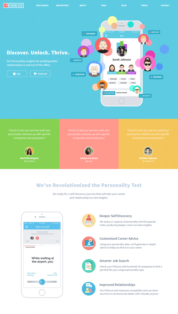
The second version of the full landing page
The second version was also following flat stylistics. The headline letters were made smaller, although not losing their readability. The image of a mobile device with a profile screen was also featured, but the archetypes were taken out of the strict limits and grouped around the device providing rather big and distinctive images. Call-to-action buttons this time were not colored in the other color and featured only shapes of the buttons to make them look more business-like. The part with testimonials was made simpler, with no specific details and provided colorful blocks with the copy and the avatar of the person or company providing the testimonial. The third part also had a different layout as the image of a mobile device was moved to the left side of the page and the rest of the page provided the blocks of descriptions copy. This part had a light background and was reinforced with the colorful icons originally created by the designer so that they could support the message.
The second variant was accepted by the customer as the final one. It was more business-like and provided a high attention ratio. Then the designer also added some more catchy elements to the first pre-scrolled area. This part was provided with interface animation of the archetype images animated while hoovered.
This work showed the importance of each and every detail while designing a landing page. This job goes far beyond the limits of pure art because it includes deep analysis so that all the elements were meaningful, informative, and guiding users to the achievement of their goals.
More Design Case Studies
If you are interested to see more practical case studies with creative flows for UI/UX design, here is the set of them.
Watering Tracker. Mobile UI Design for Home Needs
Big City Guide. Landing Page Design
Vinny’s Bakery. UI Design for E-Commerce
Health Care App. UI for Doctors
Slumber. Mobile UI Design for Healthy Sleeping
Kubrick Life. Educational Biography Website
Designer AI. Dashboard and Graphics for Fashion Service
Pazi. UX and UI Design for Vehicle Safety Mobile App
CashMetrics. UX Design for Finance Management Service
Originally written for Tubik Blog
- English
- Ukrainian