
Case Study: Company Website Design for Aitken Turnbull
Case Study: Company Website Design for Aitken Turnbull Check web design for a stylish company website for the architecture company Aitken Turnbull, created by the digital agency Harrison Carlos.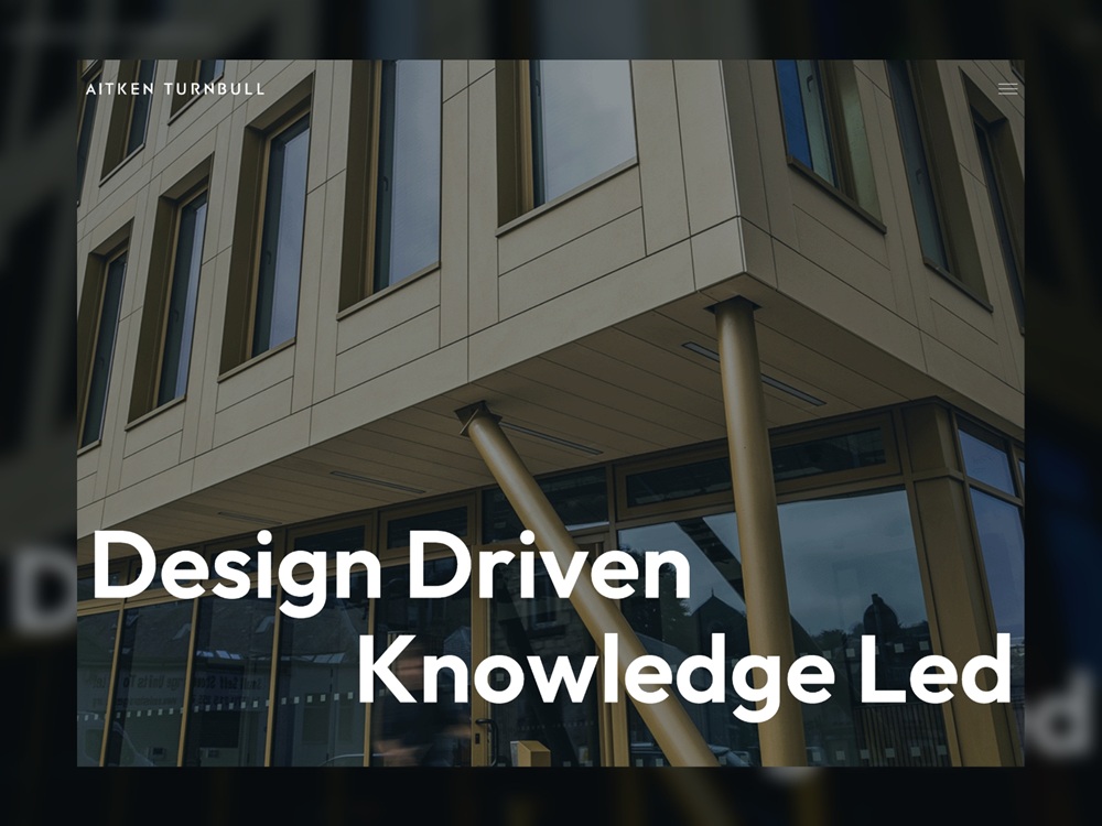
This web design case study provides a glimpse of the stylish company website for Aitken Turnbull, an architecture company. The project was accomplished by Harrison Carlos, a strategy-led creative and digital agency based in the United Kingdom.
As the agency mentions in the project presentation on their website, the team first refreshed the Aitken Turnbull brand, then translated their bold new identity into a high-impact digital experience. The primary task for the creative team was to build a modern, people-centric website that could convey their values and process.
Aitken Turnbull required a website that did more than just showcase their portfolio. Their key requirements centered on creating a digital space that was both modern and people-centric, while effectively communicating how they work.
- Brand Alignment: The company website needed to consistently complement the newly signed-off, refreshed brand.
- Modern but People-Centric: They sought a modern aesthetic that still prioritized their people-first approach.
- Process Clarity: The site had to clearly communicate their values, working method, and process, which their old website didn’t get across.
- User Experience: The final site needed to be intuitive, easy to navigate, and accessible.
Let’s look more closely at the web design solutions that the Harrison Carlos team offered, keeping a great balance of usability, readability, and well-thought-out content arrangement crucial for an efficient company website.
Home page design
Functional menu design
Based on the new brand guidelines, the digital agency designed and built a modern website, full of personality but respecting the firm’s established heritage, to ensure it truly reflected their work. To reach that goal, the creative team:
- delivered a modern, bold design anchored by big, high-quality project images that immediately captured user attention
- integrated visual elements of ‘architecture’ throughout the user interface, using sharp edges and clean lines to give the site a structure and feel that mirrored the profession
- maintained a clear focus on the business’s core activities while deliberately using imagery of people across projects and case studies to reinforce the people-first methodology
- engineered the website with clear, strategically placed calls-to-action (CTAs) to encourage users to discuss their projects and requirements directly
- used subtle, engaging web animation throughout the website pages to smoothly pull all the design elements together, creating a polished, high-end user experience.
Team page
Projects page
Approach page
About Us page
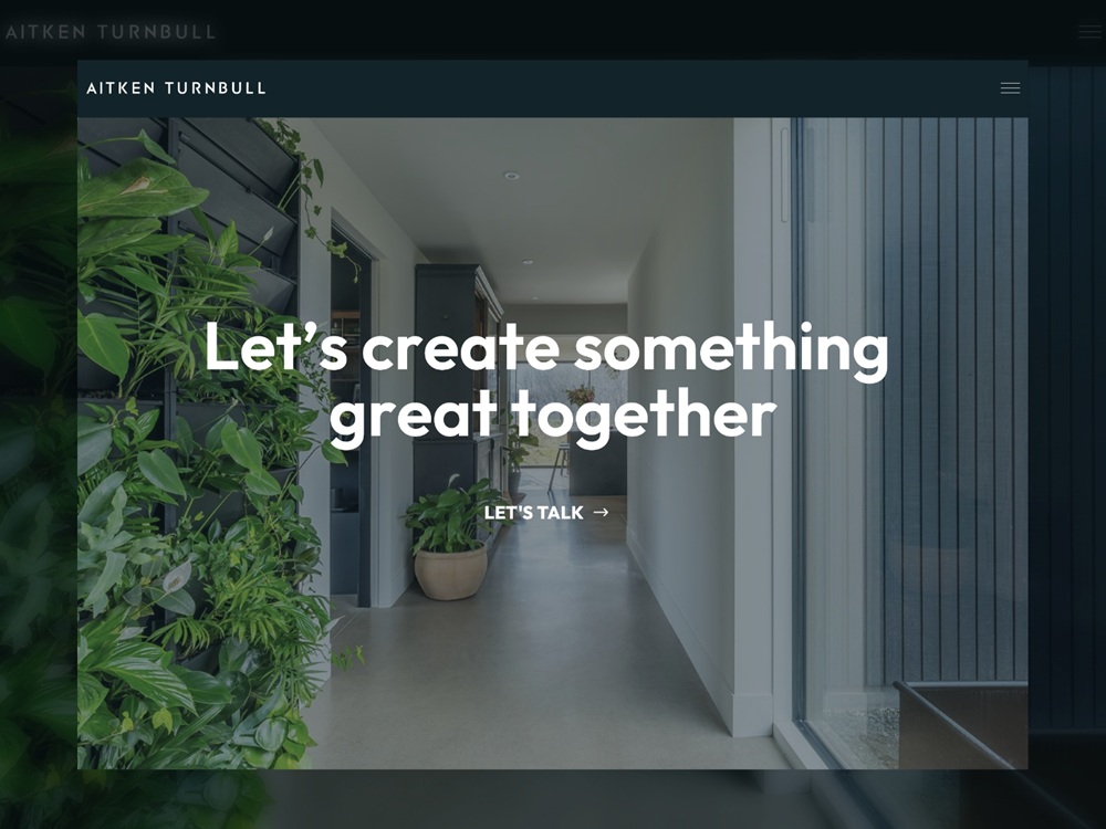
Contact page
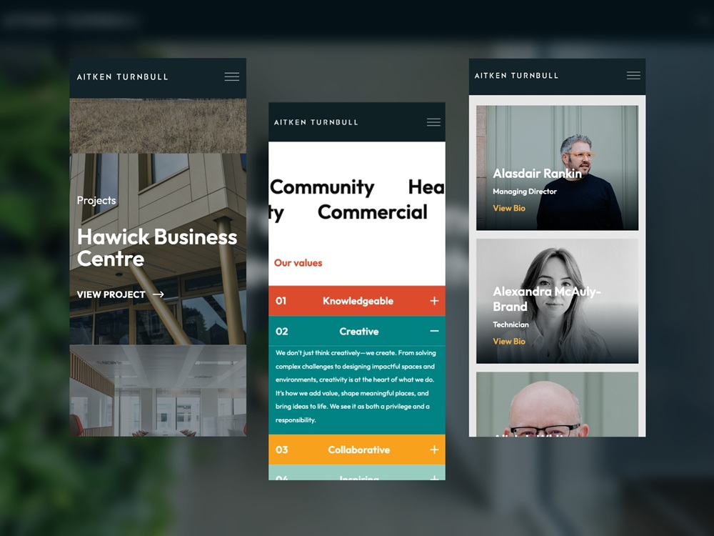
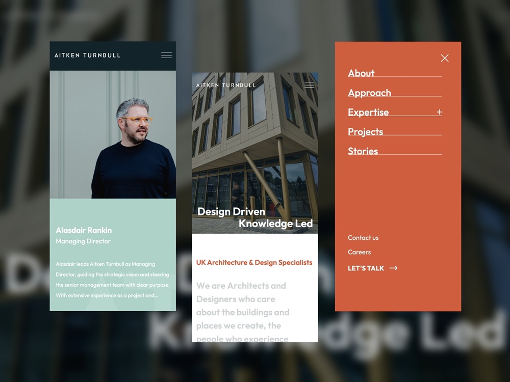
Mobile version of the website
If you are interested in seeing more projects by this team, check the Harrison Carlos website.
New design case studies are coming soon; stay tuned for new posts.
For more inspiration, check the sets of other posts from our D4U Inspiration gallery, where I gather impressive projects by different creatives to share their art with you, for example:
- collection of dashboard designs
- UI/UX design projects for healthcare and healthtech
- set of modern UI/UX design solutions for finance and fintech
- case study on web design for robotics company
- a bunch of UI concepts for user onboarding design
- set of creative designs for 404 page
- logo design collection for various business goals
- captivating 3D animation concepts
- creative web designs with 3D graphics
- inspiring mobile interactions design examples
 https://design4users.com/case-study-company-website-design-aitken-turnbull/
2026-08-03
© by
Marina Yalanska
,
https://design4users.com/case-study-company-website-design-aitken-turnbull/
2026-08-03
© by
Marina Yalanska
,
- English
- Ukrainian