


Case Study: PointZero25. Brand Identity and Web Design for Event Agency
Case Study: PointZero25. Brand Identity and Web Design for Event Agency Check identity and web design process for out-of-the-box event service PointZero25, combining business and entertainment, logic and magic.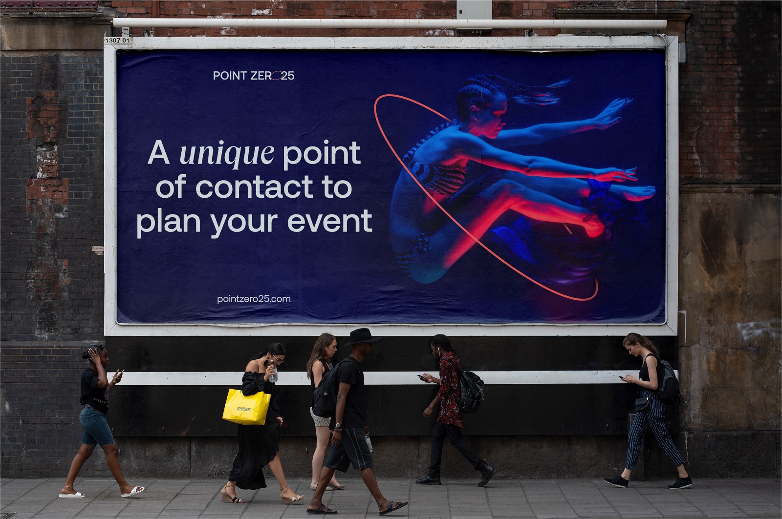
A new design case study from our team is up, this time full of magic and entertainment: welcome to check the creative story of identity and web design process for out-of-the-box event service PointZero25.
Project and Client
PointZero25 is the agency that helps organize perfect events with high-quality artists fitting clients’ needs, watching out for the slightest details. It combines international producing expertise to offer end-to-end theatrical strategy and execution support for musicals, plays, and cabaret shows. It’s the art that nothing can spoil.
The task for tubik team was to develop a sophisticated and attractive identity that would grow brand awareness and recognizability and support the company in communicating effectively with the customers via diverse channels. We also worked on the website design, elegant and emotional, informative and catchy.
Process and Result
Based on a great combination of expertise and experience, the clients approached tubik with a clear understanding of what value and problem-solving potential they wanted to share with the service they launched. PointZero25 was positioned as a reliable and professional service selecting and offering high-quality artists internationally for custom events, festivals, TV shows, and corporate events, so they strived to make it the unique point of contact for people lacking the expertise, knowledge, and contacts to assemble and select shows and artists.
Identity Design
The detailed discussions and research stage made it clear that the core elements that form the brand image are expertise, reliability, and creativity. The service combines emotion and logic, performance and management, magic and reality – and that’s what the visual branding had to communicate to the customers.
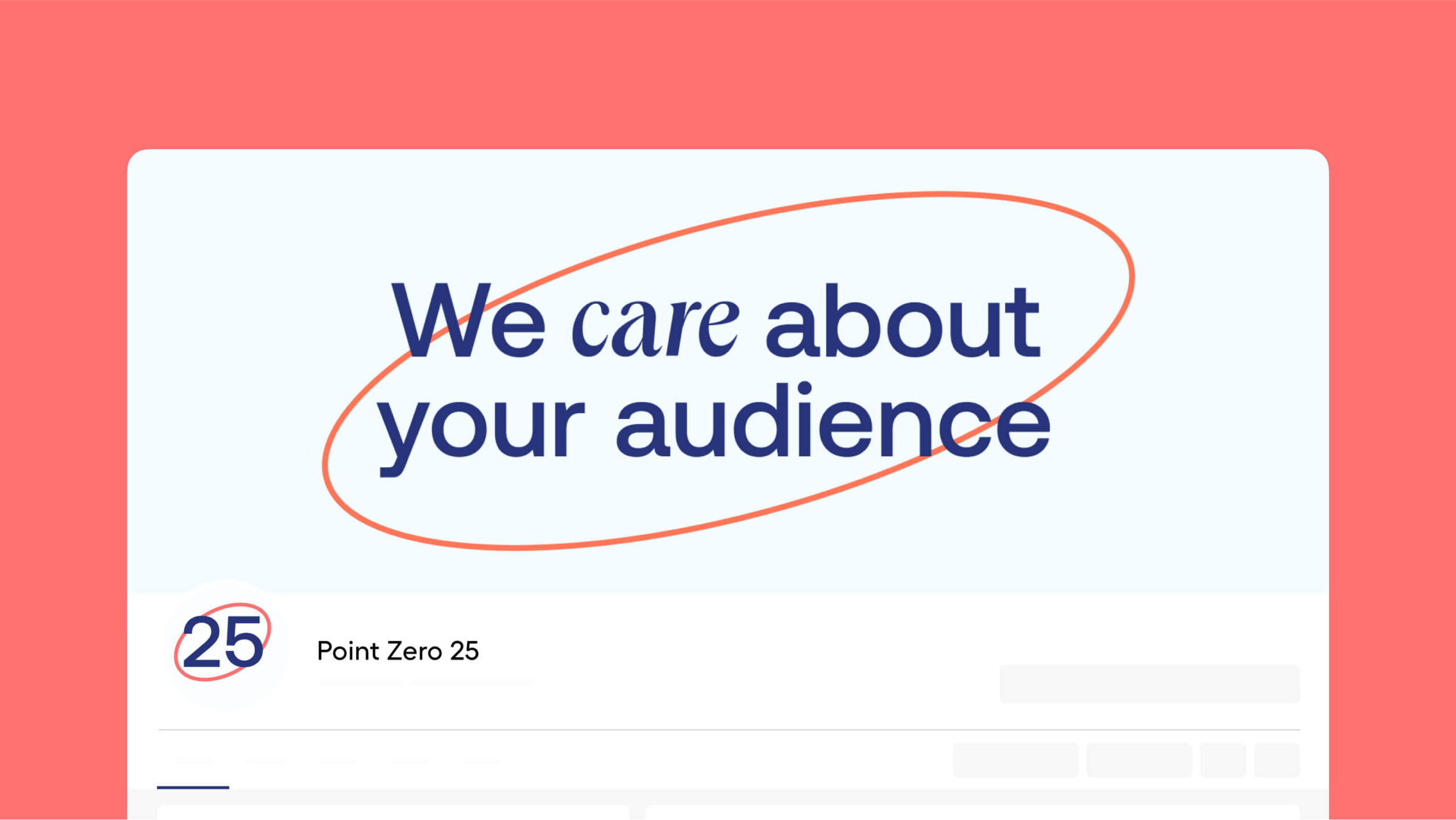
The logo, as one of the central elements of identity design, in this case, is a solid and readable wordmark with an original element: the letter o in the word zero was transformed into a line element echoing the shape of an ellipse. This graphic element is multilayered: it reflects the shape of the letter o, the shape of a zero character, and the shape of the stage associated with the nature of the service. Further, in branding development, it was used as a consistent cross-cutting graphic element.
![]()
As the service uses a lot of digital communication channels, the animated logo was also developed to make the experience more dynamic, lively, and eye-catching.
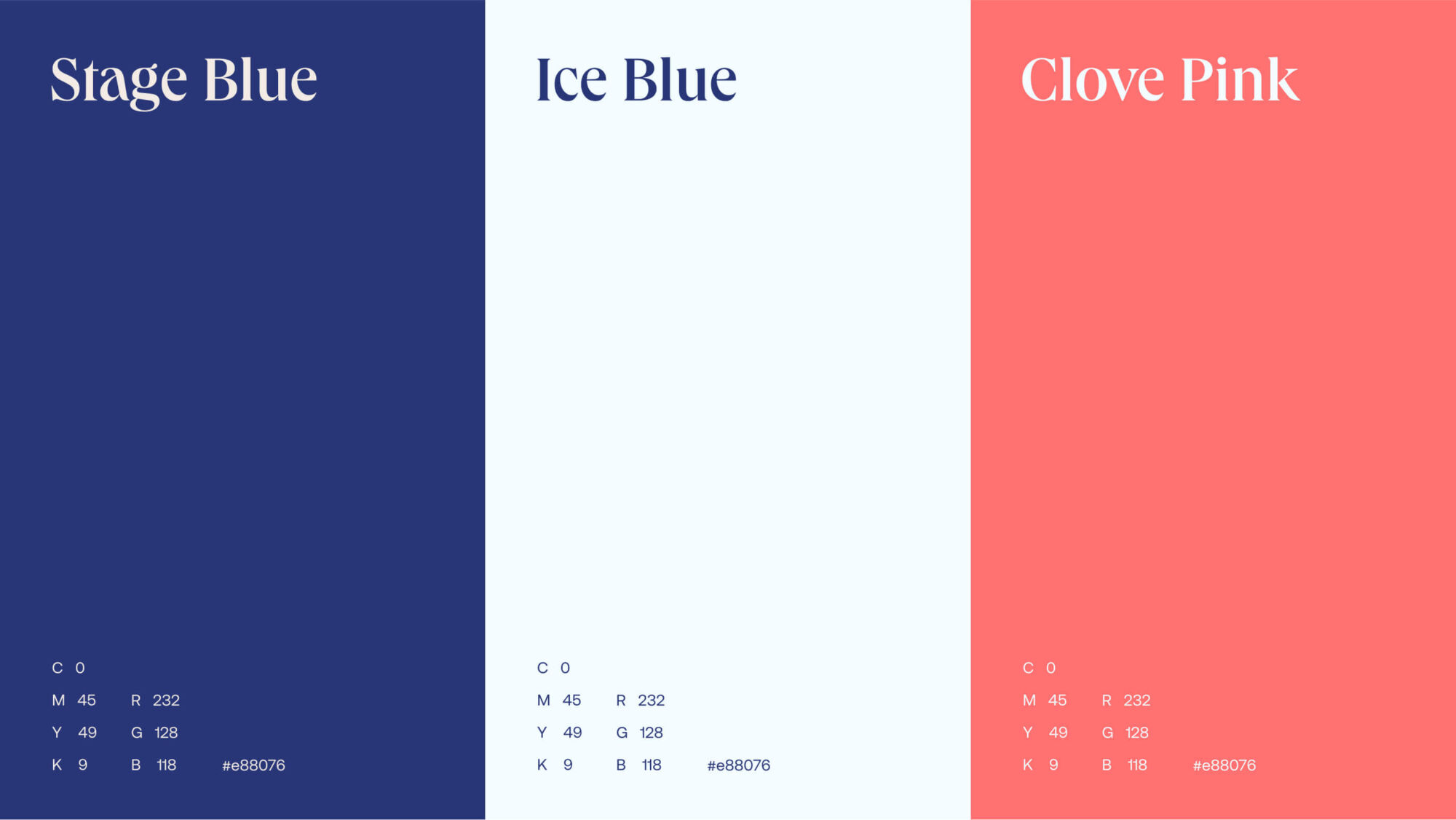
The brand color palette combines stability, trustworthiness, and business vibes of blue shades and the energy and passion of warm clove pink.
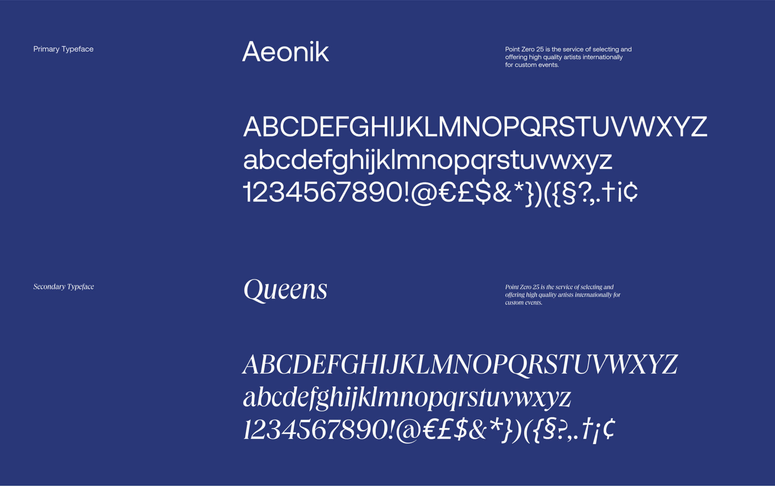
The typographic choice for this case combines the solid readability of Aeonik as a primary typeface and the classic elegance of Queens. Aeonik is positioned by its creators as a Neo-Grotesk with a Geometric skeleton, with Modernist roots but details referencing mechanical early Grotesks, with proportions that are wider than a typical Grotesk but thinner than a typical Geometric Sans, which structurally creates an excellent balance for both display and text use. Queens, a classy serif typeface that features a distinctive backward-leaning lowercase a and an extremely large x-height, is used as a secondary typeface and allows for creating catchy and eye-pleasing typographic contrast not only between the pieces of texts but also within one sentence.
Here’s how the mentioned brand colors and fonts work in various pieces of visual identity: posters, billboards, and social media communication. Also, the broader look at different elements of the visual brand image gives a hint on how the ellipse shape becomes the keynote element, consistently uniting graphics into one design system; it is integrated into different items in the diverse approaches, line and filled colors or photo content, vertical and horizontal, fully explicit or only showing a part as a slight visual hint.
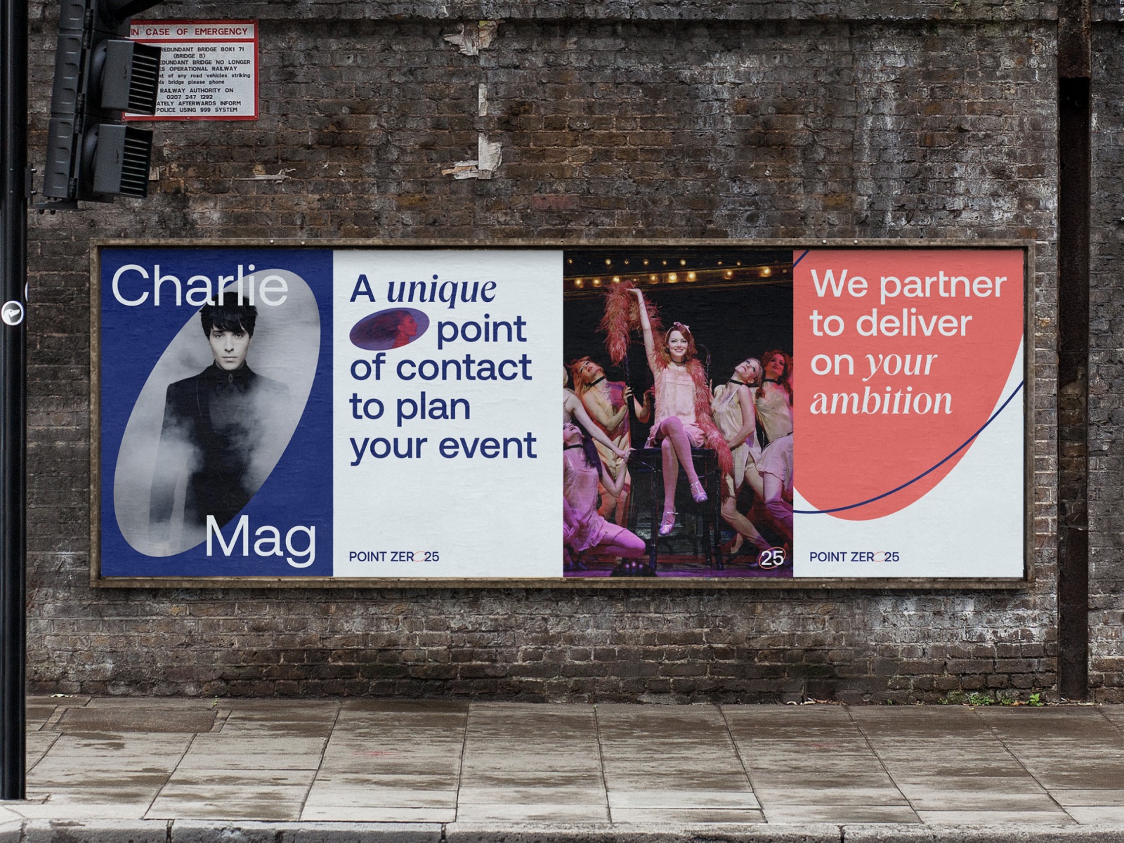
Posters design
Outdoor advertising billboard design
Social media header image and logo avatar
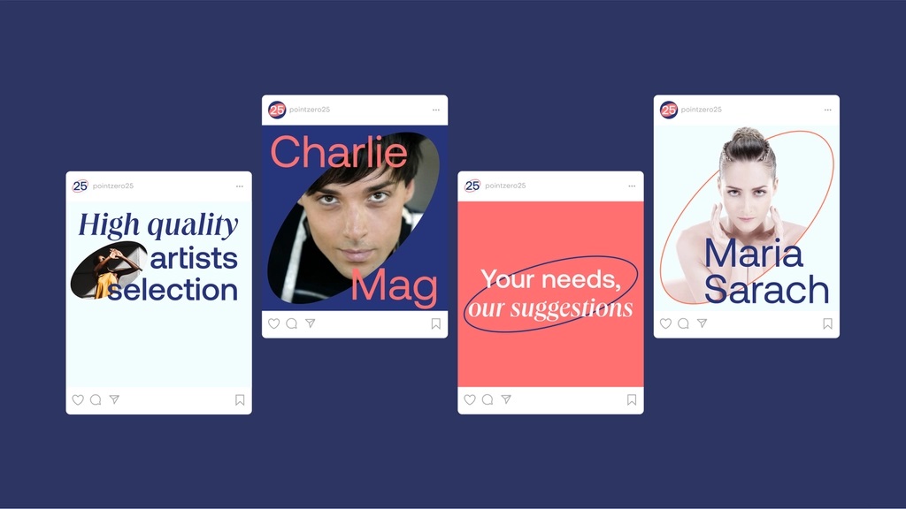
Templates for social media posting and advertising
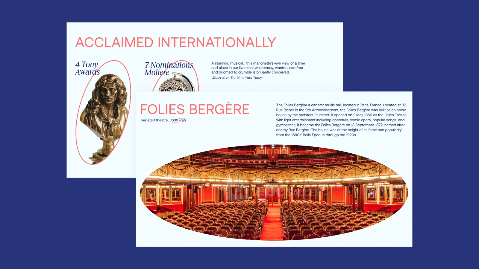
Templates for presentation slides
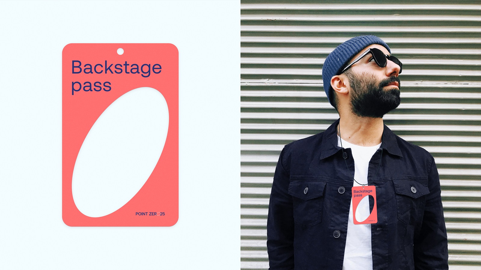
Backstage pass concept
Favicon design
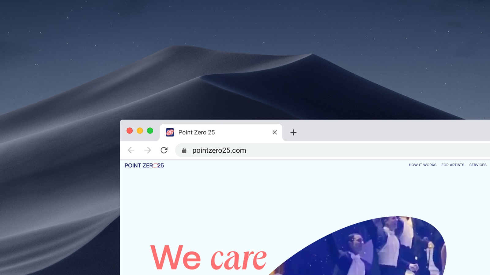
Web Design
The next stage of brand development was creating a website that would not only be clear, business-like, and functional but also catchy and impressive, corresponding to the nature of the service. The website echoes the approach set in identity design and broadens it with the following features:
- simple and clear layout
- contrast color pallete
- bold typography, playing with fonts within one piece of text
- blend of the images and graphics with the text
- magazine style
- image and video focused approach
- minimalistic illustrations
The UX wireframing stage helped all sides of the creative process to define the major content blocks and arrange them properly so as to make the web presentation of the service’s benefits engaging and informative.
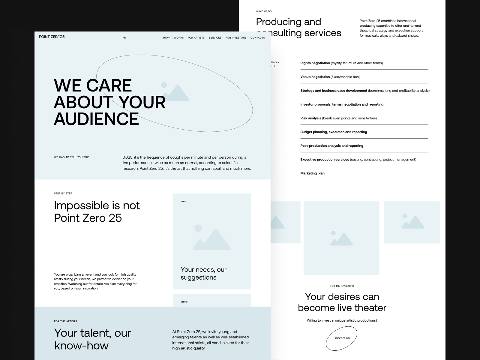
After having agreed upon the structure, the designers started wrapping it into sophisticated style and elegance. The web pages were built around a solid visual hierarchy, making them skimmable and scannable, focusing on images and videos setting the atmosphere and sharing the instant association with the sphere of performance and entertainment.
Here you could also notice the cross-cutting ellipse element in various manifestations, from the shape to frame the video in the hero section to the CTA elements design.
To add playfulness and liveliness to the user experience, bright inclusions of smooth web animation can be found across the pages, for example, button motion, hover animations, list appearance animation, and other slight details. Different color backgrounds and split screen approach in some sections effectively work as visual dividers, helping website visitors perceive the content more easily and quickly.
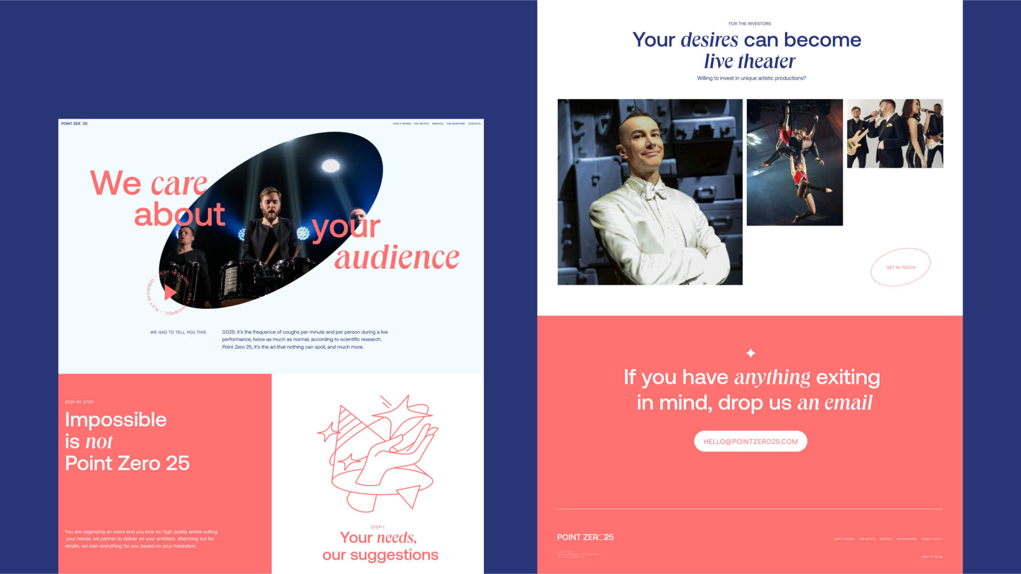
In addition to the primary photo and video media content, the set of custom neat and stylish line illustrations was created to visually support the presentation of the service’s benefits and features.
The design project for PointZero25 was a great example of how consistent and well-thought-out branding design helps to effectively mix business and entertainment, functionality and emotionality, logic and magic.
New design case studies from our team are coming soon. Stay tuned!
More Design Case Studies
Here’s a set of more case studies sharing the design solutions and approaches for some of the design projects done by the Tubik team.
Advocacy Through Walls. Website Creation for Advocacy Guide
Serra. Identity and Product Design for Financial App
MOVA Brewery. Ecommerce Website Design for Beer Producer
Nonconventional Show. Website Design for Podcast
Drug Test Innocence. Website for Socially Impactful Online Resource
Crezco. Brand Identity and UI/UX Design for Fintech Service
FarmSense. Identity and Web Design for Agricultural Technology
Carricare. Identity and UX Design for Safe Delivery Service
Otozen. Mobile App Design for Safe Driving
Uplyfe. Identity Design for Health App
Bennett. Identity and Website Design for Tea Brand
Originally written for Tubik Blog, graphic and video content by tubik
- English
- Ukrainian