How To Use Animation To Improve Mobile User Experience
How To Use Animation To Improve Mobile User Experience Read about the benefits of animation in UI design for mobile apps and check the big set of examples on how they add usability and elegance to interactions.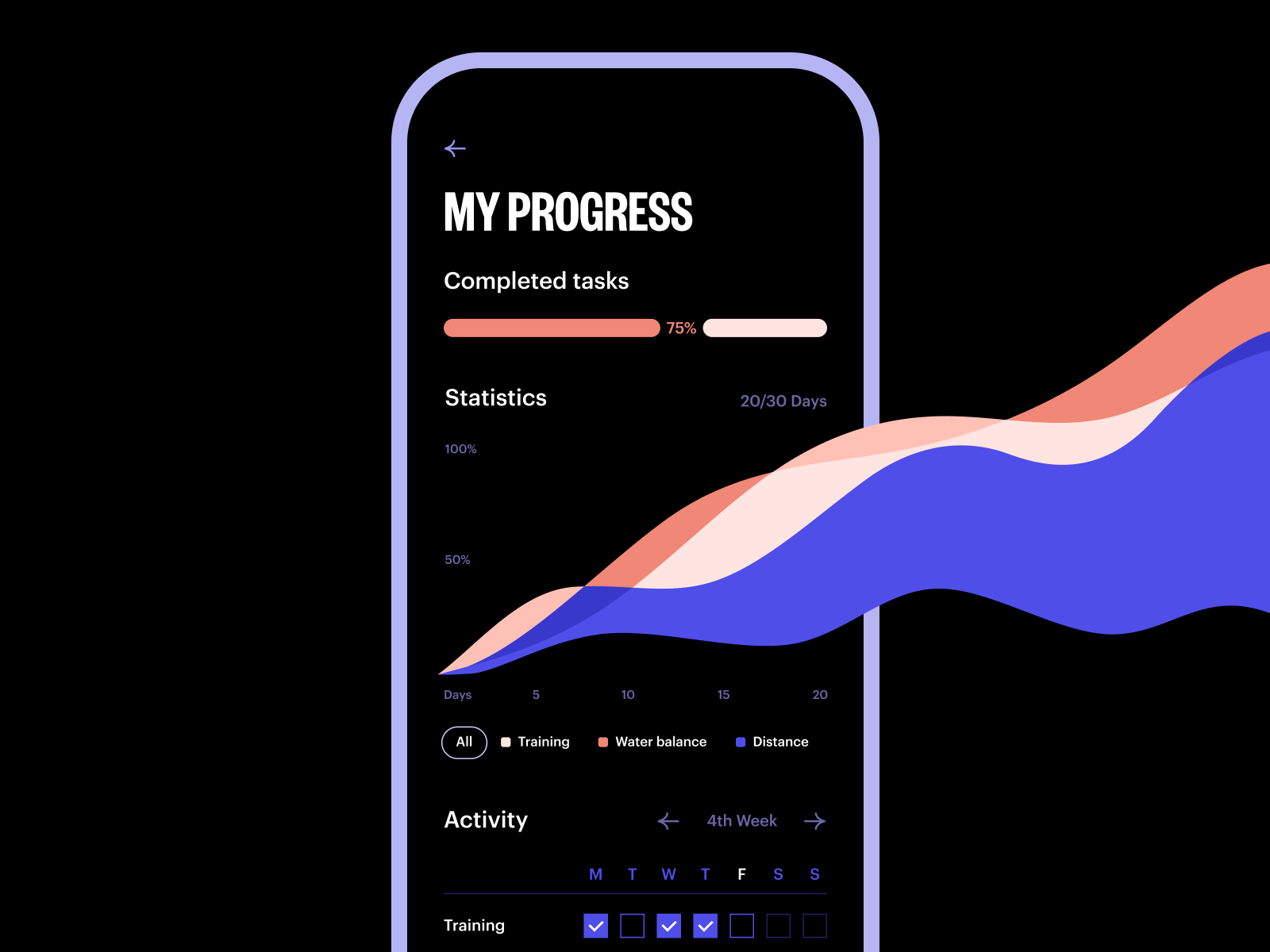
In UX design, app animations present the area for endless creative search as well as one of the objects for hot debates. In today’s article, we are going to consider how to use animation in mobile app design to provide a positive user experience and smooth interactions.
As everything integrated into an interface, app animations must be a functional element rather than the decor. Motion elements should be considered from the very start of planning a user journey. Designing animations, you need to analyze their influence on the usability and desirability of the app – and if you cannot see a real positive impact, reconsider the approach. The advantages and utility of motion in the interaction process have to be obvious and outweigh possible pitfalls. Good UI animation is the cherry on top. Let’s review the most popular types that are well-checked to enhance the mobile user interface.
Heartbeat animation concept for tab bar interactions
Feedback Animation
Feedback animation informs the user that a particular action is done or failed. The animation of this kind keeps the line of communication between the user and the app even in basic operations. Somehow, it imitates interaction with real objects in the physical world. For example, when you press a real button, you feel the strength put into this action and the resistance of the button. In a mobile app, it’s impossible: you just tap the screen and do not have physical feedback of that kind. That is why interacting with sensor screens, we tackle vibrations and visual signs to get the response from the app. And this is when UI animation saves the game. Animated buttons, toggles, switches, and tick or cross signs quickly inform the user if the action is done.
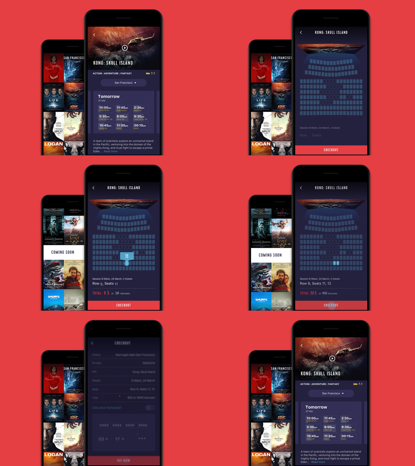
For example, here’s the Cinema App flow of interactions on buying tickets. The transition from the showings screen to the choice of seat is made through the animation of the movie poster: the screen transforms into a picture of the movie hall. Pressing the desired seats, the user can see how the buttons change color and understand that the system accepted the data. The animation of the tick sign marks the finalization of the process.
Another example can be seen in the interactions for the Watering Tracker app: having watered the plant, a user hits the button, and it changes the image from drops to tick, marking out that the needed action is done.
![]()
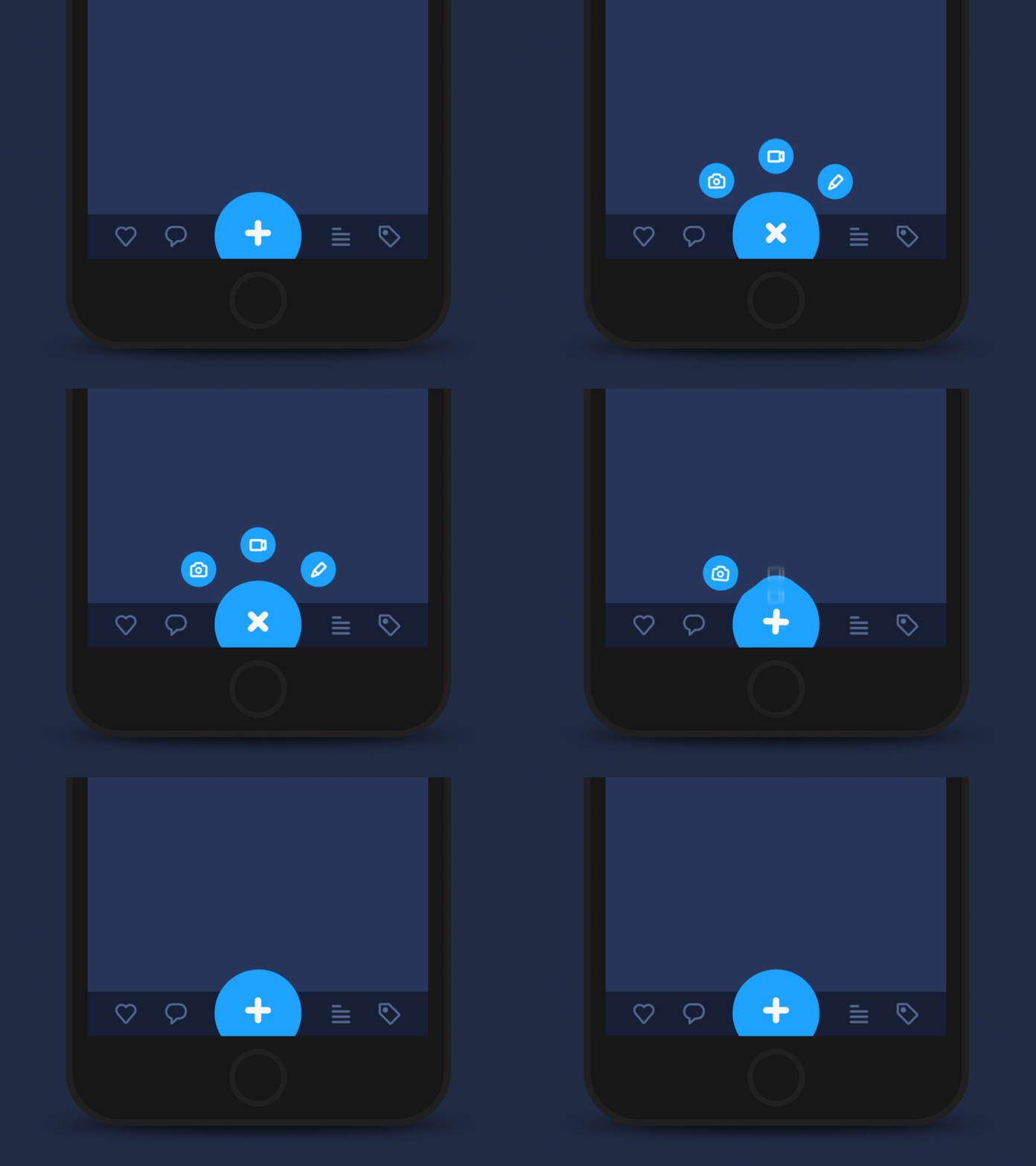
Even with basic navigation, mobile UI animations may add not only feedback but also fun. Check this concept of an expandable button: with a pinch of motion, it imitates physical interaction with a substance like jelly.
Here’s the examples of feedback animation in the Event Planning app concept: when the user is tapping the participants’ photos, the central circle changes the general number.
Progress Animation
If the process of interaction is a bit longer and users have to wait, they would prefer to understand what’s going on and what’s the progress. The biggest advantage of this animated interaction is providing assurance for the users, making them aware and confident in the process of using the product. A confident user means a positive user experience and provides a good ground for a high level of user retaining. Animation of progress bars, timelines, and other dynamic elements can kill several birds with one stone:
- inform the user about the level of progress
- provide the entertaining element blunting possible negative experience of waiting
- designed originally and elegantly, can become a viral feature that users will want to share with others and engage more users into action.
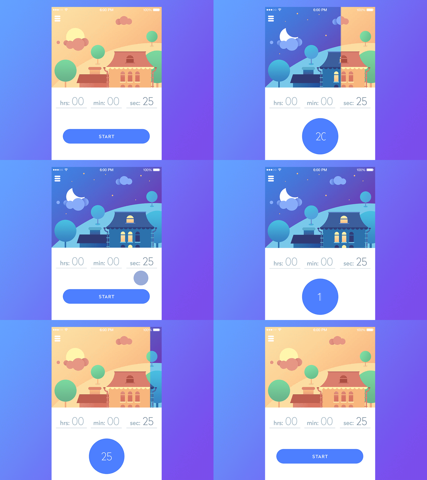
Below, you can see a timeline app: the process of waiting is supported with animated graphics featuring the transition from day to night while the button shows the progress in numbers.
Here’s another example: catchy and eye-pleasing animation of a pie chart reflecting the completion of the tasks in the task-management application. Another screen also features a custom animated illustration for a welcome screen to make the user experience positive from the first seconds.
And here’s the set of animated interactions with the user progress graphs on the stats screen in Challenge App.
Loading Animations
This must be one of the most widely-used types of mobile animation. It may be defined as a subtype of progress animation as it informs a user that the process of loading is active. There are different variations of it, such as loaders, preloaders, and pull-to-refresh animations.
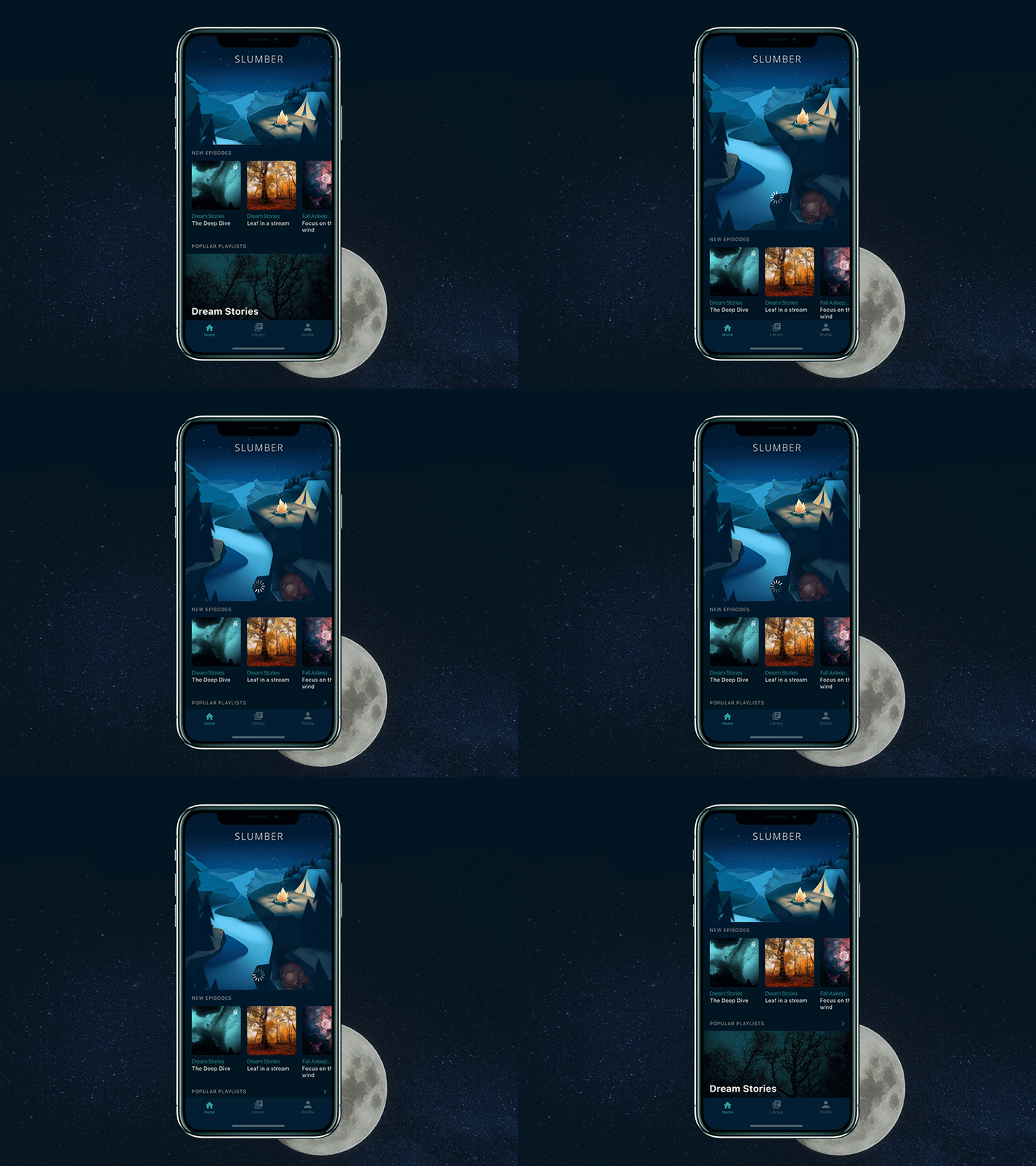
Here is an example of pull-to-refresh in Slumber app: pulling down the tab of new episodes, a user is waiting for and sees the slight animation of a loading wheel which shows that tracks library refreshment is in progress while animated illustration makes the time of expectation not that boring.
And here’s a pull-to-refresh animation with custom theme graphics for the financial application concept.
Here is another example of loading animation for the search process in the Fitness app, making the waiting process clear and good-looking.
Attention-Drawing Animation
This kind of animation plays the role of UX affordance when users interact with your app. It supports general visual hierarchy with motion catching the user’s attention and directing it to the necessary details. This way it saves precious time on scanning all the screen layout and makes navigation more clear and intuitive.
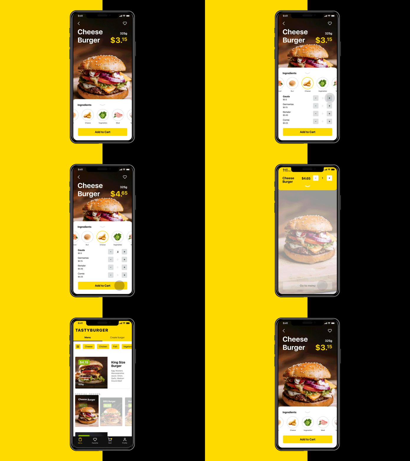
This set of interactions for Tasty Burger app features the animation of changing the price. It adds life to the process and makes it natural. Moreover, with motion, it instantly attracts the user’s eye to core information this way giving a prompt what to look at.
Transition Animation
Animation of transitions adds style and elegance to the process of interaction and coming from one screen to the other.
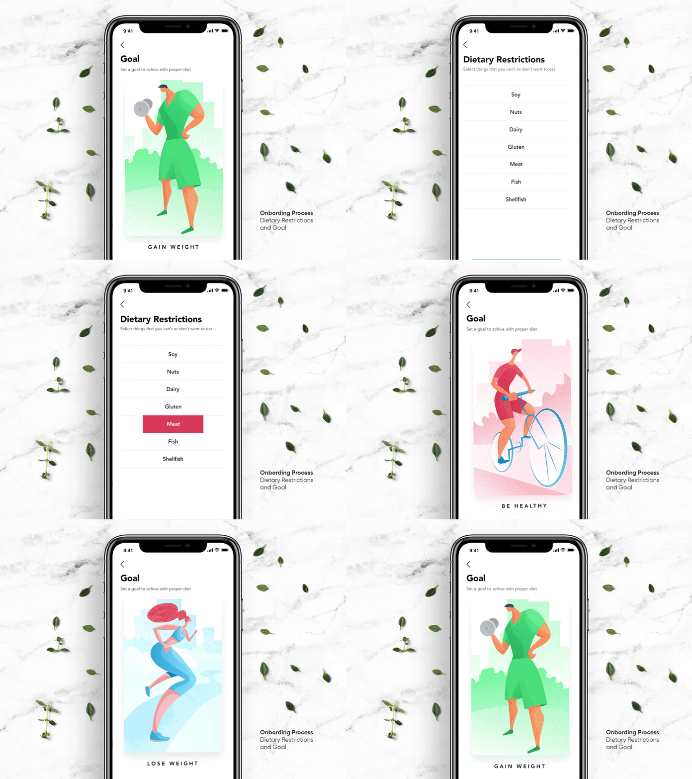
Here is the set of transitions in Perfect Recipes app: here users customize their recipe base according to their goals and dietary restrictions. The transition between the cards of goals supported with motion supports a positive user experience.
Here’s a stylish Carfinder app design with beautiful and smoothly animated transitions.
Yet, it’s not only about beauty. In our recent article devoted to conceptual UI animation for mobile apps, we showed examples of how the animation of transitions may add the illusion of more space between the elements and this way make the layout airy and light, like in the example below.
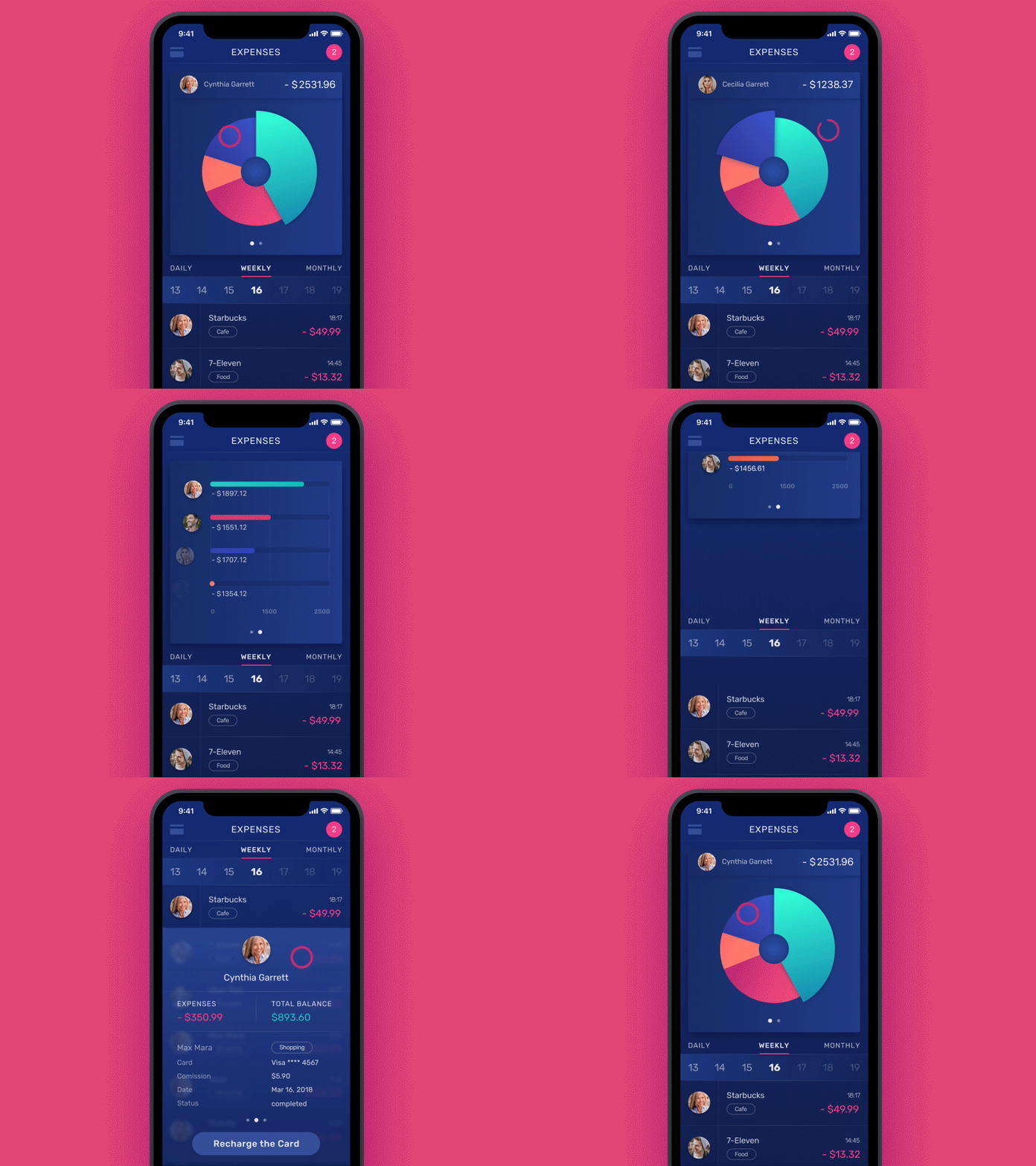
Here’s one more example of creative animation for the transition process in a financial app concept when the user comes from a pie-chart to the list view saving and the color markers: animation makes the connection between the screens and data visualization closely connected to each other and lets users see this connection.
Marketing Animation
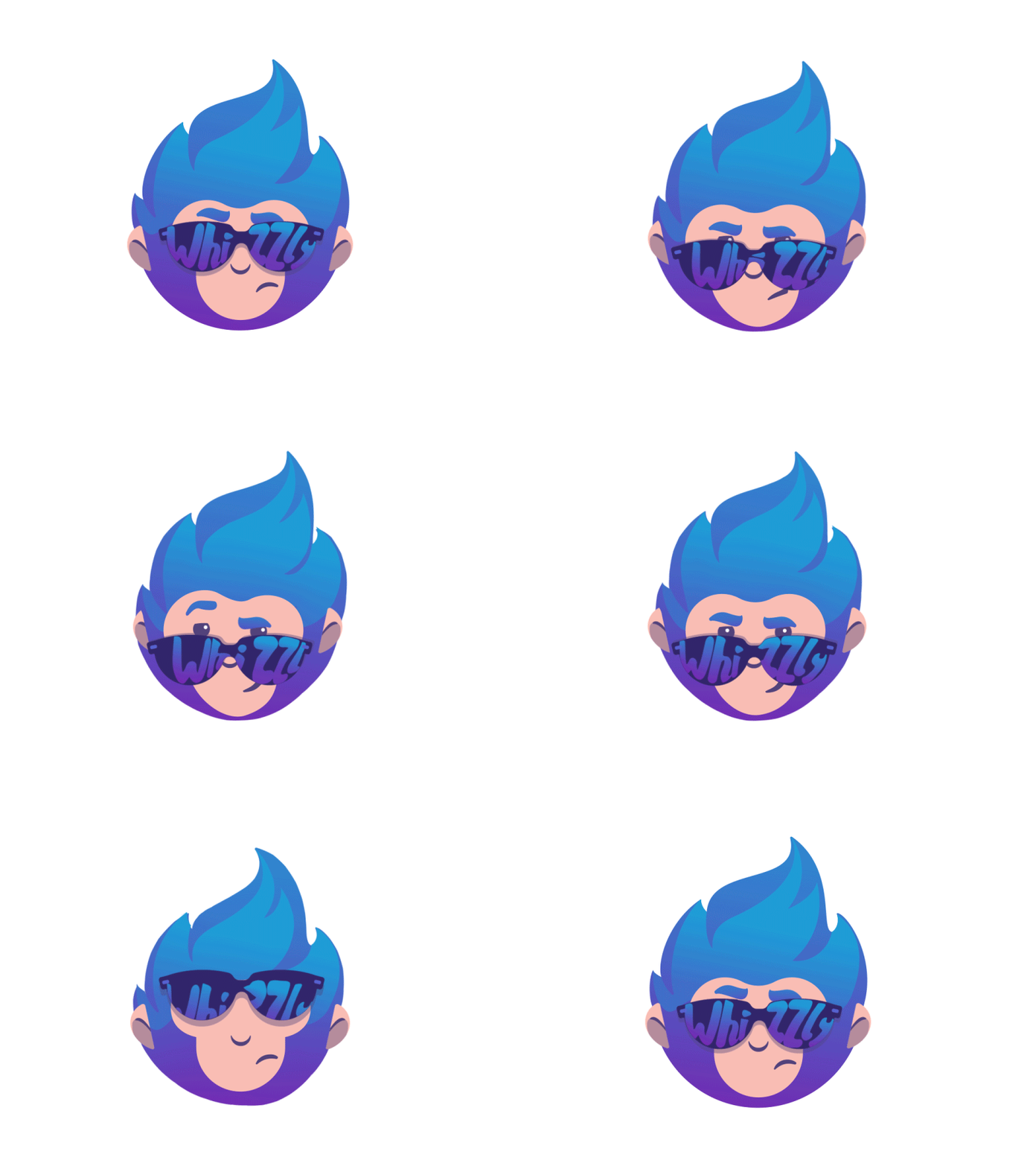
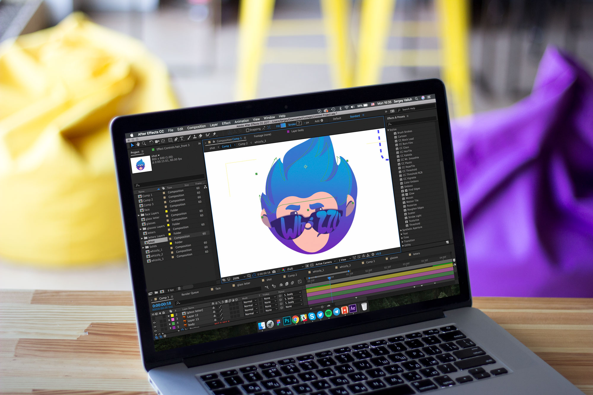
Wise integration of branding to UI design can play a big role in increasing brand awareness. In most cases, it is the animation of logos, mascots, and the like, which is often effectively applied to splash (welcome) screens. Marketing animation in apps is usually focused on attracting attention to the visual signs of the brand. Here’s the animated logo we created for Whizzly, the app for self-promotion of young talented people. The animation is catchy, more memorable, and enables designers to add vivid emotional appeal.
Here’s another example of an animated logo for a bakery to add fun and dynamics to its promotion via the web.
Animated Notifications
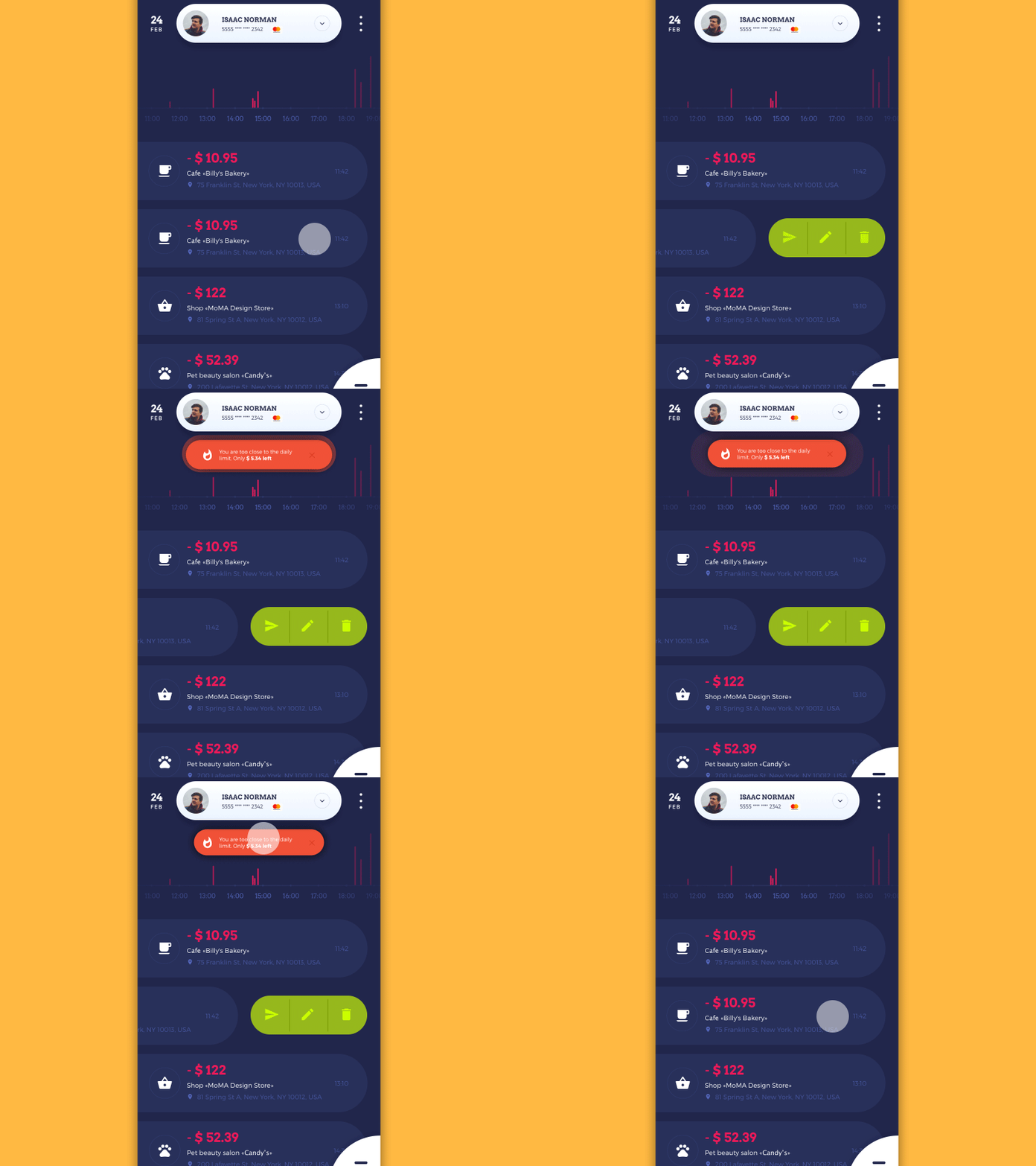
Notifications are the signs attracting users’ attention to the updates in the app. Supported by unobtrusive animation, notifications become even more noticeable and set higher chances that users won’t miss important information. Below you can see an example of such a UI element in the Home Budget app: notification is made prominent not only with the bright color but also with the motion imitating pulsation.
Scroll Animation
Scrolling is one of the typical interactions we are used to in both web and mobile interfaces. Animation adds beauty and elegance to the process, makes it stylish, original, and harmonic. Keep in mind that scrolling may be applied in different directions, not only vertically but also horizontally like in Photo App shown below.
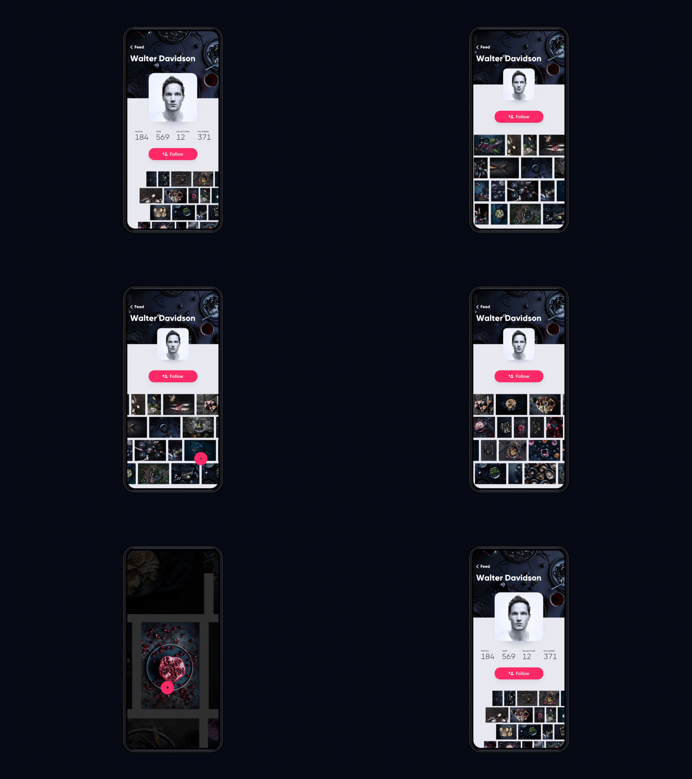
Another example of beautiful scrolling is implemented in the Gallery application.
And here’s how the scrolling looks engaging with an animated background in Quotes App.
Storytelling and Gamification
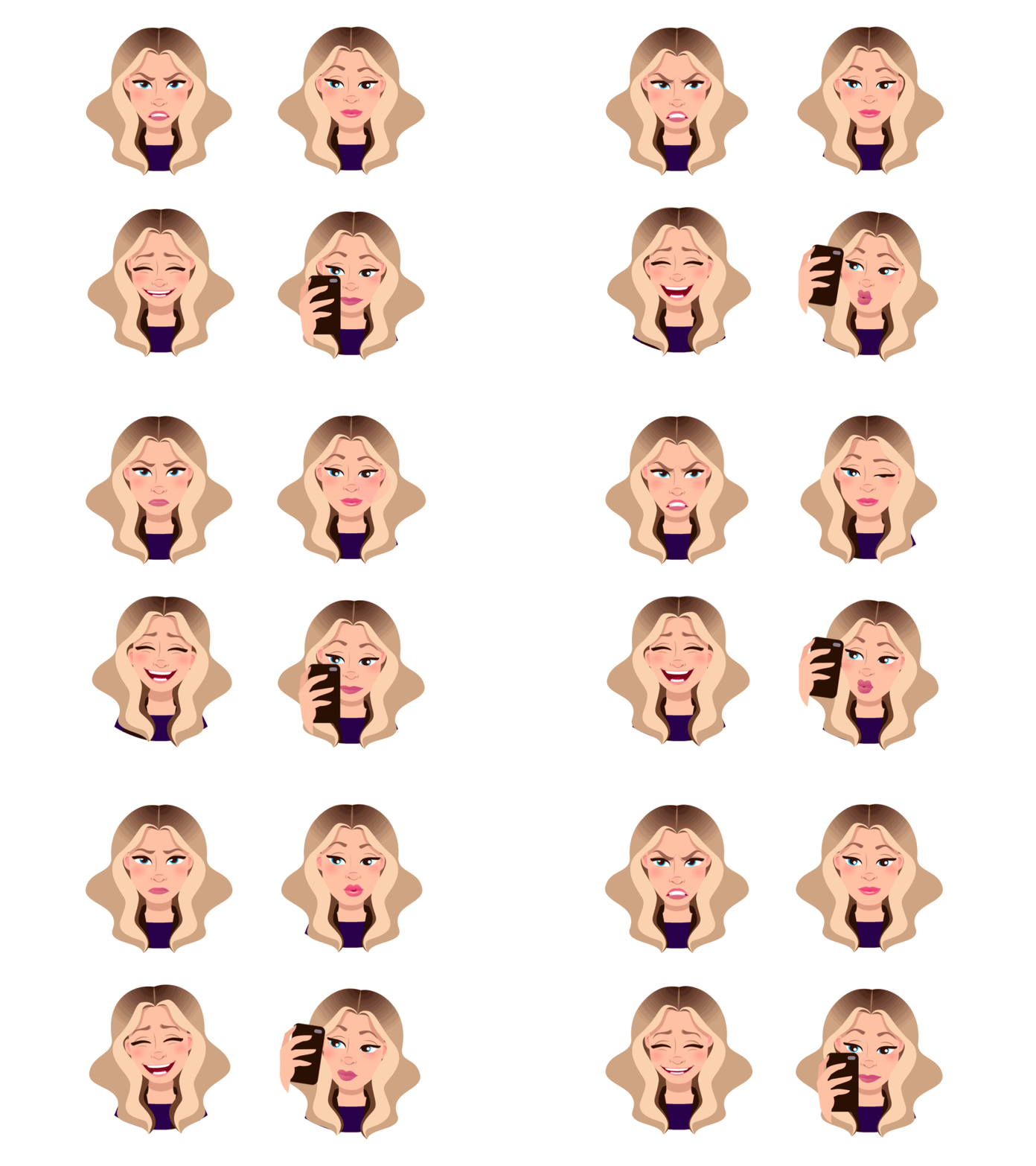
One more reason for using animation in mobile apps is making it a part of a story or a game. Animated stickers, badges, rewards, mascots – these are only a few ways to make an app interface interesting and lively. For instance, here you can see animated stickers for Mood Messenger reflecting various feelings: using them adds strong emotional appeal to the user experience.
Benefits and Pitfalls of UI Animation
Applying animation in a mobile app, designers should analyze both the positive and negative impacts they may have on app interactions. We prepared a short checklist that will help you in the process of decision-making.
Among the advantages of motion for mobile apps, we would mention:
- saved screen space
- increased usability
- originality
- convenient and easy interaction
- ability to fulfill several functions simultaneously
- speeding up the processes of interaction
- providing clear feedback to the user
- creating necessary expectations.
On the other hand, among the disadvantages designers have to consider:
- loading time
- distraction factor
- time and effort-consuming technical realization.
Useful Reading
Here’s a set of handy articles for further reading on the theme of UI animation:
What Is Conceptual Animation and How It Works in UX Design
Mobile Motion. 20 Creative Concepts of UI Animation
Interface Animation: Eye-Pleasing, Problem-Solving
Animated Interactions. Motion on Purpose
UI Animation. Microinteraction for Macroresult
Interface Animation. The Force of Motion
Animated Logos: When, Why, and How to Use
Originally written for Tubik Blog
- English
- Ukrainian


