Wireframing VS Prototyping: Specify UX Terminology
Wireframing VS Prototyping: Specify UX Terminology The article compares functions and goals of two UX design stages: wireframing and prototyping. Read about their benefits, differences and role in the design workflow.
You can’t build a great building on a weak foundation. You must have a solid foundation if you’re going to have a strong superstructure. Gordon B. Hinckley
Effective design always requires a stable foundation. Well-thought-out information architecture, as well as prudent interaction and navigation systems, are the base that forms a positive user experience. It is recommended to plan the details from the very beginning of the creative process.
There are certain techniques that allow creating visual representations of layouts and sharing the ideas with everyone involved in a project. Two of these techniques, wireframing and prototyping, have become significant parts of the design process.
However, designers sometimes confuse a wireframe and a prototype or talk about them as synonyms. Today’s D4U post discovers the differences between wireframing and prototyping and shows which objectives they help to accomplish.
What’s a wireframe?
A wireframe is a simple visual scheme that represents a layout of a screen or page of a digital product, such as a website or application. They are often compared to architectural blueprints since a wireframe is usually a monochromatic illustration which shows the structure of a screen. Also, designers can use bright marks or spots to outline specific areas or design elements. There are three types of wireframes: low-fidelity, medium-fidelity, and high-fidelity.
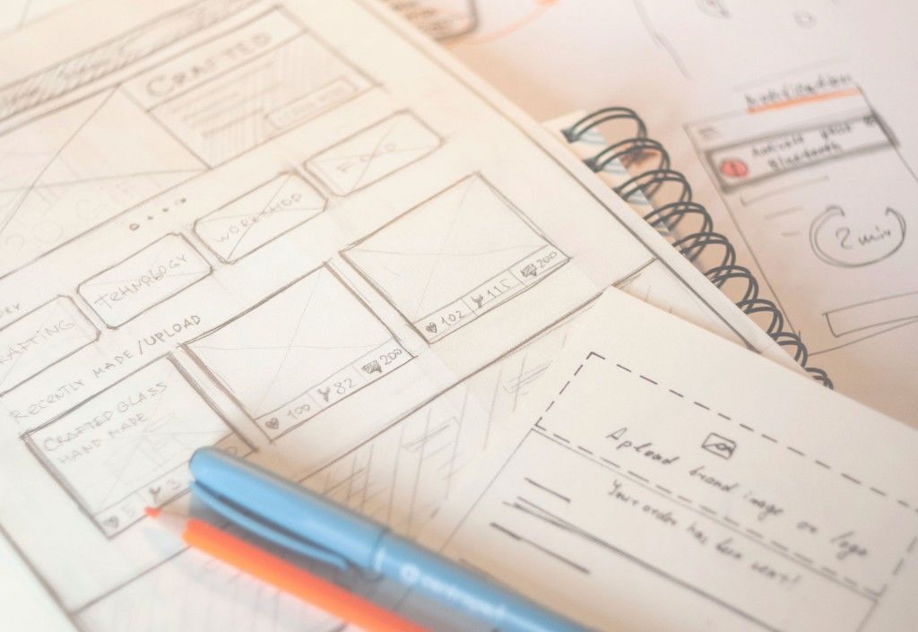
Low-fidelity wireframes are black and white illustrations which aim at showing a “big picture” of a layout and often created manually with pencils or markers. UI elements are represented as boxes and lines followed by short captions. This type of wireframes may seem a bit abstract still it shows the basic structure of a user interface.

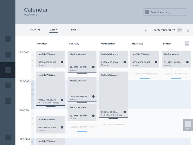
Medium-fidelity wireframes are similar to the previous type since they are also created in a monochrome palette. They are oriented to demonstrate more detailed and realistic layouts the reason why medium-fidelity wireframes can be created both manually or via digital tools. Another difference is that this type allows for distinguishing copy elements so that the typographic hierarchy could be set. In addition, designers provide more detailed comments on each element.

Example of UX wireframe for HealthCare App
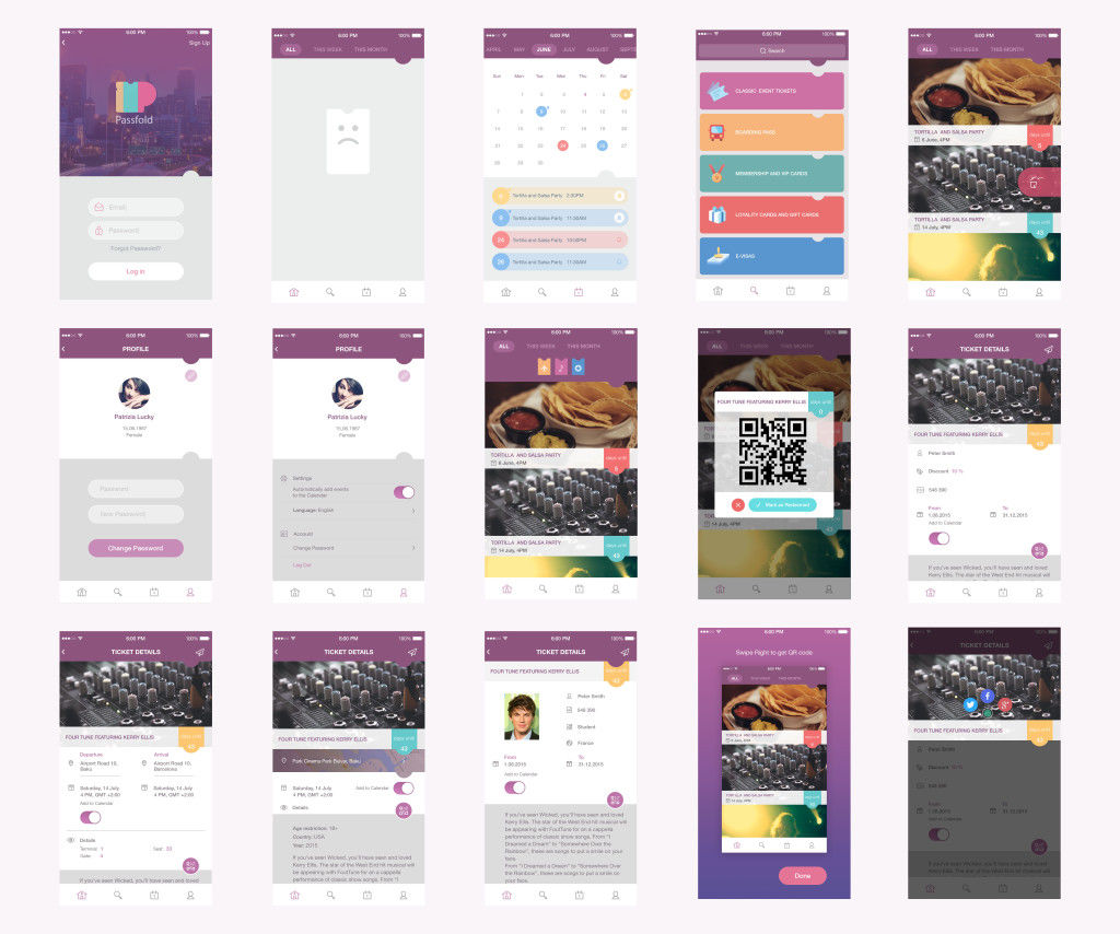
High-fidelity wireframes (mockups) are created via digital tools. They are built in color and present the screens in a view close to the final visual performance, which makes it different from the previous. Designers pay deep attention to typography and the presentation of UI elements. This type can be called UI wireframes or mockups.

UI Mockups for PassFold
What’s a prototype?
A prototype is a sample model of a digital product. It is created for testing the efficiency of the solutions and decisions made about the design for websites and applications. Designers think out interaction and navigation systems and try to make them as much similar to the final result as it is possible. Such an approach gives an opportunity to reduce possible problems before the development team starts their work. Making changes is much more time-consuming and expensive at the stage of development that’s why it’s vital to check the usability and navigation in advance.
Prototypes should not be seen as the analog of the final product. They are effective tools for improving UX design at the very first stages of the creative process. However, prototyping all the details on the final stage of UI in most cases is not so reasonable. It can be too time-consuming and in this perspective, it would be better to spend the same time coding a demo-version. Prototyping seems much more efficient and useful as the step between UX design and UI design.

Prototyping with InVision App
Wireframing vs Prototyping
High-fidelity wireframes and prototypes have been mistaken for a long time since they are quite similar in visual presentation. Nevertheless, they are different techniques which are applied at the different stages of a creative process. To find out the differences, let’s see which objectives they aim at.
Wireframing objectives:
- Creating a fast visual representation of a layout.
- Visualizing an idea and share it with clients.
- Building effective information architecture of a product.
- Setting visual and typographic hierarchy.
- Making a pre-plan of a user journey.
- Thinking through UI elements placement.
Prototyping objectives:
- Giving a detailed view of the UI elements of a future product.
- Thinking through navigation and interaction systems.
- Testing design solutions.
- Reducing the possibility of UX problems and difficulty in navigation.
- Experimenting with the style and alignment of UI elements.
- Showing clients a clickable version of an interface.
As we can see wireframing and prototyping have different objectives. Wireframes are focused mostly on the structure of the page while prototypes are created to give a more detailed look at the UI elements, their style, and alignment. Moreover, prototypes have a great advantage as they give the opportunity to test the interactions similar to the final product.
We can’t say that one technique is better than the other. Even more, they can work better if they are applied together. Prototypes can be created from static wireframes, making them clickable and interactive.
Everyone is free to determine for themselves which of these techniques to select or even maybe apply them in a combination. Everything lies in the situation and circumstances. Choose wisely!
Useful Design Articles
UX Design Glossary: Navigation Elements
UX Design Glossary: Interface Navigation Elements. Set 2
How Human Memory Works: Insights for UX Designers
Types of Affordances in User Interfaces
5 Basic Types of Images in Web Design
The Anatomy of a Web Page: Basic Elements
6 Elements of Efficient Company Website Design
UX Practices on Product Page Design
How to Design Effective Search
Web Design: 17 Basic Types of Web Pages
Guide to 6 Effective Types of Web Animation
Directional Cues in User Interfaces
- English
- Ukrainian

