Mobile Motion: 20 Bright Concepts of UI Animation
Mobile Motion: 20 Bright Concepts of UI Animation A fresh set of motion design concepts: check diverse approaches to user-friendly UI animation improving navigation and interactions in mobile applications.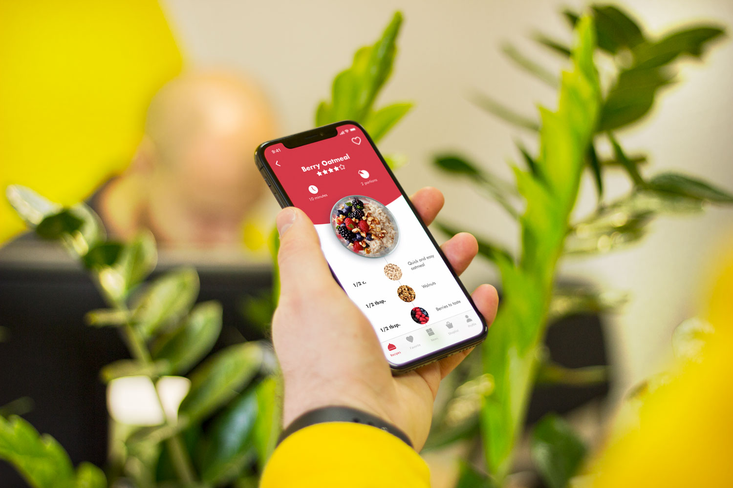
A lot of trends have stepped aside but motion keeps its top positions in the domain of user experience for mobile and web. Animation has become an essential part of effective user interfaces making them more interactive, fun, and user-friendly.
Tubik designers know how helpful the well-crafted animation can be for usability of digital products, especially for mobile applications. Adding to diverse design ideas and practical examples shown on our blog before, today a fresh set of concepts with sophisticated UI animations is ready for your attention. Let’s take a look at them.
Vegan Recipe App
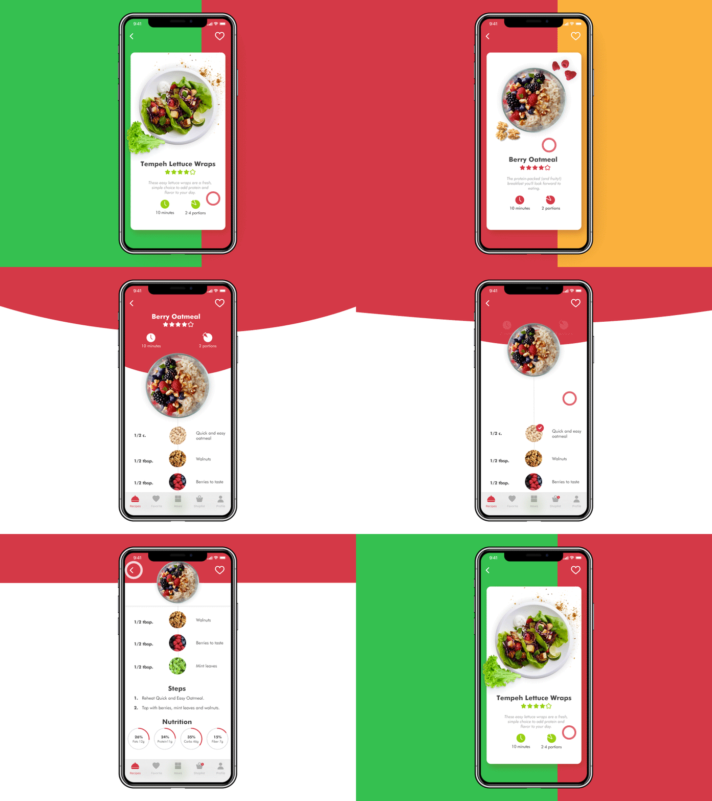
This is a concept of Vegan Recipe app enabling users to choose the dishes based on vegetarian principles and add the necessary ingredients to the shopping list. Here you can see the basic set of interactions including choice of recipes with the horizontal swipe. When users tap on the specific recipe, they can see the detailed information on its ingredients and nutrition. The tab bar includes simple icons helping to navigate in the app.
Tasty Burger App
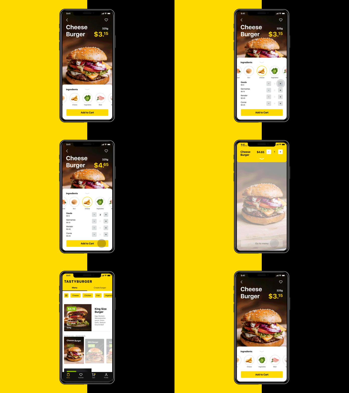
Another food concept is a fresh and juicy Tasty Burger App allowing users to order a traditional burger from the menu or customizing any option for themselves adding or removing the ingredients. The item screen is focused on the high-quality photo of the chosen burger making users want it even more. The ingredients are displayed at the bottom of the screen so users can add or remove them without efforts since it’s one of the easiest tap areas to reach. And finally a yellow CTA button “Add to Cart” helps to complete the purchase.
The menu screen includes brand name on the top to increase recognizability. Users can apply filters for the fast search or pick an item from “special offers”. All the UI elements in menu screen are structured due to the sufficient visual hierarchy allowing users to interact with the app.
Mobile Game App
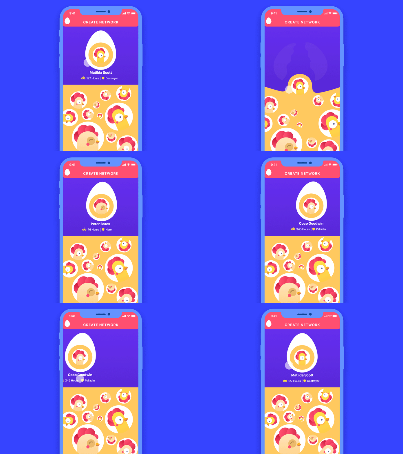
This is the animated concept showing interactions for a mobile game Chicken Attack. It allows players to create their own networks via the set of random matches that can be skipped or added. The triadic color scheme makes UI look more playful and funny flat illustrations of chickens bring positive emotions. The animation shows how an egg breaks and one more chicken, presenting a player, joins a team. This way the basic operation of adding a player becomes lively and gets a strong association with the theme of the game.
Business Card App
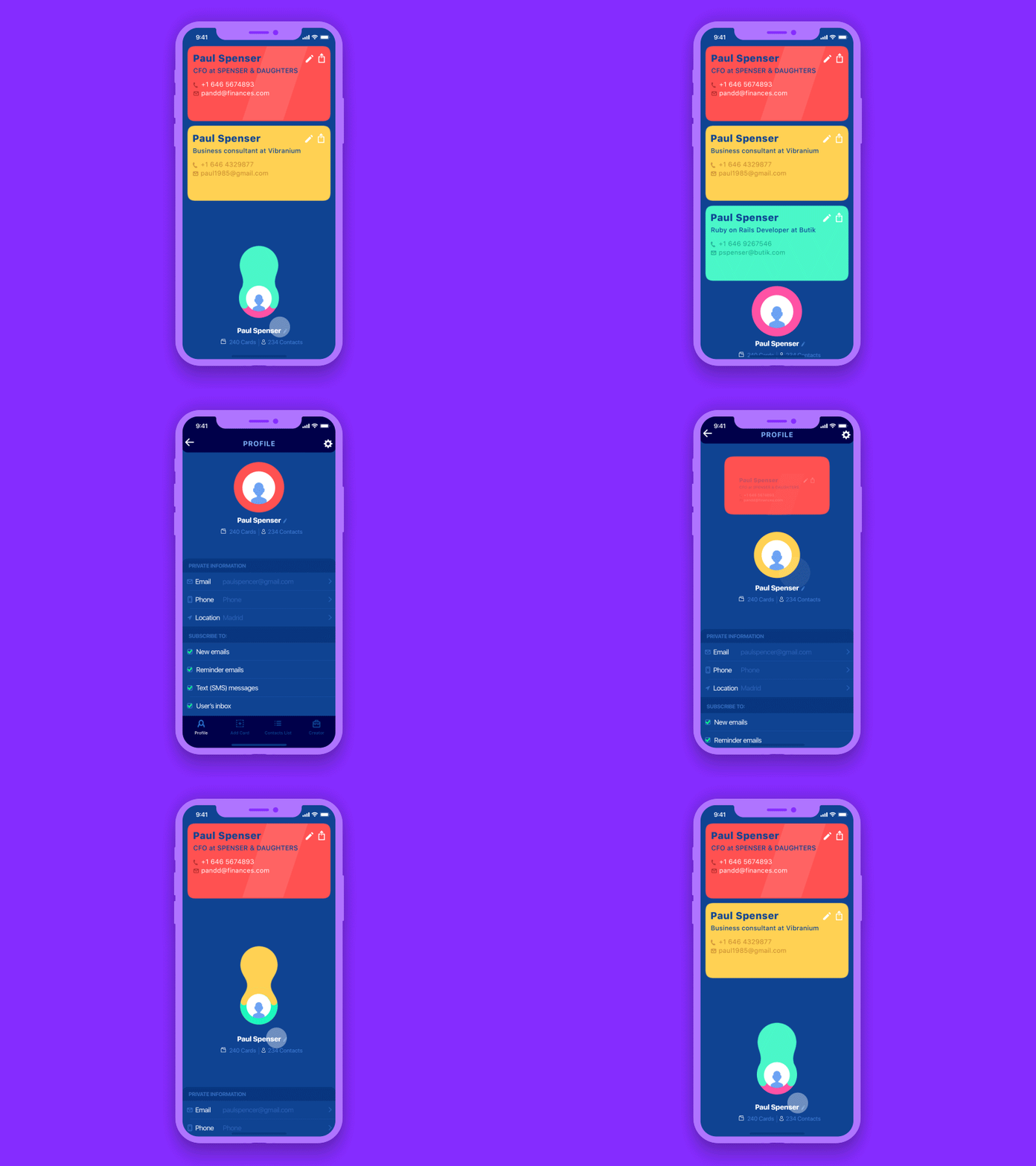
Here’s the UI concept of Business Card App, an application for creating, keeping and sending contact data in a form of virtual business cards. For users working at multiple positions, it may save a set of cards as you can see in the animation. Cards in the user’s set appear by dragging the first one down.
Watering Tracker App
![]()
![]()
Here are two screens presenting some interactions for a watering tracker. It reminds users to water the plants as well as tracking the watering stats for every plant. When users accomplished watering they push a custom button with water drops and it changes into a check sign. In addition, there is the information showing when a plant needs to be watered next time, so when people confirm watering it changes the data immediately.
The second screen presents a feature of adding a new plant to the list. Users can take a photo of a plant and the app automatically defines what it is and how it should be watered.
Photo App
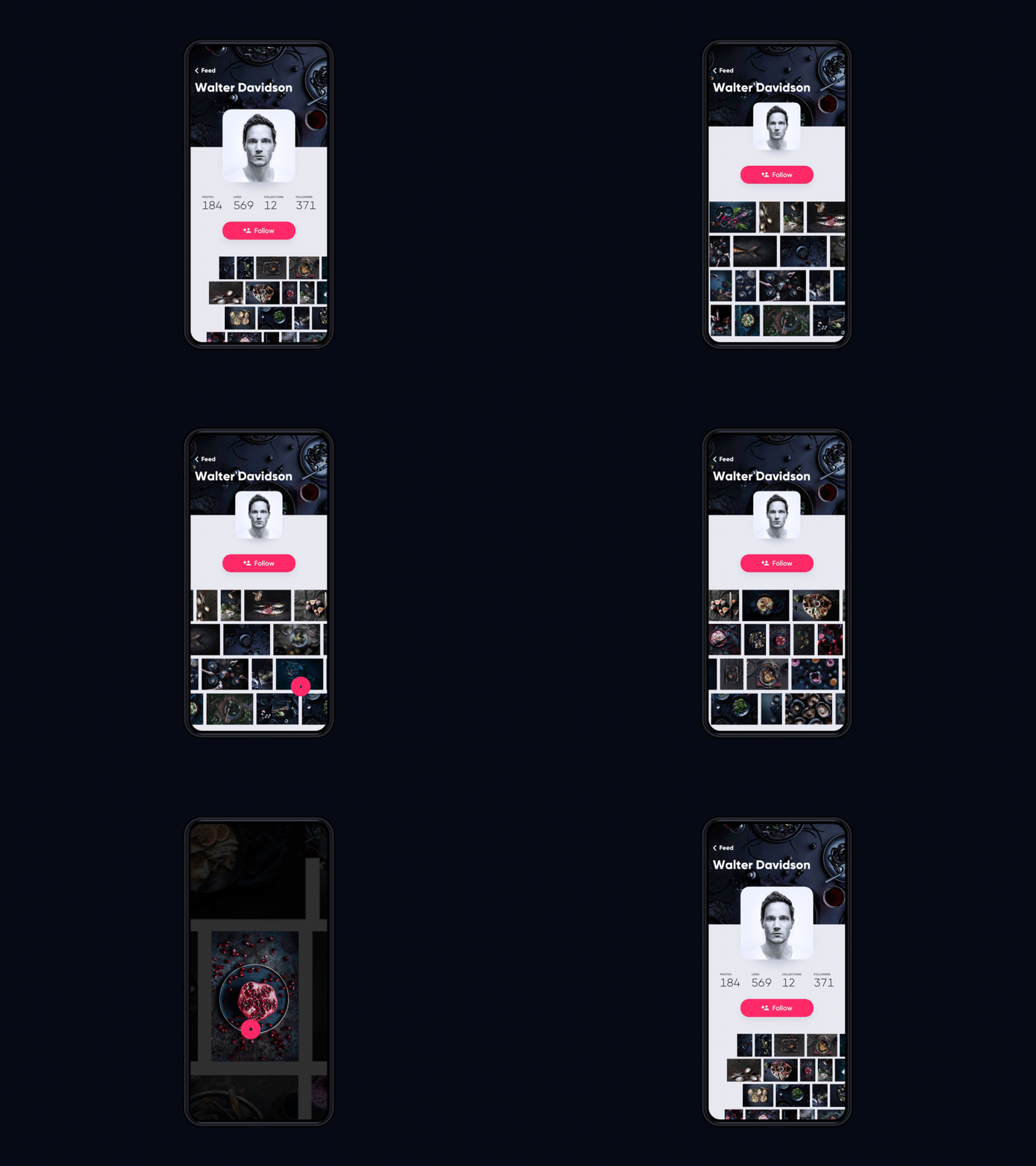
Here’s a UI concept for a photo app. It’s a social network that allows photographers to present their portfolios elegantly and connect to the world. The current view shows a profile screen with a photo gallery. Users can see view photos with a swipe and tap to open the full-sized versions.
Homey App
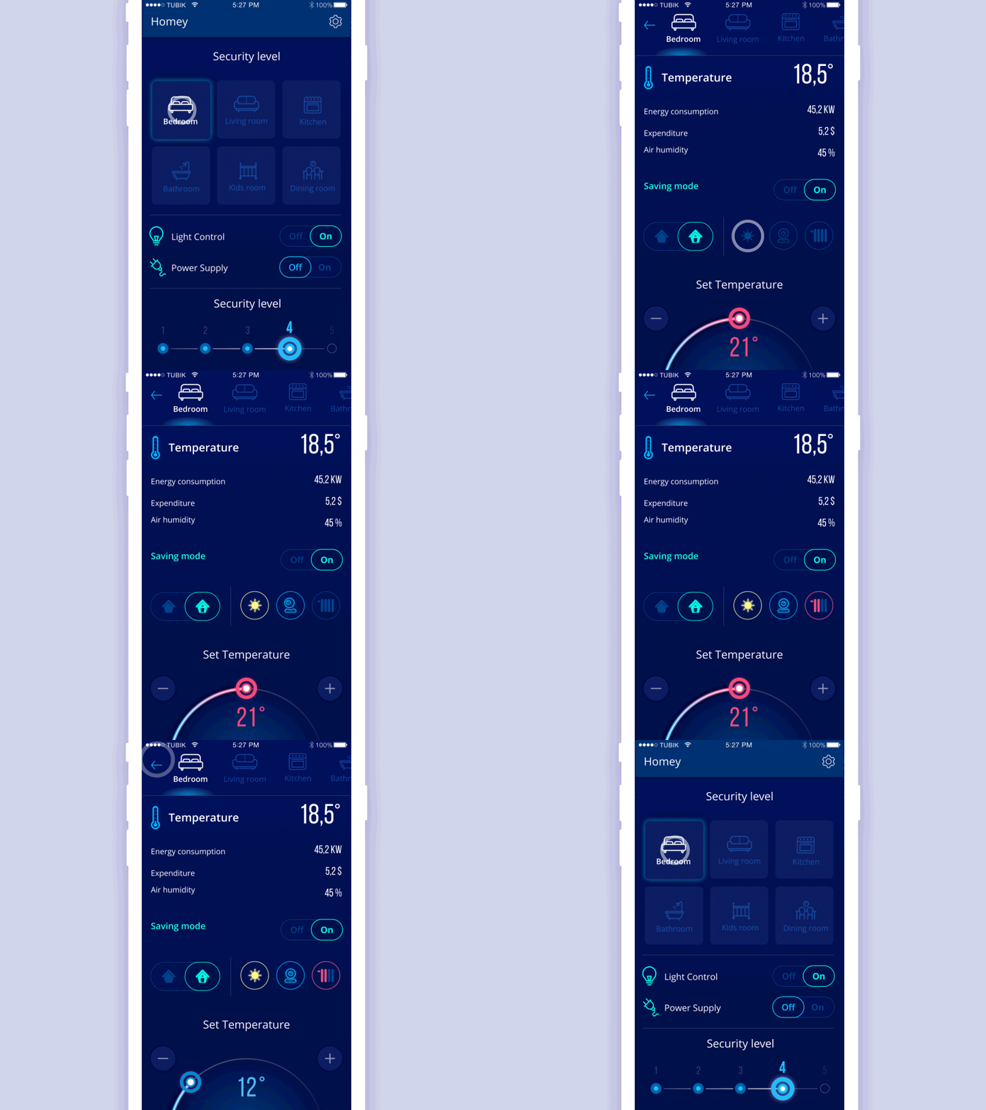
It is the UI concept for Homey, the app enabling users to apply the functionality of smart homes in their dwellings. The featured screens show that users can choose the room and see the basic data about them like temperature, humidity, and energy consumption. Also, people can tune the settings and see the expenses as well as turn saving mode and security of different levels. All the interactions are animated with the use of colors which looks especially deep on the dark background.
Loading Motion for iPhone X
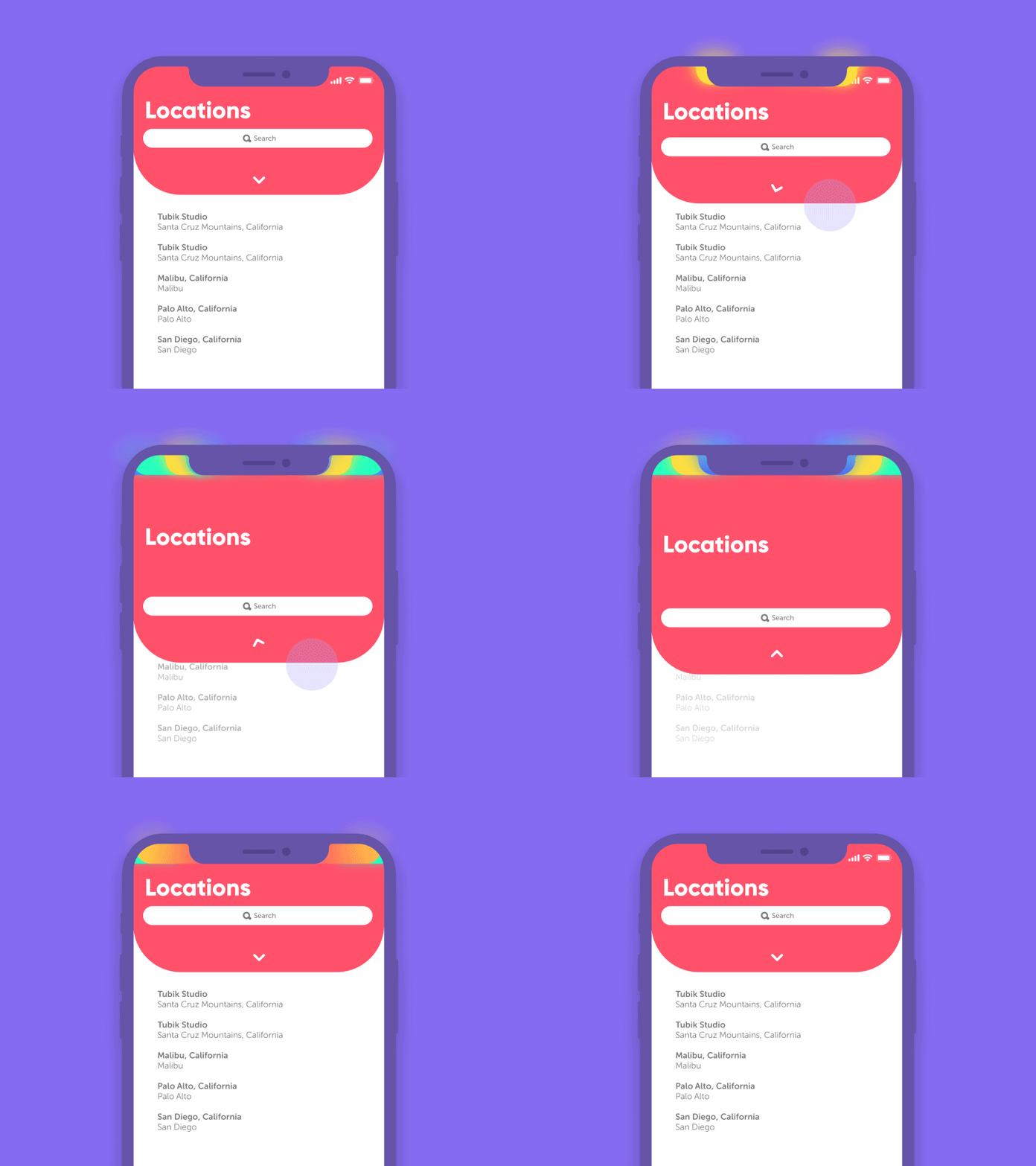
Here’s a concept of a content loading animation shown in the status bar of iPhone X. When users drag it down the rainbow animation appears. This is a bright way to decrease the tense of waiting and entertain users for a moment.
Balance App
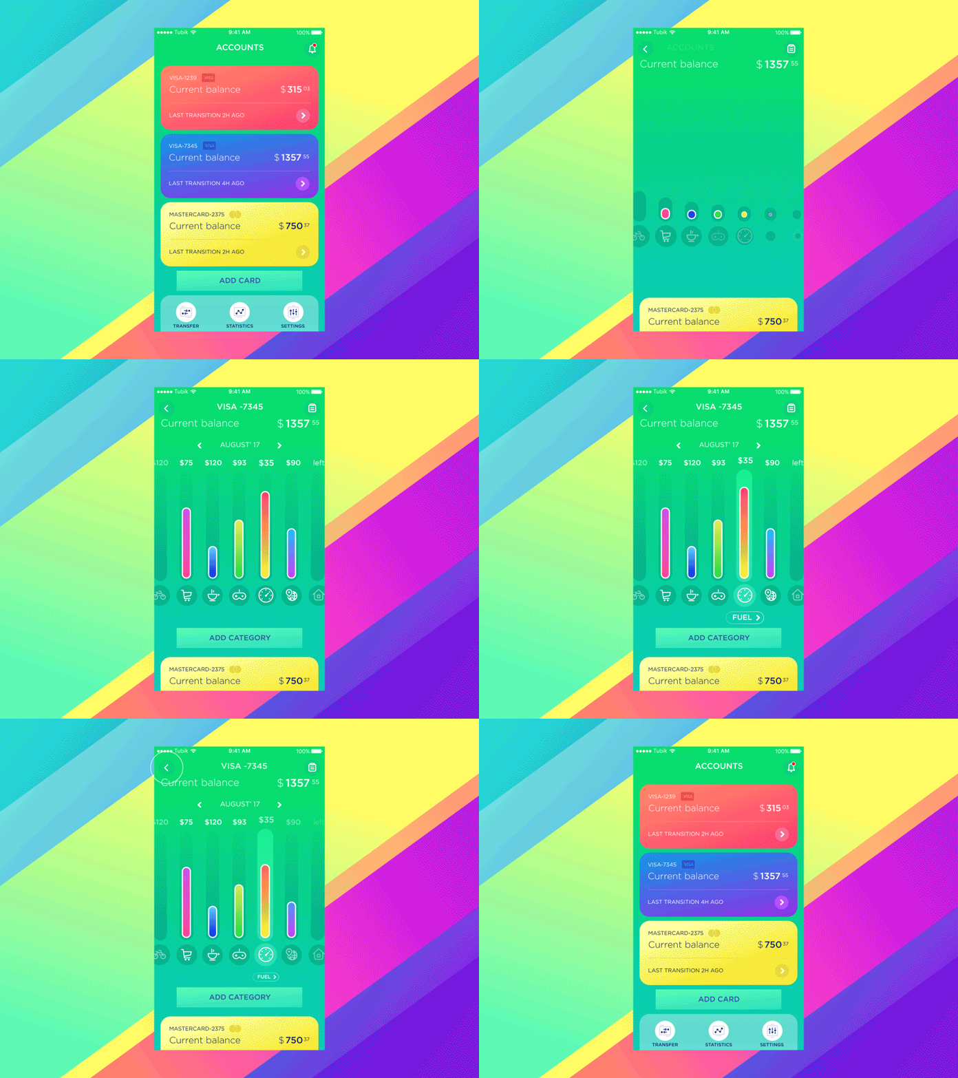
This is a concept of the Balance App, a mobile application for tracking finances. It helps users to check the balance of their bank cards easily, check the expenses along particular categories, and keep updated how much money left to the limits set by the user. The designer has chosen the green color as the basis as it is often associated with safety, confidence, and growth. The smooth animation demonstrates the transition from one screen to another.
Travel Brightly App
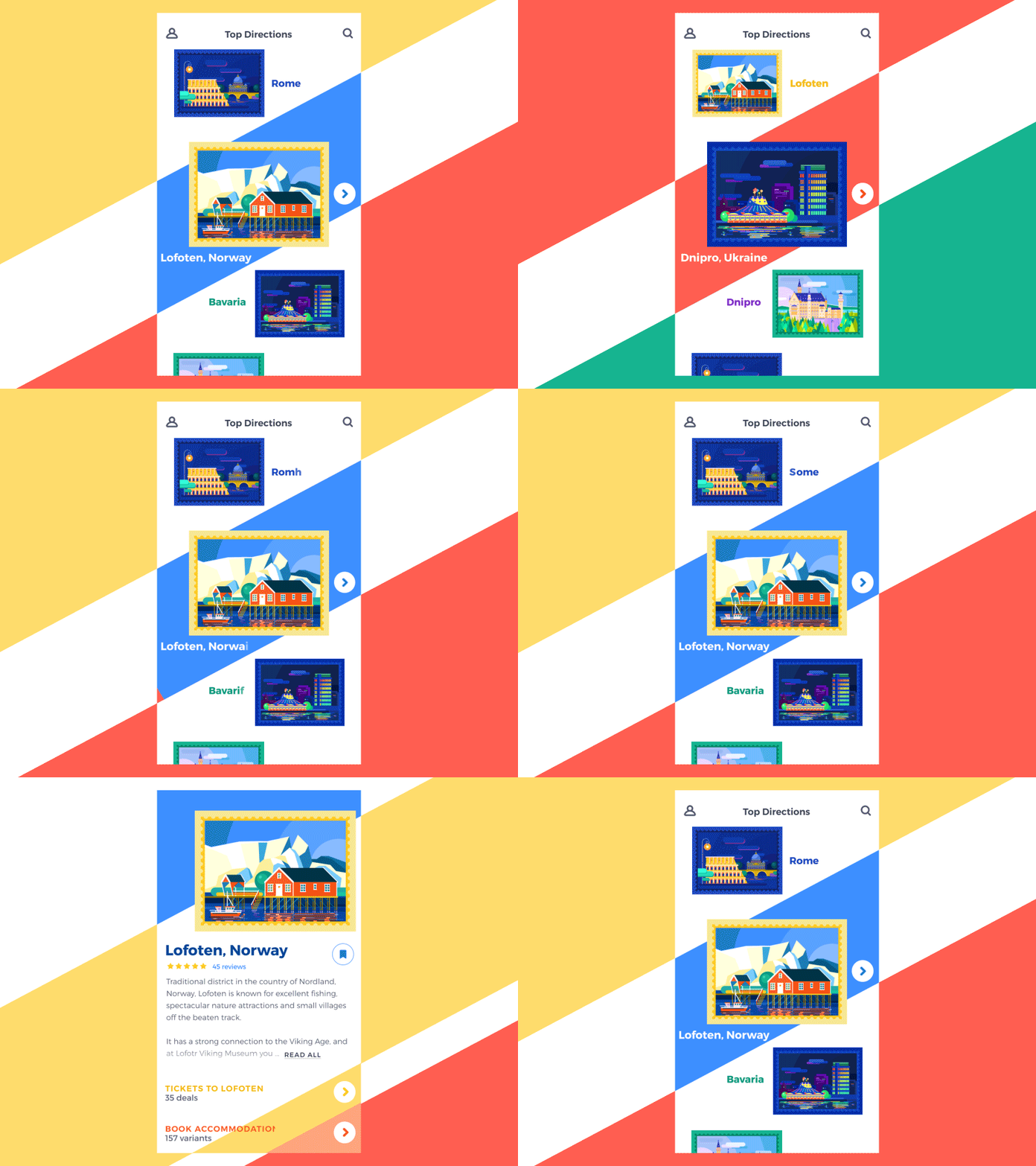
This is a user interface concept for Travel Brightly App. It’s a mobile application providing information about various destinations around the world. The app collects various offers on accommodation and tickets to them and enables users to share their reviews. The feature making the app really special is bright custom illustrations for every presented place. Graphics are followed by names of cities and both demonstrate the animation when users choose a city.
Mobile Menu Interactions
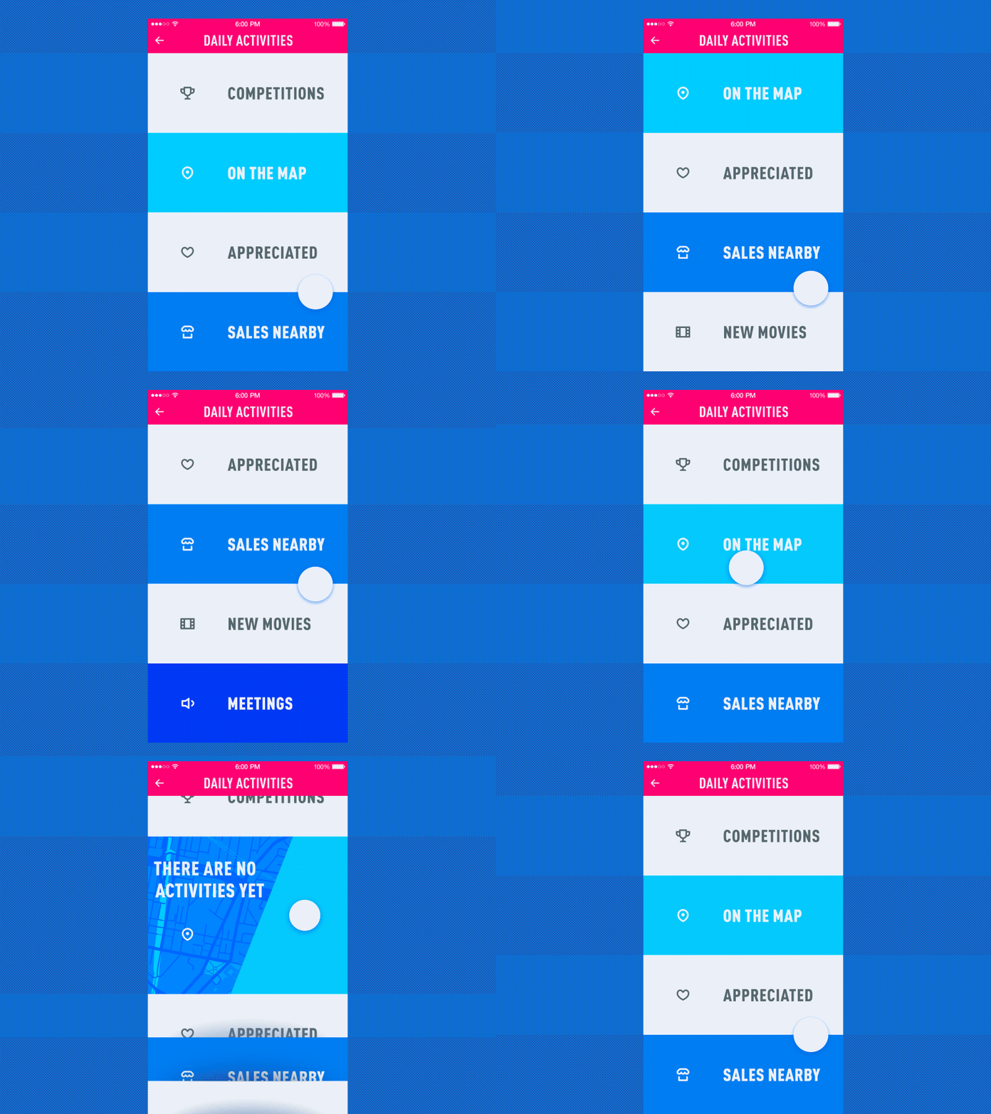
Here’s the concept presenting interactions with the menu of categories for a simple app enabling a user to collect and track all kinds of daily activities. Contrast colors and bold typography also contribute much to making navigation clear and intuitive. Smooth motion supports the usability and elegance of interactions.
Learn Chinese App
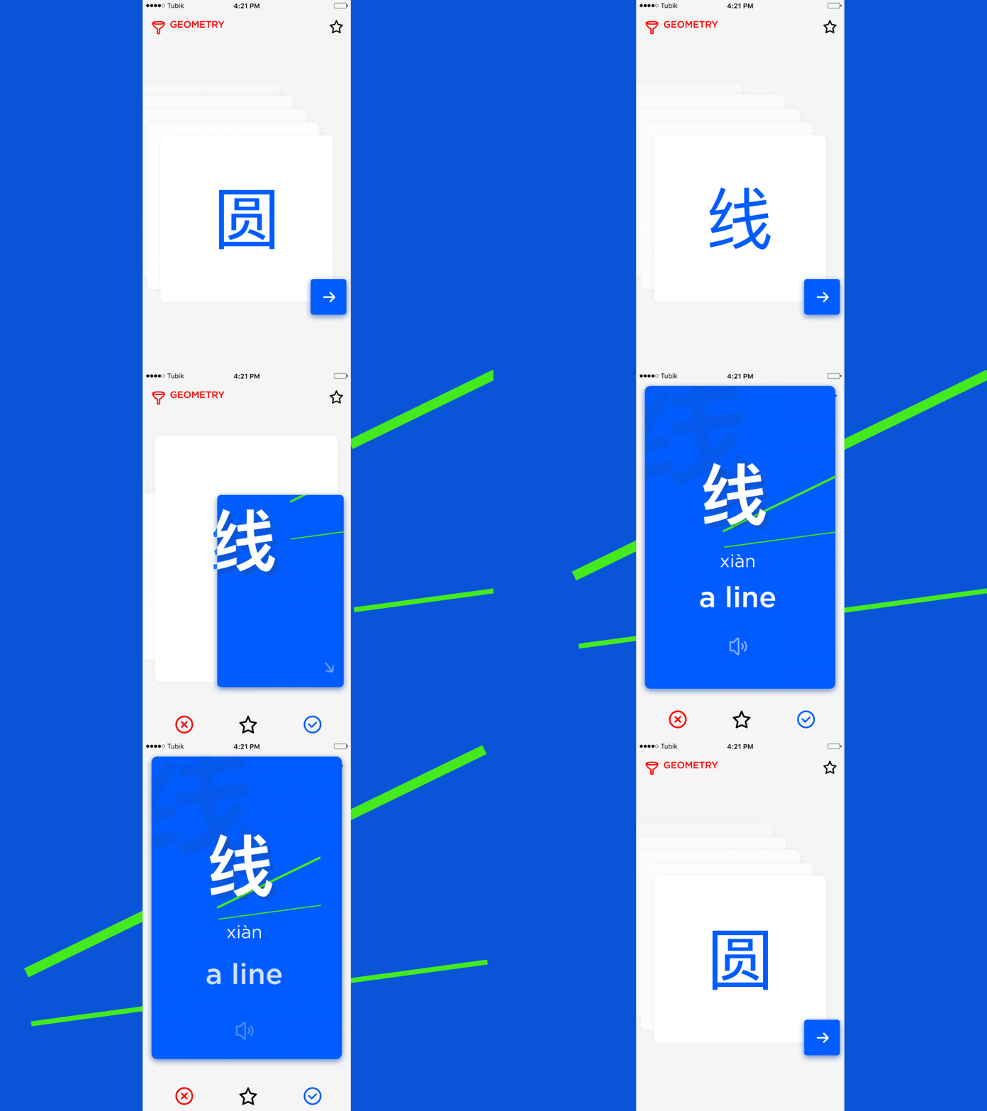
This is a UI concept of Learn Chinese application presenting the cards to learn Chinese characters and pronunciation. One side of a card shows the user a character and the other side allows for seeing its transliteration and translation as well as enables a user to hear it. Users can save the cards, mark them studied or non-studied and learn various thematic collections. The interesting motion makes the learning process brighter and more interactive.
Book Swap App
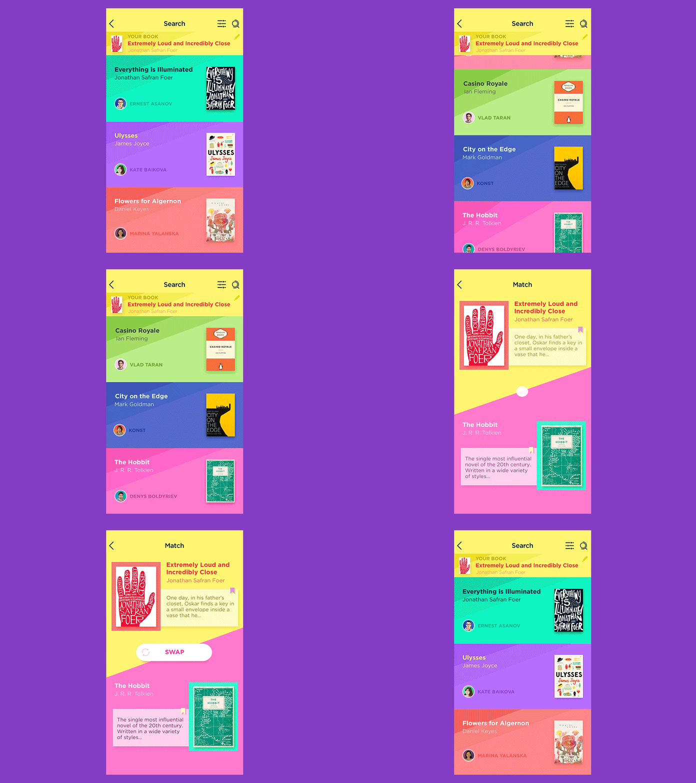
Here’s a UI concept of a book swapping application. It organizes the books by cards: each book card has a unique design that matches its cover. The animated concept shows the interactions with the feed showing books and their owners, and also the card of two books to be swapped. Moreover, the animation can be seen in the smallest details including the CTA button “Swap” with moving arrows.
WineYard App
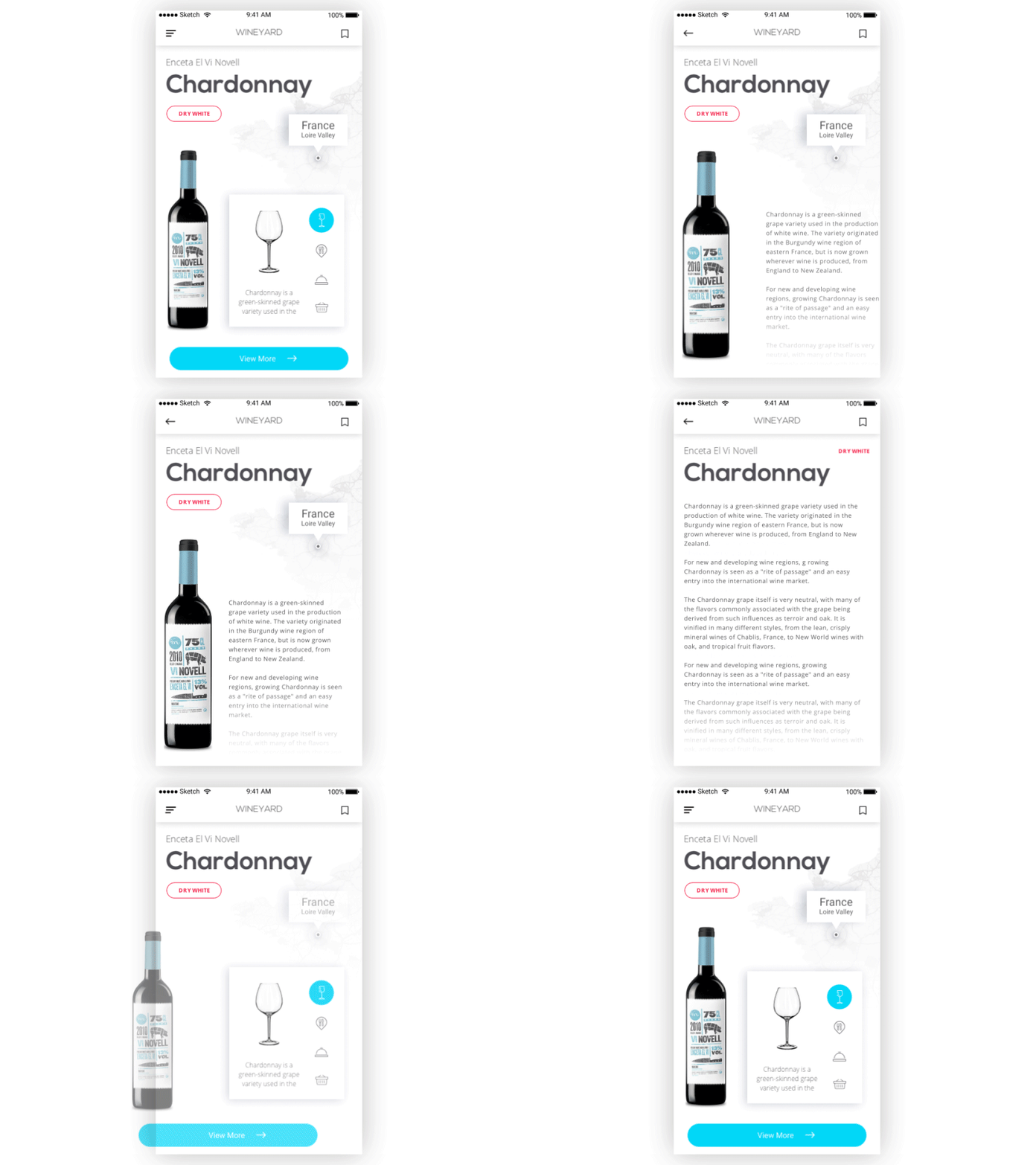
This is WineYard, the application enabling users to learn about different kinds of wine, get tips on serving them and food to combine with. Also, the app gives information where the chosen wine can be bought based on the user’s location. When users push “View more”, the full data about an item appears in a smooth motion while other UI elements such as a photo and title fade away.
Cinema App
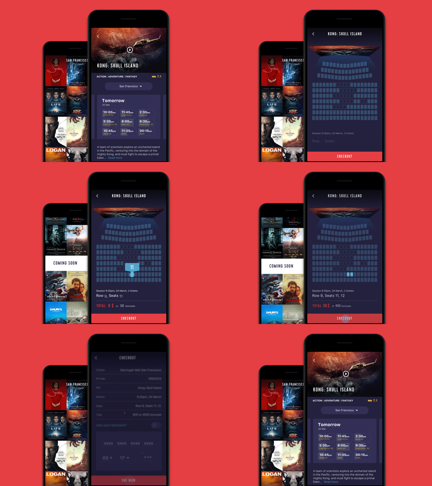
This is a UI design concept of a mobile application for the cinema chain. The first screen features interactions with the home screen showing the list of films. Films are presented via posters placed closely to each other so that users could see more options at once. Tapping on a poster people go to a screen of the particular film with all the necessary details.
The second screen shows the flow of choosing and booking the seat. Picking up a particular showing, users can see the available seats, pick the ones they like, and book them, paying right from the app.
Music News App
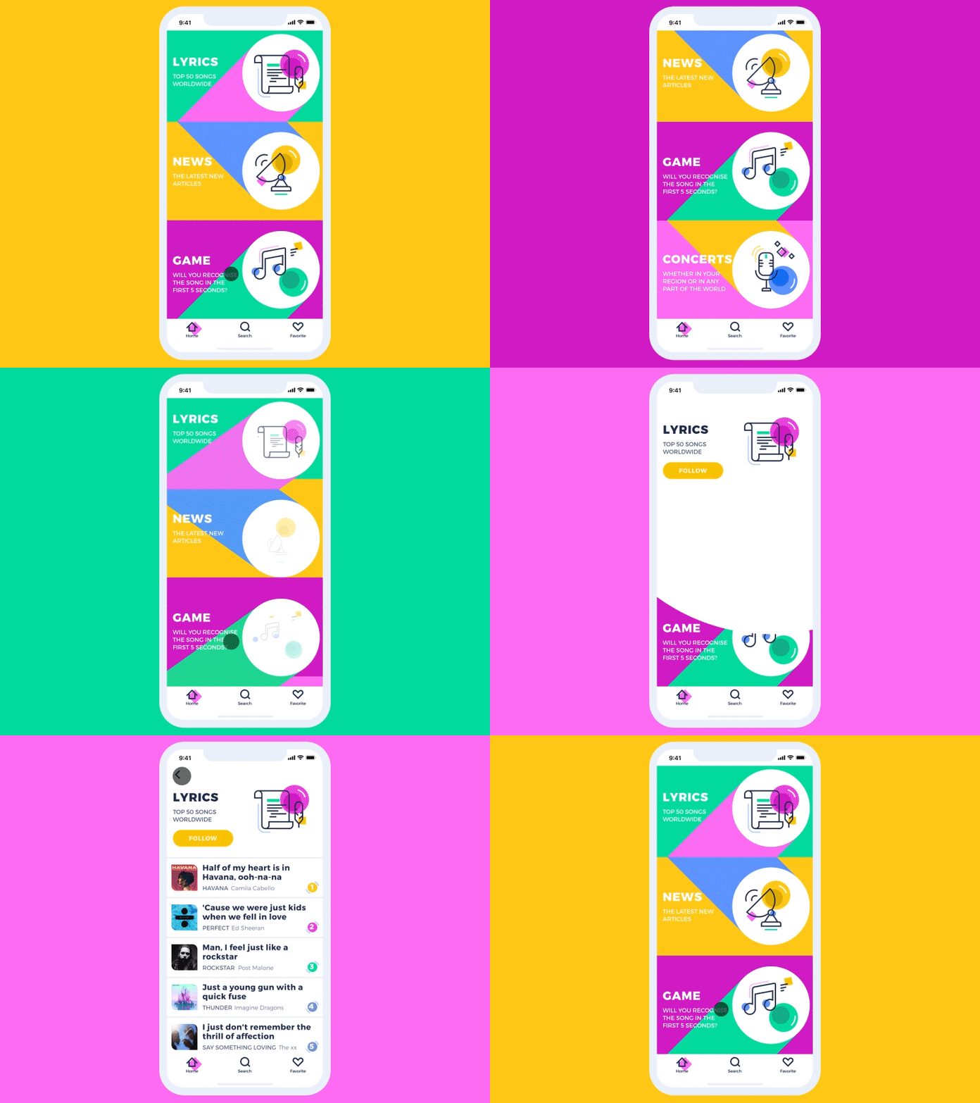
This is a creative concept for Music News App helping collects lyrics, news, and quizzes about music all in one place. UI is presented via a bright color scheme and custom illustrations which make an app look original. The background of a home page applies geometric shapes that change their place and colors when users swipe through the screen.
NGIN App
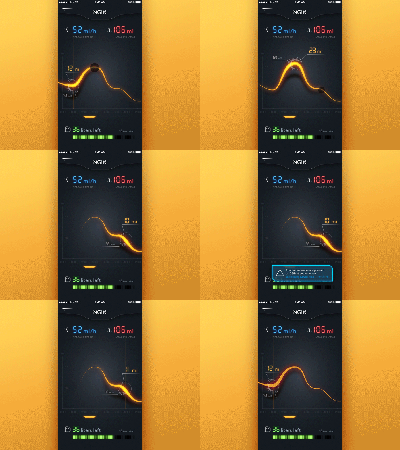
NGIN is the conceptual application for smart car control. The app automates the process of regular data collection informing users about the technical state of the vehicle and conditions of its exploitation. The presented screen gives the user basic current stats like average speed, distance, fuel consumption and useful notifications. The animation shows the interactions with the graph curve of the speed for the chosen period and the notification which features glitch effect to add a bit of fun and support the general stylistic concept.
Home Budget App
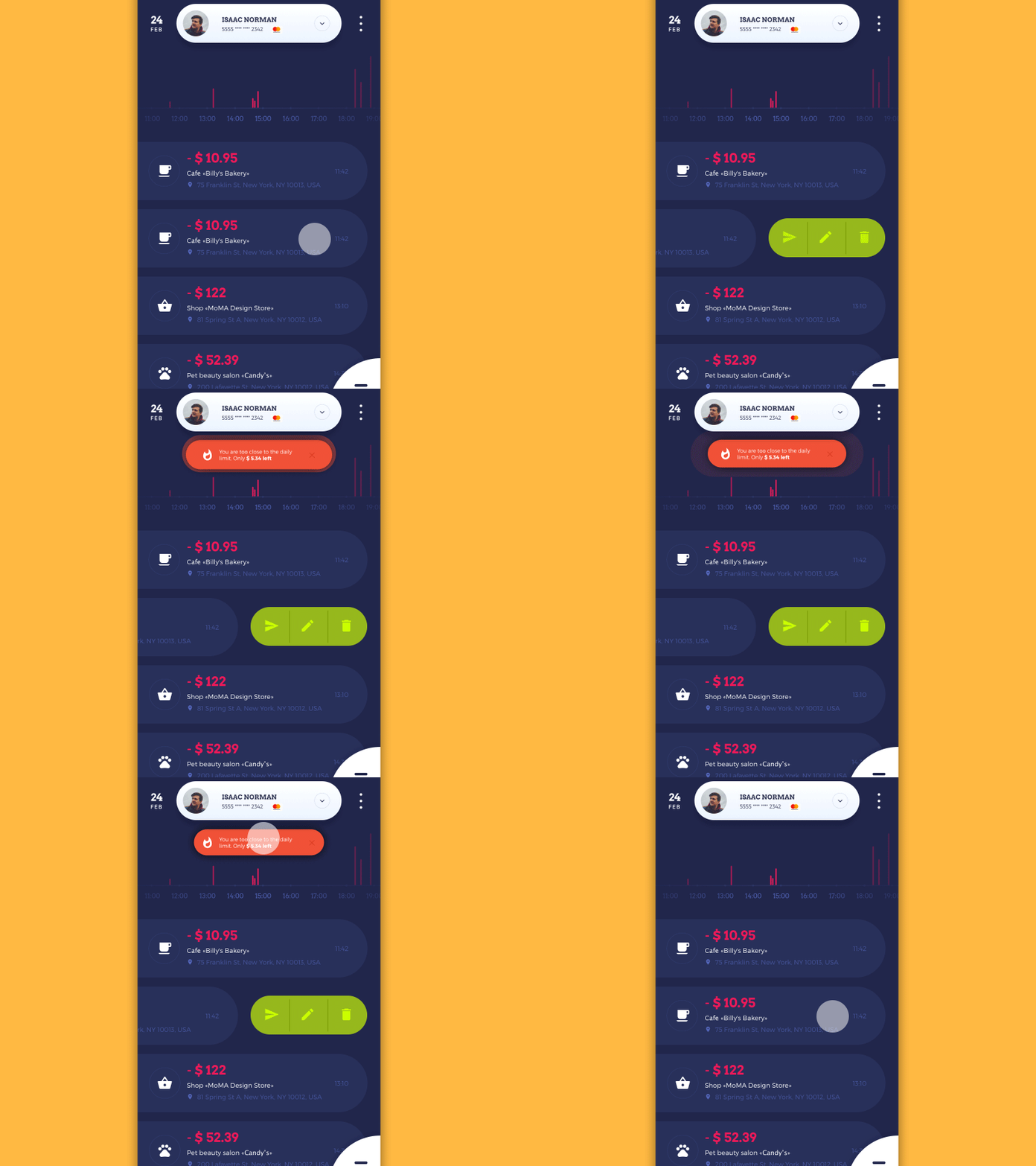
Home Budget application allows users to manage their expenses and incomes, creating the extended database for tracking financial flows and changes getting comprehensive stats. The animation makes interactions and navigation more intuitive despite a significant amount of data.
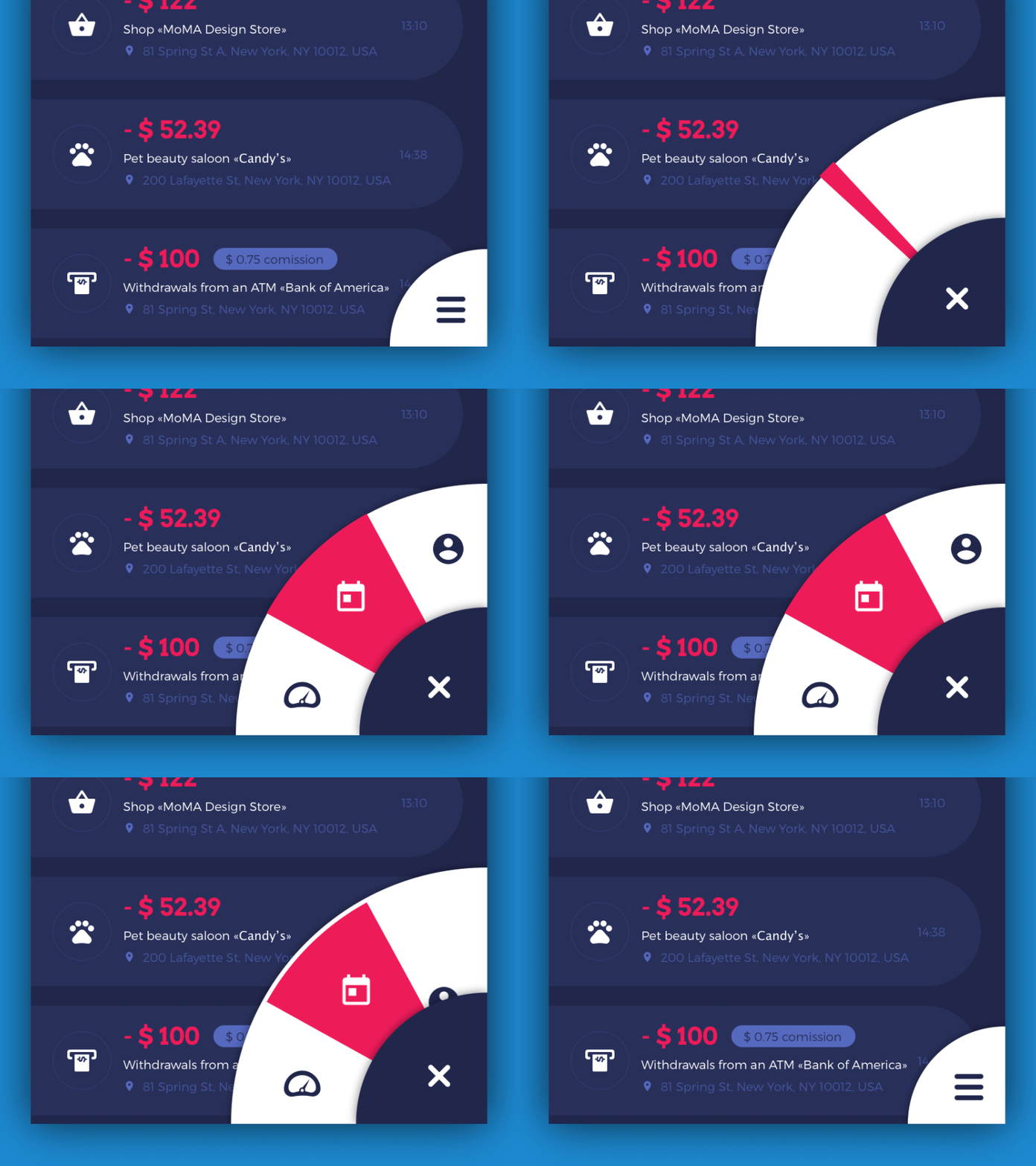
The second concept shows interaction with the feed of financial operations for the current day and the hamburger menu.
Recipe App
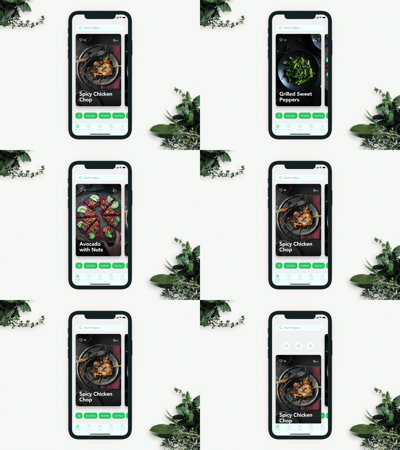
This is a mobile application providing users with database of recipes. It helps to find recipes on the basis of the supplies users currently have at home or create a shopping list to buy ingredients that are missing. The concept shows the process of interactions with recipe cards. Users can choose the right card with a side swipe. Unobtrusive and elegant animation during the first interaction can prompt about the additional functionality that is hidden under the card and available on swipe down.
As you can see, animation can become an effective solution for various problems in user interface design. Well-crafted motion components can improve navigation and make the interactive process even more user-friendly.
Recommended Reading
Interface Animation: Eye-Pleasing, Problem-Solving
Creative Motion: 12 Concepts of Interface Animation
UI in Action. 15 Animated Design Concepts of Mobile UI
Animated Interactions. Motion on Purpose
UI Animation. Microinteraction for Macroresult
Interface Animation. The Force of Motion
Case Study: Toonie. UI Animation Development
Originally written for Tubik Blog
- English
- Ukrainian


