Elegant and Informative Web Designs for Media and Editorials
Elegant and Informative Web Designs for Media and Editorials Check how UX design is created for effective information sharing and perception: web designs for editorials, blogs, and media resources.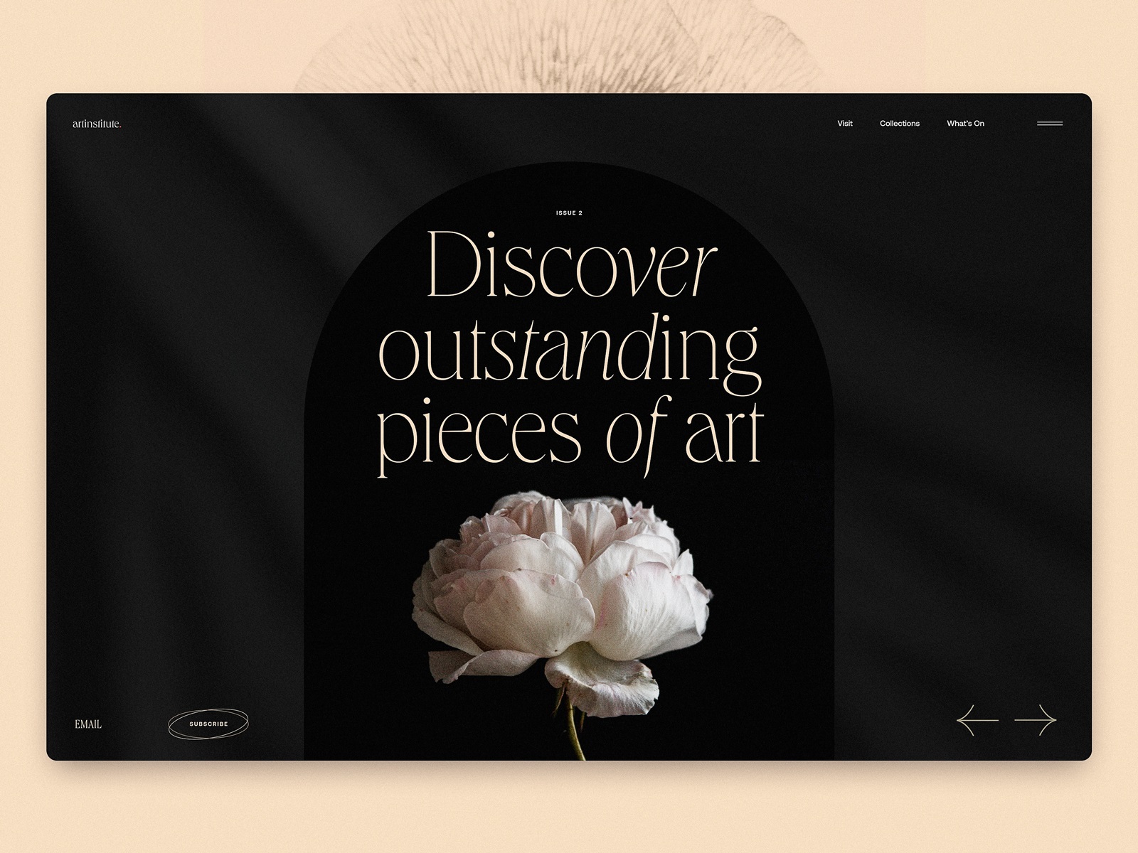
Let’s review another collection of web designs crafted by the tubik design team. This time, it gathers the set of layouts created for the web resources whose objective is to help people get informed and read conveniently, to share a considerable amount of diverse information, and make its consumption, search, and browsing effortless, pleasant, and wrapped elegantly and stylishly. Below, you will find a bunch of designs developed for editorials, blogs, media resources, and review platforms. Enjoy and get inspired!
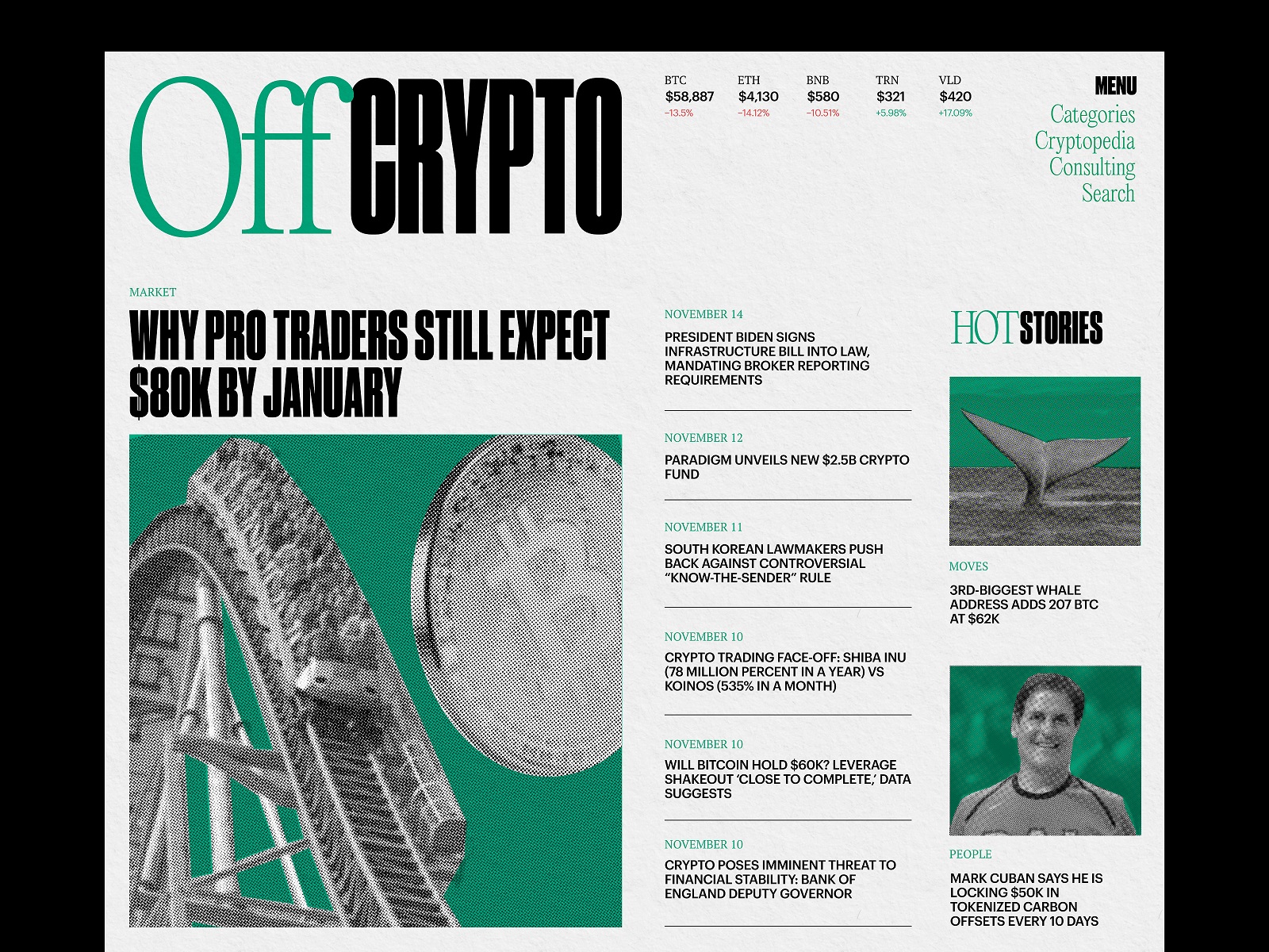
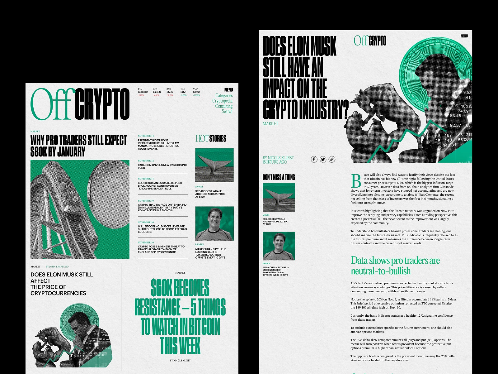
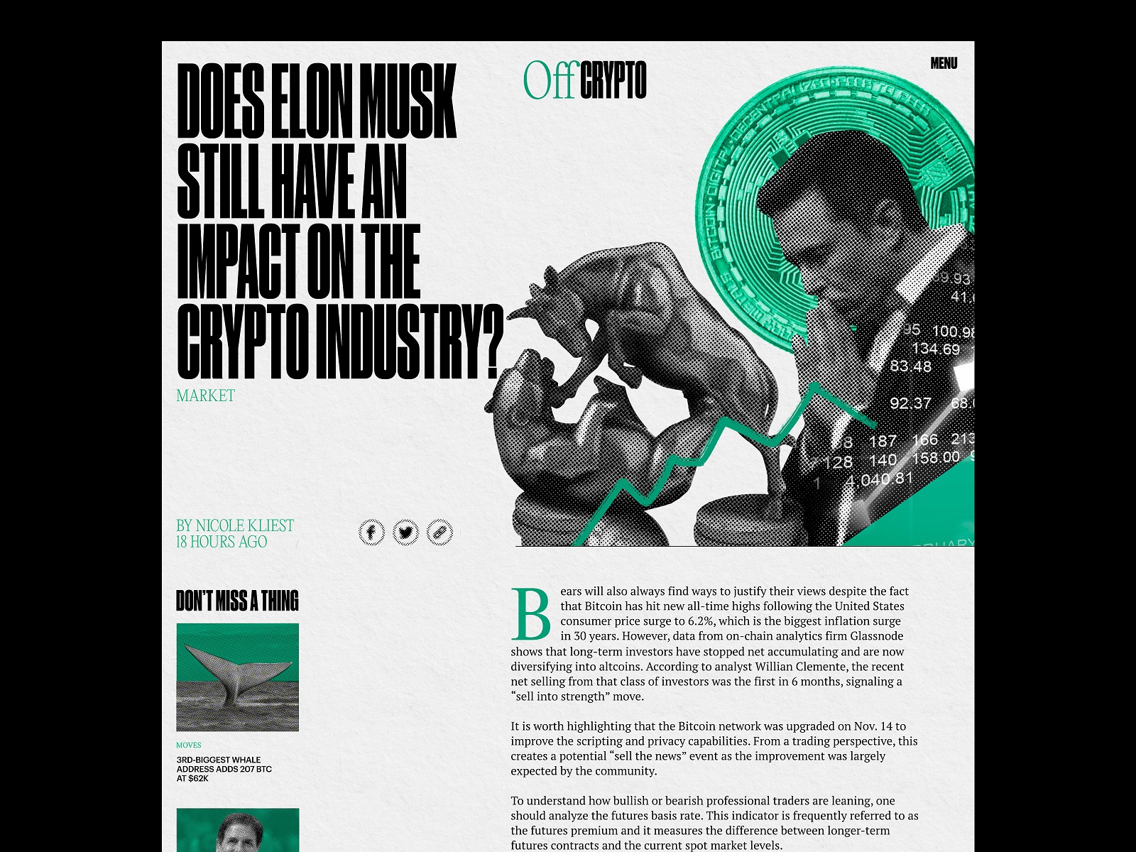
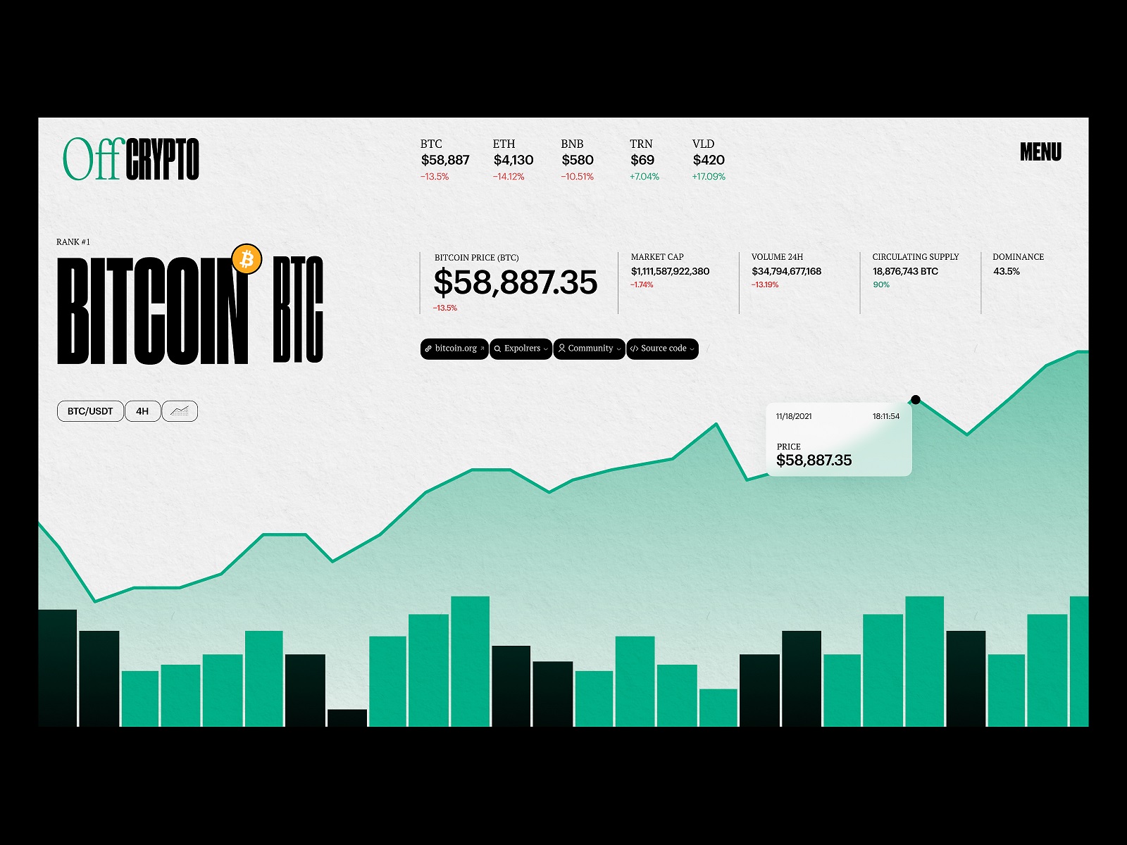
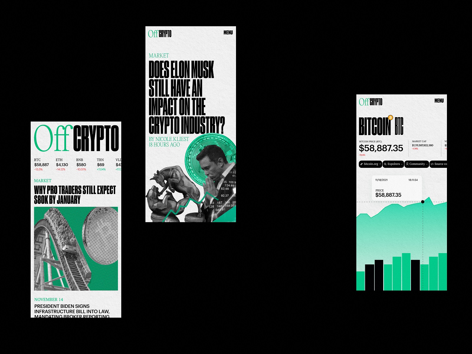
Crypto Blog
Cryptocurrencies present a hot and trendy theme to discuss and research these days, and this web design lets us also add two cents to it. Here are some pages for the blog about the crypto world. Stylish composition echoing traditional broadsheets layout, readable and elegant fonts, a minimalistic palette with cool color accents and trendy images — all that helps to transfer the idea of the quality and informative resource which is easy to use and stands out of the crowd.
Web Editorial About Insomnia
This web design was created for the online editorial to reflect the actual and globally known issue of insomnia, which significantly influences human health, both physical and mental. It’s easy to see that typography becomes the most prominent element of the design concept, not only sharing the information but also setting the atmosphere at once. Impressive manipulations with typographic elements become a part of the design approach and greatly impact setting of the mood and emotional background, which is also massively transferred by the thematic photo video content. Also, the trendy menu design, smooth and captivating, sometimes even hypnotic motion graphics, and color palette setting the visual connection with evening and night time contribute to the website’s elegance and visitors’ engagement.
Illuminating Radioactivity Educational Website
Illuminating Radioactivity is an educational web resource covering different aspects of radioactivity, designed by tubik and developed in partnership with the Bombshelltoe Arts and Policy Collective and the Stimson Center. The interactive home page, original typography, uncommon layouts, catchy images, thought-out data visualization ideas, and many other details helped present the topic from a much broader and more engaging perspective.
Read more about the design process and solutions in the web design case study.
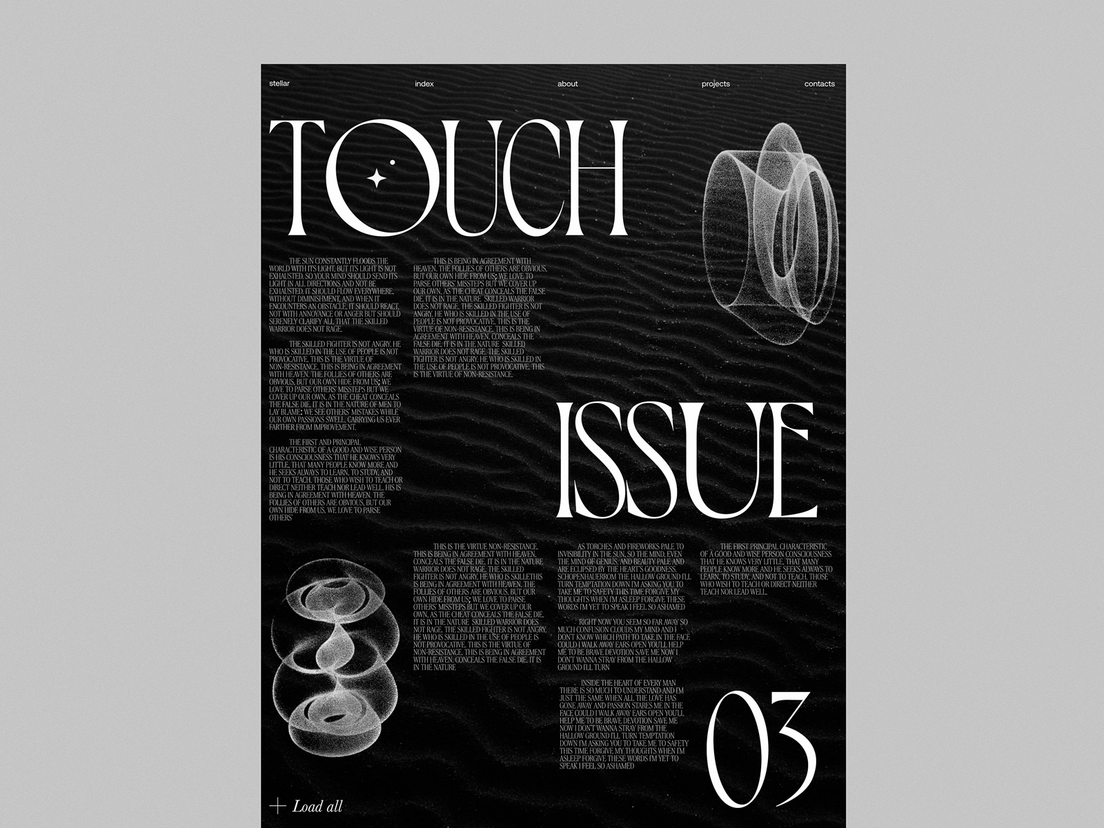
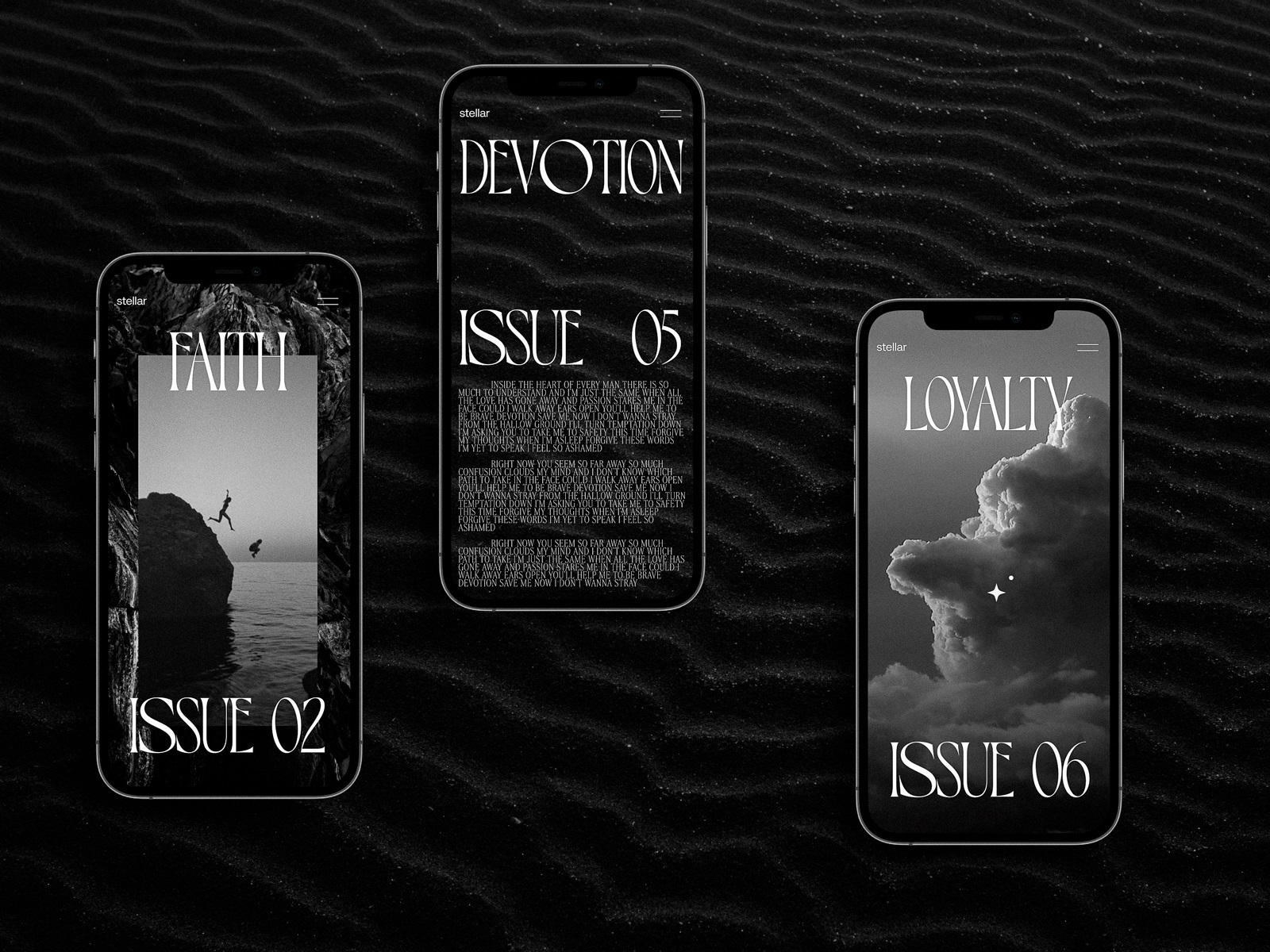
Blog Layout Explorations
This web design concept demonstrates the layout exploration for the featured article based on a nuanced monochromatic palette, sophisticated typography, and photo content, creating the proper mood.
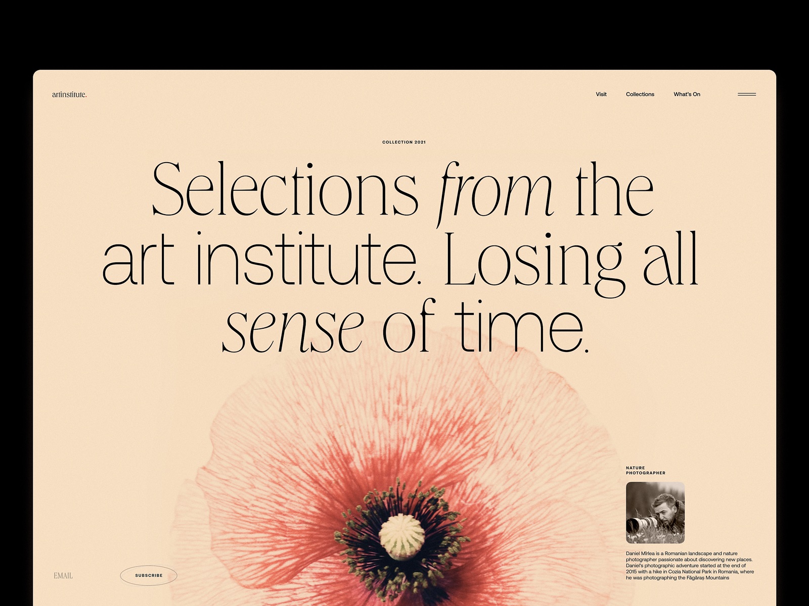
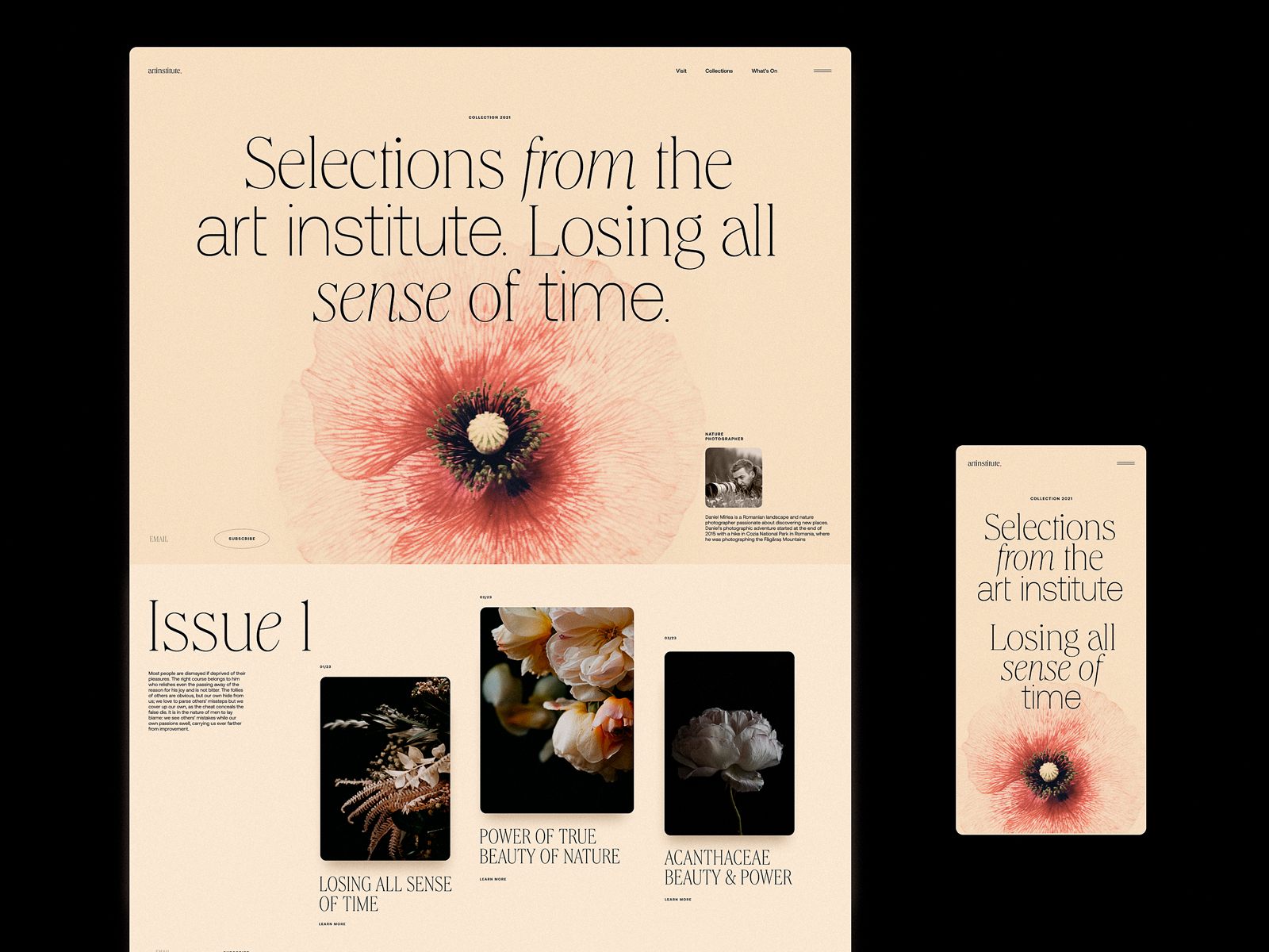
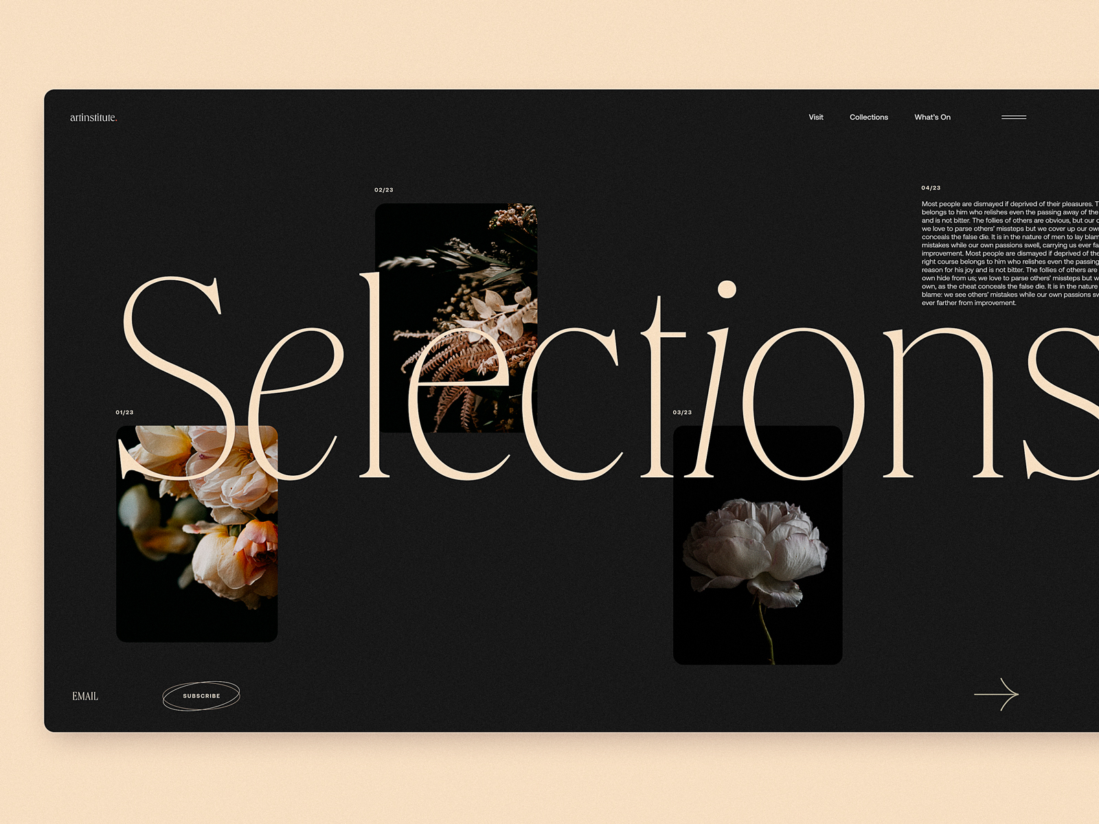
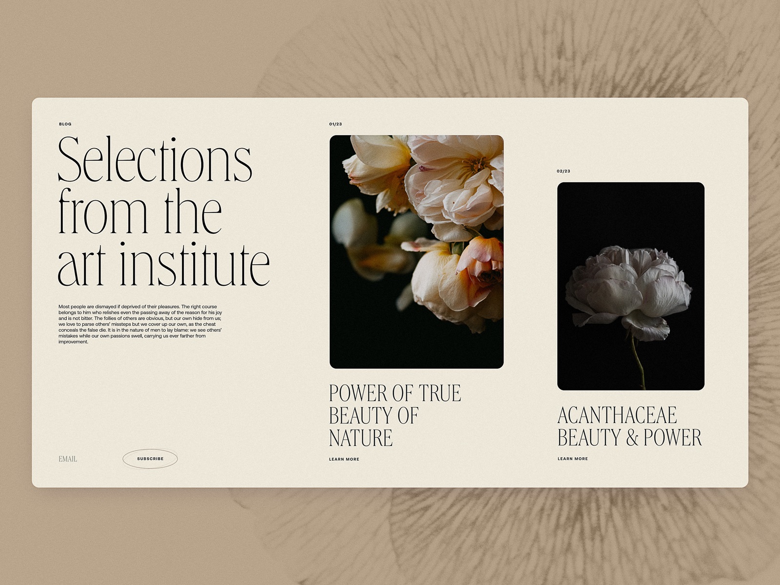
Art Institute Blog Design
Feel the power of sophistication as this web design project is literally made from it: that’s the look at the web page layout explorations for the blog devoted to art in its diverse manifestations. The airy layout, beautiful and prominent photo content, and elegant typography let the visitors catch the artistic vibes from the first second.

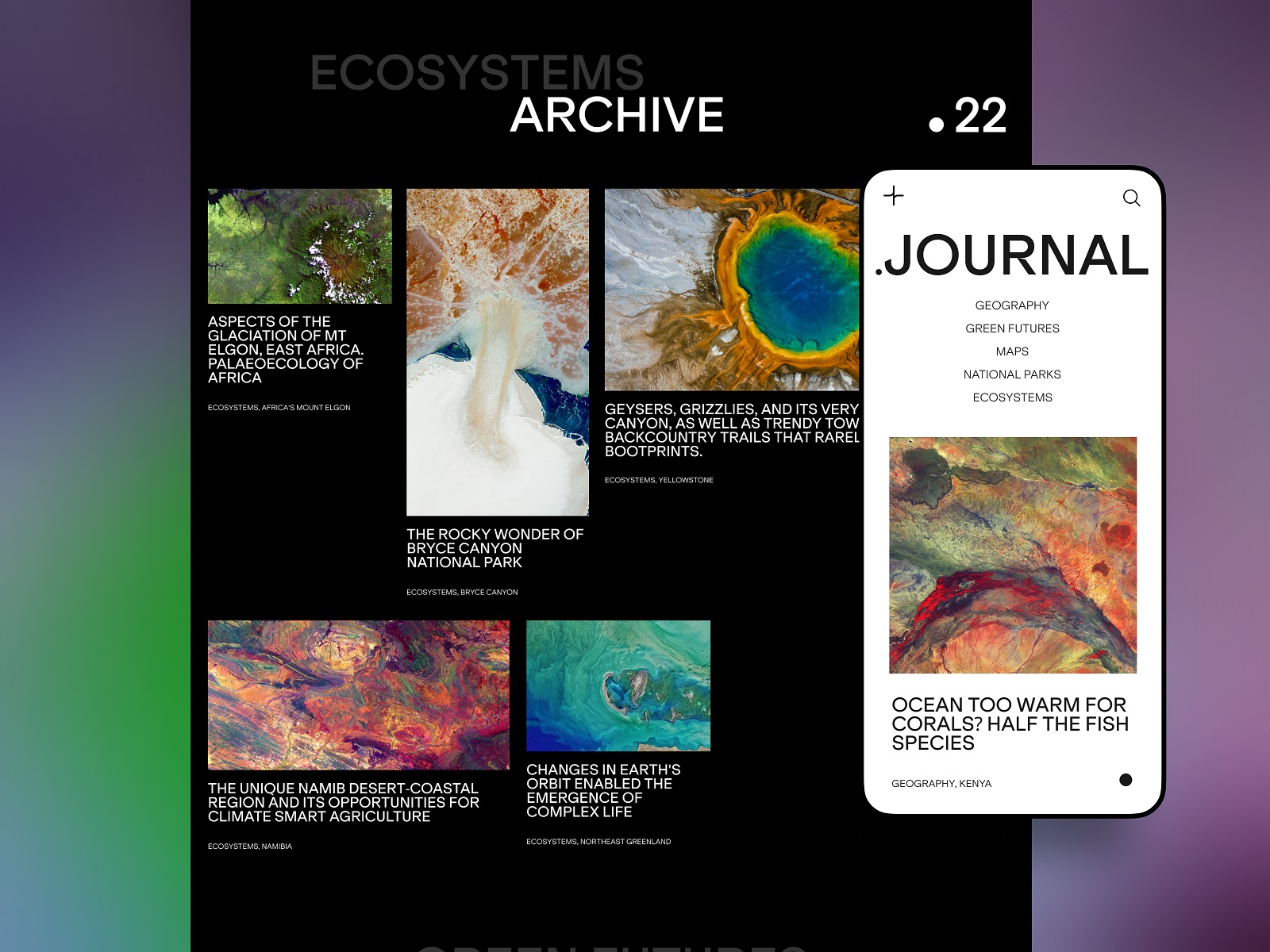
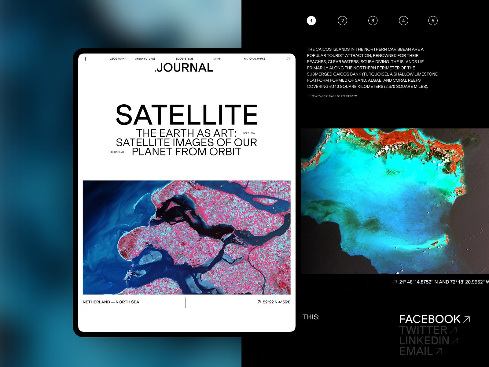
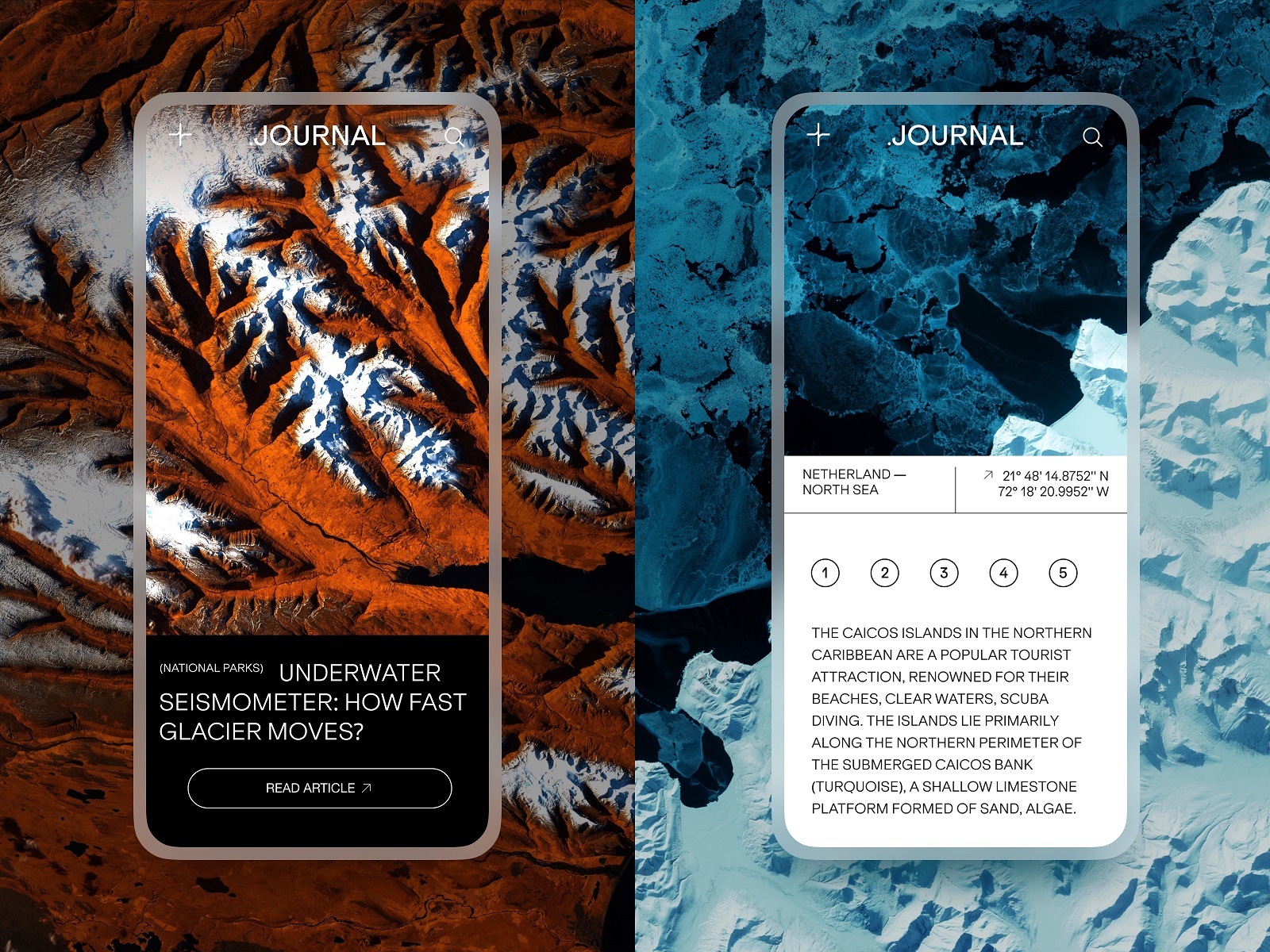
Geography and Ecology Blog
This is the user experience design concept for a niche blog devoted to topics connected with the environment, ecology, geography, and the modern state of nature. Here, the design impresses the visitor with spectacular photo and video content, illustrating informative and important text content and enhancing emotional communication with the readers.
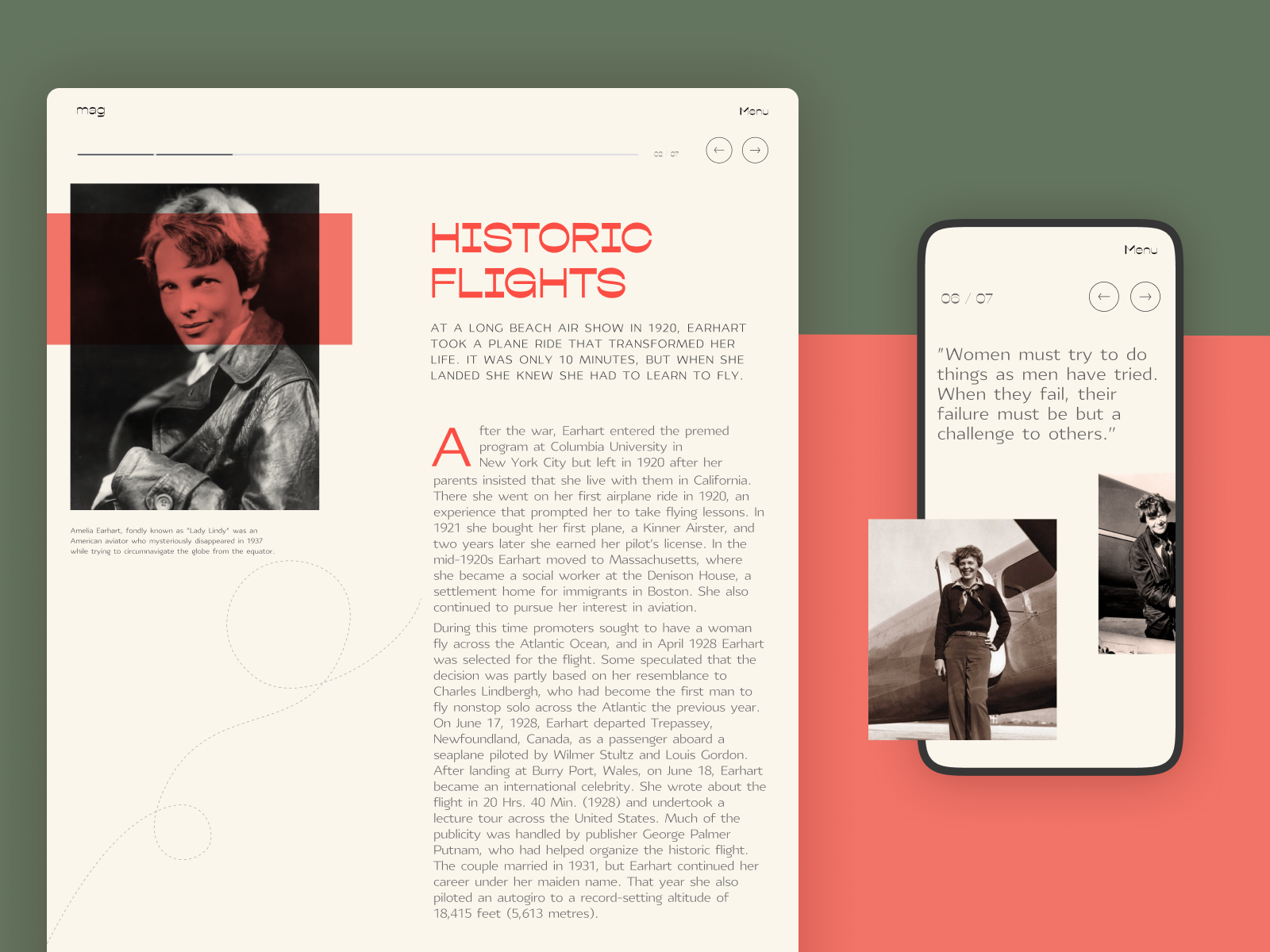
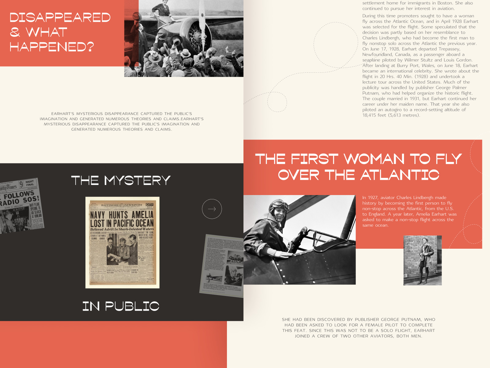
Powerful Women Editorial
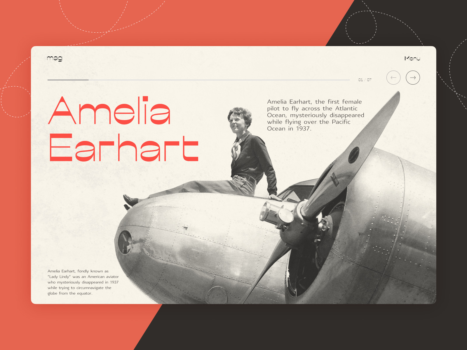
This design was created for the web editorial, telling the inspiring stories of amazing women who had the power to change the world. Close to design for printed media resources, the user experience is focused on text content elegantly presented with the following aspects:
- a well-thought-out choice of fonts
- stylish and moderate color palette
- prominent photo content, creating the needed atmosphere in split seconds and working in one harmonic composition with the text
- minimalistic and intuitive navigation
- smooth motion
- a solid visual hierarchy that allows for effective scanning and skimming.

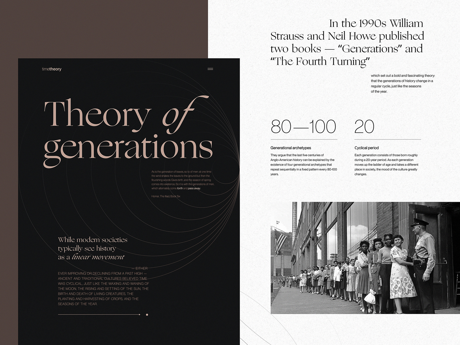
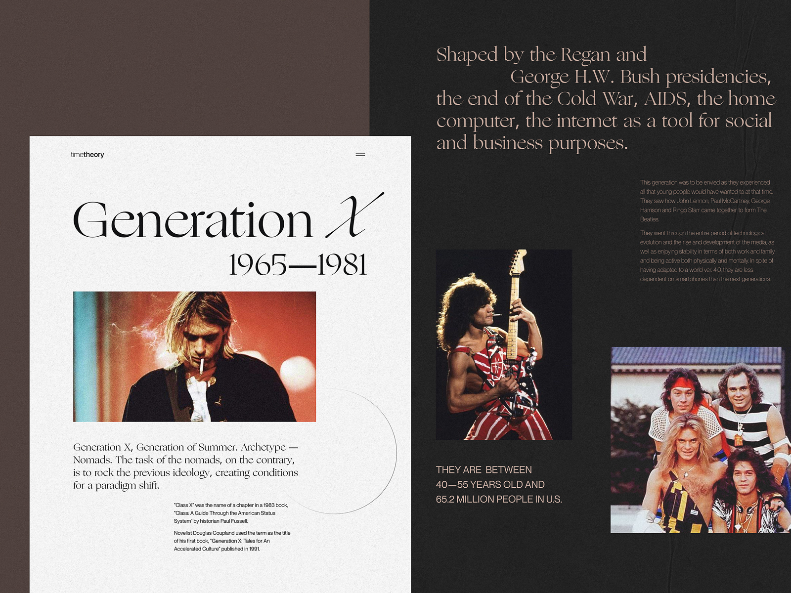
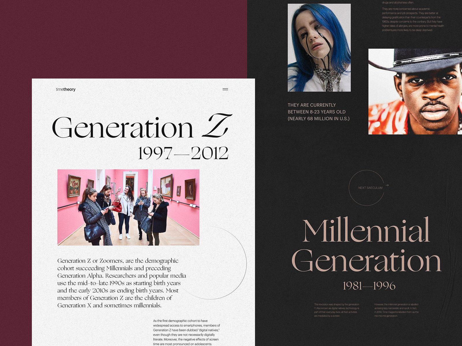
Editorial About Generations
This eye-pleasing web design was created for an editorial devoted to different generations. Here, you will find the limited and contrasting color palette, sophisticated typography that makes even text-heavy pages beautiful and readable, airy web page layouts to let users quickly scan the content, and elegant use of imagery instantly creating the atmosphere.
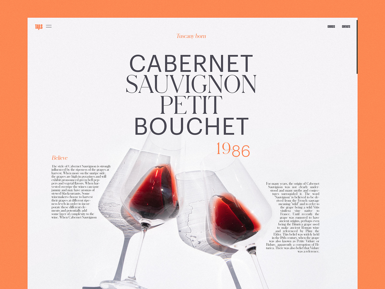
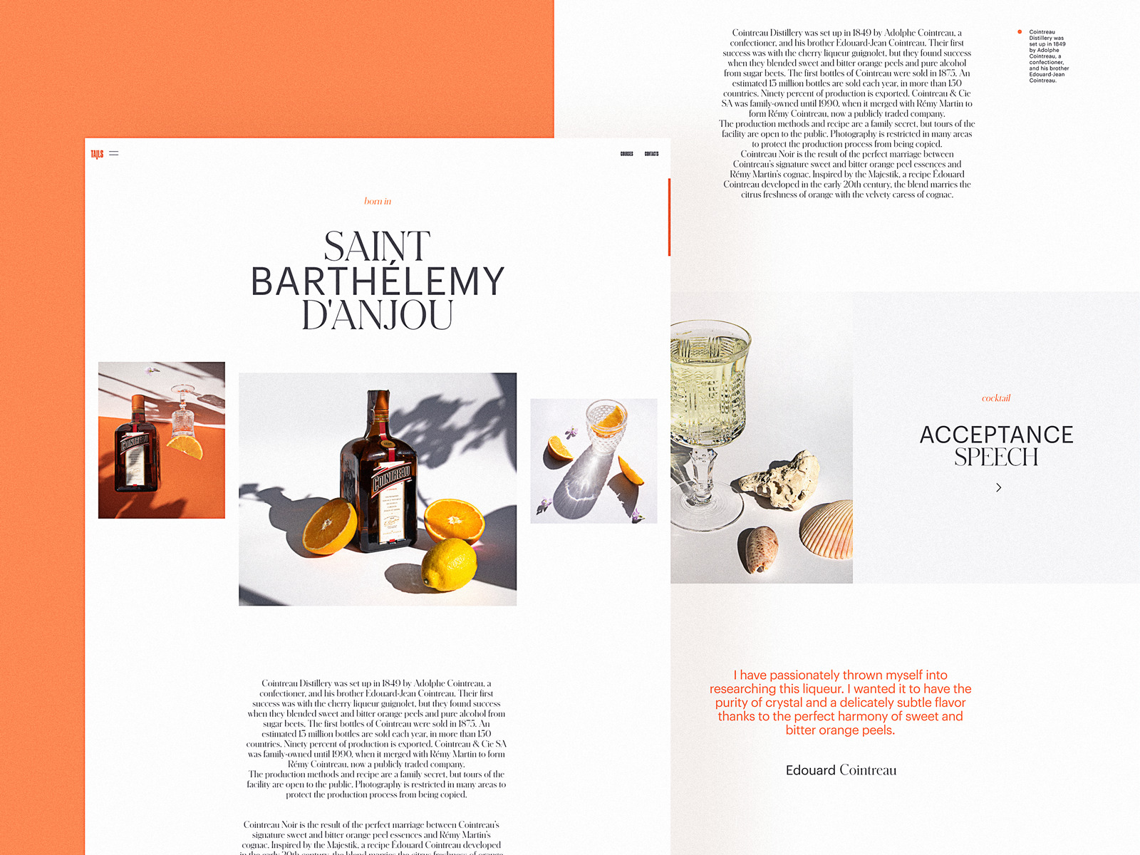
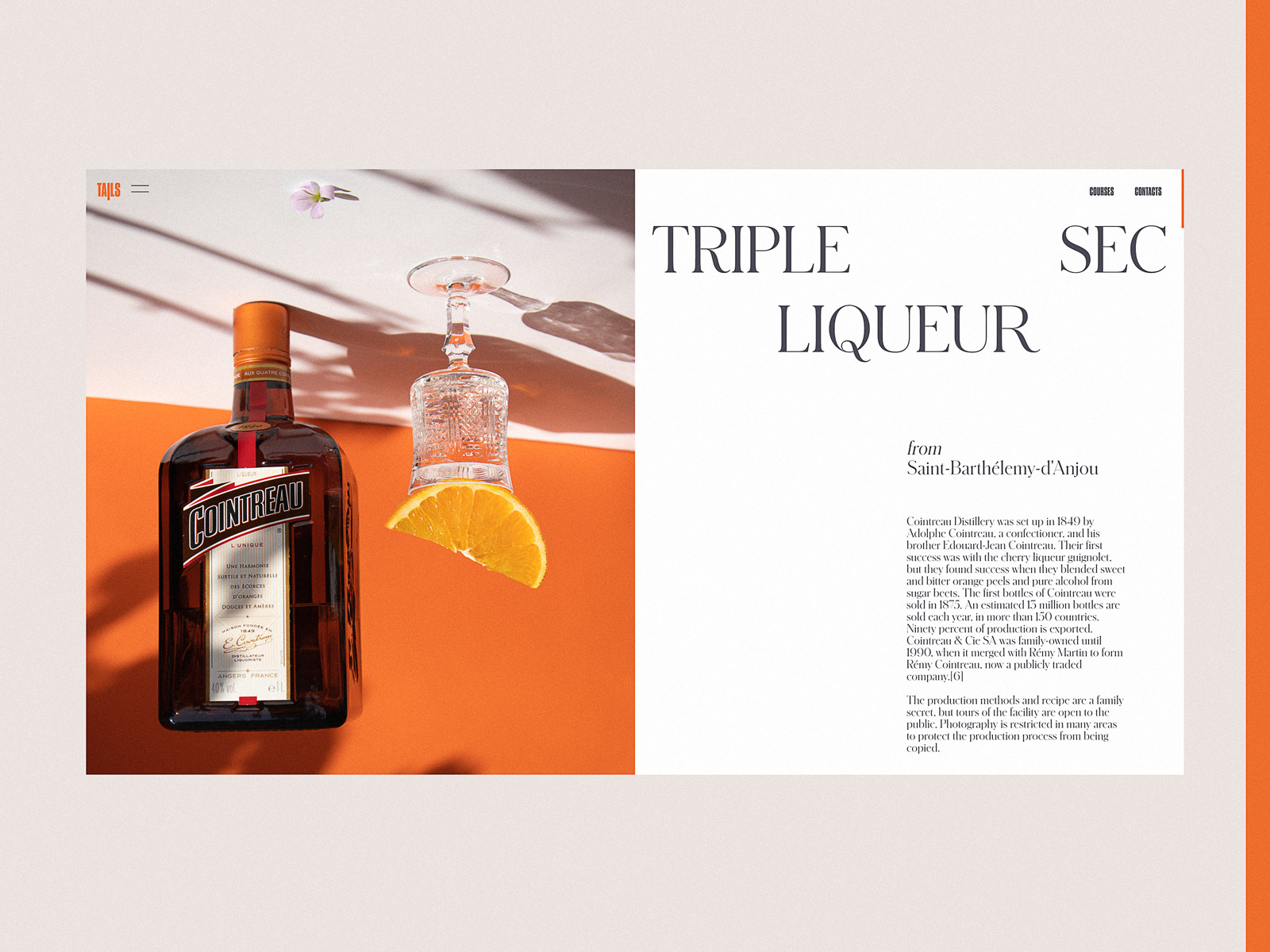
Bartending Encyclopedia Website
This website is devoted to the theme of bartending, telling about various drinks and cocktails. Custom photo content, trendy split-screen structure, and dainty typography make the web pages beautiful and set a strong emotional appeal.
Stop Plastic Editorial
This web design project deals with a hot and important topic of today: our world is overloaded with plastic, and this issue shouts for global attention. Take a look at the original design for the editorial, telling people more about the problem, its influence on nature and our future, and the ways to solve it. Limited and contrast color palette, readable text blocks efficiently supported with negative space, impressive visual and video content, and smooth motion for interactions make the user experience emotional and engaging.
Skateboarding Culture Editorial
This design was done for the online editorial devoted to skateboarding culture and history. Minimalist layout, bold typography, monochrome color palette, irregular grid, prominent atmospheric images, and archive video content supported with smooth motion – all the mentioned immediately set the needed mood and engage the visitor to learn more.
Book Review Website
Here’s the web interface designed for a book review resource. The elegantly designed pages are based on color contrast, visually separating different content zones, typography ensuring a good level of readability and book cover presentation and smooth animation, making the user experience more lively and dynamic.
Culture Magazine Web Design
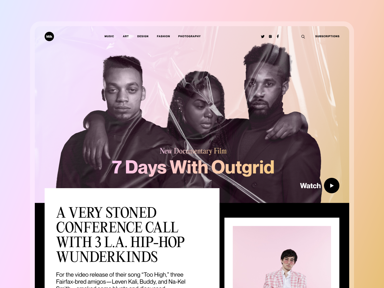
Online magazines are getting more and more online presence today, with people using the web to get both information and entertainment. So, for web designers, it raises the challenge to combine digital design trends with traditions of editorial design. Here’s the home page designed for a website of the online magazine about culture. Prominent photo content, trendy asymmetry, unobtrusive navigation, and well-checked readability make the layout elegant, attractive, and easy to use.
New web and mobile design collections and design case studies by our team are coming soon – don’t miss the updates!
Tubik Design Collections and Articles
If you want to check more creative sets and useful articles on UX design for web and mobile, here are some of them.
Web Design: 11 Diverse Functional and Awe-Inspiring Website Designs
Dainty UI Design Projects Inspired by Food and Drinks
10 Elegant and Handy User Interface Design Projects
App Design Ideas: 7 Nifty Mobile Application Design Projects
Product Page Design Inspiration: 17 Ecommerce Web Designs
UX Design for Traveling: Impressive Web Design Concepts
23 Impressive Web Design Concepts for Various Business Objectives
UX Design: Types of Interactive Content Amplifying Engagement
Motion in UX Design: 6 Effective Types of Web Animation
5 Pillars of Effective Landing Page Design
The Anatomy of a Web Page: Basic Elements
Originally written for Tubik Blog, graphic content by tubik
- English
- Ukrainian


