


Case Study: Educational Website About Radioactivity Phenomenon
Case Study: Educational Website About Radioactivity Phenomenon The design process for Illuminating Radioactivity, an impressive educational website covering the radioactivity phenomenon from different perspectives.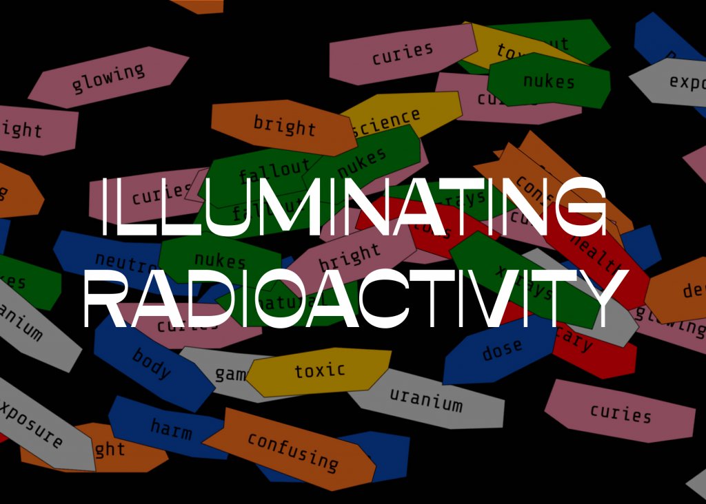
A new era of education requires new approaches and sets fresh challenges. However, it also provides educators with diverse new channels and media to reach their audience and cover the issues. Our today’s case study also shares a project of that kind. Welcome to read about the creative process for Illuminating Radioactivity, an impressive educational website designed by the tubik agency and showing how thoughtful and daring design changes the approach to modern education.
Project
Web and graphic design for an online educational resource covering different aspects of radioactivity.
Client and Idea
Although known more for quite a poor reputation, radiation as a phenomenon is presented by not only tragic but also curious and inspiring stories, facts, and findings. The clients set an objective:
- to experiment with the interweaving and creative retelling of these complex narratives,
- to push the common perception of the radiation phenomenon,
- to diversify and broaden the knowledge about radiation.
They wanted the project to revitalize the collective understanding and embolden people to be responsible custodians of our radioactive world.
As for the client side, Illuminating Radioactivity is generously supported by the Stevens Institute of Technology. It was developed in partnership with the Bombshelltoe Arts and Policy Collective and the Stimson Center. In addition to the website, a part of the project is the book Atomic Sublime by Lovely Umayam and Tammy Nguyen.
Design
The main creative direction the Tubik team got to realize by design and content presentation was changing the perspective of a common vision of the radioactivity phenomenon. In particular, the website had to present a lot of various information from experts and scientists in a comprehensible, digestible, and engaging way for a wide and diverse audience. The content visual performance had to shift the understanding of radioactivity as something negative to a much broader outlook, including the positive side as well.
The first iteration of web design was corresponding to educational needs: airy and elegant, simple and intuitive, somehow looking like a beautiful textbook. And that was the moment when the client got totally sure they wanted something absolutely uncommon and even revolutionary. They strived for the design breaking standards and stereotypes as the project idea in its essence aimed at breaking standard thinking about radioactivity.
So, Tubik designers developed a totally new concept of visual style and interactions.
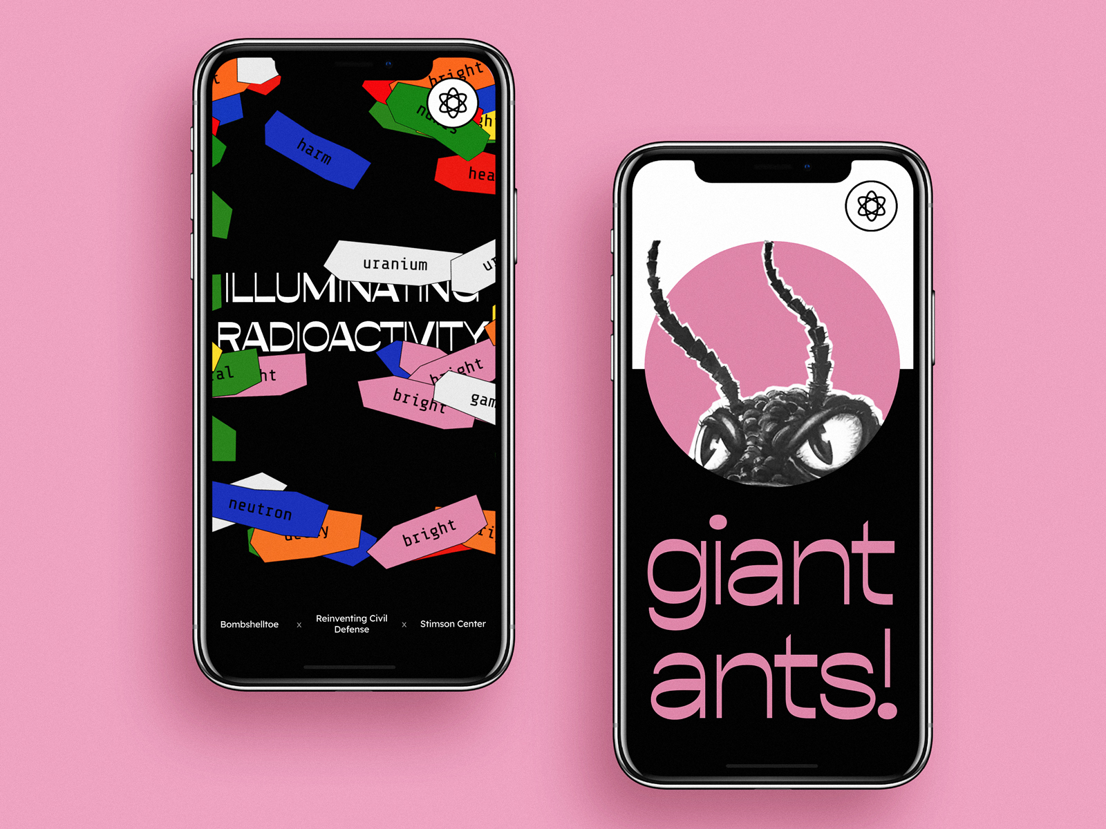
Interactive Home Page
One of the clients’ wishes was to make the home page interactive. There are many stereotypical associations about radiation, mostly negative. The clients’ idea was to add the interactive form on the home page and offer visitors to input the associations they had about radioactivity. Yet, designers got them quickly convinced that offering a newcomer not knowing much about the website to take some effort was not the best way to go. Instead, they came up with an idea of a super interactive page. It opens the field full of bright tags featuring popular characteristics of radioactivity and hiding the name of the project. Moving the mouse cursor, users remove the tags, as well as the website, is going to erase the common stereotypes about the theme of radioactivity.
Typography
As text content is the core of the informational value of the project and readers have to interact with it much, the choice of typography means was one of the most important stages of the design process. The main font used for the title elements is also symbolic. It is called Opposite, and it was chosen for its original, attractive, and irregular geometry of characters. Amazingly, even the font supported the objective of setting the opposite direction to the global understanding of radioactivity.
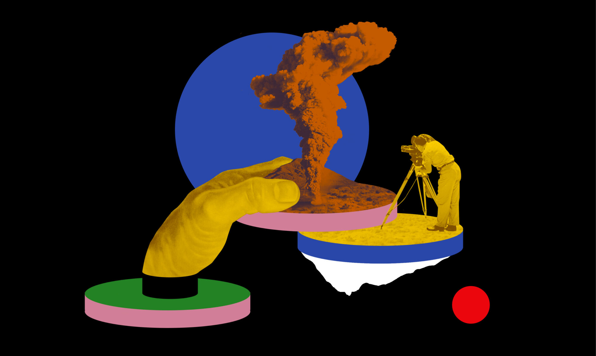
Images and Animation
To step aside from the traditional presentation of archive photos and graphics, massive work was done on images. The major type of visual content for the website is trendy and catchy collages with a vibe of brutalism and livened with smooth animation.
Keeping the balance of text blocks and images integrated into the narration, the designers performed such a serious theme and content in a way that wouldn’t let the users feel bored.
Each section of the website also has a theme collage and a specific color solution. Together with the long-scroll structure, all that creates the amazing experience of engaging storytelling.
Details
There are also other design details that are worth mentioning as they added their two precious cents to cool interactions:
- an interactive cursor with dynamic visual effects supports the theme
- the effect of visual noise is added to all the website pages to amplify the atmosphere
- some of the website parts also feature the sound imitating the Geiger counter
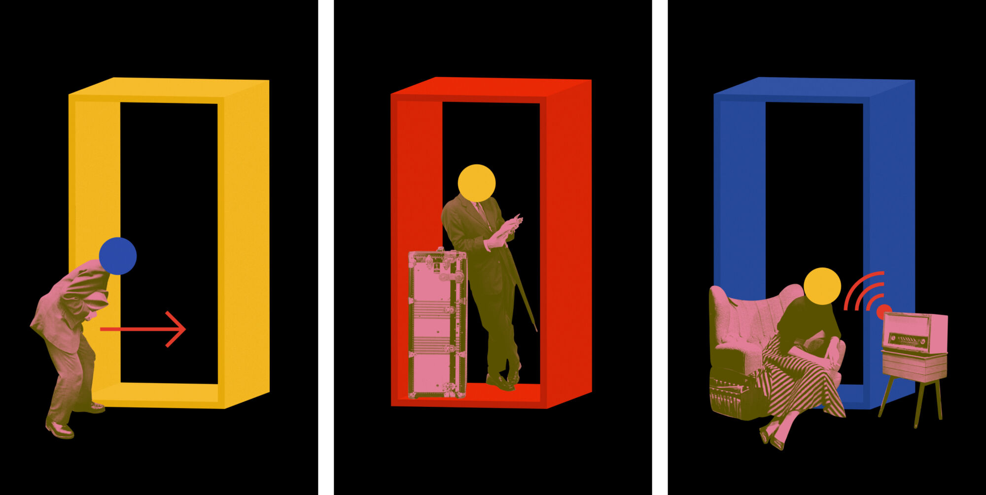
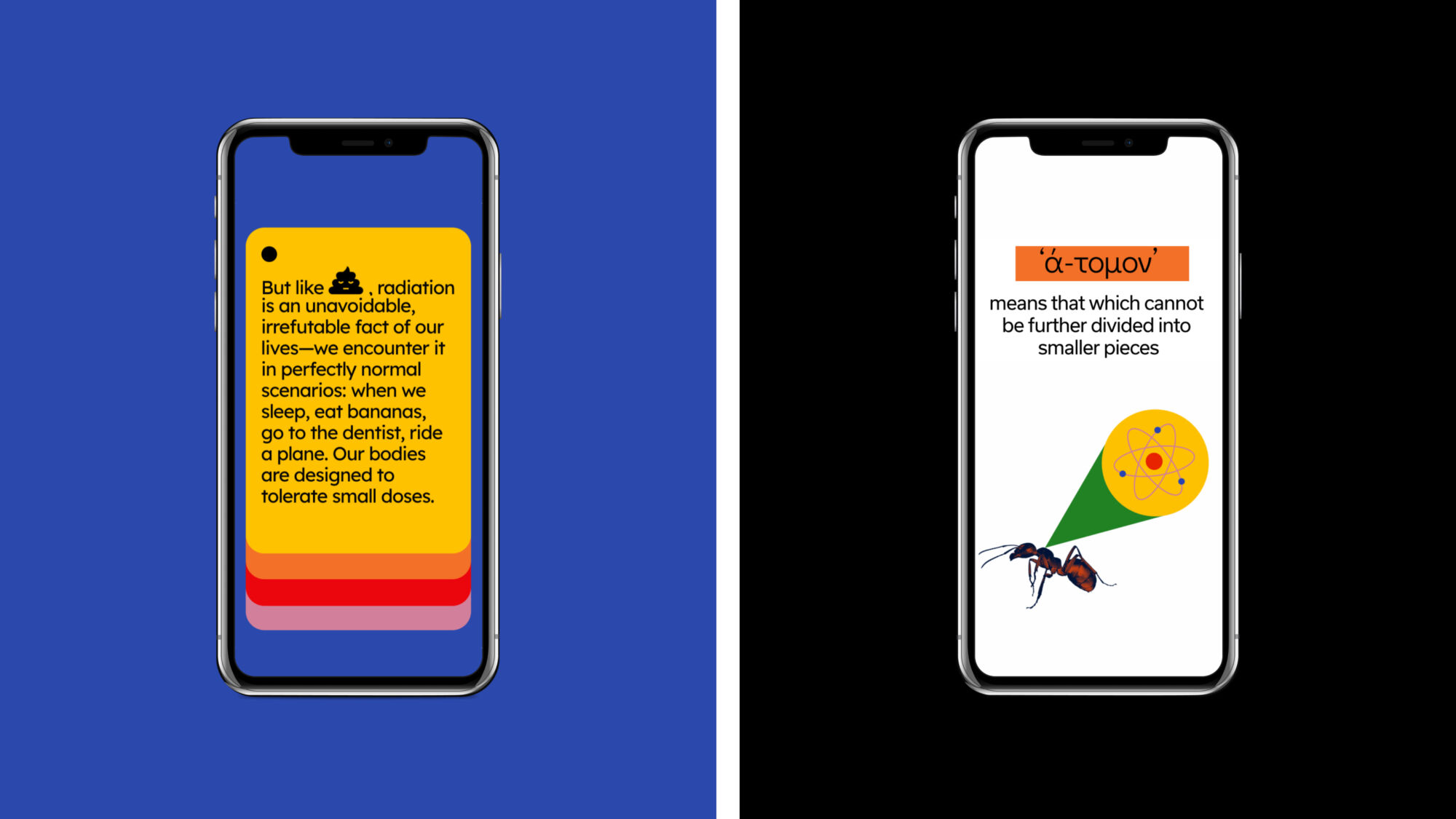
- the pages devoted to the findings of particular scientists break the long bulks of information into several bright cards, changing one another in the process of the scroll and making text consumption easier
Technically, the base platform to realize the project was Readymag. When the general stylistic concept of the visual performance was agreed upon, the designers moved right to Readymag and built all the user experience with it from the very start. This way, they could check directly and in no time how the interactions and animation work together with the diversity of text and backgrounds.
The mobile adaptation of the website was also designed to impress visitors independently of their device choice.
No doubt, that was a super informative experience for all sides. The design team had to dive deep into the theme and work in tight collaboration with experts to make the website not only attractive and unique but also readable and trustworthy. This impressive website was recognized as a Site of the Day on Awwwards.
Check the live Illuminating Radioactivity website to find not only useful information but also bright and original design solutions.
More Design Case Studies
Here’s a set of more case studies sharing the design solutions and approaches for some of the UX design projects by tubik.
BlockStock. Brand Identity and Website for Minecraft Models Resource
Roebuck. Mobile Design and Illustrations for Educational App
Lumen. Website for Museum of Mountain Photography
GNO Blankets. Branding and Web Design for Ecommerce
Designer AI. Dashboard and Graphics for Fashion Service
Pazi. UX and UI Design for Vehicle Safety Mobile App
CashMetrics. UX Design for Finance Management Service
Bitex. UX Design for Stock Analysis App
Tasty Burger. UI Design for Food Ordering App
Slumber. Mobile UI Design for Healthy Sleeping
Originally written for Tubik Blog, graphic and video content by tubik
- English
- Ukrainian