Interface Animation: Eye-Pleasing, Problem-Solving
Interface Animation: Eye-Pleasing, Problem-Solving The article focused on problem-solving potential of animation in user interfaces. Types of problems users can have in UI interactions and animated solutions for them.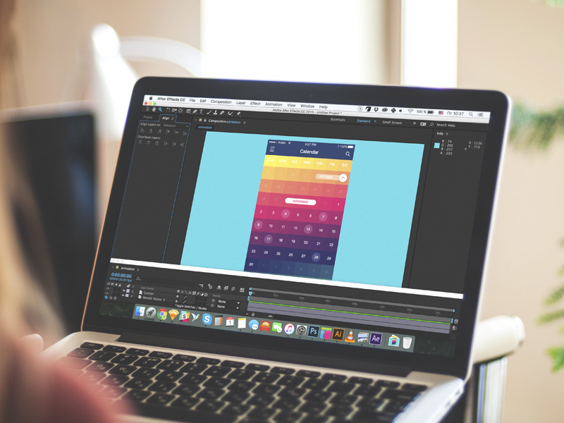
Animation applied in user interfaces is the topic drawing high attention and provoking hot debates nowadays. Although there is a big army of those who find animation an unnecessary feature overloading user interface and making it more complicated, most users expect motion as an integral part of interaction experience. So, designers and developers work over more and more sophisticated methods to make animation pleasant-looking and problem-solving characteristics of modern apps and websites.
Why do users love motion so much? Mostly, because animation supports the essence of actual and real interaction, it creates the level of feelings and perception close to what people have when they are interacting with a physical object in real life. This sort of feeling can boost user experience rate of positiveness really high as the more natural user feels, the less effort is needed to deal with the app or a website, and the more clear it is how it works. Certainly, it makes users satisfied. No secret, satisfaction, and pleasure are among top things encouraging people to use the product again.
Like everything that is put into the interface and process of interaction with it, the animation must be a functional element, not just a decor. Considering motion elements while planning user journey around the digital product, the designer should deeply analyze its potential for increasing usability, utility, and desirability of the product before making a decision to apply it in the layout or transitions. Animation in UI requires a thoughtful approach and always needs to have a clear purpose set behind. The advantages and utility of using it in the interaction process have to be obvious and outweighing the possible disadvantages. Animation should become icing on the cake, not a fly in the ointment.
Define the problem
One of the best approaches to make animation functional not only attractive is to reveal the problems that it potentially can solve. It can be done at all the stages of the design process:
– user research will let you know who the target users are, what’s their age, preferences, the level of tech literacy, environments and conditions at which the product will be used, and plenty of other factors from the users’ side that can influence user experience;
– marketing research will give the insights of existing products, their strong and weak sides as well as methods of forming user loyalty, which is the good basis for defining USP solving particular users’ problems as well as original ways of the product presentation and performance;
– UX wireframing stage will enable to think over the logic of interaction, layout, and transitions and get the first assumptions of the points which can be strengthened with animation;
– prototyping stage will reveal new aspects of live interaction with the screens;
– UI design stage will provide the complex of visual presentation for the product scheme and system setting a new perspective of applying animation into the app or website;
– user testing will show if the decisions made about animated elements were correct and their benefits really outweigh possible pitfalls.
At every stage, if the designer sets the goal to reveal possible big or small problems users can have, animation, as well as any other design element, can take the role of problem-solver for the case.
Let’s review some typical problems that can be solved by means of interface animation.
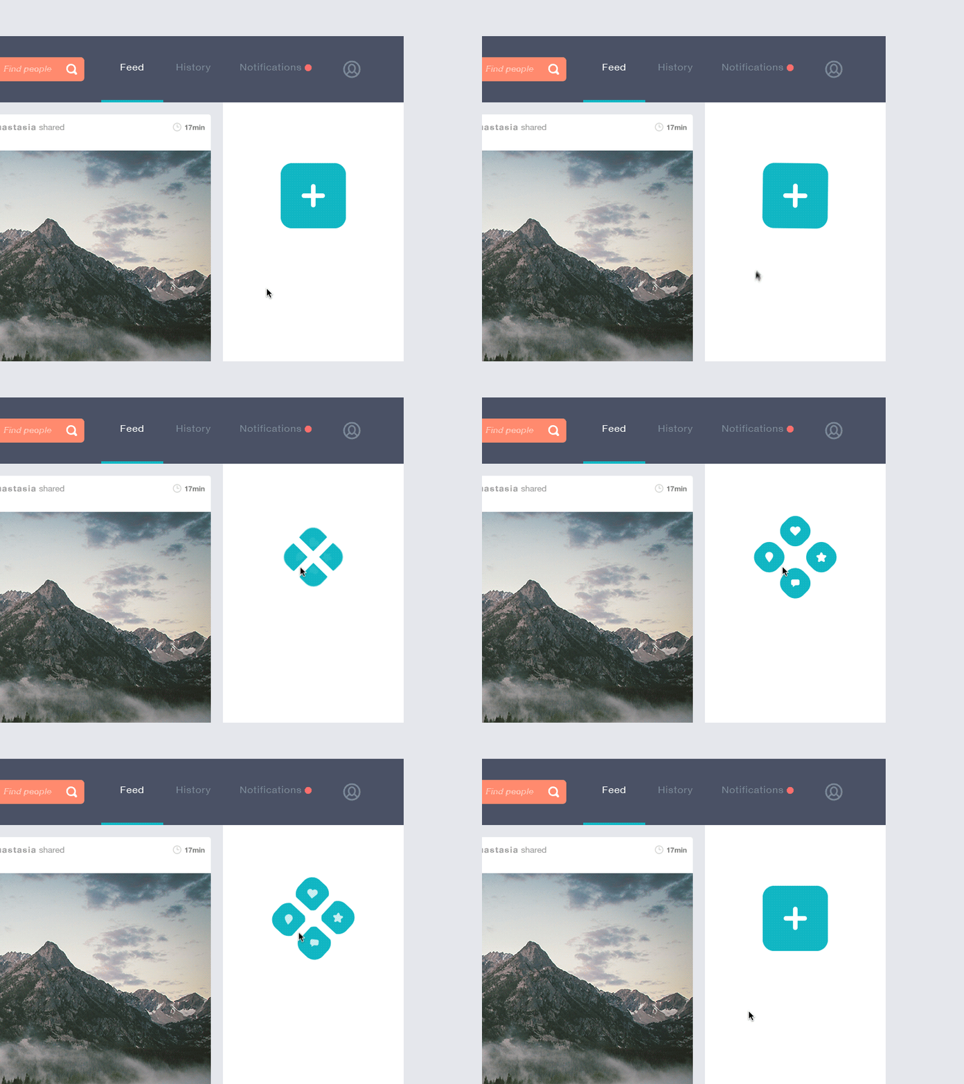
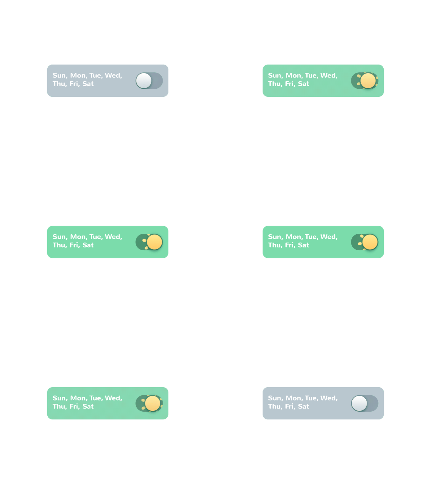
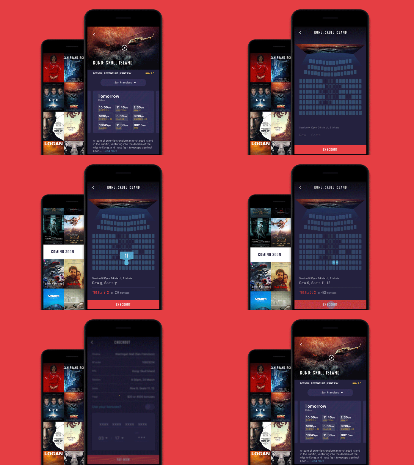
Problem: I want to know the action is done.
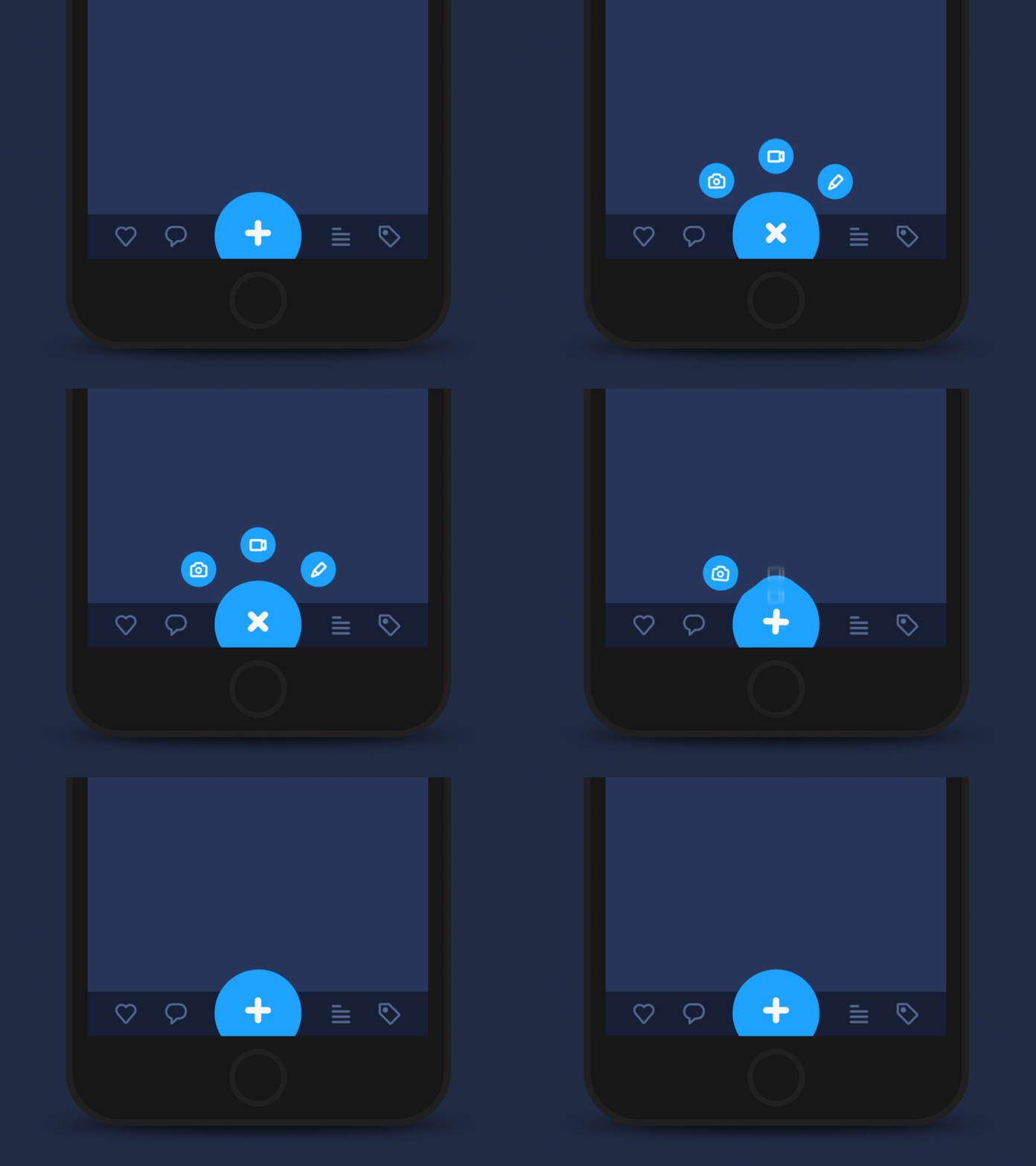
This is one of the problems that can be easily and quickly solved by animated details applied in UI. Microinteractions supported by clear finalization via motion create fast feedback for the user and make the experience positive and efficient while navigation simple and intuitive. Animated buttons, switches, toggles, and other interactive elements inform the user in split seconds activating all the potential of fast visual perception.

Hamburger button interaction
Tab Bar interaction
Add Button interaction
Problem: I want to know that action is in progress.
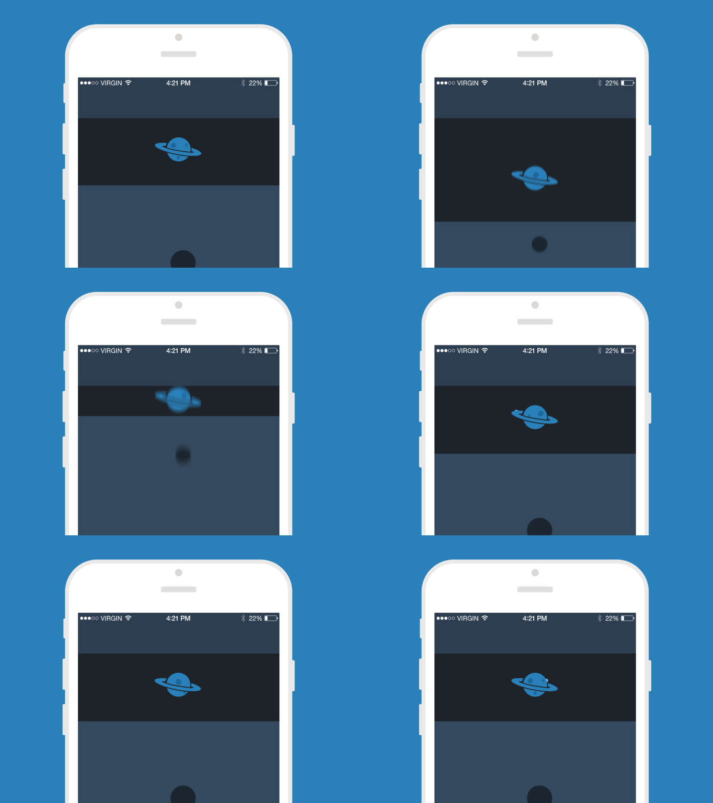
This is also a huge area of application for diverse motion design potential. When users interact with a digital product, they want to know what is going on at every single step. Making users wait in uncertainty is the risk of losing those users. Still, when users are informed, waiting can be not so annoying and stressful. So, this aspect should always be taken into account and there are many ways to support it via interface animation. This is the high time for pull-to-refresh indicators to come into play and show their best.

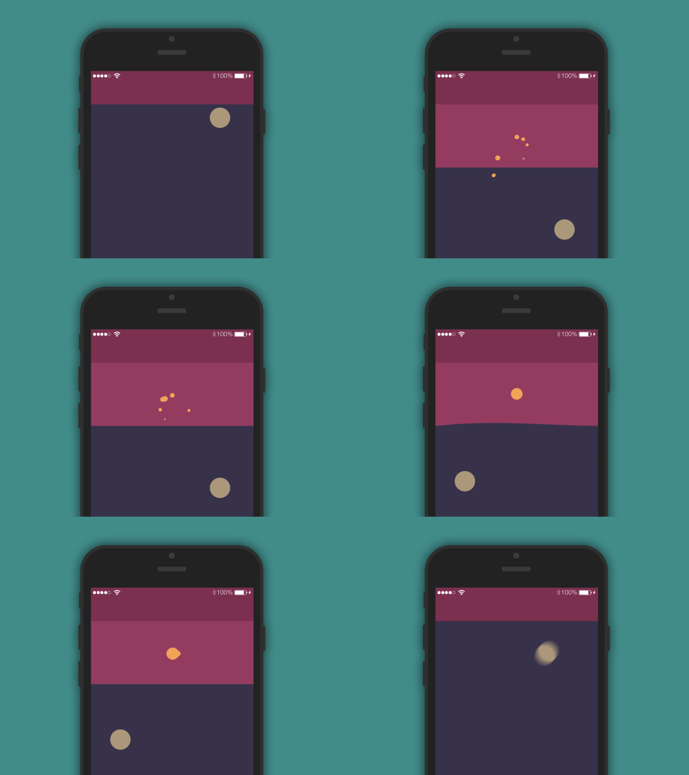
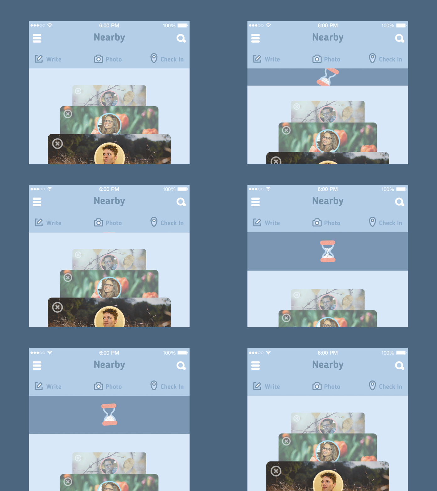
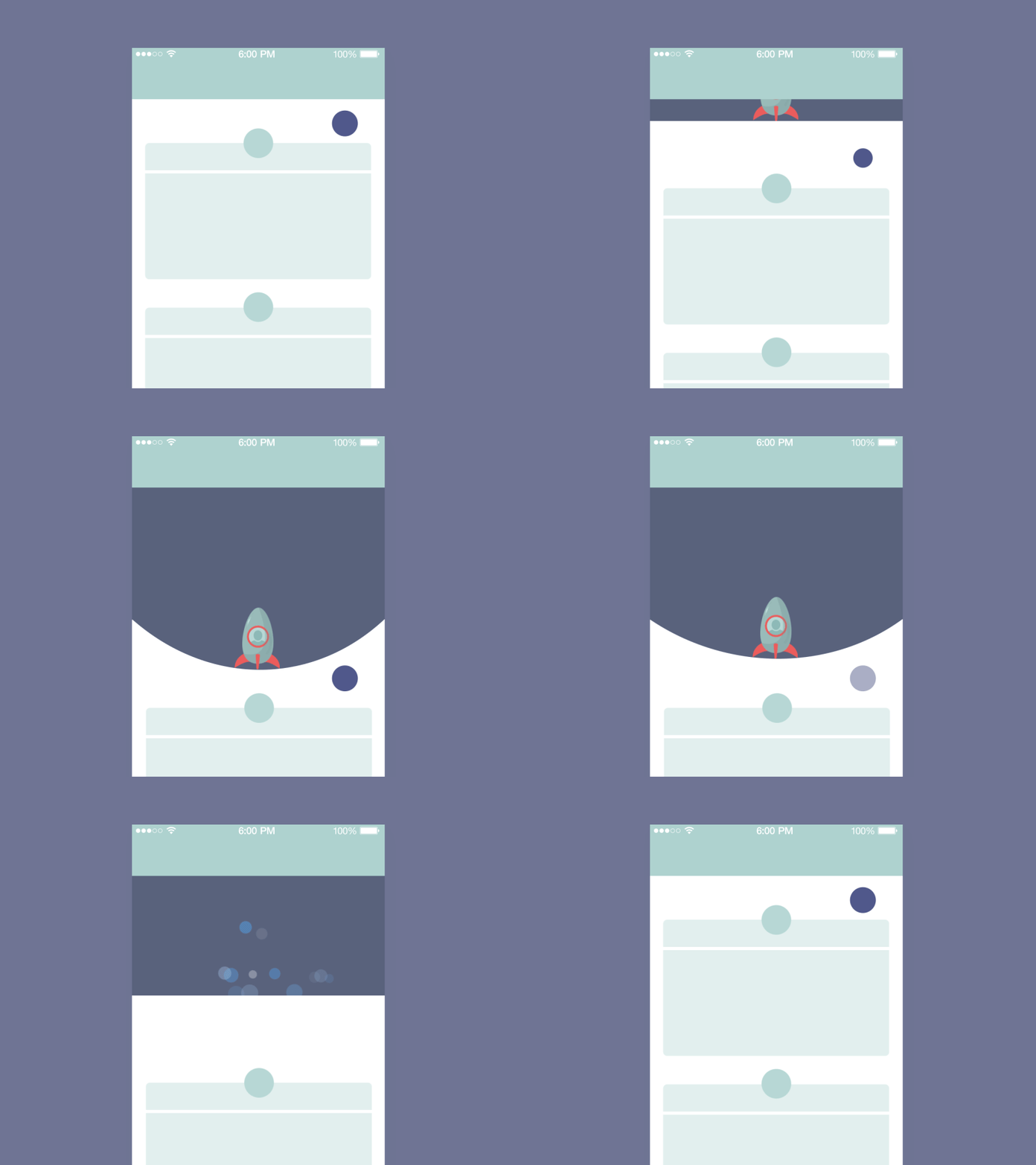
Problem: I can’t see the progress and don’t understand how long it will take.
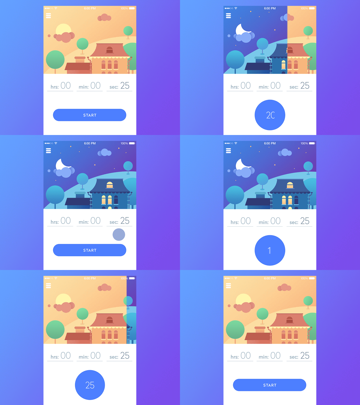
Quite often it’s not enough just to let users know that the process is going on. They often want more: to see how fast it is progressing and how long it will take. Again, interface animation can be a great helper here. Load bars and progress bars, animated timelines, and other dynamic elements can kill several birds with one stone:
– they inform the user about the level of progress
– they can become the entertaining element blunting negative experience of waiting in the process of interaction
– designed and animated in an original way, they can become a viral feature that users will want to share with others and engage more users into action.
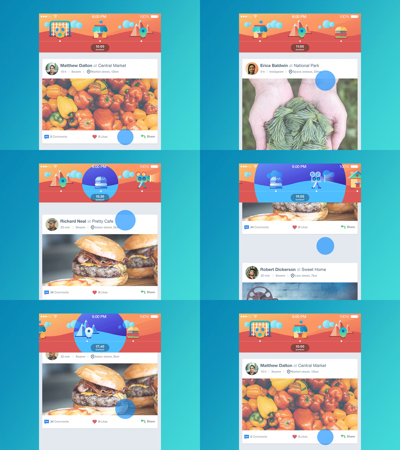
Problem: I don’t want to make my screen a mess.
That is really a vital thing to think over in the interface design. If the screen or page looks like mess overloaded with tons of data which is not clearly organized, it will require additional effort from the user to understand how it works and where the needed information can be found. The more effort, the higher chances are getting that users will go away in search of a simpler solution. In the vast majority of cases users wish to have apps and websites that will simplify and improve their life, perhaps even will do some job for them rather than will take additional effort and time on interaction. Animation can be a good way to enhance interaction with various data blocks and sections and make everything feel organized even in highly data-saturated and complex interfaces.
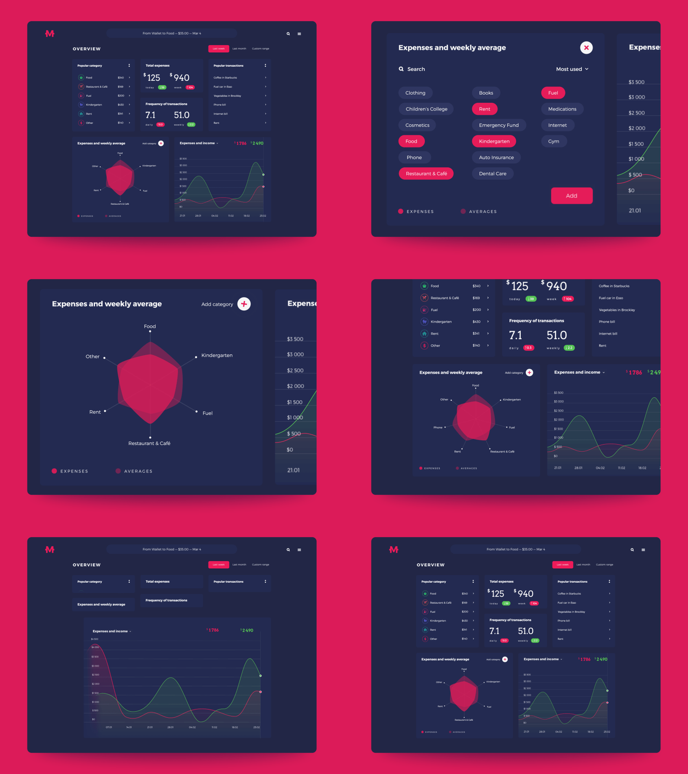
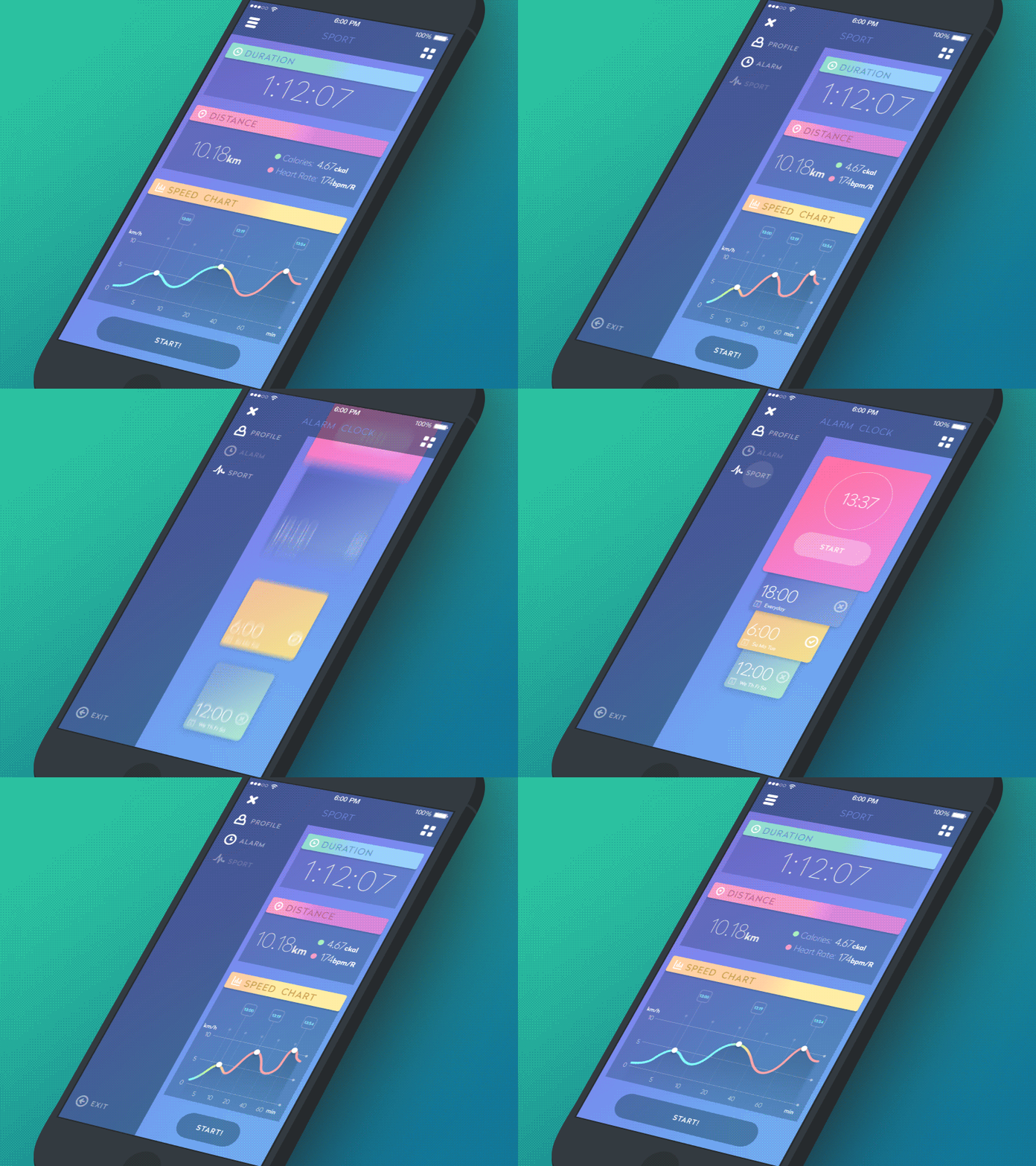
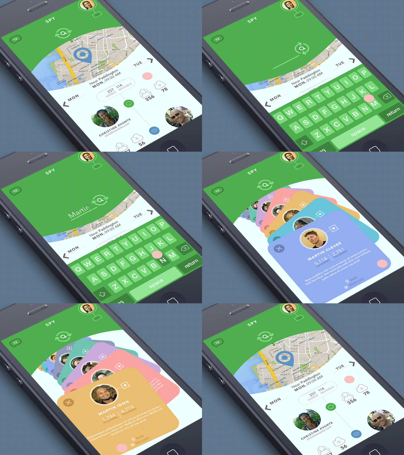
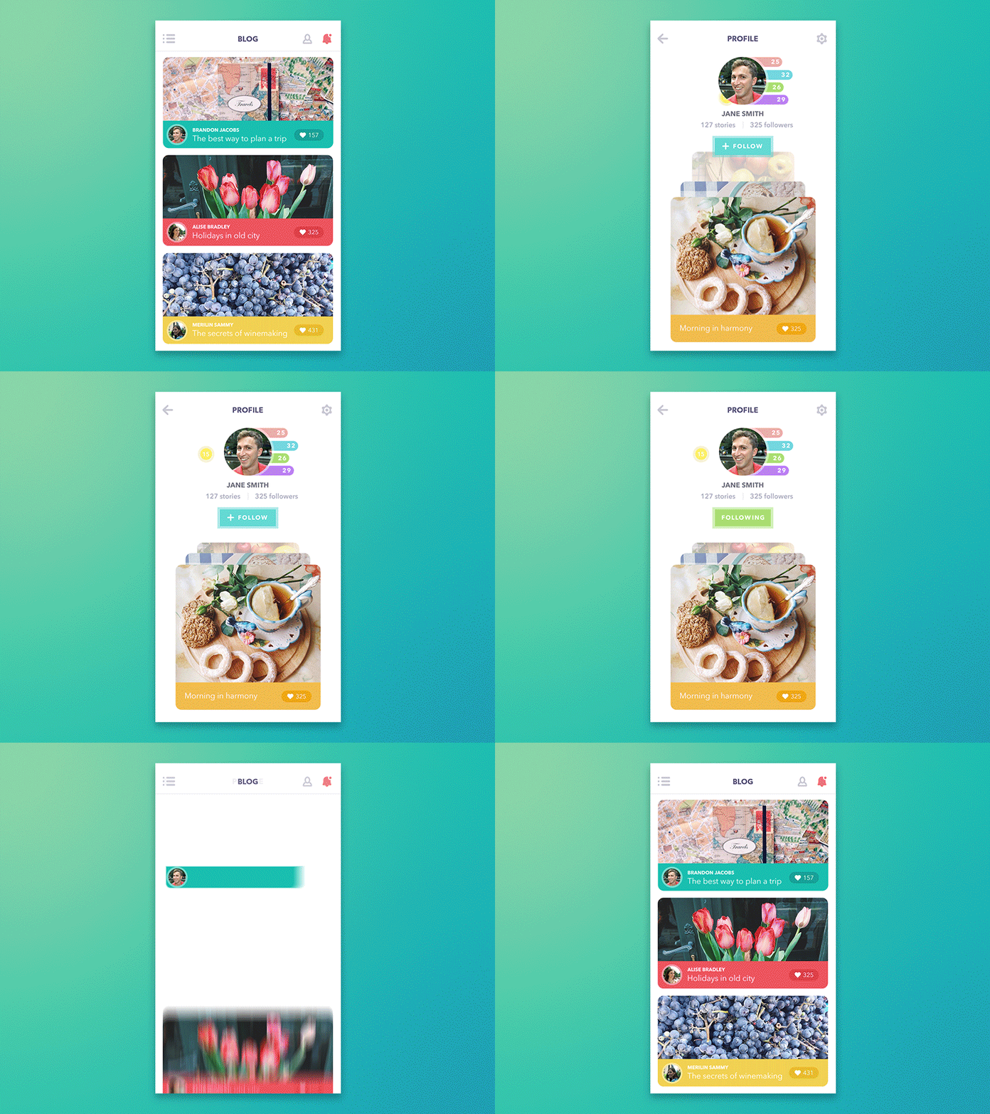
Problem: I want to see the key things first.
Visual hierarchy and clear navigation are always a great concern for designers creating an interactive digital product. Users’ attention should be immediately drawn to the key element of interaction according to its goal and conditions. Animated interface elements present great supportive force for this aspect, enabling faster and more distinct visual marking of important elements in the layout.
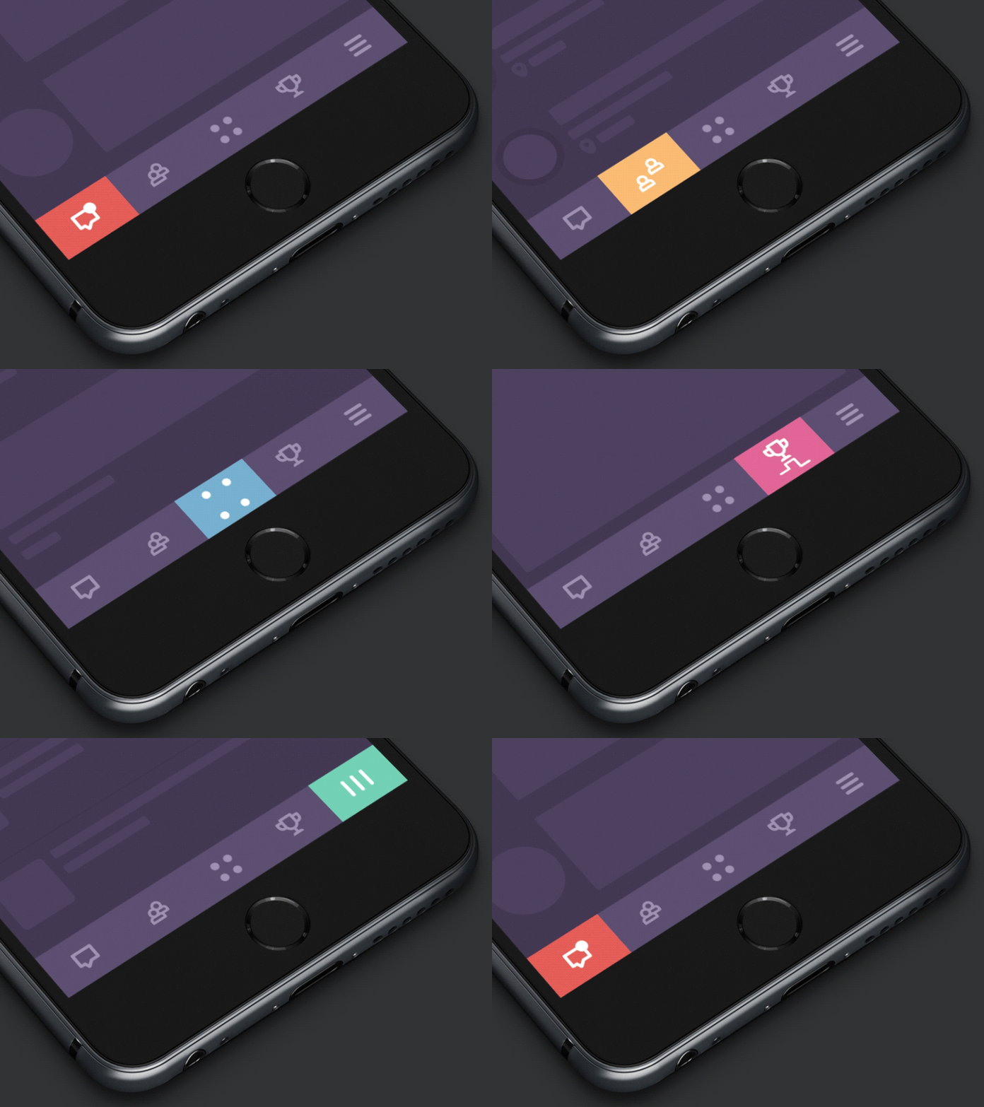
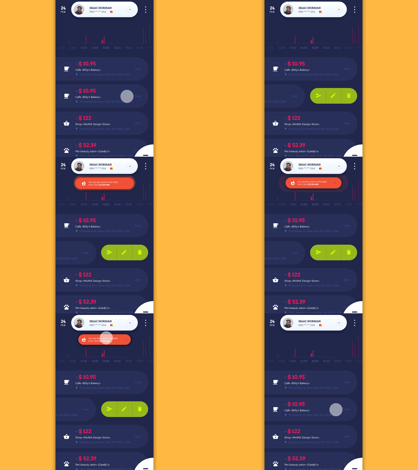
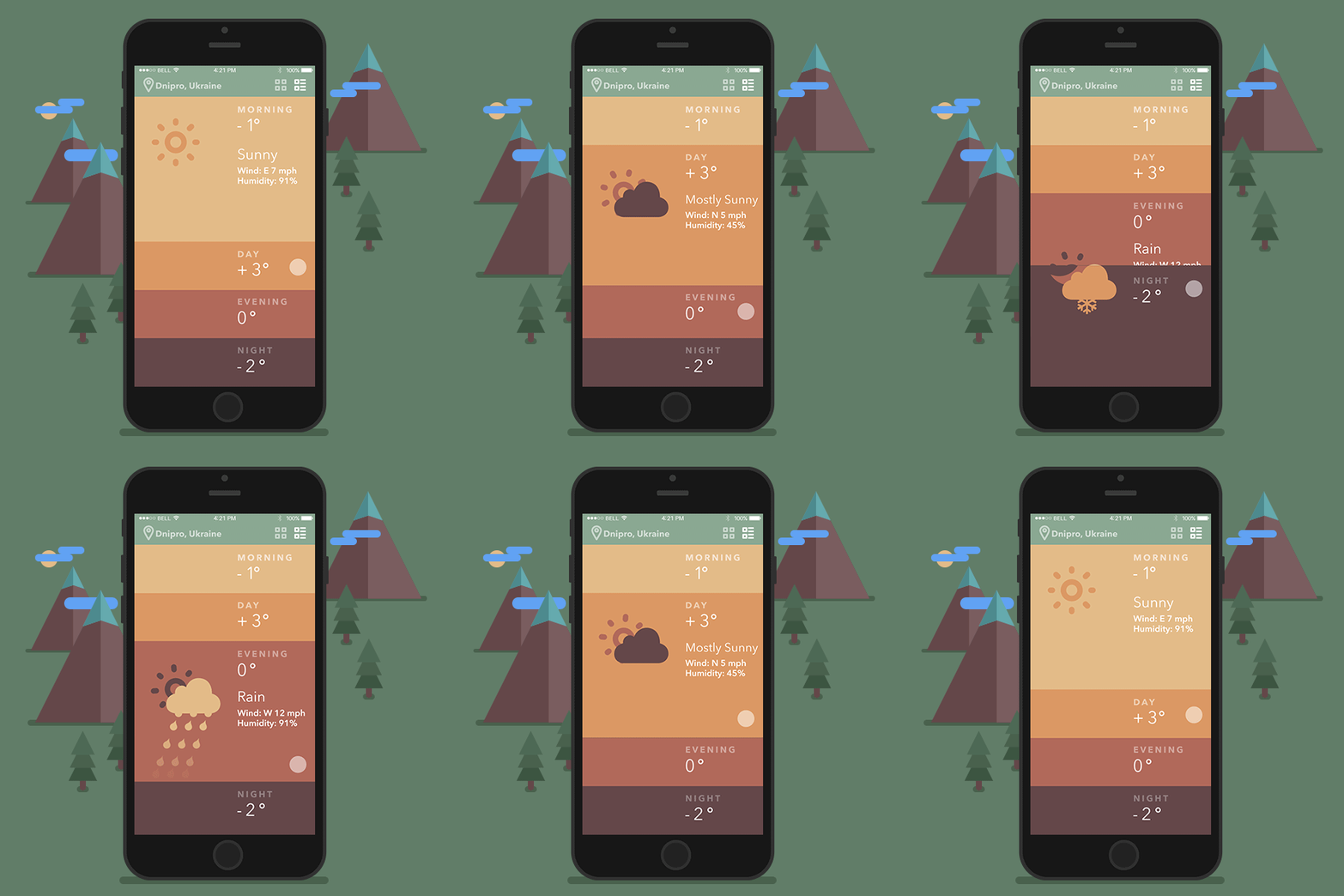
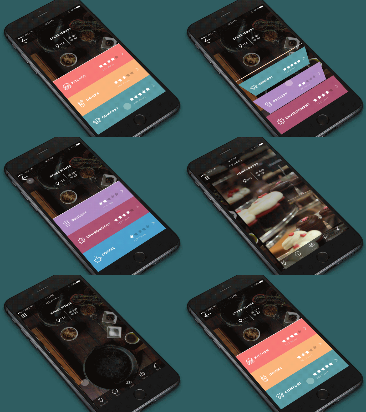
Problem: I want to feel the interaction natural.
This is the problem that most users will not be able to formulate, still, it has a great influence on user experience. If users say something like “I’m not sure what’s wrong but there’s definitely a thing”, try thinking over more natural interaction. Animation in the interface can create a pleasant illusion close to natural interaction with physical objects which often doesn’t need too much cognitive process. For example, if you pull the object, press it, move out the tab, the movements should feel natural. Again, users won’t be able to see this sophisticated work accomplished by designers: they will take it for granted and the fact it makes them comfortable will be the biggest praise for design solutions.
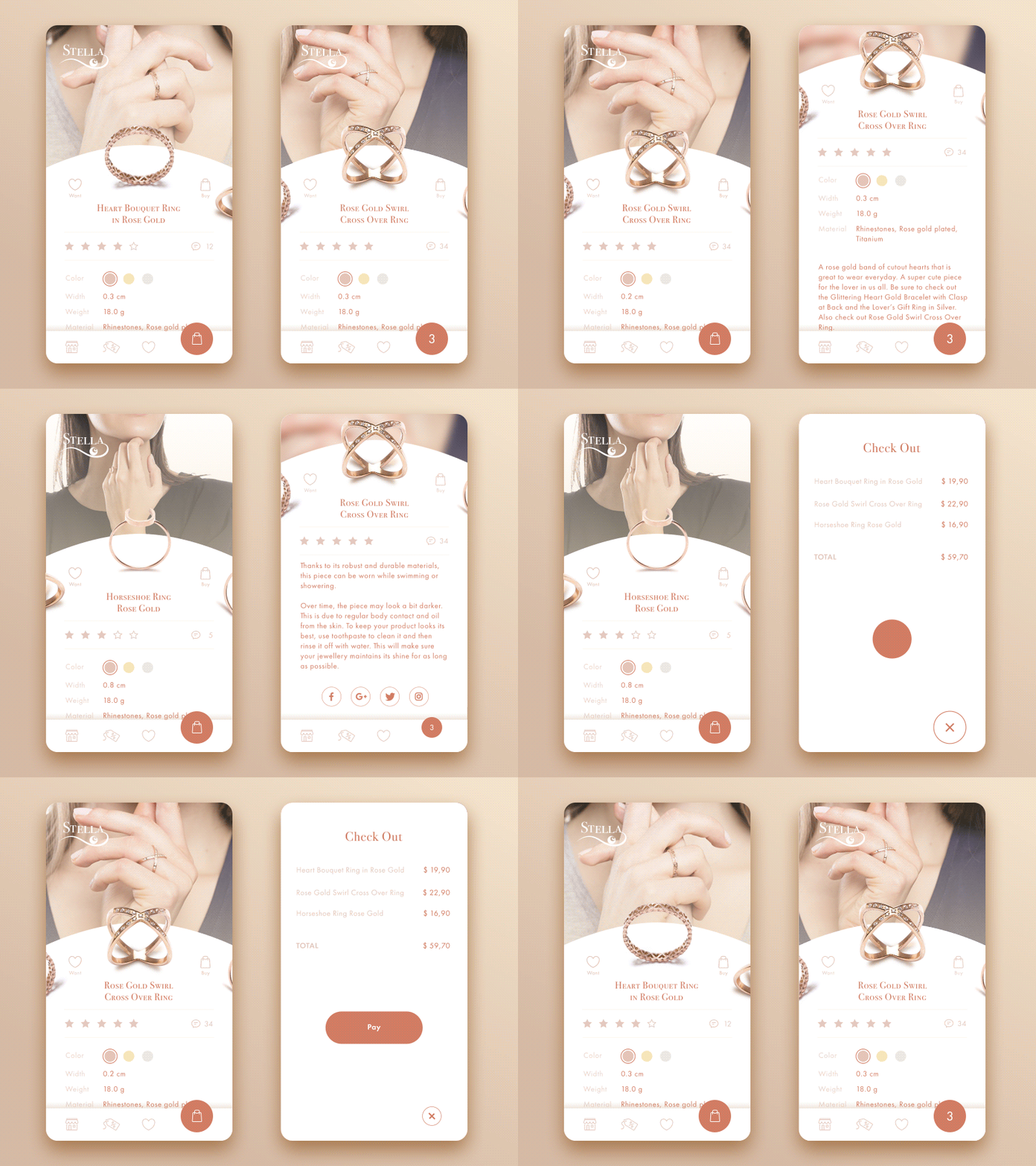
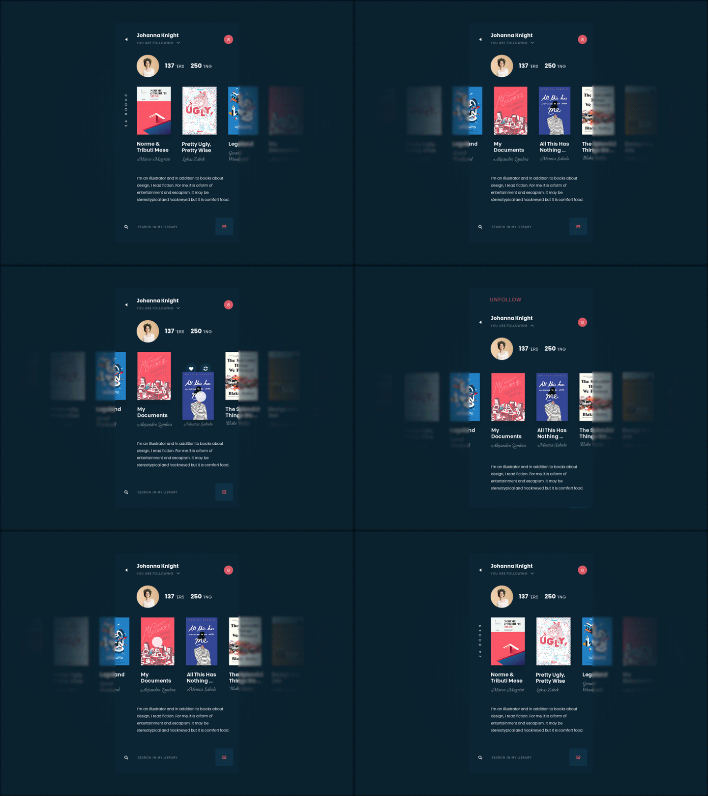
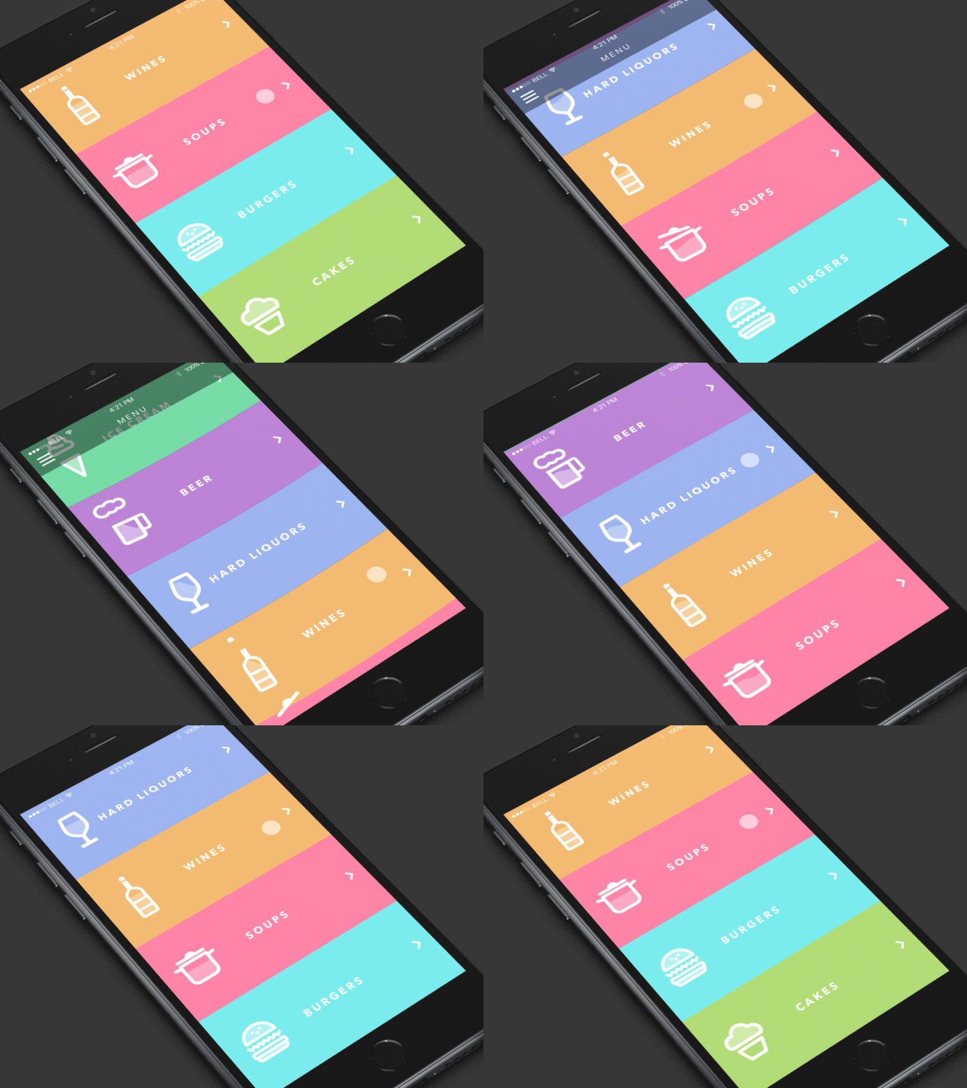
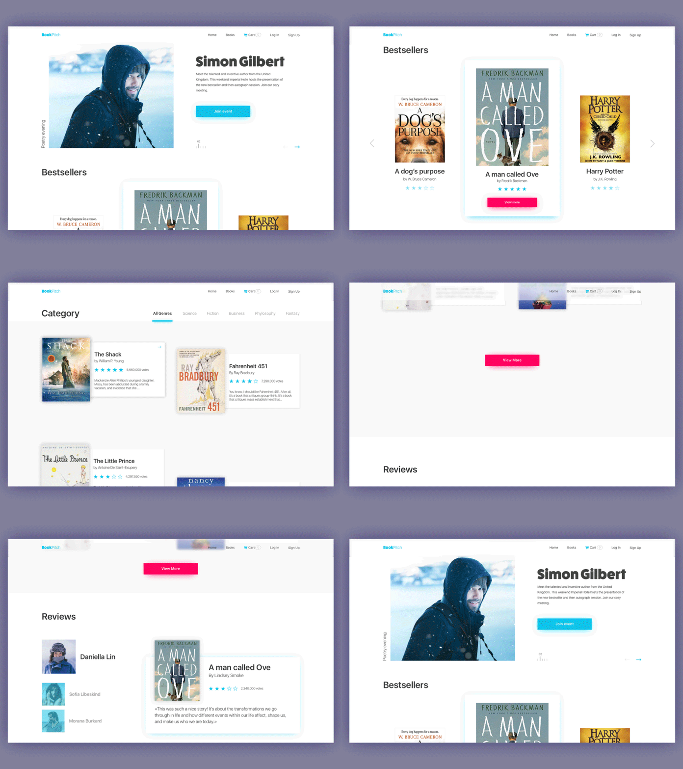
This sort of problem is also popular in interaction with web interfaces. Thought-out movement of layout elements while the webpage is scrolled can enhance user experience significantly and create the feeling of one integral smooth interaction rather than several separate parts or blocks of the page. All in all, it’s pleasant and engaging, and these emotions are a good factor in retaining users.
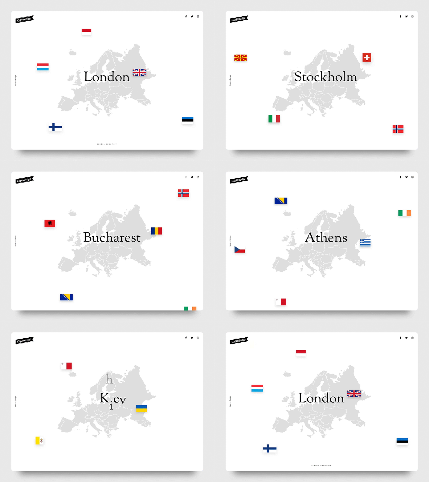
Capitoledge — Free Screensaver
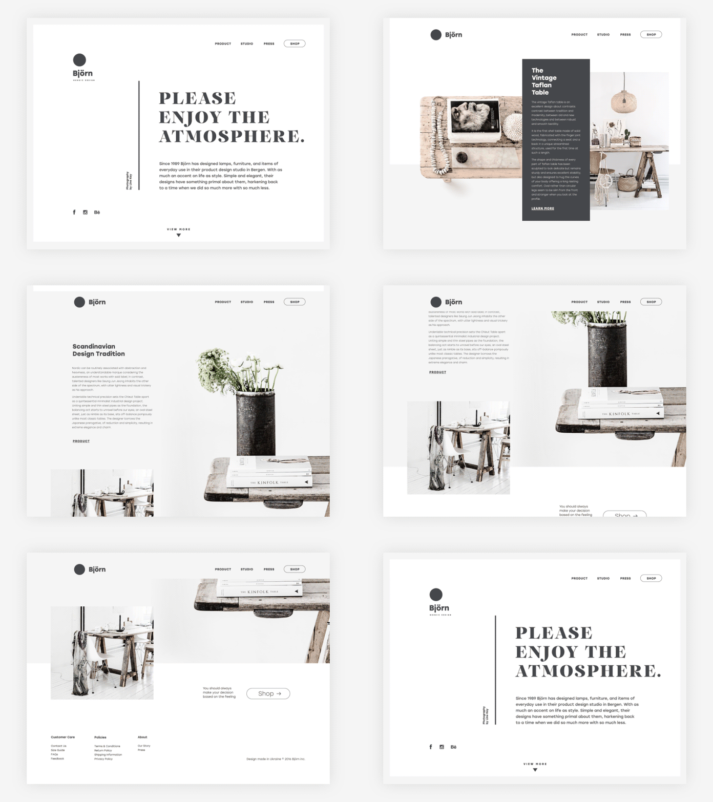
Problem: The screen/page is boring.
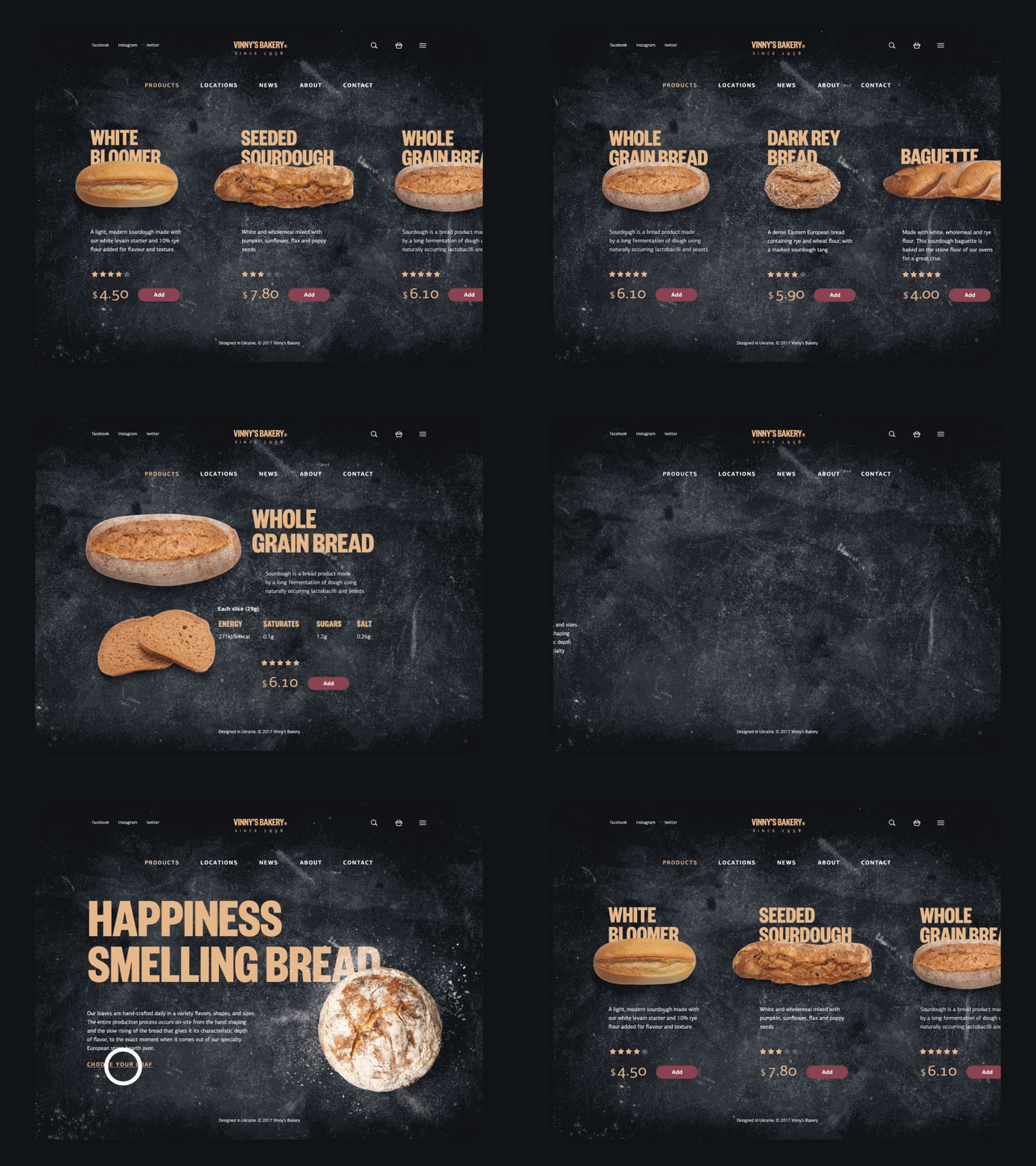
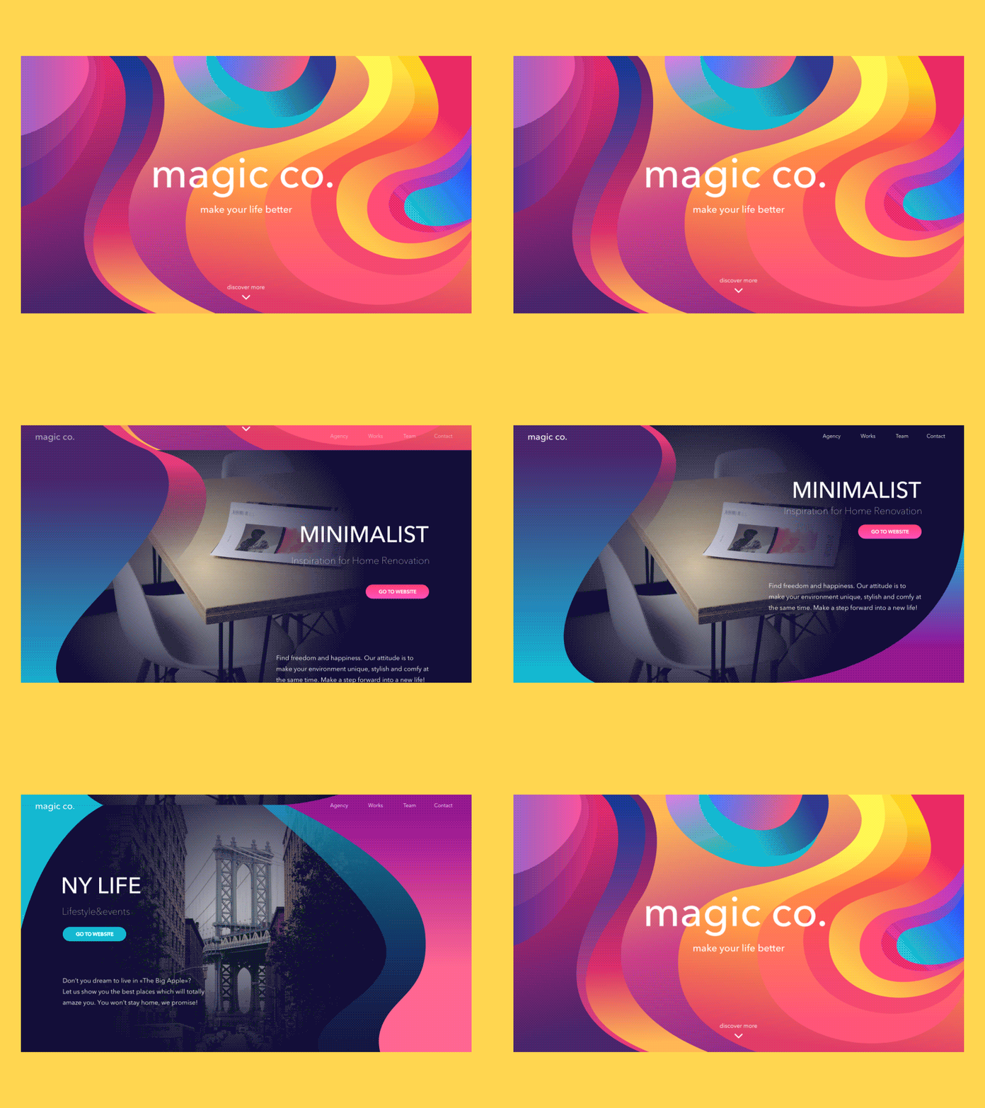
Obviously, talking about interfaces, people often move the functional side and usability to the foreground, as key or sometimes even the only aspect requiring consideration. And that’s right and logical, still, it cannot null the fact that people are driven not only by logic. There are also such big factors as emotional and aesthetic satisfaction able to influence user experience greatly. The thoughtful balance of utility and usability on the one hand with emotions and aesthetics on the other can bring the user-friendly product. And animation is a great booster in this perspective of interface design. It can mark out the beauty of colors and gradients, breath life into the layout, make movements dynamic or viсe versa smooth, strengthen the power of UI elements with motion, and original transitions.
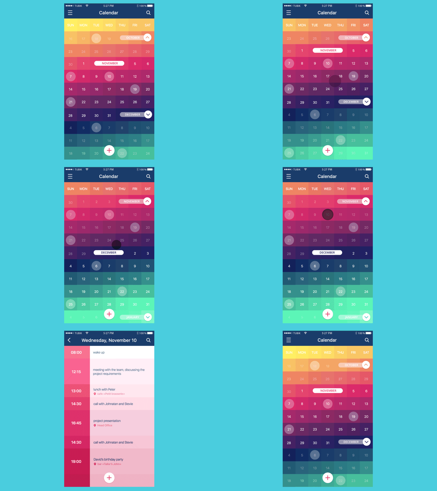
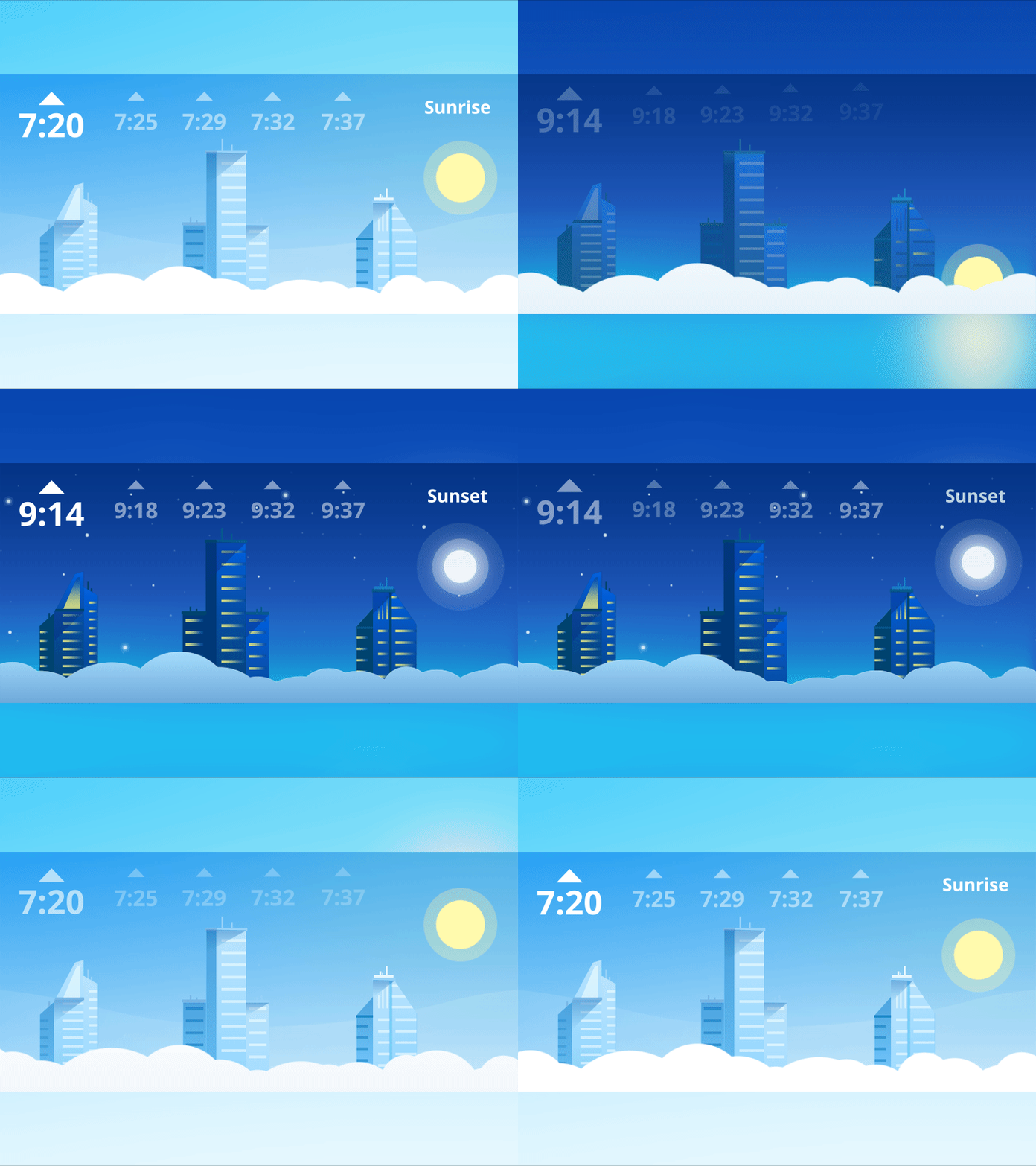
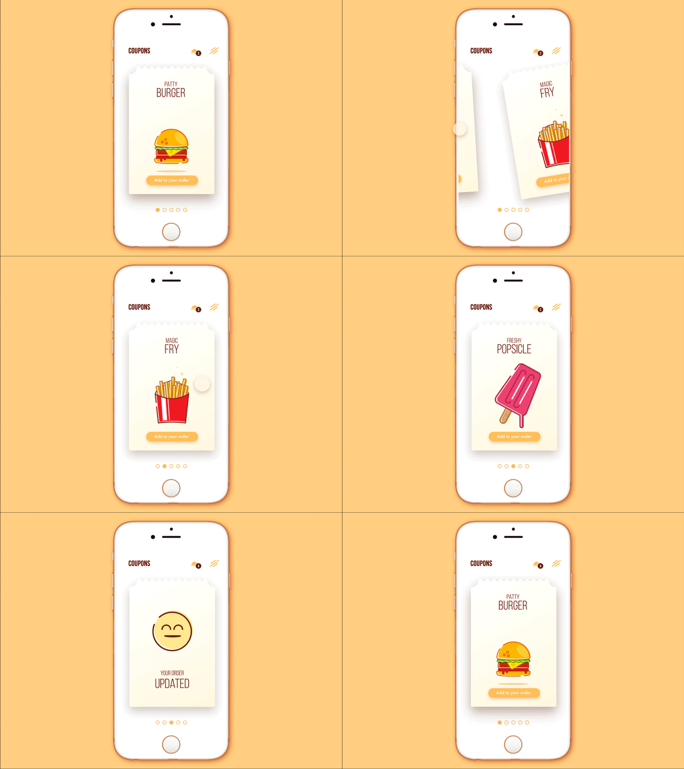
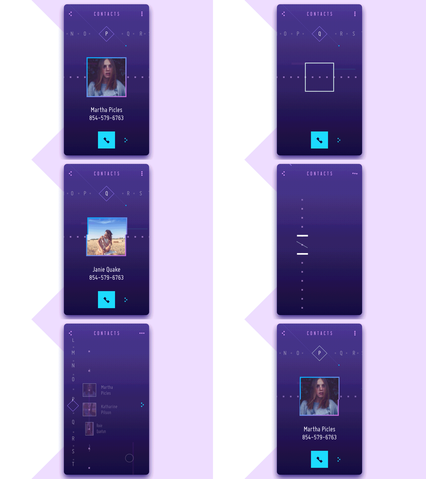
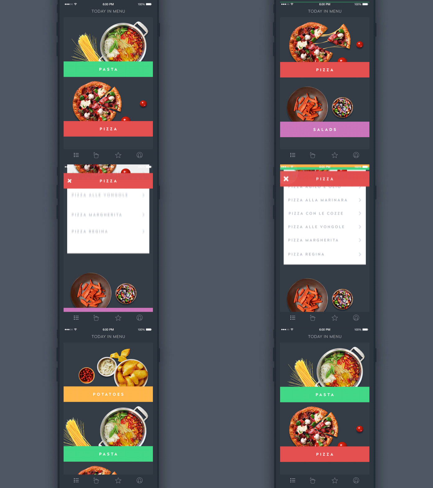
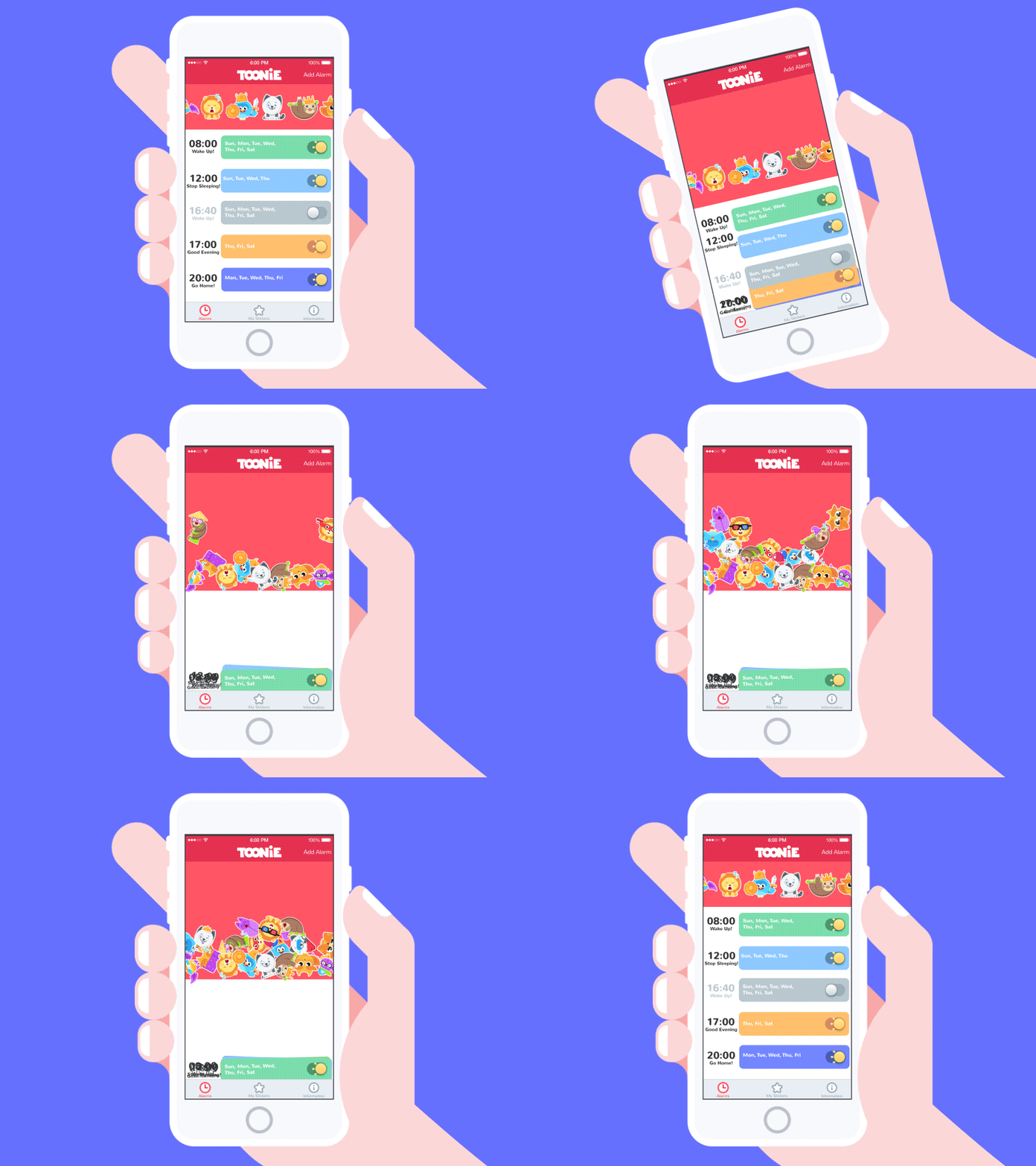
So, definitely, animation in user interfaces has massive potential in solving diverse problems of interaction. Still, even the slightest piece of motion added into UI requires a thoughtful approach analyzing not only advantages but also possible drawbacks. Animation should support the user, that is its main goal in the interface.
Recommended reading
Diverse issues of applying animation in UI design have been an object of professionals’ attention for a considerable period. Here is the collection of articles for those who would like to read more on the topic.
Interface Animation. The Force of Motion
Animated Interactions. Motion on Purpose
UI Animation. Microinteraction for Macroresult
15 Animated Design Concepts of Mobile UI
How to Use Animations in Mobile Apps
Originally written for Tubik Blog
- English
- Ukrainian


