How to Use the Power of Mascots in Branding and UI Design
How to Use the Power of Mascots in Branding and UI Design Today mascots show their power in branding, marketing and user experience of websites and mobile apps. Let's check their benefits and design examples.
When creating a product or designing a message for people, we strive to make it as human-centered as possible. One way to support effective communication between users and products is to create a strong mascot. Let’s check its benefits and how it can help with user interface design and enhance branding.
What Is Mascot?
In basic terms, in design and marketing, a mascot is a character, a personified image that becomes a symbolic representation of a brand, company, or even a public figure. The term originates from the French word “mascotte,” which means lucky charm.
It’s worth noting that historically, the term “mascot” was applied to figures of people, animals, or objects taken as symbols of good luck by a particular group. For years, mascots have been seen as carriers of luck and positive energy. That may be one of the reasons they are so popular in design for user experience and marketing goals, as positive feedback and emotional appeal can directly drive conversions and profit.
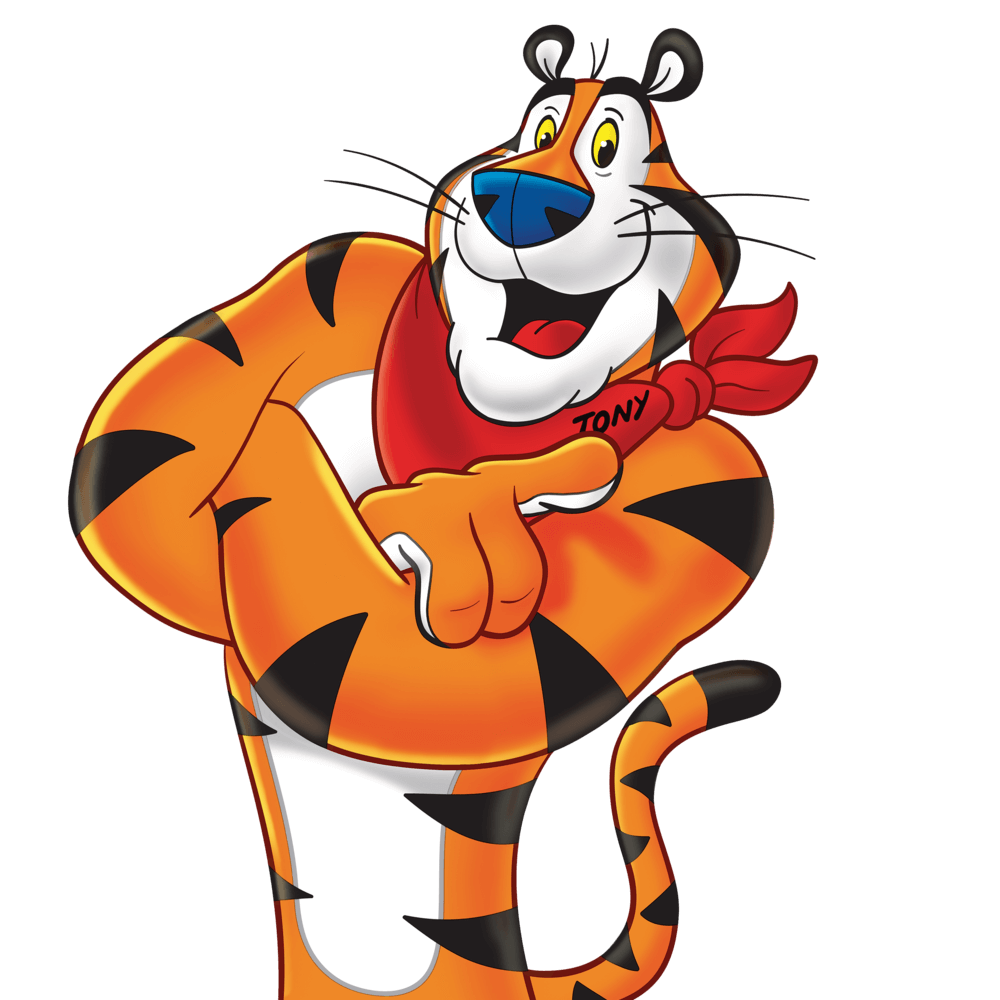
Famous character Tony the Tiger, mascot designed for Kellogg’s Frosted Flakes
One of the areas where mascots have gained huge popularity is sports. Remember team mascots, especially for the teams whose names are based on real animals or creatures that could potentially get human-like characteristics. Team mascots could be presented not only as images of animals or people but also as specially designed fantastic creatures, and have been highly effective in promoting teams and increasing their recognizability. One more example is the well-known mascots of the Olympic Games, designed specifically for each event and featuring the visual features of the host country. In sports, mascots are not just about uniting and supporting. They are also a huge business with all that merchandising stuff people buy to keep memories about events and mark their support for the team, country, or even a particular person. Another area where this approach has caught on is educational institutions that use mascots to build strong branding.
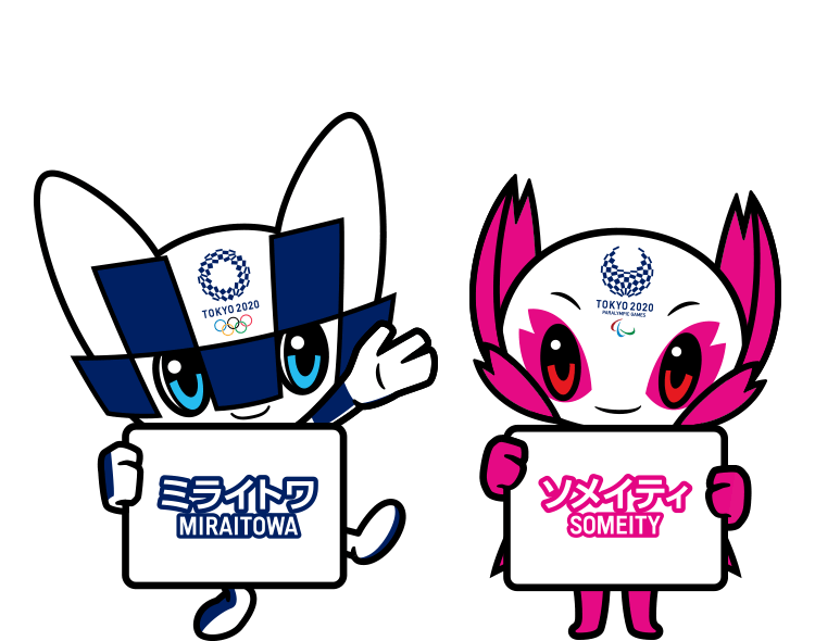
Official mascots of the Olympic Games in Tokyo 2020
No wonder, with all that power, mascots got highly popular in marketing and advertising, long before they moved to the web. They won customer attention in diverse ways, from small badges to live, costumed characters who could physically communicate with people.
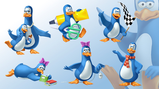
Kinder Pingui Mascots
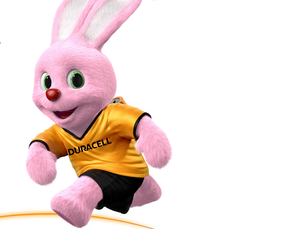
Lively and full of energy Duracell bunny mascot
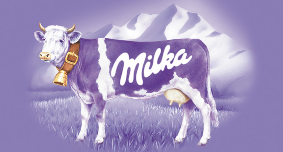
Milka purple cow mascot
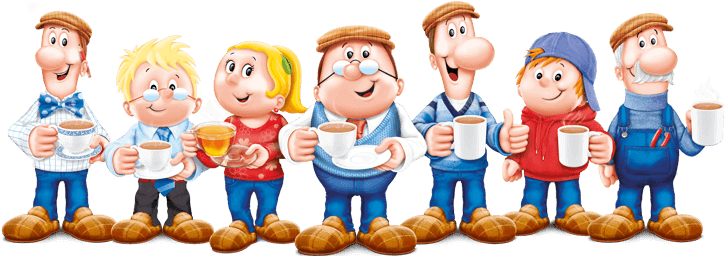
Teltey tea folk
Today, mascots are also widely applied in digital products for the web and mobile. Let’s review the reasons.
![]()
Mascot design process for Saily App
Benefits of Mascots
What’s so good about mascots that makes them used so widely?
Enhanced communication
A mascot serves as a good interconnector between the user and the product. In interfaces, it can serve well as a basic element of communication and interaction. Just changing its appearance (for example, mood, outfit, activities, etc.) may quickly deliver a clear message to the user. Mascots can communicate directly through speech bubbles, provide visual prompts with various facial expressions, reflect the user’s mood with different graphic variations of the mascot, provide helpful instructions in an app onboarding tutorial, and congratulate the user on their achievements.
Flexibility of personification
The business practices of successful companies show that a well-crafted mascot can be even more effective than product endorsement with a famous person. Mascots can reflect any traits of character, any style needed for product positioning, and communicate via a diverse set of visuals. They broaden the horizons of personification. With mascots, designers and marketing specialists can create unexpected, catchy looks or bring fantastic characters to life.
![]()
Logo mascot design
Memorability and recognizability
Most of us are visually driven, and our brains work in such a way that we notice images faster and remember them better than text. Being images far from abstract and having human-like features, mascots tend to take everything from the abilities of human memory: we catch them fast, easily remember them due to particular associations, and recognize them faster than abstract images, seeing them again. All the mentioned has great importance in creating strong brand awareness and building patterns in user interfaces.
Consistent visual marking
Mascots offer wide opportunities for visual branding across different carriers of identity, website pages, or app screens. Mascots can be used in logos, interface illustrations, hero banners, chatbots, stickers, various swag, and branded merch.
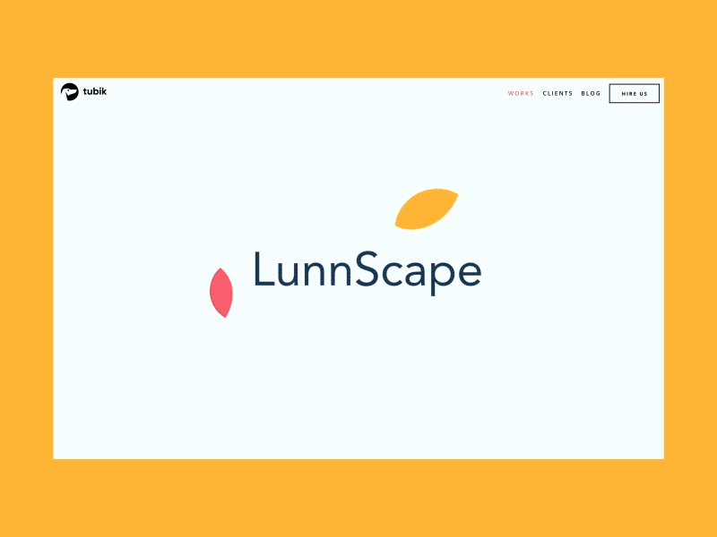
Logo mascot designed for LunnScape
Brand voice, tone, and character
Mascots are a strong way to convey and reinforce the brand’s tone and voice, which is the foundation of a brand strategy. Custom characters usually reflect the most important feature of the product and convey the idea in a fast and harmonious way. What’s more, it enables a creative team to send the key message to the user: with a mascot, it won’t take long to understand if the product is serious or entertaining, lively or calm, business-like or easy-breeze, highly private or broadly social, and so on and so forth.
Emotional appeal
Although we tend to believe that logic and common sense rule our actions, a big part of the decision-making process relies on emotional appeal. A mascot is one of the well-established methods to provide emotional triggers and feedback, letting the interface or brand speak the user’s language. This way, it makes the product more user-centered.
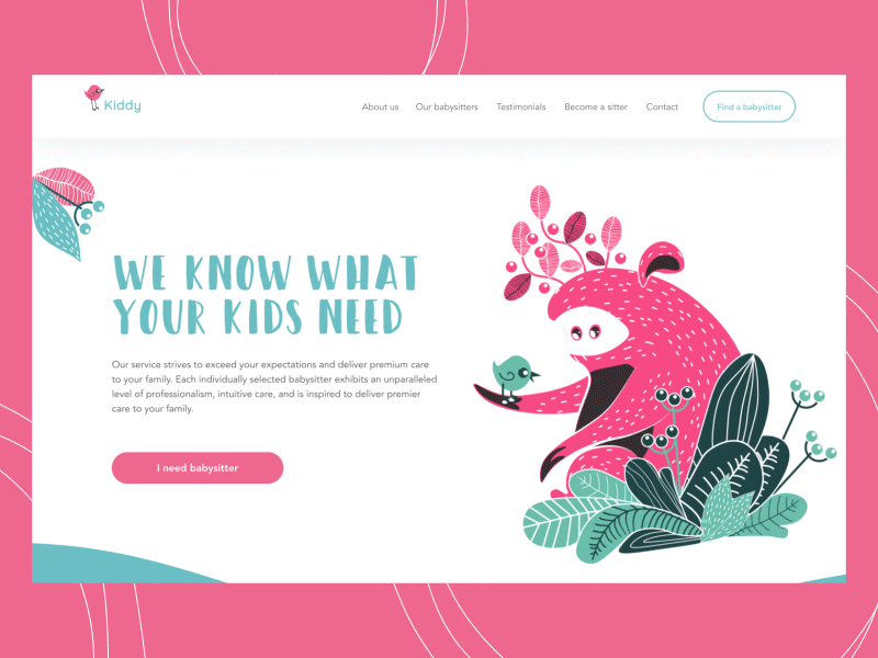
Originally created characters used as mascots for a babysitting service
Virality potential
An original catchy mascot can be used as a powerful element of virality: in this case, it becomes so popular with users that they not only spread it to each other but also create new versions, parodies, discussions, memes, and the like. That also works efficiently in products for kids when the mascot actually becomes a key representative of the product and creates a high level of desirability.
Style and beautification
People change not as fast as they think: we all know that quality and functionality are at the top, but they still need a good dress to impress, especially in tight competition. Mascots often become a core element of the visual presentation for a website, mobile app, or physical product. So, it has a big impact on the aesthetic part of perception, adding beauty and style to the brand image.
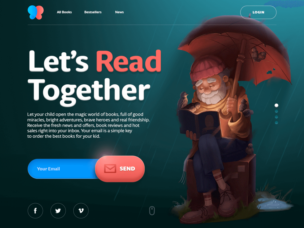
Mascot character used as a hero image for an e-commerce website selling books for children
Features of an Effective Mascot
Sure, each case needs an individual approach to the mascot that aligns with the particular goals and brand image. However, there’s a checklist of essential basic features to consider for any mascot design. To work well for marketing and user experience, a mascot should be:
- memorable
- recognizable
- original
- representing a consistent character
- flexible to adapt and adjust
- applicable for diverse tasks
- looking good in different sizes and resolutions
- stylistically harmonic
- lively and user-friendly.
Case Studies: Mascots in Branding
Let’s review some practical case studies when mascots became the center of marketing strategies. Quite often, if stakeholders and the creative team make a decision upon such a technique, the mascot starts its way from logo design. Mascot logos can work as independent symbols or in combination with a typographic element if the logo is a combination mark.
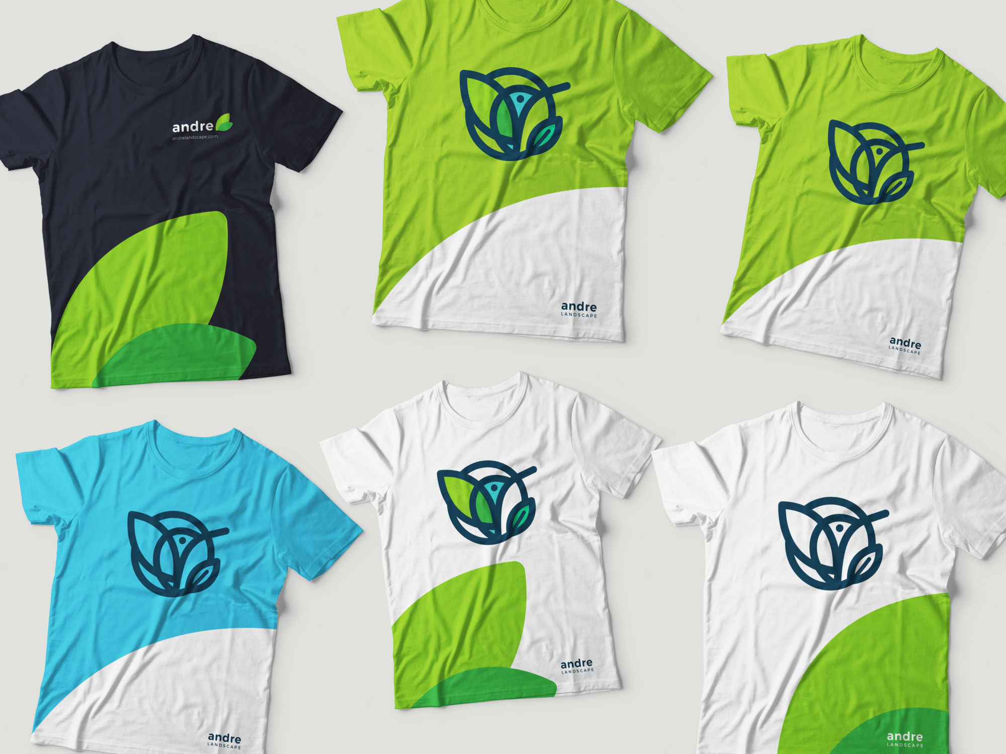
For example, here’s a logo for Andre’s landscape company. Their first logo was a lettermark, but during the creative search for the brand redesign, the decision was made to create a mascot. They chose a friendly hummingbird whose image was harmonically combined with the shape of a leaf. Then the mascot set the foundation for the further development of corporate identity.
![]()
![]()
One more example is a mascot logo designed by Tubik for Whizzly, the social network for showcasing talents and sharing creative projects. The app’s target audience is teenagers and young adults, so the character had to establish a connection with them and convey the required mood at once. The creative search brought the team to this cool monkey that knows the taste of fame. Animated logo version for the splash screen and promo animations, allowing an even brighter emotional background.
![]()
![]()
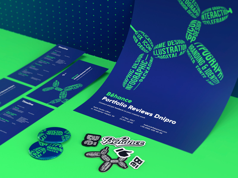
Another example to remember is the event branding case Tubik designed for the local Behance portfolio event. It featured a dog mascot made of the words marking various design directions.
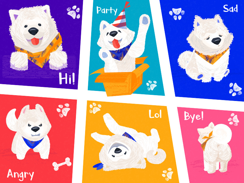
These days, another powerful way to integrate mascots into branding is through stickers, like this set below featuring a pack of emotions for a cute dog character.
Case Studies: Mascots in UI
Mascots are helpful in web and mobile interfaces: they liven up interactions, catch the user’s attention and draw it to needed details, become memorable elements, maintain consistency with a general stylistic concept, and create a strong impression of direct, human-like communication with the user.
Used in illustrations that show actions or interactions, a mascot is also a good way to avoid extra copy on-screen. This way, the precious space is saved for other layout elements or just more “air” really needed to create a good perception of data on the screen or page.
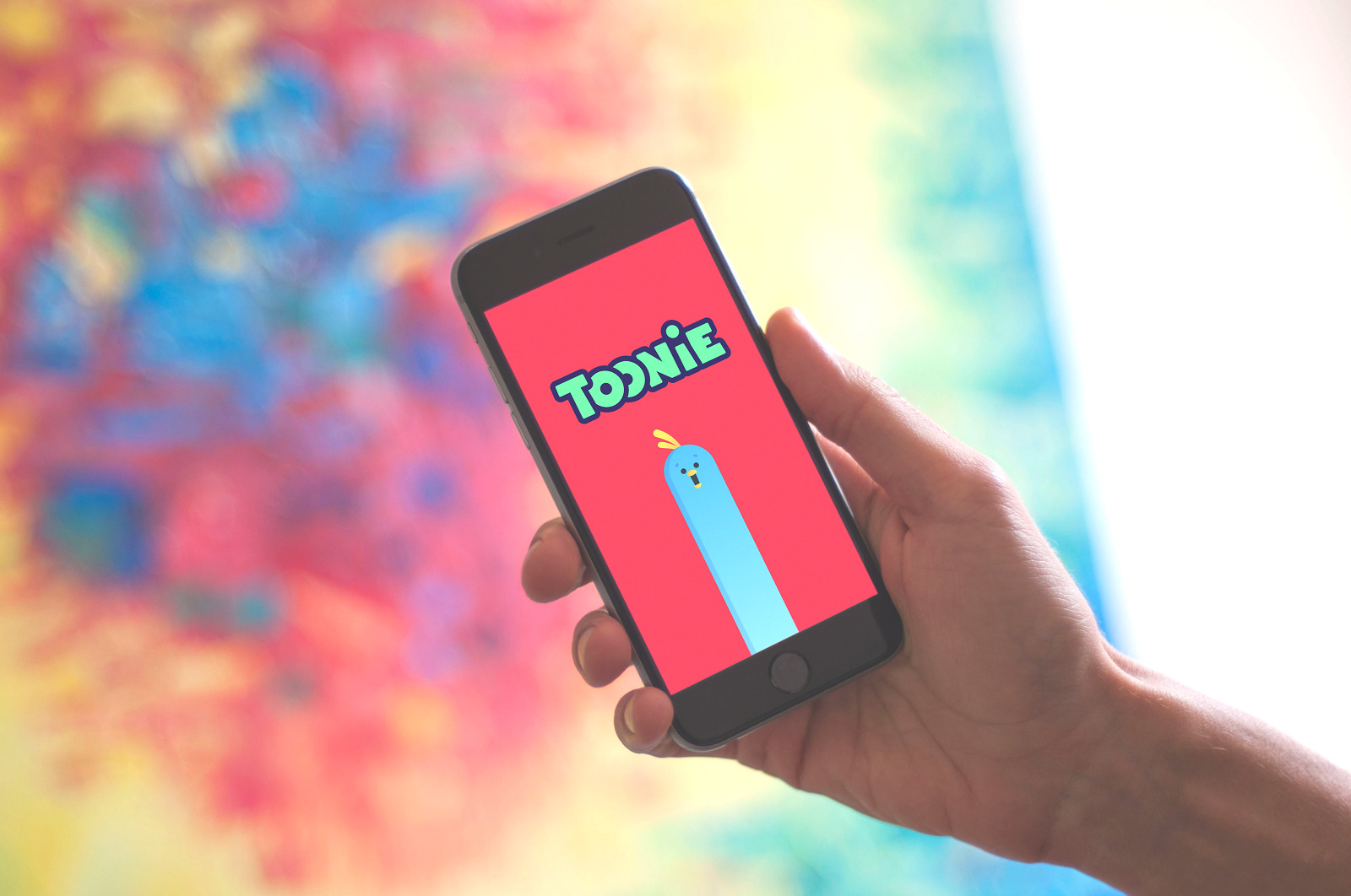
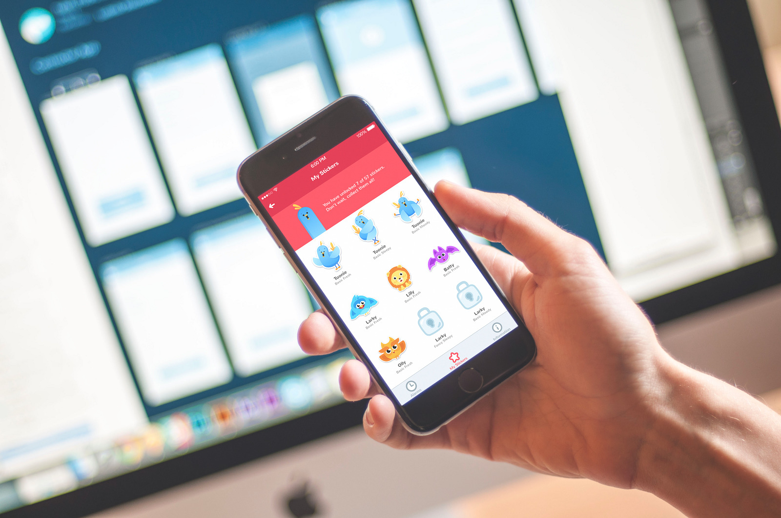
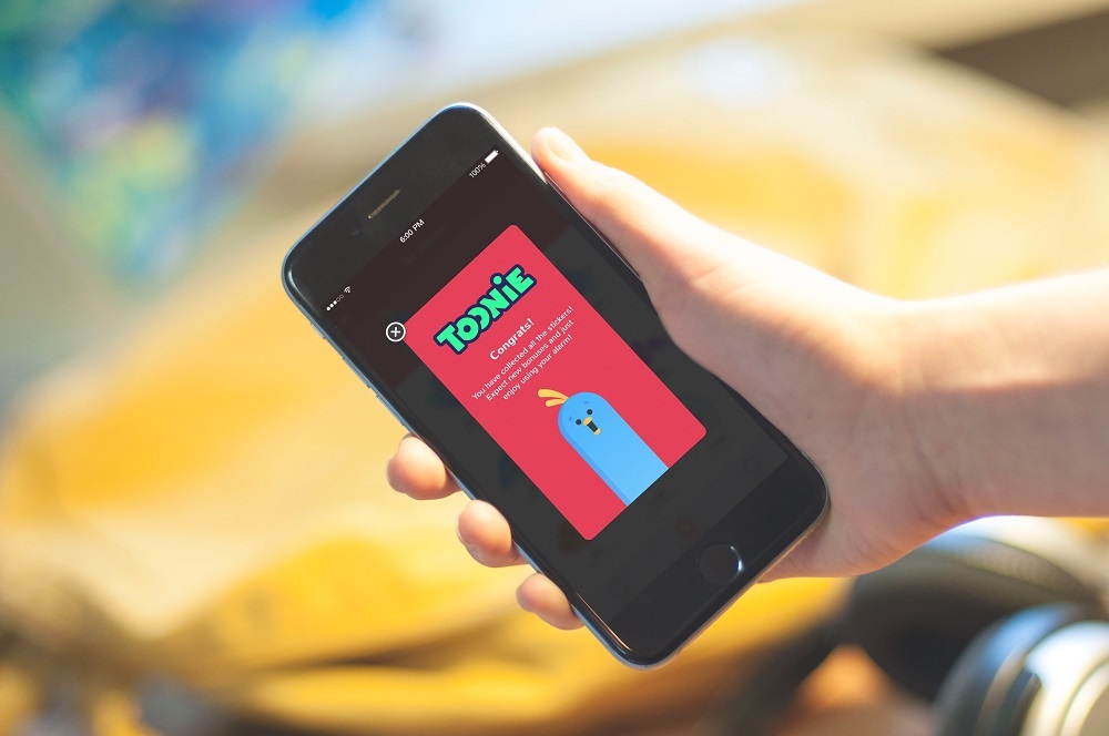
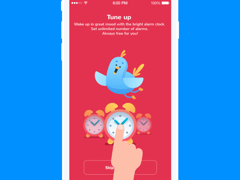
One of the bright cases for the issue was a mascot created for Toonie Alarm, a simple alarm app with elements of gamification. The idea of applying the mascot was set almost instantly to let it convey the product’s voice and tone, create a sense of natural communication, and support the mood. So, Toonie was born to be a funny, cheerful bird, whose mission is to make the world brighter and help users to interact with the alarm. It informs users about news, rewards, and errors, and just adds some fun and color to everyday life.
Here is an example of a landing page we designed for a kindergarten: it features a super funny 3D animation of a mascot, instantly setting the mood and amplifying the emotional appeal.
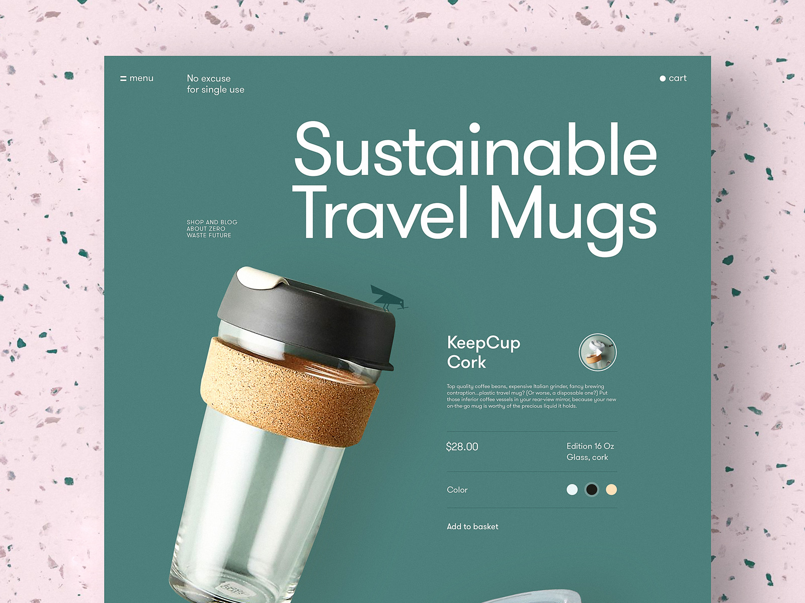
One more example to share is the case of web design for a platform devoted to zero-waste living. It features a consistent usage of a small but important mascot, a little bird that accompanies the website visitor from one page to another. The mascot strongly associates with the theme of nature, and its engaging animation makes the pages feel more lively and dynamic.
No doubt, the use of mascots in UI should be based on careful user and market research, not to overload the interface. The aim of a mascot in any environment is to simplify and speed up interaction with a product or information flow. If the objective is not achieved, the mascot can play a bad role and distract users.
Useful Reading
Here are some handy articles to help you dive deeper into branding, illustration, and user experience design for various goals.
10 Big Reasons to Apply Illustrations in UI Design
Creative Stages of Logo Design
UX Design: How to Make Web Interface Scannable
Mobile App Branding: Tips, Strategies, and Examples
How to Create Catchy Flat Illustrations
The Role of Branding in UI Design
6 Creative Stages of Design for Branding
Guide to 6 Effective Types of Web Animation
Originally written for Tubik Blog
- English
- Ukrainian