What Is Conceptual Animation and How It Works in UX Design
What Is Conceptual Animation and How It Works in UX Design The article gives the definition of conceptual animation and considers its role in attractive and innovative UX design. Packed with examples.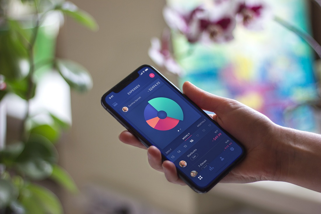
Animation in user interfaces has been an issue of hot debates for several years so far. It’s especially active in the domain of conceptual animation for user interfaces. It offers creative experiments and pushes the limits of UI motion.
Here in Tubik Studio, we have already shared articles about UI animation and its benefits for apps and websites. Today, let’s continue the theme considering how conceptual animation influences product success together with a motion designer from Tubik Studio Kirill Yerokhin.
What Is Conceptual Animation?
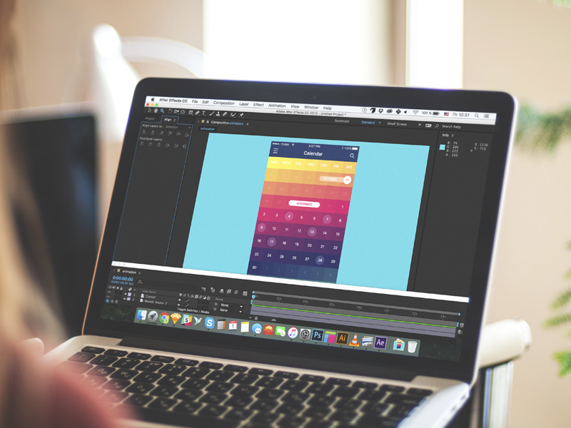
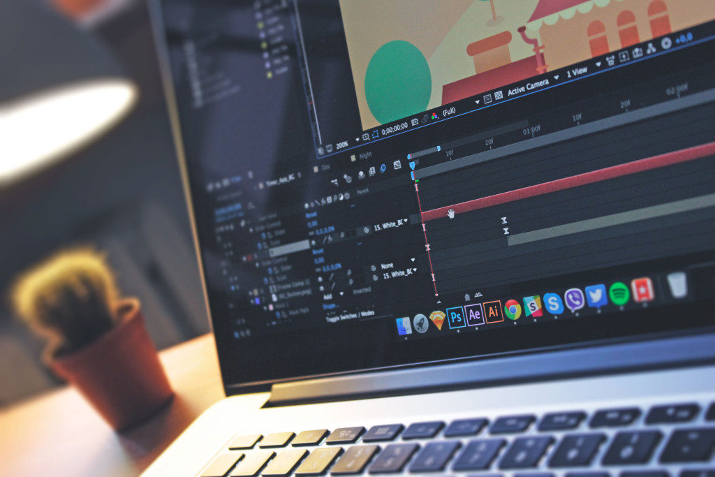
Conceptual animation is a field of concept art. It is a piece of motion design that is created to convey a particular idea before it is put into a real product. In user interface design, conceptual animation may be found in various concepts for interactions, transitions, manipulations with controls, animation marking the feedback from the system, etc. Motion designers use a variety of tools among which we could mention Adobe After Effects, Principle, Figma, and InVision.
Why Is Conceptual Animation Needed in UI Design?
This is a kind of controversial issue today. Conceptual animation steps aside from the ready-made solutions and well-checked approaches trying the ways to go beyond the limits and rules. Animation of this kind may seem unreal, needless or impossible for technical realization.
The point is that both static design (glyphs, icons, changing color and shape of controls or interface as a whole) and animation of UI present the way to make an application stand out from the crowd of similar applications which sometimes look like clones.
The statement that all the developers hate conceptual animation and never want to work on its realization is not true. In design it depends. Actually, as well as in other creative spheres where innovations are met with disbelief by some people saying it’s impossible to make. While others do their best and find new ways and approaches letting people solve new problems.
Demand determines supply. As soon as the “market” sees a fresh design concept, animation in particular, there are the ones who will seek for the ways to make it real and use it in the real world. At this moment the product of designer’s thought stops being just a concept. Here in Tubik, we have had numerous cases when conceptual interface animations, even quite complex ones, were successfully coded by third-party developers.
Practice shows that on the technical side of the issue, the realization of the conceptual animation is a question of time to spend rather than the general existence of such a possibility.
Examples of UI Animation Concepts
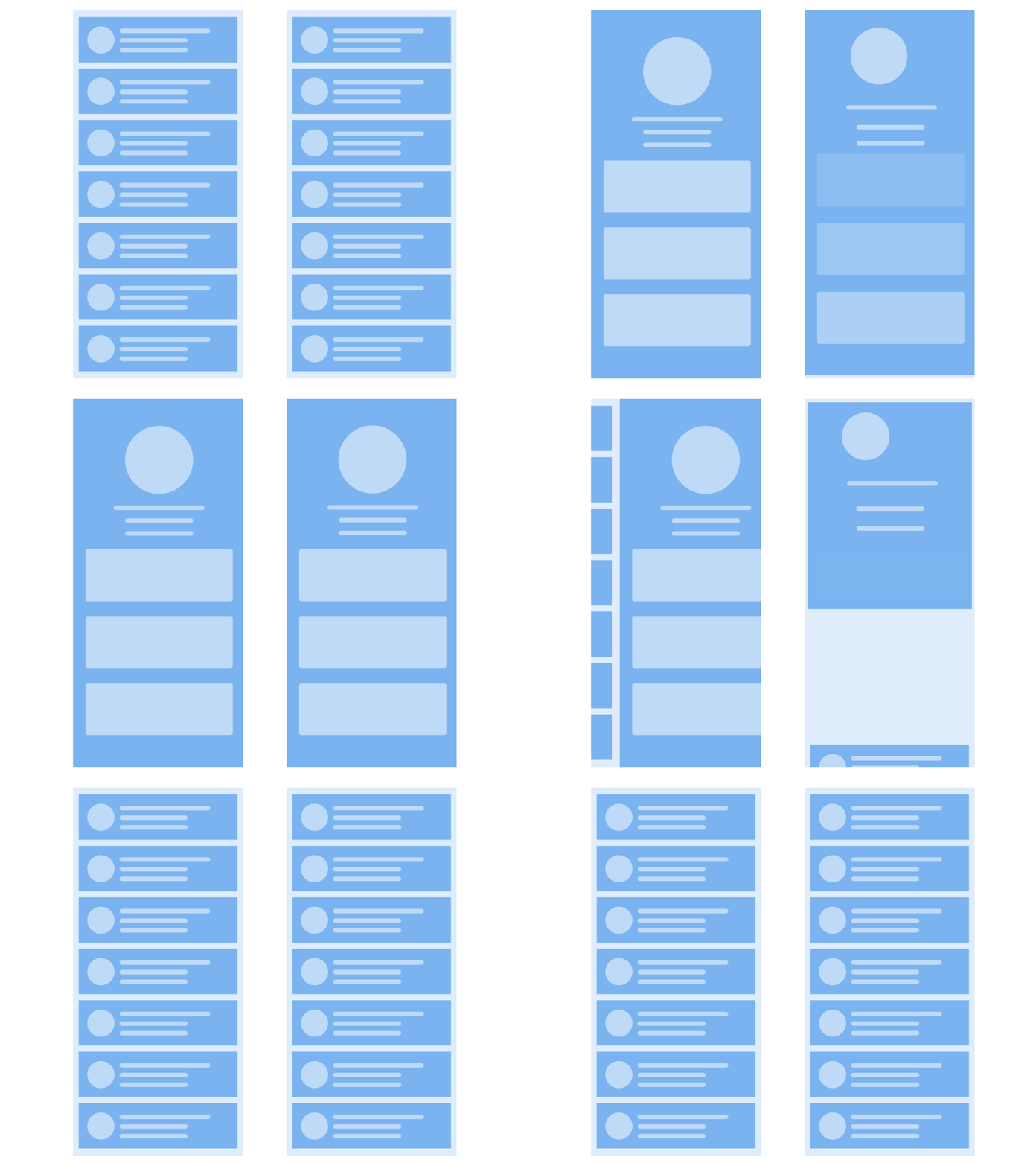
Scrolling a list of items
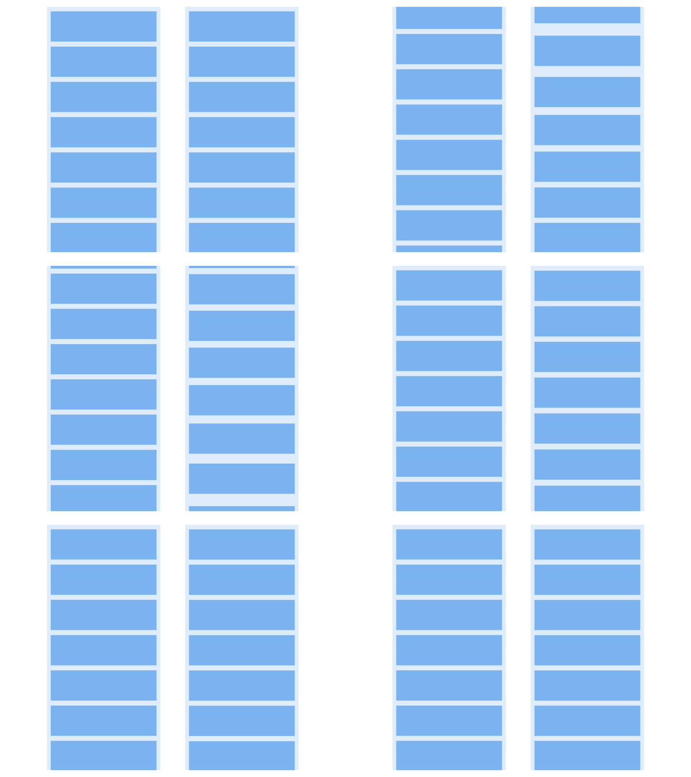
The first example features interaction with a list of items: while the left variant just moves all the list up, the right one imitates pulling the cards with a little holdback. The second variant looks lively and adds a bit of fun to the scrolling process. Another interesting thing is that the right concept creates a visual illusion of more space between the cards which supports the feeling of more air in the interface.
Transition from the list to the item
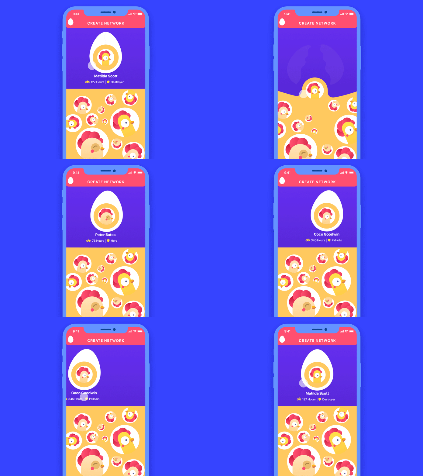
Here’s another example: the left option shows the basic way of transition from the list or menu to a particular item screen while the right one adds dynamics to the process.
Opening side menu
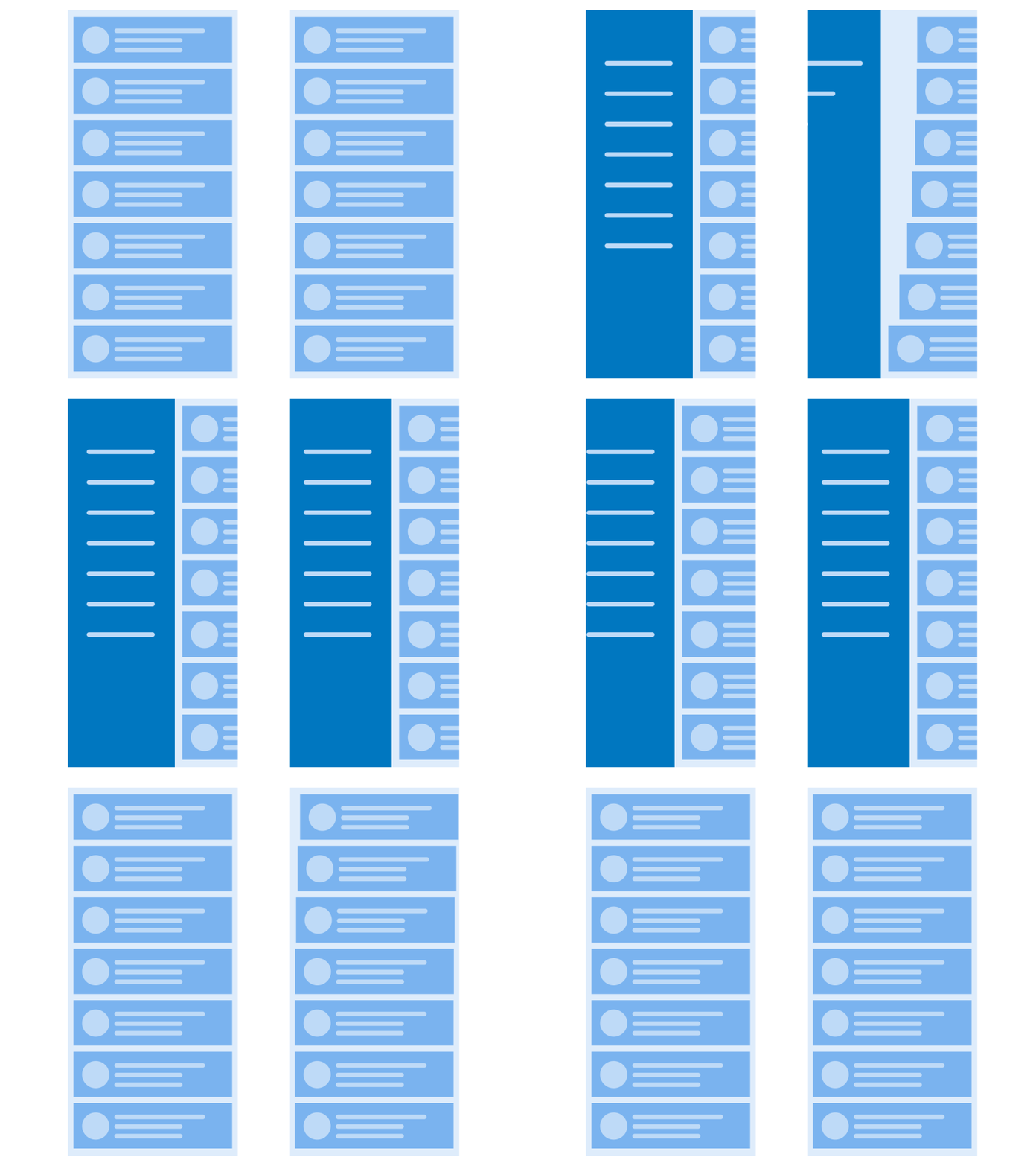
A conceptual animation may also add life and dynamics to such a basic operation as an opening side menu. Using a gradual flow of featuring the objects, the designer makes the process look more elegant.
UI Animation Concepts in Realistic Interfaces
Conceptual animation is one of the creative stages of user interface design: motion designer may offer different options to discuss with clients and developers. Here are some examples worked out by Kirill together with UI designers.
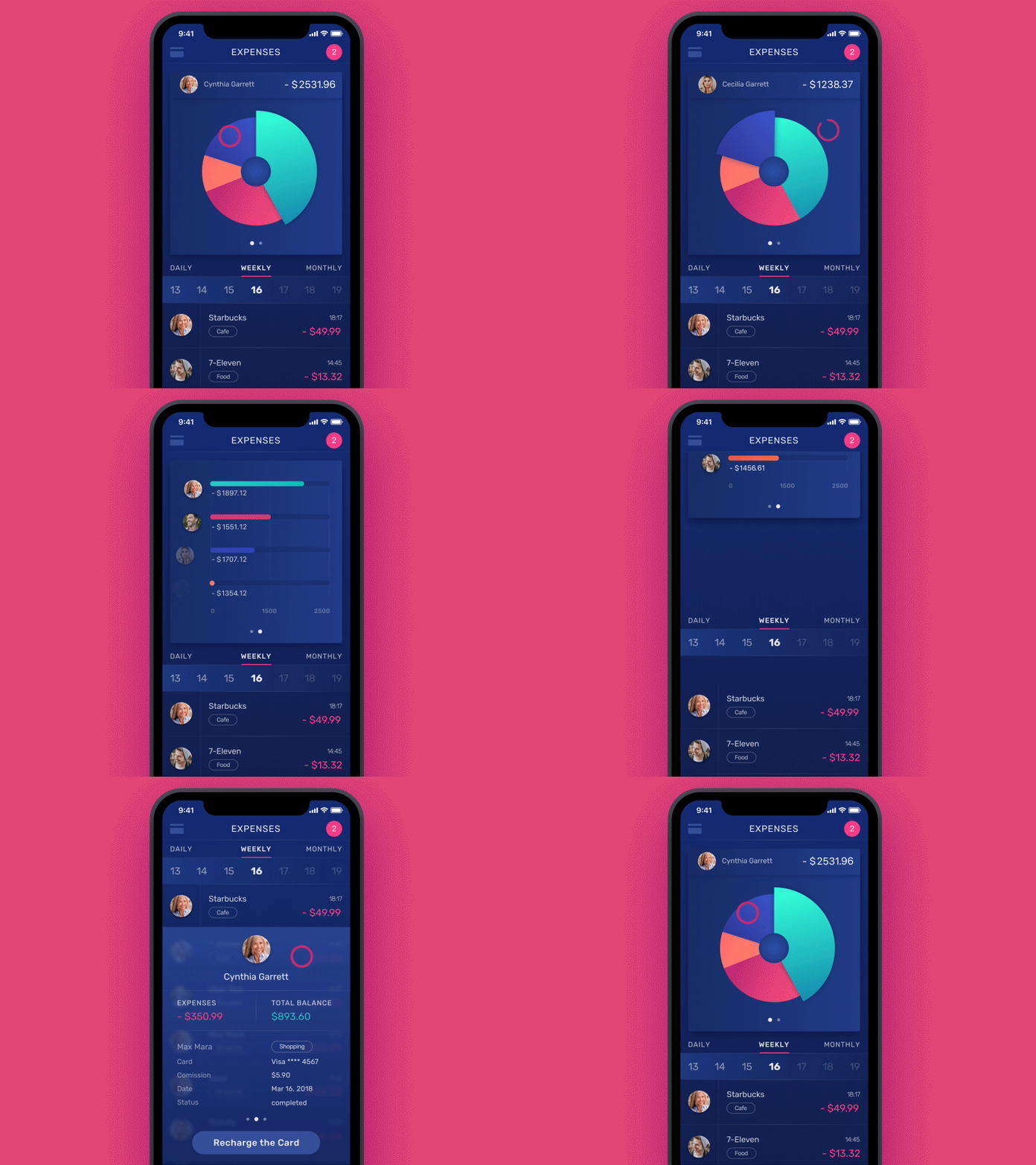
Finance App animation creates a stylish transition from the pie chart to the list applying color marking
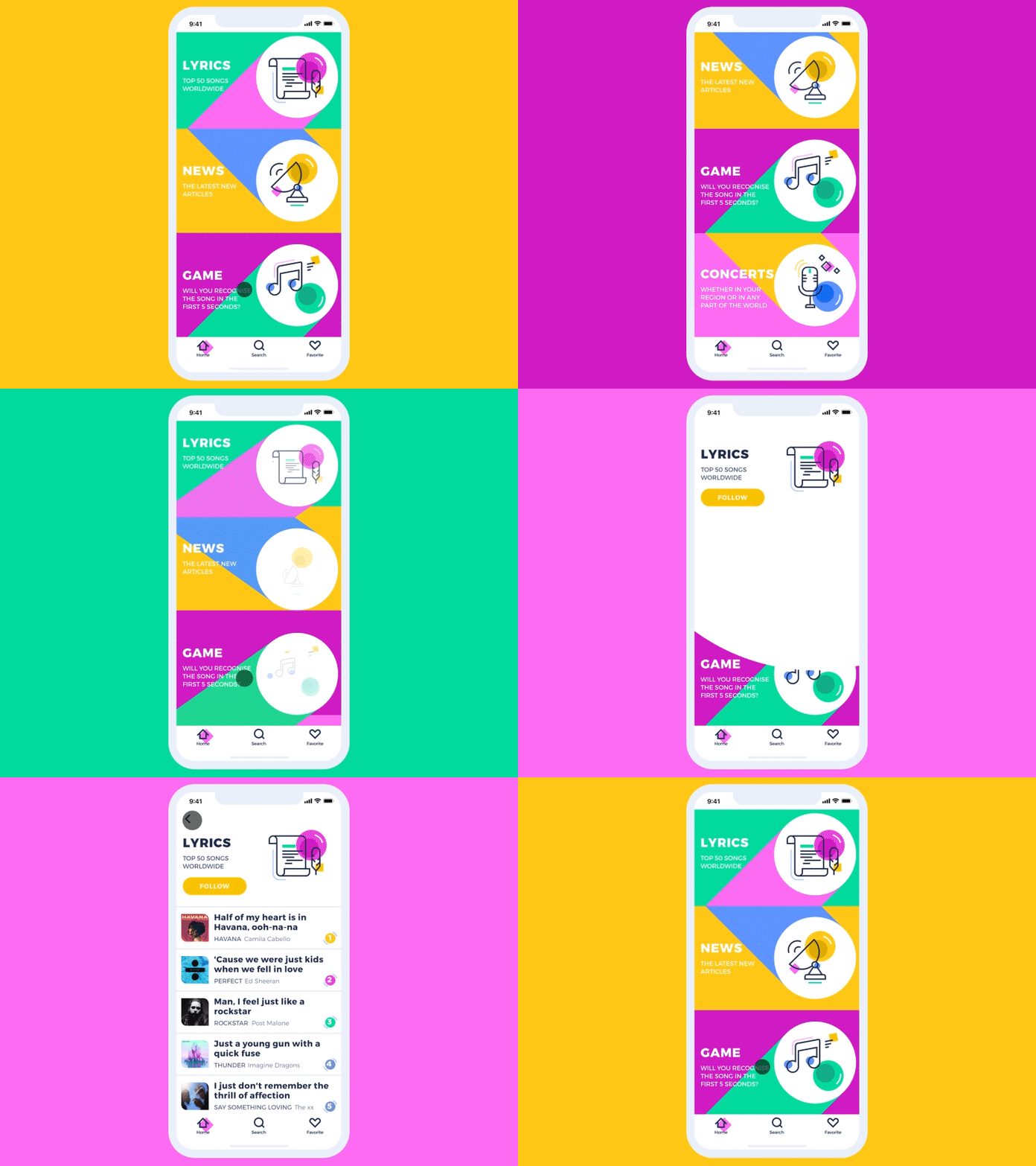
Music News App animation plays with shapes and lines in the transition from categories screen to a list
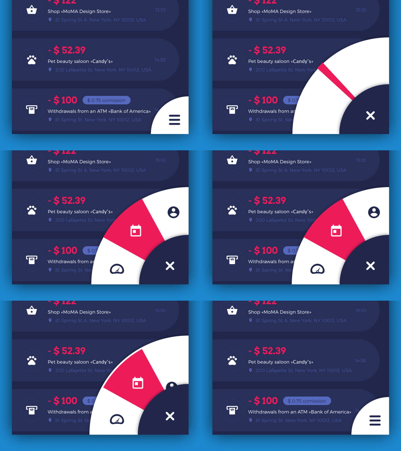
Animation concept for UI of Home Budget app adds dynamics to opening the hamburger menu
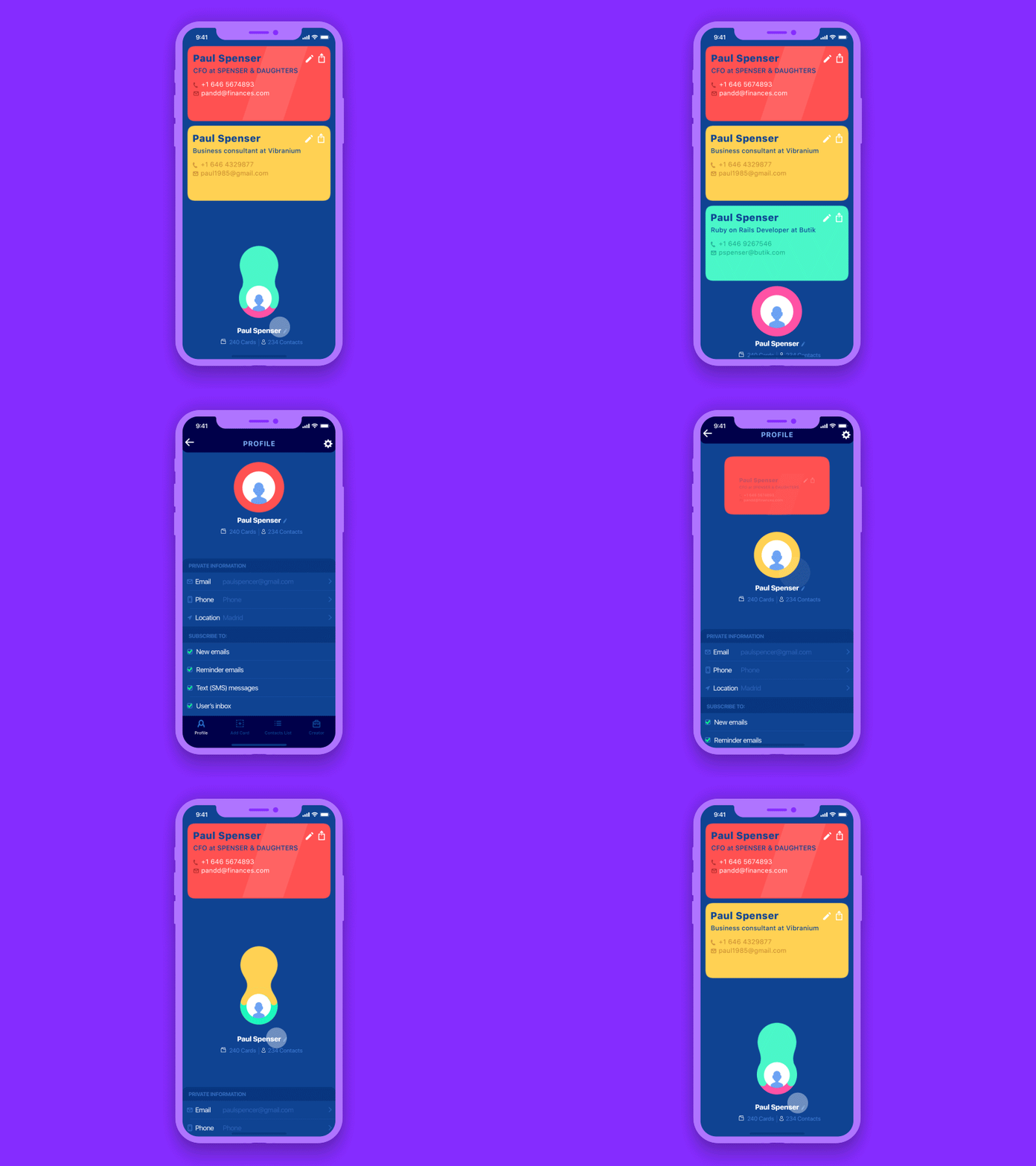
Business Card UI Concept imitates the funny effect of pulling out the card from a profile avatar
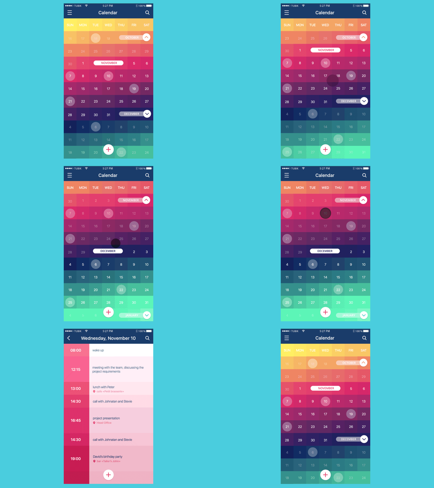
Calendar app animation concept sets an elegant transition from the calendar screen to a schedule screen
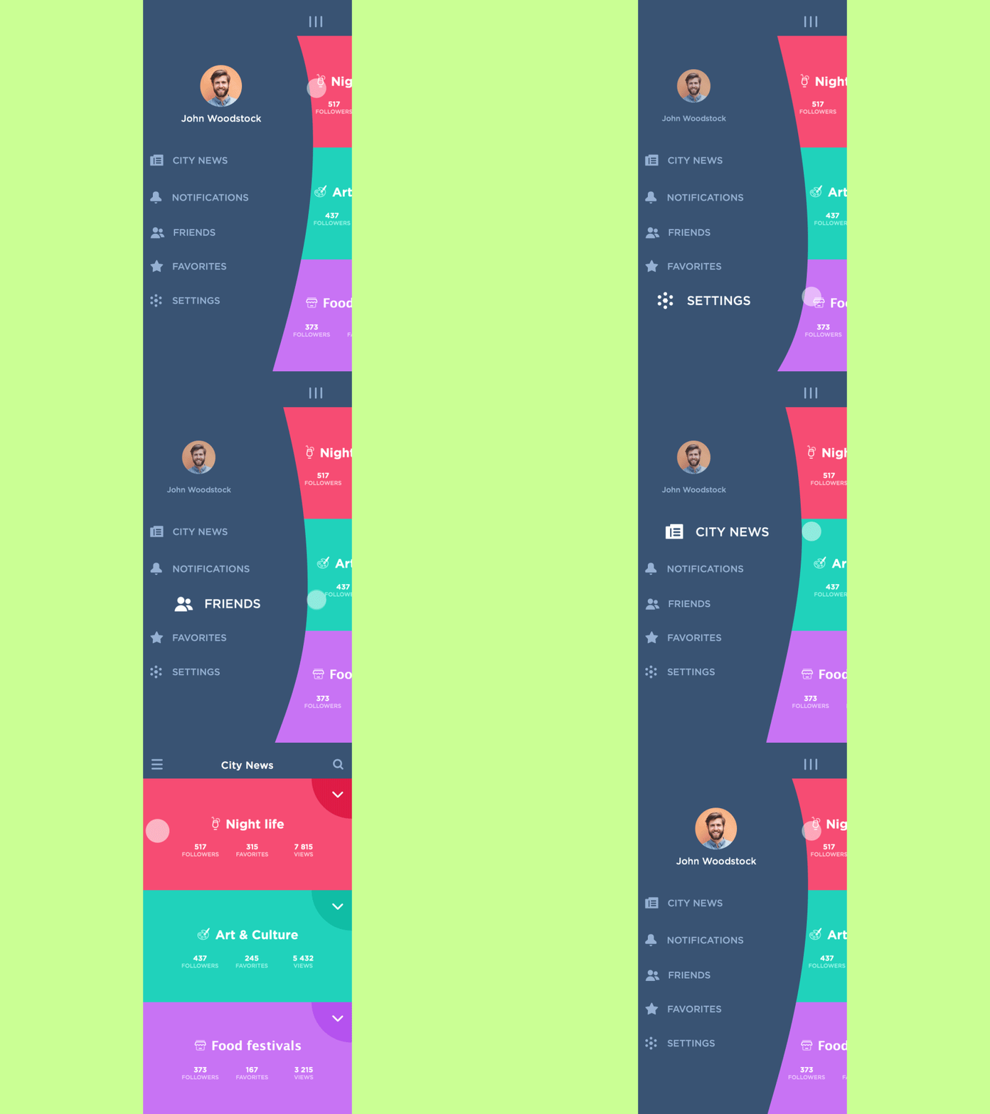
One more animation adding fun and supporting visual hierarchy to interactions with the side menu
Key Benefit of UI Animation Concepts
In fact, creation and research of something innovative start from a concept in practically any industry or creative field. Look at the automotive industry or architecture, remember how new art directions appeared and developed in history. Whatever is the sphere, the attitude to concepts will show two opposites from “that’s just a fantasy that has nothing to do with real life” to “why not…” Both variants are viable. Still, for better or worse, concepts from the power that makes progress possible.
The same situation is observed in the domain of UI animation. Most animations that today are taken for granted as an integral part of our interfaces were a kind of “unreal” concepts not so long ago. In the age of flat design, when shapes and colors are striving for simplicity and cleanness, animation becomes the proven way to make the apps and solutions stand out in terms of tense competition.
Useful Reading
How to Use Animations in Mobile Apps
Animated Logos: Why, Where, and How to Use
Motion for Mobile. 20 Bright Concepts of UI Animation
UI Animation: Eye-Pleasing, Problem-Solving
Animated Interactions. Motion on Purpose
UI Animation. Microinteraction for Macroresult
Interface Animation. The Force of Motion
Originally written for Tubik Blog
- English
- Ukrainian


