Basics of Information Architecture for Designers
Basics of Information Architecture for Designers The article providing insights into the basics of information architecture for designers and setting the link between IA, UX and UI for websites and applications.
The World Wide Web contains a tremendous amount of information which is hard to imagine unstructured because a human brain wouldn’t be able to perceive any single thing. People got used to seeing the content and functionality of the digital products as many of them are now: structured and easy to use. However, it doesn’t occur unintentionally. Designers and developers take responsibility of constructing content and navigation system in the appropriate way for users’ perception. The science that assists experts in the content structuring is called information architecture. Today’s article is devoted to the essence of information architecture and presents the basic points every designer should know.
What’s information architecture?
Information architecture (IA) is a science of organizing and structuring the content of the websites, web and mobile applications, and social media software. An American architect and graphic designer, Richard Saul Wurman, is considered to be a founder of the IA field. Today, there are many specialists working on IA development who have established the Information Architecture Institute. According to the IAI experts, information architecture is the practice of deciding how to arrange the parts of something to be understandable.
Information architecture aims at organizing content so that users would easily adjust to the functionality of the product and could find everything they need without big effort. The content structure depends on various factors. First of all, IA experts consider the specifics of the target audience’s needs because IA puts user satisfaction as a priority. Also, the structure depends on the type of the product and the offers companies have. For example, if we compare a retail website and a blog, we’ll see two absolutely different structures both efficient for accomplishing certain objectives. Information architecture has become a fundamental study in many spheres including design and software development.

The role of information architecture in design
Nowadays, when the user-centered approach in design is a top trend, many designers learn the principles of information architecture science which they believe is a foundation of efficient design. IA forms a skeleton of any design project. Visual elements, functionality, interaction, and navigation are built according to the information architecture principles. The thing is that even compelling content elements and powerful UI design can fail without appropriate IA. Unorganized content makes navigation difficult and inexplicit, so the users can easily get lost and feel annoyed. If the users face first bad interaction, they may not give the second chance to your product.
Many companies don’t see the importance of information architecture because they think it’s impractical. It’s hard to argue that IA takes some time to create it and requires specific skills to do it efficiently. However, powerful IA is a guarantee of a high-quality product since it reduces the possibility of usability and navigation problems. This way, well-thought information architecture can save both the time and money of the company which otherwise they would have spent on fixing and improving.
IA and UX design
After reading everything written above, many people may have the question: “Isn’t IA the same as UX design?”. Technically, these terms relate to each other but they are far not the same. IA is a blueprint of the design structure that can be generated into wireframes and sitemaps of the project. UX designers use them as the basic materials so that they could plan the navigation system.
UX design means much more than content structuring. In the first place, UX designers aim at making a pleasant interaction model, so that users feel comfortable using the product. They encompass various aspects influencing users’ behavior and actions such as emotion and psychology when the IA experts stay focused on the user’s goals.
Let’s get this straight: good information architecture is a foundation of efficient user experience, so the IA skill is essential for the designers. Effective IA makes the product easy to use but only united with design thinking the product has a powerful user experience.

IA system components
If you want to build strong information architecture for the product, you need to understand what it consists of. Pioneers of the IA field, Lou Rosenfeld and Peter Morville in their book “Information Architecture for the World Wide Web” have distinguished four main components: organization systems, labeling systems, navigation systems, and searching systems.
Organization systems
These are the groups or the categories in which the information is divided. Such a system helps users to predict where they can find certain information easily. There are three main organizational structures: Hierarchical, Sequential, and Matrix.
Hierarchical. In one of our previous articles, we’ve mentioned a well-known technique of content organization which is called visual hierarchy. It is initially based on Gestalt psychological theory and its main goal is to present content on the carrier, be it a book page or poster, web page, or mobile screen, in such a way that users can understand the level of importance for each element. It activates the ability of the brain to distinguish objects on the basis of their physical differences, such as size, color, contrast, alignment, etc.
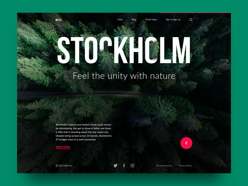
Sequential. This structure creates some kind of a path for the users. They go step-by-step through content to accomplish the task they needed. This type is often used for retail websites or apps, where people have to go from one task to another to make the purchase.
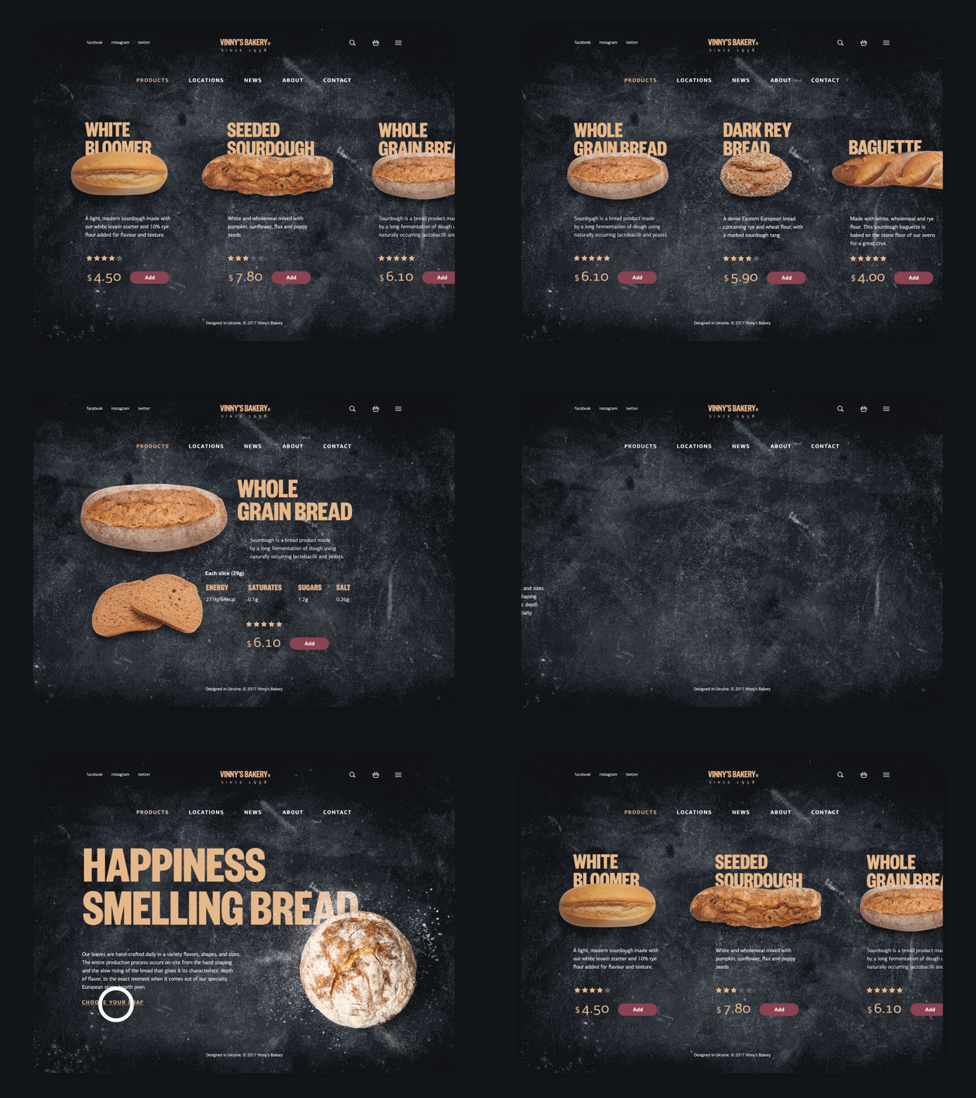
Matrix. This type is a bit more complicated for the users since they choose the way of navigation on their own. Users are given choices of content organization. For example, they can navigate through content that is ordered according to date, or some may prefer navigation along the topic.
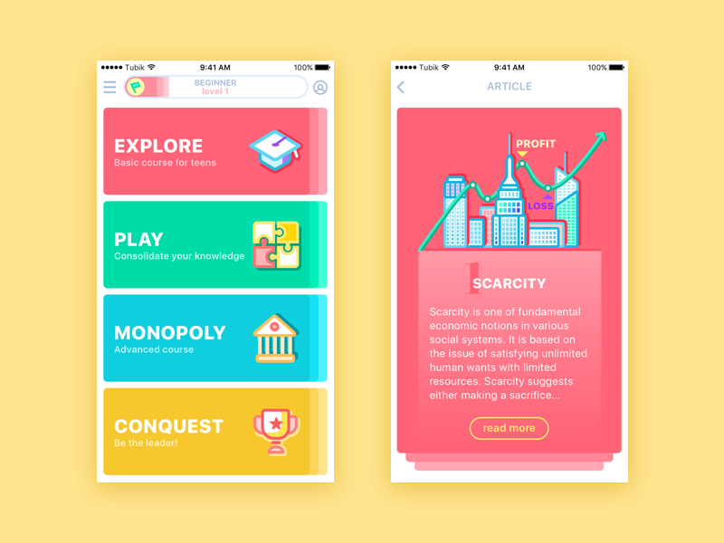
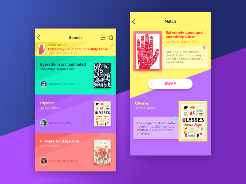
In addition, content can be grouped according to the organization schemes. They are meant to categorize the content of the product. Here are some of the popular schemes:
Alphabetical schemes. Content is organized in alphabetical order. Also, they can serve as a navigation tool for users.
Chronological schemes. This type organizes content by date.
Topic schemes. Content is organized according to the specific subject.
Audience schemes. The type of content organization for separate groups of users.
Labeling systems
This system involves the ways of data representation. The design of the product requires simplicity, so a great amount of information can confuse users. That’s why designers create labels that represent loads of data in a few words. For example, when the designers give the contact information of the company on the website, it usually includes the phone number, email, and social media contacts. However, designers can’t present all of this information on one page. The button “Contact” in the header of the page is a label that triggers the associations in the users’ heads without placing the whole data on the page. So, the labeling system aims at uniting the data effectively.

Navigation systems
In one of our UX Glossary articles, we’ve defined navigation as the set of actions and techniques guiding users throughout the app or website, enabling them to fulfill their goals and successfully interact with the product. The navigation system, in terms of IA, involves the ways how users move through the content. It’s a complex system that employs many techniques and approaches, the reason why it’s wrong to describe it in a short paragraph. So, we’ll go back to the topic a bit later on our new blog’s article.
Searching systems
This system is used in information architecture to help users search for the data within the digital product like a website or an app. The searching system is effective only for the products with loads of information when the users risk getting lost there. In this case, the designers should consider a search engine, filters, and many other tools helping users find content and plan how the data will look after the search.

To sum up, we can claim that information architecture is a core part of the powerful user experience design. Efficient IA helps users quickly and easily navigate through content and find everything they need without striking a blow. That’s why designers are recommended to learn the basics of IA science.
The topic of information architecture is wide and there are more interesting and useful aspects. Our next article on this theme will be devoted to the various techniques and methodologies which designers employ to create efficient IA. Stay tuned!
Recommended reading
IA for the Web and Beyond
How to Make Sense of Any Mess: Information Architecture for Everybody
Information Architecture Basics
The Difference Between Information Architecture and UX Design
Originally written for Tubik Blog
- English
- Ukrainian


