


UI Animation. Microinteraction for Macroresult
UI Animation. Microinteraction for Macroresult The set of considerations about use and purpose of interface animation in user-centered interface design in the aspect of efficient microinteractions.
Microinteraction is one of the key things to care about in UI/UX design. They are, perhaps, the best proof that attention to small details is able to give big and powerful results. Most books and articles on UX/UI design are moving round one basic message: what you finally get when the design process is finished should be not only beautiful but also useful and usable. In our previous posts and case studies, we also support the idea that UI/UX designers do not create just a piece of art: they create a product that solves the problem of the target audience, preferably in a fast and easy way. The solid ground of carefully thought-out microinteractions is able to give the designed product such key characteristics of a successful product as usability, utility, and desirability.
The essence of microinteraction
Basically, micro interaction is one particular case of a user’s interaction with the product completing one particular task. For example, when you press the “like” button (anyhow it looks like) and see that your like has been counted (the number has changed, the button changed the color or became inactive, the copy on the button informed you that you had done the action, the copy under the button or other interactive element informs that you are in the list of those who liked, and so on), that is the case of microinteraction. When you fill in the proper text field with the search request and send it to the system, that is one more case. Microinteractions happen when we follow or unfollow someone on a social network, rate the blog post, or set the timer – hundreds of things we do, in most cases, not willing to think over those simple steps too much. So, it’s easy to understand that user experience includes loads of microinteractions, and they are those magic seeds that are able to grow into great usability, efficiency, and popularity of the product if they are looked after properly.
Perhaps the best deeply professional piece of writing on microinteractions, their idea, structure, mechanism of work, their kinds, features, and role in creating effective UX design is the book “Microinteractions” by Dan Saffer. It is highly recommended to people working in the field of UI/UX design as it provides a much better understanding of user-centered design solutions.
Microinteractions, in most cases, aren’t even consciously fixed by the user – and that is actually one of the important tasks for a designer to make them as natural, clear and fast as possible. There are many ways and methods in design how to enable and improve microinteractions, and interface animation is one of them. We have already started this topic in our earlier article Interface Animation. The Force of Motion, based on general ideas of animation use and purposes in interfaces according to practical experience of Tubik design projects and concepts. There we mentioned that animation enabling and improving microinteractions is something like health: people do not notice it when it works properly but realize its importance when something goes wrong. Microinteractions naturally supported with motion are also hardly notable for users until the moment when they face the problem of their absence. So, today, we would like to provide you with more detailed thoughts and examples about some kinds of this interface animation type.
Animated microinteractions
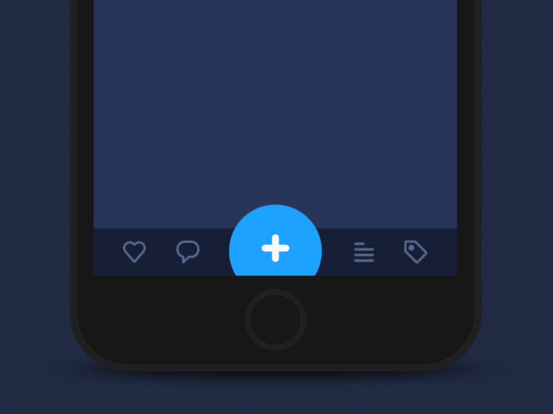
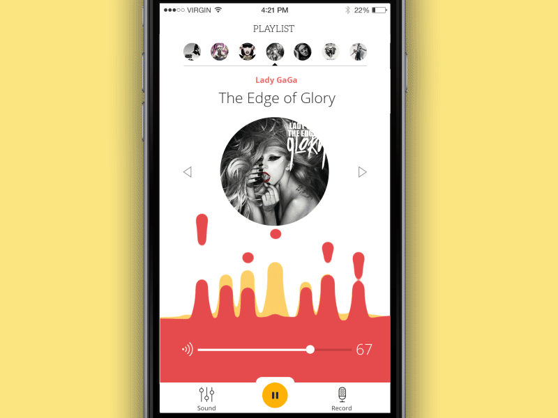
Animated buttons
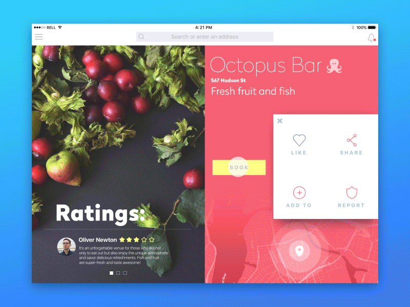
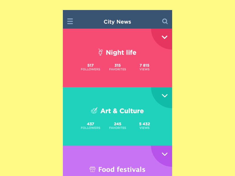
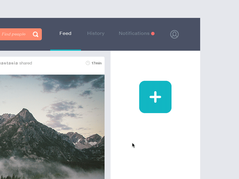
Buttons of different kinds and sorts are, obviously, the most popular elements of interaction. What is more, they are easily perceived by users as the elements with which they can activate a screen or a webpage functionality, even for users with low levels of computer literacy, as buttons actually imitate interaction with common physical objects. So, buttons are among the elements actually influencing the nature of user experience, making it easy and positive or, vice versa, annoying and confusing. Buttons, in a lot of cases, are among the most frequently used triggers of microinteractions and vital elements of navigation. So, they need thorough attention from the designer in deciding on not only color, shape, special effects, textures, and placement but also necessity, appropriateness, and nature of animation.
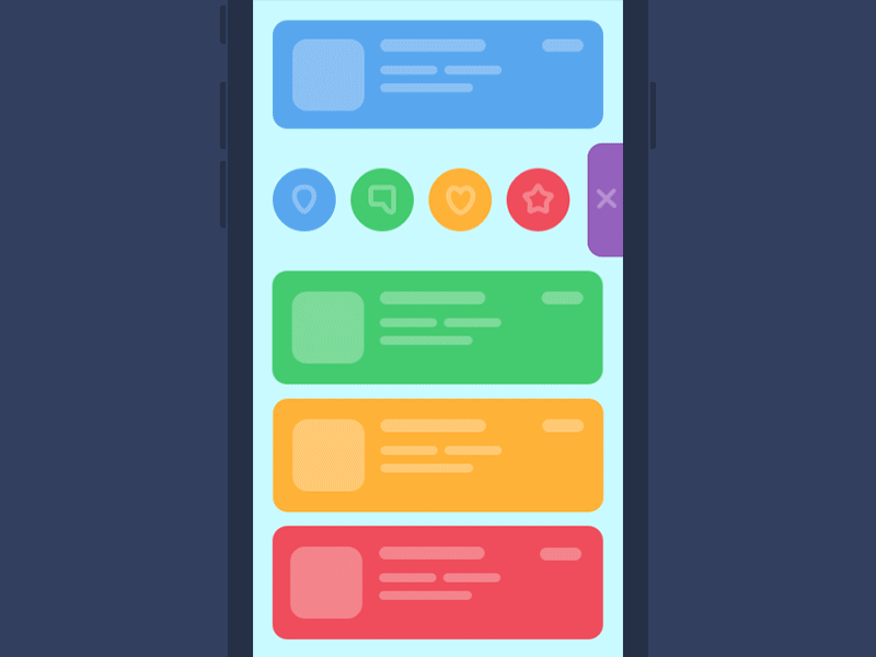
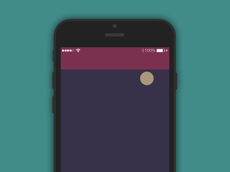
Pull-down-to-refresh animation
This type of animation for interfaces is among the most popular now, and customers often mention it from the very first stages of work on UI design for mobile applications. On the one hand, it simultaneously provides two steps of interaction with the app, showing that the user has reached the upper limit of content scrolling and that the screen of the app is refreshed. On the other hand, it opens incredibly broad space for creativity at the graphic UI design stage as the elements activated in this process could be not only informing but also stylish, good-looking, and entertaining. Moreover, this type of interface animation can efficiently use specific branding elements supporting general brand awareness and making the logo or mascot of the brand more memorable and recognizable.
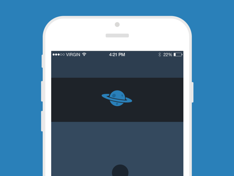
State of process animation
Some kinds of microinteractions happen immediately, while others need some time to finalize. Anyway, for a positive experience, users need to understand what is going on at every step they take. So, loading processes and the like should be shown to the user clearly, and they are also a great space for designers’ creativity. As in the previous case, some standard solutions can be used as well as entertaining and funny details and effects or elements of branding can be promoted here. In this case, designers should analyze the core target audience to decide what kind of animation can be supportive here and if it needs either a sort of loading bar or circle or any additional data like the percentage with numbers shown or any explanatory copy.

One more thing to mention is the fact that using any kind of digital interactive product, what the user really needs is communication via fast feedback from the system. Even if the user has to wait, he/she should be clearly informed about it. It is the basis for all the types of animation featured above. The most important and initial aim of animation is to clarify, ease and speed up the process of interaction, and only after this to beautify and create the so-called “WOW-effect.” Interface animation solutions should be accomplished on the basis of usability rather than pure decoration and entertainment.
However, as well as in the previous post on animation, we appeal to common sense in the use of animation for microinteractions. Animation should support the users, help them, and be applied where it is really reasoned with usability increase, not distracting or overloading the screen.
Points to consider about animation for microinteractions
- It shouldn’t overload the page or screen too much, causing the long and annoying process of loading
- It should be thought over the perspective of different devices and conditions in which target user can potentially use them
- It shouldn’t create high distraction from the most important features or content on the screen or web page
- It should correspond with the general stylistic concept of the application or website to support the general harmonic perception of the product.
Designing solutions for efficient microinteractions, the designer has to act somehow at the crossroads of design, psychology, sometimes linguistics, and other spheres of science and human activity. A thorough analysis of the target audience and testing ideas and concepts enabling micro interactions usually open the door to higher usability. Animation used wisely in the interfaces can become one of the ways to effectively speed up interaction and make it more natural when it’s needed, at the same time creating pleasant and stylish visual design.
Useful Reading
Here’s a set of handy articles for further reading on the theme of UI animation:
How To Use Animation To Improve Mobile User Experience
What Is Conceptual Animation and How It Works in UX Design
Mobile Motion. 20 Creative Concepts of UI Animation
Interface Animation: Eye-Pleasing, Problem-Solving
Animated Interactions. Motion on Purpose
Interface Animation. The Force of Motion
Animated Logos: When, Why, and How to Use
Originally written for Tubik Blog.
- English
- Ukrainian