3 Stylish Visual Identity Projects by Black Pepper Design
3 Stylish Visual Identity Projects by Black Pepper Design Check the fresh issue of D4U Gallery featuring elegant visual identity design projects by Black Pepper design team.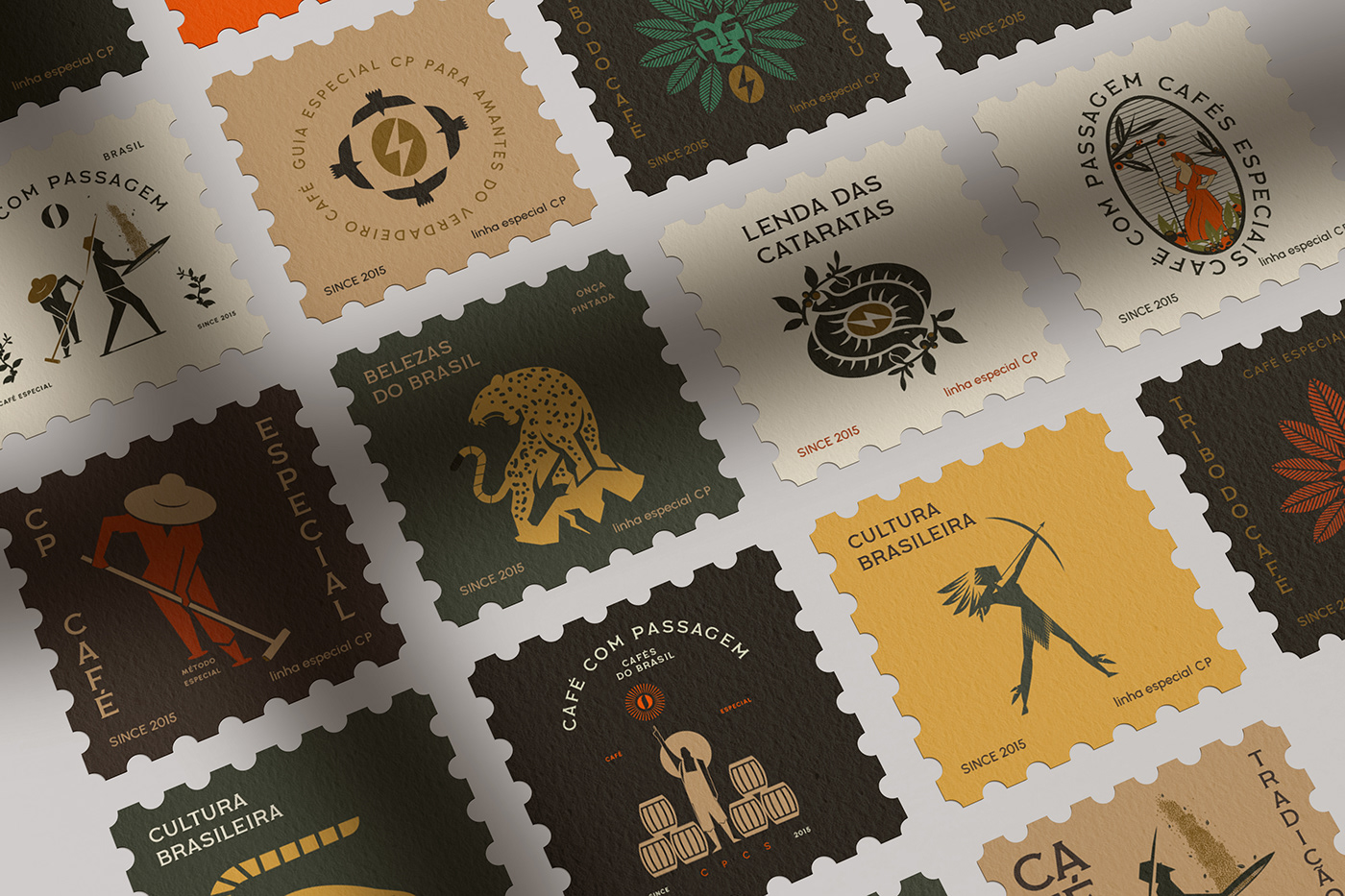
A new dose of design inspiration is up in our D4U Gallery, and this time, it’s another episode devoted to an elegant approach to visual identity design. Let’s review the stylish projects on developing a visual style approach for different brands accomplished by Black Pepper Design, a design team based in Brazil. Here, we’ve collected three of their projects reflecting their approach to graphic design and presentation for various types of business needs. Enjoy and get inspired!
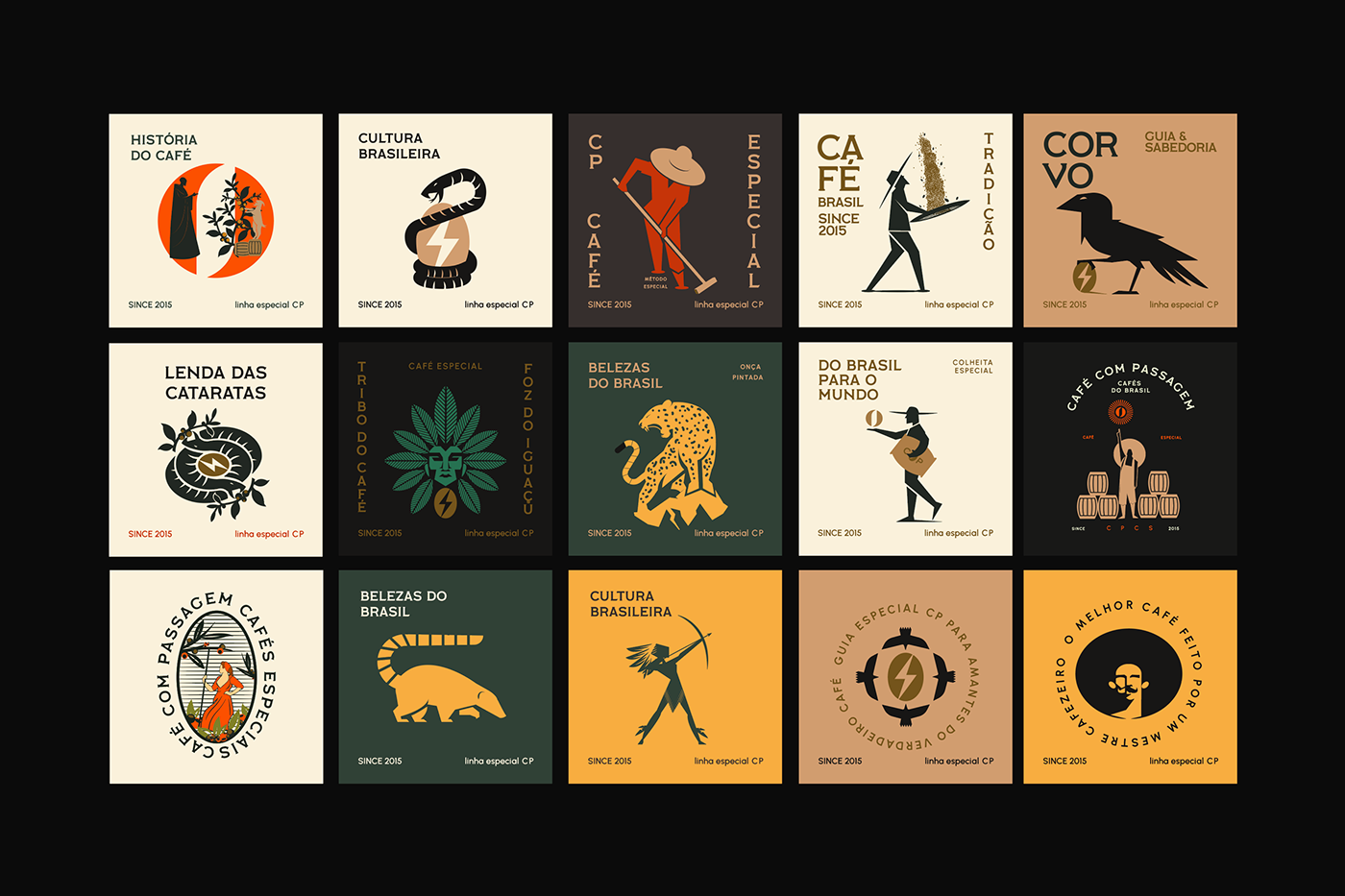
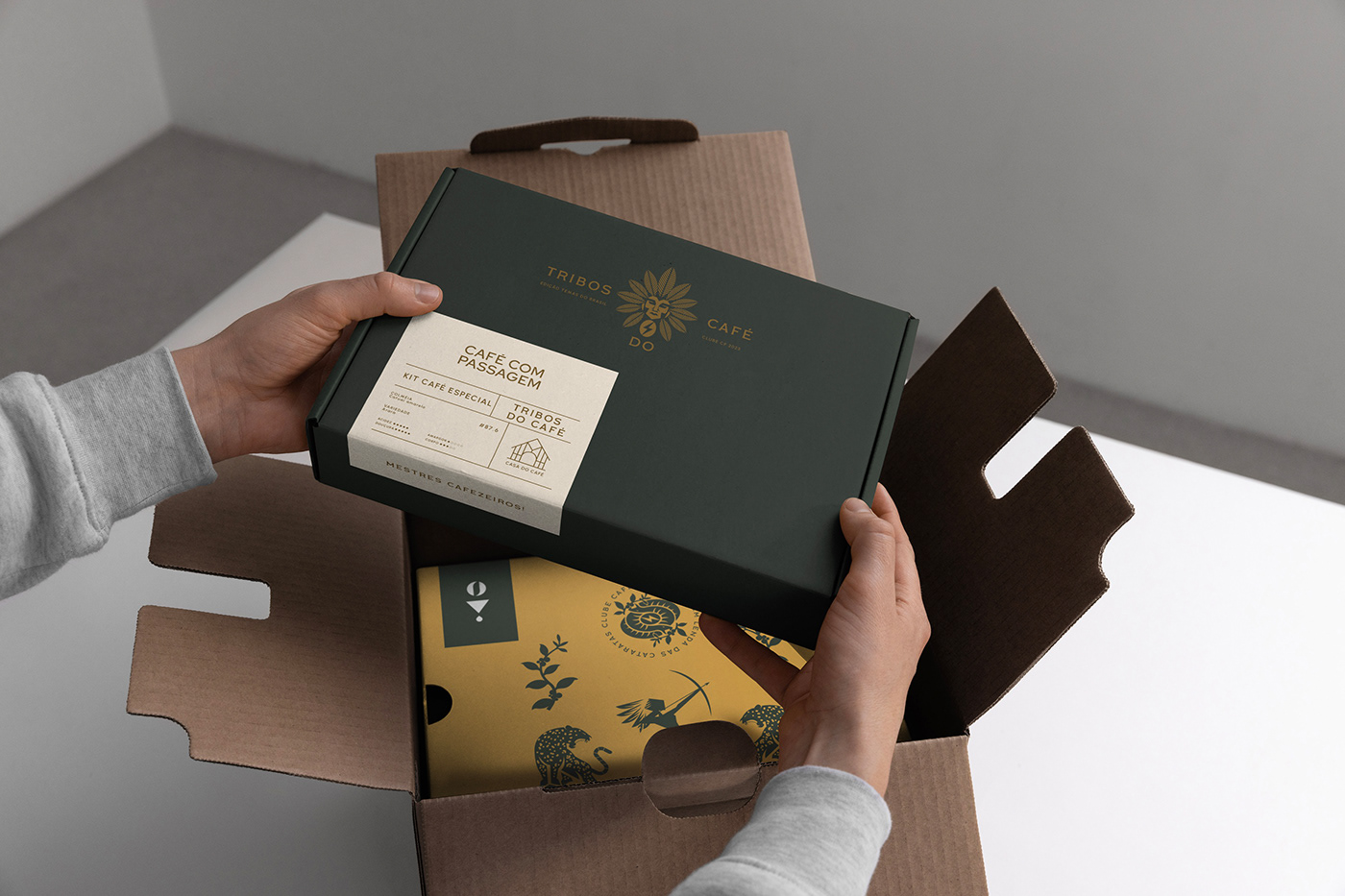
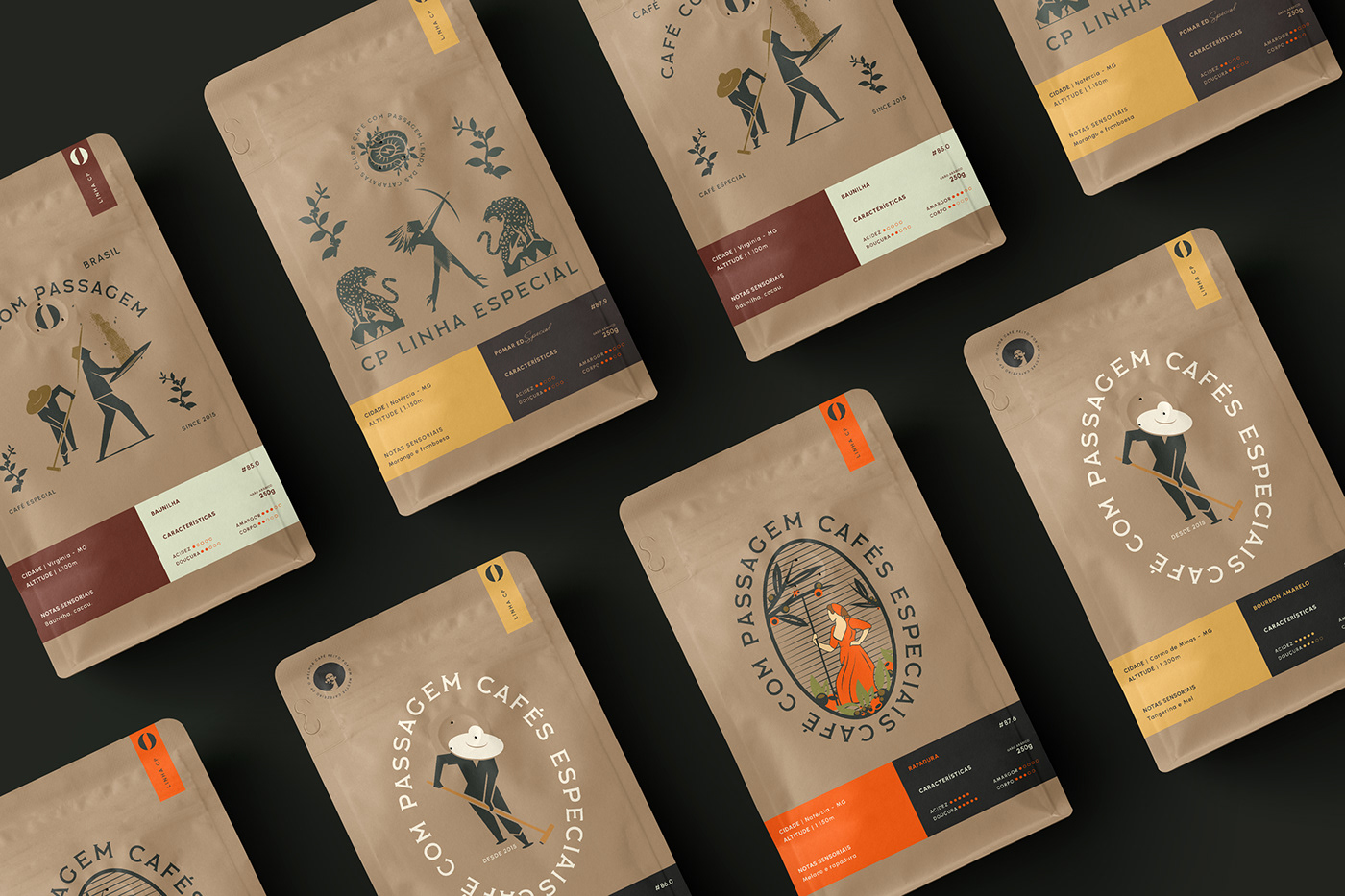
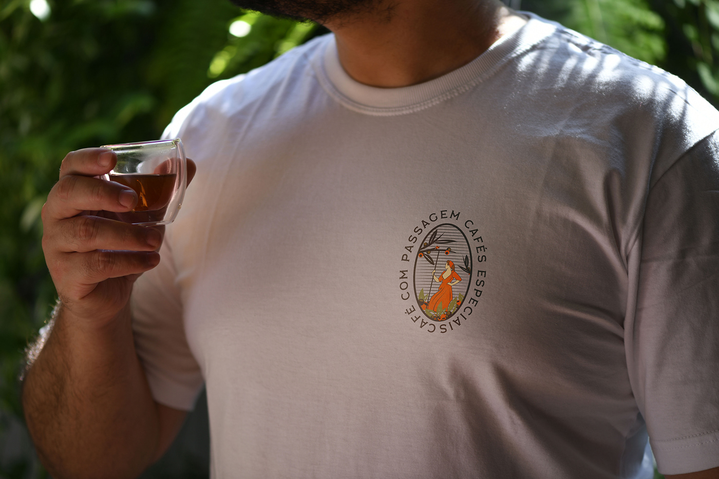
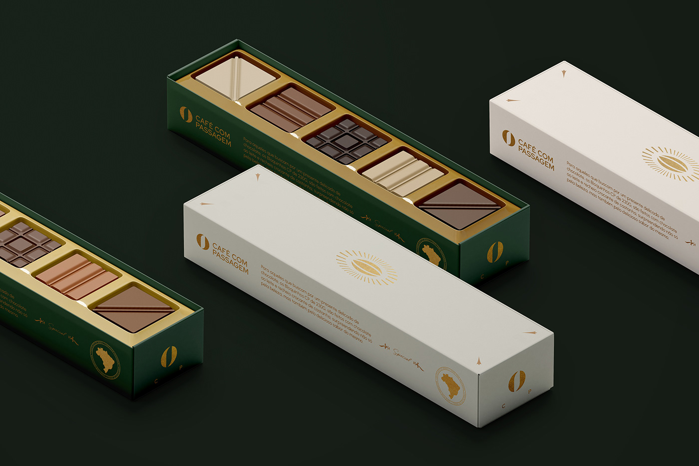
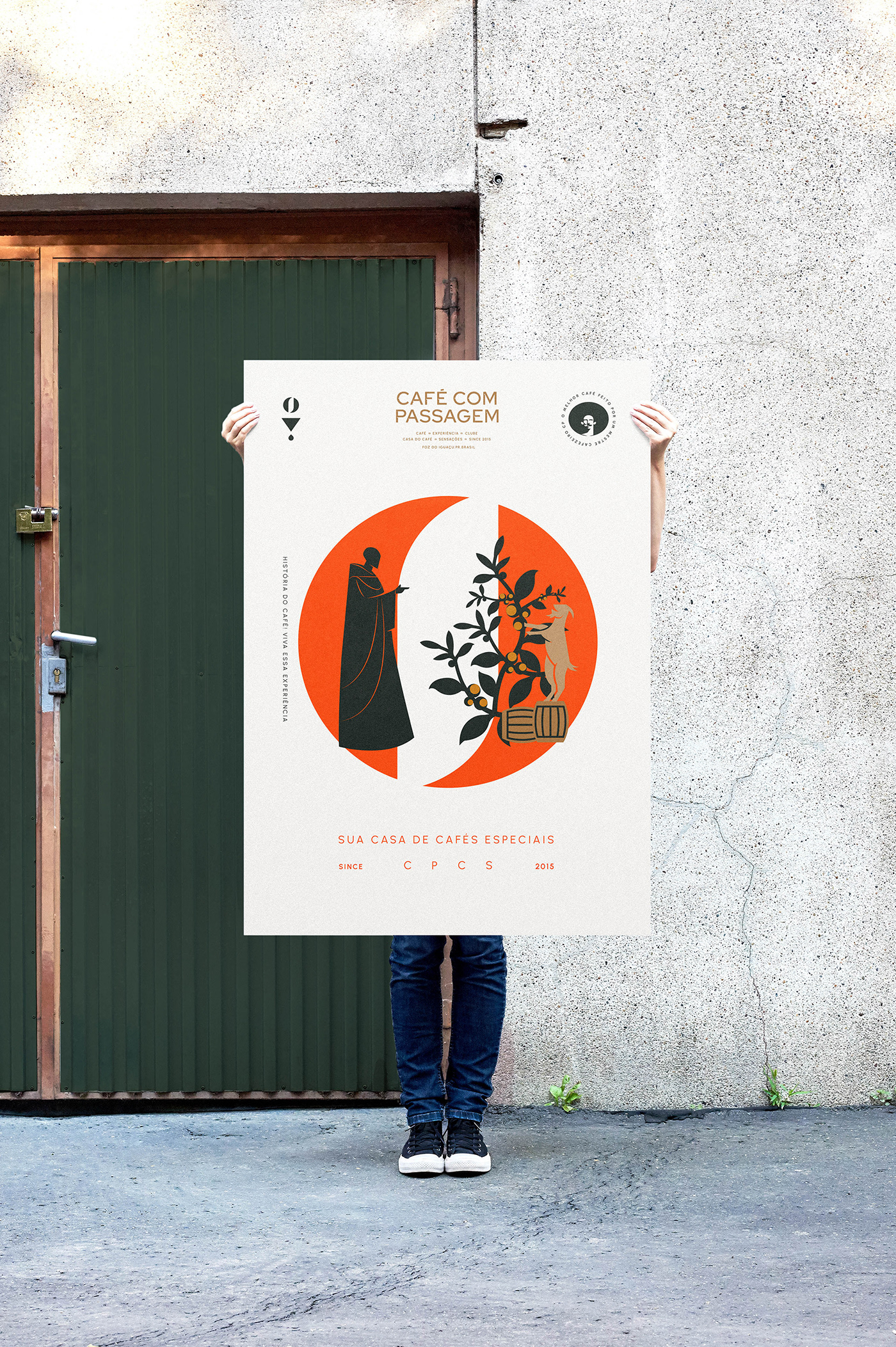
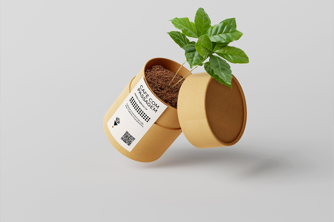
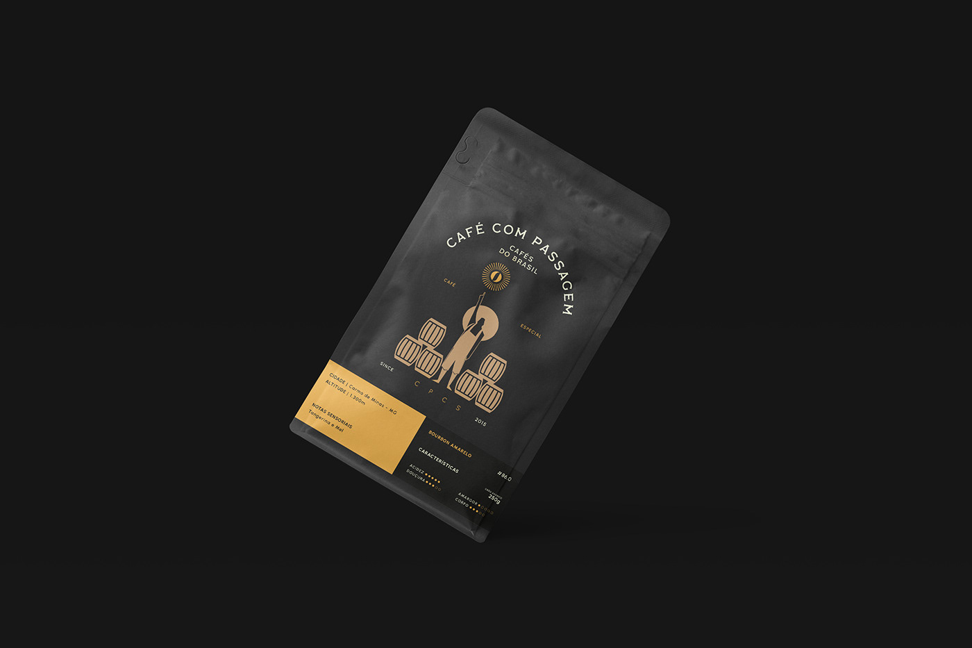
Café Com Passagem
Café com Passagem project description from designers:
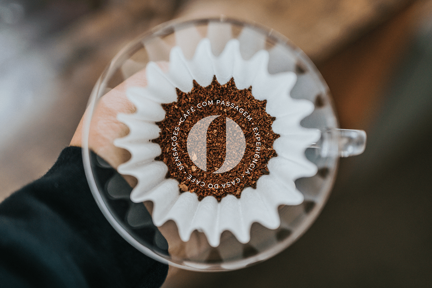
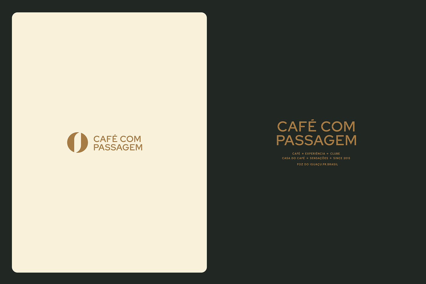
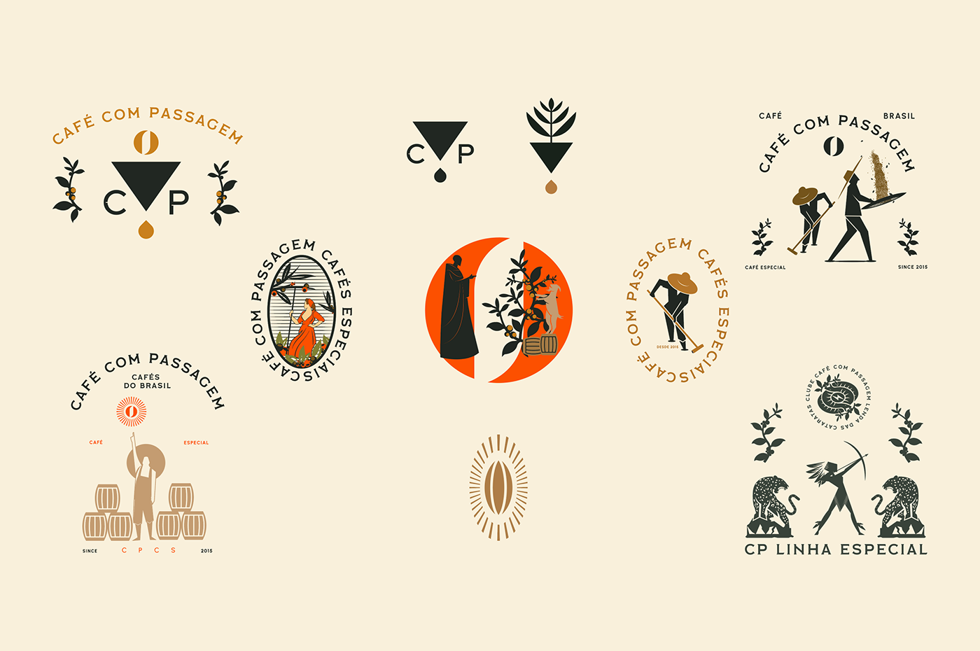
Café com Passagem is a family business focused on the specialty coffee market located in Foz do Iguaçu-PR. The need for this redesign came with the aim of praising the special Brazilian coffee bean, creating a brand aligned with the quality of the product that is able to reach international territories as well as the expectations of the specialty coffee consumer, who generally seeks knowledge about the world. of coffee and appreciates the stories behind each cup.
Specialty coffee in Brazil is treated in a very meticulous way, a process that involves many people and respects nature. The visual identity was built based on these precepts, with elements that reinforce craftsmanship, manual harvesting, people, Brazilian culture, and sustainability. The symbol in the typography represents coffee and the world, the Brazilian specialty coffee that has gained a prominent position in a global context. For the supporting graphic elements, animals from the Brazilian fauna (mainly from the Paraná region), the legend of Naipi and Tarobá, and drawings that illustrate the wisdom of the past of coffee cultivation were used.
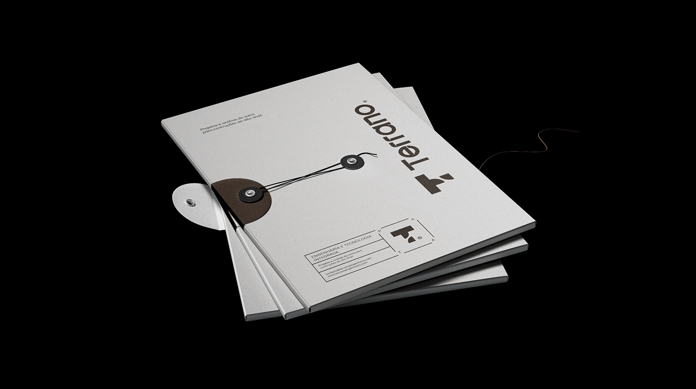
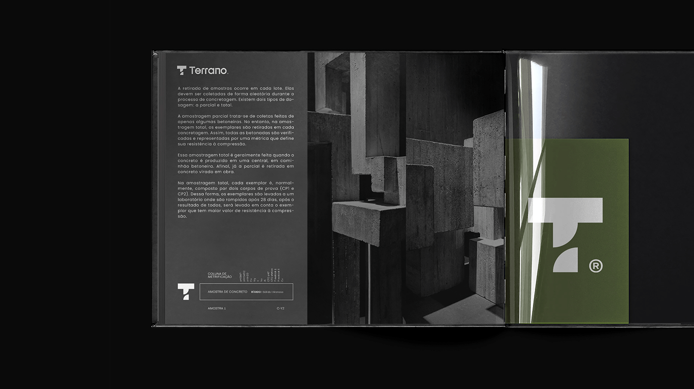
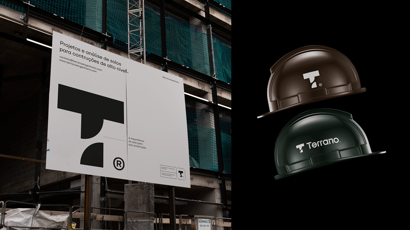
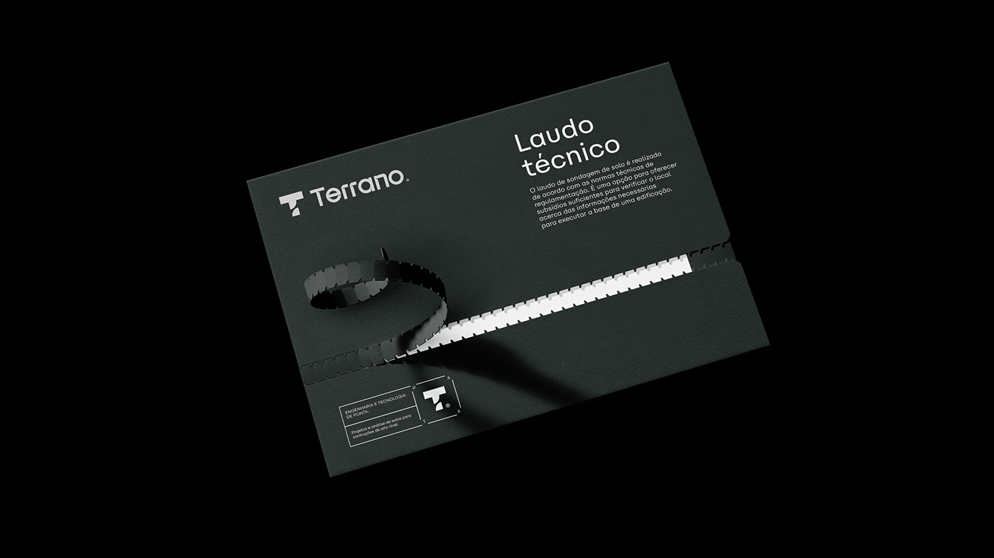
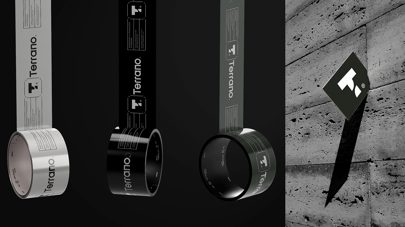
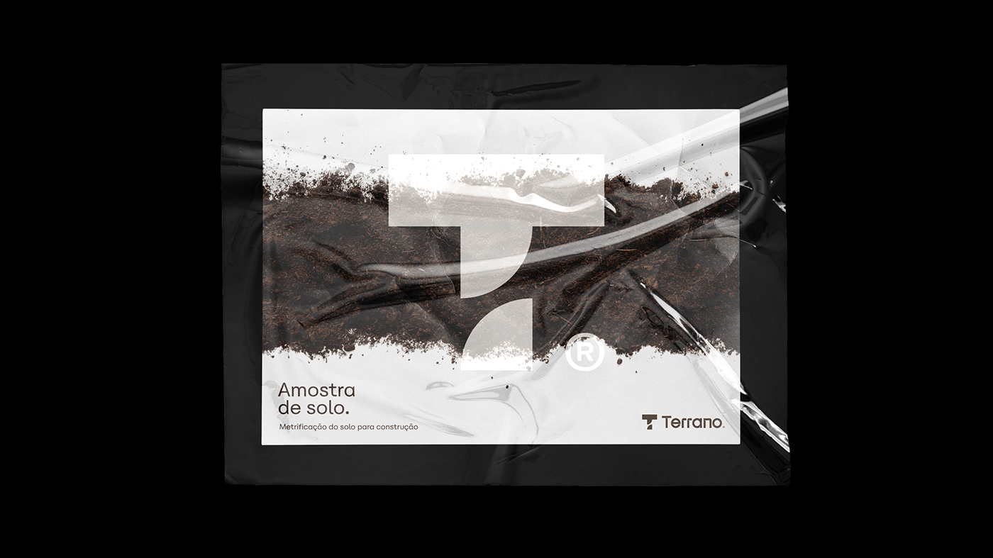
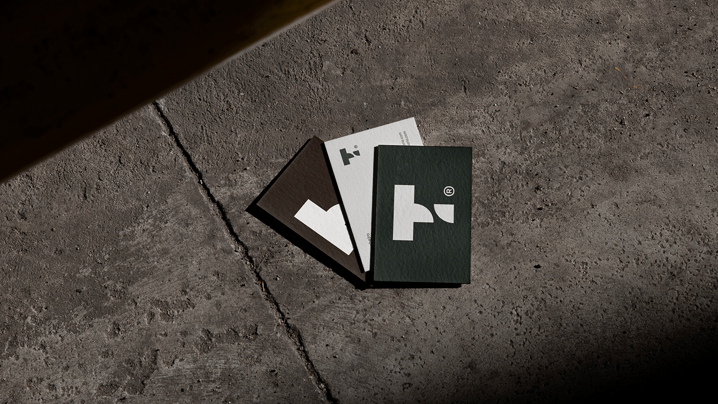
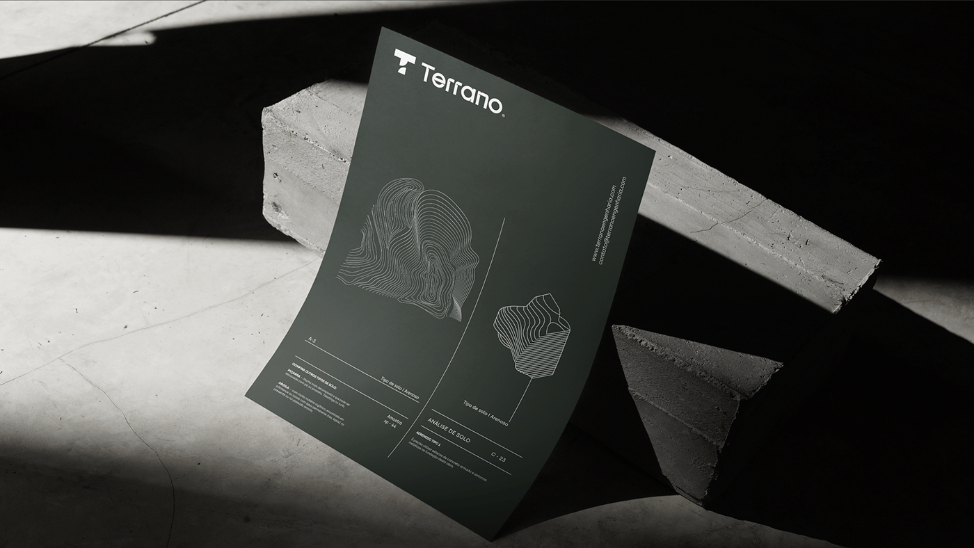
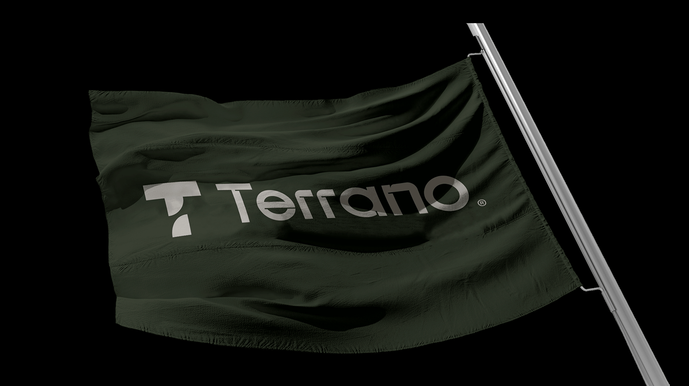
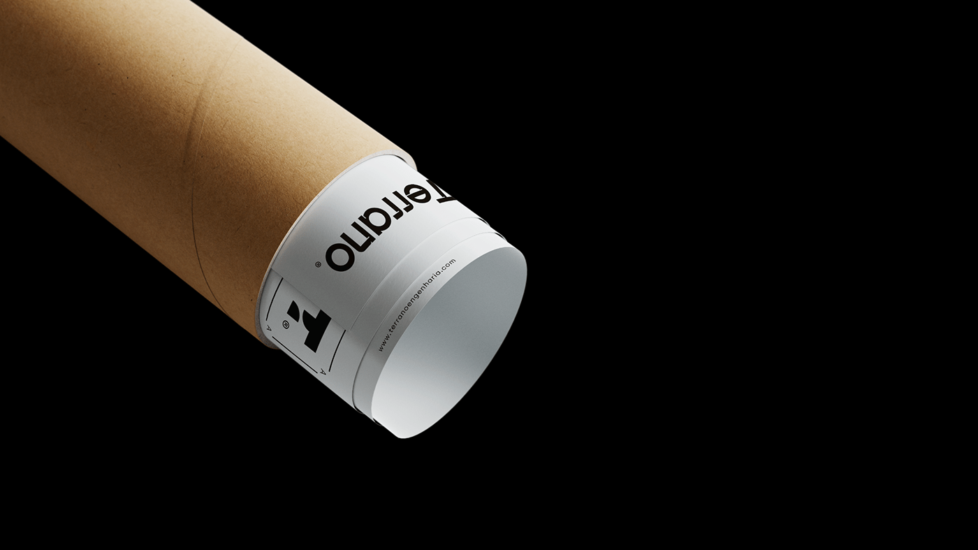
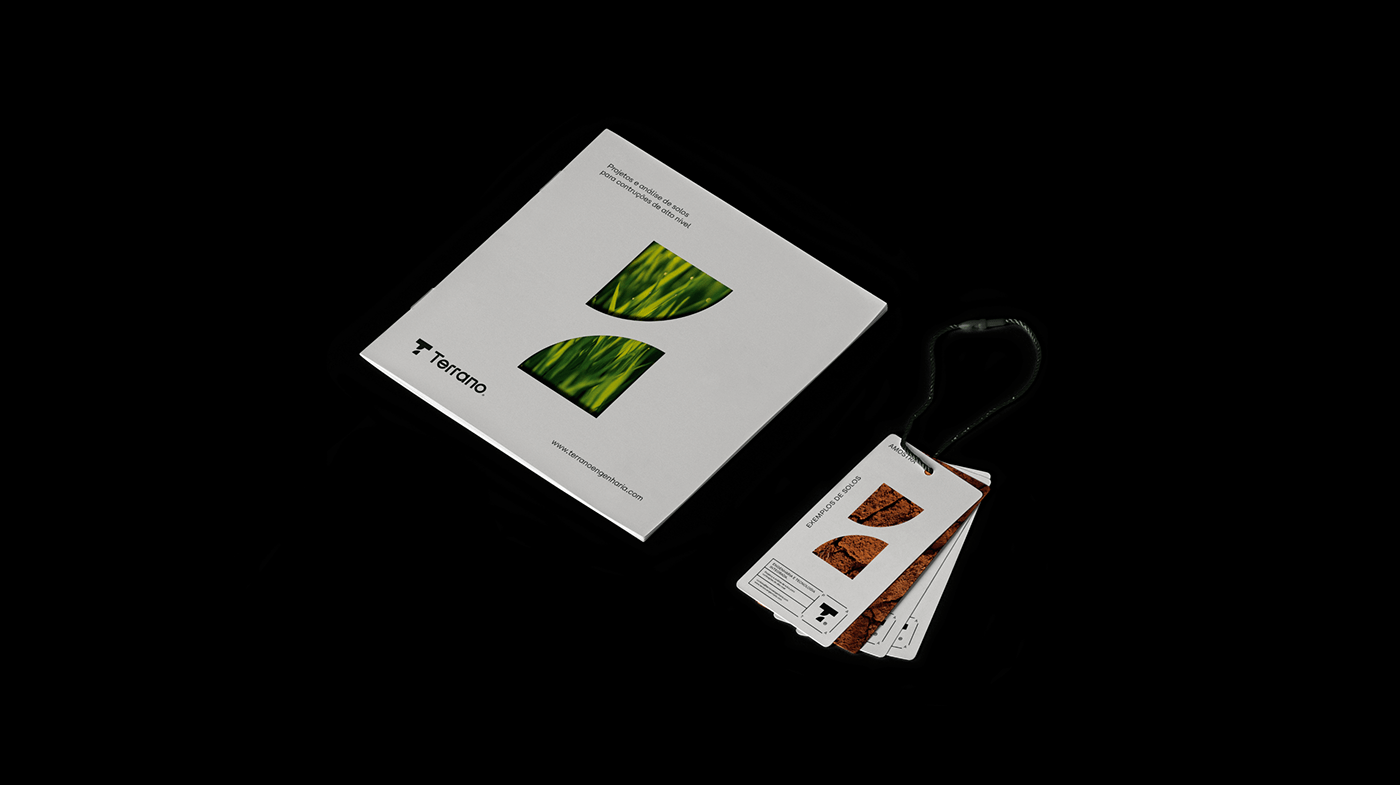
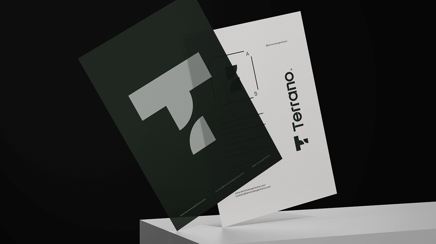
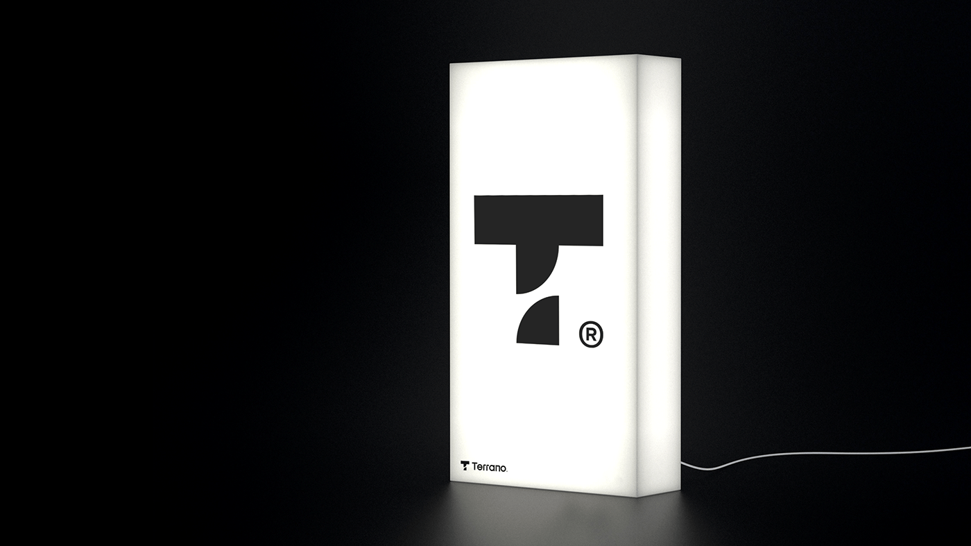
Terrano Engenharia
Terrano Engenharia project description from designers:
The brand was built by reinforcing the terrain’s work fronts (projection, work alignment, topography, and soil analysis) and also supporting the main pillars that the client expects to find in an engineering company: precision, seriousness, and safety.⠀
The colors used in the project represent a gradient of soil colors. Symbols and lines are essential elements in maps, and that is why they were added to the various geometric shapes of the visual identity – from the symbol “T” of the logo that was obtained from joining squares to complementary materials. The formats are generalist to facilitate reading and increase the level of understanding.

![]()
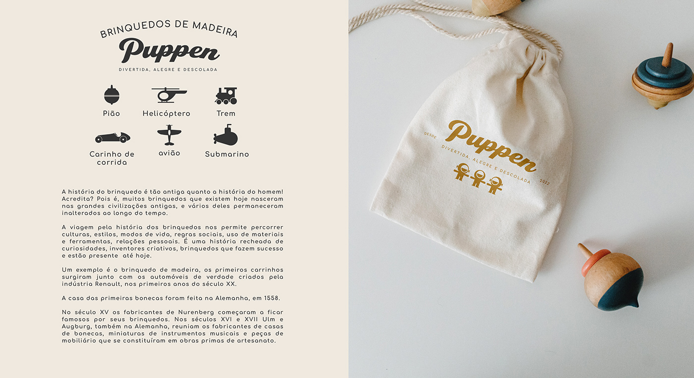
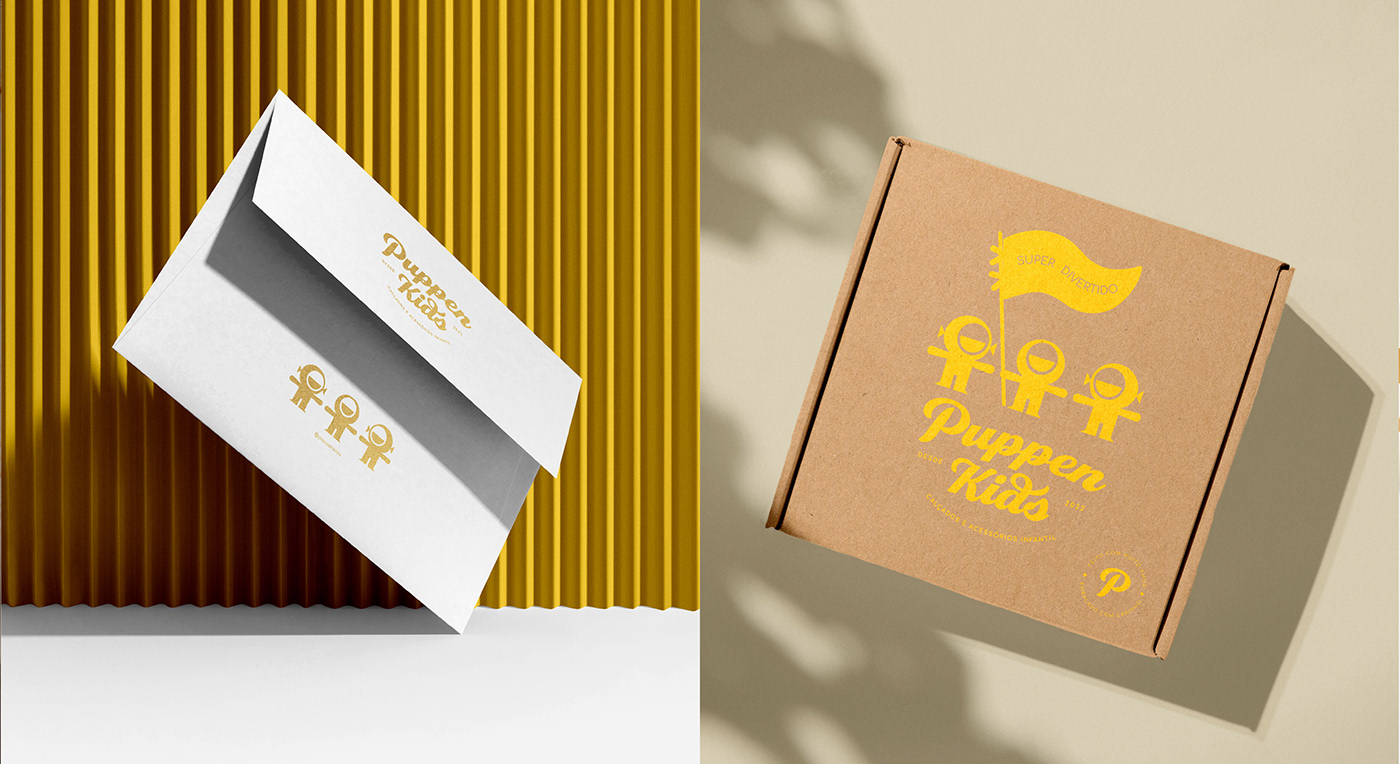
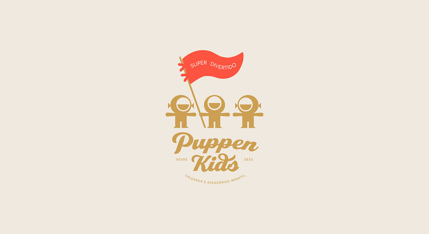
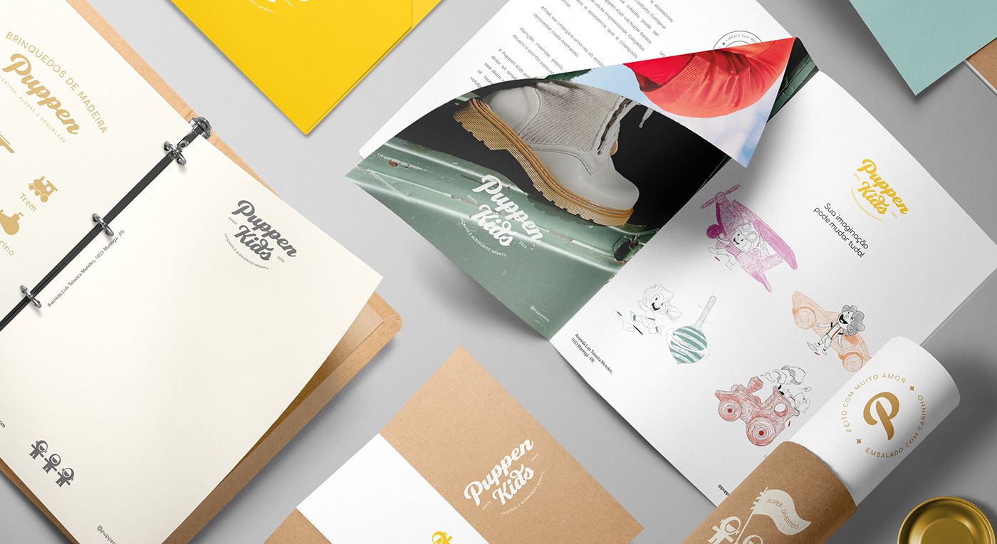
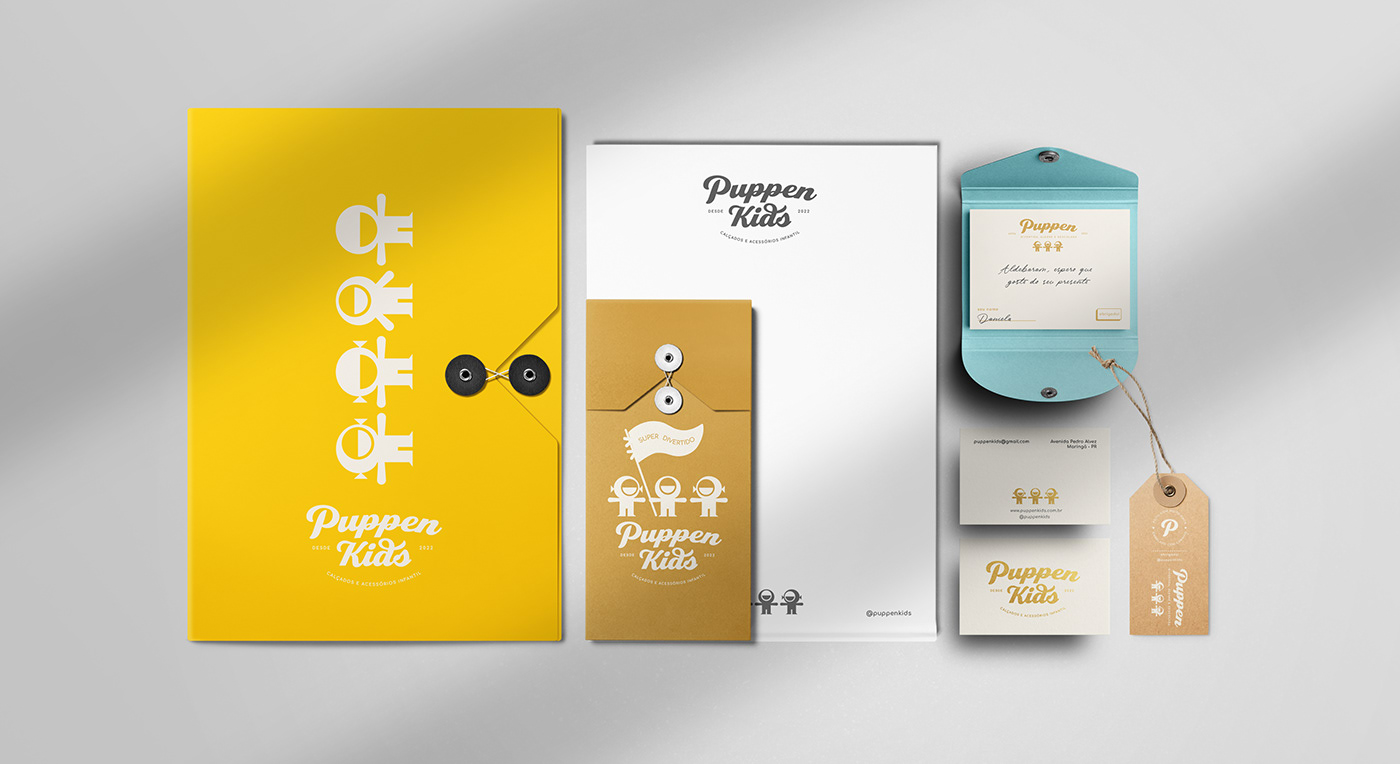
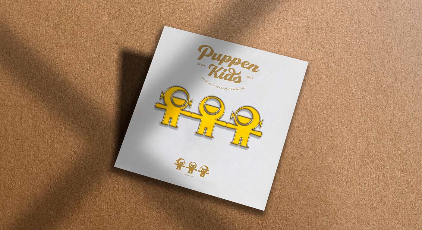
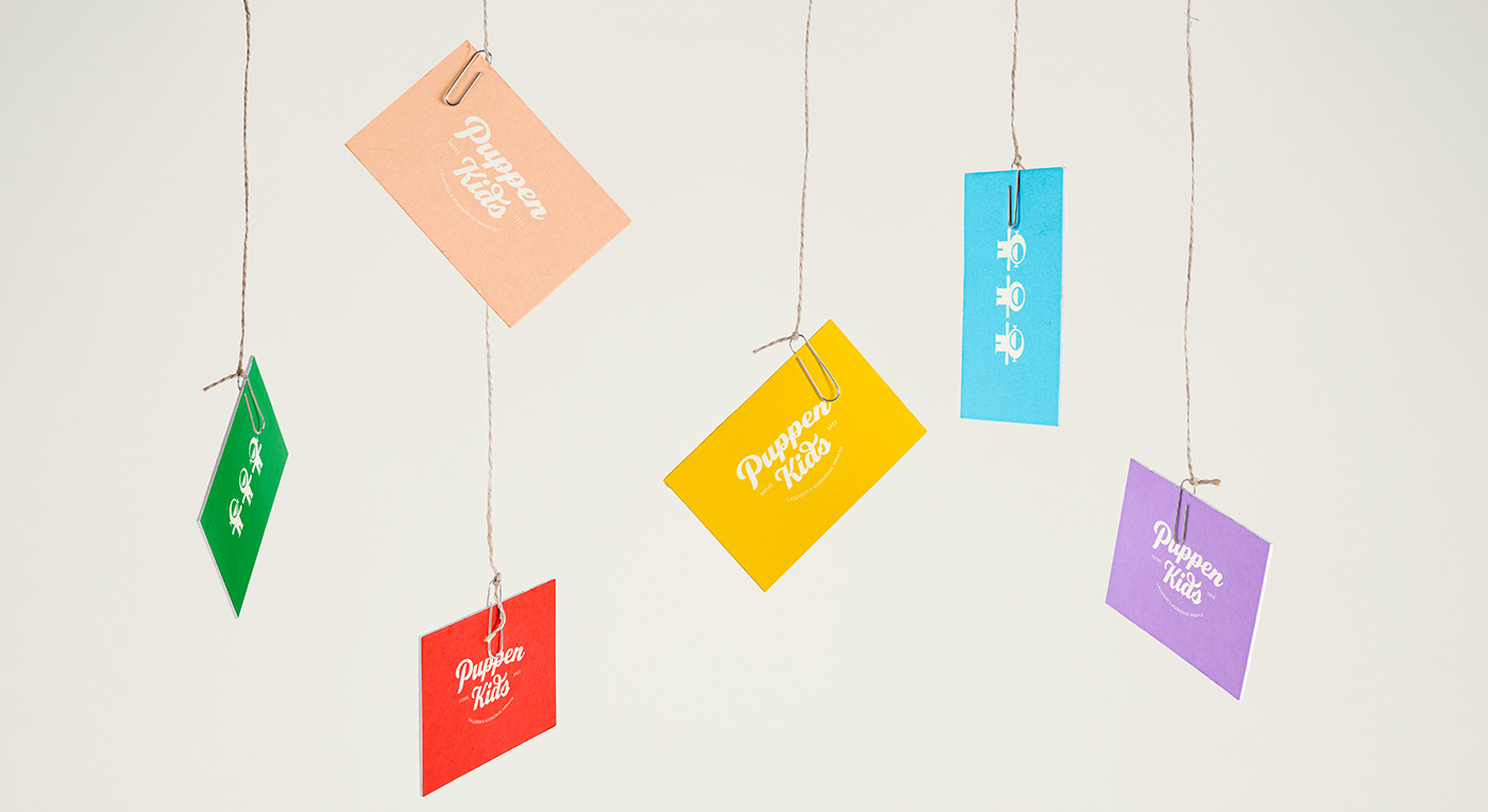
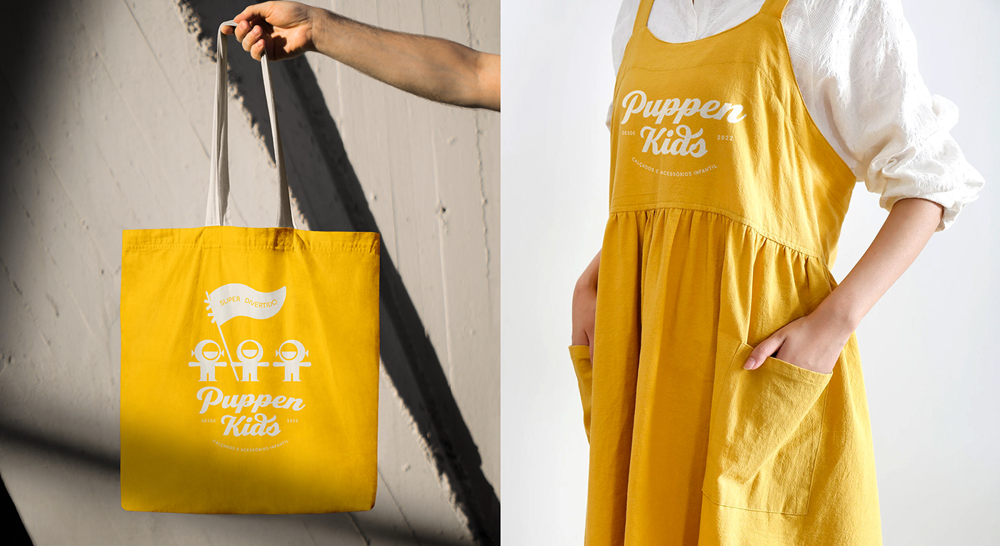
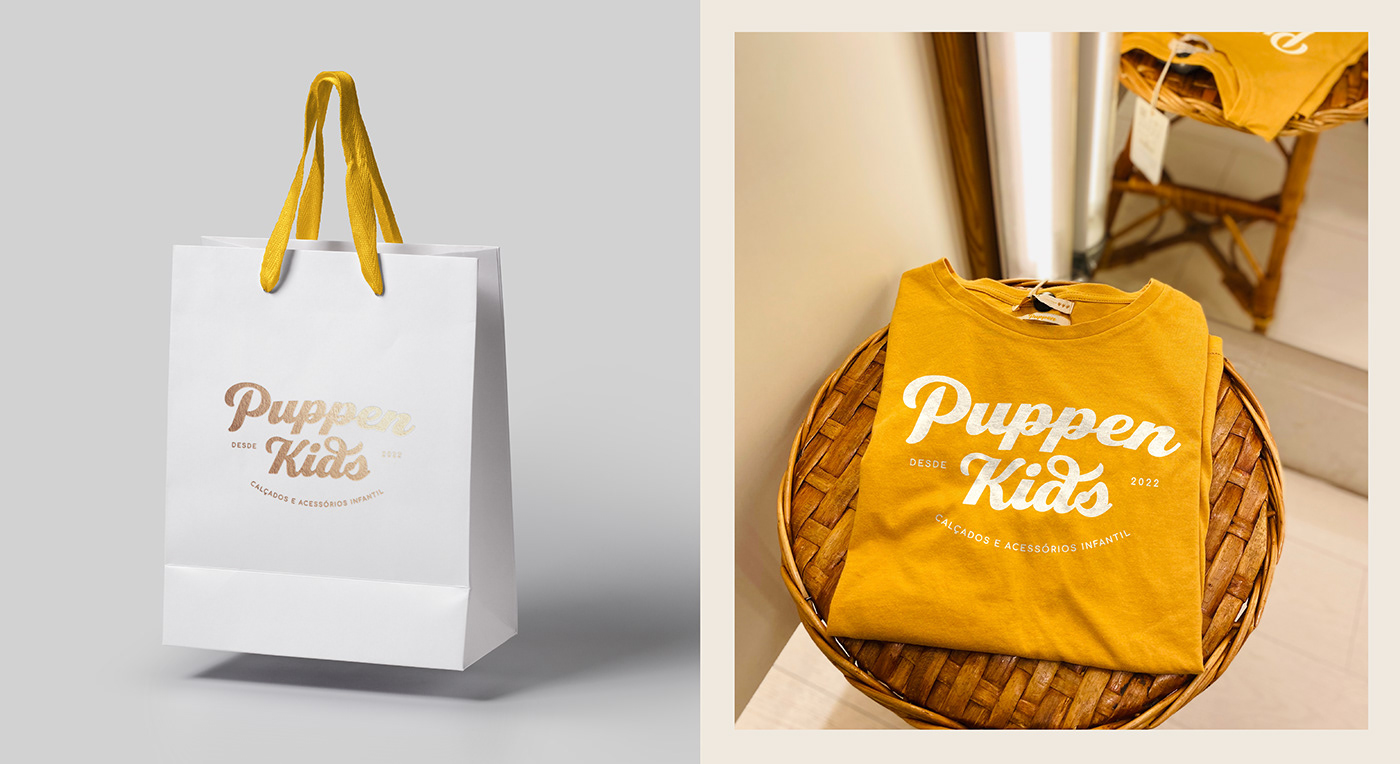
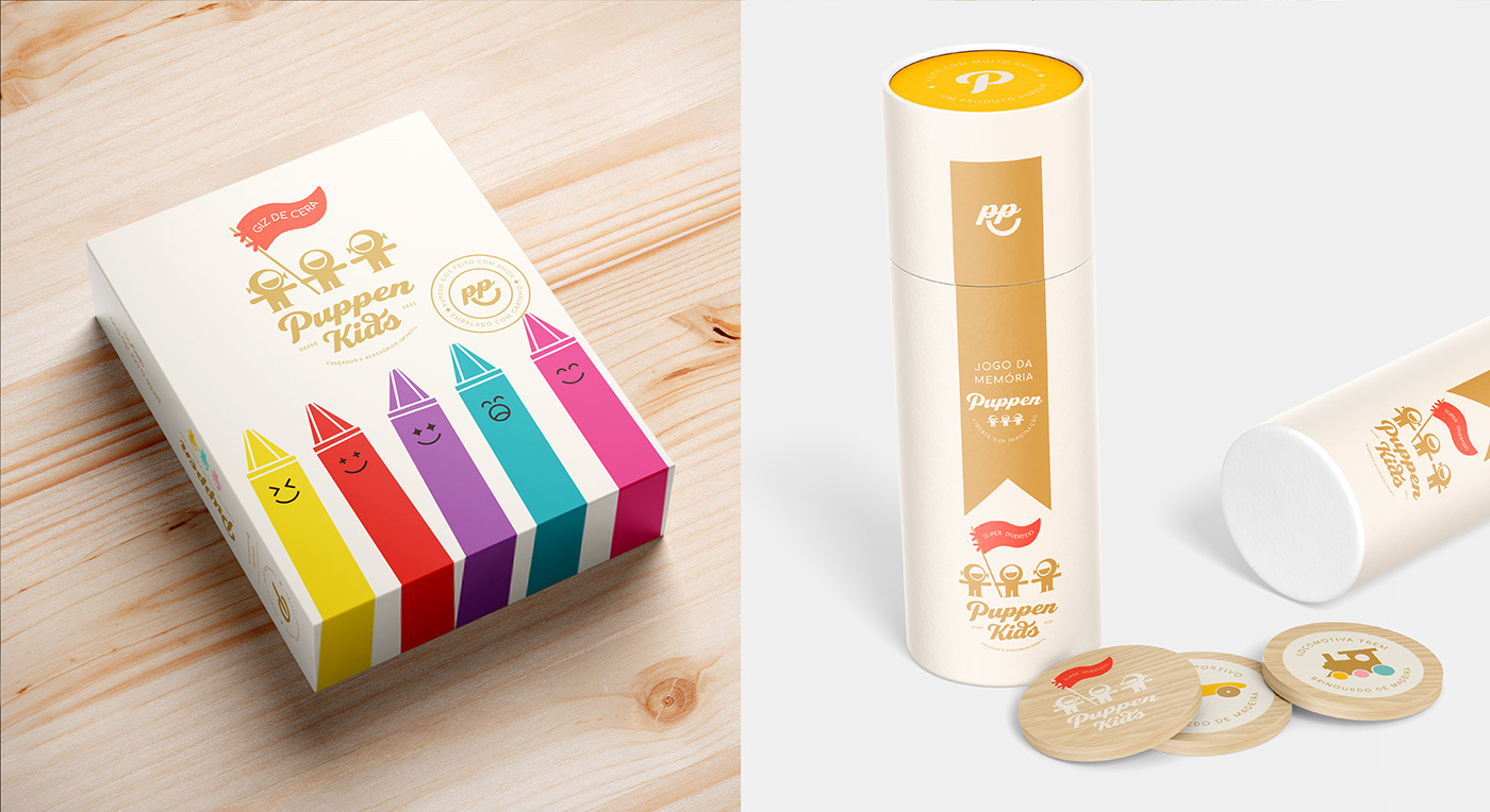
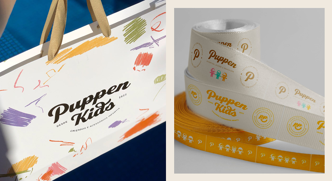
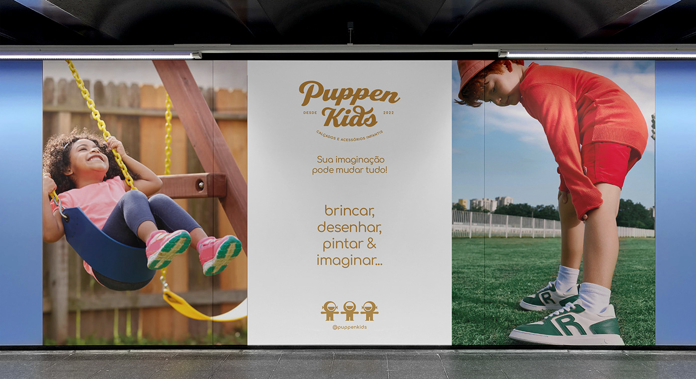
Puppen Kids
Puppen Kids project description from designers:
The word “Puppen” used in the logo comes from the German language, which means dolls. The dolls historically occupy a place that brings warmth and affection, in addition to the rescue of free play. They were used in the complementary material as well as in the company’s name, contextualizing the idea of how dressing can be fun, cheerful, and cool.
The purpose of this visual identity is to encourage children to create their own imaginary world, express themselves, and play with comfort and style. The three dolls were strategically designed to initially represent Hannah, João Guilherme, and Isadora, children of Puppen Kids entrepreneurs – the biggest incentive to open a store in this segment. Being a democratic color, yellow is prevalent in Puppen Kids’ visual identity – not imposing any gender barriers.

Check more projects by this team in the Black Pepper Design portfolio on Behance.
New D4U Gallery issues are coming soon; keep up with new posts.
For more inspiration, check the sets of other posts from our D4U Gallery, where we gather impressive creatives to share their art with you, for example:
- creative wine packaging design projects
- sophisticated brand identity designs
- identity and packaging design projects
- logo designs for different business goals
- people illustration gallery
- captivating 3D animation concepts
- impressive packaging designs
- artistic portrait collages
- childhood illustrations
- 3D illustrations
- book cover designs
- English
- Ukrainian