UI Design Concepts for E-Commerce: Sell Like Hot Cakes
UI Design Concepts for E-Commerce: Sell Like Hot Cakes E-commerce presents a special creative field for UX designers: check the collection of diverse web and mobile design concepts for customer-friendly interfaces.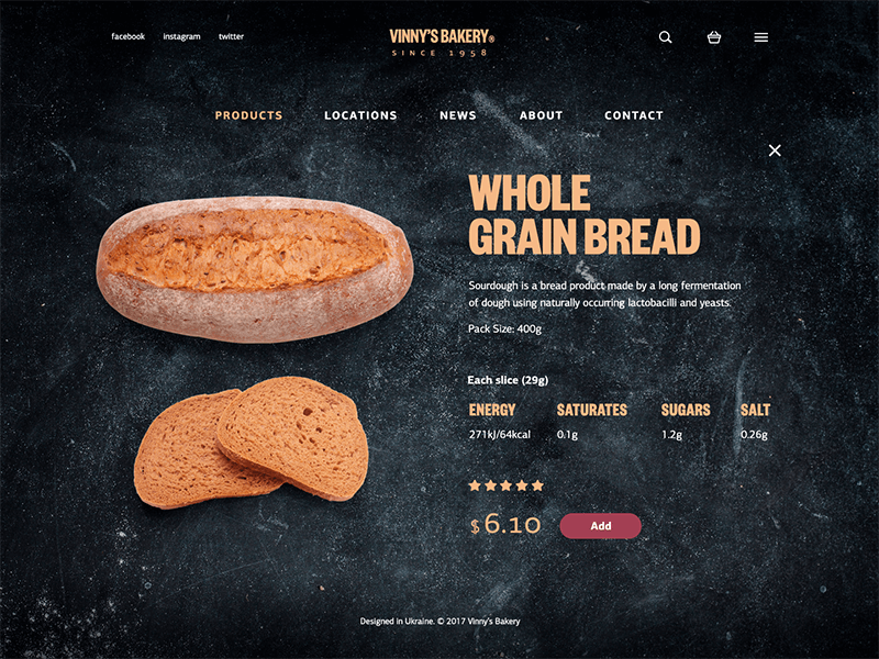
In many cases when we are buying something, it’s not just about getting new things. It’s often about feelings and memories, dreams and achievements, changing ourselves inside and outside, sharing and giving, improving, and learning… The advent of new technologies opened new perspectives for both shoppers and sellers, and the process of upgrading this type of relations is in active progress. A decade or two ago, buying something on the Internet was not included in a typical daily routine while now getting things and services in a couple of clicks cannot surprise anyone.
This state of things sets new challenges for the sellers, with efficient and appealing digital products for e-commerce ahead. “If you do build a great experience, customers tell each other about that. Word of mouth is very powerful,” said Jeff Bezos, the founder of Amazon, the biggest global online retailer. Today’s generation of shoppers is different in its vast majority: they are ready to buy almost everything online, they want to see the simple way to do it, they demand secure payment and fast delivery – and good design to present that all. That’s why websites and applications for e-commerce are so various: they have to attract their customers without getting lost in the ocean of the online competition. Well-designed user experience, based on the research of the market and target audience as well as nice and effective visual performance, grows the chances of getting profits: in the e-commerce sphere, the connection between design and profits is tighter than anywhere else.
Today we would like to offer you the set of interface concepts created by Tubik designers with the issue of e-commerce in mind. Here you’ll find the websites, mobile applications, and landing pages aimed at selling products and services.
Website for a florist shop
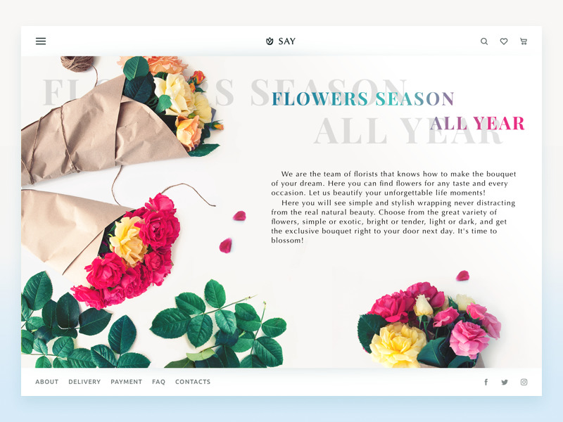
Flowers present a popular way to express various feelings and celebrate special occasions. Here’s the design concept for the online florist store: the general stylistic concept is light, minimalist and airy while prominent theme photos set the mood and inform users about the nature of the e-commerce offer. The home page sets the theme, establishes branding with the logo and slogan, and shares some information about the service. The header gives instant access to the extended menu of items hidden behind the hamburger button as well as provides the links to search, wishlist, and shopping cart presented with minimalistic stroke icons. The footer includes links to important service pages and accounts in social networks.
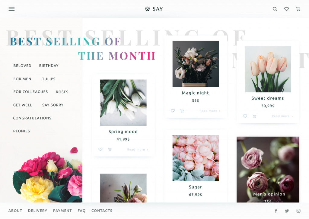
Another page shows the catalog of items organized in cards: each presents the high-quality photo which is vital for this kind of business, price, and ability to add it to the cart or save to the wishlist right from the catalog page. There’s also the cloud of tags marking popular categories for better navigation.
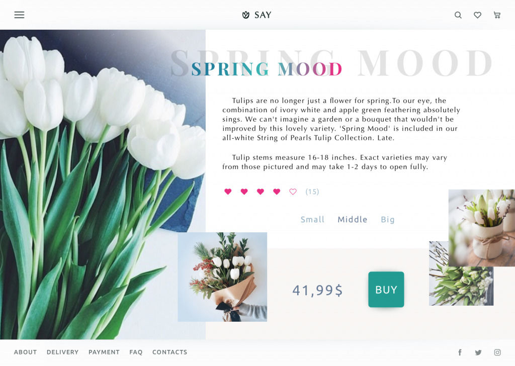
If the user wants to learn more about the particular offer, it can go to its product page, like the one shown above, and check the details.
Application for the e-commerce jewelry store
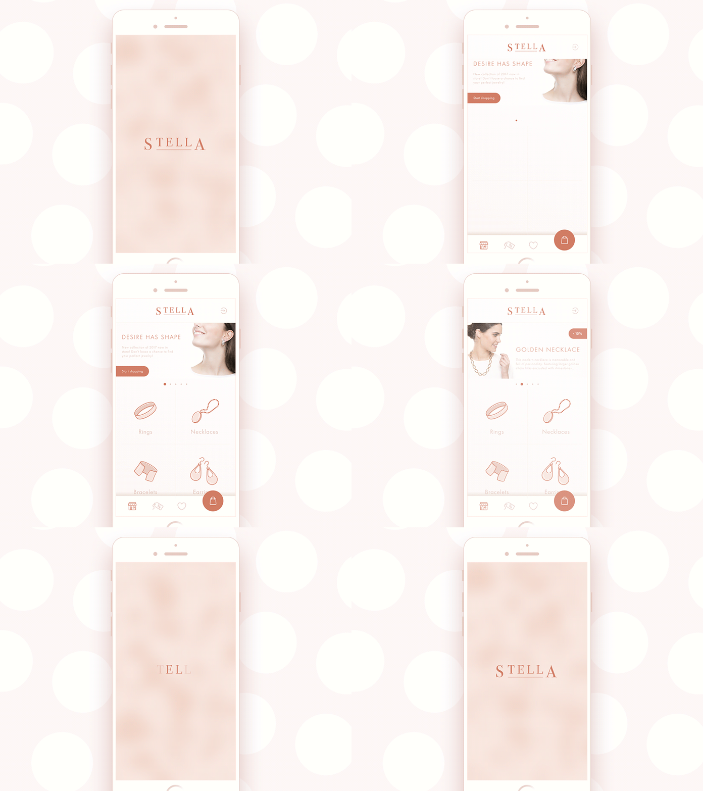
Here’s a set of interactions for the app design concept of the online jewelry shop. The presented screens show the starting point of interaction with the app from the splash screen to the catalog showing categories of goods and special offers. The app provides theme photos setting instant visual associations with the offered items while icons are stroke and minimalistic not to distract buyers’ attention. The color palette features pastel shades that look sophisticated on a general layout full of light and air, and that feeling is supported with smooth and unobtrusive animation of the interface elements.
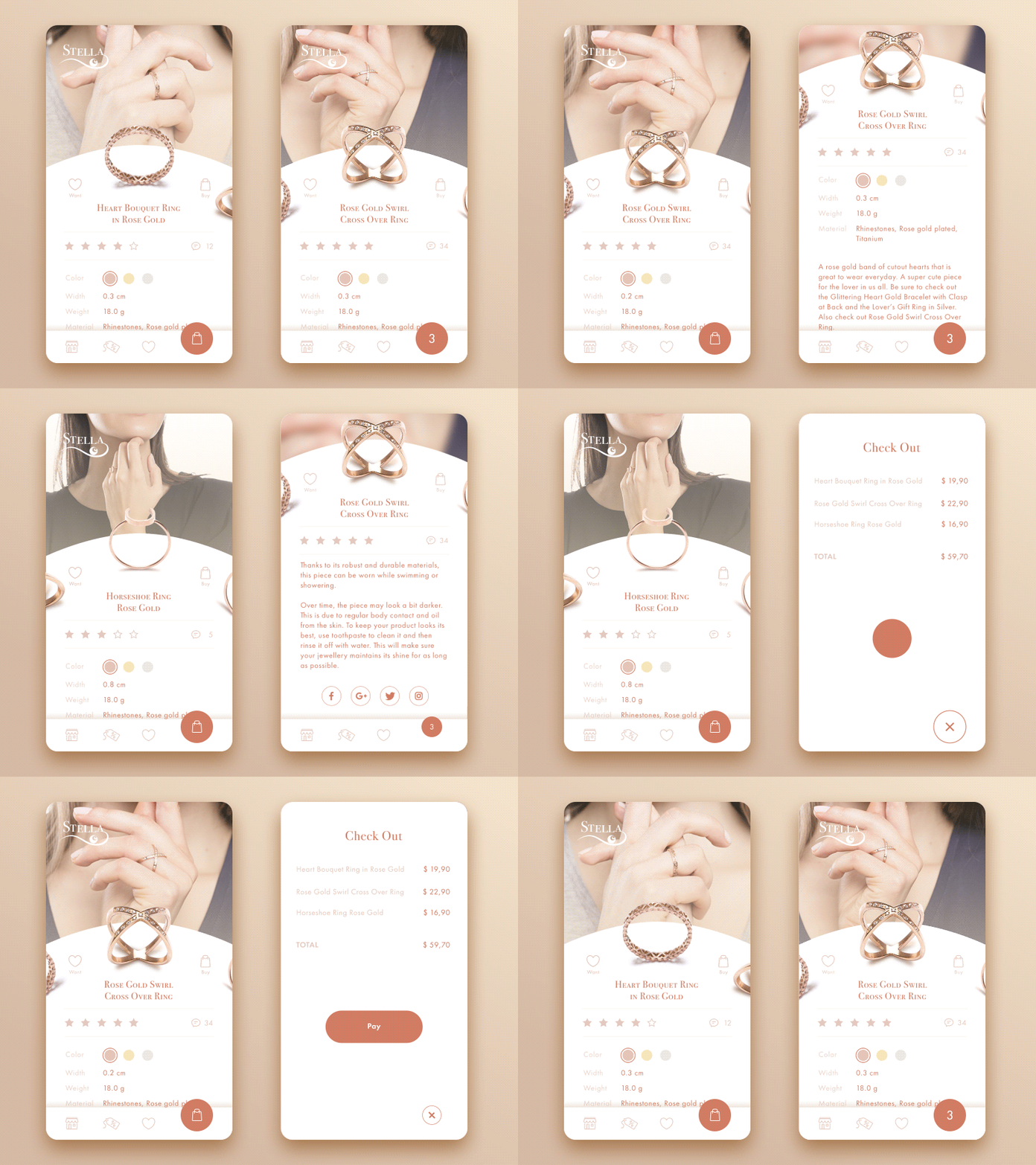
The presented screens show the animated interactions with items: you can see how users can choose a product from the catalog, check its details and rating. They can also share the product cards to their social network accounts and open check out. Visually, the center of the visual composition is focused on the images presenting the items, while icons are stroke and minimalistic not to distract buyers’ attention.
Application for a cinema
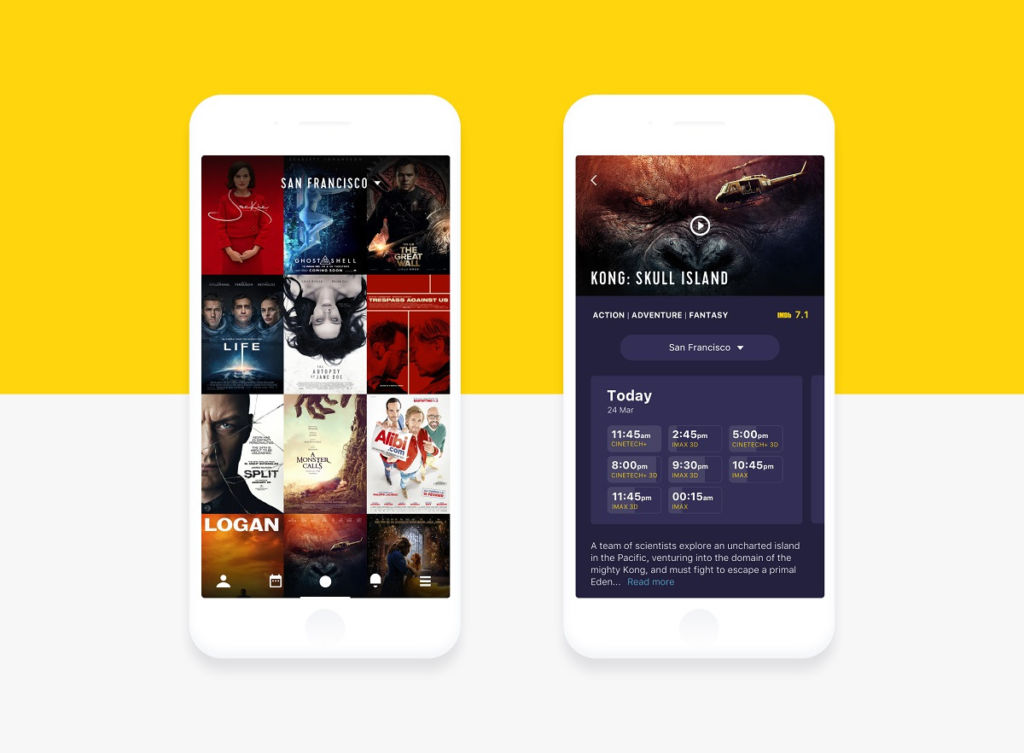
Despite the Internet, movie portals and super TV-sets we have in our homes, going to the cinema is still one of the most enjoyable and popular ways to spend free time either alone or together with friends and family. We follow the premiers, check the schedules, discuss acting and special effects afterward. And obviously, it is another perspective for e-commerce challenge. Here’s a sort of creative experiment – a mobile application for a cinema chain called Cinema App. The home screen shows the list of films presented with instantly recognizable posters. Tapping on the one among them, users see a screen of the particular film with all the necessary details: genre, trailer, description, rating, as well as the showings for the particular city for a particular date.
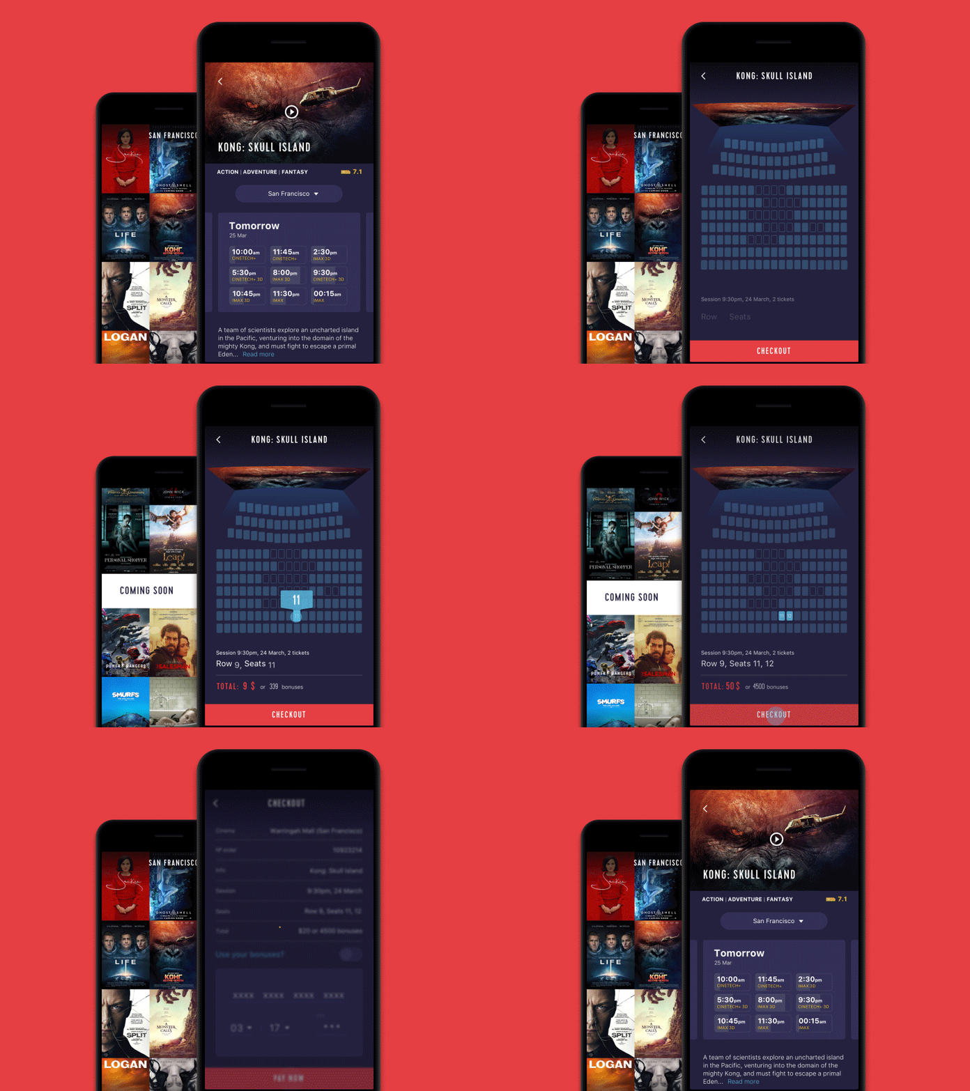
And this is the flow of choosing and booking the seat. Selecting a particular showing, users can see the available seats, choose the ones they like and book them, paying right from the app.
Landing page for dance academy
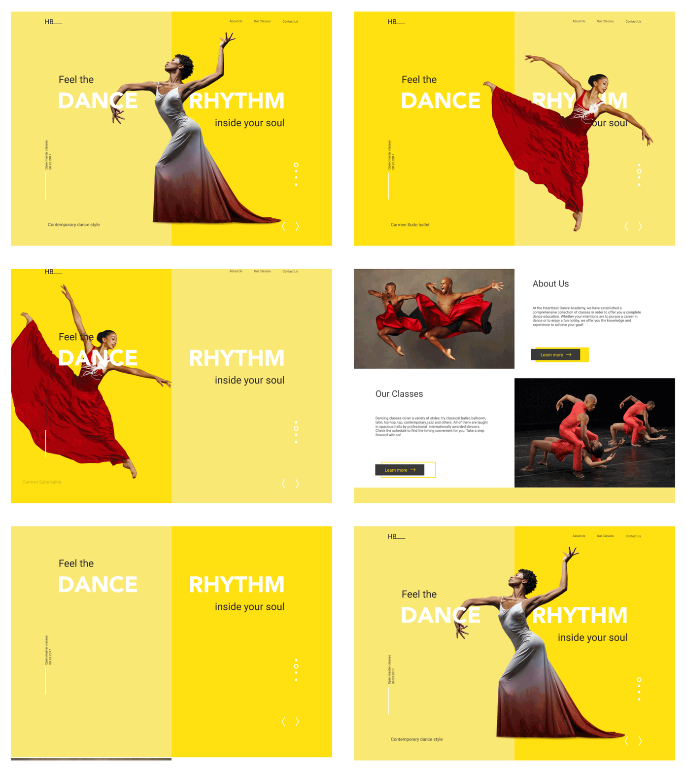
Here is the animated set of interactions for the landing page of the dance academy called HeartBeat. The elegant and minimalistic layout shows prominent theme images, gives short descriptions of the activities and links to core areas of information as well as provides the contact form to get in touch. The top section includes the horizontal slider which informs users about the upcoming workshops. Scrolling down, users can read brief descriptions about the academy and the types of classes it offers with buttons enabling users to learn more, and they can use the simple contact form to get in touch. The designer was inspired by the photos of dancers by NYC Dance Project, Paul B. Goode, Andrew Eccles, Paul Kolnik, and rich animation of the dancers added a special experience to scrolling. This approach creates a sort of wow-effect to support aesthetic satisfaction which corresponds to the preferences of the target audience. This is an effective example of selling the original type of services with sophisticated design solutions and a good balance of beauty and simplicity.
Website for herbs and spices store
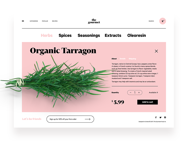
This is the design concept of The Gourmet, the online market for herbs, spices, seasonings and all that kind of stuff. Here you can see a product page presenting a particular item with the prominent theme image, description, price, and ability to add the item to the cart. The minimalist header provides the links to the core areas of the website while the hamburger menu hides the extended catalog. Moreover, here the designer tried a creative experiment: this concept applies design techniques traditional in e-commerce for fashion but the type of goods is very different – they are for eating and cooking.
Bookshop website
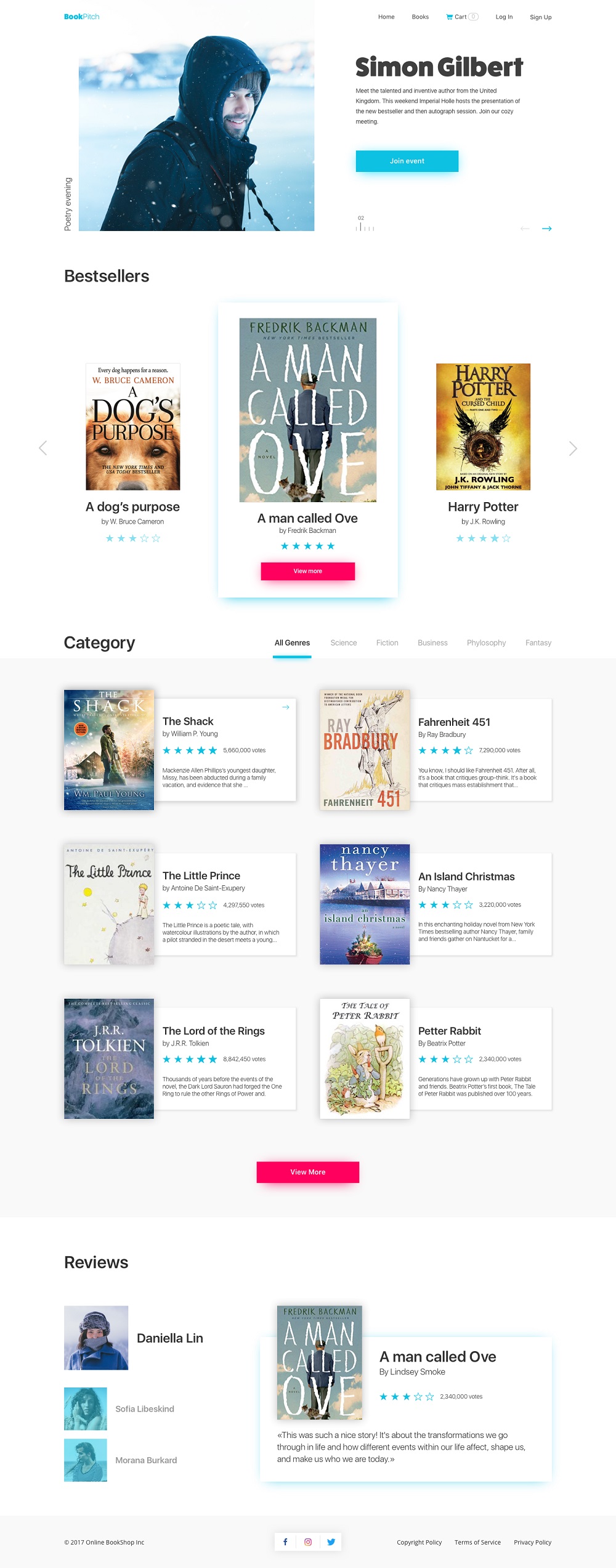
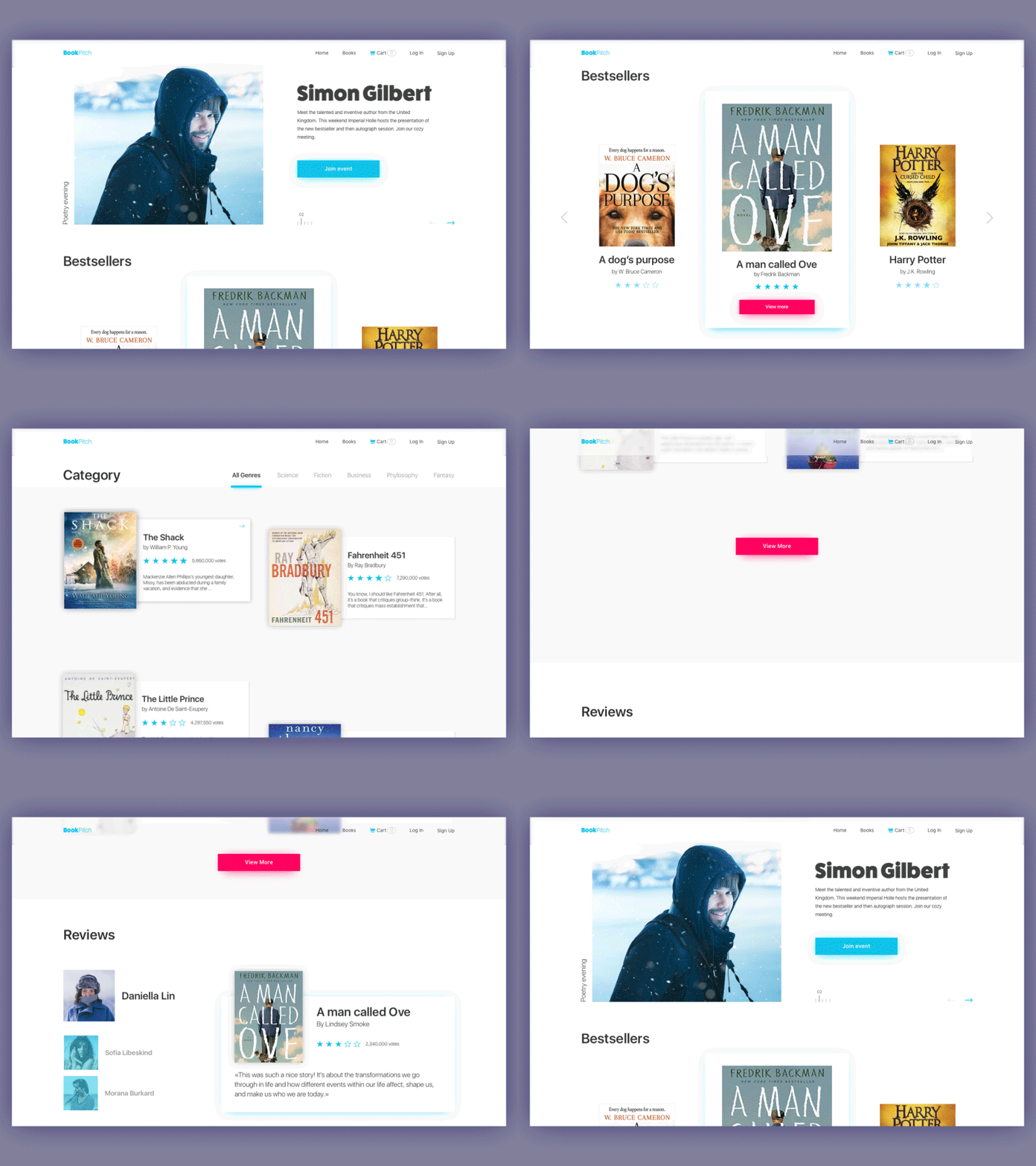
The famous author Stephen King once said: “Books are a uniquely portable magic” and numerous generations of readers prove it all the time. More and more people now use the Internet as the source to both learn about books and buy them. To support this direction of e-commerce, here’s the design concept for an online bookshop Book Pitch. The interface uses light and airy background and includes several theme blogs showing news, bestsellers, categories of items, and reviews from readers. The visual presentation is strengthened with slight scroll animation.
Landing page for selling exhibition tickets
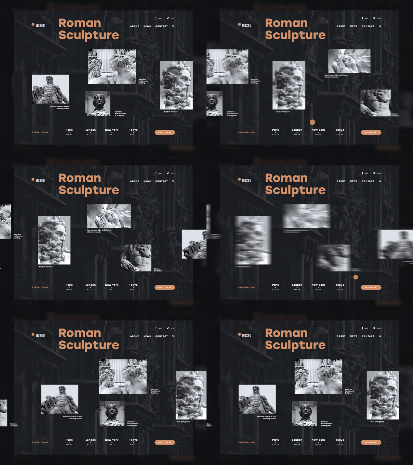
Although the sphere of art doesn’t look directly linked to e-commerce, the connection really exists: more and more users are buying and booking tickets online. Here’s the interface for this service – a landing page promoting an art exhibition. The idea behind it was to make this sort of informative promotion aesthetic and unobtrusive for the user as well as highly informative. It applies the horizontal scroll with the smooth animation of cards presenting key exhibits, shows the locations and dates, and prominent call-to-action for buying a ticket.
Landing page for an online travel gear store
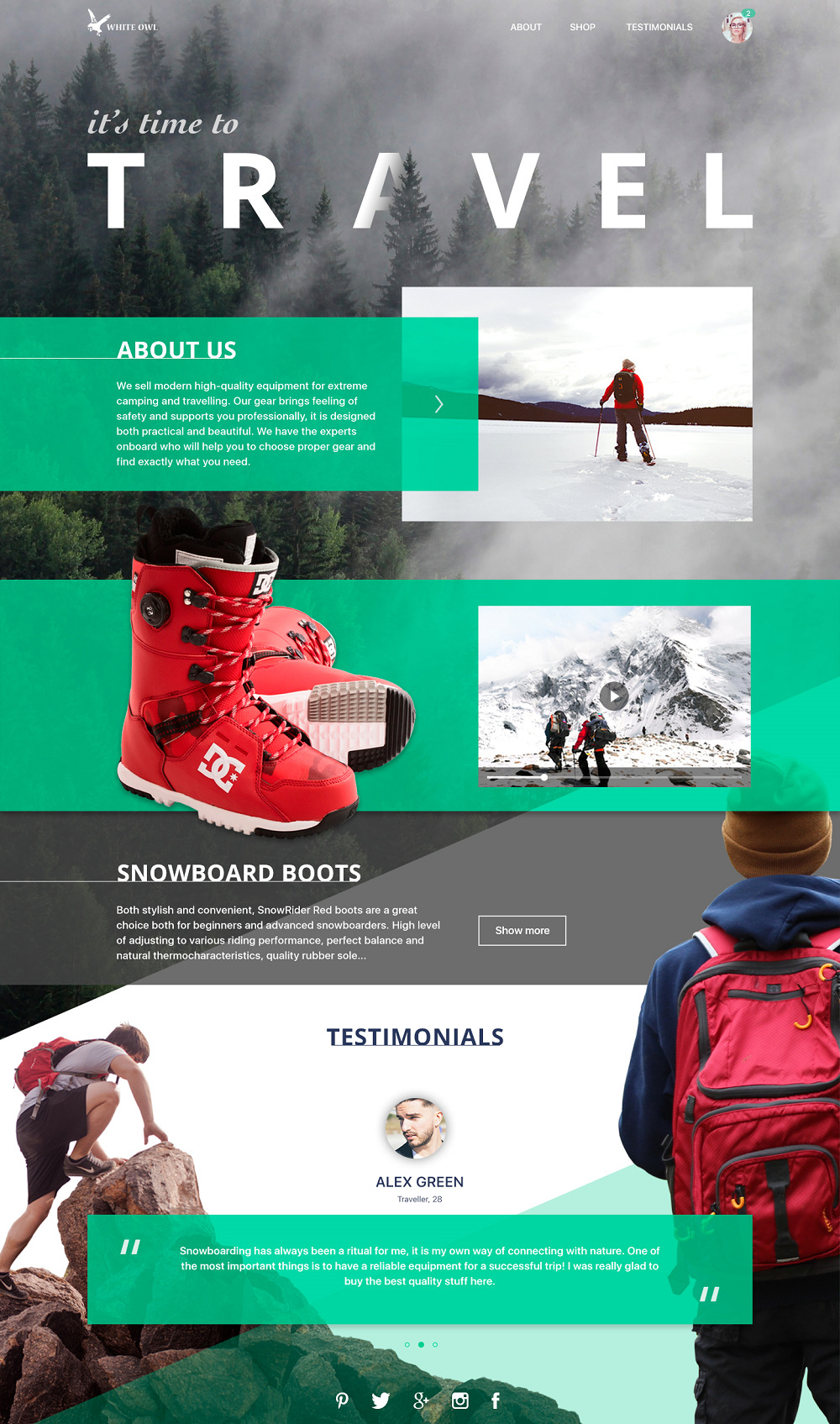
Here is the layout of a landing page: the company presented by it sells gear for extreme sports and active traveling so images were selected to set immediate understanding of the main theme. The page includes the general description of the shop, presents the ability of transition to the catalog via the description of hot offers and also has testimonials part to provide users’ opinion about the service.
Website for a bakery

Another example the concept of a bakery website for which we presented the full design case study here before. Here is the animated version featuring interactions with the website: home page, catalog the f offers and the page presenting a particular position. The designer followed the philosophy of minimalism which is user-friendly, attractive and informative. Dark background supports the brand image with the idea of the elite and exclusive offer as well as set the ground for sophisticated presentation of the sold items.
Randomizer for the online furniture store
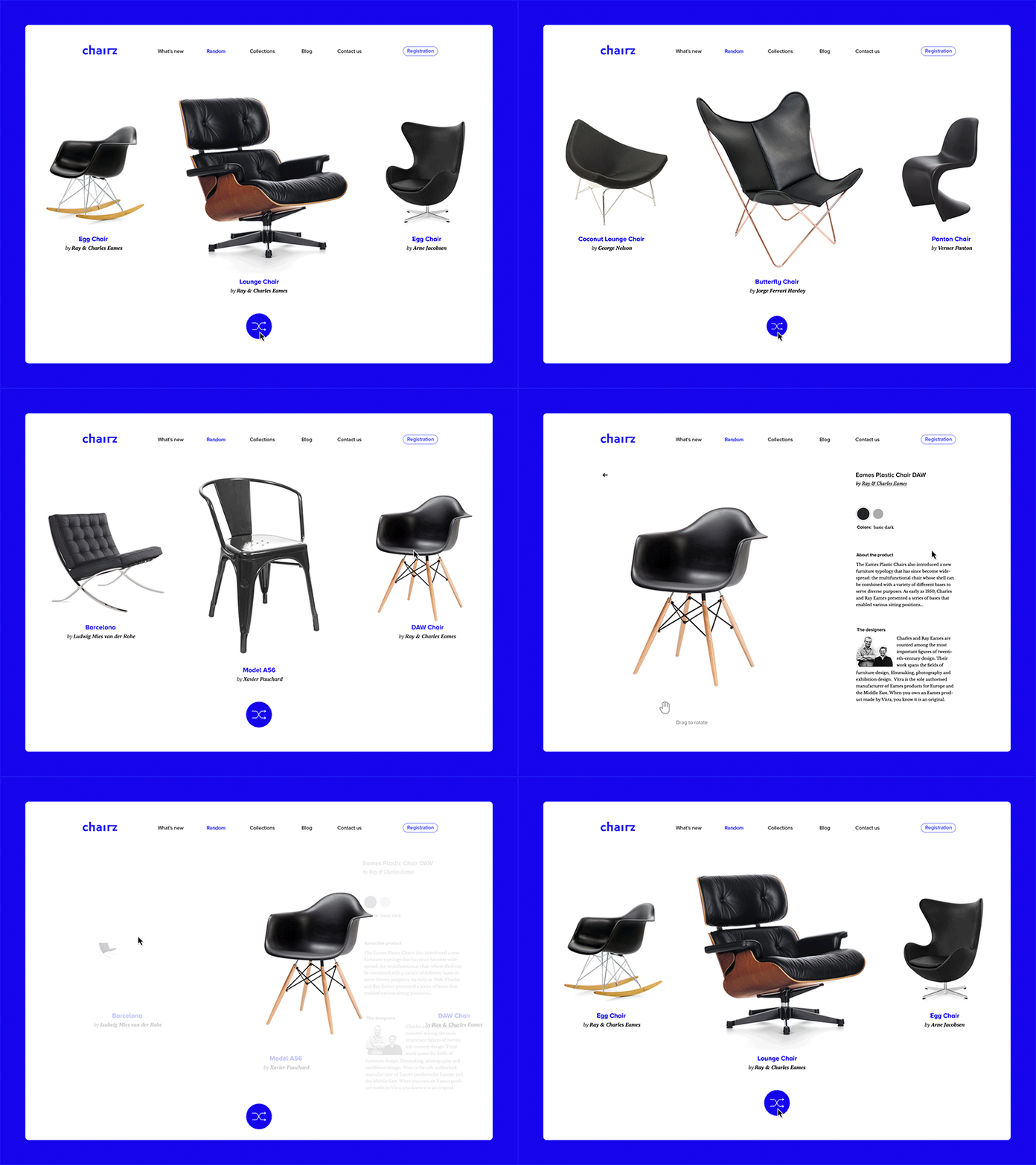
Here’s the concept of a randomizer that allows users to choose between many options of designer chairs in this case. However, the idea can be applied to any e-commerce digital product. This is a helpful thing as usually we don’t know what we want until we see it. Minimal and bold color palette and prominent item images make the interface helpful and intuitive for users.
Landing page for online farm grocery
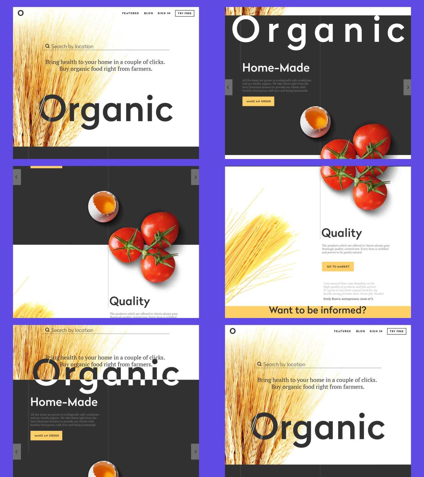
As a famous writer George Bernard Shaw once said, there is no sincerer love than the love of food. This one is a landing page whose aim is to promote the shop of organic food. It is composed of several blocks presenting the products, highlighting some important aspects of service, call to actions and testimonials.
Website for the fashionable clothes shop
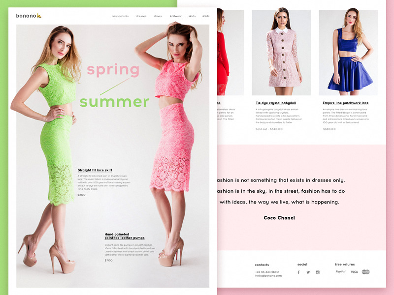
Another example of design for e-commerce presents the layout of a catalog page for the website of a company selling fashionable clothes for women. The header includes the links to the global categories of the clothes and the page features the fresh arrivals with photos on models, pricing, and brief item description.
Useful articles
If you want to go deeper into the theme of design for e-commerce and learn more about strategies, principles, terms and practical cases, this set of articles can be helpful:
Hit the Spot: Design Strategies for Profitable Landing Pages.
UX Design for E-Commerce: Principles and Strategies.
Design for Business Goals. Explore the Target.
Case Study: E-Commerce. UI Design for Bakery Website.
Short but Vital. Key Abbreviations and Terms in Design for Business.
Strategies for Efficient Landing Page Design.
Case Study: Saily App. Designing C2C E-Commerce Application.
Originally written for Tubik Blog
- English
- Ukrainian


