Mobile Typography: 8 Practices for Powerful UI
Mobile Typography: 8 Practices for Powerful UI The article presenting effective tips on mobile typography helping to create compelling user interface design with the functional copy elements for positive UX.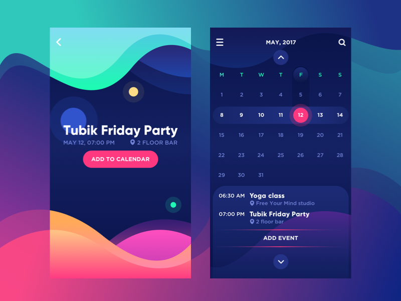
Mobile design heavily depends on every detail it consists of. Screens are quite small so designers need to choose elements thoughtfully trying not to overload user interface. Such a peculiarity makes typography creation for a mobile rather tough task. Mobile typography requires deep attention to the details from an appropriate kind of fonts to compelling tracking and alignment.
No matter how challenging it sounds, designers strive to build effective mobile design because smartphones are a huge part of our life. The article describes essential principles for compelling mobile typography.

High level of legibility
Legibility is called a level of how distinguishable and recognizable the words and characters are in a text. The major objective of powerful typography is clear text which users perceive without efforts. Small screens and ambient light of mobile devices may become a problem on the way to creating legible typography. To avoid problems with legibility, designers need to consider all the factors influencing clarity of text.
Font size
In terms of mobile typography, the size does really matter. Some may think that on small screens tiny fonts will work best. It’s a misbelief. Small fonts on a bright mobile screen can make user’s eyes hurt from tension and bring a headache. Of course, modern devices allow screen zooming still it’s not always convenient for users to spare an unnecessary effort. Fonts in mobile UI should be big enough for users to read easily but not too big to save typographic hierarchy. The appropriate font size is a key to pleasing UX.
Leading
As we’ve mentioned in our previous article, leading is the spacing between the baselines of copy. In a mobile interface, leading is usually smaller compared to a desktop version. Wide leading may ruin the visual unity of text while too short space makes it badly legible. If a leading is done right, readers go fast from one text line to another and big pieces of copy become legible.
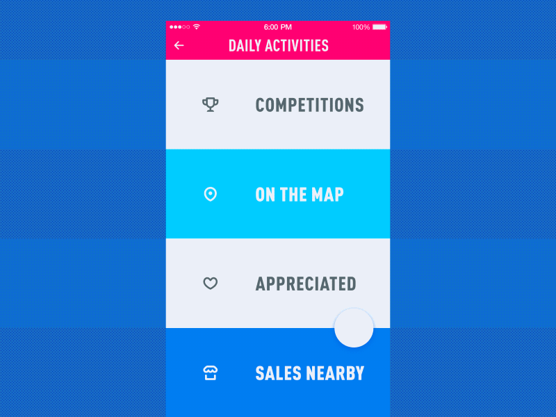
To-Do List App
Line length
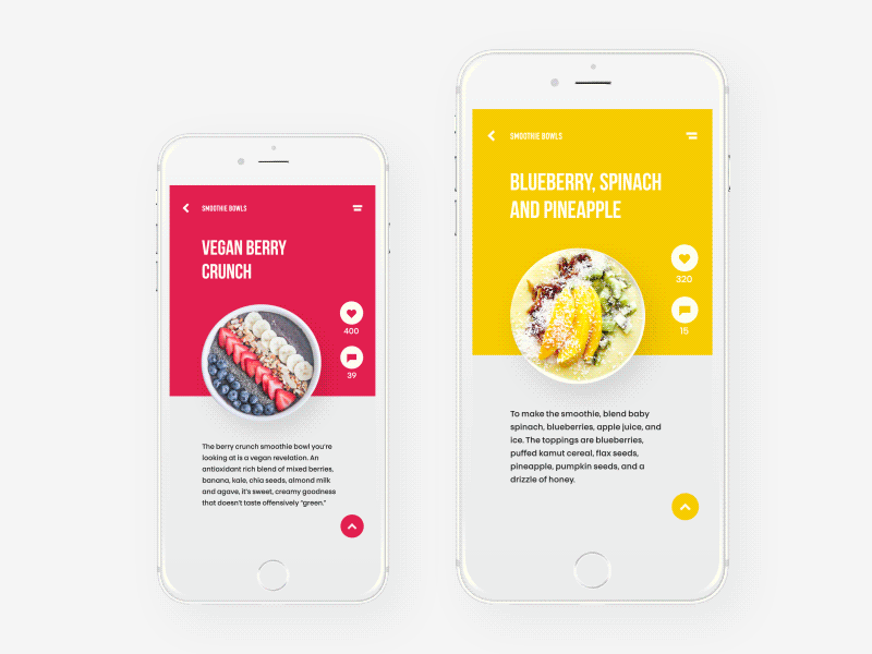
To make body copy comfortable for reading in mobile interface, designers consider all the parameters including length of text lines. Optimal line length for a desktop screen won’t work same for mobile. Too long lines would go beyond screen borders, that is why designers are recommended to keep the number of character per line within 30-40.
White space
When design elements are tightly gathered in a bunch, the user interface looks messy and navigation is rather difficult. Designers need to give elements space to breathe bringing a relief to users’ eyes and mind. The size of mobile screens doesn’t allow using much of white space that’s why a balance between the elements has to be found.
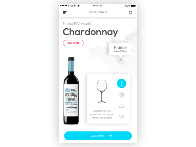
Wine Year App
Fewer levels of hierarchy
Visual hierarchy is applied to organize content in interfaces clearly so that users can distinguish layout objects on the basis of their physical differences, such as size, color, contrast, alignment, etc. Hierarchy divides content into levels, assisting users to learn copy content gradually step by step without effort and get oriented in the digital product.
Web design usually contains three levels of copy content, which include such elements as headings, subheaders, body copy, CTA buttons, and captions. However, small mobile screens don’t provide enough space for three levels, so designers apply only two. Elements of a secondary level, such as subheaders, step aside to make the UI look clean.
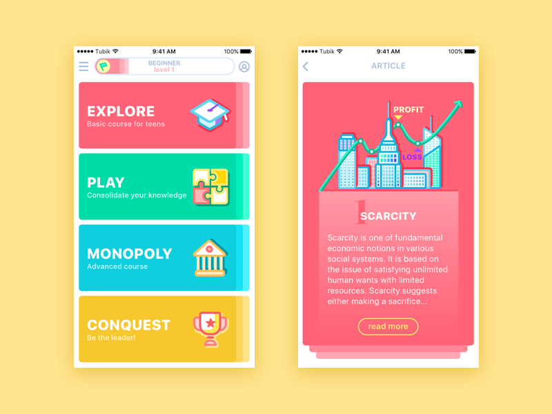
Moneywise App
Simplicity of fonts
A key feature of effective mobile UI is simplicity. Design should be clear, and the navigation easy to use, so font choices have to be based on the requirements. First of all, it is recommended to keep a number of fonts within two or three to make the text look solid. Designers often settle on two types of fonts for mobile interfaces because it requires fewer levels of hierarchy than web design.
Moreover, kinds of fonts should also fit a simple and clean style. Novelty and decorative fonts may look illegible on small screens. Designers regularly combine a serif and a sans-serif font to create enough contrast of copy elements in the layout. In addition, it’s good to reduce effects like a shadow for mobile fonts. On desktop screens, they may work nicely but will make small mobile screens look overloaded.
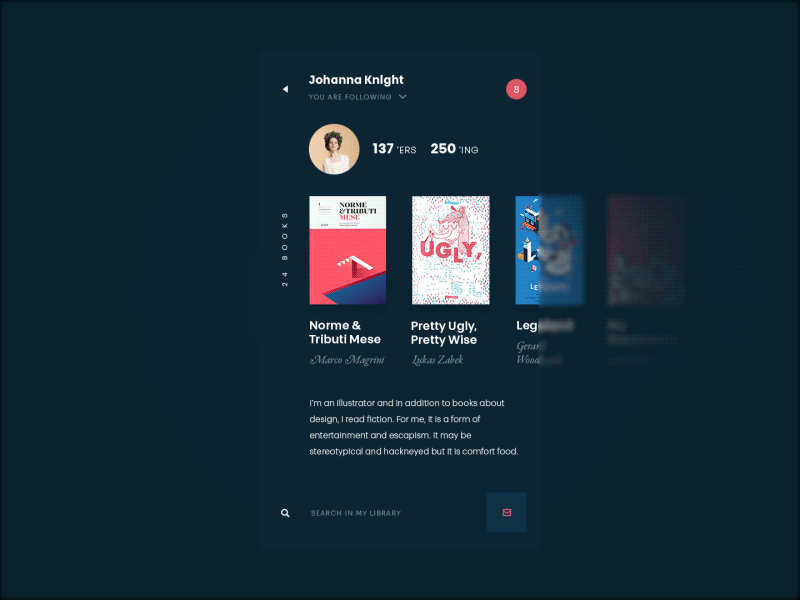
Book Swap Interactions
Delicate contrast
Contrast is an efficient tool for designers. It helps highlight vital UI elements and contributes a desirable level of text legibility. However, speaking of mobile interfaces, contrast may play a bad joke. Small screens, ambient light, and short fonts make a contrast image look unpleasant for users’ eyes. Reducing the contrast between the background and copy elements, designers help users feel comfortable while reading text on a mobile screen.
Contrast can be created not only with colors but also through font sizes to establish a visual hierarchy. Nevertheless, mobile interfaces are short of space for giant headings, that is why size contrast should also be reduced.
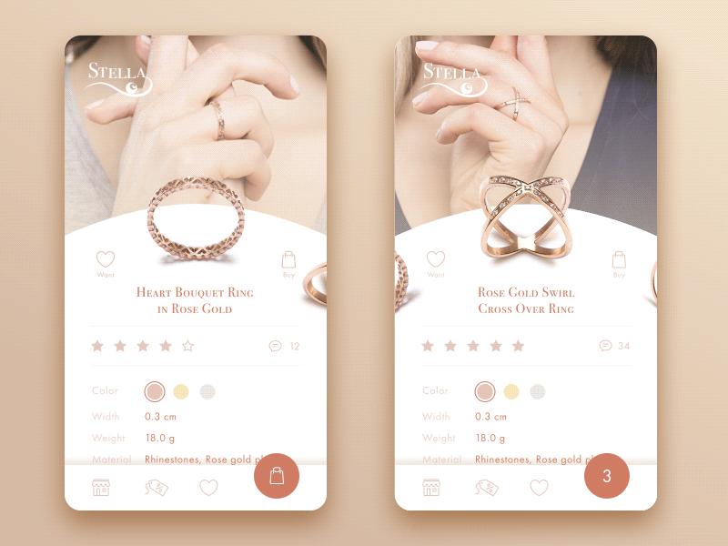
Jewellery E-Commerce App
Responsive typography
People surf the Internet via all devices available today. That’s why responsive design is a key condition for a successful digital product. Typography is a vital part of design responsiveness. The wrong size, width, and placement of fonts have a significant impact on the whole composition. Even the most insignificant changes may break the balance between all design elements.
When creating typography for a digital product, designers need to consider how it will appear on different devices. Planning such things helps to avoid unnecessary problems in the future.
Prioritized content
To make mobile interfaces valuable and straightforward, designers need to take care of the wise content organization. Users want to have fast access to the information they are looking for, and mobile screens can make the process complicated.
Mobile UI has no room for unnecessary copy elements. There should be only essential content thoughtfully prioritized. Based on users’ needs and preferences, designers set a structure assisting people to navigate within the product and find what they are searching for. Text elements are prioritized by size changes as well as different widths or kinds of fonts.
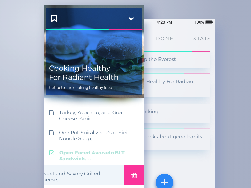
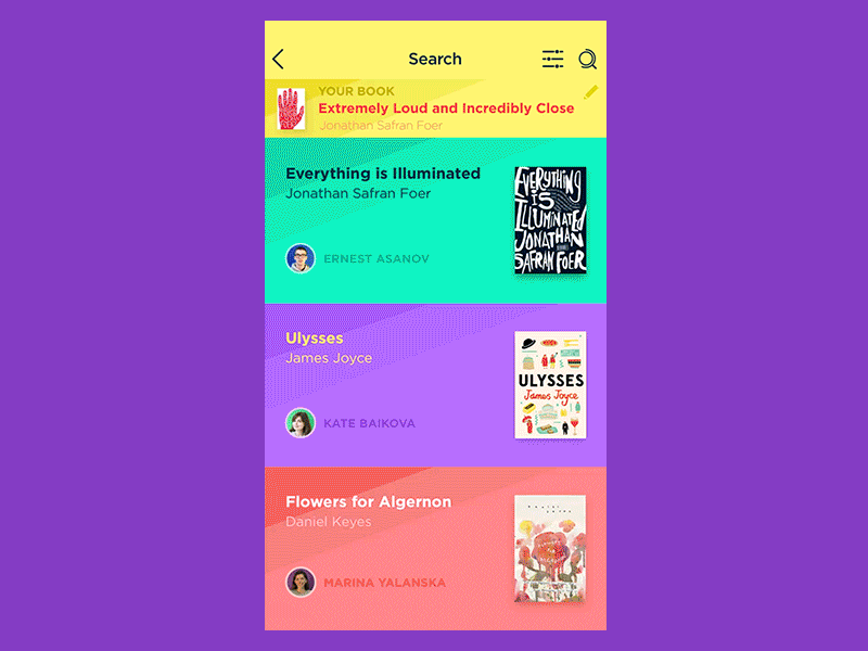
Book App
Clear text rags
Depending on the type of product, designers apply appropriate alignment for text blocks. It can be placed on the left, on the right, centrally or it can be justified. However, speaking of mobile design many experts often stop their choice on left side alignment. This kind of text forms where the beginning of each line is placed equally and the rags look similar to stairways. Such a structure helps users easily go from one text line to another and scan text fast and easily. If body copy alignment is justified (text lines placed equally), it has no rags either side. The text with such structure is difficult to scan on a mobile screen.
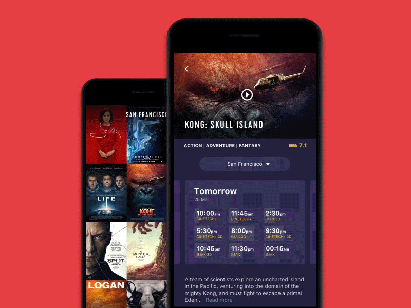
Healthy Food App
Functional typography
While computer users click and scroll to interact with products, mobile screens should offer much more functionality. There are many text elements in mobile interfaces that allow users to perform actions, such as buying a product, making a call, or going to a website.
Designers need to ensure users understand how text elements work and can complete the actions. Functional typography should be highlighted among the other elements, and clickable elements should be large enough to tap.
Menu Interactions
Things to jot down
- Minimalism. Mobile screens are short of space, so try not to overload them. Simple fonts, clean style, and a minimum of elements will do their job.
- Test the smallest first. Mobile devices have various sizes, but the biggest problem is the smallest. Create your design based on how it will look on the tiny screens first. When it’s ready, you can easily adapt it to the bigger sizes.
- Avoid decorative and cursive fonts. They don’t render properly on the small screens. Moreover, decorative fonts overload the interface with unnecessary details.
- Legibility first. Of course, it’s good to make beautiful, catchy UI, but sometimes all the colors, contrast, and original fonts can hurt the legibility of the copy. A good-looking text is not enough. Make sure it is legible; otherwise, users won’t be able to read information and use your product properly.
Jewellery App
Every mobile UI design project is an interesting challenge. Meet it with the knowledge, and the results will please you.
Recommended reading
Meaningful Mobile Typography by UXPin group
7 Simple Rules for Mobile Typography
Typography in UI: Guide for Beginners
Originally written for Tubik Blog
User Experience Design Articles
Here’s a bunch of articles to dive deeper into the theme of usability and user experience design.
5 Basic Types of Images in Web Design
The Anatomy of a Web Page: Basic Elements
6 Elements of Efficient Company Website Design
UX Practices on Product Page Design
How to Design Effective Search
Web Design: 17 Basic Types of Web Pages
Guide to 6 Effective Types of Web Animation
Directional Cues in User Interfaces
 https://design4users.com/mobile-typography-8-practices-for-powerful-ui/
2026-01-17
© by
Marina Yalanska
,
https://design4users.com/mobile-typography-8-practices-for-powerful-ui/
2026-01-17
© by
Marina Yalanska
,
- English
- Ukrainian