Illustration Case Study: Step-by-Step Process for Winter Olympics Artwork
Illustration Case Study: Step-by-Step Process for Winter Olympics Artwork The illustrator from Tubik unveils a creative process for a complex digital illustration devoted to Winter Olympic Games: check the workflow and tips.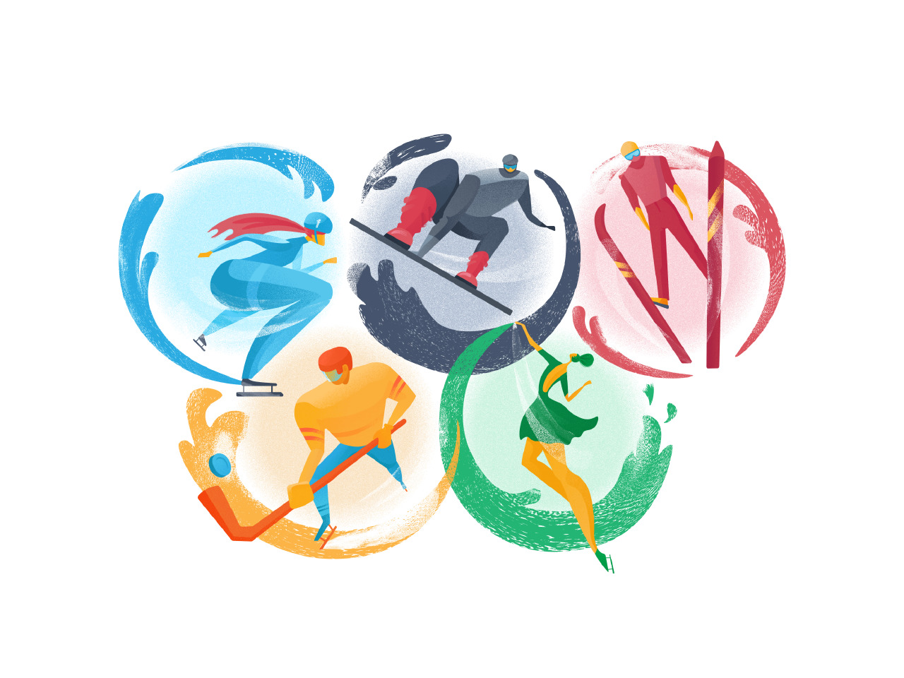
A creative process that designers set for digital illustration may vary in approaches, tools, and stages. Yet, it’s always interesting to see the real workflow through which illustrators go all the path from the idea to the final artwork. Today we want to unveil such step-by-step progress for a digital illustration by Tubik designer Yaroslava Yatsuba. Earlier she shared the set of helpful tips on flat illustration design, on how to catch your original style not losing harmony and balance. This time let’s move one to the work-in-progress case study.
Having explored the work styles and approaches, Yaroslava says that with long-term practice, both traditional and digital artists work out their own routine and the number of creative stages. In this post, she shares her process which mostly has 5 steps. Here it’s presented by the example of her fresh artwork reflecting the theme of the Winter Olympic Games.
Stage 1: Sketching by Hand
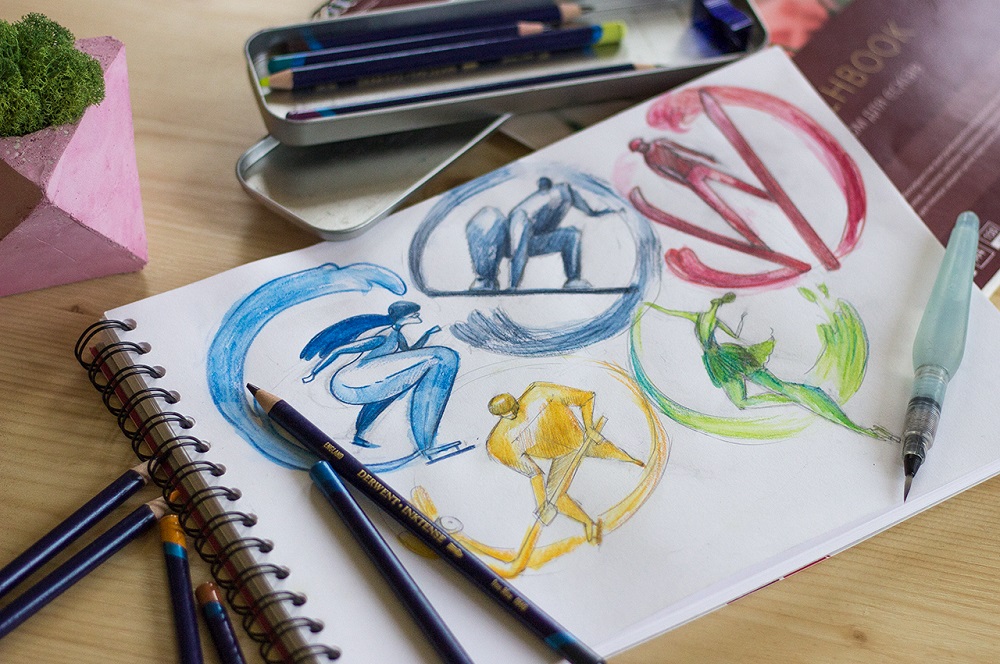
The first stage is devoted to the search of composition, dimensions, characters and their interactions. It is done by hand sketching. If this sketch isn’t going to be shown to clients, don’t try to go deep into all the details – strive for the level of fidelity clear for you personally and save the ideas.
Stage 2: Turning a Traditional Sketch into Digital
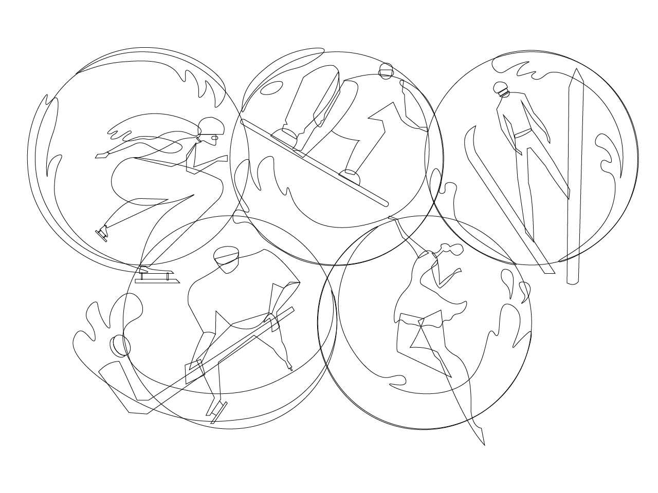
The second stage transforms the idea from traditional to digital drawing. Yaroslava uses the scanned or photographed sketch as a base in the Adobe Illustrator. Then she starts to outline the sketch using Pen Tool if lines are strict and Curvative Tool in case of smooth lines. At this stage, she draws the main dimensions without details as well as moves bodies and structures in search of a nice composition. This is the phase when the frame of the illustration is created.
Stage 3: Color Choice
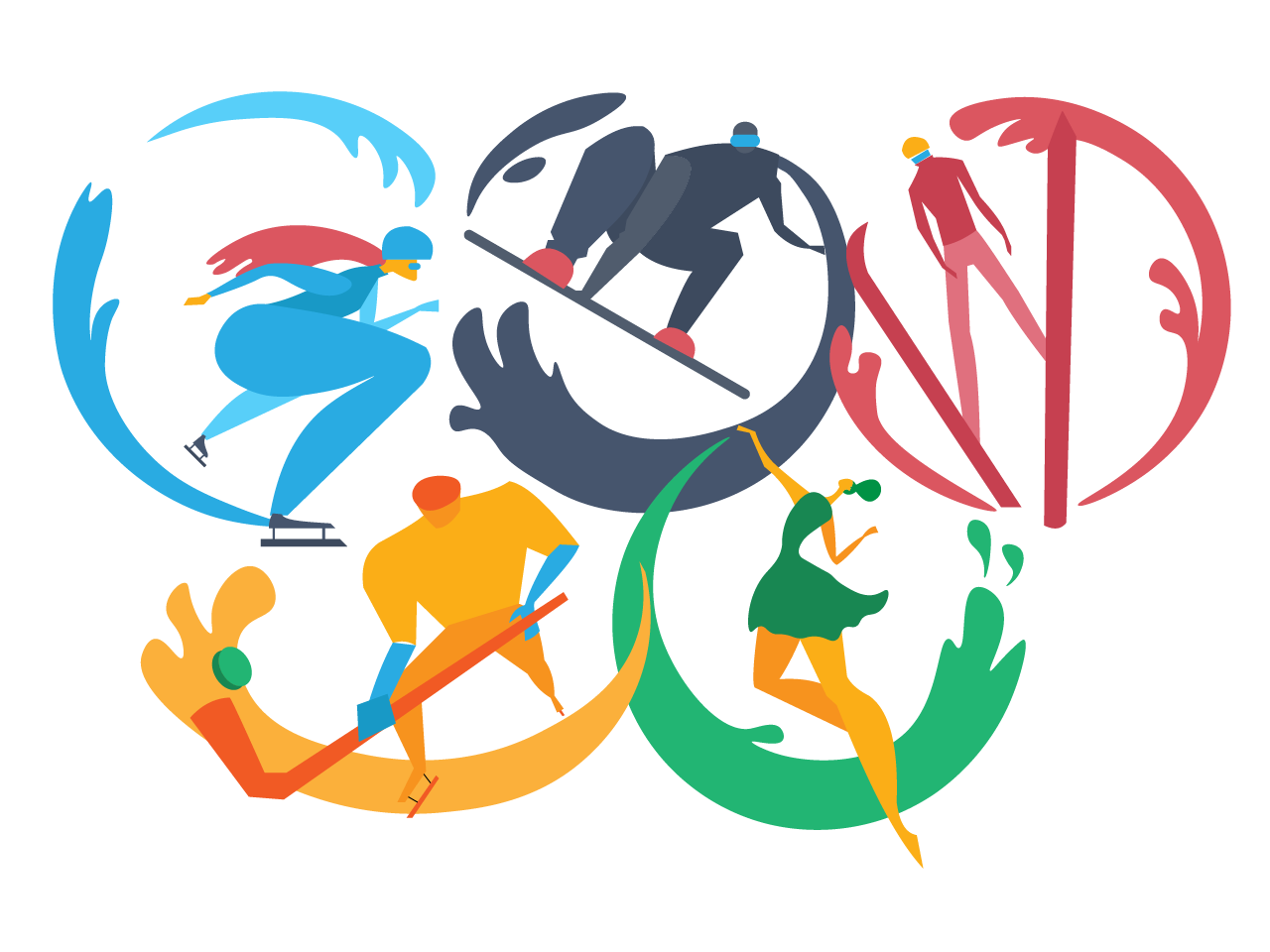
The third stage is all about color. The designer has to make the decision about color palette and combinations. In this particular illustration, the choice was not so hard: she decided to apply the colors of the symbolic Olympic rings. Each of them was used as the basis for a particular ring with the character inscribed into it.
Stage 4: Dimensions and Details
The next stage is devoted to working out details and adding volume. The dimensions and shapes are getting clearer and sharper.
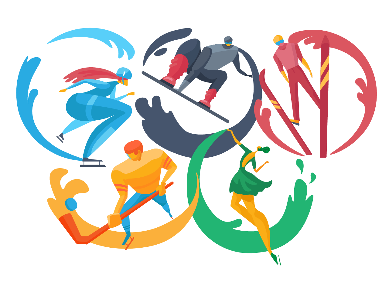
Stage 5. Textures and Dynamics
At the final stage, the designer adds the textures. They breathe in life into the visual images. In this illustration, textures allowed for setting the effect of speed, dynamics as well as visual prompts of the winter season.
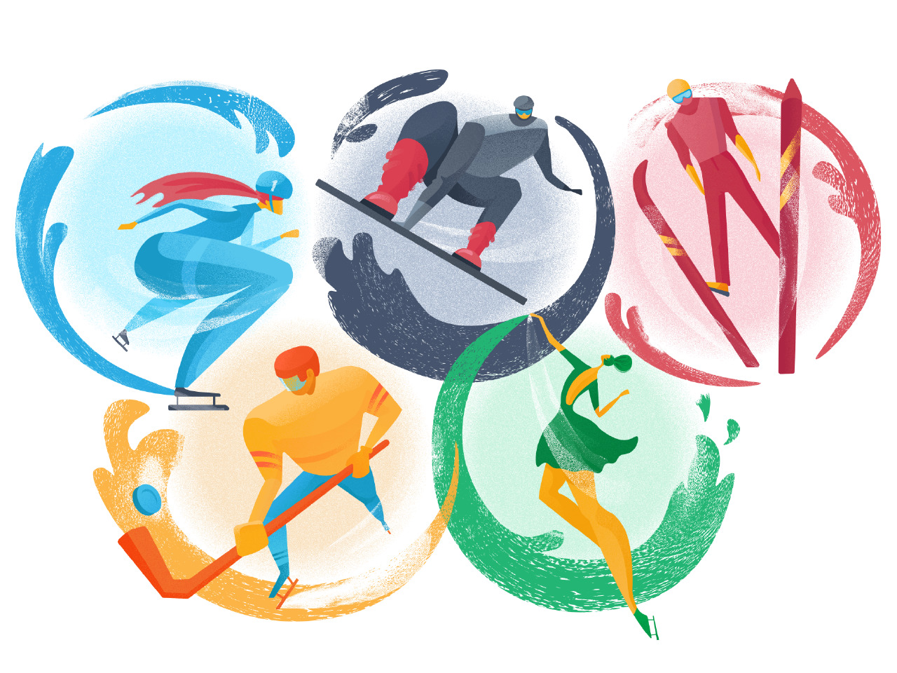
In most cases, the designer adds textures with masks. She creates a mask and copies there a black-and-white gradient of the element to which the texture is applied. Then she applies the Grain effect. The other variant is painting inside the mask with the texture brush of white, black or gray color depending on the needed effect.
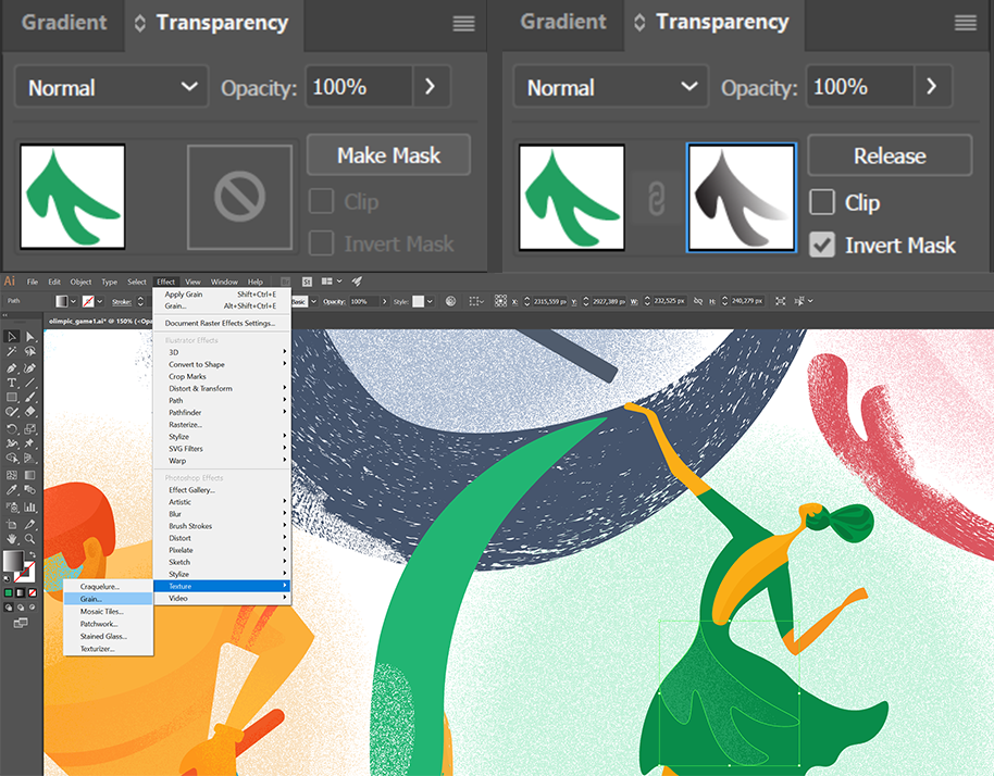
In the end, she scales the illustration, makes a reflection for the holistic view and adds small alterations if they are needed. The illustration is ready!
Final Tip
During the illustration process, the designer follows the principle to cover all the illustration at every particular stage. All the parts of illustration have to be equally worked-out at the level required by the specific stage before moving to the next step. This approach helps to avoid the situation when some parts are developed in the slightest details while the others feature the lack of patience and persistence. Harmony and consistency are the artist’s best friends.

Check the earlier article to see more illustrations by Yaroslava and read a bunch of useful tips for graphic designers.
Useful Case Studies
For graphic designers interested to see more practical case studies with creative flows, we have collected the set of articles.
Moonworkers. Digital Illustrations on Film Production
Quisine. Branding Design for Food Delivery Service
Dicey. Logo and Mascot Design for Party Game
MYWONY. Storytelling with Brand Intro Design
Florence App. Illustrations for Healthcare Service
Tubik in Paris. Design Process for Narrative Illustration
LunnScape. Identity Design for a Landscape Company
Binned. Brand Identity Design for Cleaning Service
Reborn. Identity Design for a Restaurant
Andre. Corporate Branding Design for Landscape Firm
Originally published in Tubik Blog
- English
- Ukrainian


