Drink Beauty: Elegance of Beverage Packaging by Studio Guild
Drink Beauty: Elegance of Beverage Packaging by Studio Guild A set of impressive beverage packaging design projects by Studio Guild, an Australian-based packaging design studio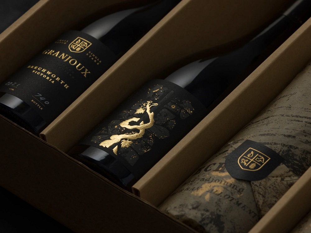
The new name in D4U Gallery this time is Studio Guild, an Australian-based packaging design studio with a focus on the food and drinks industries. In this post, I invite you to review some of their eye-pleasing and sophisticated packaging design projects for various beverage brands. The original descriptions from the studio website allow you to dive deeper into the ideas behind the final graphic solutions.
These projects employ different stylistic approaches to drink packaging, from vibrant and illustration-based to minimalistic and abstract, but all present an impressive creative outcome. Enjoy and get inspired!
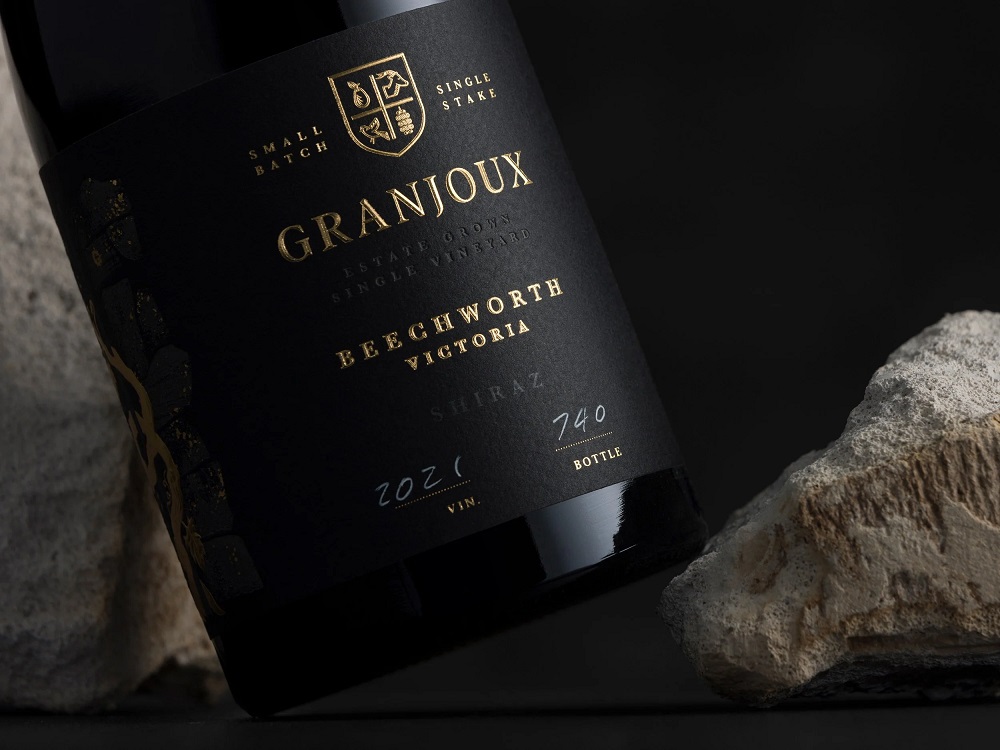
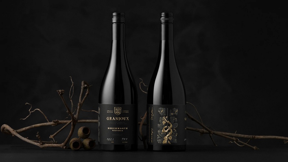
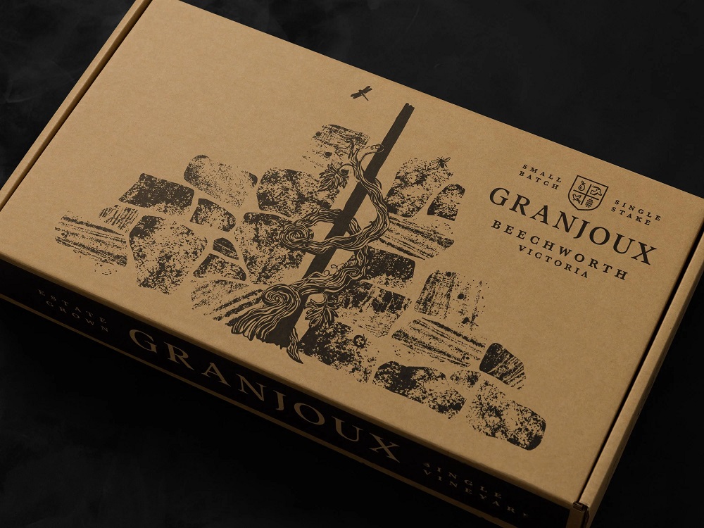
Granjoux
In 1860, Frenchman Ambrose Granjoux planted a small vineyard just outside of Beechworth, Victoria, Australia. Today, the dry-stone-walled vineyard, or clos, has been rejuvenated to its former glory thanks to its new owners. To honor the original founders’ European heritage and traditional growing techniques, single-staked vines, decomposed granite, clay, and slate soil guide this low-yielding, organic vineyard to produce fruit of exceptional quality.
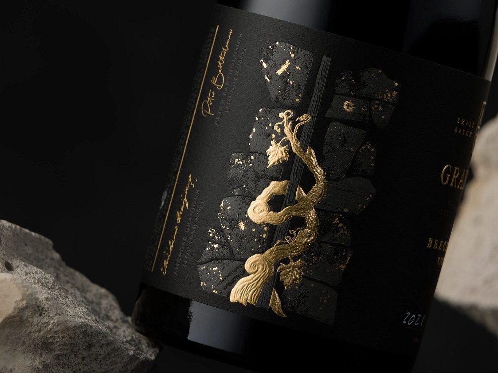
Studio Guild created a premium textural look to tell the story of this very bespoke and unique vineyard. The small batch range with premium finishes – heat deboss, sculptured embossed
foiling, rooftop emboss typography, required multiple vintages to be printed, enabling the client to number and batch each year. This production problem-solving also adds to the coveted, highly sought-after offer.
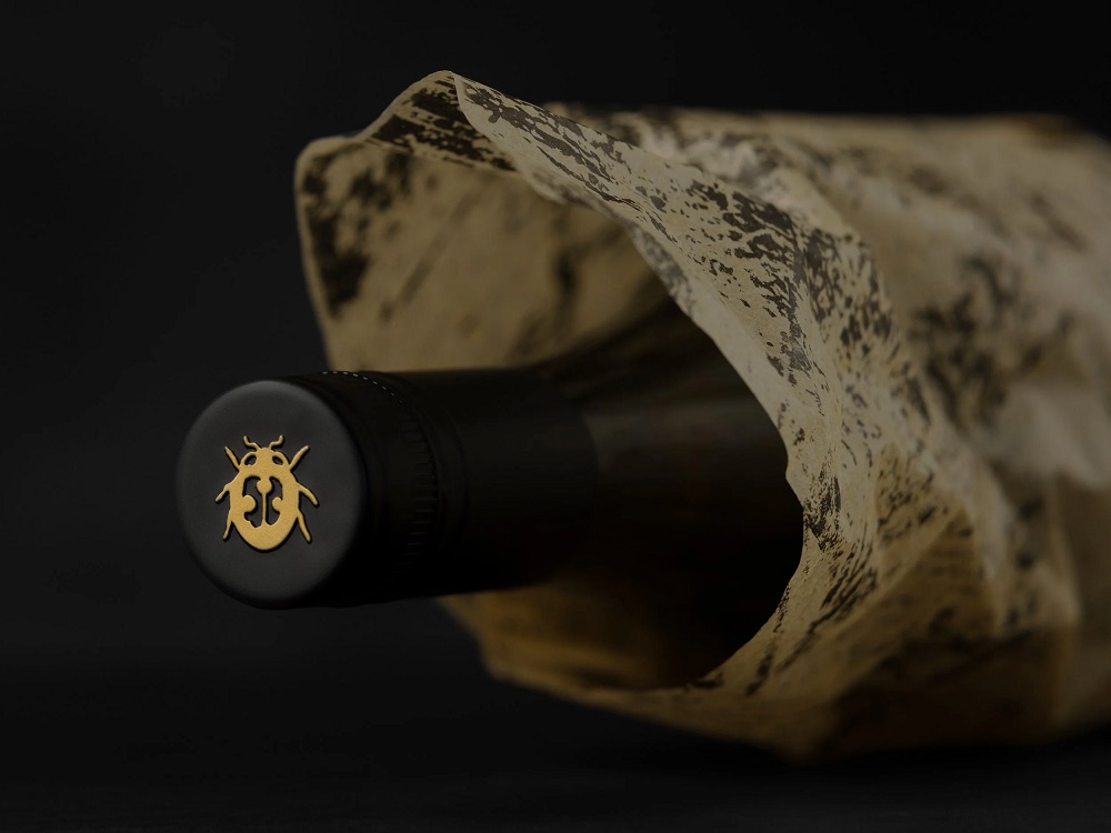
The heat deboss of the dry-stone wall features tiny insects, including a ladybug, a bee, and a dragonfly, which contribute to the story of the healthy micro-climate that helps this vineyard produce exceptional fruit. The ladybug also sits on top of the cap as though continuing to protect the precious product inside after it leaves the vineyard.
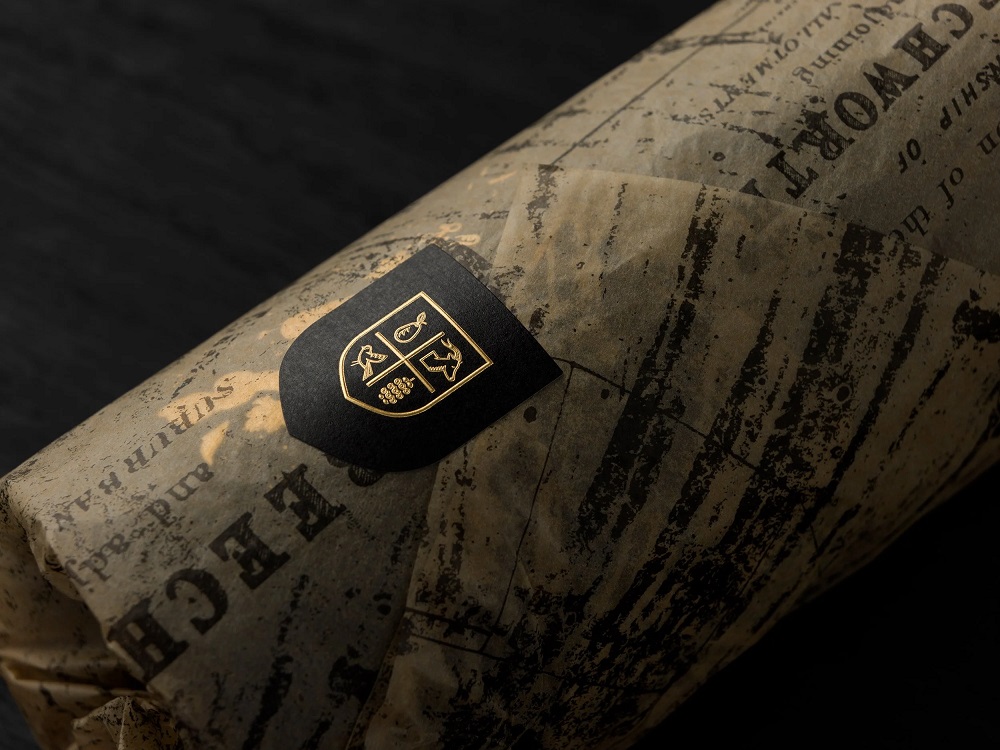
The logo identity was given a modern treatment of the traditional coat of arms style. Within the shield, each element represents stories within the vineyard. The pear tree sits within the stone wall that is over 100 years old. The wild goat – the historical coat of arms image for the new owner’s name, Batheolomew. The mulberry – alongside the pear tree stands a mulberry tree of equal heritage. The bird – the beautiful, tranquil property is also home to many native birds.
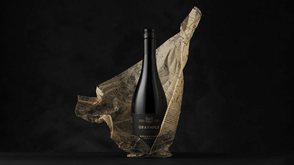
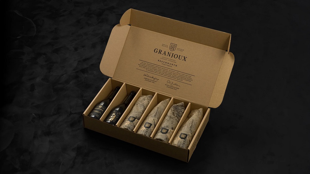
To complete this premium offer, the branded lie-down box entices consumers to discover the treasures inside, with the dry-stone wall and single-stake vine guiding the story of what’s inside. Once opened, they are exposed to the beautiful artisan tissue paper created using historical mapping and documents from the original site. These have been sealed with a gold foil sticker that hints at the premium offer inside the bottle.
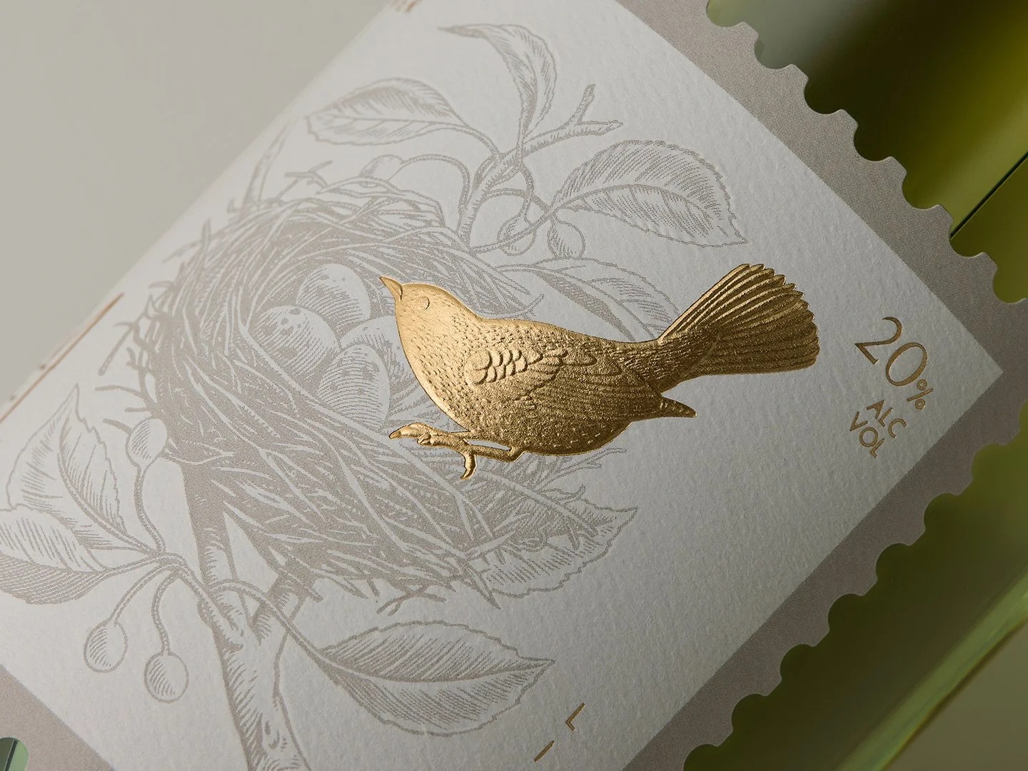
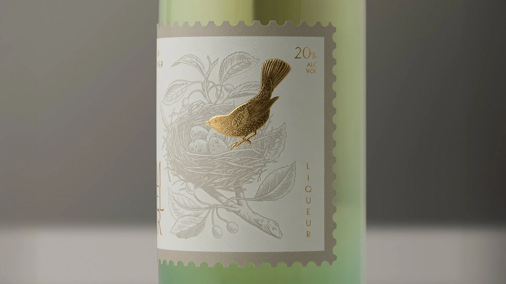
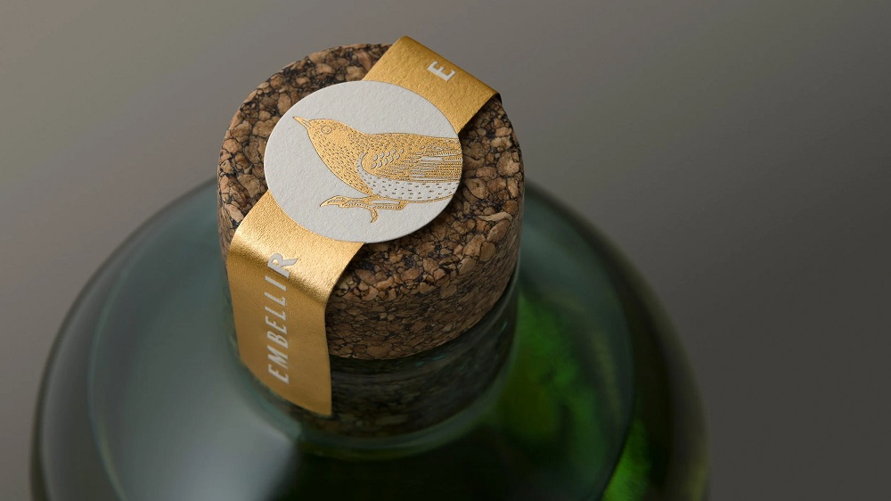
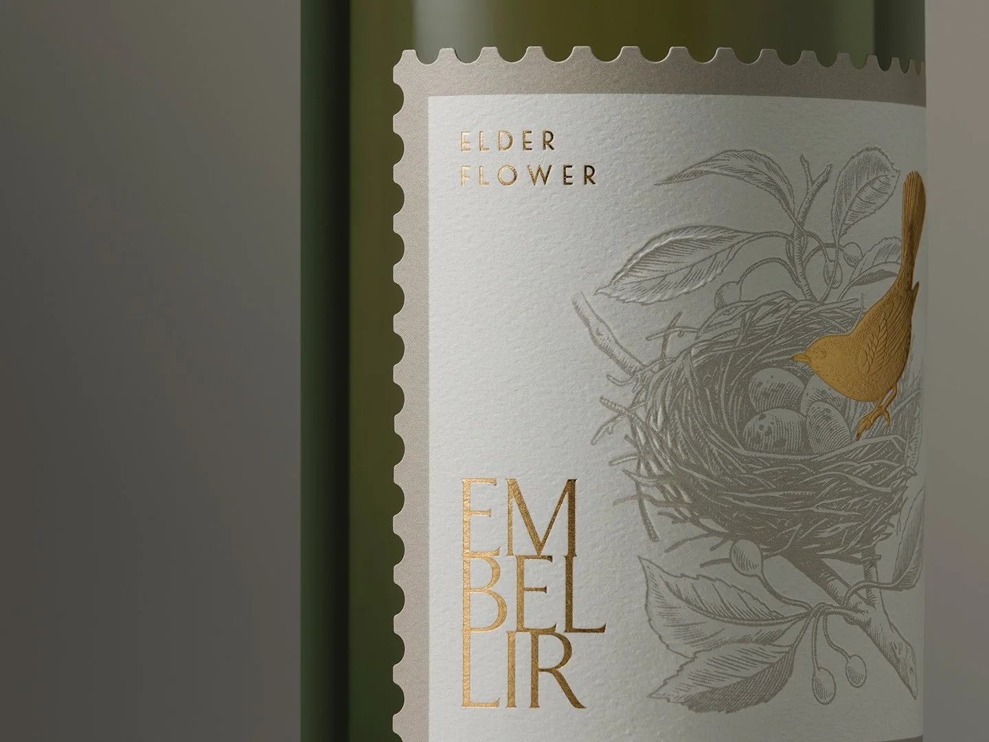
Embellir
The French verb embellir translates to “to make beautiful,” “to enhance,” or “to adorn.” It encapsulates the act of elevating something from ordinary to exceptional, whether through decoration, refinement, or intricate craftsmanship. This concept became the foundation for the design narrative when Labelhouse approached Studio Guild with a unique request: to create a bespoke label that showcased the depth, detail, and sophistication of their finishing capabilities, particularly sculptural embossing. This request sparked the central theme of the design, “embellishment” in every sense of the word.
To align with the elegance and delicacy suggested by the term embellir, they chose Elderflower Liqueur as the imagined product. Its refined flavour and artisanal appeal perfectly complemented the intricate visual direction they wanted to pursue.
At the heart of the design is a bird, delicately perched on the edge of its nest, an ever-evolving structure that, like the label, is being carefully embellished stick by stick. This imagery becomes a metaphor for craftsmanship, detail, and the layering of elements to create beauty. The bird is brought to life through a sculptural embossing technique, lending it a striking three-dimensional presence. In contrast, the nest is subtly debossed into the surface, adding depth and tactile texture that invites touch and closer inspection.
Framing the design is a die-cut border that mimics the serrated edge of a traditional postage stamp, symbolising the preciousness of the label and reinforcing the theme of considered, intentional detailing. The result is more than a label; it is a celebration of form, finish, and the timeless art of embellishment.

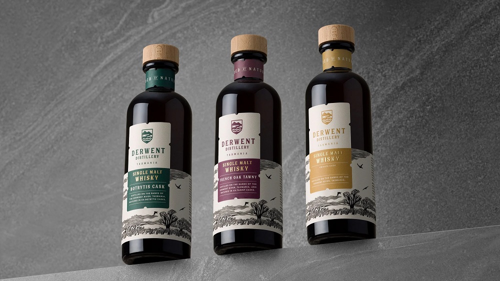
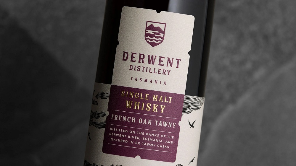
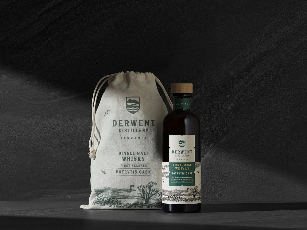
Derwent Distillery
Situated on the banks of the pristine Derwent River in Tasmania is Derwent Distillery.
Tasked with creating a premium Whisky range, Studio Guild set out to depict the essence of Tasmania in a bottle – textural, artisan, rustic, earthy, and bespoke. This stunning range of Whiskies tells the story of the environment surrounding the distillery. The outlook onto the river, the native bushland, the bird life, and the low-lying fog unique to this area, is called the Bridgewater Jerry.
True to the Tasmanian artisan style, a hand-carved linocut was created by Studio Guild and a fresh new image for the brand identity. As the consumer picks up the bottle to explore the tactile label, they are met with the unexpected delight of the die-cut river flowing down the back.
Bottle – 100% recycled glass.
Label – made from recycled materials.
Closures – compostable & 100% plastic-free
….authentically guided by nature.


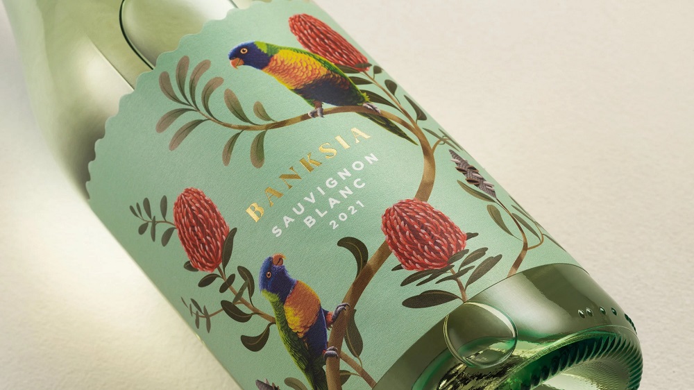
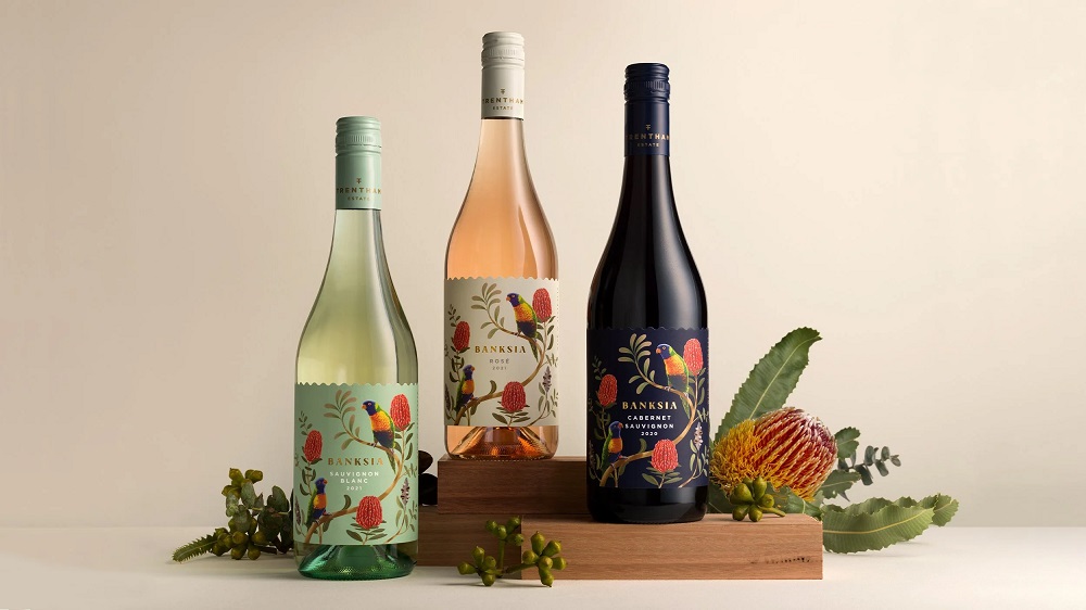
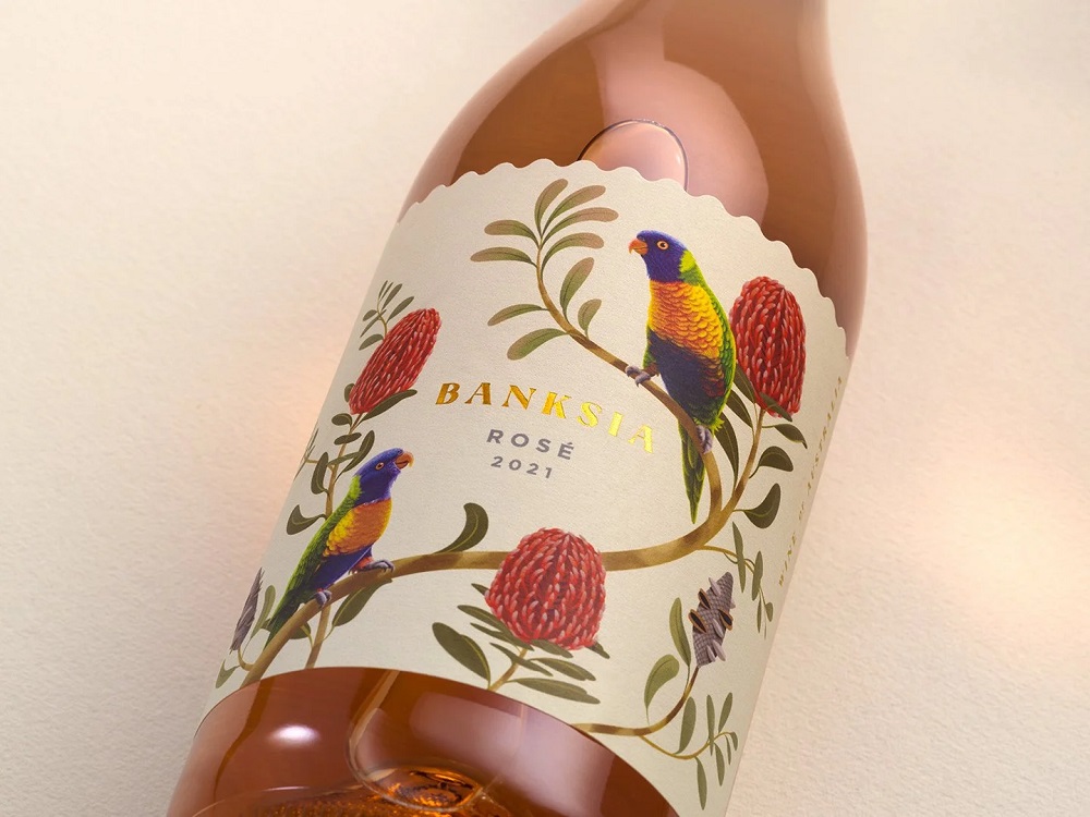
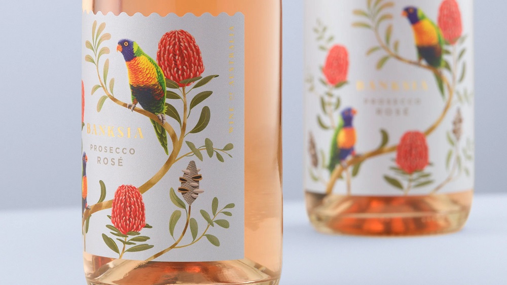
Banksia
Trentham Estate resides on the beautiful banks of the Murray River, where it is home to hundreds of species of native flora and fauna. Leading down to the river is the native garden, abundant with wildlife. It is here that the local lorikeets munch on the native Banksia flower.
The peaceful but colourful aspect of the design has been created to engage an emotive connection with the consumer. The aim was to engage with an export market to open new opportunities in new markets. We set out to create a brand that was quintessential Australian, in a tasteful way – without kangaroos and koalas!
With Trentham Estate’s unique position by the river, the strategy is to create a consistent brand story based on the environment through different storytelling chapters. The curved die-cut edge represents the flow of the river and enhances the brand’s tranquility, creating a sense of place and adding shelf impact.
The back label has been thoughtfully designed by following through the die-cut edge, adding wavy lines, and an approachable tone of voice to connect with the mid-range consumer this brand needs to appeal to.

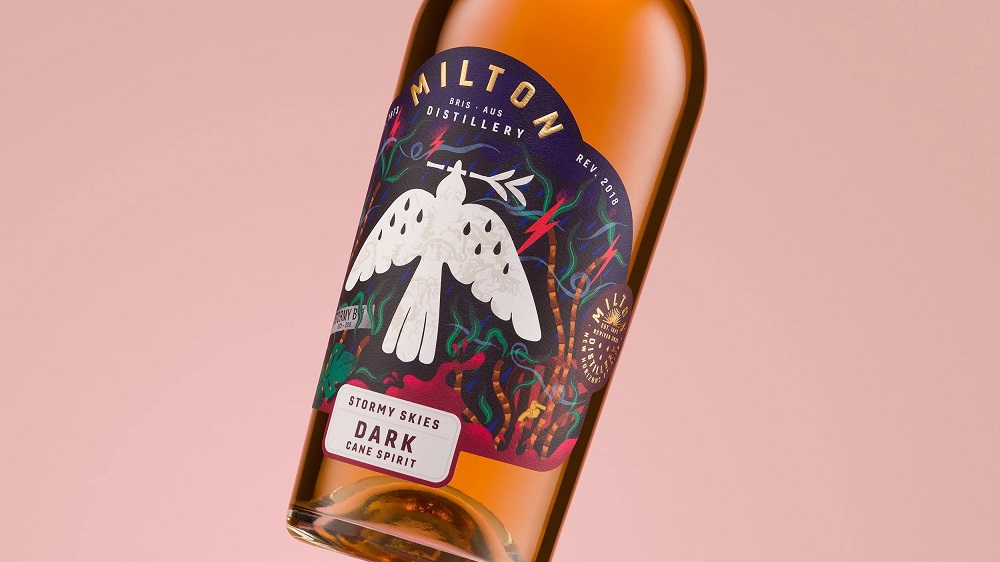
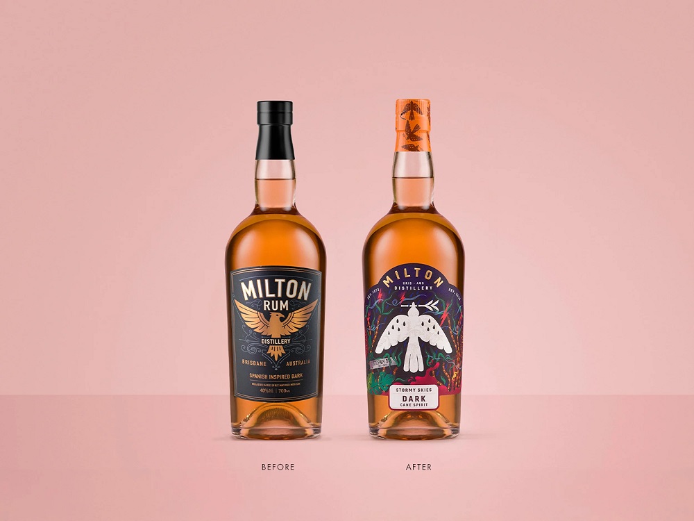
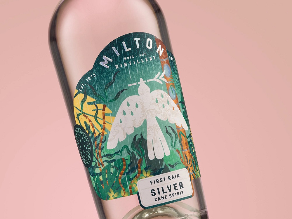
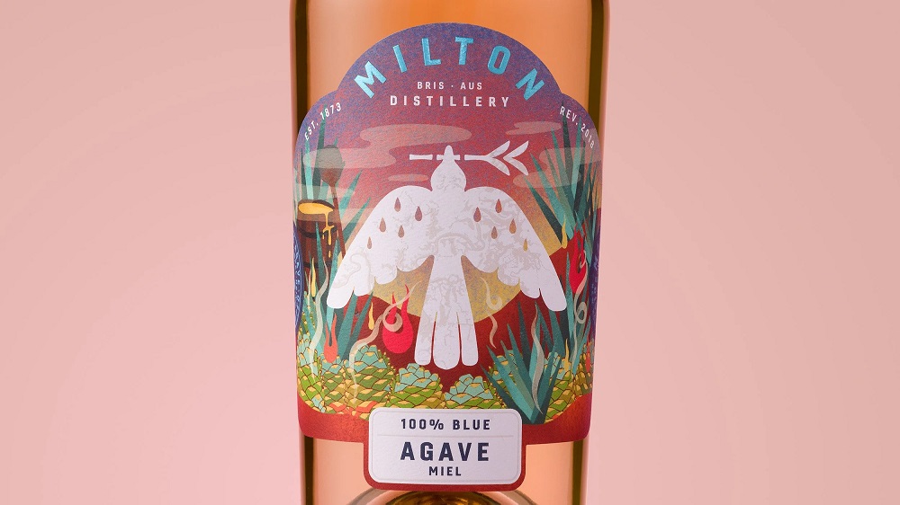
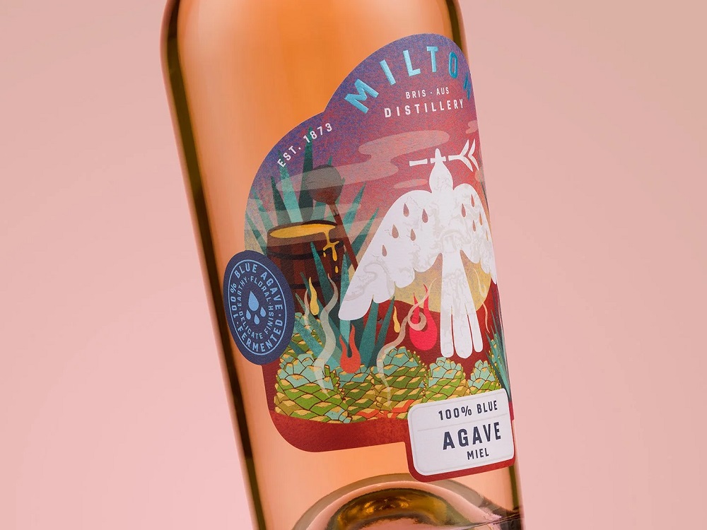
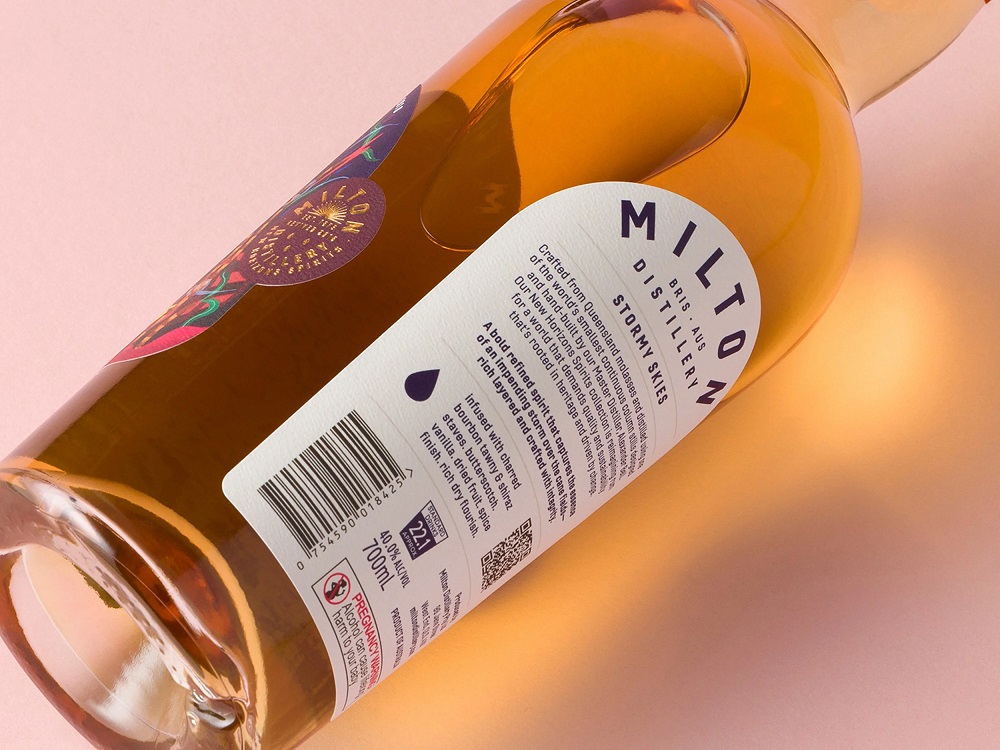
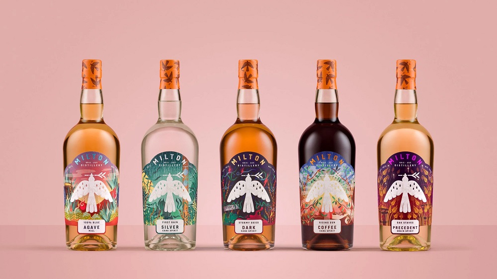
Milton Distillery
Milton Distillery approached Studio Guild to recreate their brand for a new generation of Rum drinkers. To re-position the brand for growing interest from female consumers, younger males wanting to experiment within the Rum and Cane Spirit category, and the growth of cocktails, a fresh, new, gender-neutral look was needed.
Central to the brand story is the Eastern Koel bird. Also known as the ‘storm bird,’ which was said to fly ahead of rising flood waters, warning residents of the pending danger. Here on the label, it takes on a protective role and stands prominently on the shelf, creating a cohesive brand architecture.
Each cane spirit tells its own chapter as part of the brand story, relating not only to the tropical environment but also to what is in the bottle.
Stormy Skies – a bold, refined spirit that captures the essence of an impending storm over the cane fields.
First Rain – a delicate spirit which embodies purity and clarity, delivering a refined, clean finish, capturing the first scent of rain.
Rising Sun – stands as a tribute to the art of crafting spirits that inspire and excite, like the dawn of a new day, redefining what a coffee rum can be.


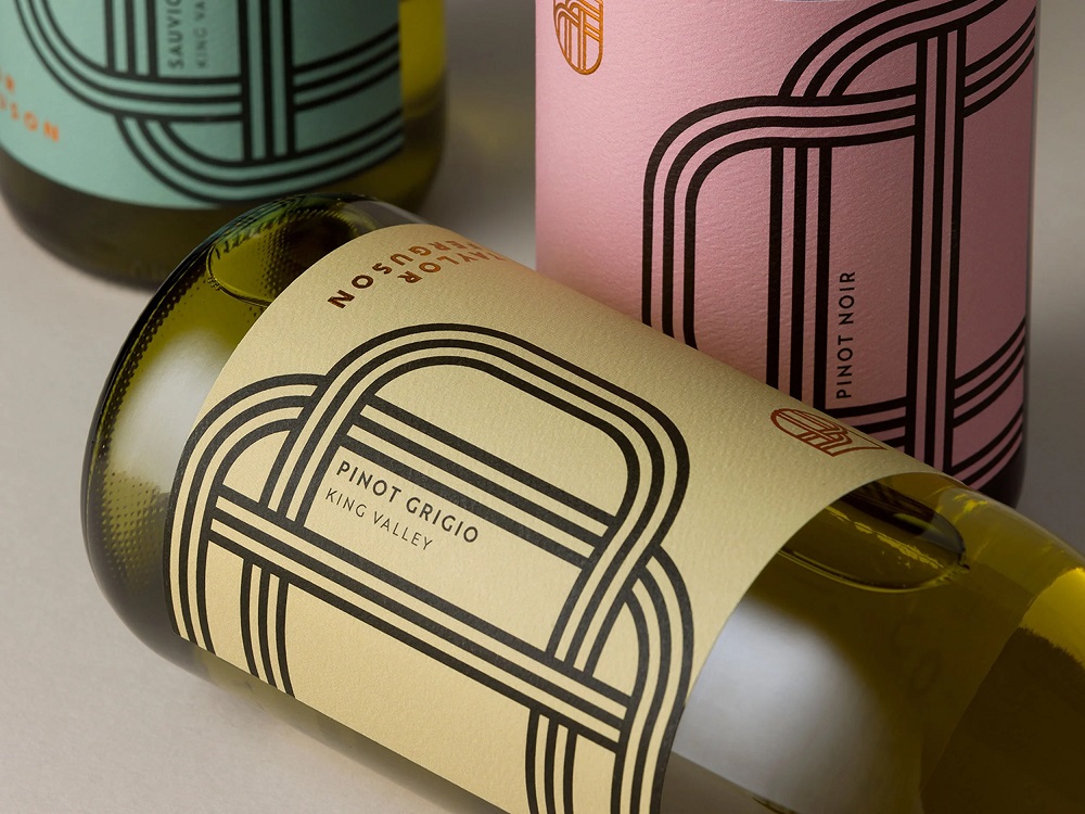
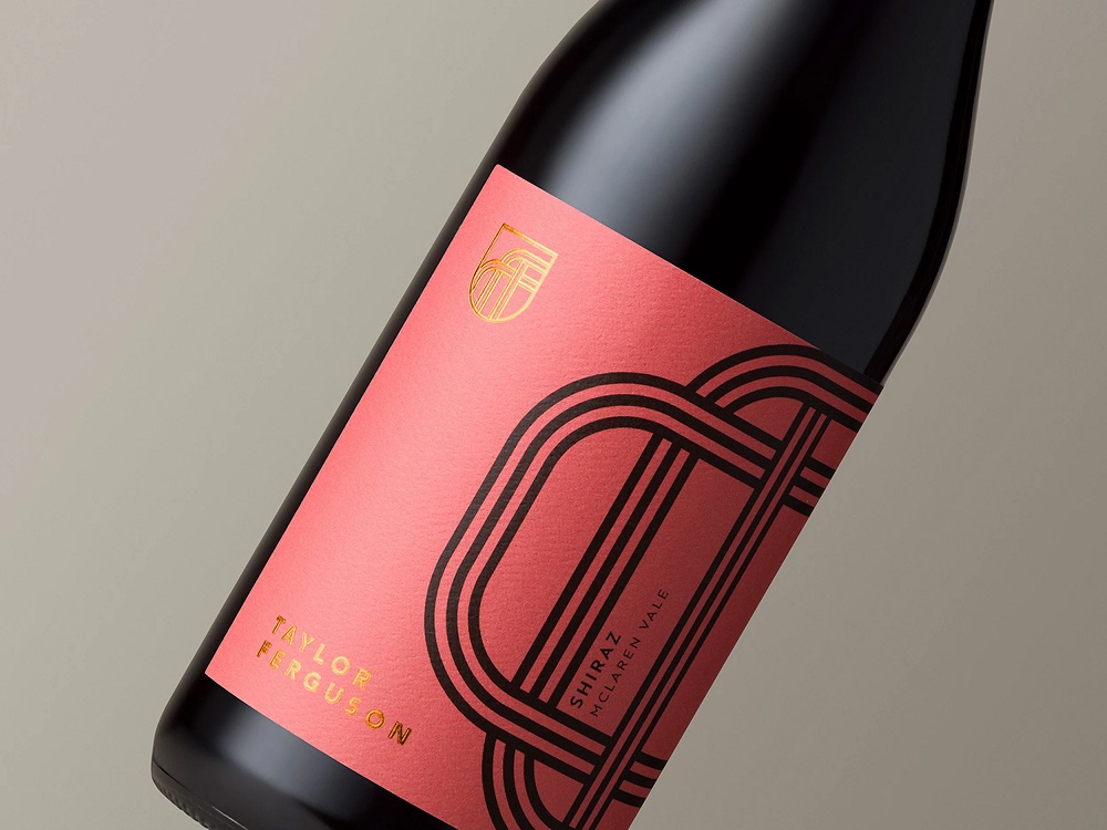
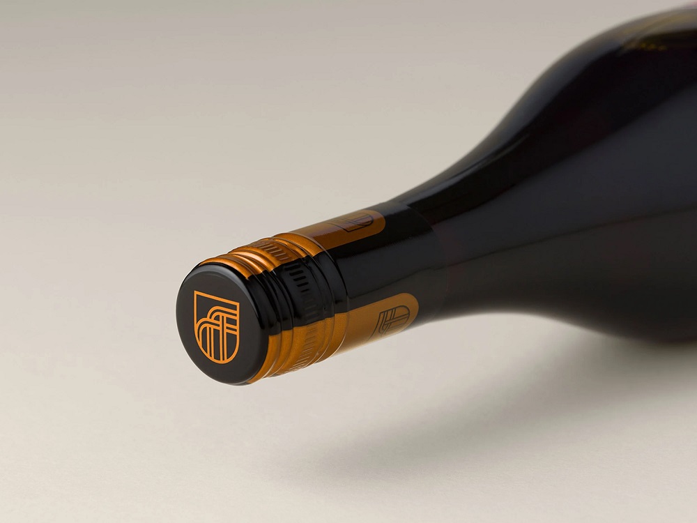
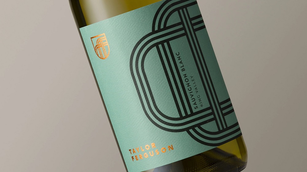
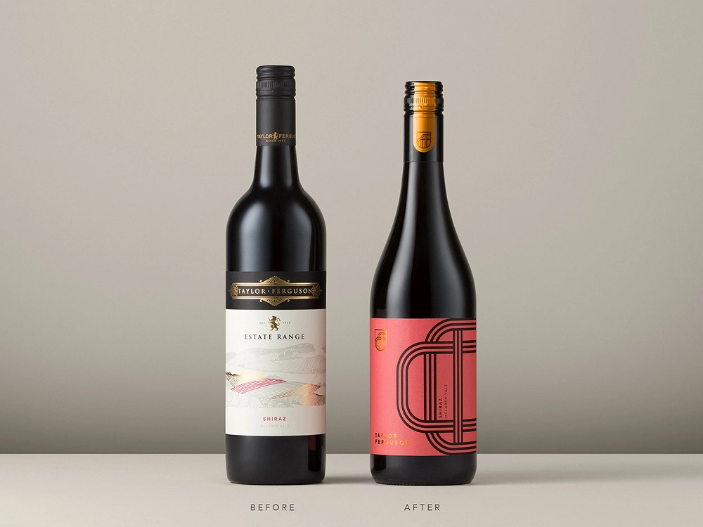
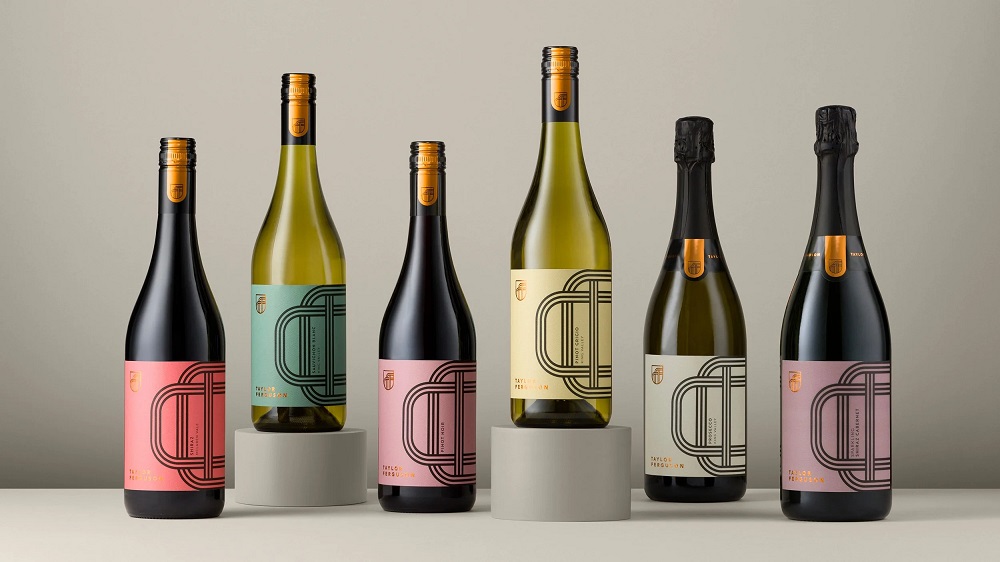
Taylor Ferguson
The need to stand out in the current wine market is paramount. Wine distributor Alepat Taylor reached out to Studio Guild again after the market success of other brand refreshes we have created for them. This time, the brief was to bring new life to the Taylor Ferguson range, which was lacking in engagement and sales. The previous branding was tired and dated, with little support or engagement from trade or on-premise, so we set out to create a brand with better shelf impact to regenerate consumer interest.
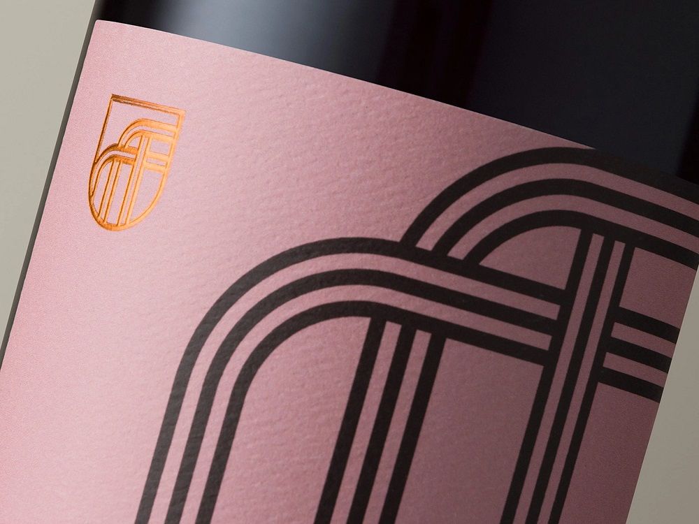
The old range had the typical vineyard-themed imagery. We believe every successful brand should include concept and strategy, no matter what the brief. The creators’ aim was to weave a story around the regionality of the range, but in a more contemporary and impactful way. To tell this story, we created a graphic label and brand that is based on rows of vines and separated vineyard blocks. The strong black lines contrast against the muted tones of the background colours to create a disruptive formation on the shelf.
The new Taylor Ferguson brand mark is a nod to the traditional shield mark with a simplified, modern interpretation. The mark follows the aesthetic of the label graphic to form the “TF” initials. This branding has then been extended into a branded capsule. Though the branding looks graphic and simple, it’s the secondary assets that allow the brand to adapt beyond the packaging, ie, assets to use on socials, tasting notes, clothing, and advertising.
The back label has been developed with these design assets in mind. Though there is loads of information to house, we feel the back label design should always be considered. You never know if a consumer will see the bottle for the first time from the front view or the back view.
The chosen colours are disruptive on the shelf without being too contemporary and risk losing relevance in future years. They create a warm, sophisticated look to the brand, over-delivering to the consumer for the price point.

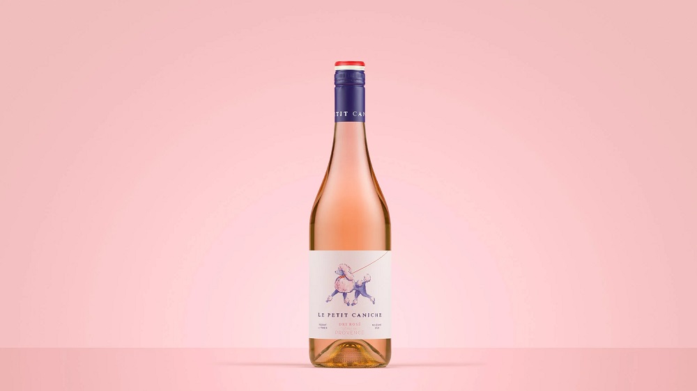
Le Petit Caniche
In the heart of Paris, where the streets hum with café chatter and the scent of fresh croissants drifts through the air, a little poodle takes her daily promenade. With a confident strut and a twinkle in her eye, she is the very soul of French charm – playful, elegant, and effortlessly stylish.
She pauses at flower stalls, greets artists along the Seine, and turns heads wherever she goes. She isn’t just a dog, she’s a symbol of a lifestyle. One that celebrates beauty in the everyday, delights in the small things, and flair in every detail.
Inspired by this whimsical slice of Parisian life, ‘Le Petit Caniche’ was born. At its heart lies one instantly recognisable image, the little poodle, a playful yet poised icon that leaves a lasting impression. It tells a story without a single word: of lightness, sophistication, and unmistakable French character. One glance and you’re transported to a sunny Parisian terrace, a clinking glass, and a laugh shared between friends.

You can see more of the team’s projects on the Studio Guild website.
New D4U Gallery issues are coming soon; stay tuned for new posts.
For more inspiration, check the sets of other posts from our D4U Gallery, where we gather impressive creatives to share their art with you, for example:
- logos and identity design
- wildlife-inspired illustration projects
- vibrant digital illustrations collection
- illustration-based packaging for food and beverage
- artistic packaging design for biscuit brand
- abstract poster designs
- food lovers guide: illustrations and graphic design
- 3D character art projects
- wine packaging design
- captivating 3D animation concepts
- impressive packaging designs
- 3D illustrations
- English
- Ukrainian