7 Essential Variables To A/B Test in Your Email Campaigns
7 Essential Variables To A/B Test in Your Email Campaigns Email marketing is a powerful way to attract new customers and get repeat business. Check how to tune your email campaigns with A/B testing.
You’ll probably agree with me when I say: Email marketing is a POWERFUL way to attract new customers, as well as get repeat business.
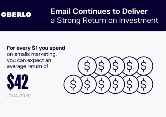
According to a DMA study, email marketers can expect an average ROI of $42 for every $1 spent on email campaigns.
Source: oberlo.com
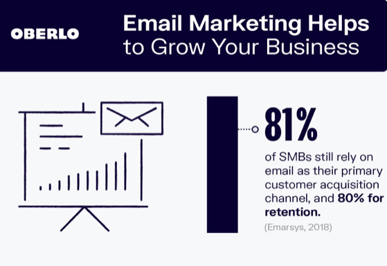
With such a massive ROI, it comes as no surprise that email campaigns are the marketer’s favorite. According to Emarsys 2018 analysis, 81% of small businesses still rely on email campaigns for primary customer acquisition and 80% for retention.
Source: oberlo.com
Put simply, emails are so popular among digital marketers that email engagement is considered a top metric for evaluating content performance.
But here’s something that will disappoint you. The majority of the marketers see their email campaigns fail – some struggle for months to improve campaign results, while others succumb to the intense competition.
Now, why does that happen?
Because there’s no one-size-fits-all solution to email marketing: if strategy A has worked for Company X, there’s no guarantee for it to work for Company Y as well.
That’s why it is essential to run A/B tests when trying new formats or strategies for your email campaigns. Until a marketer thoroughly tests different variables in their email campaigns, they’ll never figure out what’s best for them.
Before we get into details, let’s quickly understand what exactly an A/B test is.
Understanding A/B Testing
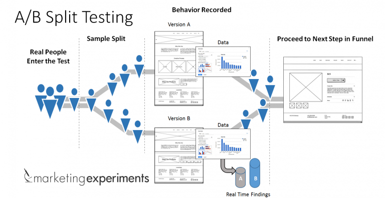
A/B testing, often termed as ‘split test,’ is a method that involves splitting your email list into two separate lists and sending different variations of emails to each. Then, you’ll send these two versions to two similar audiences and evaluate which one performed better.
Source: marketingexperiment.com
Let’s understand with an example:
To run an A/B test for email marketing, you’ll create two different versions of your promotional content with the first variable as ‘Subject Line.’ In other words, you’ll create two different subject lines for the same email content, i.e., Subject Line 1 (Sent to Group A) and Subject Line 2 (Sent to Group B).
After sending these emails to Group A and B, you’d start comparing the open rates and clicks for both subject line variations and figure out which one got more clicks.
Just like the ‘Subject Line,’ you can run, make changes in different parts of your email content, and run A/B tests to compare results.
The bottom line is – for your email campaigns to become successful, you should focus on experimenting with your own emails.
Choosing Variables for A/B Test
The first step to setting up an A/B test is deciding the variables that you’ll test.
Instead of relying on assumptions and guesses, it’s best to run an A/B test and then make a more informed choice. Fortunately, there are many variables you email marketers to test. Below is the list of variables you might consider testing in your Email Campaigns.
Subject Line
An email subject line is one of the most powerful email marketing elements. It’s the first thing you people see and read when they enter their inbox – and it’s what they use for deciding whether they’re going to ignore, read, or delete it.
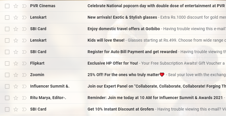
Look at the short (yet catchy) subject lines of the emails in the image above (also notice the urgency each of them is trying to create through the subject line itself).
Without a doubt, every email marketer should A/B test their subject lines to figure out what their customers like or dislike. Some of the variations you can make in the subject line include:
- Length of Subject Line
- Word Choice in Subject Line
- Clarity of Message through Subject
- Questions and Punctuations in Subject Lines
- Urgency by talking about limited-time offers
The key is to keep it short, simple, and catchy—people today like No Nonsense email subject lines. In a broader sense, the best practice is understanding your audience well enough to know what style, language, and offers will be attractive to them. You can learn the same through multiple A/B tests.
Personalization
Another fastest growing trend that’s seen in email campaigns is personalization. By personalization, we don’t mean adding a user’s first name into the subject line – this one has become such a common practice that users don’t find it attractive anymore.
So, you’d need to try variations here as well. The key is to go beyond the first name. How about trying location-specific language, offers, and interest-specific terms. Most good email contents rely on a personalized, conversationalist tone to attract readers.
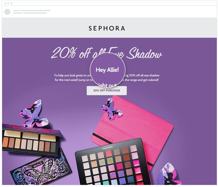
Source: campaignmonitor.com
Sites like BuzzFeed are known for taking advantage of conversational, casual tone, and super-successful clickbait headlines.
What you can do as an email marketer is to test different variations of personalized email content for determining which one hurts or helps your engagement or click-through rates.
Below are few techniques for writing personalized emails:
- Personalize Email campaigns around the Buyer’s Persona
- Personalize around Buyer’s Interest
- Make use of user location
- Make use of specific times to the day
- Highlight Mutual Connection
- Use their name more than once
The Layout of the Message
Email layouts are equally important. They serve a purpose beyond the visual appeal of the email body. A neat layout can make a significant impact on how your subscribers engage with your email.
Look at this email we received from Paytm – notice the simple design, no-nonsense approach, plenty of white space, short text, and of course, a decent CTA.
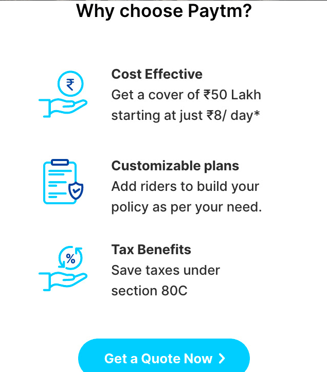
You can test vibrant colors, off-grid designs, a retro look, and bold typography for your email campaigns. Following the trend, you can go for 3D imagery with more image depth, isometric illustrations, and futuristic designs. In short, make as many variations as you like, and A/B test them to understand audience taste. You can follow the following tips:
- Structure your email for easy reading
- Be relevant
- See email design as an extension of your brand
The key is to make sure your designs are visually captivating, without having too much written content or graphic that distracts the audience from essential parts of your email.
Testimonials to Include
No matter what people say, testimonials have the power to attract new customers. Recommendations written by previous users take away any hesitation a new customer might have about making the purchase.
And that’s the reason why email marketers today harness the power of testimonials in their emails. Let’s look at different ways you can incorporate them into your emails and A/B test each of them to see what’s driving more conversions:

Source: hatchbuck.com
- Incorporate short product reviews (best testimonials are punchy, not long)
- Make use of user-generated content (utilize their images, video, or social media post to enhance impact)
- Share complete case studies
- Personalize the use of testimonials by highlight customers that belong to the demographic of the mail recipient
- Combine testimonials with a different form of social proof
Images
Yes, texts are a crucial element in emails. However, marketers should never underestimate the power of images or visual content. Images not only allow you to strengthen visual appeal but also help communicate messages that can’t be conveyed through text.

Here’s a simple (and equally captivating) email I received from Indigo. Make note of the catchy headline, simple image, the CTA button, brand-relevant colors, and useful messages they conveyed using just a few words.
Follow these best practices for A/B testing your marketing emails and get most from the variables:
- Use email background images
- Use email banners or templates
- Try stock images for increasing visual appeal
- Use illustrations and videos
- Ensure brand identity by using standard brand colors and styling elements
In other words, it’s natural for humans first to notice a visual instead of text – but only if it is captivating enough to grab their attention.
Preview Text
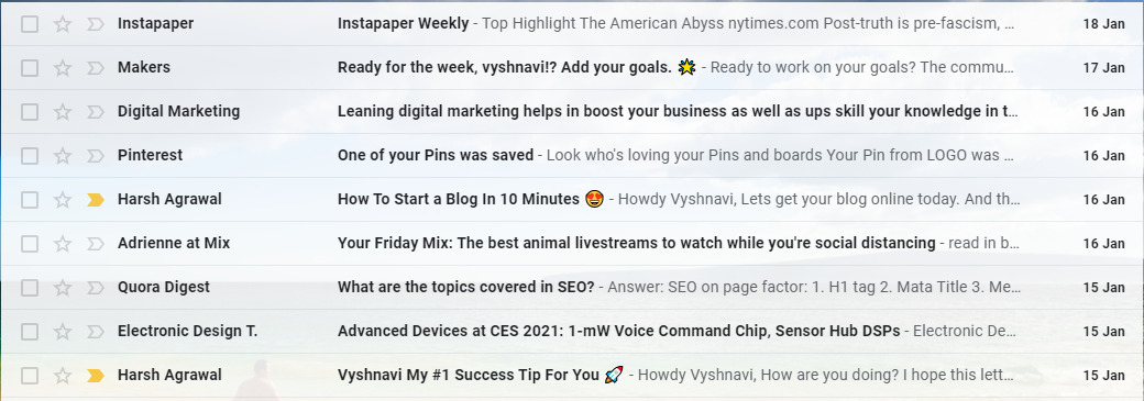
With modern email clients, it’s not only the subject line that appears in the inbox but also the preview text. So, email marketers can use this as well to increase open rates – because preview texts tell your audience more about the content of your email.
The light grey colored texts you see in the image above are ‘preview texts.’ They range from 35-140 characters, which makes them an important part of your email.
Hence, just like the subject line, your preview texts must be as interesting. If your preview test shows unclickable links or unmeaningful texts, then you’re wasting the opportunity.
Call to Action
Just like the Subject lines, CTAs are also a crucial element of your email. It encourages the email recipient to act. So, while designing emails for your campaign, be sure to optimize your CTA and maximize the conversion rates. Here are few tips you can use for optimizing CTA and A/B testing them:
- Use action-oriented texts (Try it Out Free, Get the Discount, Reserve Your Spot)
- Create Urgency (Shop now, Reserve now – 6 Spots left, 50% off today only)
- Make your CTA button large and easily readable.
- Add enough white space.
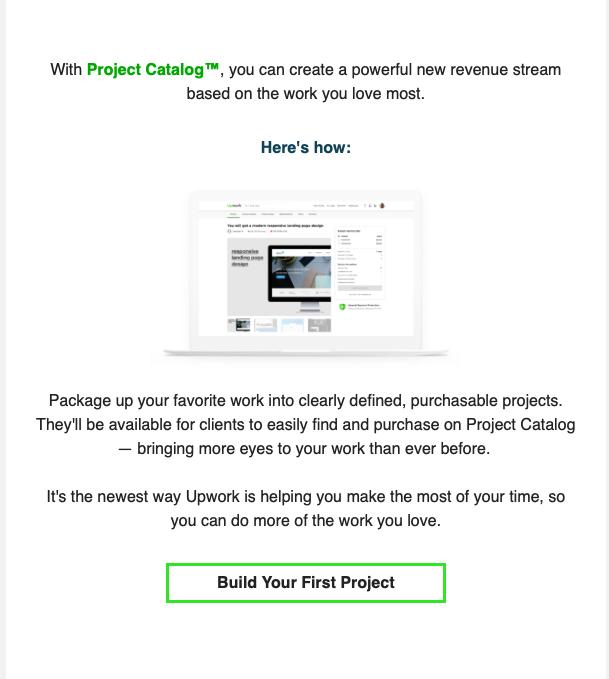
Look at this Upwork email we received – note the sufficient white space, personalization, short message, and unique CTA text that encourages users to take action.
The key is creating CTA that converts prospects into customers. If you haven’t run enough A/B tests, CTA buttons are a perfect place to start. After all, there’s no button that works for everyone, at all the time. So, go run some A/Bs – test style, font, placement, color, and words.
Analyzing A/B Test Results
Once you’ve run email campaigns with different variables or variations, take a close look at the results. For emails, you might want to look at the email open rates, the conversion rate, and the click-through rates.
As a marketer, your most important job should be tracking these metrics for each email version to ensure you’re not losing a critical insight or sales. The end goal should be identifying what’s working. You should focus on conversions and not just the open and click-throughs.
For analysis, you can also use A/B testing tools. Fortunately, there is plenty of software that’ll make your job easy.
To make sure you get significant insights from test results, make sure you don’t miss out on any of these tips.
Test both variations at one time
When you’re running an A/B test, make sure to run the two variations at the exact same time because timings play a vital role in any marketing campaign.
If you run version X at 10:00 pm and version Y at 5:00 am, how would you know if the performance changed because of the time difference?
Run tests for a substantial time period
Depending on your email content and the kind of action you’re expecting from your audience, it’s wise to give A/B tests enough time for producing useful data. Now only you would know how much time is enough for pulling data. So, don’t rush into the process, and do not restrict the time in which you’ll be generating the results.
Use A/B testing сalculator
While few marketers calculate results manually, others use calculators to conduct statistical significance tests. The A/B testing calculators will spit out your data insights and save your time from the tedious calculation.
Take actions based on the results
While the A/B tests help marketers study the impact on different variables on a case-by-case basis, they’re also an excellent tool for deciding future moves. A smart marketer is the one who studies which variables worked better than the other and apply the lessons they learned from each test for future efforts.

Illustration by Karolina Kalinowska
Wrapping Up
Yes, email campaigns are the ultimate ingredient for growing your customer base. But if they are not aligned to the right variable, no amount of work can save your prospects from drifting away. It will still fail. For a successful email campaign, you need a great understanding of what’s working and what’s not.
What I mean to say is – don’t just rush into it and assume what will make your email campaigns successful – you could lose customers at this delicate point. Instead, spend adequate time researching, testing, and analyzing your campaigns.
About the Author: that’s the guest article by Vyshnavi Basuthkar is a SaaS Marketing Analyst (who specializes in paid social strategy, social media management, content strategy, and email marketing) at piHappiness, top customer feedback software designed to collect customer feedback on Web, iPad & Android tablets.
- English
- Ukrainian


