Strategies and Principles of UX Design for E-Commerce
Strategies and Principles of UX Design for E-Commerce The articles providing general insights on design for e-commerce websites and mobile applications in business, UX and UI perspectives: tips and strategies to consider.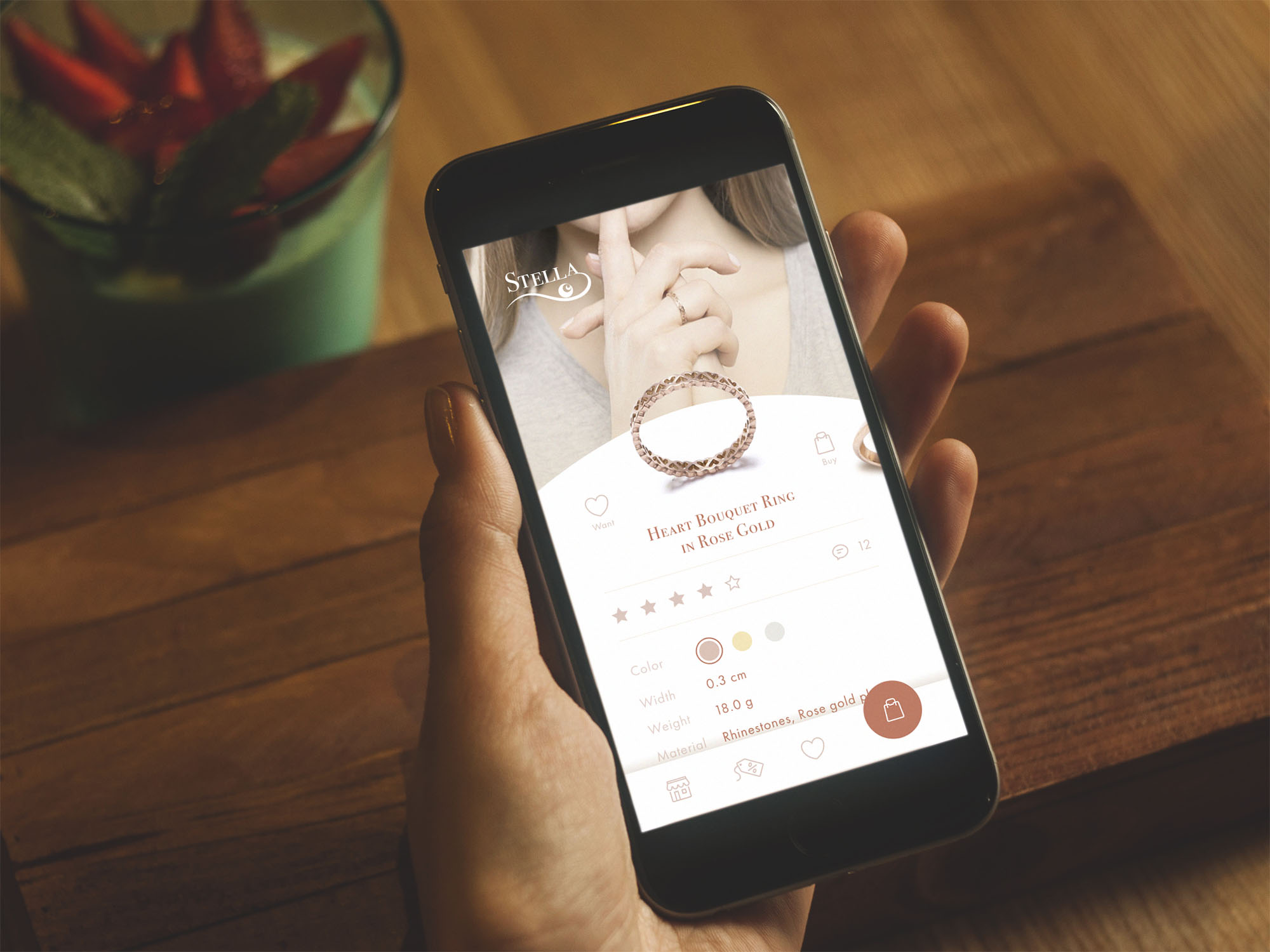
Quite a long time ago, the British author and scholar Thomas Gray stated: “Commerce changes the fate and genius of nations.” Over the last decade, commerce has seen hundreds of new ways to reach customers, driven by technological innovation and its growing role in everyday life. More and more buyers are prioritizing the online shopping experience, and more and more sellers are launching new channels and methods in response to this trend. And this is the sphere in which the design of a positive user experience directly moves the stakeholders to profits. Today we are talking about UX design for e-commerce.
What is E-Commerce?
In general terms, e-commerce (Electronic Commerce) is the process of conducting business in which goods or services are provided to customers via electronic devices and the Internet. This sort of communication and finalization of sales adds some new aspects to data management, sales channels, advertising, presenting goods and services, and moreover — enabling the full cycle of commercial operations, including payments, delivery, and refunds.
The last decade witnessed booming e-commerce development. Today it provides opportunities for not only e-trade both from businesses to buyers but also online auctions and user-to-user sales platforms. E-commerce systems and activities today include presenting and booking a wide range of services, e-banking, commercial operations with e-money and e-wallets, diverse forms of e-marketing, and many other things which customers are using more and more often on an everyday basis.
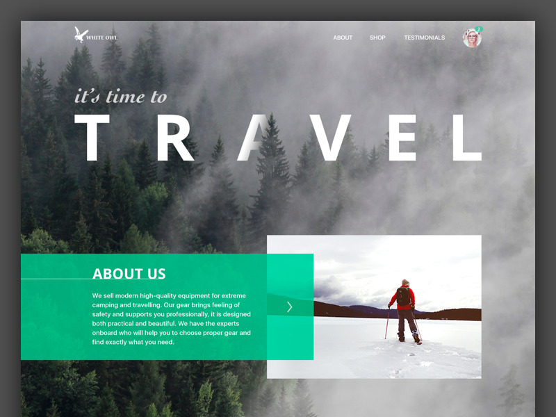
Travel Gear Landing Page
The role of design for e-commerce
«If you do build a great experience, customers tell each other about that. Word of mouth is very powerful,» says CEO of Amazon Jeff Bezos, and it’s hard to argue. Obviously, the success of e-commerce activity depends on several factors, among which:
- the quality of the product or service offered
- the quality of the content presenting the offer to customers
- the quality of design for the electronic platform — website and/or mobile application — via which the sales are going to be delivered.
So, it’s easy to see that the UI/UX design part plays a vital role. Thoroughly thought-out logic and transitions, simple and straightforward microinteractions, fast feedback from the system, attractive product presentation, easy payment flow, and plenty of other details and features can directly influence increasing profits for the business involved in such a popular e-commerce game. This is the field where designers and business experts can work as one team for the good of everyone, first of all, of the target users.
Designing an e-commerce website or mobile app, designers should definitely consider the following aspects:
- operational simplicity
- strong branding
- security of users’ data
- effective use of visual elements
- clear data presentation via menus, catalogs, etc.
- user’s ability to leave feedback about goods and services
- easily available general and contact information about the business providing goods or services
- design that supports the offer not overshadowing it.

Handmade Toys Landing Page
On that ground, let’s check the details from three key perspectives whose combination in design makes success for e-commerce platforms: business aspects, UX aspects, and UI aspects.
Business Perspective: Branding and Promotion
Websites and mobile e-commerce applications are (well, should be) always the products created within a particular business scheme. It means they are part of a certain business plan with the specific goals in mind and the planned ways to achieve them. Therefore, design for this sort of product definitely starts much before the first real line appears on the paper or screen. There are several important issues that should be considered and agreed upon before the actual design starts. Among them we would mention the following:
– USP of the product. It’s essential to set which benefit (or set of benefits) will differ this website or application from the others and make it the core value presented via design.
– defined target audience. In e-commerce, it’s important to set who your buyers are from the initial stage of the project. Knowing their age and culture, potential problems and wishes, the level of tech literacy, and trust in the idea of online shopping, the social circles influencing them and aspects forming their habits, designers can be more precise searching for the shortest way to a successful purchase.
– positioning, tone, and voice of the brand. How would you describe your brand? Is it friendly? Fun or serious? Mass or luxury? Easily available or exclusive? Does it communicate to potential buyers in formal, informal or semi-formal style? Does it open much or mostly keeps reserved silence creating the mystery around the offered goods? These questions may seem far from business which has to be all about finance, profits, points of sales, and other stuff of that kind. Still, these issues present the number of features which will set the future brand image. And the design is somehow going to be its face, outfit, and make-up.
– marketing and sales channels. No doubt, it’s hard to immediately set all the channels for selling and promoting the future product; however, effective business planning means thinking over the core of them from the start. It will enable the design team to track and support the consistent experience of both getting to the product and actually interacting with it. Even more, designers take an active part in setting and strengthening marketing and sales via a variety of means from branded items, landing pages, and product videos to exclusive photos, posters and banners attracting customers to the platform where they actually can buy.
– type of business relations. Type of business relations based on target customers deeply influences the core aspects of UX design. Set from the start whether it’s B2C, B2B or B2C to create proper layout and predict possible user behavior.
– typical environment of use. Designers need to know when, where and in which conditions users will typically use the website or app: these factors have a considerable impact on the decisions about layout, color scheme, typography, transitions and interactions, which all need to have the global objective to make the process of shopping easy, quick and enjoyable.
It’s clear that all the points mentioned directly influence design solutions and the techniques and approaches used to realize them. It means that the best way to go is to involve designers in the discussion together with stakeholders and marketing specialists at the early ideation stage, if possible; if not, then specification and tasks provided to designers afterward have to include maximum information about those aspects. If you work in an outsourced design team, make sure you get this information to stay focused on the key aspects of the task. If not, communicate with the clients until all points are clear. This communication will save many hours of iteration that occur when the design is started from scratch without a basis of information and goals.
UX perspective
Talking about e-commerce, it’s vital to understand that selling the goods once via the website or mobile application is the minimal program of action. What stakeholders of the business really aim at is having this user buying via their website or app again and again. User retention is the direct condition of growing profits. And we have to admit that this aspect makes the e-commerce sphere highly attractive to designers. The objective that should be achieved is clear and simple: people have to reach the e-commerce platform and buy items offered on it.
Make no mistake, positive user experience is the key thing for user retention. In the case of e-commerce, the four key aspects of UX are quite clear:
- utility lies in the nature of the product: it helps users to choose and buy things and services they need.
- usability has to make the customer journey clear and easy, without unnecessary clicks, time lost on loading overloaded pages or inconvenient menu, the frustration of not getting feedback from the system, etc.
- accessibility has to bring up design that can be used by different categories of users, for example, people with disabilities (dyslexic, color-blind, etc.) or low level of tech literacy.
- desirability means that the app will get the look and feel which will make the experience enjoyable and users will wish to get back again.
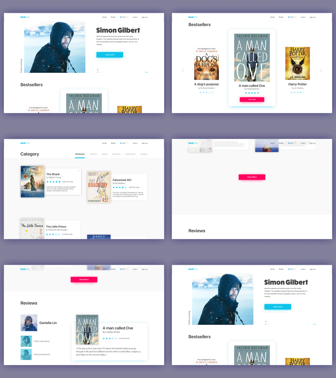
Bookshop Website
Among the core aspects addressing the issues mentioned and considered from the early stages of design, such as UX wireframing and user research, we would mention the following.
Intuitive navigation
You can have an amazing website with a stylish and trendy design and breathtaking images, but the success of it will be measured not by the number of “wows” it will bring out. The efficiency is measured simply: by the number of complete purchases. If users don’t buy, the design means nothing while stakeholders lose their money. Clear intuitive navigation plays the premier violin here. At every step of interaction, users need to understand clearly plenty of simple things, like:
- what company or brand they are dealing with
- what page they are at
- where the menu is
- how they can get back to home page or catalog
- where the search and filters are
- how long the page-loading process is going to take
- how they can see the detailed information about the item
- how can they choose between the options for the same item (color, size, etc)
- how they can pay for the item
- how they can save the items they would like to get back to later
- how they can contact the seller
- how can they see the rating and reviews of previous buyers, etc.
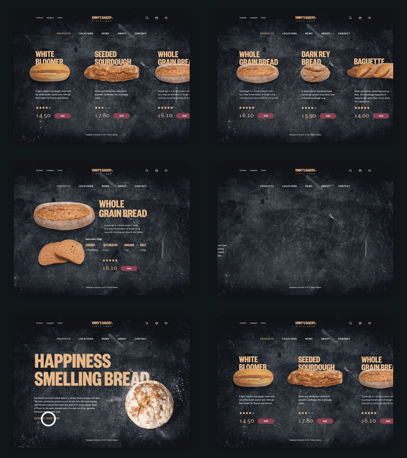
Bakery Website
Every button, link, and card can play a crucial role and change the conversion significantly. What’s vital to bear in mind: in terms of intense competition we have in e-commerce now, buyers aren’t ready to wait or waste their time on unnecessary operations. What they demand from e-commerce is an experience that is faster, easier, and more convenient compared to going to a physical store. If you don’t give it to them, they will look for it somewhere else.
Sales funnel
Sales funnel (in other words — purchase funnel) is a technique that moves the customer through several stages of involvement, providing him/her with necessary information about the product and benefits, persuading them to make a purchase. Basic sales funnel includes the following stages:
- Introduction (Awareness). User gets the initial information about the product, its brand name and nature. In other words, the user learns that the product or service exists on the market.
- Education (Interest). User is provided with more detailed information about the features and benefits of the product or service that can potentially interest them and solve their problems.
- Evaluation (Analysis). User gets the chance to compare the offer with its competitors and obtain the information about USPs (Unique Selling Points) of the offered product or service.
- Decision (Engagement). User gets final vital arguments engaging him/her to make a decision; it can be a short summing-up about core benefits of the offer, data about additional bonuses or special offers, engaging call to actions, and explanation of the purchase process.
- Purchase. User makes a decision and takes the ability to make a purchase. The sale is done.
- Retaining (Repeating the experience). User gets the opportunity to leave feedback, obtain additional contacts supporting the offer, subscribes to updates, gets the chance to repeat the purchase easily if desired.
In terms of e-commerce, the sales funnel is supported with a diversity of functions that digital products can offer. Awareness of the principles of sales funnel leads to customer-centric, informative and engaging design solutions. Sales funnel can be either fully represented on the website or landing page as well as in mobile application or from an outer source, for example, social media taking over the mission of awareness and interest and directing engaged traffic to the platform enabling users to buy.
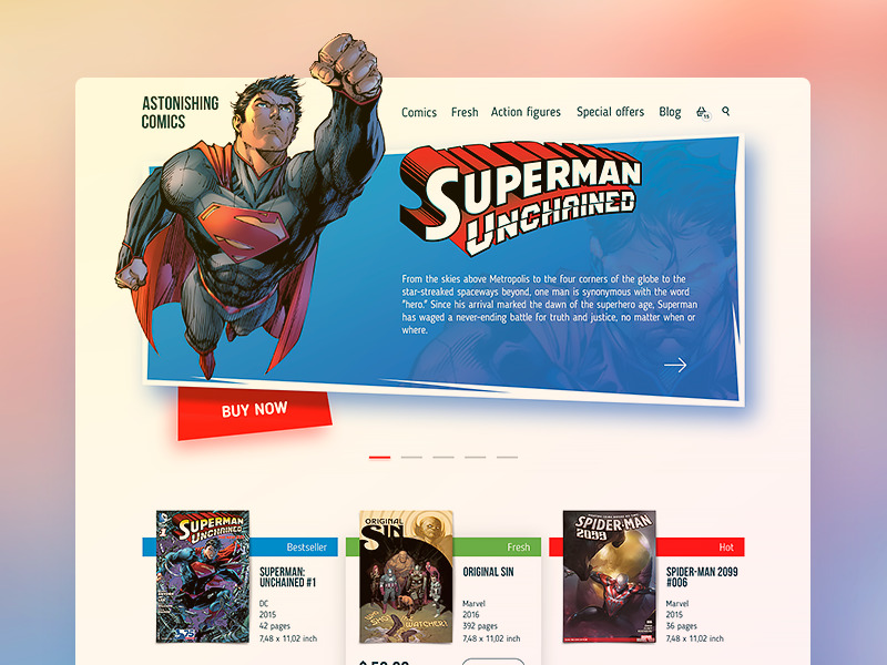
Comics Online Shop
Effective presentation of the items
The layout of the product pages or screens is another key consideration. On the one hand, it’s advisable not to overload the page with too much information which will overwhelm users and can distract their attention from the major goal – to make the purchase. On the other hand, users aren’t ready to go from one page to the other to get different information about the item. Therefore, the designer has to take the time for thorough research of the issue and find the right balance of data given on one screen. The analysis of the target audience and user testing can give clues to what information is required by the target audience for the specific categories of items or services.
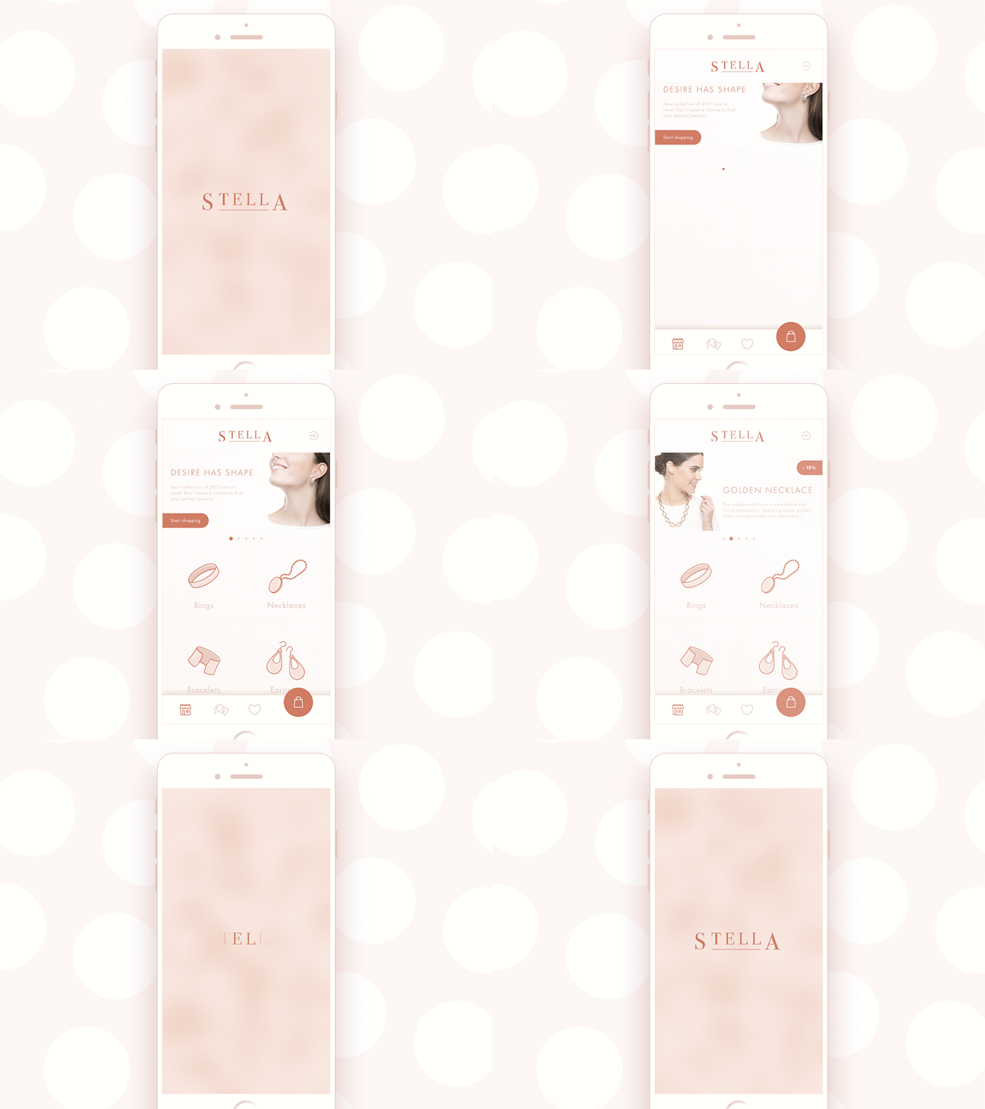
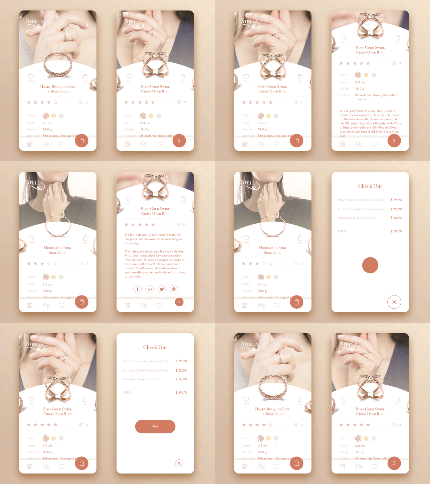
Jewellery E-Commerce App
UI perspective
Being concentrated on not only logic and transitions but also looks and style, UI design stage also contributes much to the success of the e-commerce project. It is the aspect that creates visual performance and sets the solid ground for the desirability of the interface and positive emotional feedback from the buyer. At UI design stage for e-commerce, designers have to find the general stylistic concept which will support UX aspects mentioned before and will give the online point-of-sale the attractive looks. Some aspects, which designers have to take into account in this perspective, are:
- choice of colors that correspond to the brand image and strengthen emotional feedback
- setting the style corresponding to the nature of the commercial offer: reaching the website, people should instantly understand if it sells household goods, fresh vegetables, trendy clothes, exclusive devices, or anything else
- the visual hierarchy, which makes the core zones of interaction instantly noticeable
- the general harmony of perception which sets the feeling of aesthetic satisfaction, supporting positive user experience.
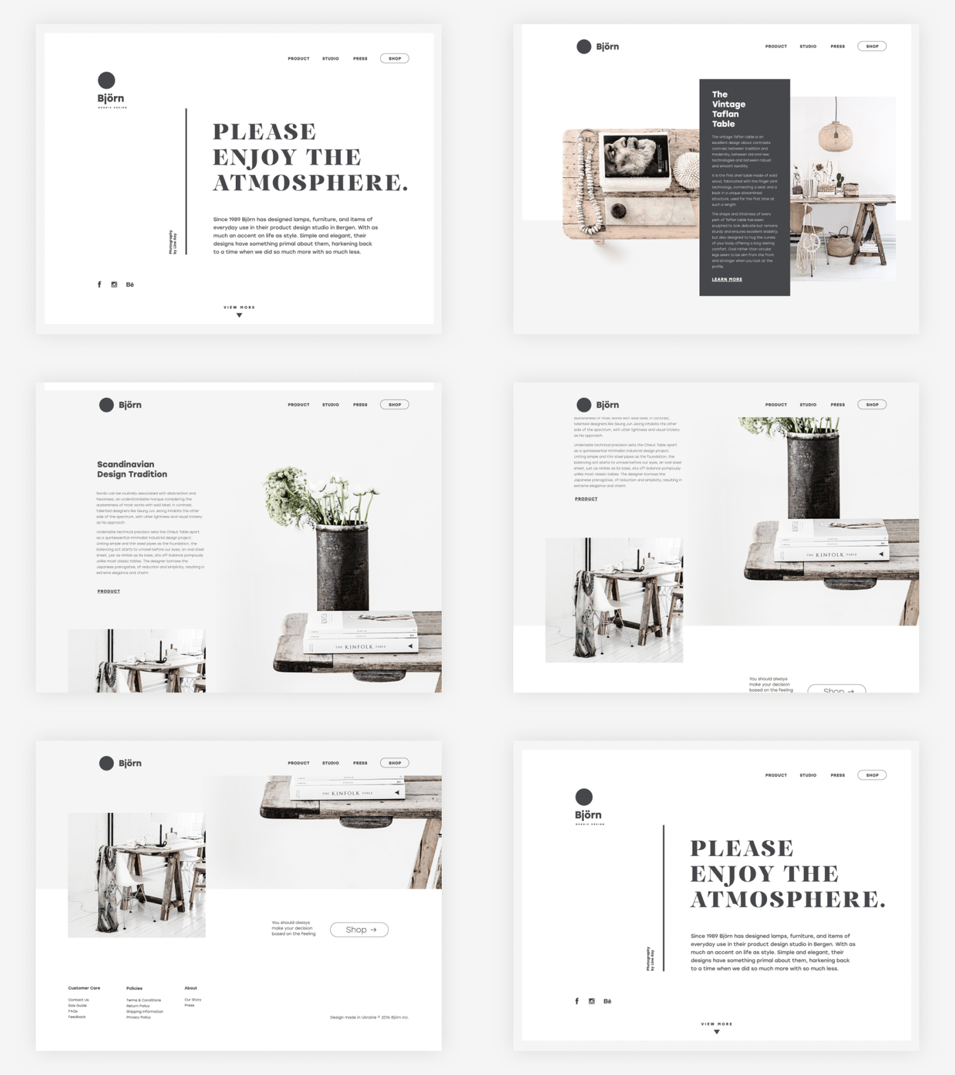
Design Studio Website
Points to consider
For the bottom line, here’s a simple checklist for some essential aspects designers would rather consider when orking on e-commerce projects:
Know the buyers: user research will help to get the needs and wishes of the arget audience.
Have users informed: make the screens or pages filled with information and functionality users really need for making a purchase.
Keep design consistent: not only does the website or app itself need consistency of design for all the screens in terms of general branding, but also social networks, print materials, and actual point-of-sales appearance, if they exist.
Refresh the experience: minor changes or attractive details added to the interface from time to time without breaking general visual consistency can give the feeling of refreshment, like new looks of mannequins do in the window displays of the shop.
Check your solutions: user testing can have a great impact on understanding the factors that boost conversions. Ideally, it should be applied not only in the process of design but also after the launch of an e-commerce platform on the basis of real user interactions and troubles that can arise.
Be careful about revolutions and wow-effect: the power of habit plays a big role in the products of this kind. Choosing layout, menus, or icons, which stand too far from the ones users are generally accustomed to, can bring confusion and frustration. For example, usage of any other image instead of the magnifying glass to mark the search field can result in bad user experience as buyers know that visual symbol and will look for it. So, making this sort of experiments, take time to test them well.
Respect the buyers: remember, that they are not abstract metrics – every figure in conversion report is about real people. Look for the interface that will respect their time, effort and needs and it will bring positive experience of shopping for both sides.
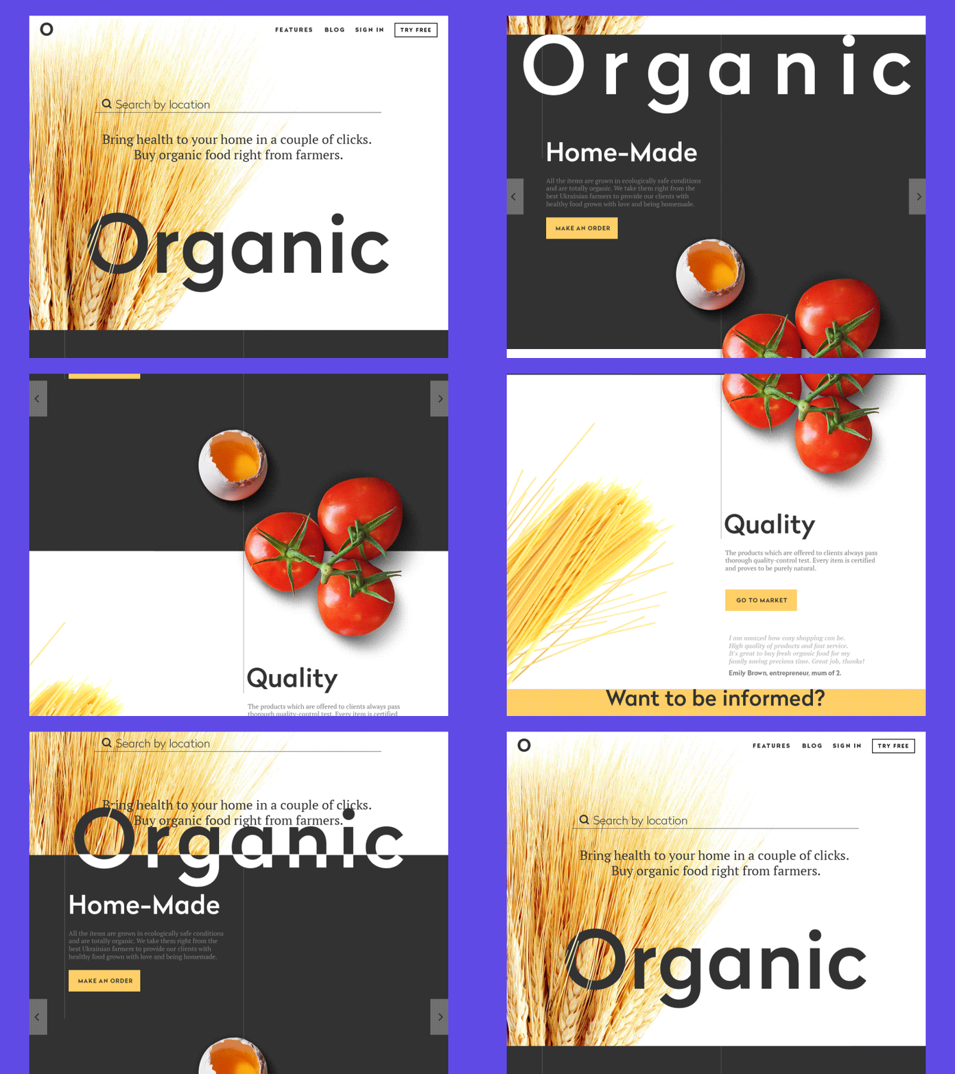
Organic Food Shop
Originally written for Tubik Blog
Recommended reading
Here is a bunch of links to the articles and design collections which could provide further interesting explorations of the topic:
Product Page Design: Best Practices on UX for Ecommerce
Two Types of User Motivation: Design to Satisfy
The ultimate guide to designing ecommerce websites
Ecommerce UX: 3 Design Trends to Follow and 3 to Avoid
Designing for 5 Types of E-Commerce Shoppers
20 Common UX Mistakes In Ecommerce Websites
Everything You Need to Know About Designing for eCommerce
11 Profitable Strategies for E-Commerce UI Design
5 Pillars of Efficient Landing Page Design
Design for Business: User-Friendly Way to Profits
- English
- Ukrainian

