Social Network Design. UX for Communication
Social Network Design. UX for Communication The article gathering general points important to consider in process of creating efficient UI/UX design for social networks of different kinds.
Perhaps one of the best opportunities coming from the Internet and appreciated by a great variety of users all over the world is the ability to easily communicate, first of all via different social networks. Today, there are loads of social networking sites and services, starting from general ones providing multiple functions and features for the broad target audience to specialized networks concentrating on the needs and pains of the narrow target audience. There are specialized social networks for mums, scientists, cyclists, writers, tourists, teachers, and so on and so forth.
Moreover, the target audience is not the only point to concentrate on. Type of content can also become a key factor in making the social network go around photos and images, videos, short or long copy blocks, links, recommendations, or something else. Anyway, although diverse social networks spring up like mushrooms, in most cases, they still find their user and readers, especially if UI/UX is thought out from the very first stages of design.
Having practical experience in design for various social networking websites and applications here in Tubik, we decided to share some of our ideas on things important to consider in the process of creating a product targeted at communication. As this topic is really wide and it’s impossible to mention everything in one post, today, we only start this conversation having gathered the general positions the designer needs to take into account while working on this kind of product.
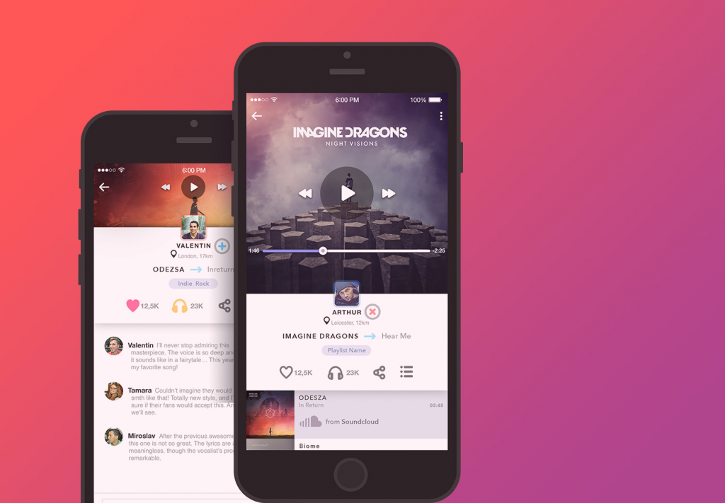
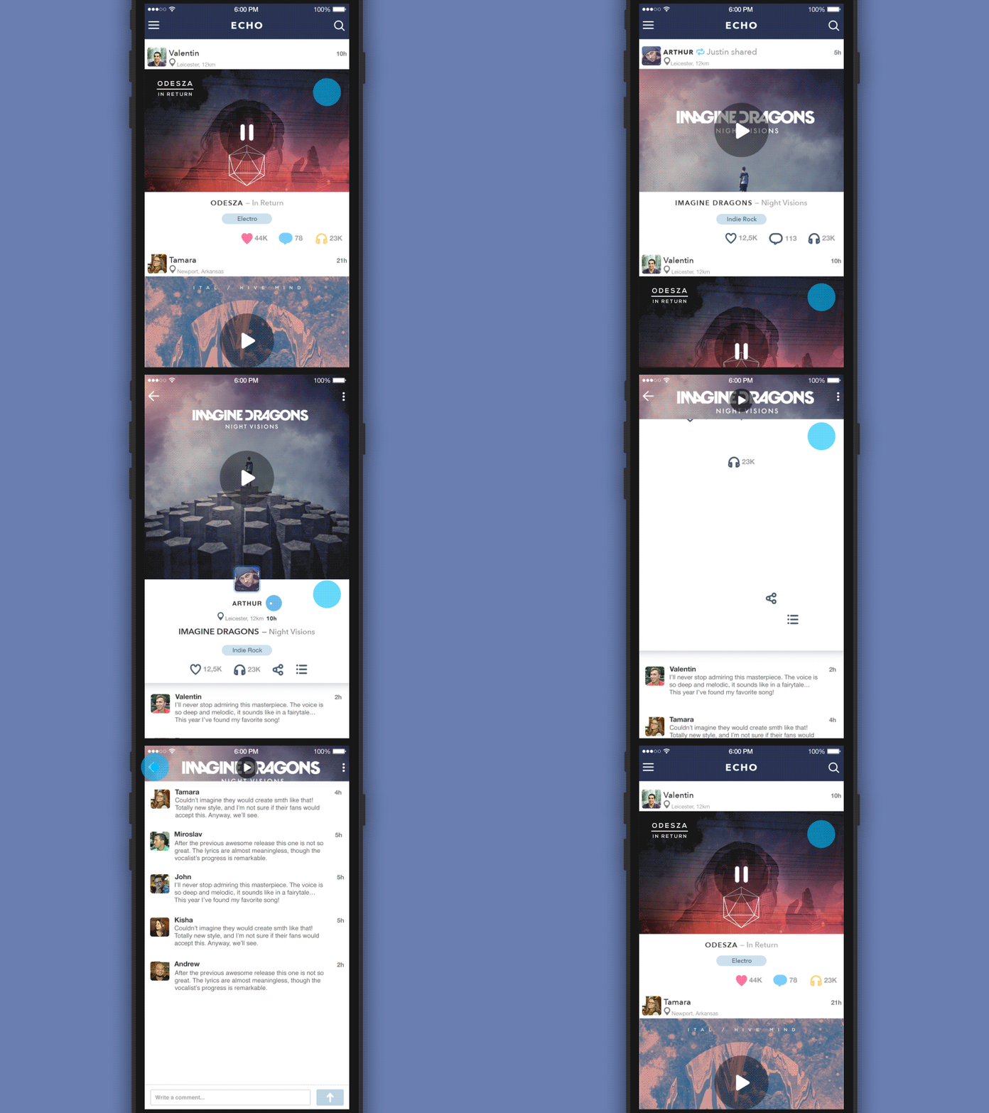
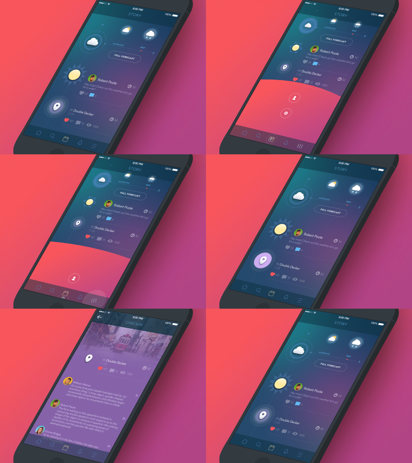
UX screens for social network Echo
Features of a social network
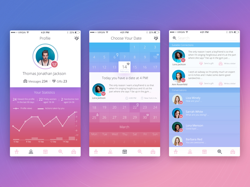
Social networks, as the services concentrated on communication, usually have some basic features, which are mostly universal independently from the target audience or perhaps the content on which the communication is based. Among these basic features we would mention:
- Creation and easy editing of a personal account, preferably with the ability to protect the data it includes
- Easy search of users and content
- Categorizing the content
- Sharing with friends or followers
- Feed showing the latest updates
- Personal and group chatting and discussions
- Creating groups, public pages, or other kinds of communities
- Clear and organized notifications informing the user about activity and socialization with his/her circle of friends, followers, communities, etc.
All these features actually make the network social, so the better they are thought out, the easier and clearer it will be for users.
Vital points for efficient UX
Thinking over the design of a social network, from the very start, the designer should concentrate on several points:
– Social network is made for communication. It is not a personal exhibition, the newsreader, a set of articles, or a gallery. It is a community where a user can be both silent and loud. It is a platform where people can communicate easily at any moment they want.
– Successful, popular, and efficient social networks are all based on user-generated content. Therefore, the user should be offered multiple functions to generate that content via discussions, posts, sharing, chatting, libraries, collections, and so on and so forth. Otherwise, the risk of failure gets really high: the social network will not attract users and will not create a platform of pleasant communication.
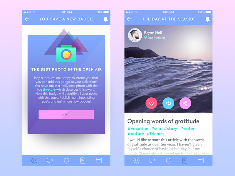
– Most users of social networks are people who are not highly tech. They don’t easily switch to updates and don’t read the sophisticated designer solutions beyond what they see.
– The power of habit, in this case, is often stronger than the wish of revolution. Nowadays, most people using the internet are acquainted with one or several social networks, so they have a kind of general understanding of basic functions and possible transitions. Certainly, just copying the existing social network scheme and functionality will not produce an original product; however, going too far from the common image of social networking features and creating something revolutionary new can confuse users. Keeping the balance on this thin line between habit and innovation is one of the vital tasks the designer will have to work out.
– Most users (if not all) are not ready to spend a lot of their time learning how the social network works. Even if they have time, they would rather spend it on doing something interesting and engaging in the network instead of working out how it functions.
– Social networks should provide useful functions and make a user aware of them. Nobody now needs the social network just for pure communication – it should give more to be attractive. Creating additional features and adding useful integrations is a good way to attract the target audience.

Remembering and considering the mentioned positions helps the designer to conduct successful user research and build efficient user stories and flows so that the social network provides a positive user experience and is able not only to attract users but also retain them and group them around a convenient and useful platform.
Solutions for efficient UX
Some of the general solutions that could be a kind of basis for the designer working on UX for a social network, we think, are the following:
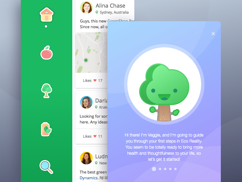
1. Easy and simple registration with a minimal number of steps needed to be done. It is advisable at the very beginning stage to provide a kind of simple, catchy, and entertaining tutorial or presentation of the basic advantages, engaging the user but not overloading with too much information.
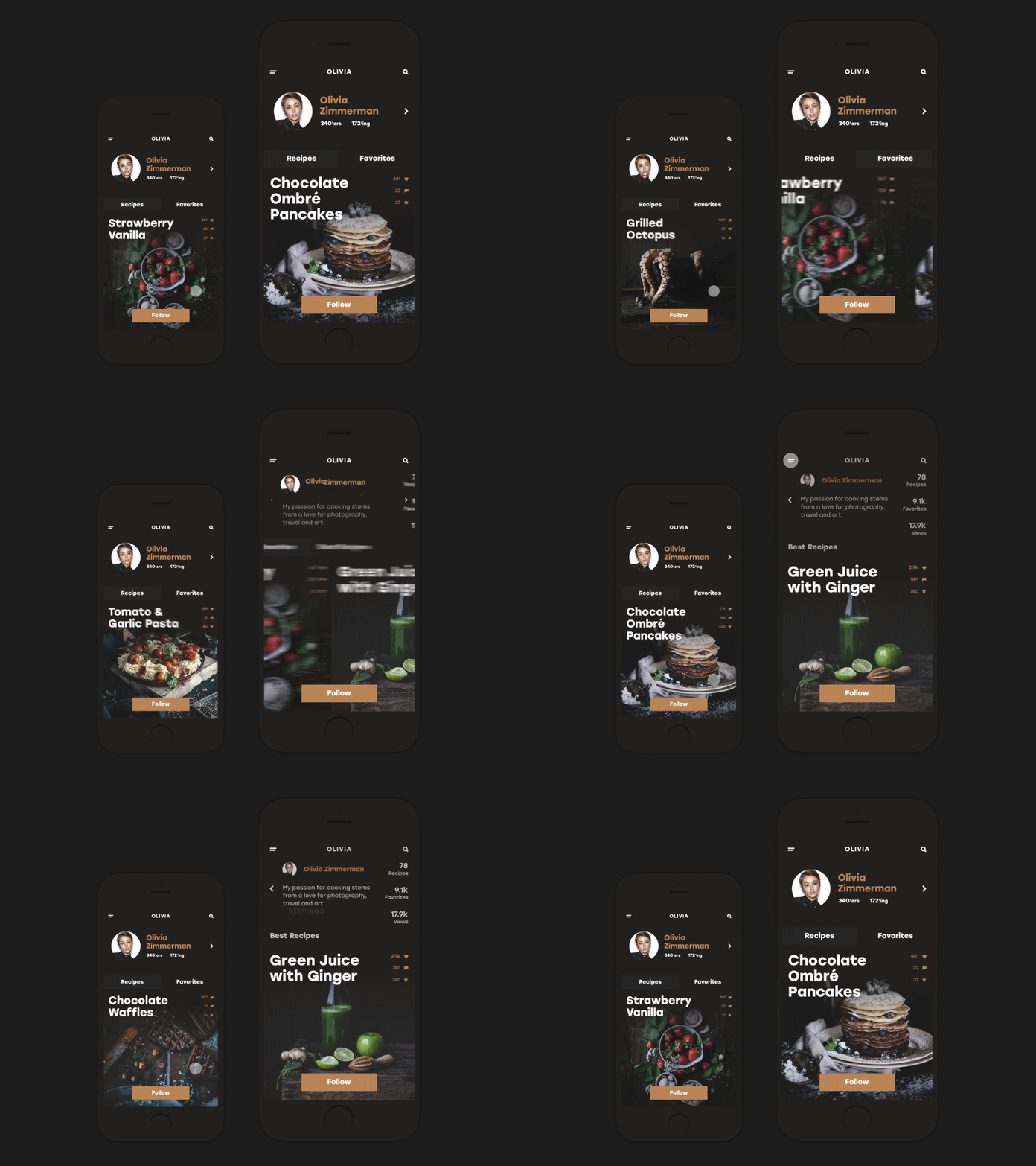
2. The account should be easy to fill in and should provide several modes of openness to others. The user should be sure that he or she is able to keep a low profile or close the data for strangers any time when it is wanted.
3. Optimized and well-thought-out search with a clear system of filters is one of the basic factors to create a positive user experience.
4. The functionality of generating and sharing content should be clear and make the process fast.
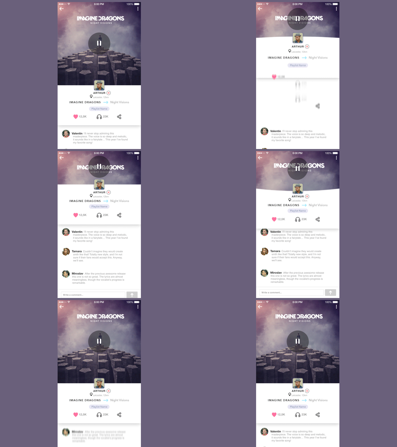
5. A feed page or screen that allows one to see the updates in the network easily, sets wanted data or users visible, and gives the ability to move directly to different functional zones of the network should be carefully designed.
6. It’s important to enable a user to categorize the content according to different nature, popularity, or other characteristics.
7. Direct communication features such as discussions and chatting should be visible, clear, and available from any point of using the network.
8. Opportunities for engaging other users, creating groups, lists, clubs, communities, public pages, and discussions become the efficient basis for making the network really social. A good way to ease using them for users is the feature of automatic grouping along the content or other characteristics and manual (personal) grouping created by the user.
9. As social networks are always full of different information and usually filled with it dynamically, it is important to enable users to save or mark the content or people they want to remember or move out of the general flow.
10. Depending on the target audience, integrations, games, special functions, or tight connections with other networks can become the factor in making the user experience positive and increasing the level of usability.
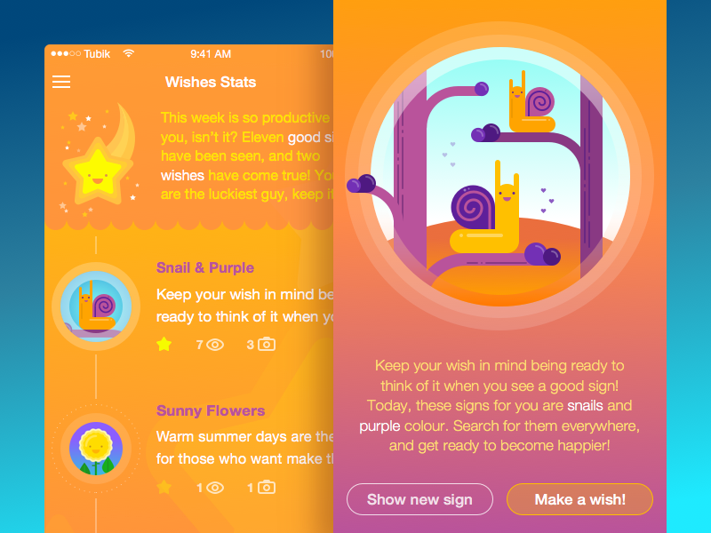
Certainly, the points mentioned above are generalized, and they should be carefully revised according to the specific design task. Thorough research of the defined target audience, and understanding target users’ needs and pains will help to think over the mentioned positions in the perspective of efficient UX, which will outline some of the points as the most important factors while the others will stay behind the scenes in the specific conditions.
Originally written for Tubik Blog
- English
- Ukrainian


