Mobile App Design: Elements of UI for Cinema Applications
Mobile App Design: Elements of UI for Cinema Applications The article presents specific features of UI design for cinema apps: common screens and interactions which are core for user-friendly movie applications.
Going to the cinema is always a nice way of entertainment. The young and old like watching their favorite films on the large screens while eating tasty popcorn and drinking soda. However, cinema lovers are very often forced to wait in long queues because this kind of leisure is so popular.
Digital technologies have come for a rescue. Nowadays, the cinema industry provides its customers with handy assistants – cinema apps. They are convenient helpers that enable people to find information about movies, including schedules and available seats. Moreover, cinema apps are tools that make the process of booking and purchasing tickets much more comfortable than ever before. Today’s article describes UI screens and features common to cinema applications.
Profile screen
Nowadays, every app aims at making the user experience more personalized and individual. The reason a profile is an essential part of any application. As for cinema apps, profiles are tools that help users book and buy tickets within a few taps. What’s more, if a cinema offers a loyalty program, it’s easier to follow customers’ activities because everything is marked in the profile.
A profile should contain only necessary info; otherwise, the screen may look too complex. When a user creates their profile, a cinema app usually asks for their name, email address, location, and cinematography preferences. Since ticket purchase is a major feature, it may be worth adding an option for credit card data. This way users will be able to make a convenient and fast purchase. In addition, by gathering and analyzing data on users’ tastes and locations, an app can inform people about upcoming movie premieres near them.
Home screen
The home screen is a base for any type of digital product, which is why it’s also known as the main page. It is a start point where users begin a journey within a product. The content of home screens varies depending on the type of app.
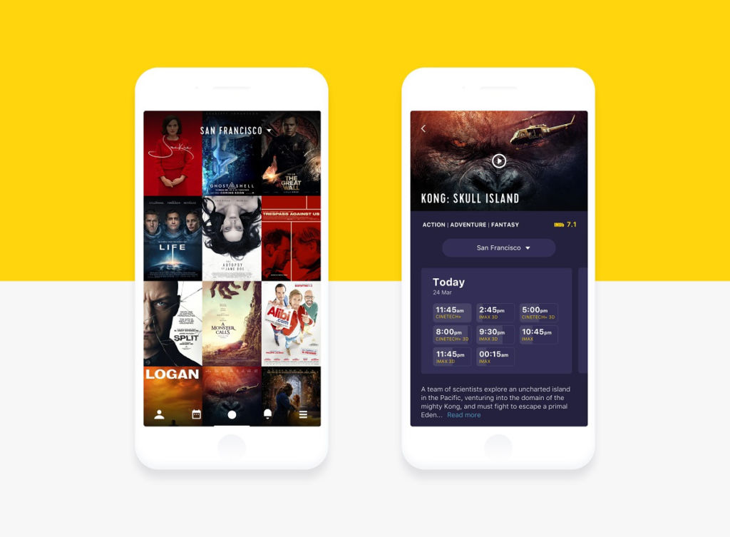
The main screen of cinema applications usually includes movie posters followed by captions with the name to show users what is on today. Films can be presented as a list or a feed so that users could quickly scan them and make their choice. The posters should be clickable and lead to the next screen with the schedule and movie info.
Also, the UI of a home page needs to provide a search field. People who have already chosen a film will be able to type a name and quickly find what they want. It may be a good idea to add some filters such as film genres to make the search process more pleasant.
Movie details screen
A poster and a name can’t properly explain a movie’s plot. That’s why a cinema app needs to provide movie details so users know what to choose.
UI design for a movie details screen is simple. It consists of a high-resolution poster, the name of a film, and a short text description. Mobile typography should be chosen properly so that the text would be legible and pleasant to users’ eyes.
In addition, some cinema apps show the rating of a movie. It can be IMDb ratings or assessments given by the users who already watched a film. This way people can see how popular a movie is and decide if they want to watch it.
One more additional feature is bookmarking. Users can fill their personal wish list or a list of favorites and go back to the selected movies later.
Player screen
It is known that video content is perceived better than copy that’s why it’s always a good idea to include movie trailers to the movie info.
The video player allows users to watch various trailers right in the app. A player can be a part of a movie details screen as well as an app can have a separate screen with the list of movie trailers. This feature is not a key for cinema apps still there are many of them which have already included it.
Schedule screen
A schedule is a vital part of the information that users receive from cinema apps. Designers should pay deep attention to its presentation as it needs to be compact and easy to find.
The schedule usually relates to one movie and shows the time when different film showings start. The time is often presented as a button so that users could tap or click it to continue their journey on booking or buying tickets.

Choosing seats
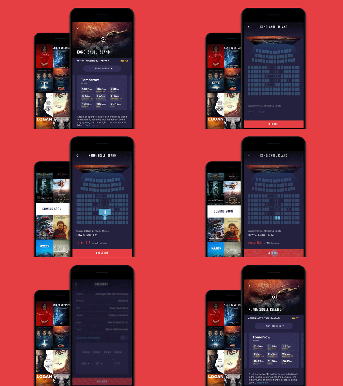
When the movie and the time are chosen, people need to see where they can sit. There are two types of UI for the seats choice screen – the list and visual representation of a cinema hall.
A list includes two main options to choose – a row and a number of a seat. The list is a light variant that doesn’t take much time to be created and the UI looks nice on various devices even with the small screens.
Today UI with the visual representation of a cinema hall gains more and more popularity. This type allows users to see exactly where the seats are located and make a proper choice. However, designers must focus on the details when creating the visual representation of a cinema hall for UI. Seats should be big enough so that users could easily tap the right one from the first try. Moreover, it’s vital to ensure a visual cinema hall looks good on different screen sizes.
Purchase screen
The opportunity to buy tickets earlier and choose the best seats is one of the biggest profits which users receive from cinema apps. Designers’ main task is to make the purchase process comfortable and secure.
The checkout screen usually includes a form where a buyer fills in specific personal data such as a name and a number of the credit card. As we said above, if users of a cinema app have their personal profiles, their personal information can be taken from them automatically.
In addition, it’s vital to ensure people feel their personal data is secure. Marks of security can be presented via visual, including callouts in a copy, as well as some icons of the famous brands that gave their approval, or maybe even some certificate signs if there are such.

Tickets
Tickets are the documents which confirm the payment and allow entering a cinema hall. Some apps send the digital tickets to the email so that users could download them on a smartphone or print them to show at the entrance. However, some cinema applications reduce the number of actions. When a user buys a ticket, it is automatically saved in their personal account and all they need to do is to activate an app right before going into the cinema hall.
Tickets can be presented via custom illustrations which adds originality to an app. Also, if a client wants something more minimalistic, tickets can be represented with simple QR codes.
Map screen
Only small towns have a single movie theatre in the area. There are several cinemas from one company around cities, so the map feature seems important here. If users set their location while creating a personal profile, an app can automatically choose the nearest cinema.

Watching films at home can’t compare with the feelings of watching them on the big screen. It means that the cinema industry is unlikely to lose its popularity anytime soon. Digital technology should help improve cinema services, so more people become loyal visitors. Cinema apps are effective tools for both the cinema industry and its clients. Designers need to learn how to make these tools user-friendly and, if possible, improve them with their creative solutions. Stay tuned!
Recommended reading
Big Guide to Types of Mobile Applications
UI for Movies. Collection of Cinema App Designs
Design for Sport: Creating User Interfaces for Fitness Apps
Music in the Hearts. UI Designs for Music Apps
Originally written for Tubik Blog
User Experience Design Articles
Here’s a bunch of articles to dive deeper into the theme of usability and user experience design.
5 Basic Types of Images in Web Design
The Anatomy of a Web Page: Basic Elements
6 Elements of Efficient Company Website Design
UX Practices on Product Page Design
How to Design Effective Search
Web Design: 17 Basic Types of Web Pages
Guide to 6 Effective Types of Web Animation
Directional Cues in User Interfaces
- English
- Ukrainian

