Branding Inspiration: Creative Logo Designs Activating Negative Space
Branding Inspiration: Creative Logo Designs Activating Negative Space In this issue of D4U Inspiration, we've collected examples of creative logo designs that apply negative space for expressive branding.
We often tend to associate something negative with something bad. Yet, there are many cases when it doesn’t work this way. Design is one of them, and today we are going to see how negative space works in it.
Negative space – or white space, in other words, – is the area of the layout that is left empty. It may be not only around the objects you place in the layout but also between and inside them. It is a kind of breathing room for the object on the page or screen. It defines the limits of objects as well as creates the necessary bonds between them according to Gestalt principles and builds up effective visual performance.
Negative space in graphic design is often seen in logos, illustrations, posters, and creative lettering: for them, it becomes an active part of the visual presentation and makes key objects even more expressive. In this issue of D4U Inspiration, we’ve collected some examples of creative logo designs that apply such an approach. Enjoy and get inspired!

Logo designed by Tubik for Aviar, the company that deals with flight rights protection. The designer creates an elegant and bold symbol playing with visual metaphors of a plane and shield combined with the power of negative space.
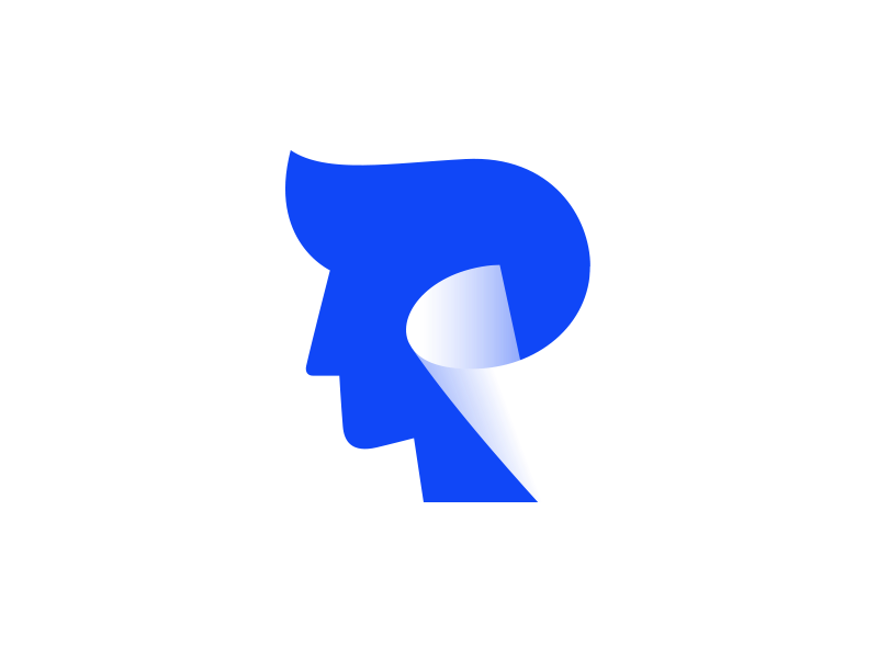
Logo by Leavingstone uses the negative space to artistically combine the silhouette of a man’s head with a rolling sheet of paper.

Logo design integrating a symbol into a wordmark by means of negative space; designed by Roy Smith for a wildlife photographer and BBC Springwatch cameraman.
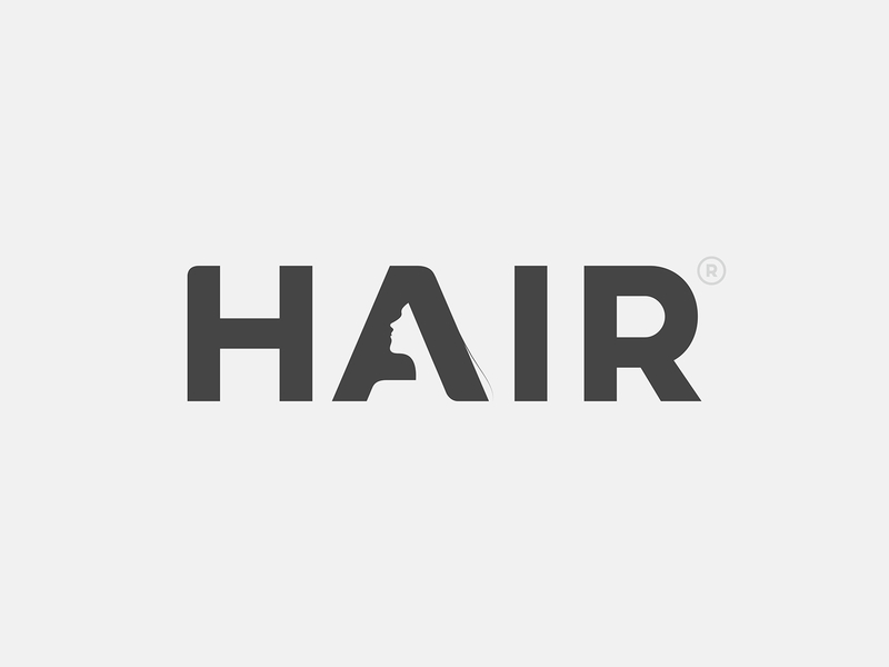
Sophisticated logo designed by Yoga Perdana and elegantly integrating the image into the wordmark
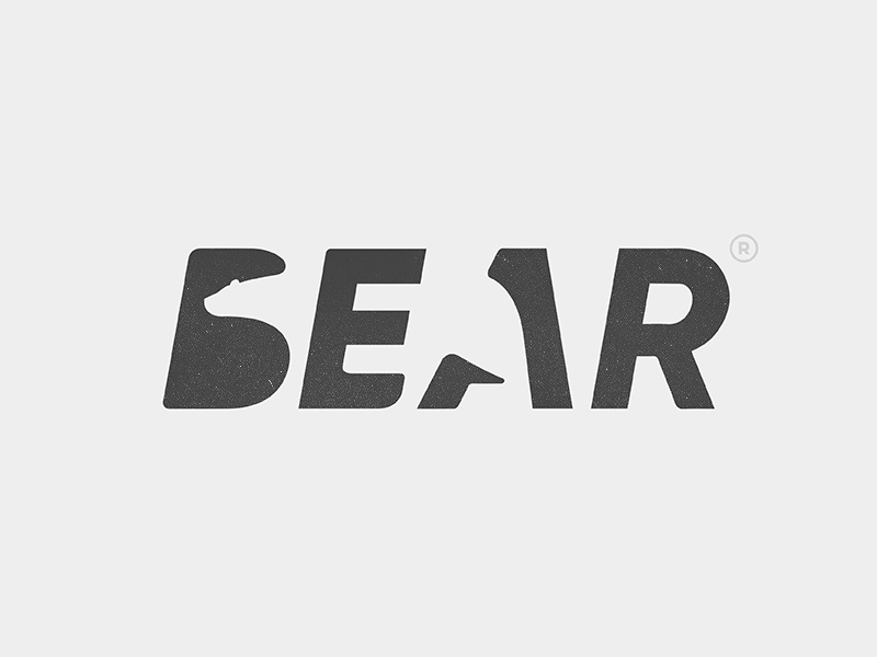
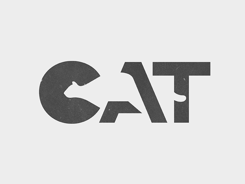
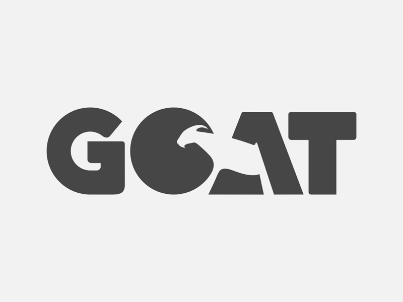
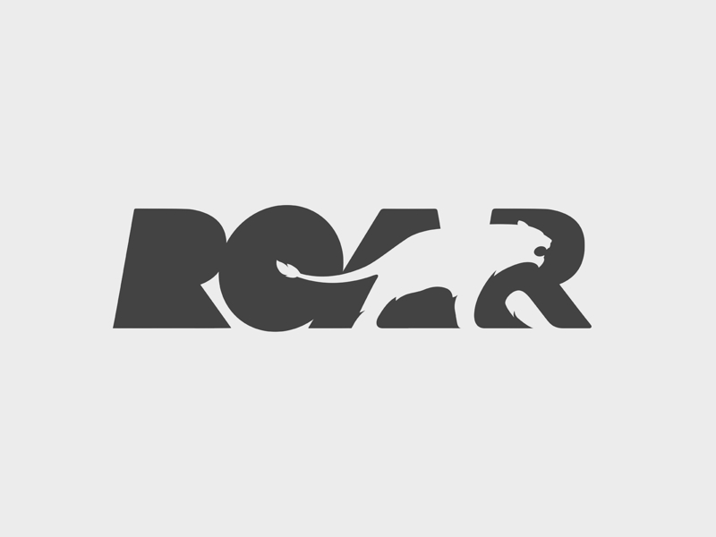
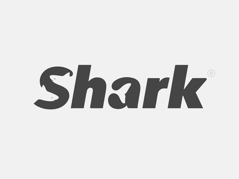

Stunning set of logos by Yoga Perdana mastering negative space for expressive branding and applying visual details connected to nature and animal world
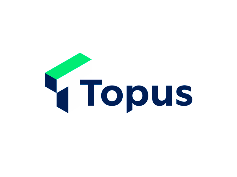
Logo design by Alex Tass for Topus, a project focused on architectural 3D scanning/printing features number 1 combined with a T letter, both showed in perspective in the negative space.

Chat Robot logo design by Dmitriy Lepisov: the idea was to use negative space and combine letters C&R, a “+” sign, a chat symbol and a robot head in one logo.
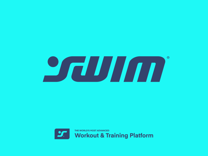
Logo design exploration by Eddie Lobanovskiy visualizing swimmer in the wordmark.
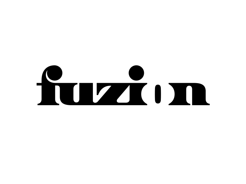
Wordmark designed by Kakha Kakhadzen is based on contrast and negative space inscribing letter O into the word.
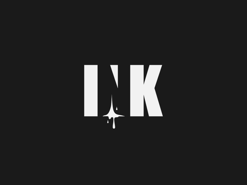
One more contrast-based logo design by Antonio Calvino uses negative space and visual details to integrate a letter into the word and making it playful with a splash of ink.
Don’t miss the collections of animated logos, animated illustrations, and other D4U Inspiration posts.
- English
- Ukrainian


