Design for Sport: Creating User Interfaces for Fitness Apps
Design for Sport: Creating User Interfaces for Fitness Apps The article describes common screens for mobile fitness apps and shows the essential layout elements for user-friendly interfaces aimed at sport and health.
Sports teaches you character, it teaches you to play by the rules, it teaches you to know what it feels like to win and lose – it teaches you about life. (Billie Jean King)
Sports has become a part of our routine a long time ago. Even more, today a healthy lifestyle is a top trend that constantly grows its popularity across the world.
Fitness apps are the key helpers for people who strive to get fit. Their functionality gives a lot of opportunities and makes keeping fit easier. Understanding the significant impact of these applications on users’ everyday life, designers do their best to activate the problem-solving potential of fitness apps. Today’s article describes common screens and essential UI elements for fitness apps.
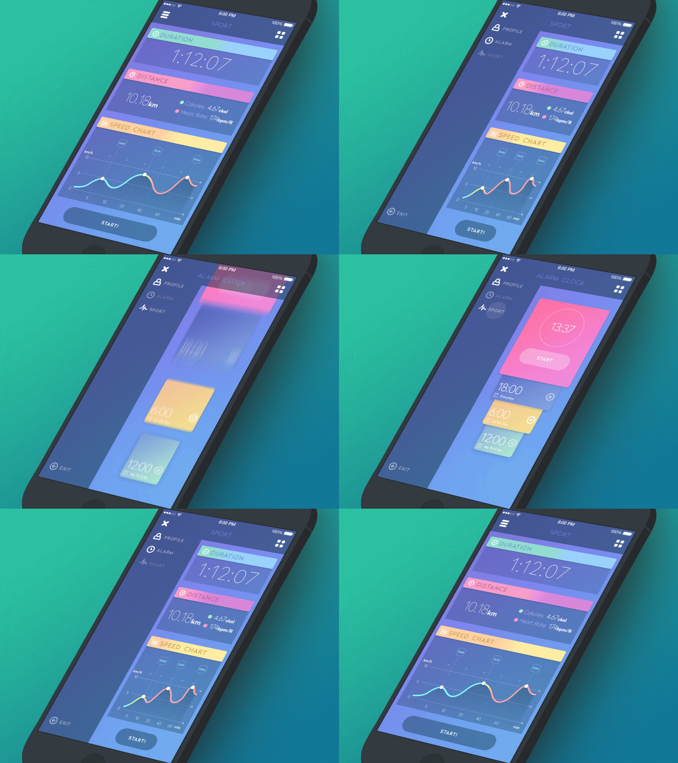
Sports App Interactions
Sign-in and Profile Screen
A fitness app is something like a pocket instructor telling you what to do and giving feedback on your achievements. To make it more comfortable and personalized, designers need to create an effective profile UI.
Before users obtain their profiles they usually go through the sign-in process. Fitness apps, as well as the other ones, can allow logging in via social networks still there are some aspects that users have to fill in to create a personalized profile. The applications usually require personal data, including age, gender, weight, and height, which helps to define users’ physical condition. Profile creation is often similar to filling in an application form. This way, users can easily provide the needed information to make a profile more personalized.
The major objective of a fitness app is to help users in their self-improvement, the reason why profiles should contain not only the personal data but also the user’s achievements such as the number of burnt calories or personal records in sports. It’s important not to overload the profile screen with the unnecessary information otherwise user interface may look chaotic.
Home Screen
It’s a core element for any type of apps. Home screens serve as the main point where users start the journey within a product. Creating UI for home screen designers need to think of it as a center of navigation and make sure users will be able to operate it easily.
First of all, the home screen should provide access to the other parts of the app. Designers can choose various ways of the presentation from a sidebar with minimalistic icons to the clickable subheaders leading to the different sections of app content. The choice often depends on the number of features provided by the product as well as the platform which it is meant for.
Activity Screen
People who aim at getting fit always have to do various physical activities. Fitness apps provide users with the feature which helps to track how active they are during a day. To make a sufficient UI for activity screen, designers include different kinds of activities and sports. Traditionally, fitness apps provide tracking time spent on sports as well as measuring the distance which users cover during a day. The distance can be calculated in two ways: walking is measured by the number of steps and running is usually measured in miles (kilometers).
The information about users’ activity is often presented via diagrams of various forms. Such presentation contributes to the effective visual perception of the data which includes many numerals. Also, designers often apply custom icons representing each kind of activity. This way the screen looks clean and neat even if users have a really active life.
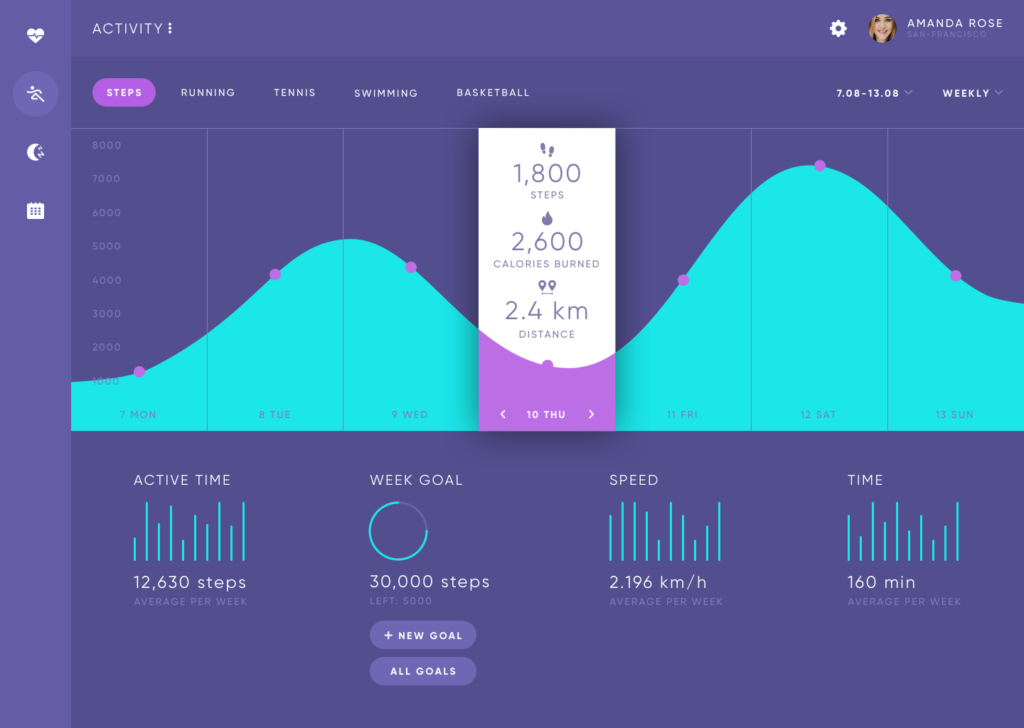
Fitness App
Heart Rate Screen
The heart is an engine that lets our body live and function, so it’s important to follow its condition daily. Many fitness apps can be connected to the various devices such as fitness wearables which allow measuring pulse. The applications usually transfer the data gathered from devices to a heart rate screen.
User interface representing the feature should be simple with a minimum of elements so that it can be easily operated. Since the process of pulse measuring takes some time it may be a good idea to supply the UI with sufficient animation which will show the loading process. For example, motion designers can animate an illustration of the heart showing it beats. Custom illustrations along with motion design can make UI look more proficient and make the process of the pulse measuring more interactive.
Sleep Tracking Screen
Nice sleep is a guarantee of the human health. Sportspeople know it better than anyone else and always try to control the time and quality of their sleep. Fitness apps show the gathered information during a night which includes the time and stages of sleep. There are four stages of sleep: the first and the second are called light sleep, the third is deep sleep and the fourth is rem sleep. The applications track these stages and in the morning users can see the statistics. The data on sleep is often shown as graphs.
Calories Screen
They say that fitness people are obsessed with calories. Well, there is truth in the words because if you want to get fit it’s vital to control what and how much you eat. As we said above, fitness applications show the information on the number of burnt calories based on the activity results. The calories data can be displayed on the activity screen as well as on the personal profile. However, it may be an effective solution to create a separate screen to provide users with the expanded information on the lost calories.
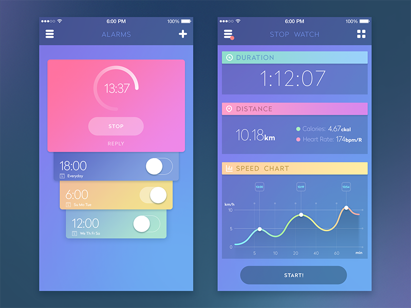
Sports App
Progress Screen
To stay motivated and continue self-improvement, it’s important to know that hard work gives results. The progress screen shows the statistics about users achievements along with failures. Here the graphs will be the best choice. If people have the progress, they see that their results are getting better and the scales on the graphs go higher.
Schedule Screen
There can be many sports activities at different times and in different places, so the schedule seems to be essential in this situation. The screen of the schedule is standardized, but to make it unique and original, designers can add some interesting icons representing various sports directions.
Goals Screen
Goals push us to achieve more, especially when it comes to fitness. People start doing sport because they have some goals like losing weight or shaping up. In fitness applications, users set maybe a bit less radical goals but easier to achieve on a regular basis. They often include walking a certain number of steps per day or week along with burning the fixed amount of calories.
The screen of goals can be presented as a sheet divided into categories: to do, doing, done. This way users will see how much they have managed to achieve and what they need to strive for. In addition, designers can settle the system of awards which will help users be even more motivated. We’ve already described awards as effective gamification tools which contribute increasing user engagement. You can find detailed info in our previous articles.
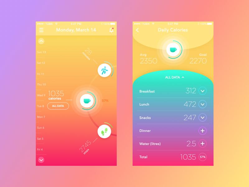
BeBright App
The sport requires persistence and fortitude and so does the creation of sufficient UI design. Learn the basics, add some inspiration, and you can surprise yourself. Stay tuned!

Originally written for Tubik Blog
UI/UX Design Articles
Here’s a bunch of articles to dive deeper into the theme of usability and user experience design.
5 Basic Types of Images in Web Design
The Anatomy of a Web Page: Basic Elements
6 Elements of Efficient Company Website Design
UX Practices on Product Page Design
How to Design Effective Search
Web Design: 17 Basic Types of Web Pages
Guide to 6 Effective Types of Web Animation
Directional Cues in User Interfaces
- English
- Ukrainian

