Case Study: Trivia Game Design and Visual Branding
Case Study: Trivia Game Design and Visual Branding Uncover the fun and lively illustration and design process for the OK Boomer trivia game: from game design and a big bunch of characters to packaging and brand communication visuals.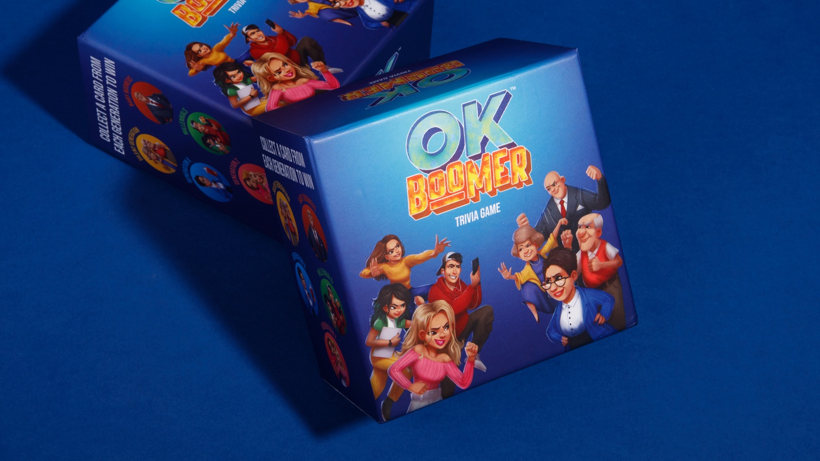
Let’s add some fun to your day. Meet one of the design projects by the tubik agency called OK Boomer, a bright and modern trivia game based on the questions at the crossroads of the knowledge, events, and experiences of different generations. In this case study, we want to uncover the fun and lively illustration and design process on the broad scope of branding and graphic tasks we covered for this project, from game design and developing a big bunch of characters to packaging design and brand communication visuals. Take a glance at the result and have fun!

Client and Project
OK Boomer trivia game combines classic trivia with a new-age style of play to create a perfect, enjoyable, and hilarious way to bring your family and friends together. To add even more fun, it has recently been extended with a couple of extension packs.
It is a project started by the serial entrepreneur Joe Spisak, whom you may remember from our case on the Dicey party game, and inspired by a lovely and touching family story he shared on the game website: “It was Christmas 2019 in Central, Pennsylvania and my family sat down for our annual holiday trivia night. You know the scene – drinks, snacks, matching pj’s, etc. We pulled the old trivia board game out from the closet, and it was kids vs. adults. Game on. As the game went on, The Silent Generation and Boomers started to absolutely dominate us. I mean, how were we Millennials and Gen Zs going to know who won the World Series in 1944? I brought up the fact that the Boomers and Silent Generation were winning because all of the trivia questions were about things that happened way before we were even born (classic millennial, am I right?). We agreed to even the playing field for game two – the Gen-Zers and Millennials got questions based on more current events, while the Boomers and Silent Generation got classic trivia questions”. Having realized how cool it would be to have to play such a trivia game on the more fair ground for all the sides, he and his family tried to find the one and failed to do that. So, they decided to create it by themselves and later were successfully crowdfunded on Kickstarter.
To breathe life into these bright and playful ideas, the tubik team worked on all the visual parts of the game: branding, game design, tons of cool characters, and packaging design. And that was really fun for all sides of the process! Join in to catch it and check the details below.
Characters
Perhaps the brightest and the funniest stage for all sides of the creative process was working on a bunch of characters that had to present different generations. After researching each generation’s distinguishing features and typical characteristics, the team made several stages of the creative search. From the earliest stages of the process, it was also essential to take into account that the characters were aimed to be featured on the play cards. Here’s a brief glance at some of the early ideas.
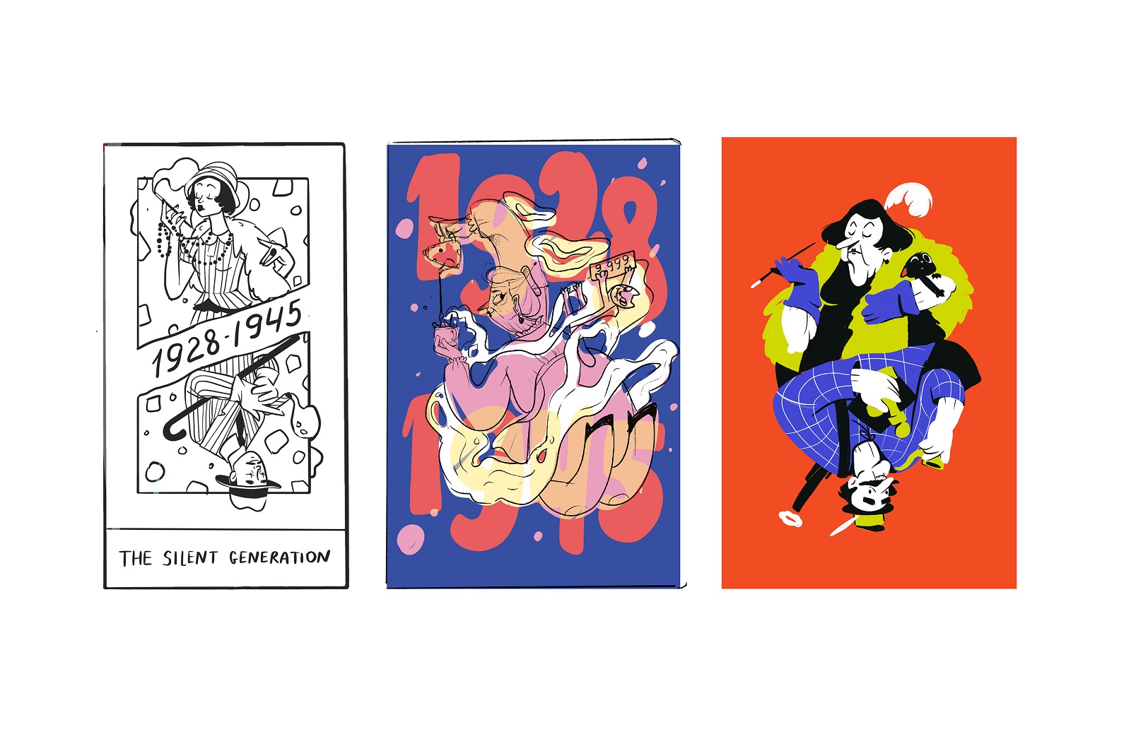
One of the iterations inspired the concept of supplying characters with specific visual attributes typical for particular times of their generation. The artist worked it out on a specific character, presenting the Silent Generation.
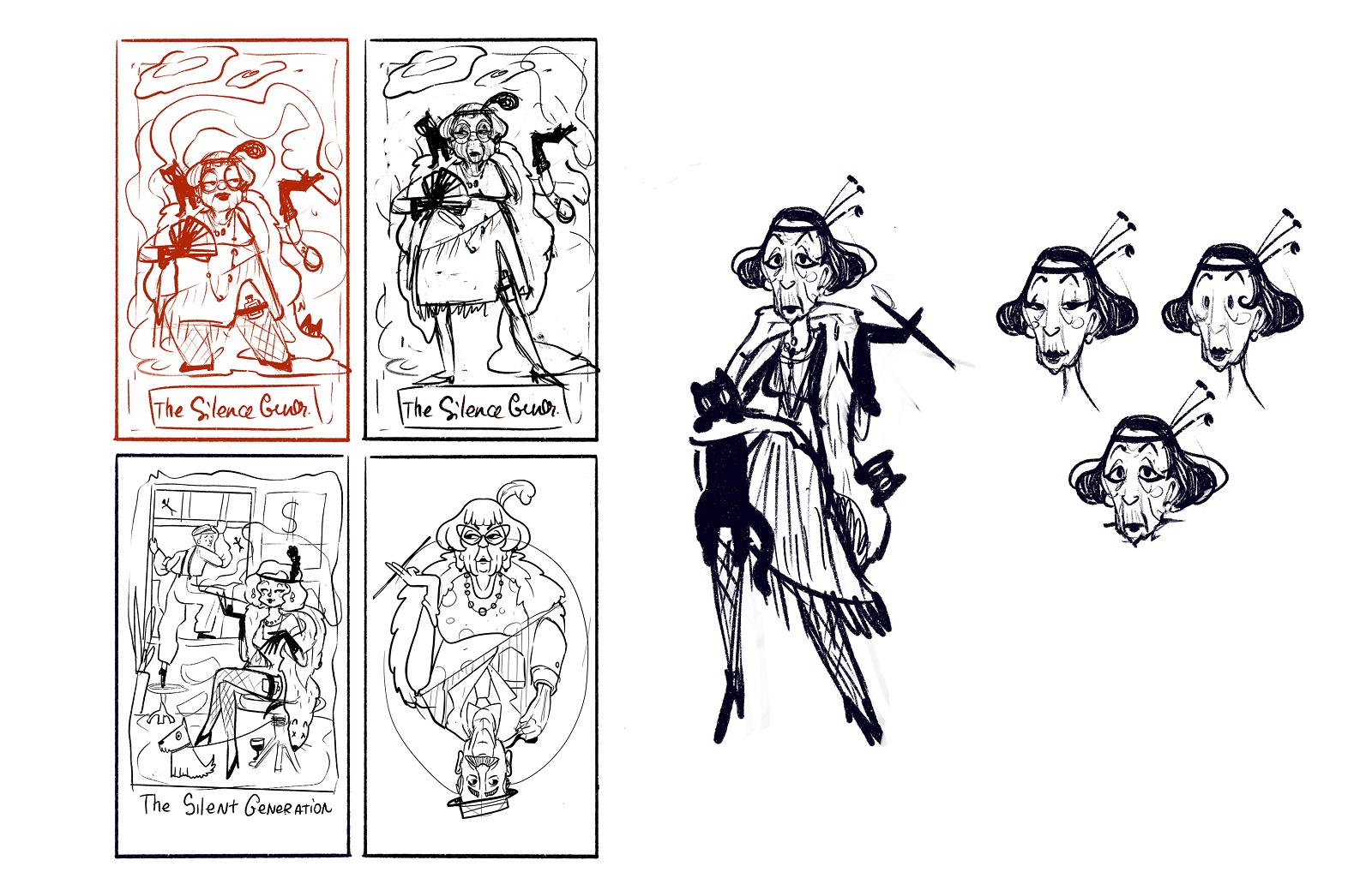
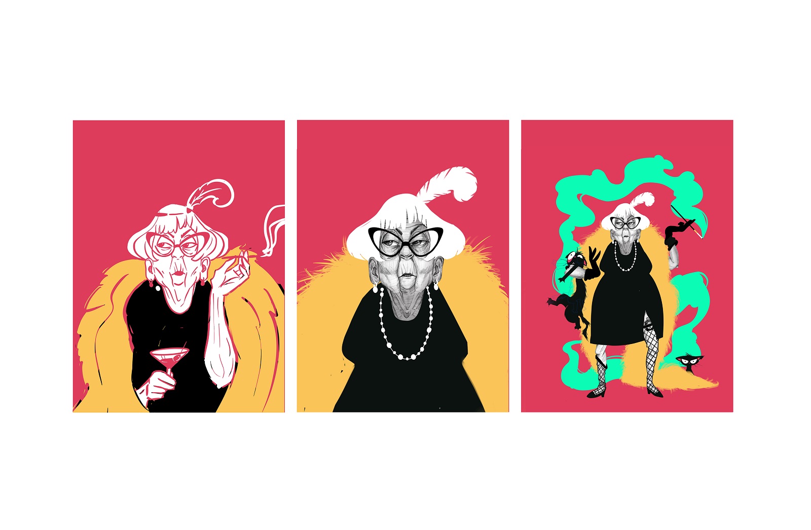
Yet, what looked cool and stylish in the digital version on the screen or in more prominent formats should have also worked well on relatively small printed cards, so too many details could get lost or hurt the picture’s legibility, so the ideas were tested in color and in different formats to check how it looks and works on the physical cards.
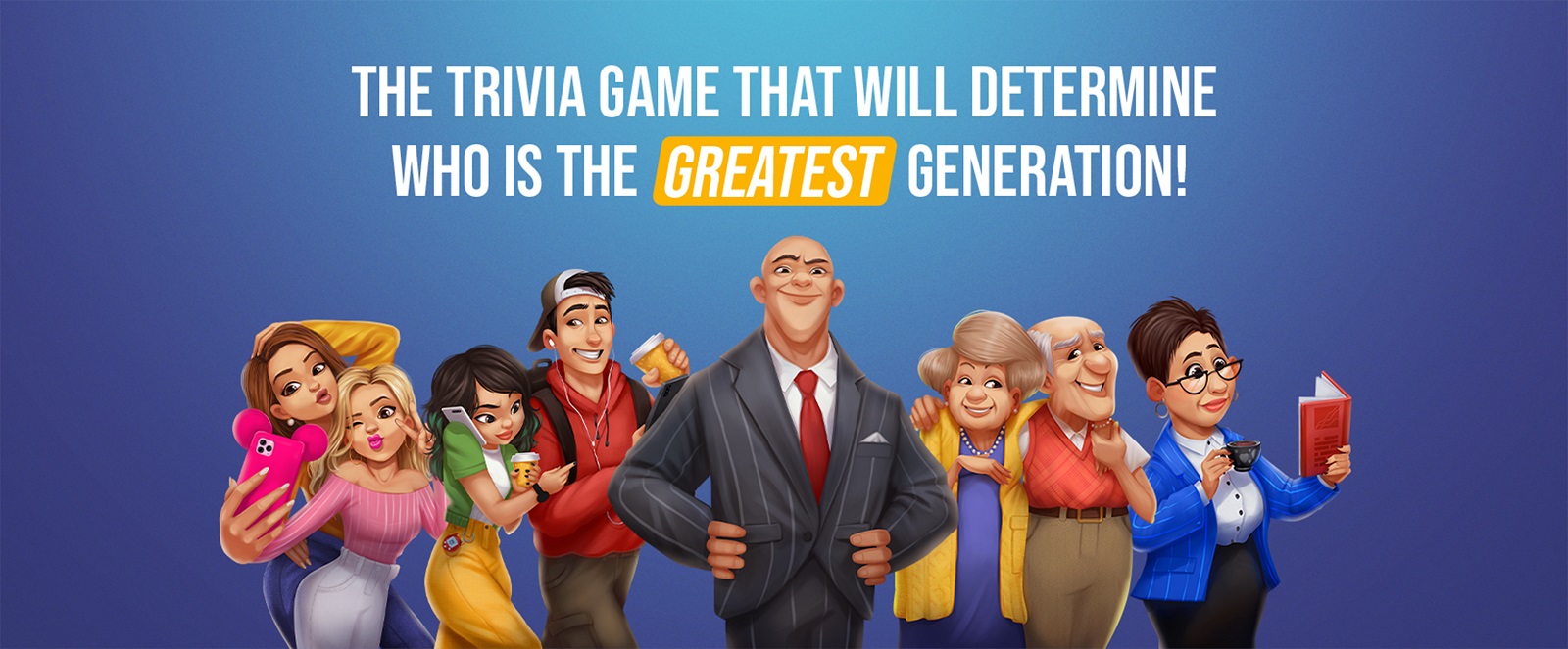
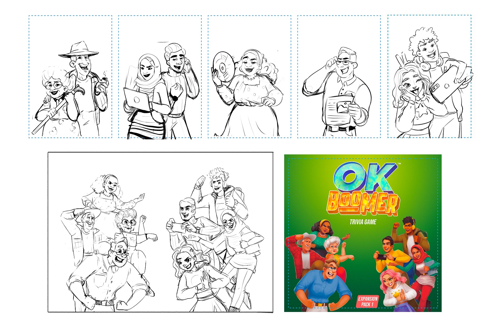
In that process, the team came up with the idea to step aside from the particular characters as separated identities and work on the image of the whole extended family that would present all the generations involved in the game and add the diversity of cool details and attributes interesting to examine.
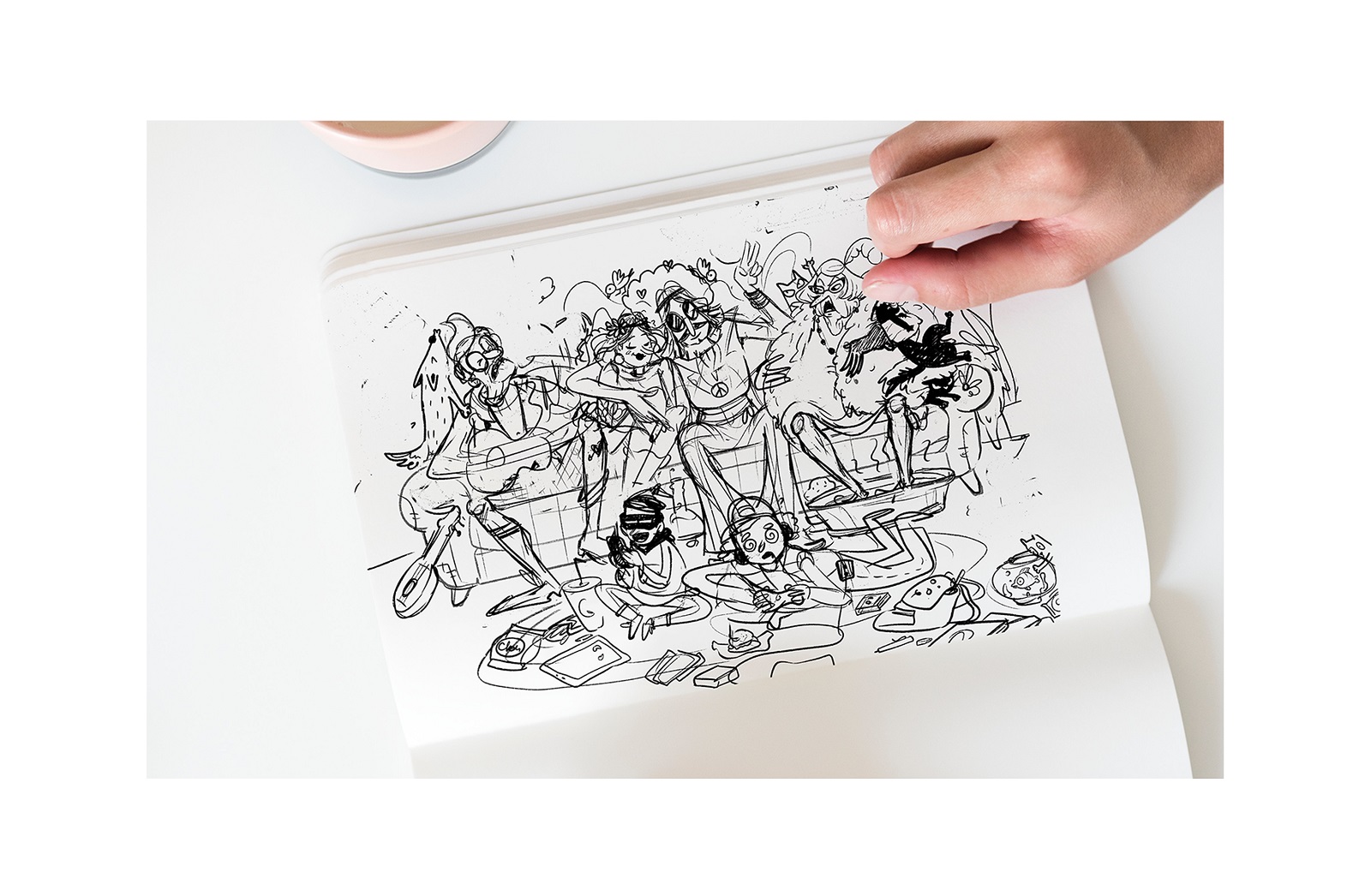
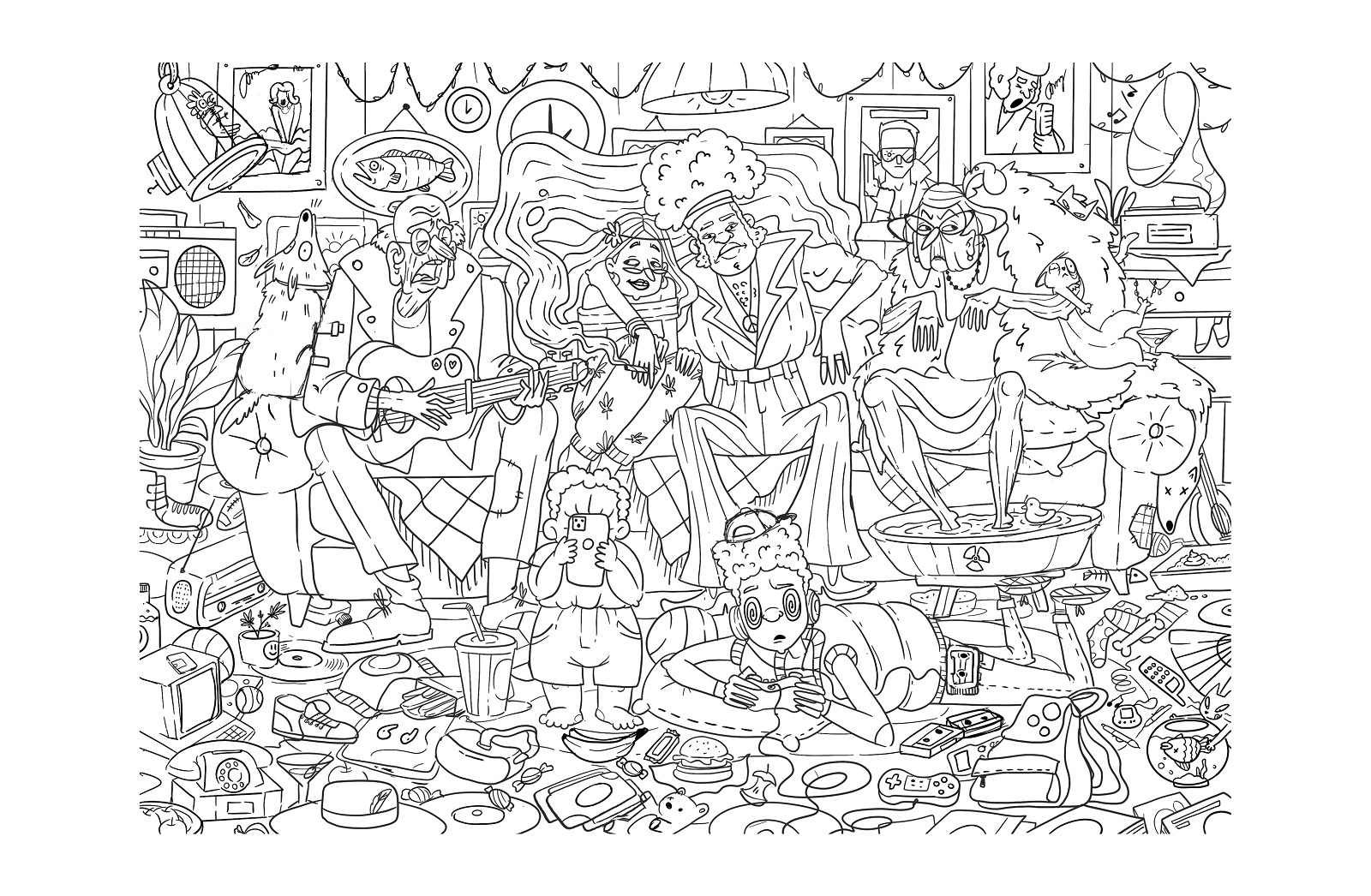
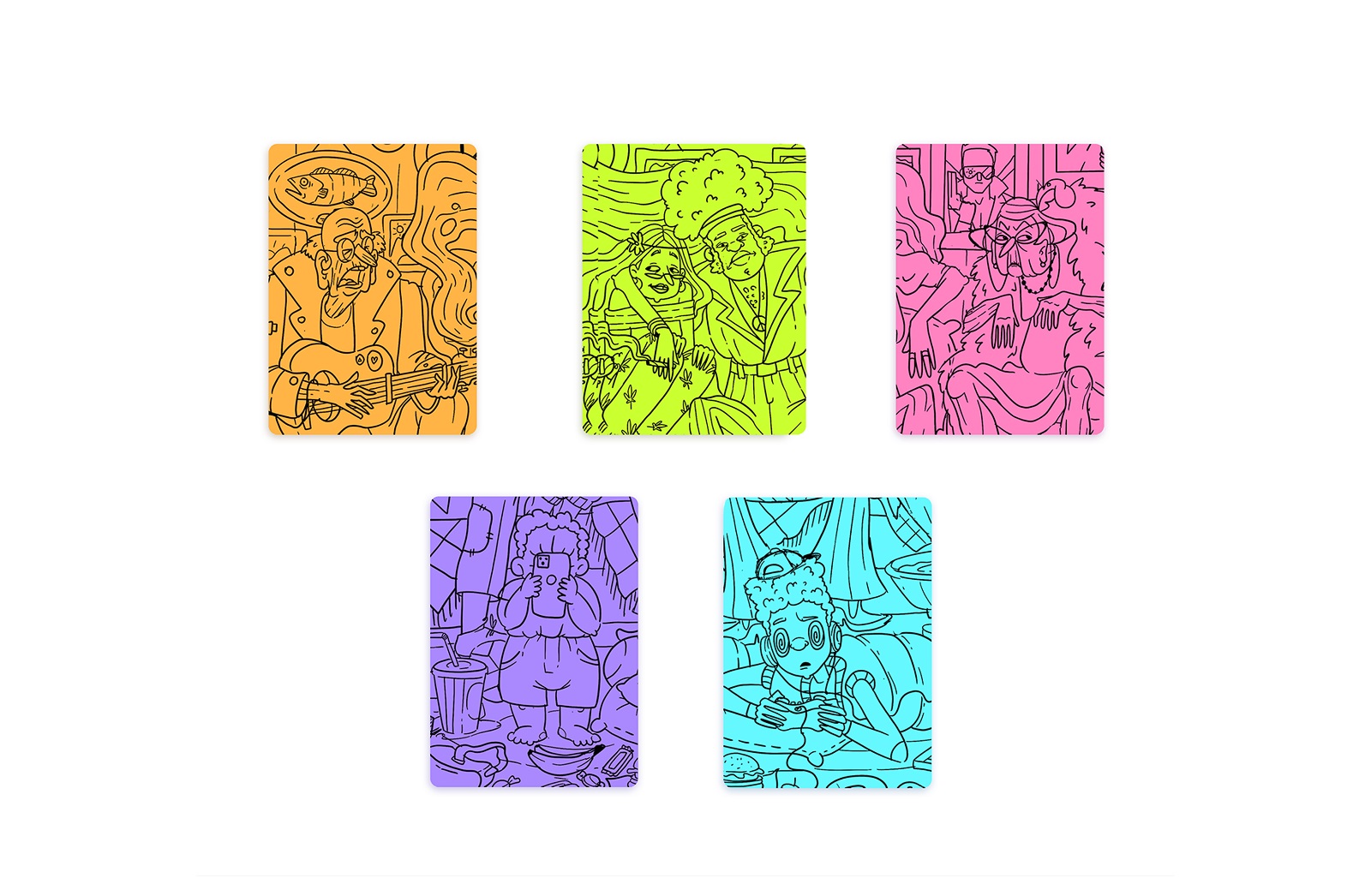
And then, the separate images for play cards of different generations were cut out right from this big picture.
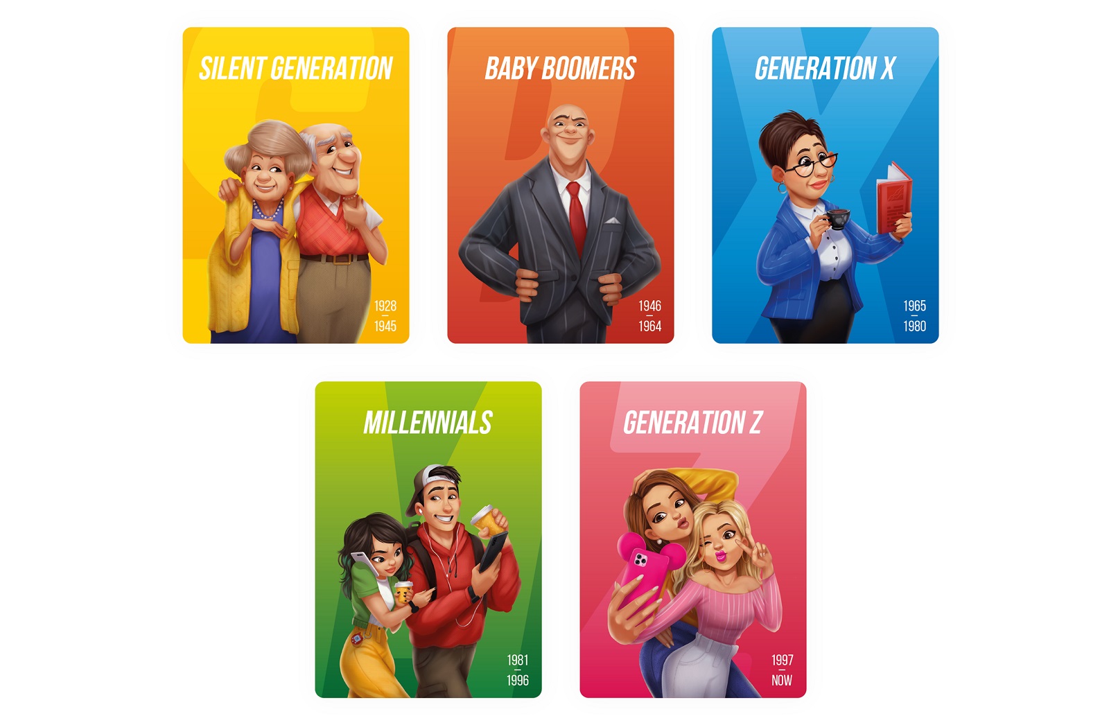
This concept could be further developed, but at that stage, the client came up with an idea: why wouldn’t that be the actual family that stands behind the concept of the game? So, shared the family photos with us where the different generations could be seen together, and the creative team started a new iteration of character design based on it. Here’s a glance at the sketching phase.
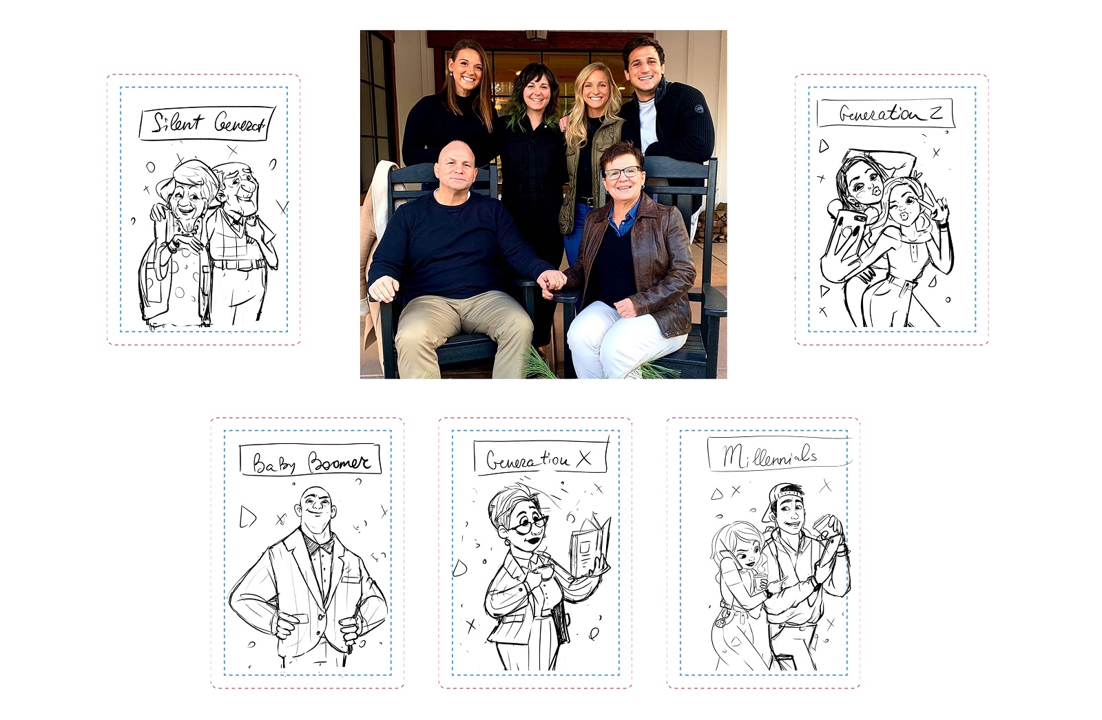
The general idea was quickly approved by all sides as it looked like what the client was striving to get for this game, so the illustrator moved to develop the polished digital versions of each character, all of them positive, cheerful, bright, and cartoonish.
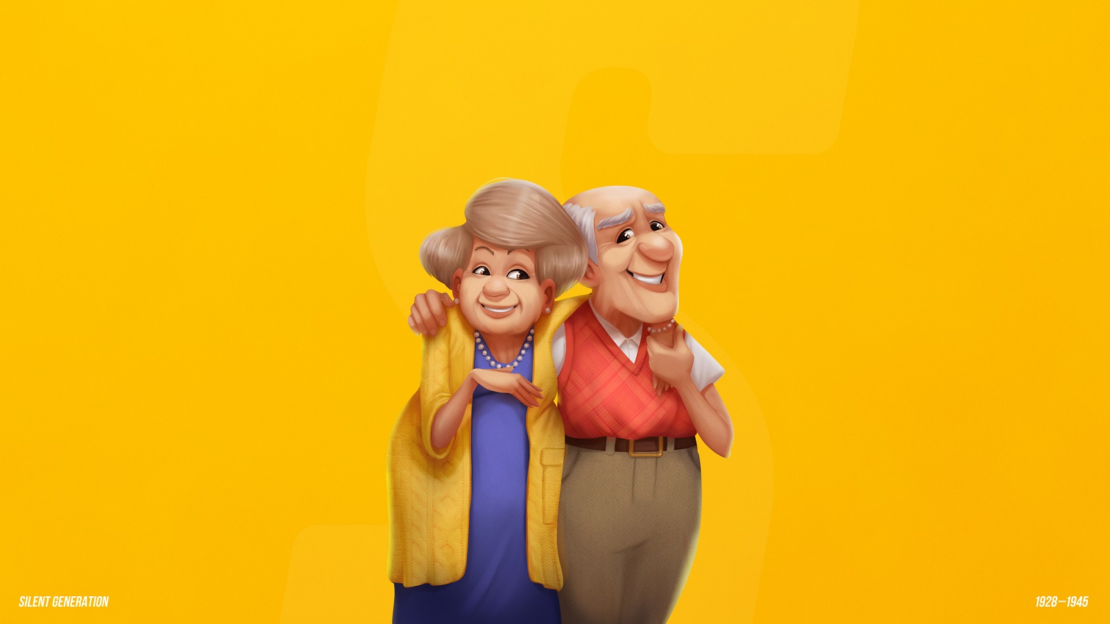
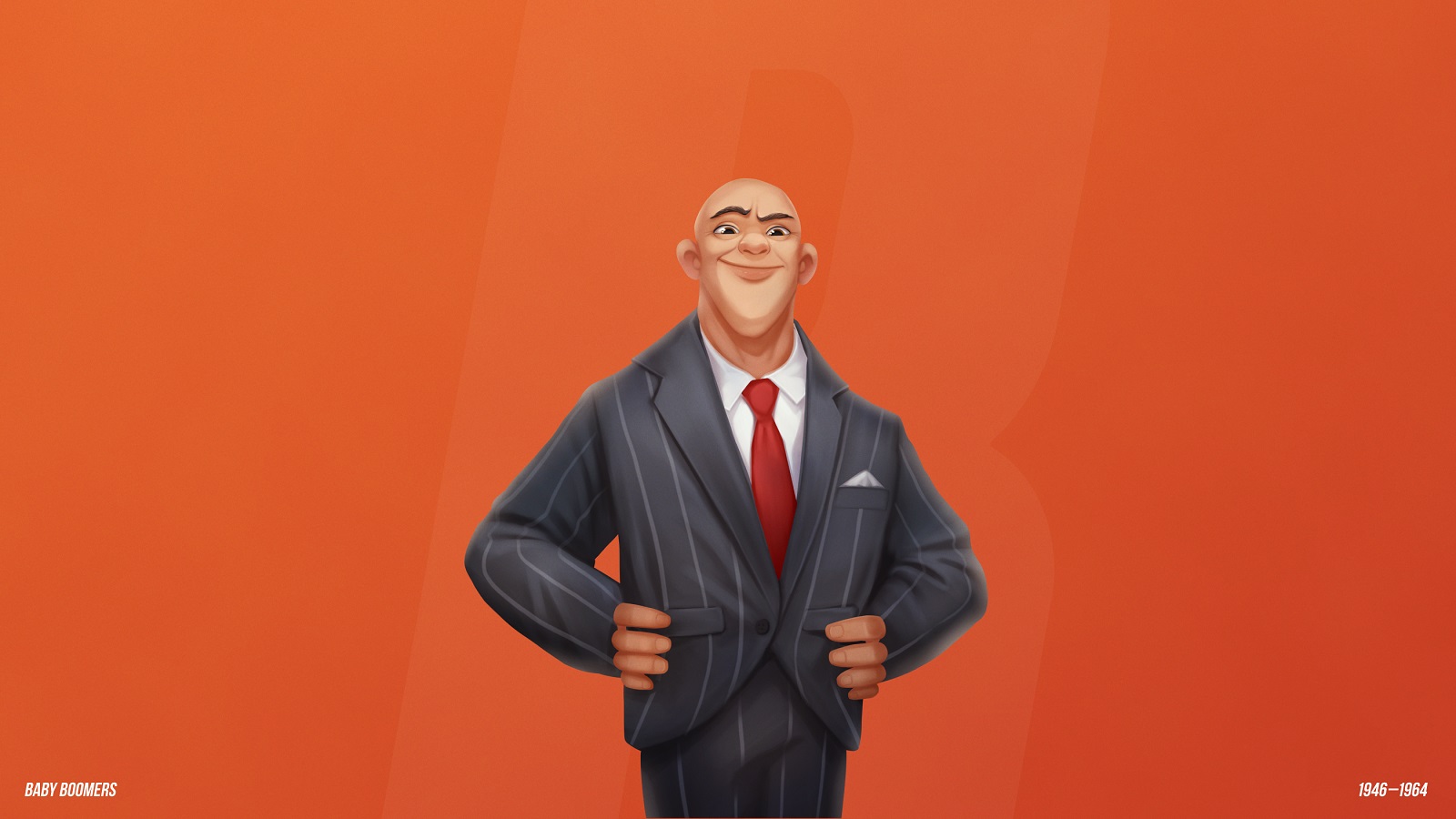

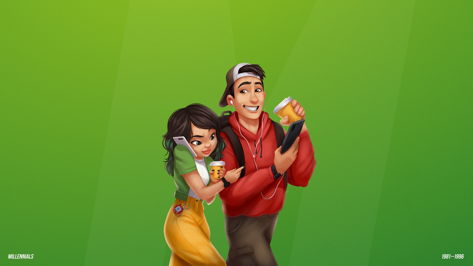
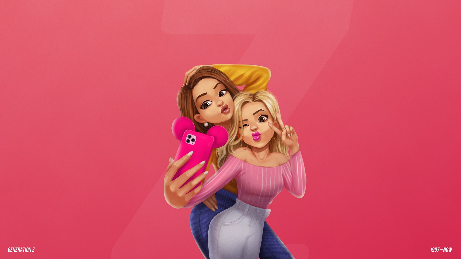
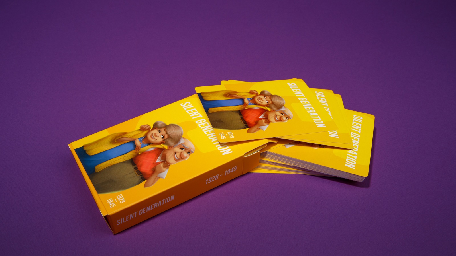
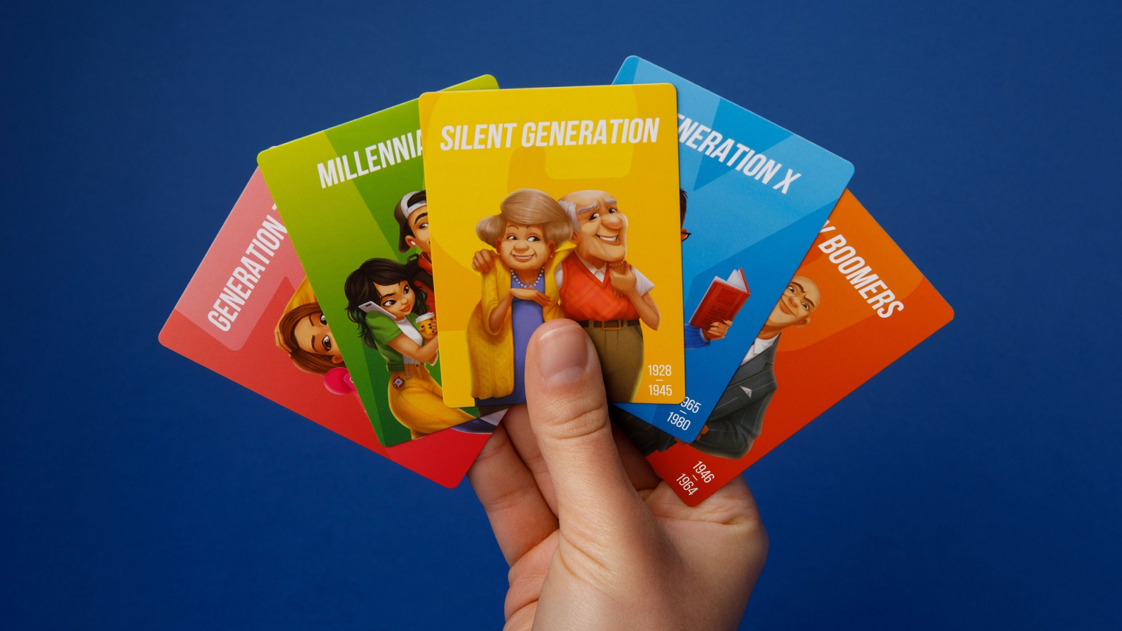
And here is what they all look like on cards.
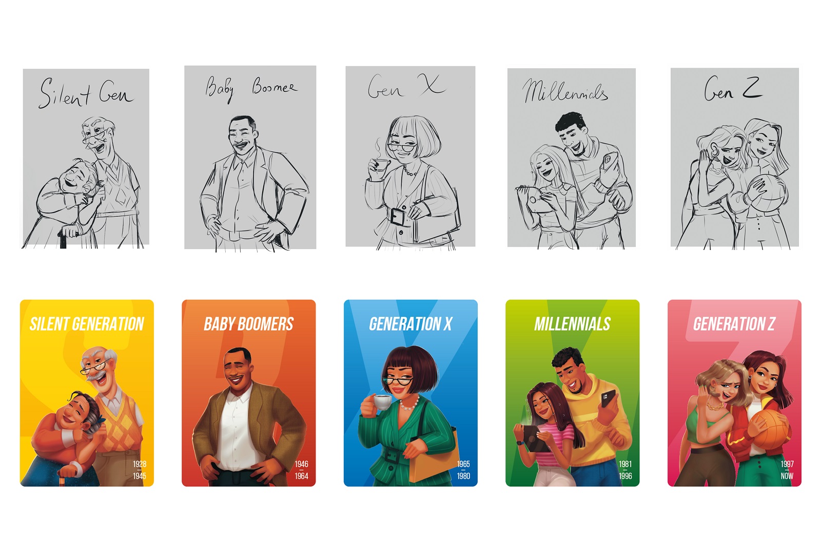
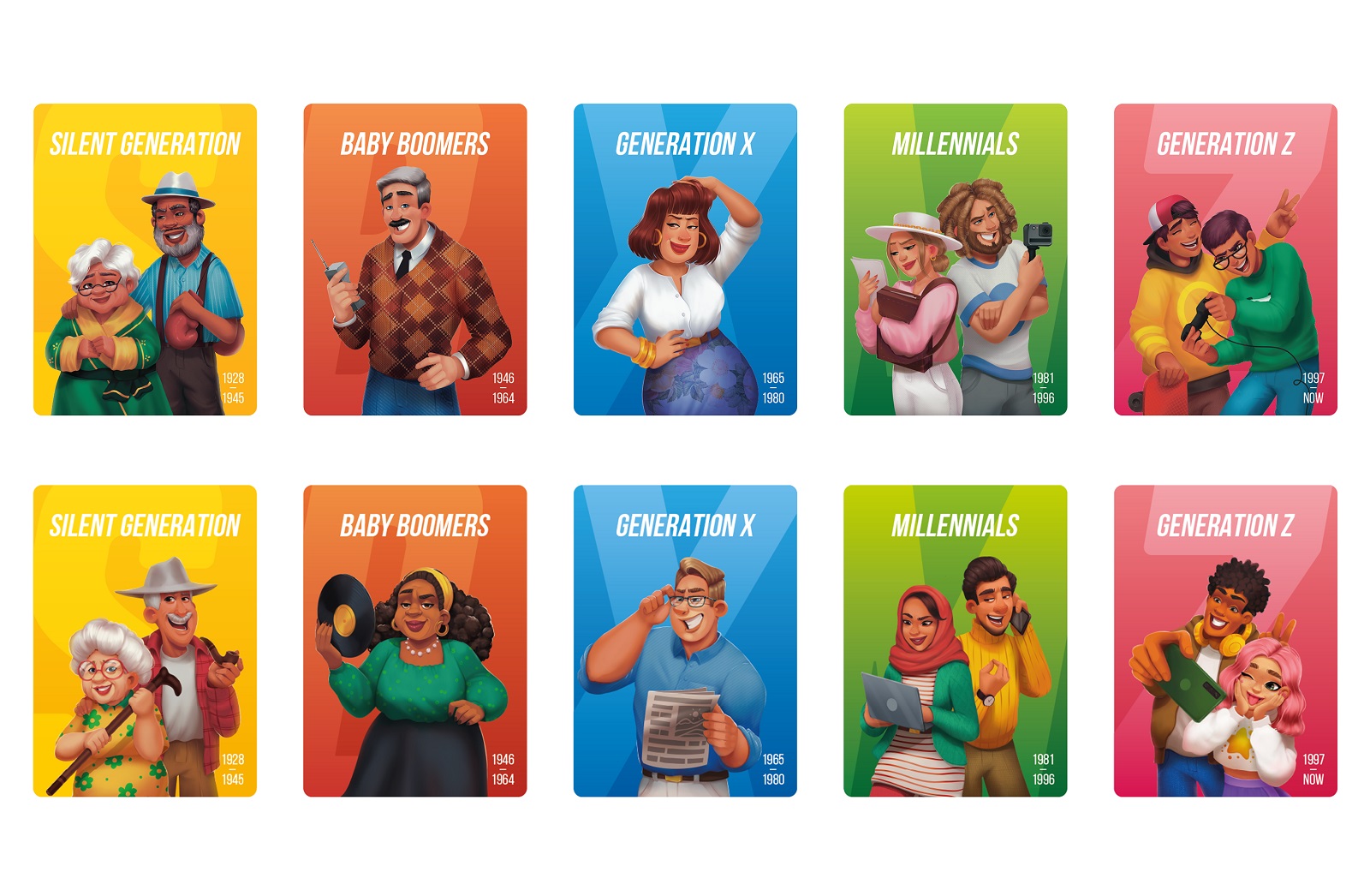
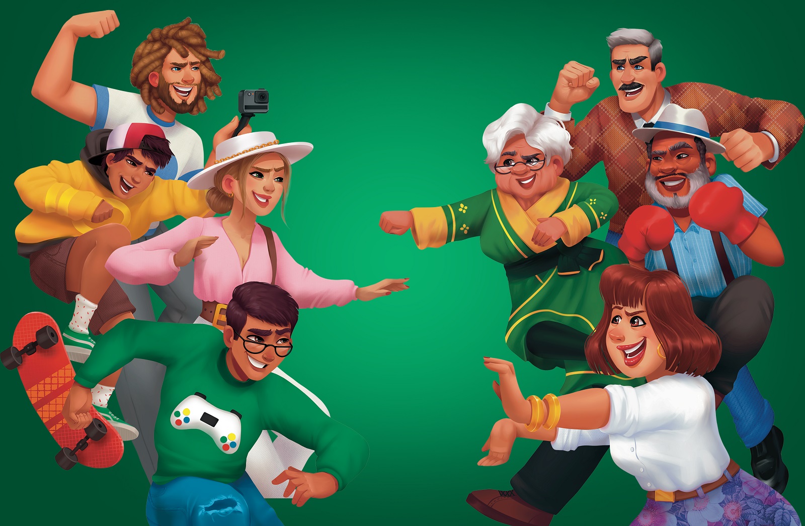
Later, we also worked on another pack of illustrations for the extension packs of the OK Boomer trivia game, and that pack reflects the idea of diverse families.
Branding and Game Design
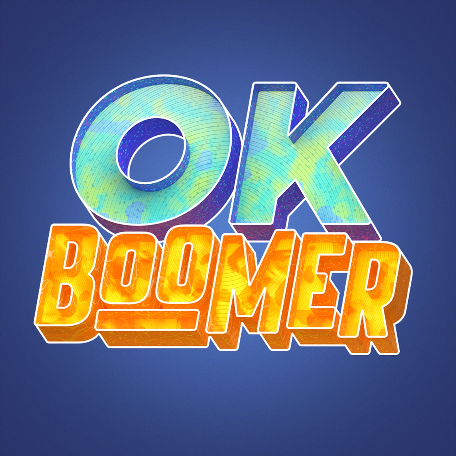
Another important task for the design team was to make the game not only attractive and beautiful but also easy to use, elegant, and functional. As well as any product, it needed a solid and consistent identity that would help it stand out and communicate with users. So, here’s a look at the logo, the bold, bright, and catchy wordmark that is flexible for different marketing objectives, both digital and printed.
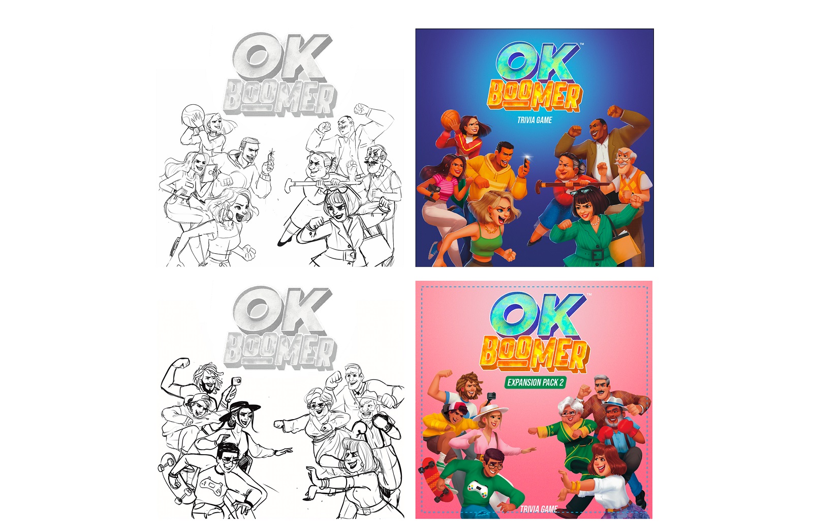
For the packaging design, the main wish was to depict the characters but not static or echoing the posing on the cards. They had to be dynamic and energetic; what’s more, it was important to add the element of opposition to reflect the nature of the game.
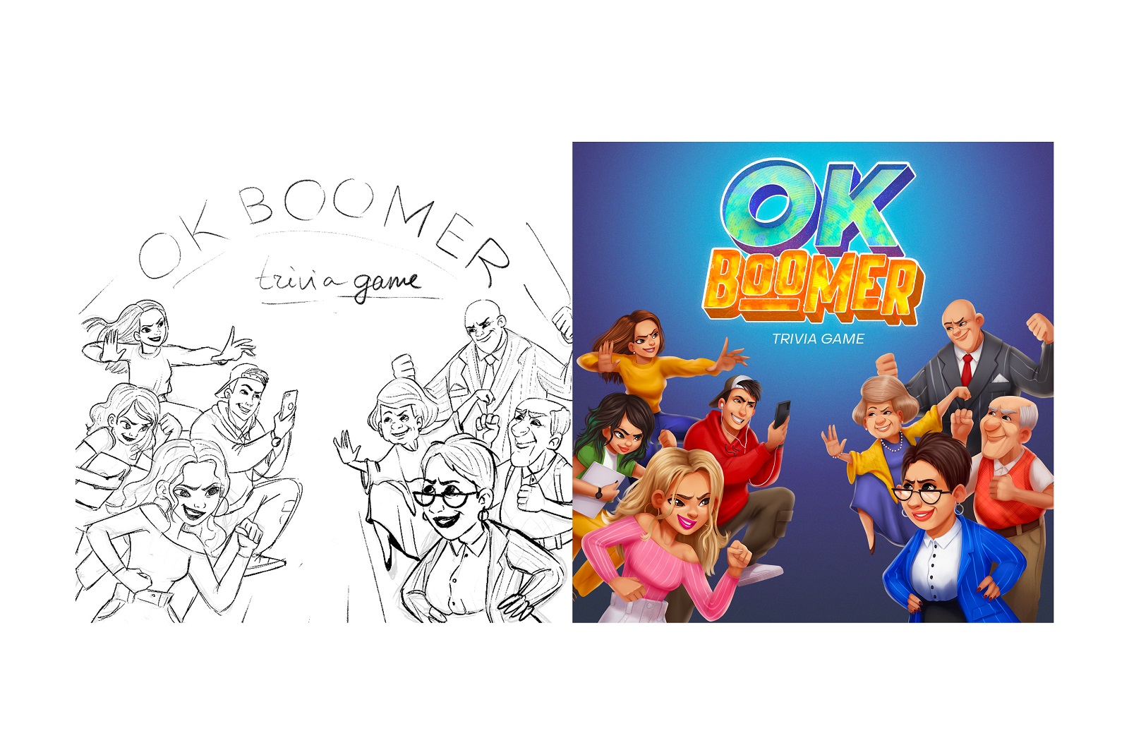
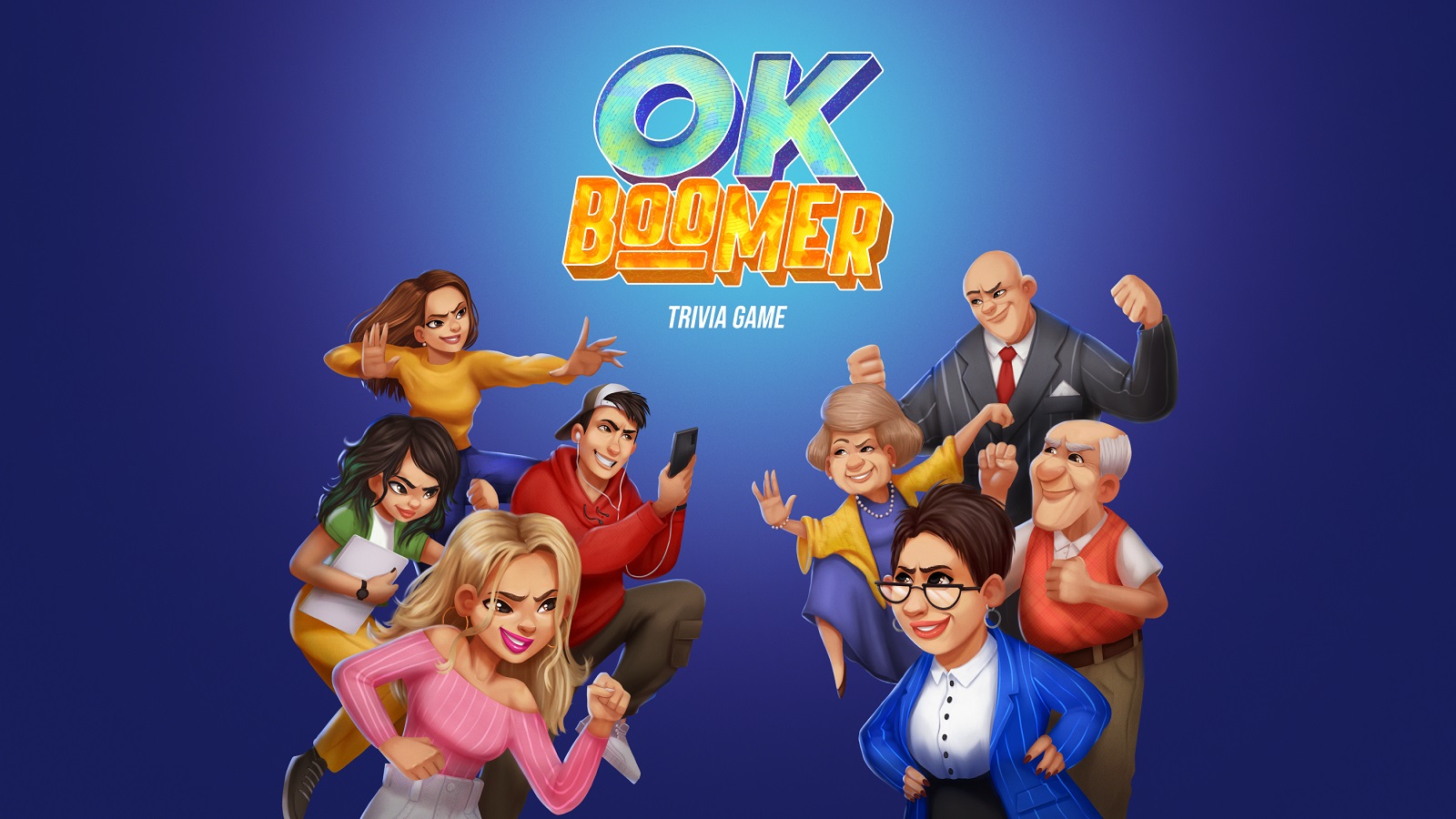
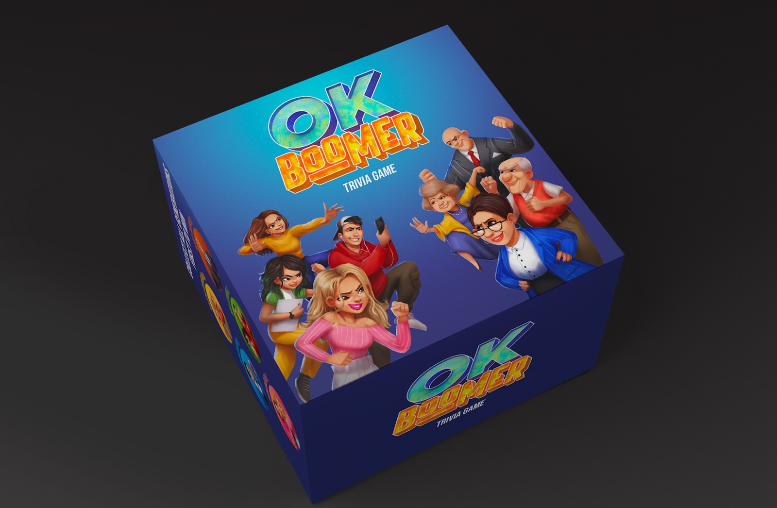
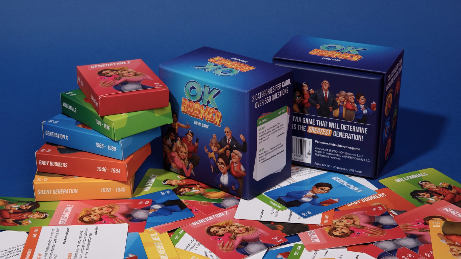
Having agreed upon the title image, the designers worked on the whole packaging as well as smaller boxes for the card deck of each generation inside the main box.
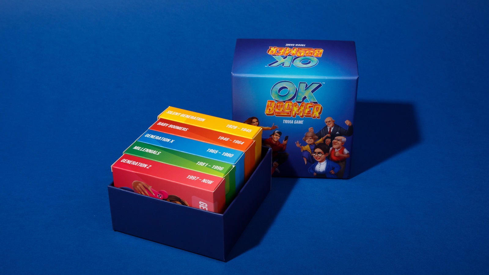
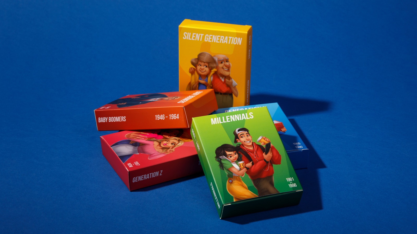
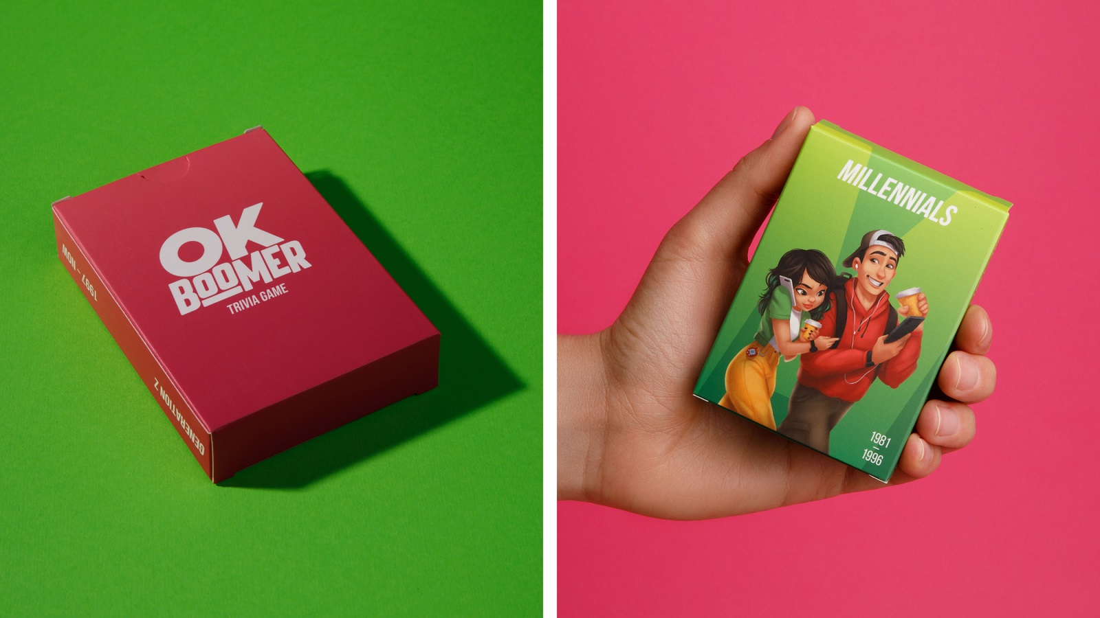
And here’s a look at the same approach for the extension packs.
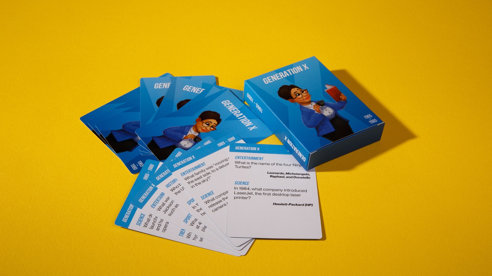
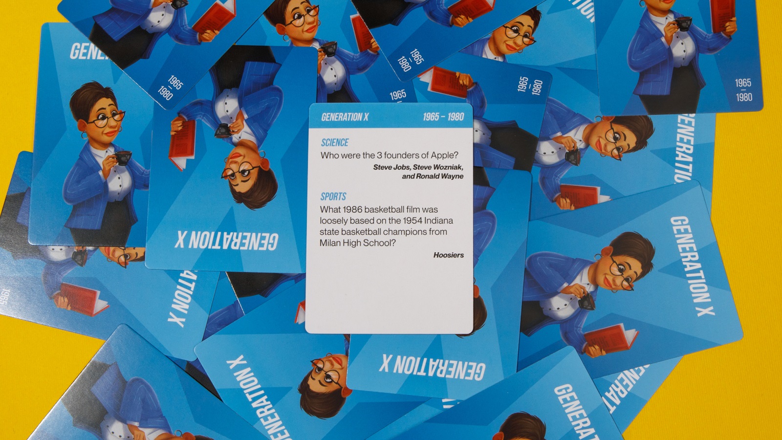
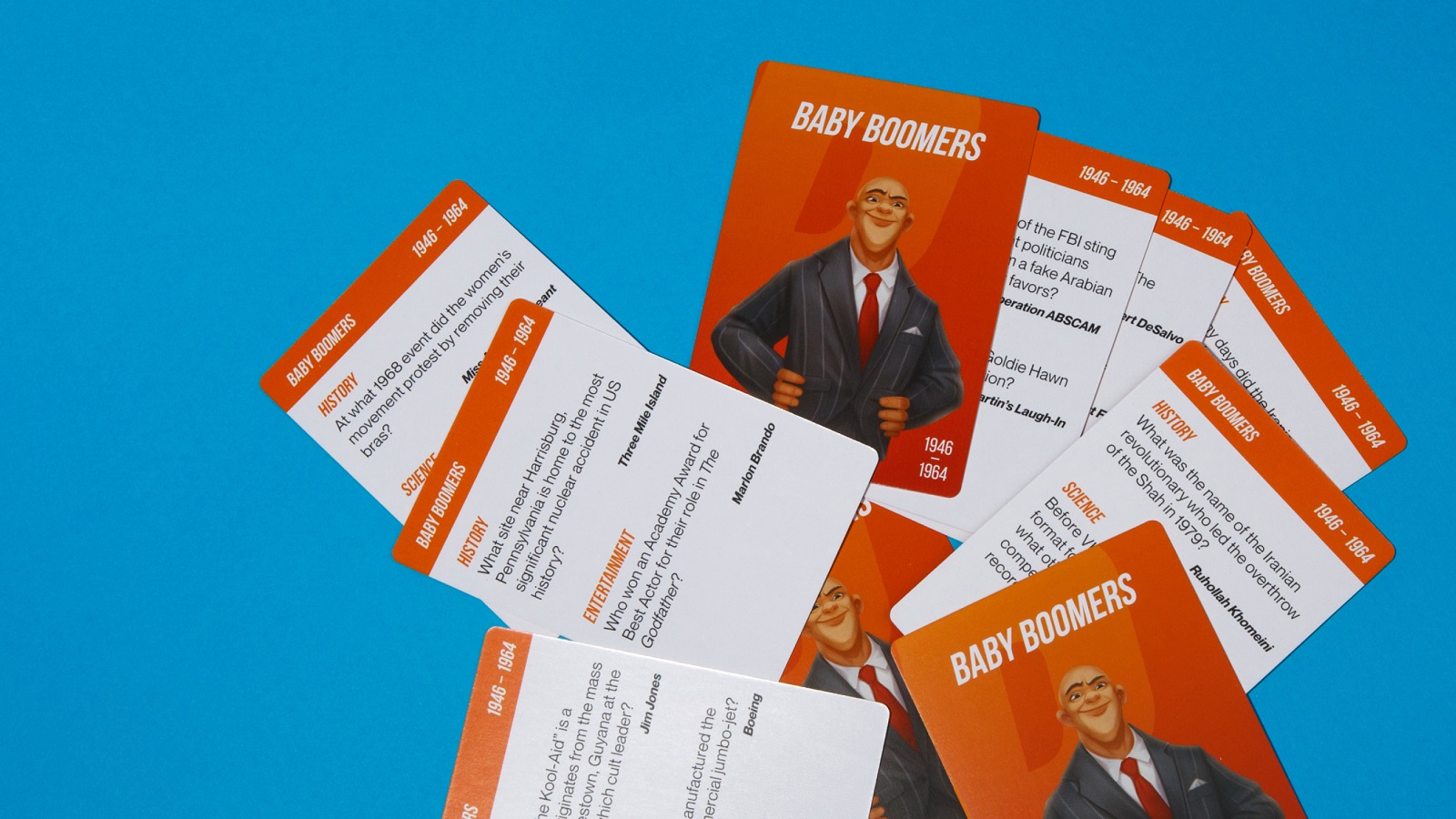
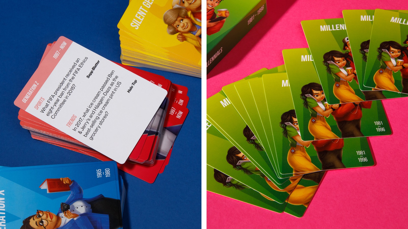
Working on play cards design and packaging for them, designers spent long hours choosing, matching, arranging, and testing to ensure that the text part that is the core of the game process is legible and good-looking, the cards look attractive and balanced, and all the details of the game keep consistent and present the united experience. Take a closer look at the cards and other elements of the real game.
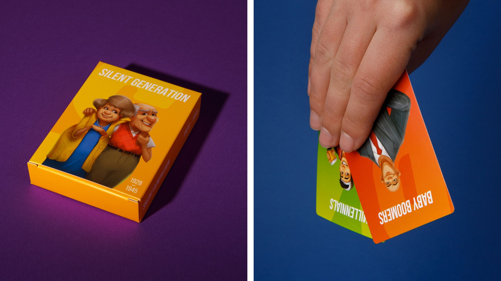
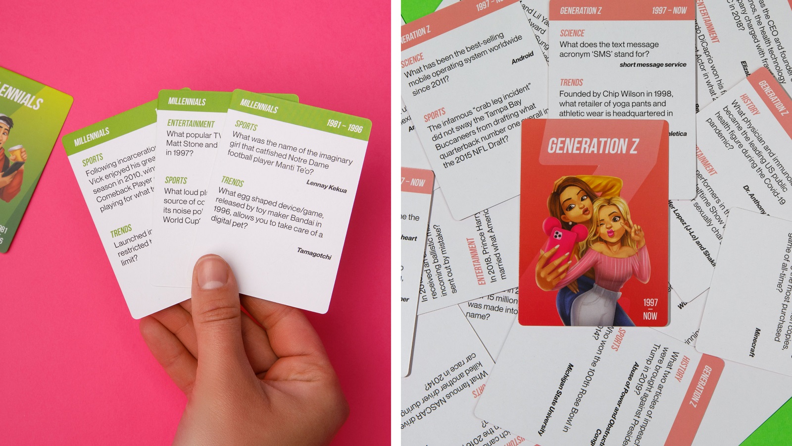
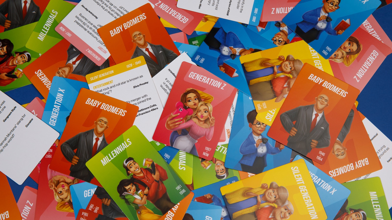
What could tell better about our job than the positive feedback from the client? And that is what the team was happy to hear from Joe, the product creator.
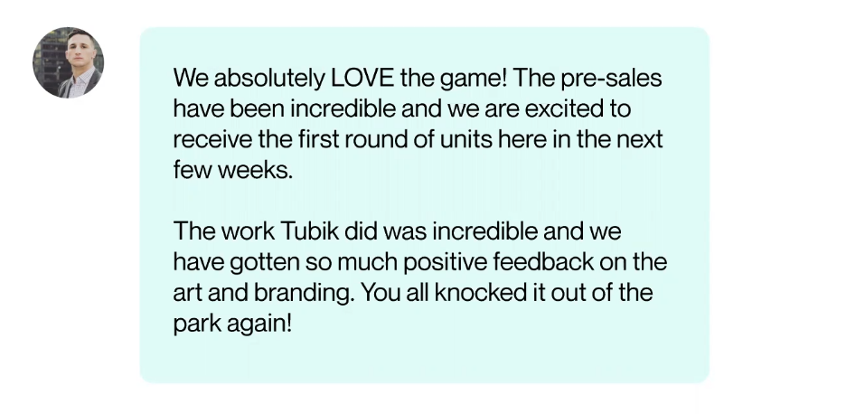
No doubt, the OK Boomer project was an invaluable, diverse, and super-jovial experience in developing the diversity of characters and working on the design for a real, tangible product from scratch. Enjoy the game, guys!
New design case studies from our team are coming soon. Stay tuned!
More Design Case Studies
Here’s a set of more case studies sharing the design solutions and approaches for some of the design projects done by the Tubik team.
MOVA Brewery. Ecommerce Website Design for Beer Producer
HP23. Website and 3D Animation for Prostheses Producer
FluxWear. Web Design and Development for Health Tech Product
UI Design Process for Web and Mobile: 3 Detailed Video Cases
Magma Math. Web Design for Educational Platform
Synthesized 2.0. Web Design for High-Quality Synthetic Data Platform
HotelCard. Brand Identity for Hotel Offers Service
Nibble Health. Identity and UX Design for Healthcare Fintech Service
Physica Magazine. Web Design and Graphics for Scientific Blog
Originally written for Tubik Blog, graphic content by tubik
- English
- Ukrainian


