Case Study: OtoZen. Designing Mobile Application for Safer Driving
Case Study: OtoZen. Designing Mobile Application for Safer Driving Case study unveils user experience design for Otozen, the technology of safe driving: mobile app design, website, and custom graphics.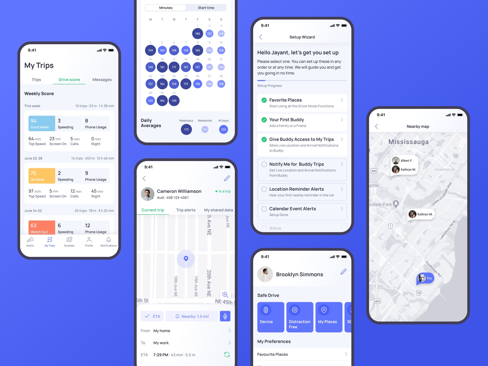
“The one thing that unites all human beings, regardless of age, gender, religion, economic status, or ethnic background, is that, deep down inside, we all believe that we are above-average drivers,” famous author and columnist Dave Barry once mentioned, and this point is getting more and more influence on people’s lives all over the world. Our new design case study also touches on that issue: let us unveil the story of user experience design by tubik for OtoZen, the technology that strives to support the idea of safe driving.
Project
OtoZen is an innovative technology for safe driving, operating via a hardware device connected to a mobile application. It helps users to turn any car into a smart, distraction-free vehicle. It is the all-in-one safe driving assistant that keeps drivers focused, organized, and connected to friends and family. Users can quickly pair the OtoZen device with their Apple or Android phones via Bluetooth and install the OtoZen Pod in split seconds, with no tools, wiring, or professional installation required.
In this project, tubik specialists were involved in auditing and improving UI and UX design for the mobile application, as well as creating custom graphics and a website that would strengthen the product’s web presence.
App Design
From the perspective of user experience design, the Otozen application was a complex project that included a diversity of manipulations with different data, some of which are changing in real-time mode and should be updated and distributed appropriately. Another concern was dealing with a lot of personal data security and privacy issues. So, the design process had to start with diving deep into the slightest details of functionality and user problems solved by the application. This is what the application looked like at the start of the process.
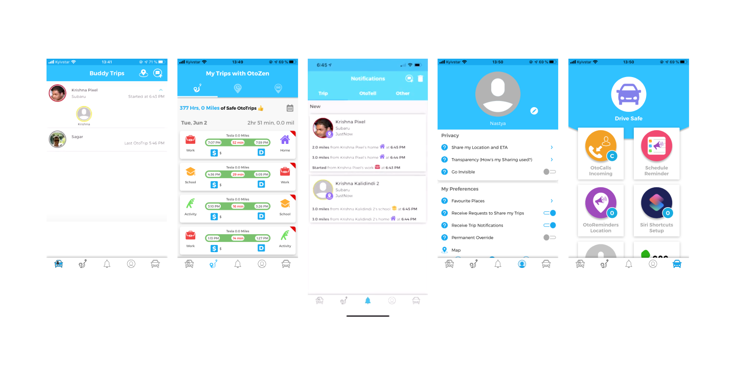
The client came to us with a prototype that had to be reviewed, discussed, and reconsidered. In general, the technology is built around the following primary directions:
- safe, distraction-free driving: texting-while-driving prevention, reduced audio distractors, high-speed alerts, feedback on driving safety level, autodial to call help for emergency
- well-used driving time and organized reminders: location/time-based reminders, audio calendar alerts, joining meetings hands-free, simplified expense reports with mileage tracking
- convenient connection and communication with other people, for example, family and friends: requesting live location and ETA of other drivers, getting easily updated with automated notifications, full control of privacy and visibility
So, having analyzed the diverse functionality and data the app had to process, considering the objectives behind the application, our team made a deep review of the pain points and blind spots in the existing prototype. That process of design audit was grounded on constant communication with clients to find out the slightest details that could have an effect on user experience and grew into tons of graphs, charts, tables, and schemes. That’s a good example demonstrating that a huge part of the user experience design process is not about visuals but about analyzing, structuring, connecting the dots, considering details, and building systems. Here’s a look at just a small part of the process.
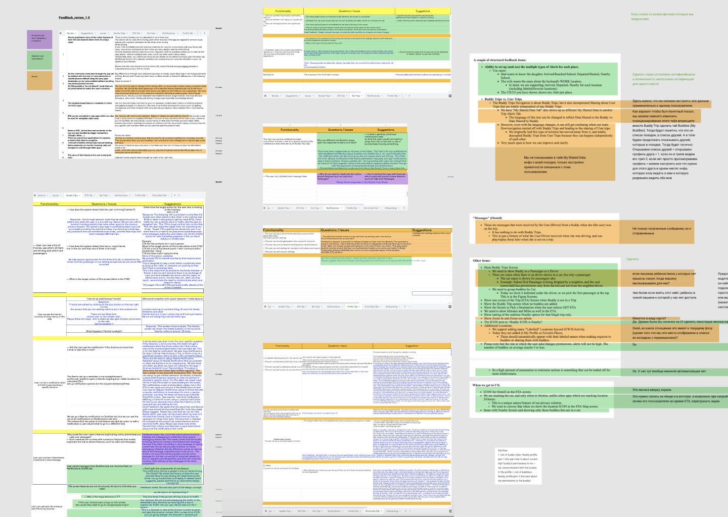
A part of multiple systematic tables textually organizing different information about the product, questions and issues to discuss, and suggestions that could improve user experience, to support collaboration between the clients and the creative team and let them stay on the same page.
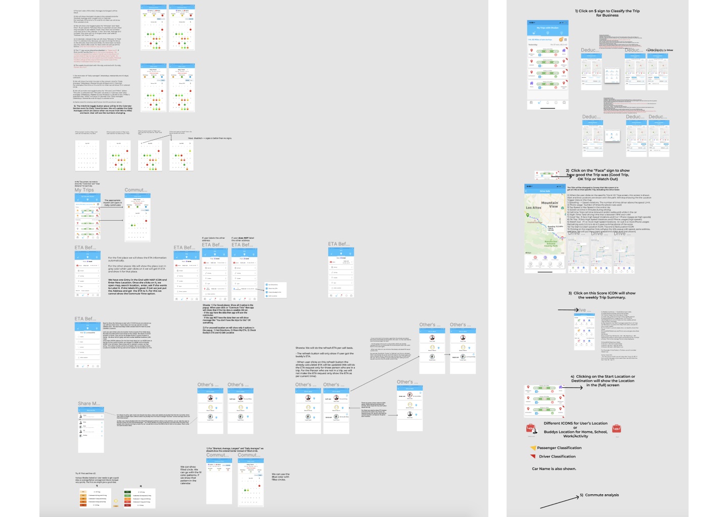
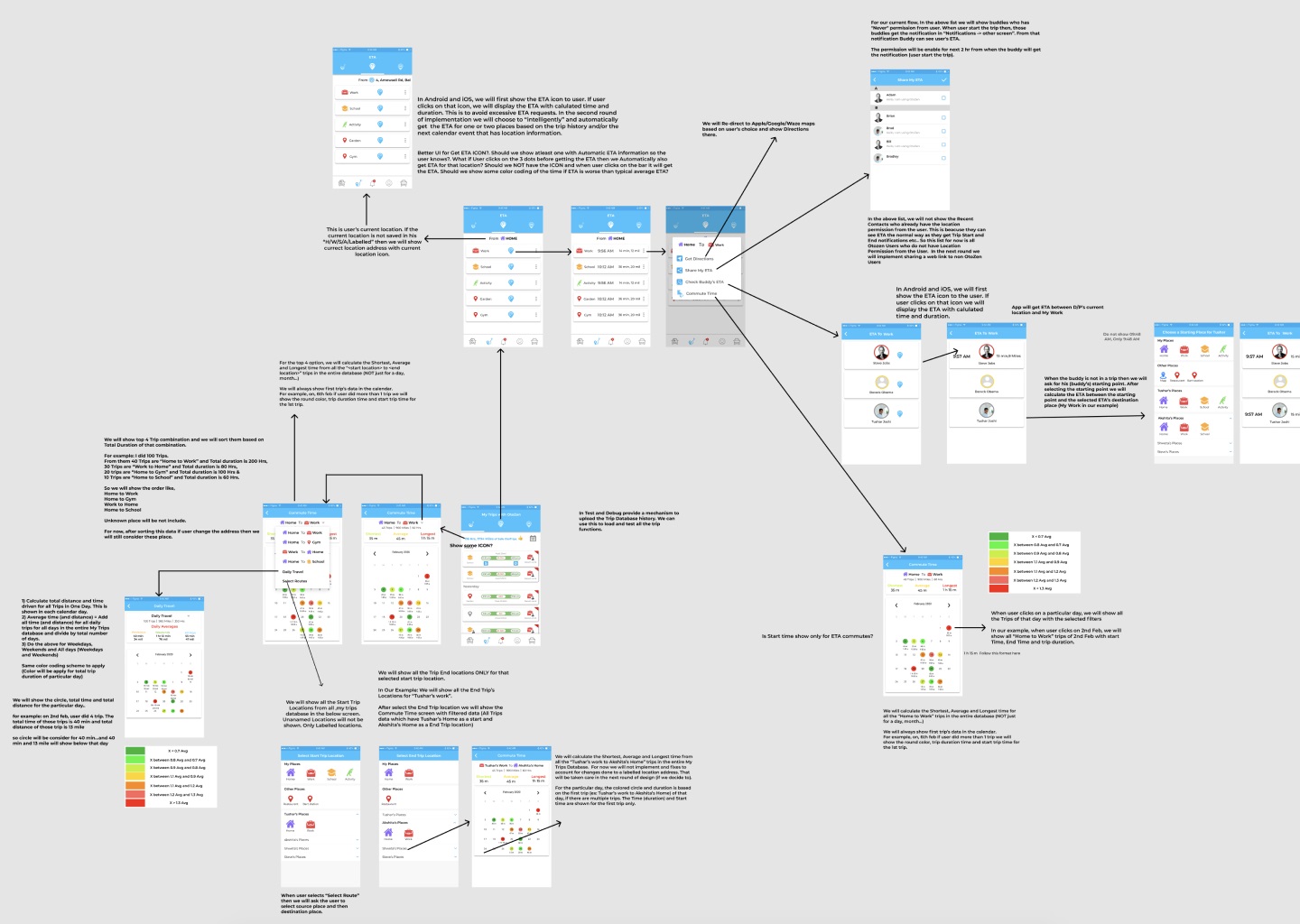
A glance at the process of analysis and structuring user interactions with the application and issues arising in the process
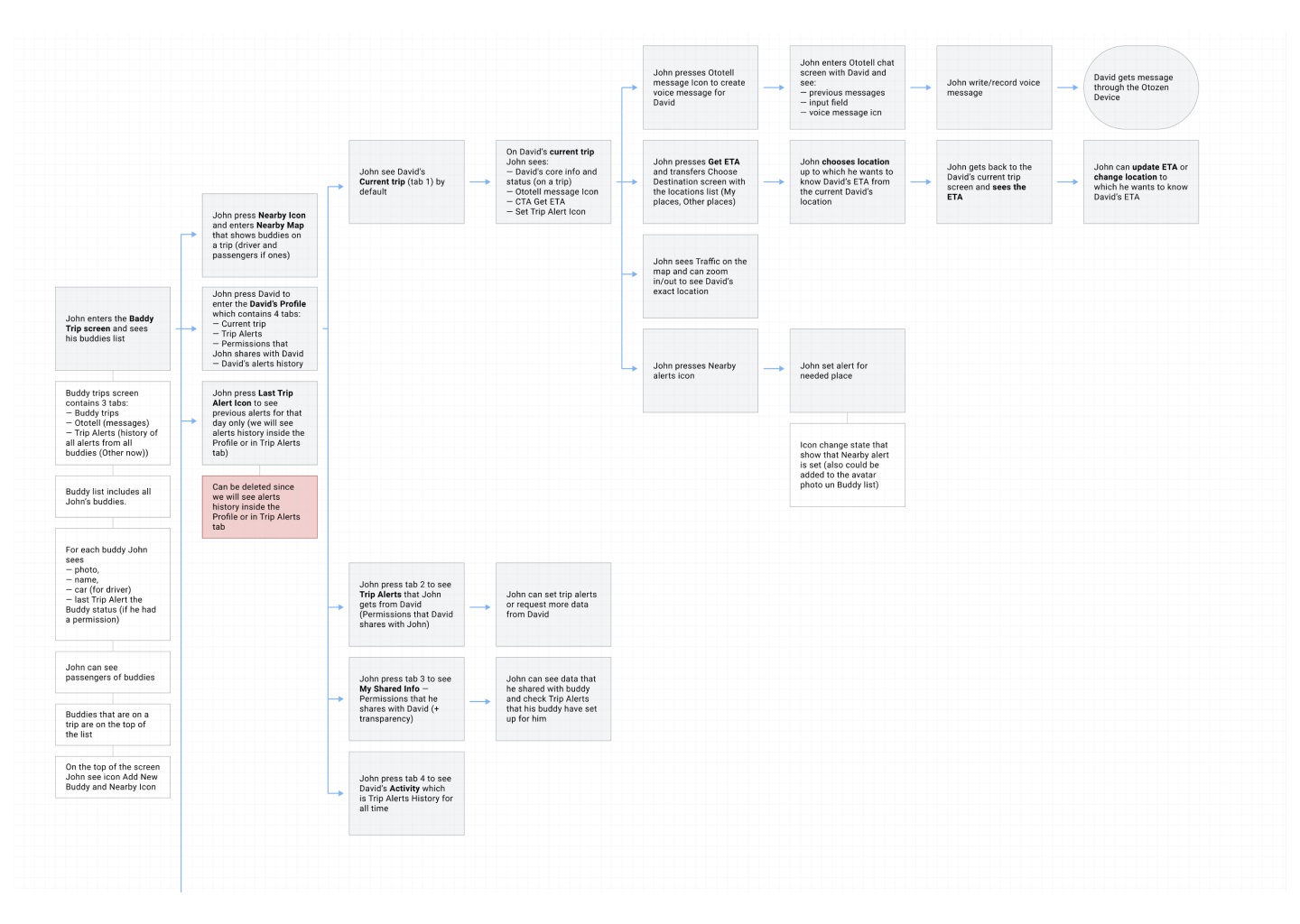
The process of building a particular piece of user scenario
So, the core tasks for the UX designer were to think over data organization, visualization, and navigation which would make complex flows of information and functions feel intuitive and straightforward and wouldn’t overwhelm users. Supporting that idea, the choice was made on a light and airy interface with contrasting but not overbright colors for critical visual elements and buttons and a highly-readable sans-serif font to make the screens scannable and easy to use on the go.
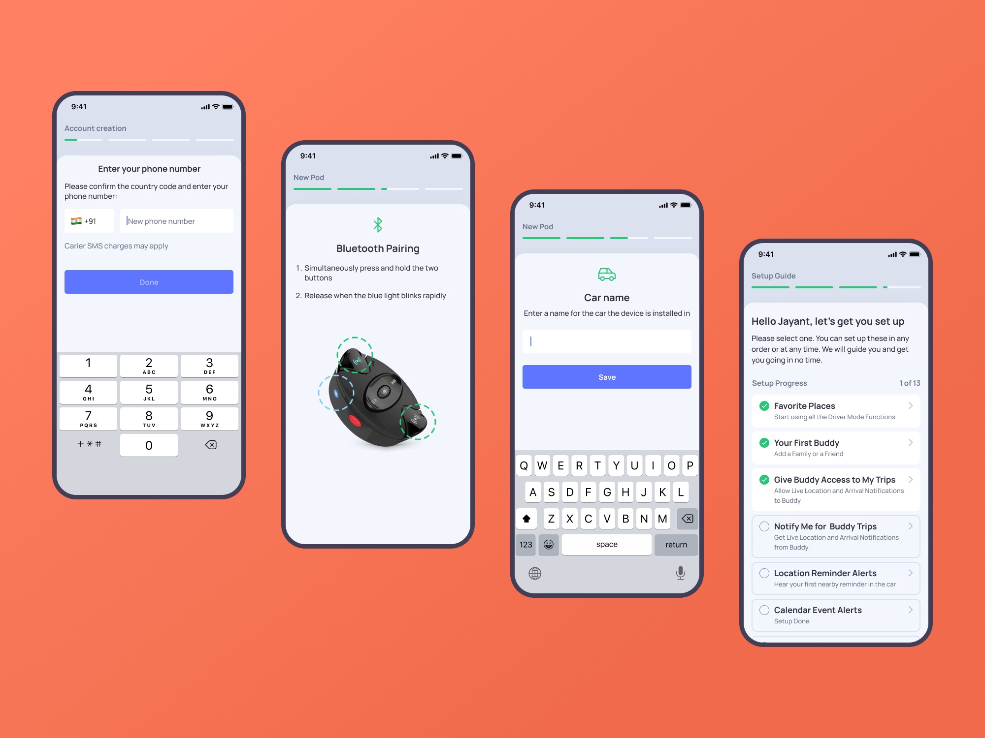
One of the significant points for the user experience design of the mobile application was effective onboarding and registration flow. The account creation process is divided into several simple steps, with a progress indicator keeping the user updated about the current stage.
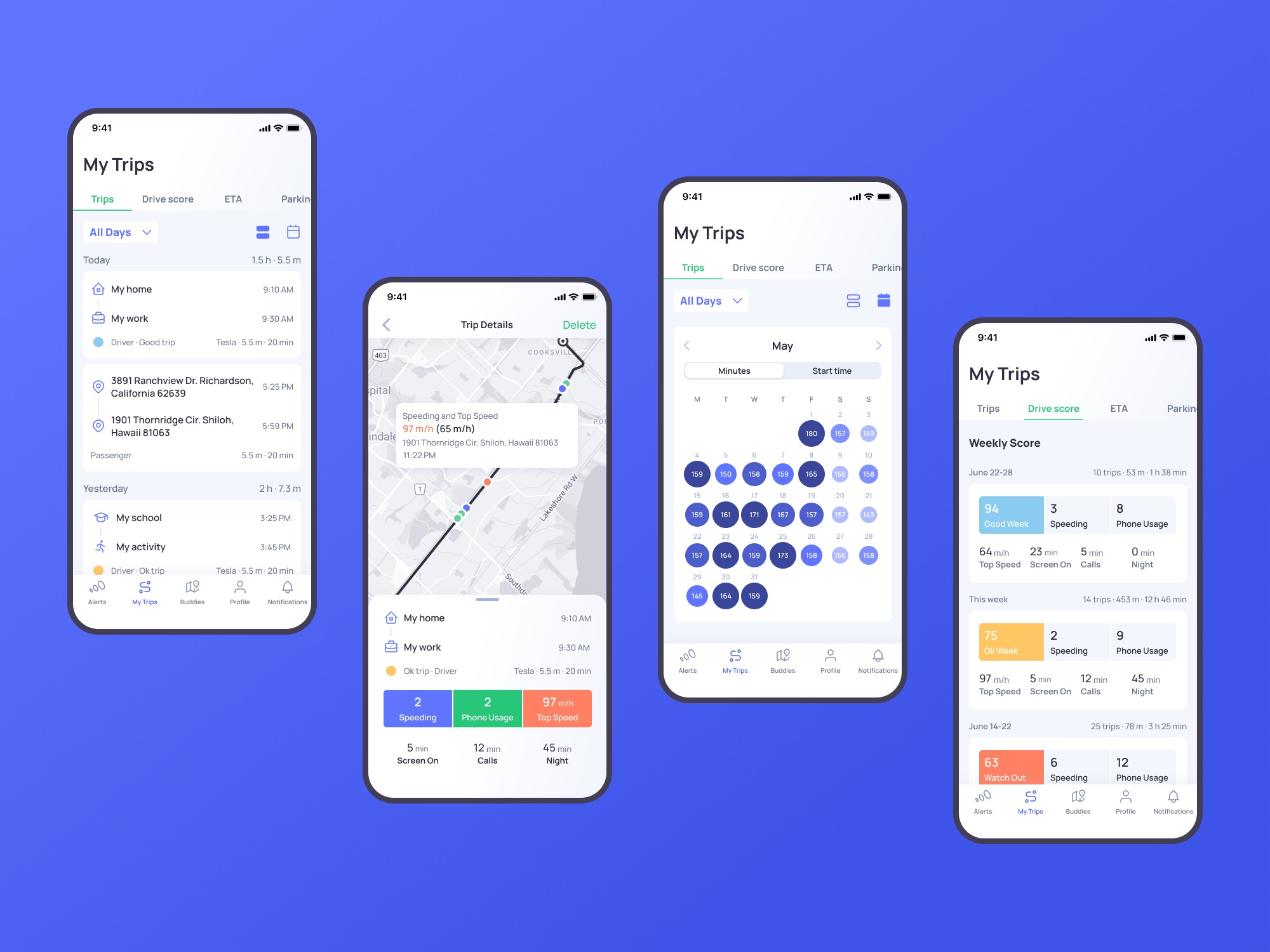
My Trips section opens the feed and gives an opportunity to easily tune what the user wants to see. This application is a good example of how well-crafted icons support the usability and navigability of the mobile interface and help set instant visual connections with different types of information. The map screen shows the trip details. It also uses color marking for the various points, such as speeding or telephone usage, this way visualizing quickly how often the issue happened during a particular trip.
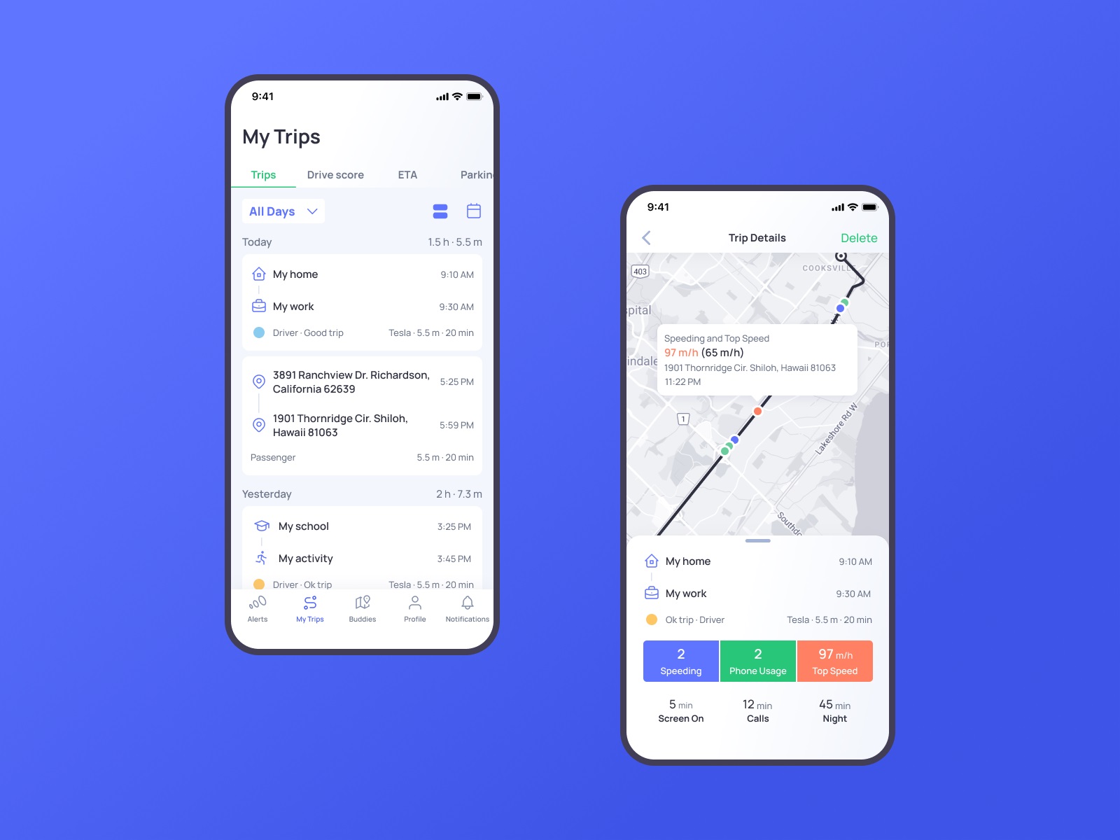
Opening the calendar, the user can see daily time stats in minutes. The drive score section opens the information on issues that influence driving safety.
The tab bar lets users switch between five core interactive zones: Alerts, My Trips, Buddies, Profile, and Notifications. To maximize the influence and make it clear for users, it combines elegant line icons and text labels to quickly inform what users will find in each tab.
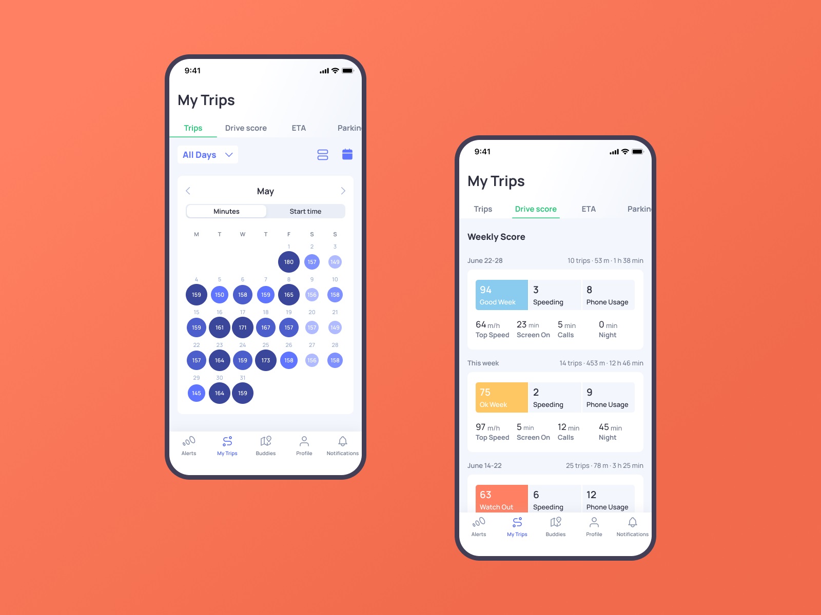
And here’s a glance at the flow of interactions with the app.
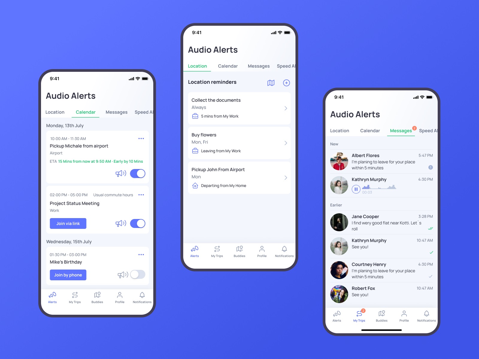
The Alerts section organizes all types of incoming alerts and helps to switch between them smoothly.
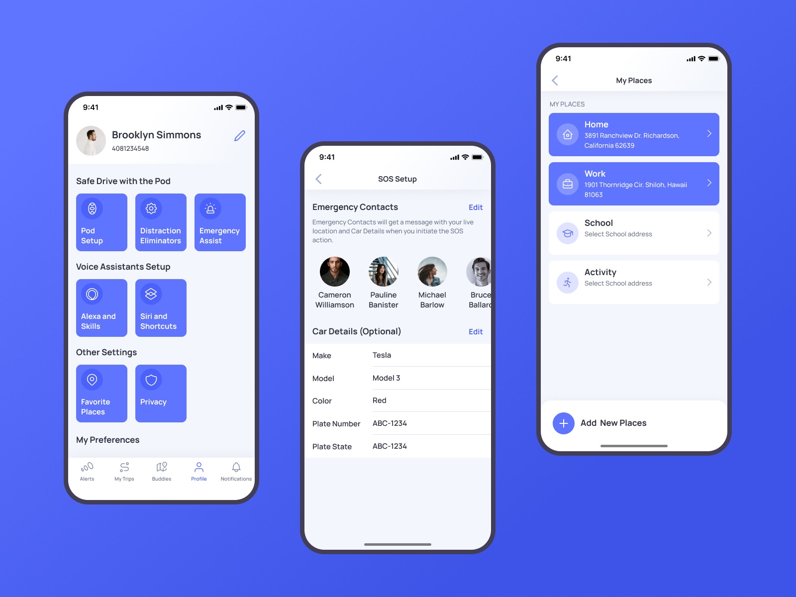
Profile screen shows different data about settings and preferences, neatly organized in groups. Here users also can add, edit, and review their emergency contacts, vehicle details, and places.
One more important and valuable feature of the Otozen application is Buddies. This function allows users to connect, make their trips trackable, and notify their chosen buddy about the needed information, such as the current point on the route or arrival. It can be super helpful for various issues, for example, when the app user needs to know where the family member is but doesn’t want to distract them from driving with calls or messages.
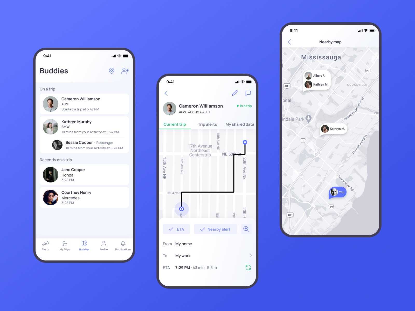
One of the points the technology creators describe as the most essential and show deep care on is personal data security. So, in the Buddies functionality, this aspect had to be well-thought-out, and sharing/accepting access to tracking the other users’ trip, OtoZen users needed to be sure that they can control the level to which they open data to their buddy in the app. That resulted in another neatly organized set of settings in the application that had to be clear and straightforward.
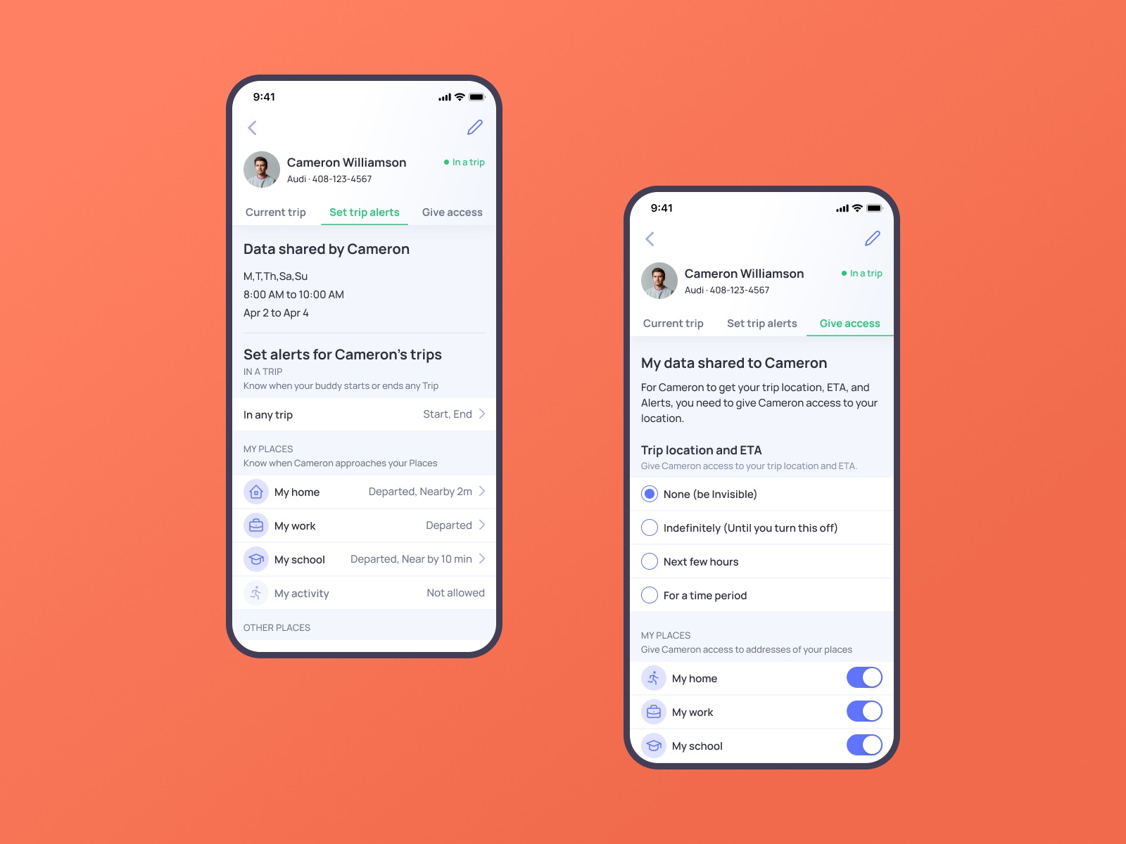
The major challenge behind the application UX design was to get together all the multiple flows of information, notifications, alerts, macro and micro settings, and decide upon the most user-friendly way to organize them.
Web Design
One of the well-checked tools for building a solid mobile application brand and effective promotion is creating a landing page or website to present the benefits and connect users to the product in an efficient, informative, and captivating way. So, the website was another task for our team to allow the OtoZen product to cover this aspect of digital marketing and set another major channel of communication with its users, letting them catch the idea and uncovering the answers for all the questions that may arise. The general layout and website style echo basic color accents and the airy, light layout of the application. The information about the technology is divided into concise sections to be scannable and skimmable. The hero section presents the immediate visual connection to the technology via the prominent image demonstrating both the device and the app and giving the main idea about the product and its value for users via an informative tagline and short description. The call-to-action button in the hero section is instantly visible due to the color contrast. It works in pair with the ghost button, allowing visitors who want more information to watch the video.
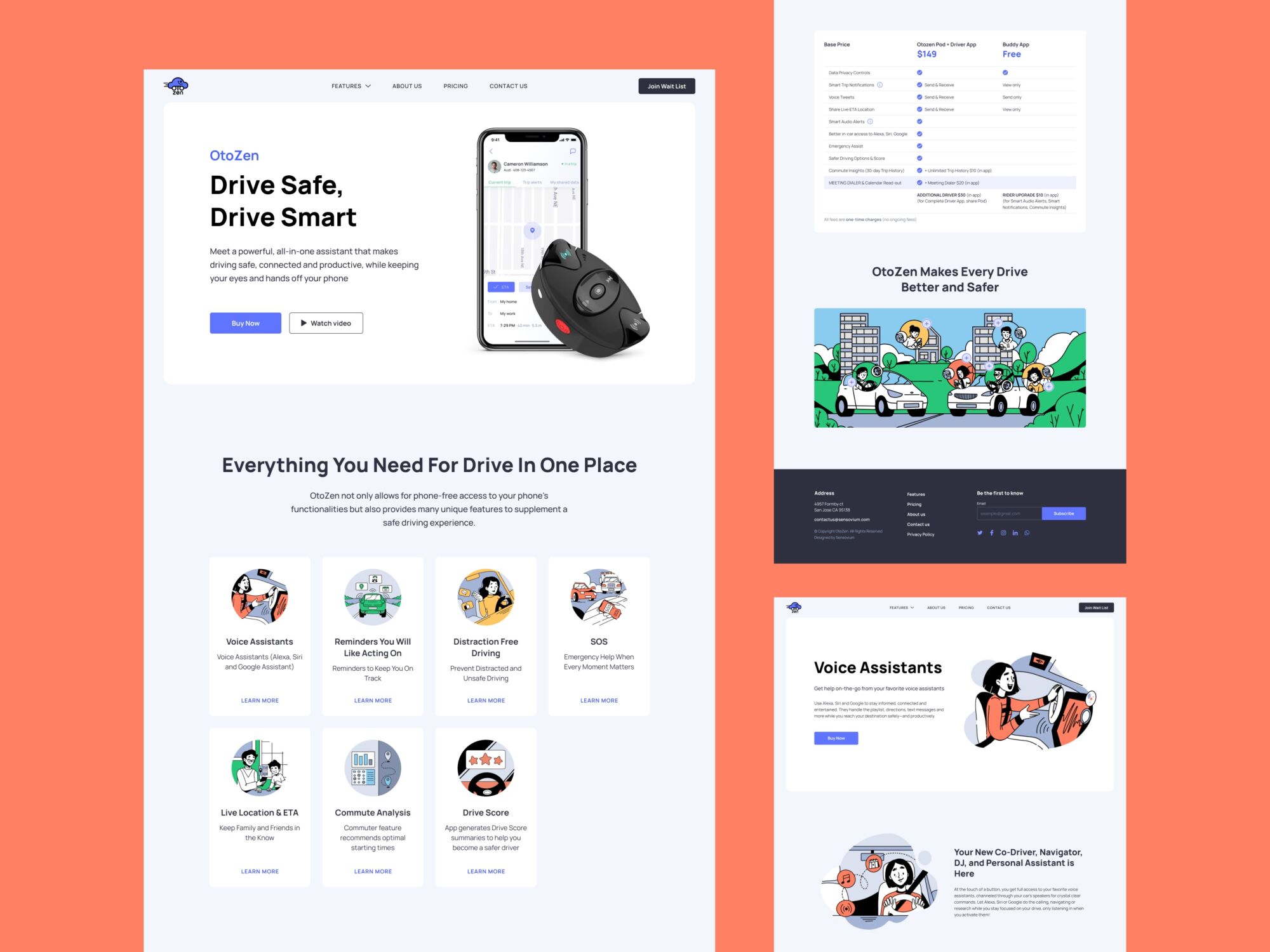
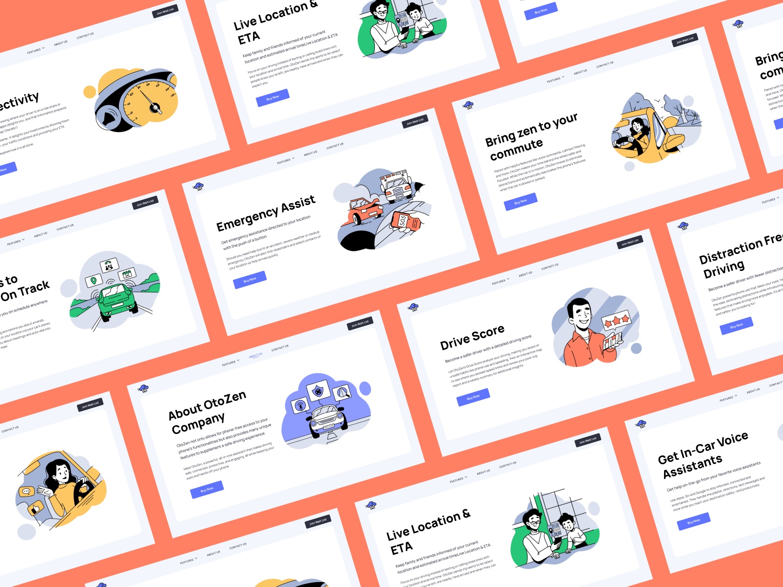
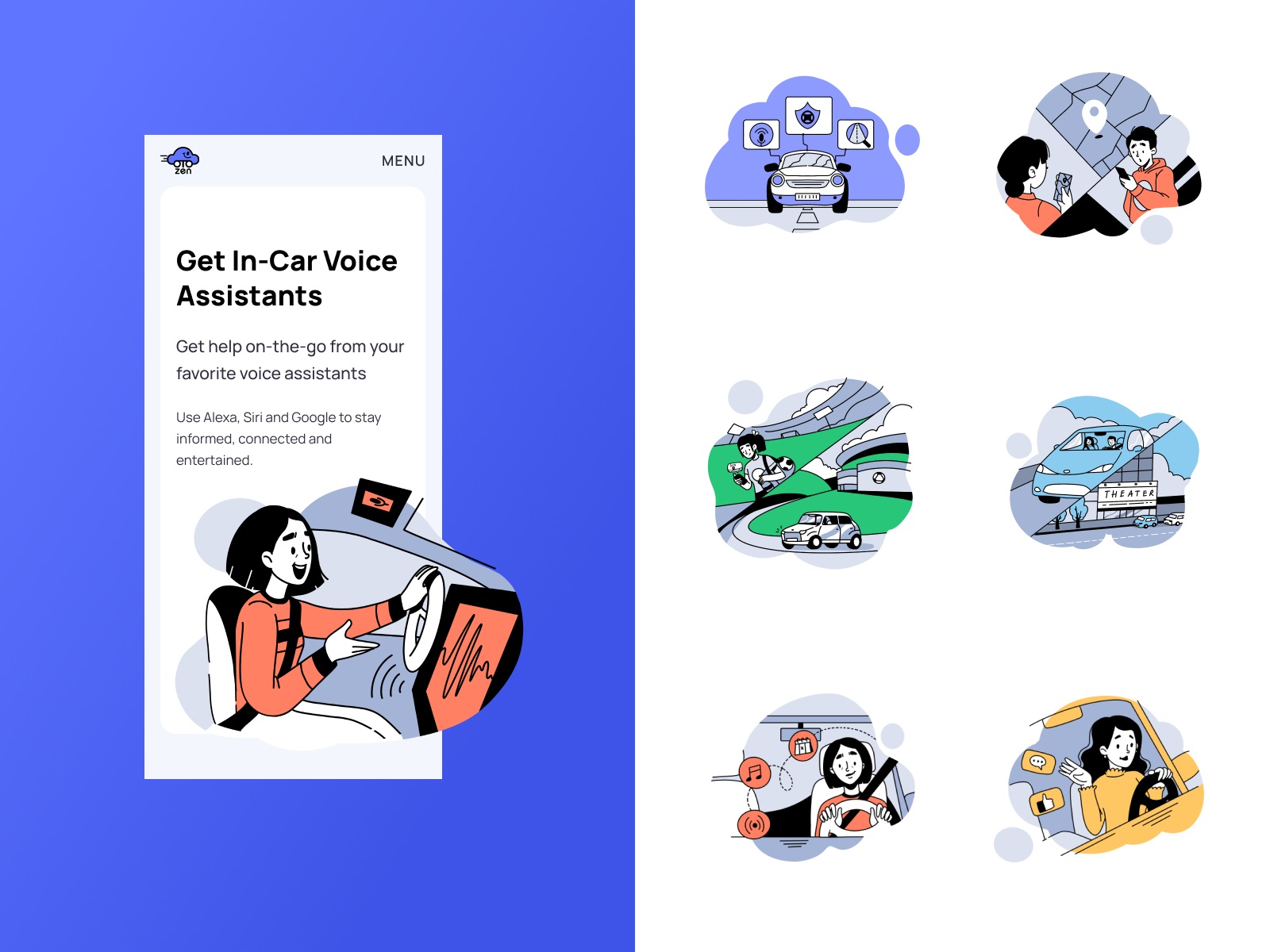
For the last few years, original illustrations applied to user interfaces have been one of the most popular and solid UX design trends. Not only do original graphics contribute to the general brand image and enhance its recognizability and memorability, but also they set a solid emotional connection between the product and its user. What’s more, they add much to the usability and visual storytelling, especially when consistent photos cannot be obtained for all the necessary demonstration needs, especially in the cases of highly technological products. The Otozen website took advantage of the custom illustrations keeping a consistent style and effectively supporting information blocks. Also, many of the pictures feature people, adding a human element to the communication. A mobile adaptation of the website makes it look attractive and work effectively from any device.
“We are very pleased with the outcome. The app UI/UX is well received by our customers. There was a consistent app UI/UX theme that was maintained throughout the development, and having the same designer working with us helped us achieve this,” the client company’s CEO wrote in his review on Clutch, and what could be the better way to finish the design story?
New design case studies are coming soon. Stay tuned!
More Design Case Studies
Here’s a set of more case studies sharing the design solutions and approaches for some of the design projects done by the Tubik team.
Nibble Health. Identity and UX Design for Healthcare Fintech Service
HotelCard. Brand Identity for Hotel Offers Service
Physica Magazine. Web Design and Graphics for Scientific Blog
CSConnect. Website Design for Immersive Experience Marketing Platform
Ready Set Recover. Web Design and Illustrations for Surgery Recovery Platform
ProAgenda. Identity and Website Design for Golf Management Service
BlockStock. Brand Identity and Website for Minecraft Models Resource
Kaiten. Identity and Product Design for Food Marketplace
Nonconventional Show. Website Design for Podcast
Crezco. Brand Identity and UI/UX Design for Fintech Service
FarmSense. Identity and Web Design for Agricultural Technology
Originally written for Tubik Blog, graphic and video content by tubik
- English
- Ukrainian


