Design Case Study: Binned. Promo Video Production
Design Case Study: Binned. Promo Video Production The design case study on an animated promo video production for a cleaning service Binned: check the full creative path from storyboard to the brightly illustrated video.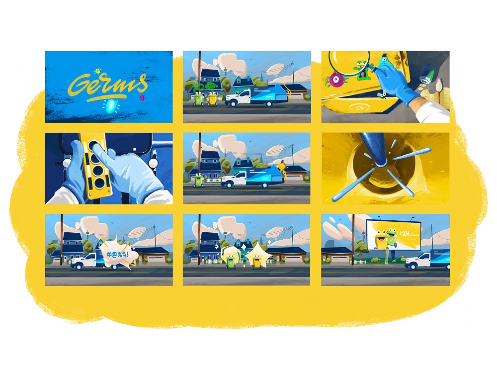
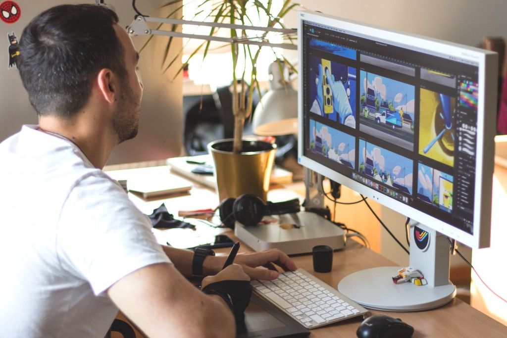
Creating a catchy and stylish promo video for a product or service is a challenging task. However, if realized wisely, it pays itself, becoming another powerful tool for growing brand awareness and promotion. Earlier we already unveiled the creative process of making a year-in-review video for Opera Software designed by the Tubik team; today’s case study is going to show you a new story on graphic and motion design for a video introducing Binned, the local cleaning service based in the USA. This time the challenge to participate in animated promo video production was assigned to studio designers Arthur Avakyan and Andrey Drobovich. Let’s have a look at the creative flow.
Task
Graphic and motion design for promotional video production presenting the local trashbin cleaning service.
Process
Binned is a service supporting a cleaner and healthier environment for the local community by washing and deodorizing the trash bins outdoors. The idea to support the brand promotion with the short, bright and catchy animated video was absolutely logical for this case: trashbins cleaning is not the topic to which people are ready to devote their precious time and read about all the benefits. Meanwhile, the promo video with funny and friendly characters could become a good way to inform the potential users of the service about all its advantages in short seconds. Moreover, activating multiple directions of perception, video was found impactful in stimulating positive emotional appeal which was to the client’s liking.
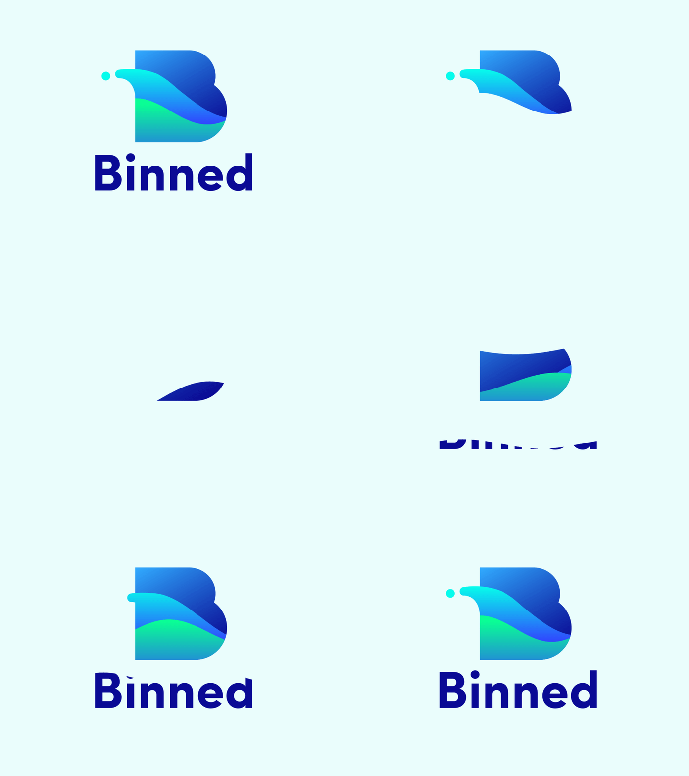
At the first stage of collaboration with the company, Tubik team created the brand identity for the service including the logo in static and animated versions as well as the pack of branded items – you could have seen the detailed design story in our previous case study. The promo video had to look consistent with the visual style applied to branding and support the idea of the helpful service improving the quality of everyday life for its clients and making the environment healthier for everyone.
Storyboarding and graphic design
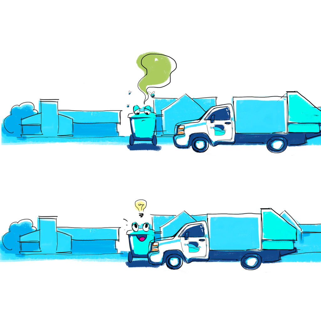
At the first stage, the client and the team agreed upon the visual concept for the video and general story it should transfer. Having got the brief and basic script of the video from the client, the graphic designer started the research and developed the first rough version of a storyboard for the story in the footage. As it usually does in the process of creating promotional videos for a company, storyboard means the illustrations arranged in the sequence of their flow for the video. They featured the images of a bin as a mascot presenting the service and the main character. In general terms, the video presented the story about a dirty and smelly trashbin which was really sad about its condition but then the truck of a cleaning service came and solved the problem quickly: dirt, insects and bad smell are removed and the bin is happy to serve people again. Below you can see the set of sketches for this stage. For this project, the graphic designer applied Adobe Photoshop for both digital sketches and final detailed illustrations.
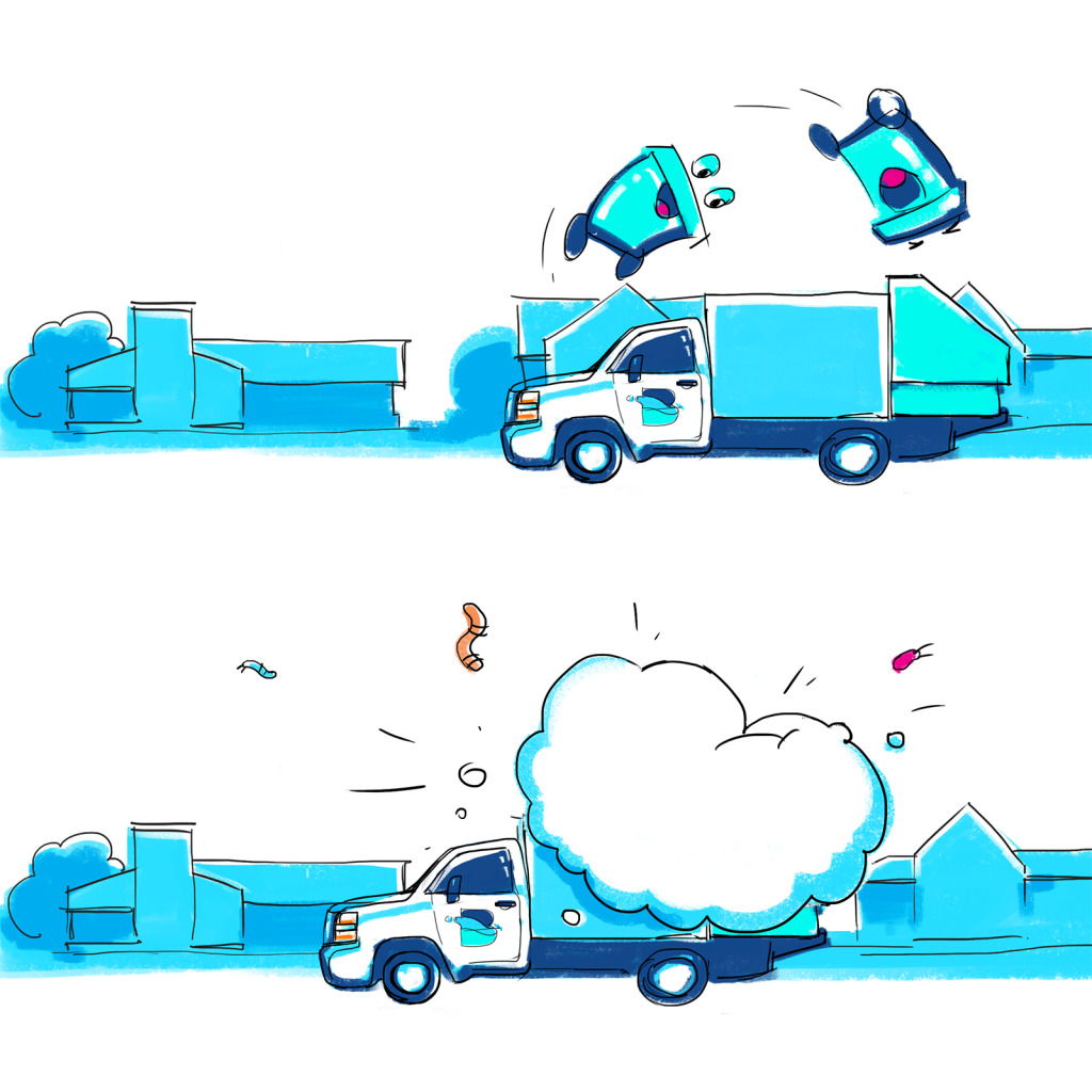
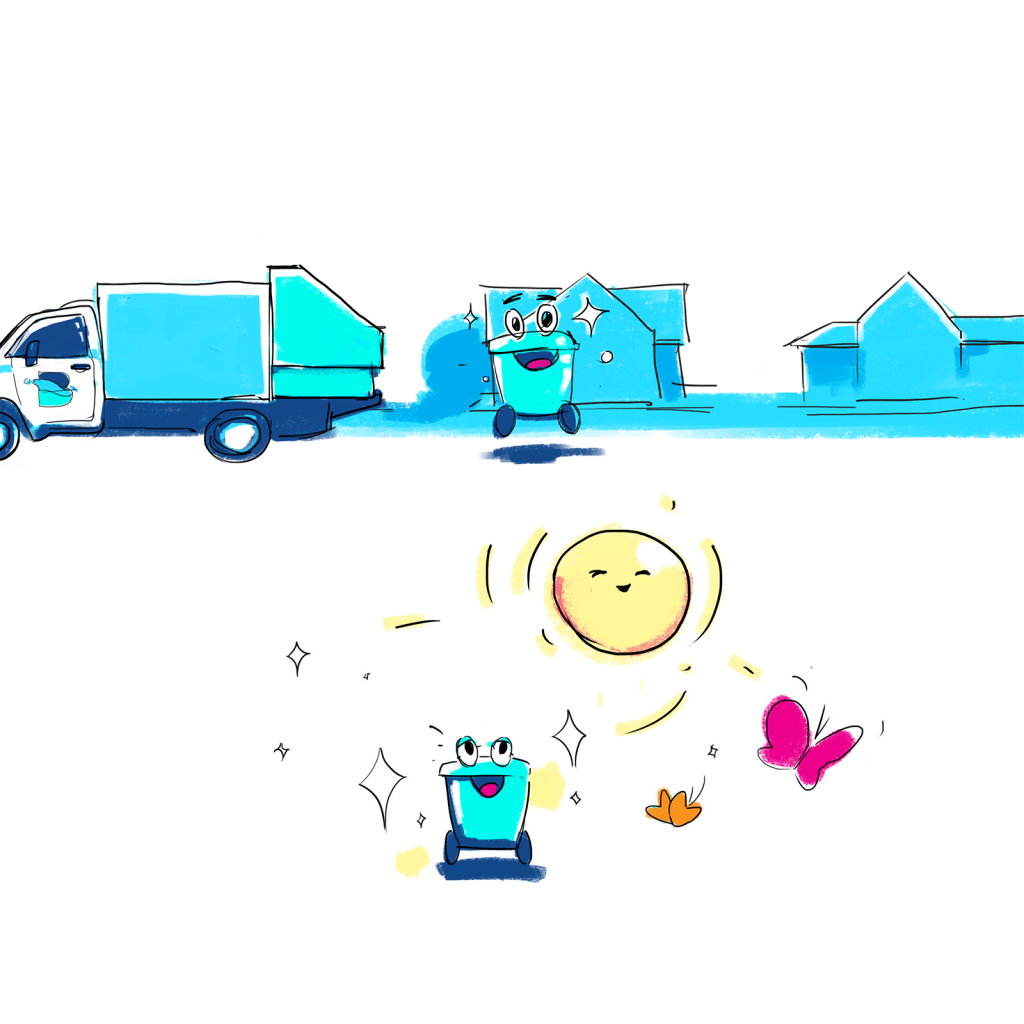
After discussing the flow with the client and agreeing upon the final number and sequence of shots for the future video, the next step meant creating a final storyboard for the video showing the scenario scene by scene. In a funny and friendly way, the short story showed the problems, which potential target audience could have, and the ways how Binned solves them easily. The style chosen for the video reflected the idea of the hand-drawn cartoon with a friendly and cute mascot. The color palette was focused on green and blue shades associated with a clean and healthy environment. One by one, the graphic designer made the final version of every part in the storyboard sequence following the consistent style and visual performance.

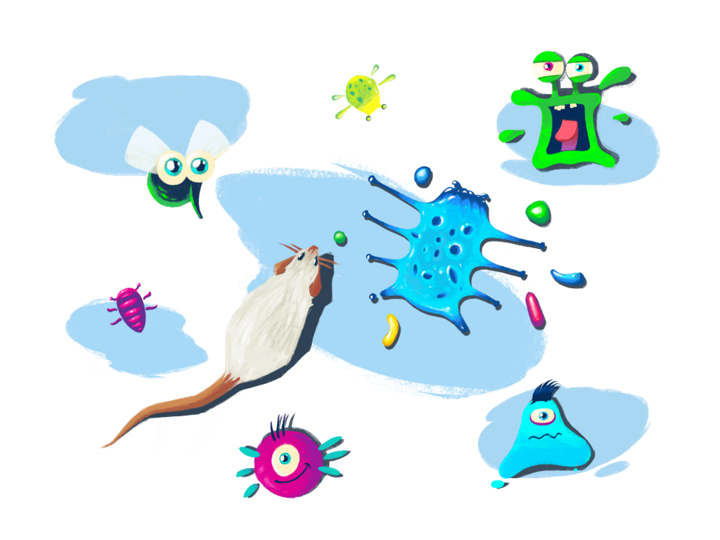
One of the microtasks at this stage was creating the funny images of the rats, insects and harmful bacterias that inhabit dirty trashbins and threaten the healthy lifestyle of the local people. Even being the negative characters of this story, they still supported the general cute and funny look chosen for the video.
As we mentioned in our guide to design in promo video production, at this stage it’s vital to set a constructive dialogue between the design team and the client: every single image in the storyboard should be discussed and approved in terms of general idea and goals set for the video. Motion design has many specific features and designers have to be ready to explain them: it can happen that clients express ideas and wishes which technically can overload the footage or look bad in the limited timing. Getting deeper into the goals and results which the client expects, designers looked for the optimal solutions which would make the video both good-looking and effective.
Animation
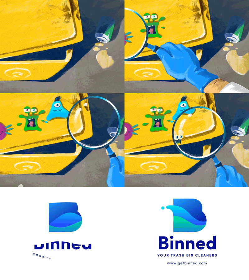
When all the storyboard was agreed upon, it was a good time to continue with motion. Here you can see how motion designer worked on visual details in different parts of the video: the magnifier glass featuring the process of a trashbin inspection, the process of loading the bins into the service truck and washing, the bins jumping happily after the wash. The design tool chosen for this type of animation was Adobe After Effects.
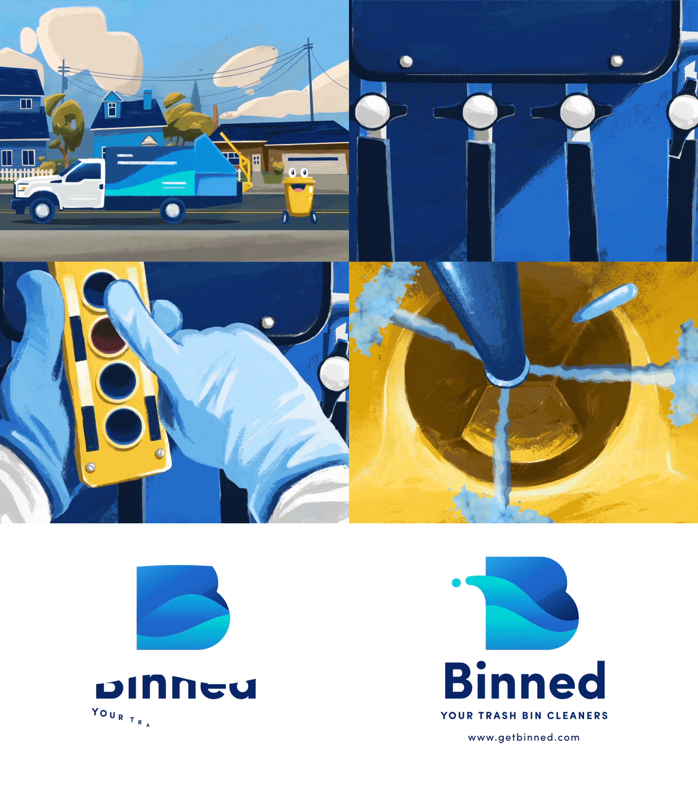
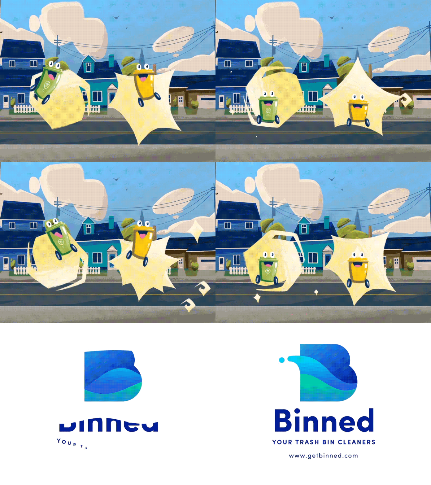
It was another project for Tubik that proved the benefits of having graphic and motion designers in one team as they work together on all the details and assets from the earliest stages of the creative process and can consult with each other any moment it’s needed. It makes the workflow dynamic and productive enabling the client to get the video without wasting time on trying to bring several teams together.
Outcome
After the animation of all the shots was finished, it was thoroughly checked along the required timing and harmonic combination with the voice-over. Here’s the final version of the video.
Binned project added one more bright page to the Tubik history providing the extensive case of participation in brand strategy for a service company, from creating visual identity elements up to consistent brand style guide and promo video. Don’t miss the updates, new case studies are just around the corner.
Originally written for Tubik Blog
Welcome to read a case study on Binned Brand Identity Design
- English
- Ukrainian


