Case Study: Pizza Brand Identity and Packaging Design
Case Study: Pizza Brand Identity and Packaging Design Case study on original packaging design and graphic items developed as a part of the tasty visual identity concept for a pizza restaurant.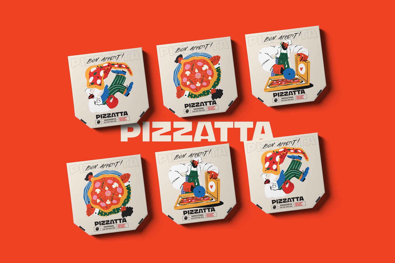
Enjoy the vibes of a tasty day with our bright and mouthwatering graphic design project. Take a glance at the original packaging design and graphic items the tubik team developed as a part of the general visual identity concept for a pizza restaurant. Have fun and buon appetito!
The design process for the project included the following creative tasks:
- logo design and brand color palette
- a consistent set of original brand illustrations
- packaging design for different types of pizza
- some branded items design
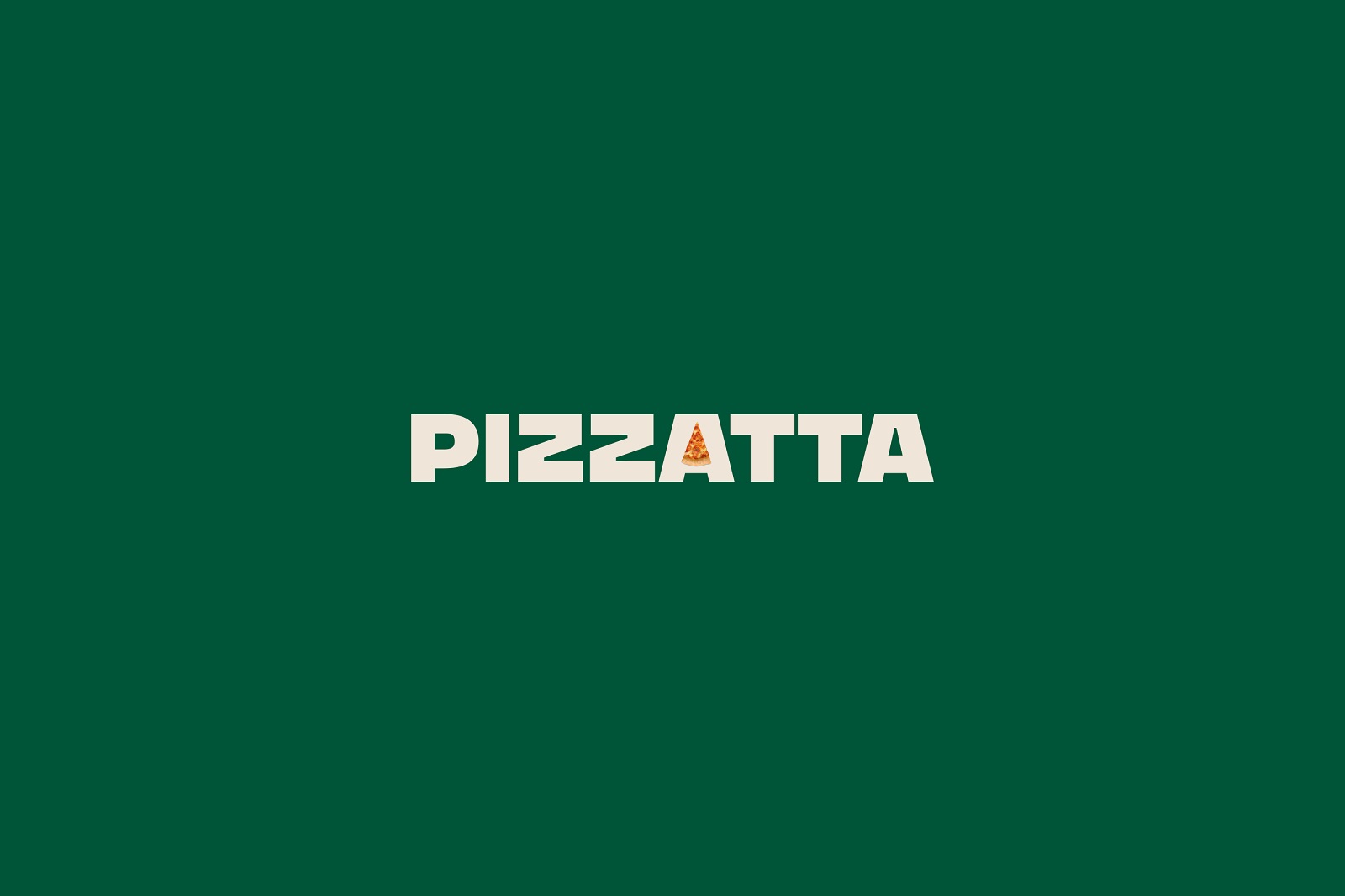
The logo design features a wordmark using a bold and stable font and echoing the shape of a pizza piece in one of the A letters. Applied to pizza packaging or branded stuff, the logo can work well in both filled and line versions. The color palette features a combination of contrastive bright, juicy colors, sharing the vibes of energy and cheerfulness: green, red, orange, and yellow.
A consistent set of illustrations was created to make the branded pizza boxes look emotional, recognizable, and original. It featured various people characters for different types of pizza. The typographic contrast also adds its two cents to make the general visual style of the brand expressive and memorable: filled and lined versions of the logo wordmark play this game together with the Bon Appetit phrase presented in artistic handwritten font style.
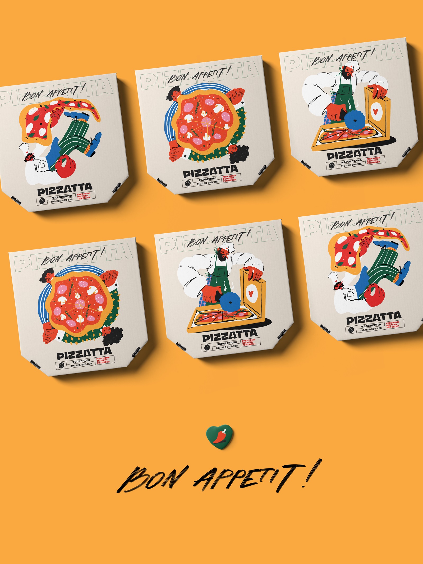
Here’s a look at a packaging design with custom illustrations for the most popular pizzas: Margherita, Pepperoni, and Napoletana.
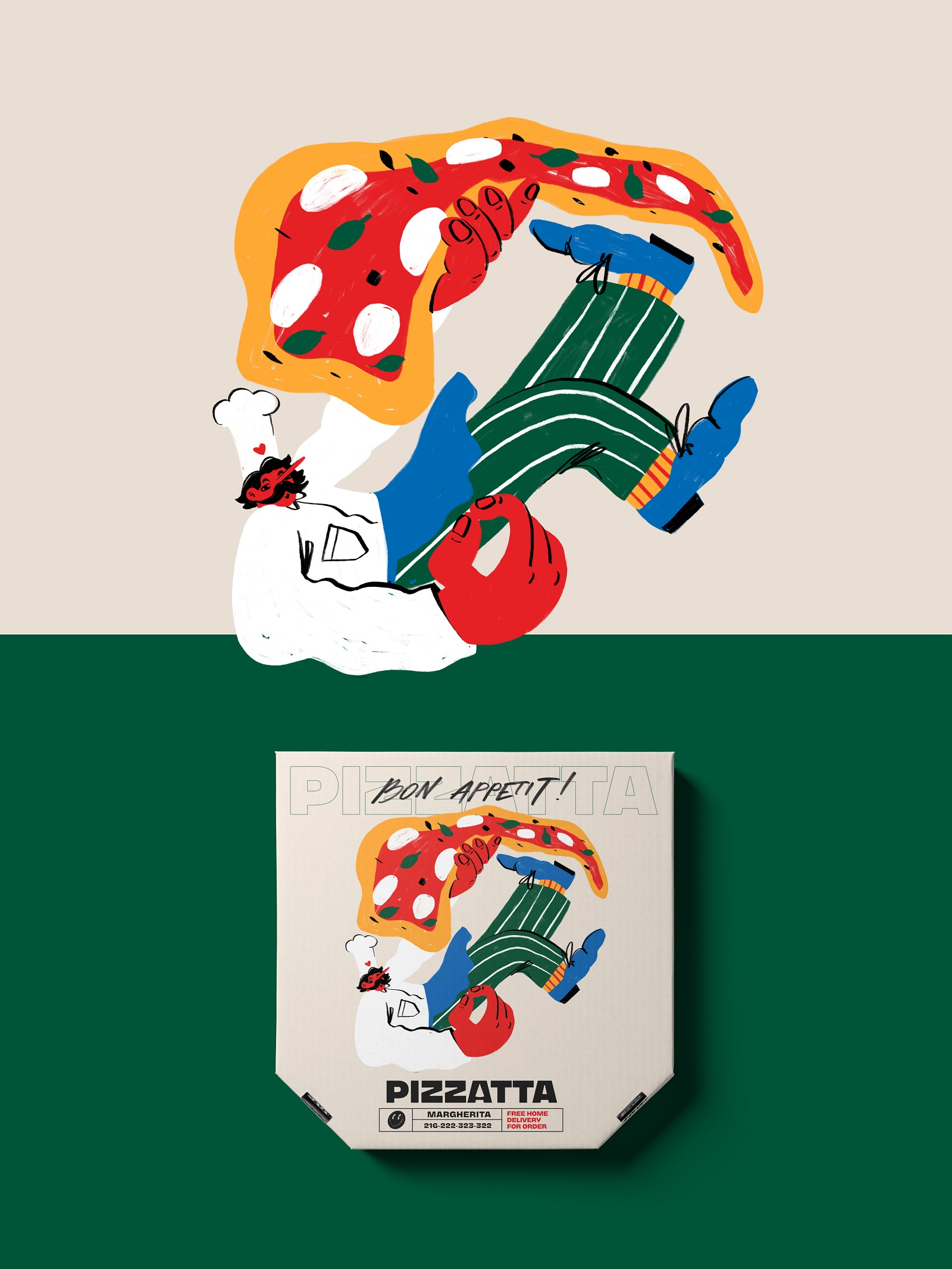
Margherita pizza illustration and packaging design
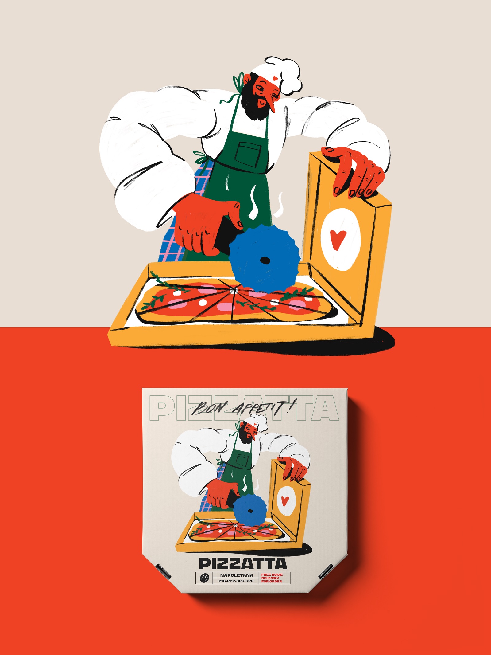
Napoletana pizza illustration and packaging design
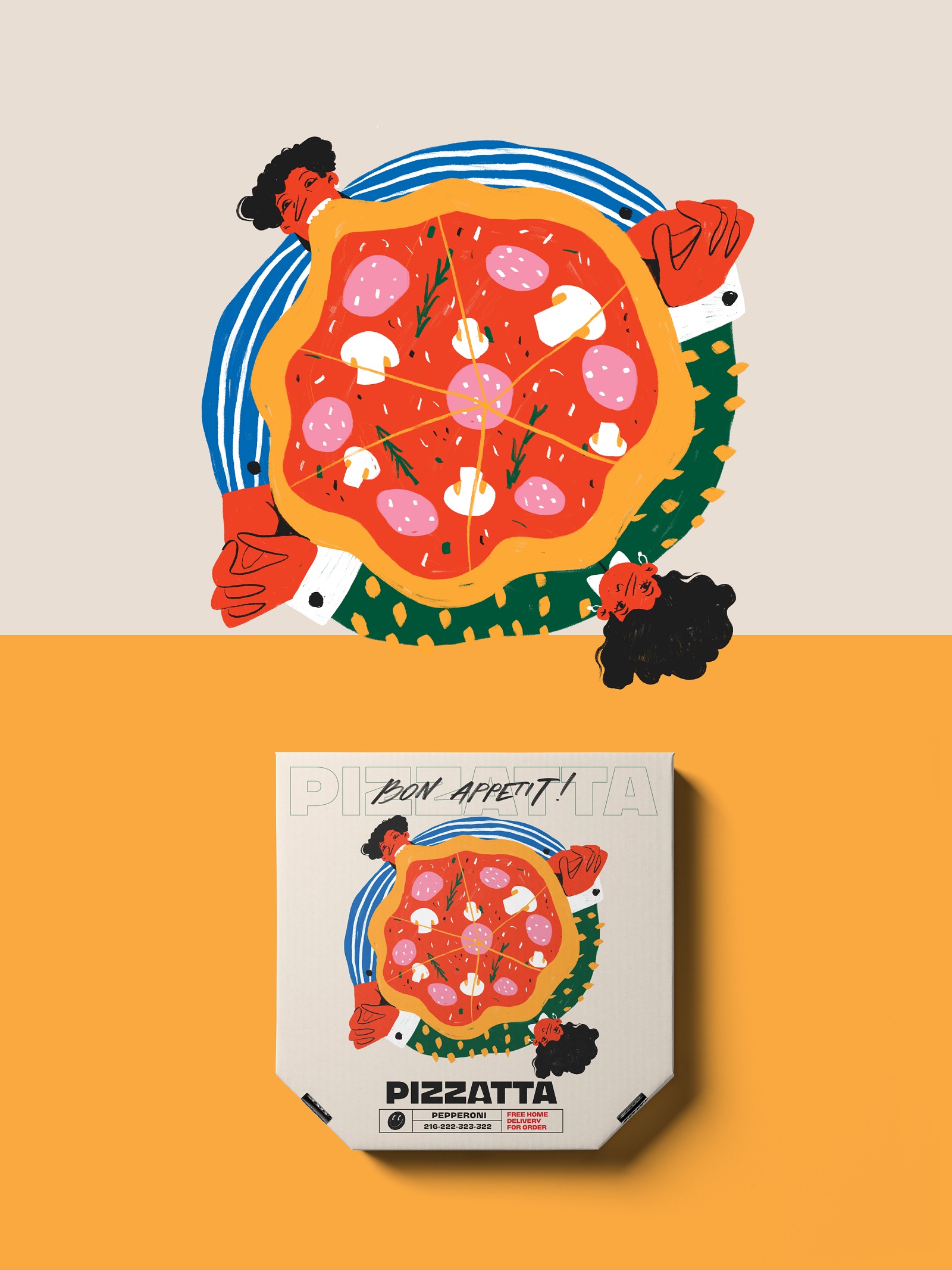
Pepperoni pizza illustration and packaging design
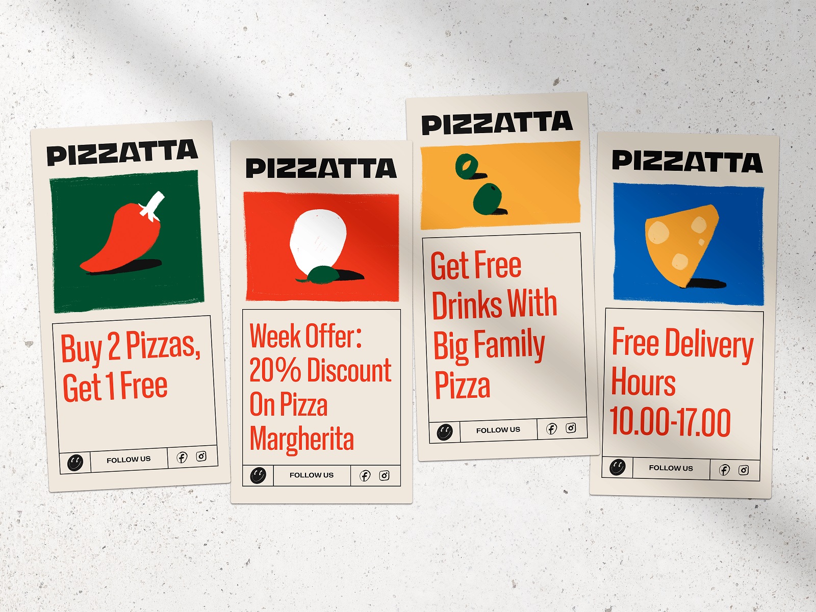
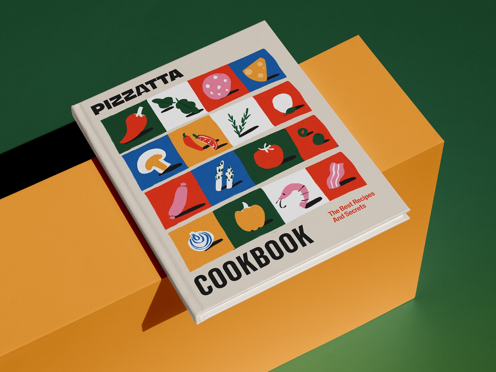
The illustration style was also extended to another set of theme graphics reflecting some ingredients typical for pizza fillings. This type of graphic details makes the visual style flexible for different marketing goals, as they can be effectively used either separately or in patterns and combinations. Here’s what they look like integrated into branded items such as special offer cards and cookbook cover designs.
New design case studies from our team are coming soon. Stay tuned!
More Design Case Studies
Here’s a set of more case studies sharing the design solutions and approaches for some of the design projects done by the Tubik team.
Pencils of Promise. Picture Book Creation Process Step by Step
Gofe. Packaging and Marketing Design for Coffee Brand
12 Bright Projects on Visual Identity and Packaging Design
Love Sign. Gift Box Packaging Design with Romantic Vibes
KOISI Tokyo. Packaging Design for Japanese Restaurant
Sidra Vivo. Vibrant Packaging Design for Cider Brand
Page Turner. Identity and Packaging Design for Bookstore Chain
SwitLuv. Theme Packaging Design About Love for Sweets Brand
Garden Gates. Identity and Packaging Design for Garden Center
Bikker. Identity Design and Illustrations for Biking Service
Kaiten. Identity and Product Design for Food Marketplace
Glup. Delivery App Branding and UX Design
BEGG. Brand Packaging and Web Design for Food Product Ecommerce
Crezco. Brand Identity and UI/UX Design for Fintech Service
Originally written for Tubik Blog, graphic content by tubik
- English
- Ukrainian


