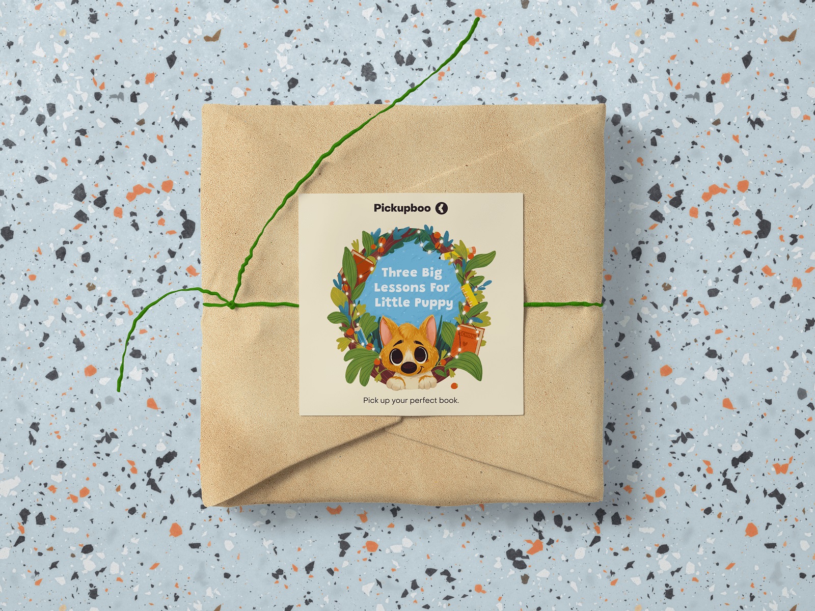
Case Study: School Puppy. Picture Book Illustrations and Character Art
Case Study: School Puppy. Picture Book Illustrations and Character Art Creative process behind a picture book for children: writing and visual storytelling, sketching, character art, illustrations, and graphic design.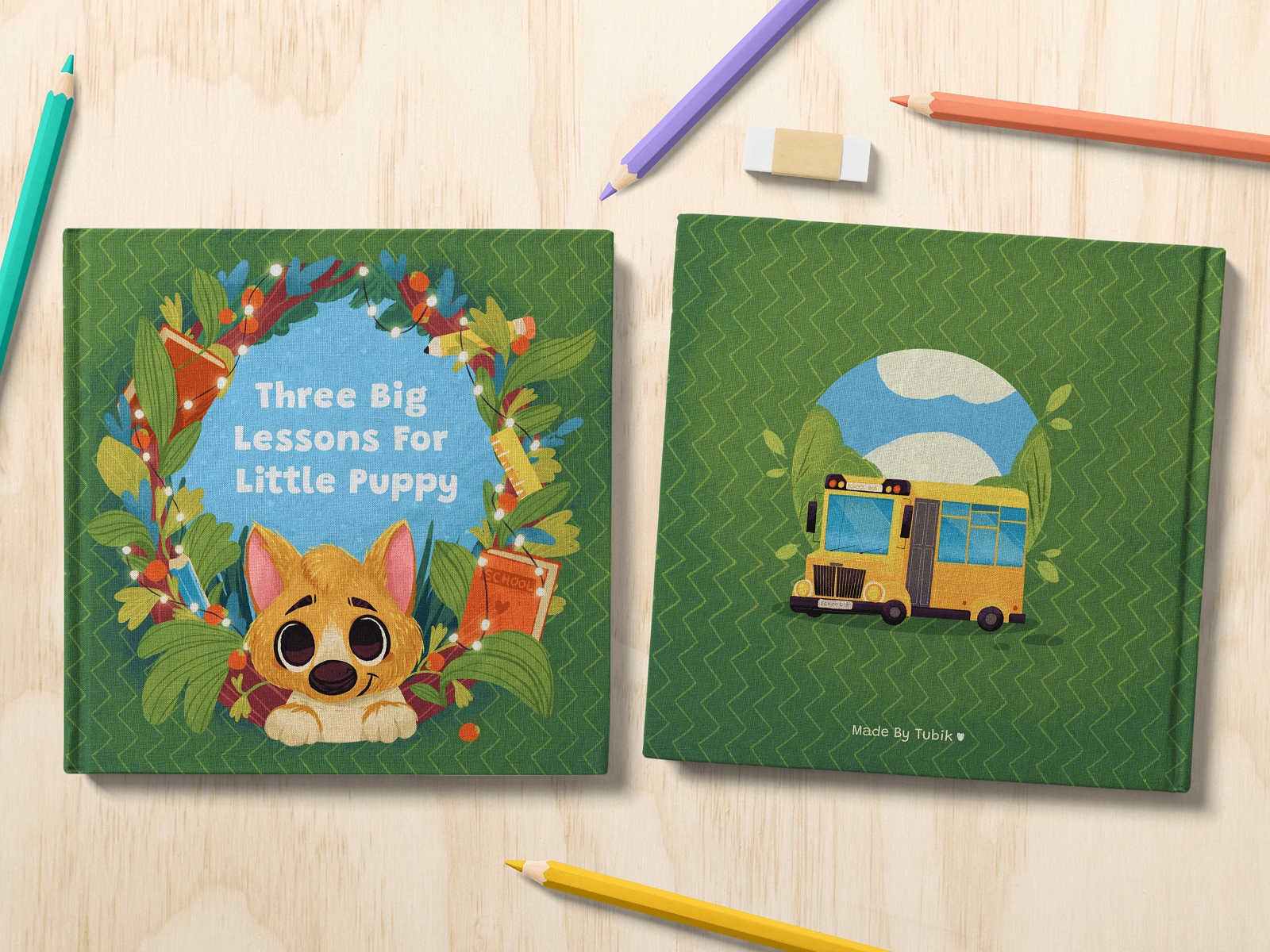
This case study unveils our recent project, which is filled with the bright cheerfulness of childhood. Here, the Tubik Arts team worked on a picture book for children, with a full range of tasks, including writing, character design, illustrations in different formats, and graphic design. Let us examine the creative process behind a children’s book by Maryna Solomennykova, Marina Yalanska, and Arthur Avakyan.
Idea and Story
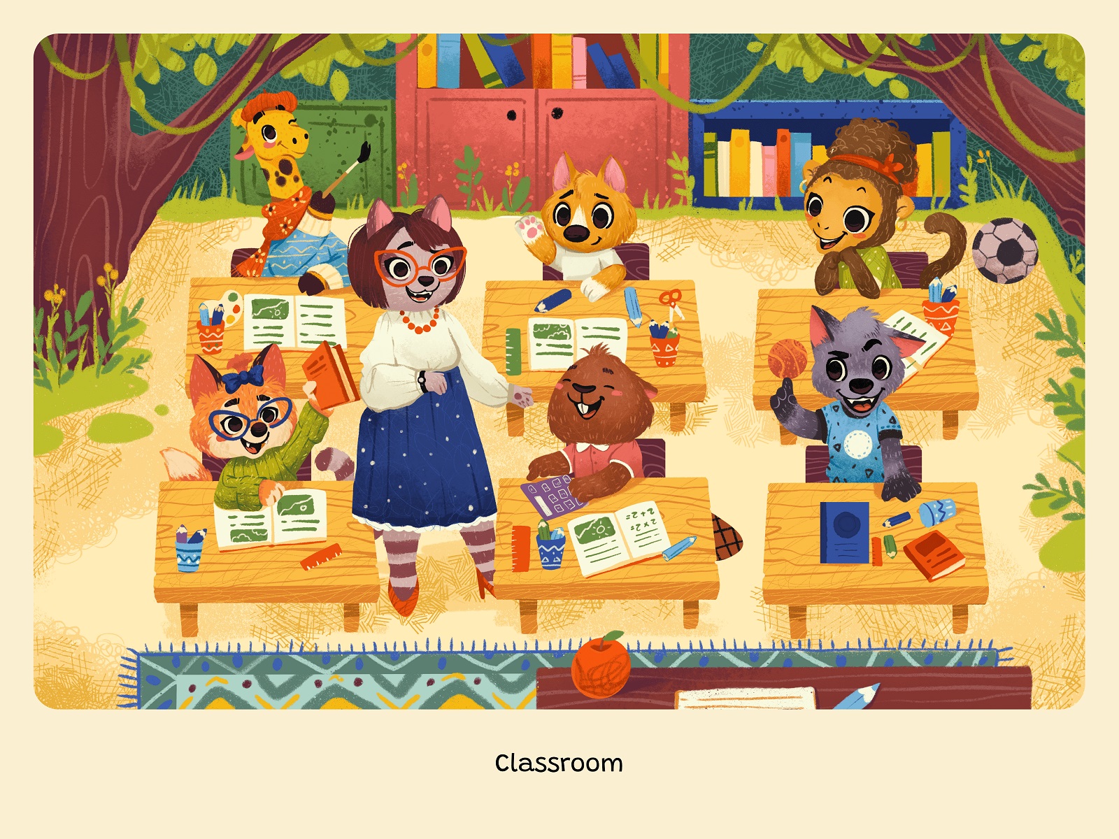
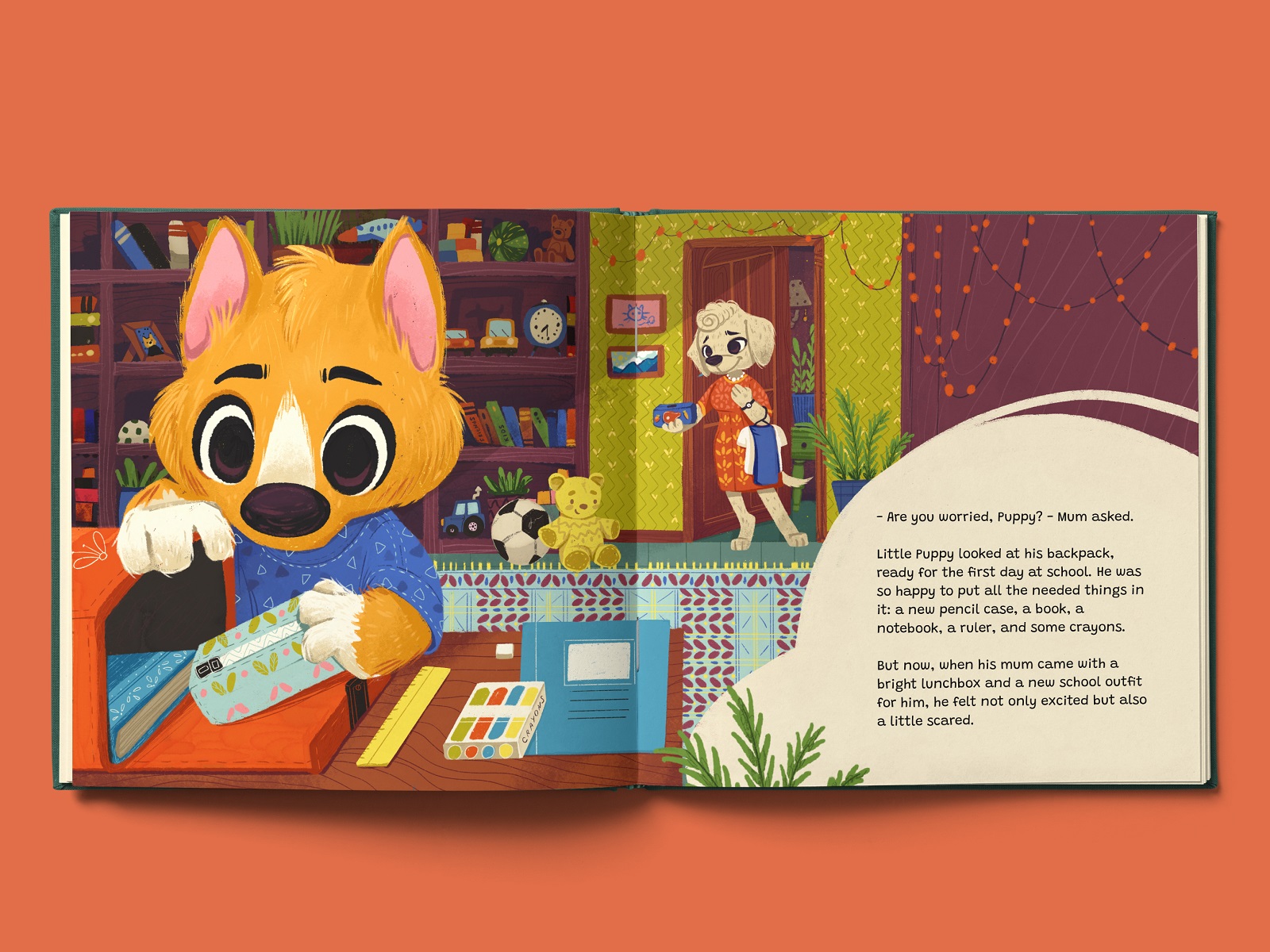
The general idea behind the picture book story was to support children preparing to start primary school and who are worried about it. It uses a classic approach to the kidlit aimed at preschoolers and primary school readers, when the fairytale uses animal characters featuring human traits and behaviors. The main character is Little Puppy, and the story is about his first day at school, his feelings and worries, and three big lessons about friendship that are very important to learn. So, through the story development, he meets many secondary characters and deals with the typical primary school background and environment.
In our case, creating a picture book started with deciding upon the general idea, plot, and approach to the type of character reflection. Afterward, the writing part was done first to let the design team understand the entire volume of textual material and define the scenes that are the best for visualization to make the storytelling emotional and engaging for little readers. However, it doesn’t mean that the writing stage was accomplished independently: to make the process more effective, the writer worked on the text advised by the illustrator and kept in mind the possible visual presentation options for different parts of the story.
When the story was completed, making it live with pictures started.
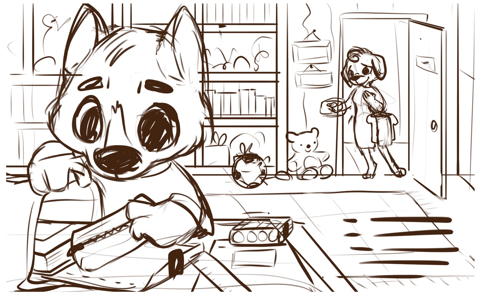
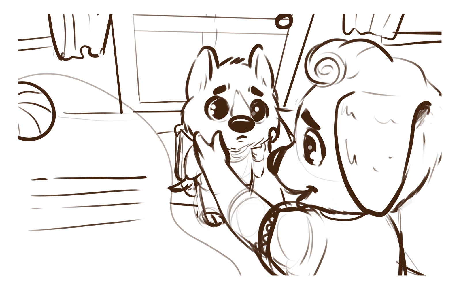
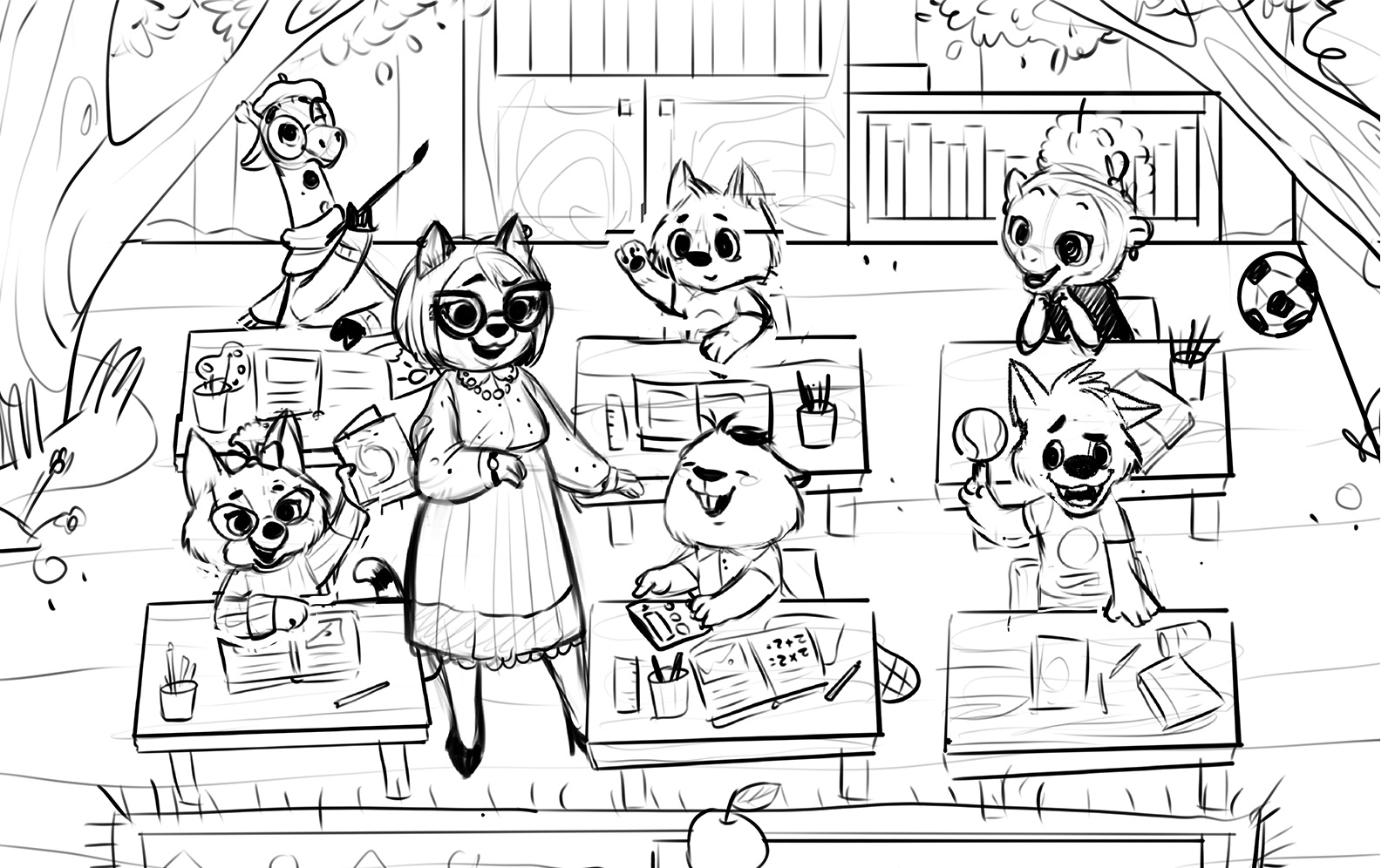
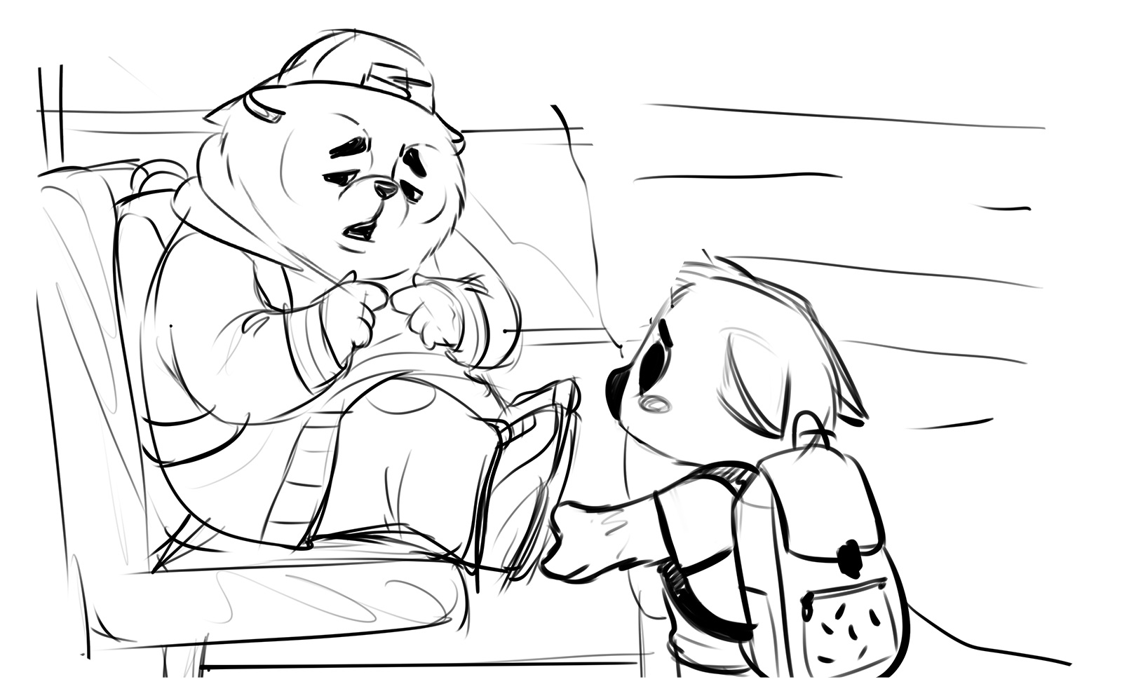
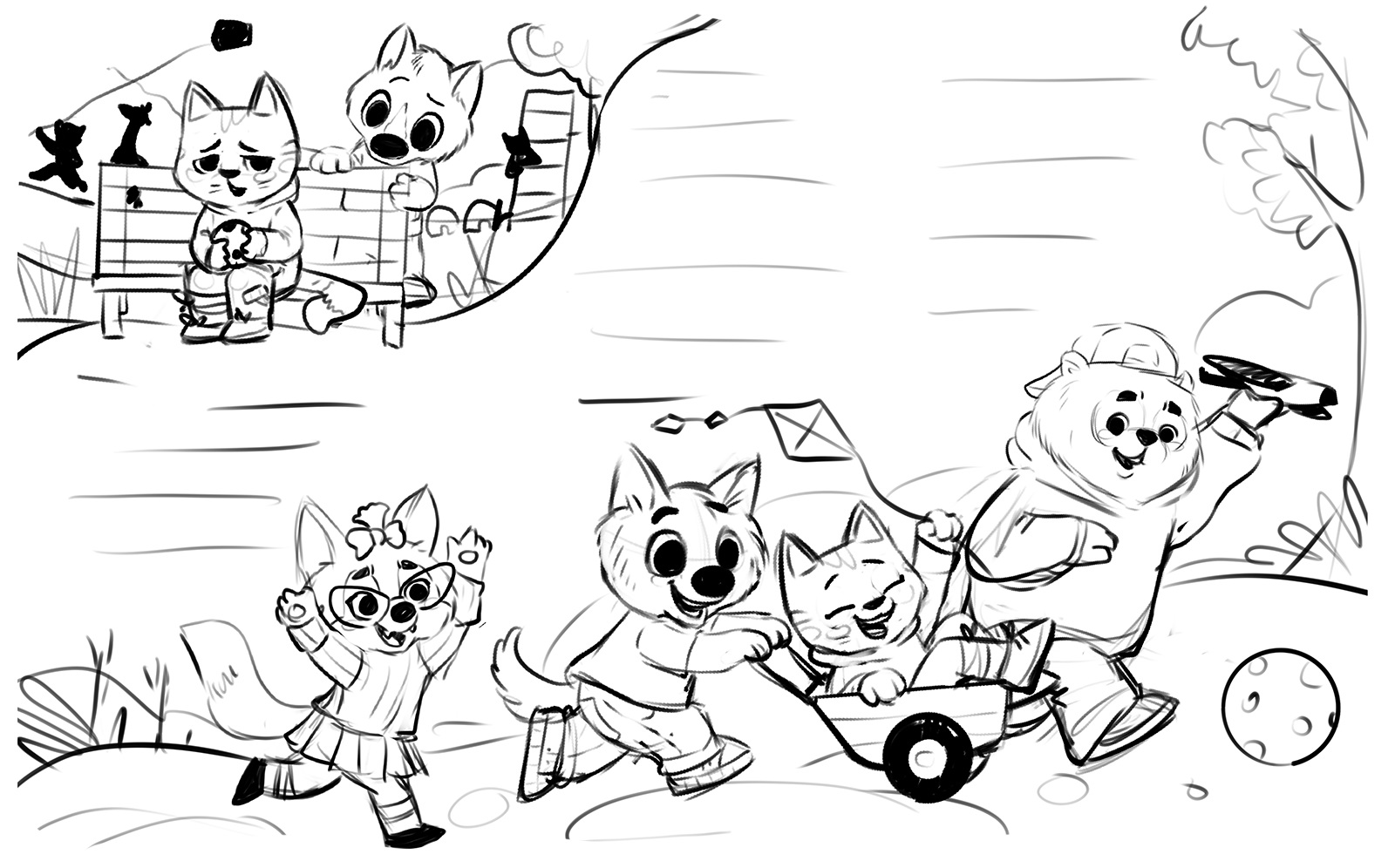
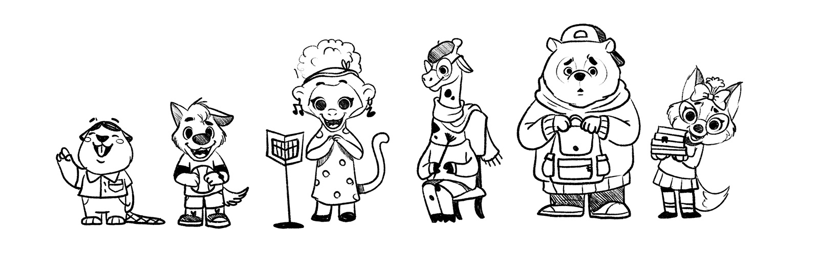
Sketches and Character Development
At the early stage of visualization, the illustration artist started with quite detailed sketches to figure out what the particular scenes would look like, their composition, and how they would influence the primary emotions and events the book tells about. In addition, this allowed us to plan the page’s structure with space for text blocks describing the specific scene. At this stage, the artist also worked on the character concepts, their proportions, facial expressions, and visual details of personalities. As in the book, they had to deal not as separate elements but as one system, it was crucial to think over them from such a perspective to keep them consistent from one scene to another.
Let’s glance at some of the sketches obtained at this creative stage.
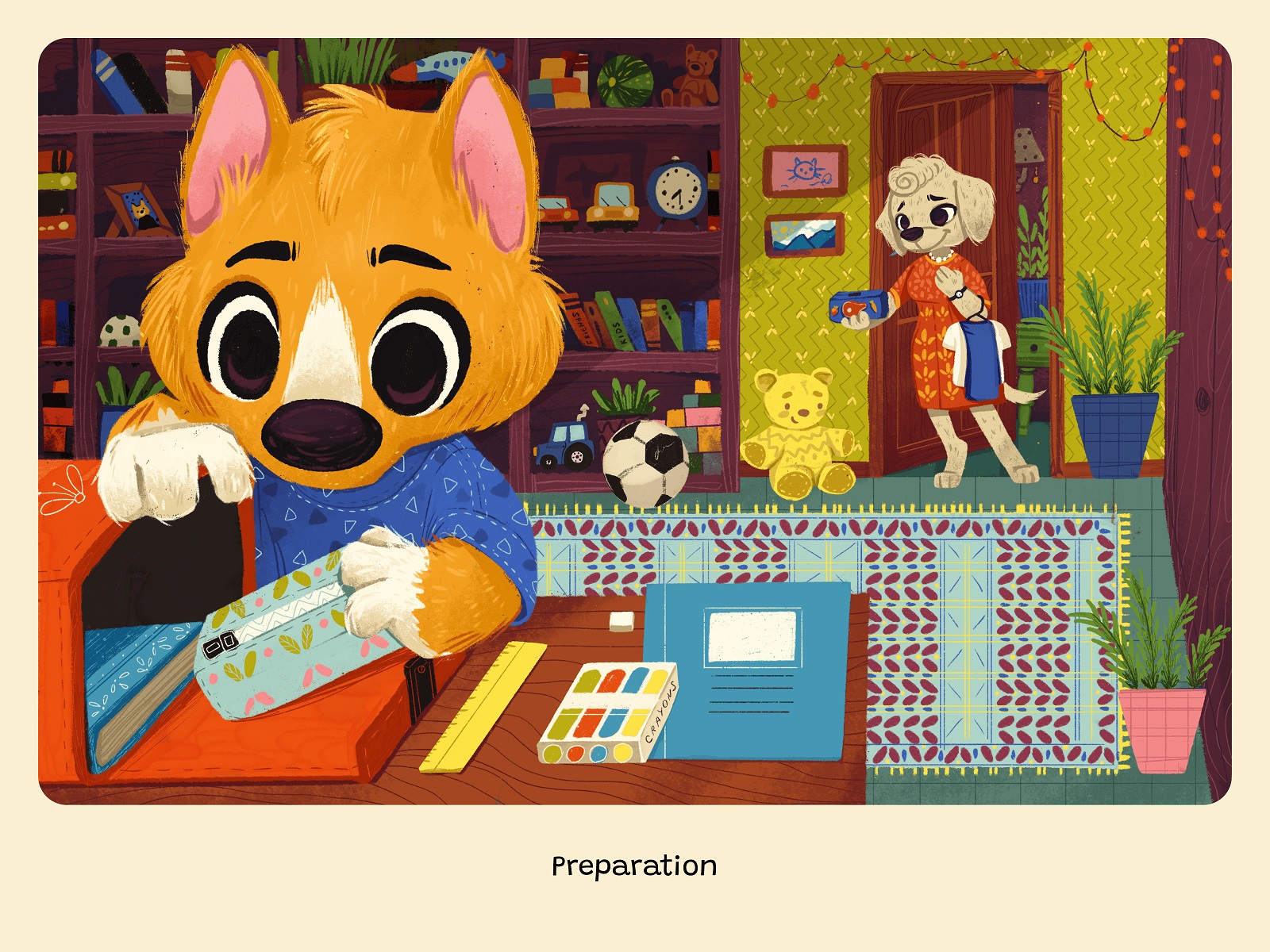
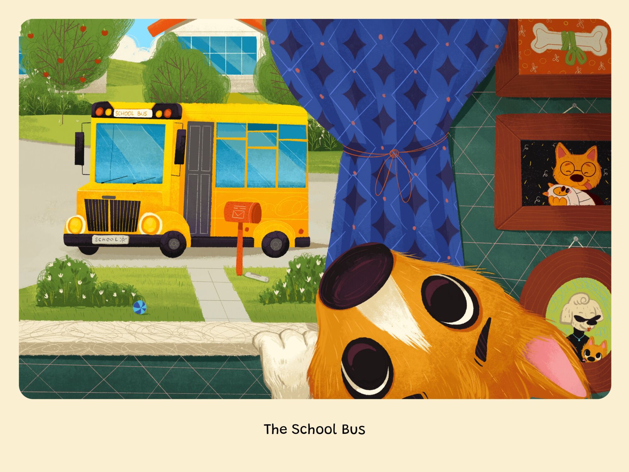
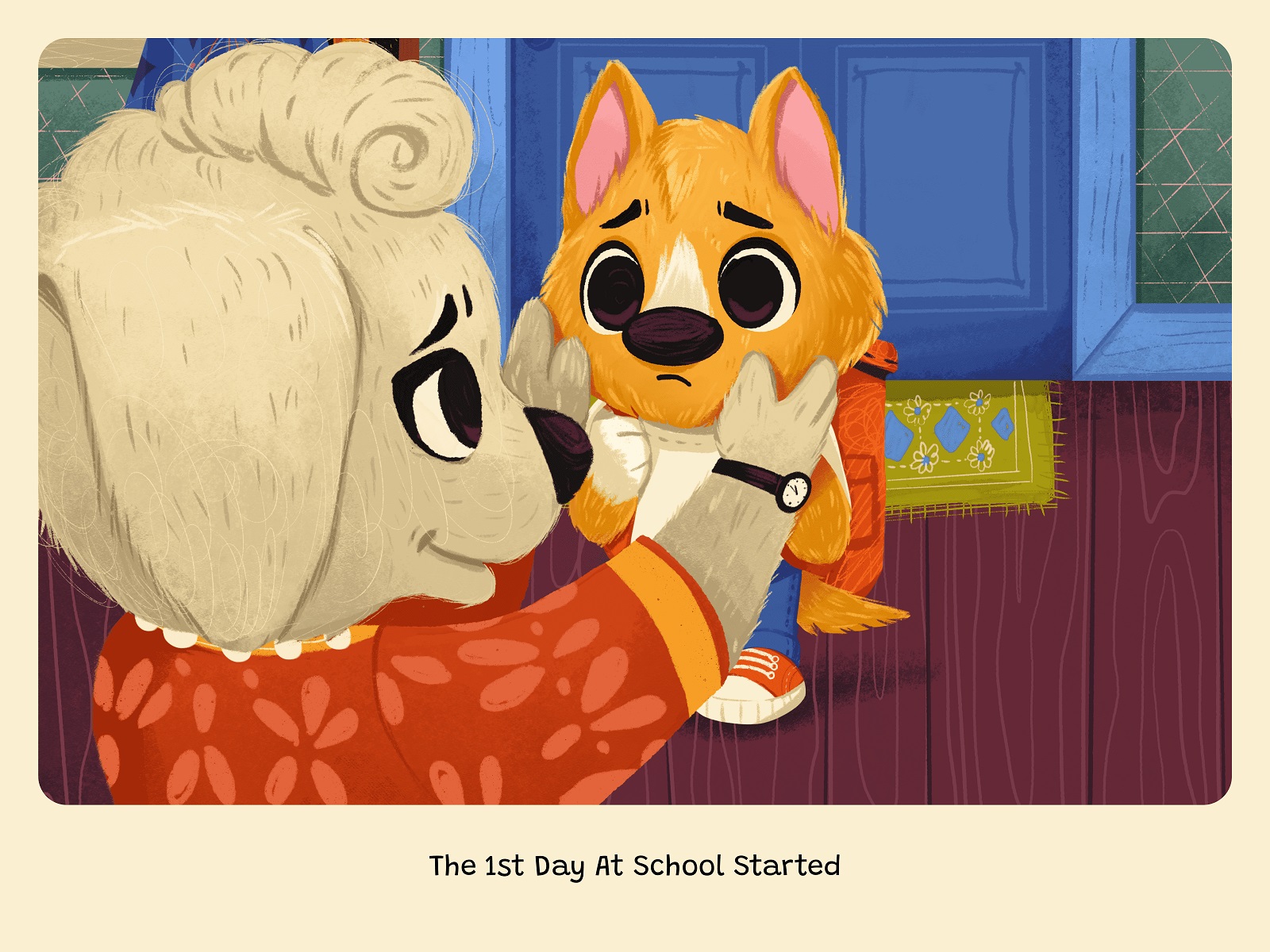
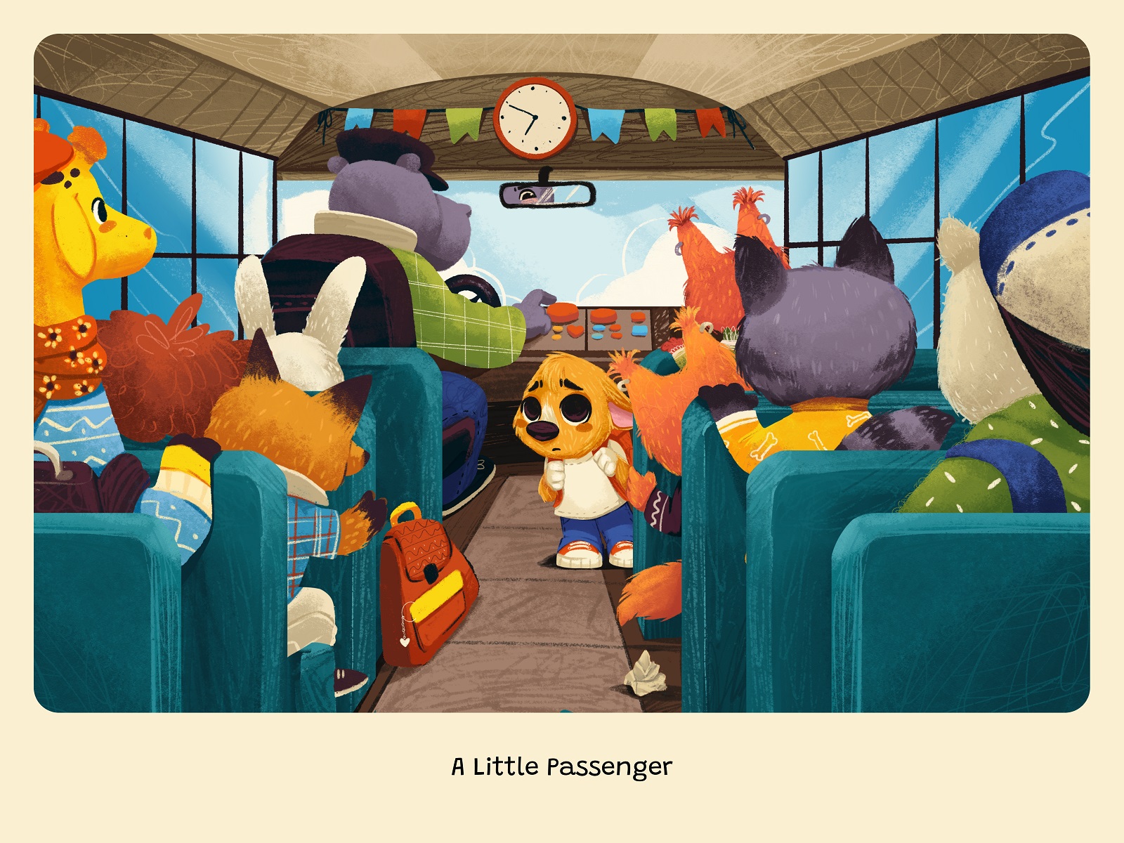
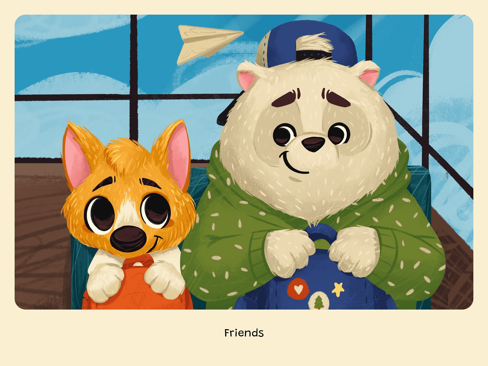
Illustrations and Character Art
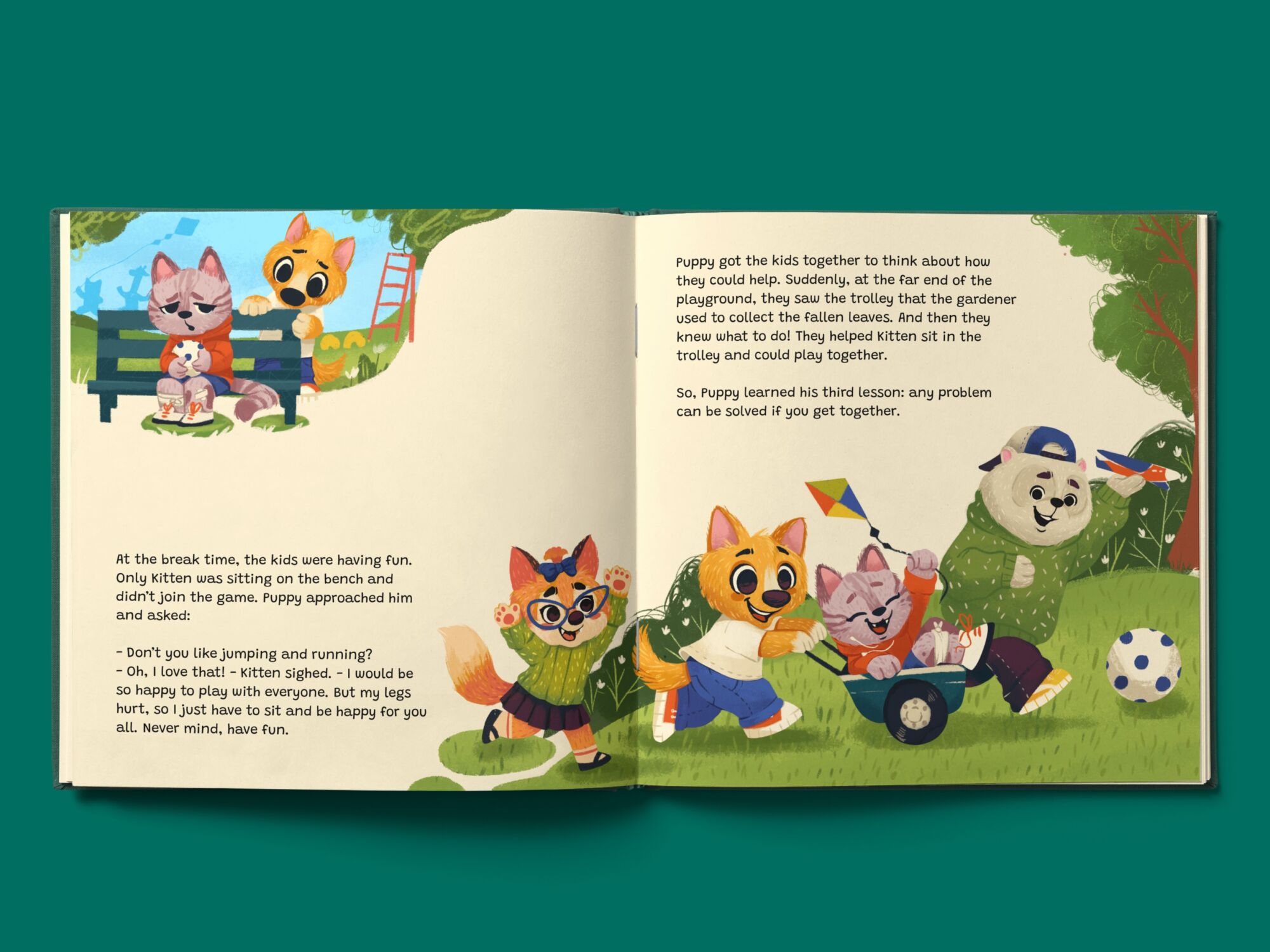
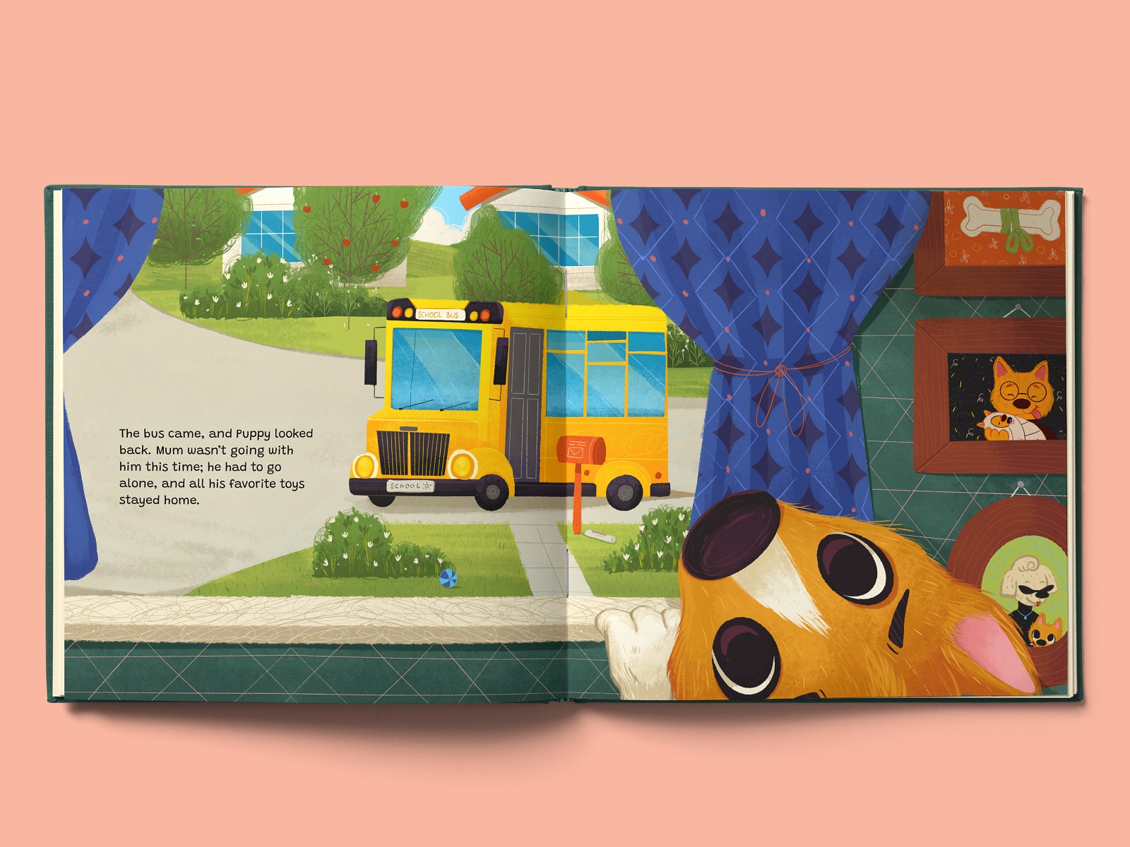
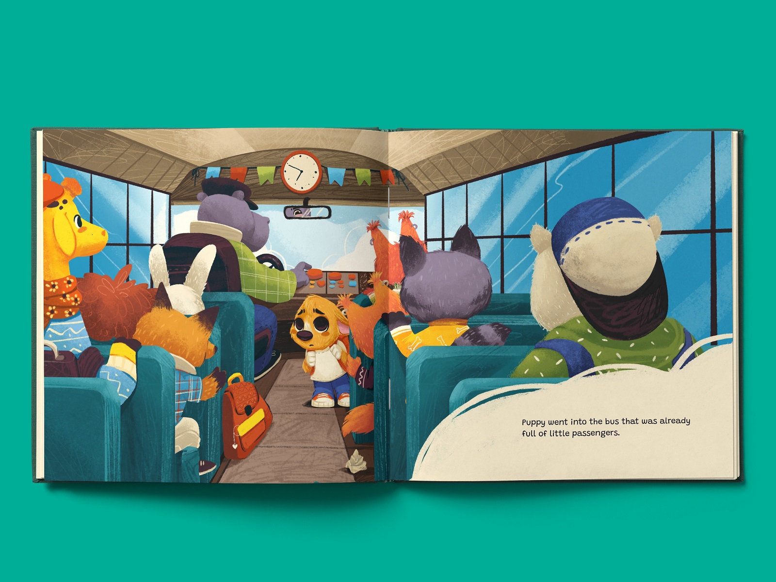
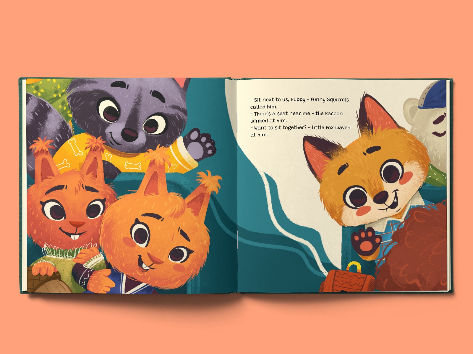
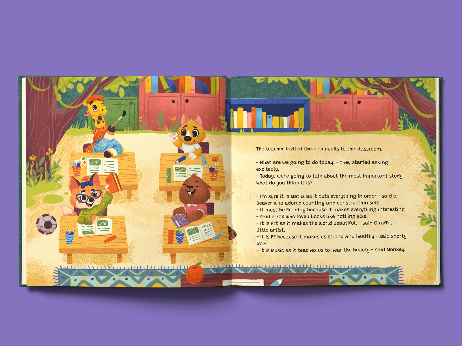
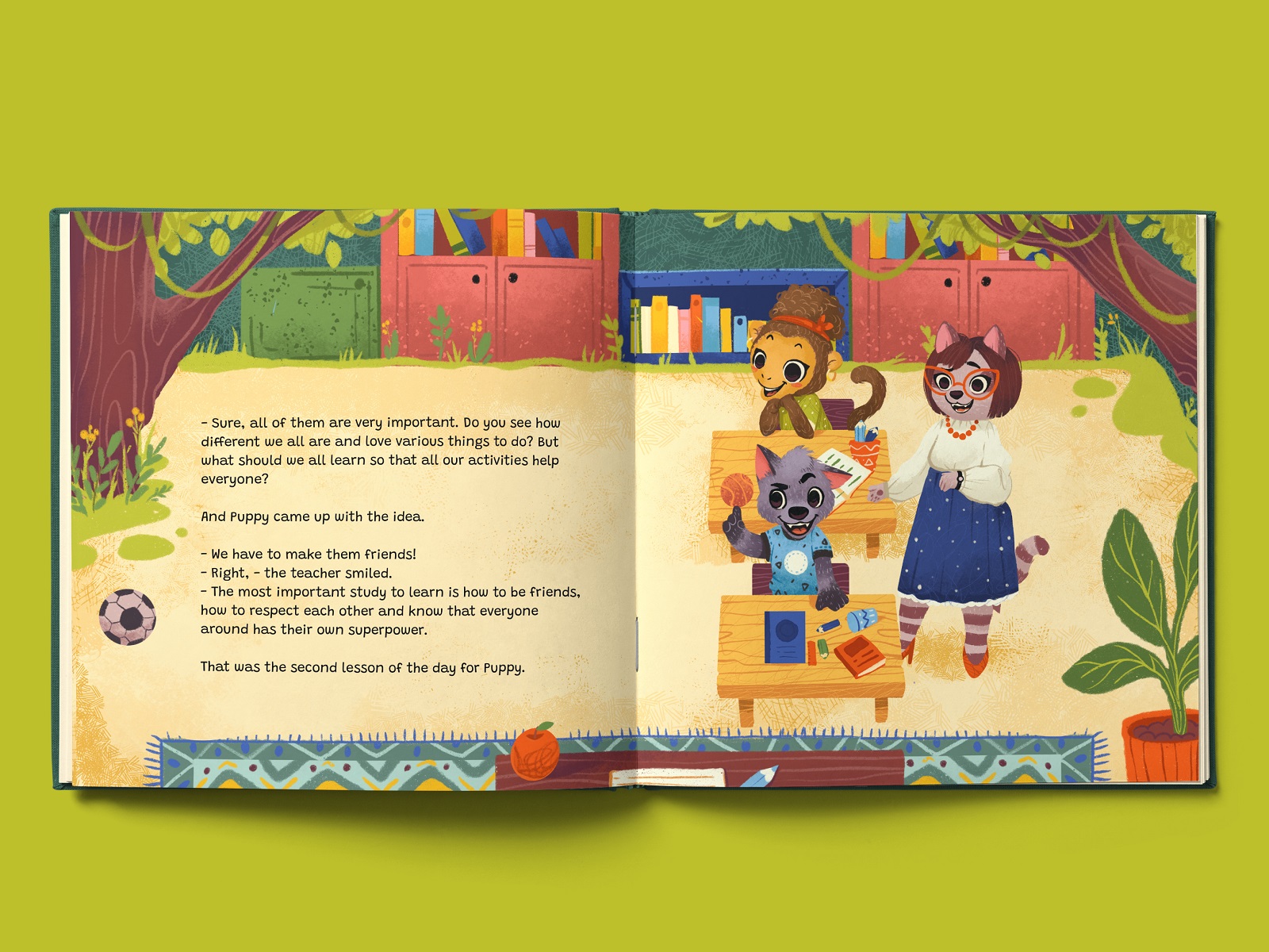
The brightest part of the process started when the major scenes were sketched and character concepts developed. The illustrations began getting colors and details, textures and patterns. The color palette is vibrant and multicolored, yet wisely selected and contrasted to be eye-pleasing and not overload kids’ eyes. Another thing worth mentioning is that the artist fills the environments with various interesting details that create the atmosphere and engage children in deeper exploration. That is especially handy for cases when an adult reads the picture book, and a child who cannot yet perceive the story primarily based on the pictures they look at. So, due to the colors and details of the environment, they quickly catch the atmosphere of a particular place and distinguish the home from school, for example, or can almost hear the sound of a motorway behind the window of a school bus or the typical noise of children playing during the break.
Here’s a look at some illustrations developed for the picture book based on that approach.
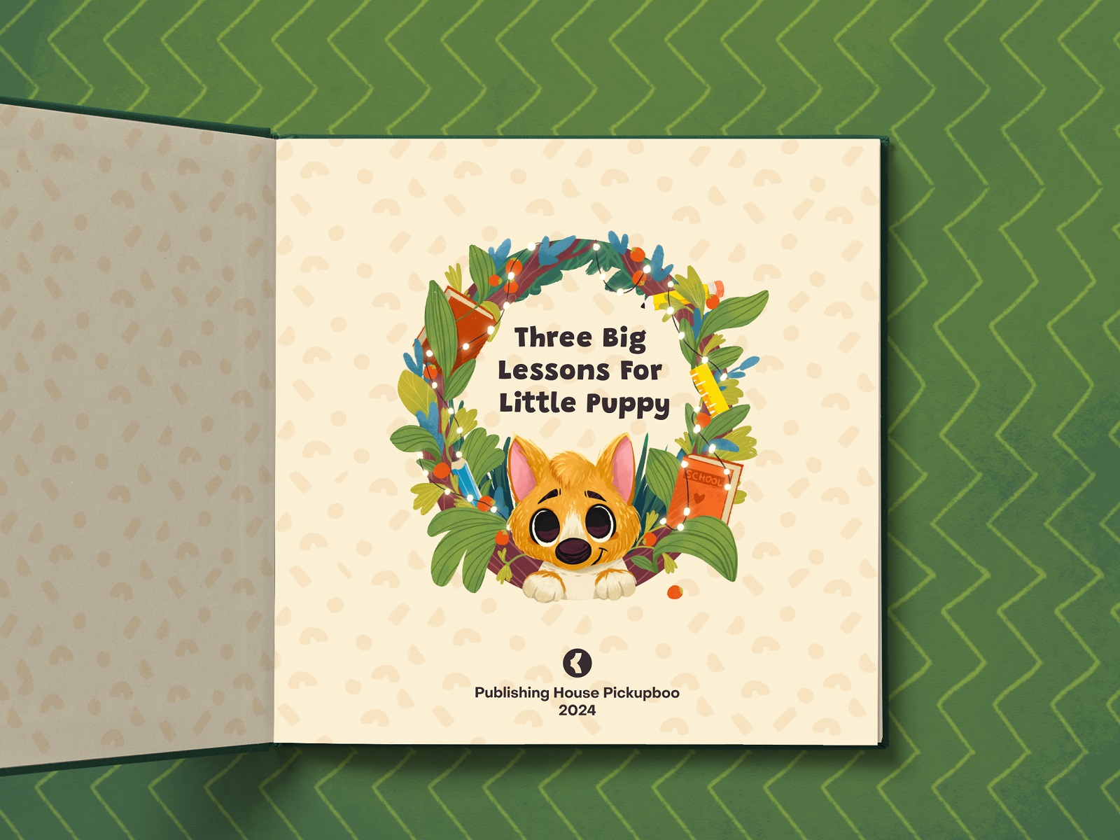
Book Design
After the illustrations were ready, it was time to start the design stage. The art and text had to combine and work together in harmony and balance. The typographic approach is based on the playfulness, but high readability and legibility of the chosen font. Although the illustrations are brightly colored, the spaces for the text blocks use a light background to make sure that it’s easy to read. The pages look consistent and united; still, there was no standardized approach to the grid, as each spread was designed individually based on the size and composition of the illustration for that specific scene.
So, let’s see the final look of the picture book design, from the book cover and endpaper design, from one book spread to another, and check how the art, text, and design get together to make this kind and cute story work for little readers.


For our team, this project was a great experience because it involved going through the whole picture book creation process, diving deep into the specific nature of art and design for this market segment, finding ways to make it more efficient, and checking what tools and approaches are handy at each stage.

Originally written for Tubik Blog
For more inspiration, check the other posts from our D4U Gallery, where we gather impressive creatives to share their art with you, for example:
- Christmas video production process
- Christmas illustrations for greeting cards
- character illustrations for an educational project
- tips and practices for artistic inspiration
- wildlife-inspired illustration projects
- vibrant digital illustrations collection
- illustration-based packaging for food and beverage
- artistic packaging design for a biscuit brand
- abstract poster designs
- food lovers guide: illustrations and graphic design
- 3D character art projects
- wine packaging design
- captivating 3D animation concepts
- impressive packaging designs
- childhood illustrations
- 3D illustrations
- English
- Ukrainian