Design Case Study: Explainer Video Production
Design Case Study: Explainer Video Production The case study on explainer video production for OffCents, the app contributing to the healthy environment: check stages of graphic design and animation.
An animated promotional video is a creative way of product marketing. These small catchy videos can show all facets of a promoted object in the best way proving people it’s worth of their time and money. That’s why an animated video is one of the efficient marketing tools helping to encourage people to buy a certain product or use the services of a company.
We’ve already shared our cases showing animated promo video production of a year-in-review video for Opera Software and an animated video for Binned. Today we present a new case of an explainer video production. The task was assigned to Tubik Studio designers Denis Boldyriev and Andrey Drobovich. Let’s take a look at the creative stages of graphic and motion design process.
Project
Graphic and motion design for an explainer promo video presenting the mobile application.
Process
Our designers received the task from a product company OffCents. The mobile app aims at fighting global warming and environmental pollution. It provides real-time, automated tracking of carbon emissions from transportation. From the OffCents application, users choose to offset their carbon footprint from any number of their car, train, or airplane trips. The app helps users to control a number of emissions and purchase offsets or Verified Emission Reductions (VERs). This way people fund various carbon-reducing projects and support a healthier environment.
The company made a request to create an animated promo video for OffCents app. The video was expected to be an explainer assisting users to understand the specifics of a product as well as the benefits it can bring to them and the environment. In our article Step by Step Guide to Custom Promo Video Design, we’ve already described the stages of animated video production. They usually include the following steps:
- research stage: target audience and market research
- pre-production stage: script writing and storyboarding
- production stage: creating graphic assets and animation
- post-production stage: video editing, adding sounds, music, and voice-over, etc.
User and market research is an essential stage of the creative process since it’s an effective way to gather the core information about the target audience including their age, preferences, and goals. Moreover, market research helps to analyze competitors and create a product which will stand out the crowd. The research stage can be done beforehand by a client or by a designer as a part of a project. In our case, the client supplied our team with all the needed information.
The client came to us with the ready-made script. It was quite a basic description containing preferred timing of the video, general description of the scenes and their sequence. However, before the creative team went to the production stage, graphic designers created a storyboard.

Illustration
Storyboard
A storyboard is the set of graphic assets organized in the sequence of their flow for the video. Storyboard visualizes the designers’ ideas giving a better understanding of the future video flow. This way the design team and the client can discuss the details of the visual part as well as the sequence of scenes before the motion design process begins. A storyboard can include images of various fidelity, from simple sketches to detailed illustrations. The choice usually depends on the requirements and urgency of the project. When clients have an only basic understanding of what they want to get not having strong visual preferences, it also may be good to use mood boards showing a variety of possible styles and flows to feel better what they want to see.
At the early stage of the ideation process, Tubik designers have developed a set of sketches showing the basic idea for the video. Every image in the storyboard was discussed and approved by the client in terms of the general idea and goals set for the video. The story in the video told about the environmental pollution, nature, and benefits of the app. Here is a storyboard made for OffCents.
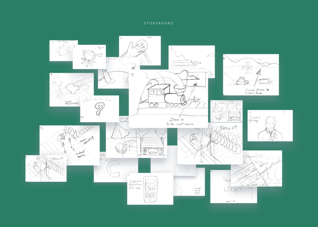
Due to the set of quick sketches, the designers managed to present their ideas to the client and quickly make a decision on the essential points which had to be included in the promo. After several discussions and considering all the aspects such as specifics of the target audience, clients and designers agreed upon the stylistic preferences and the message of the story. The team could start the production process.
Color choice
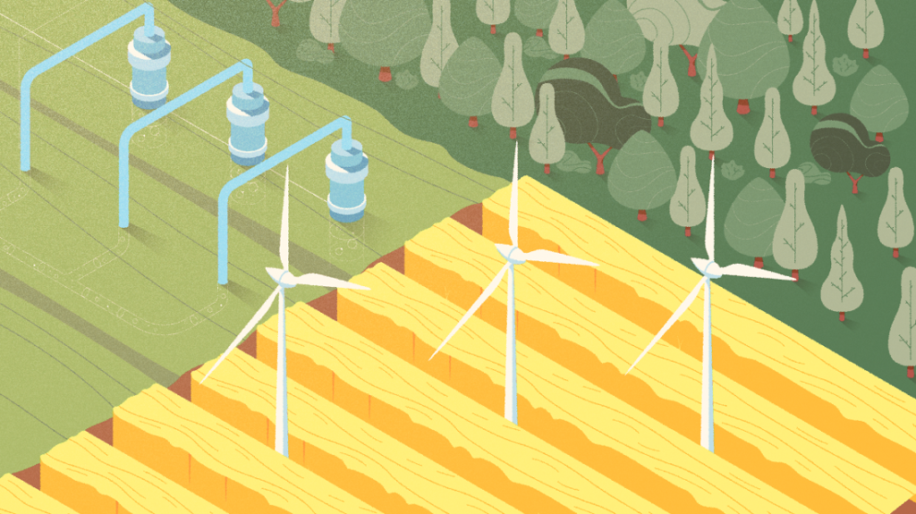
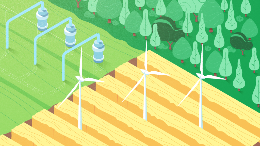
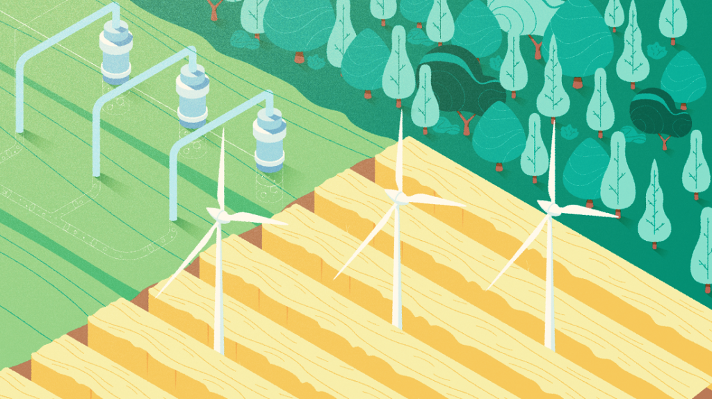
Colors have a great impact on visual perception, so the choice of the general color palette is a crucial step in graphic design. To help the clients make their decision, the designer provided a client with color variations of the same scenes. The illustrations were shown in warm and cold combinations. Also, the designer experimented with saturation and brightness of color palette. Here you can see the variations of a single scene with different colors.
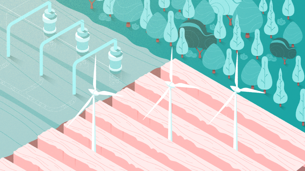
Patterns
Original patterns can make the video graphics look harmonic and native as well as add some fun to the appearance of the future promo. Since the OffCents promo video is focused on the environmental topic, the designer decided to apply some patterns similar to those we can see in nature.
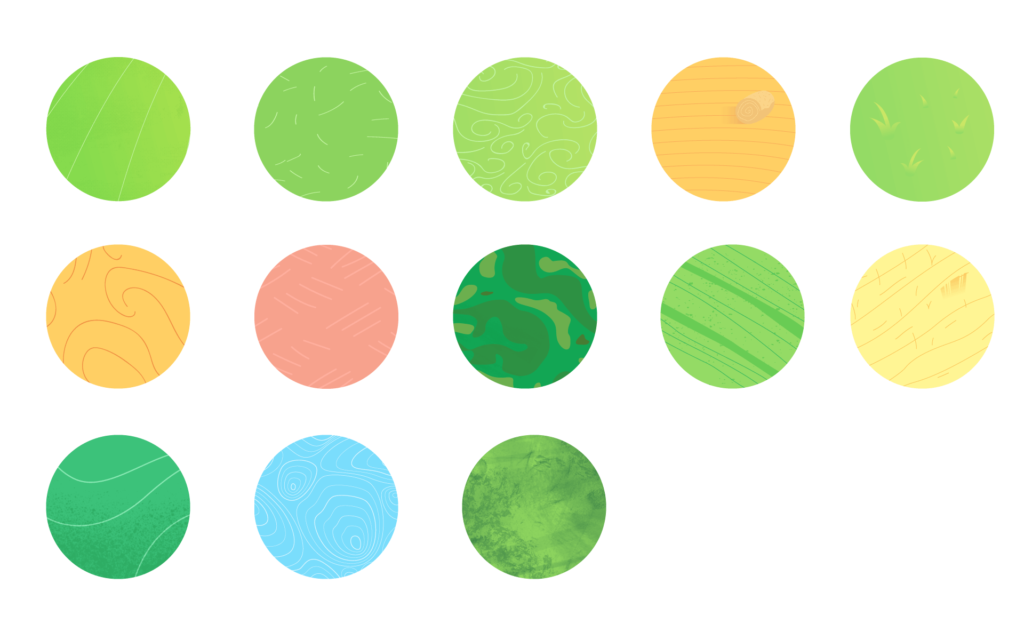
Illustrations
Knowing the style, color palette, and patterns, the designer went to the creation of digital illustrations. Here are some of the final results.
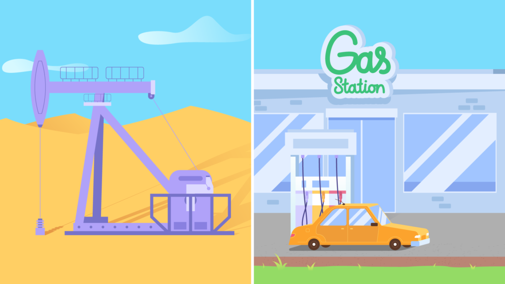
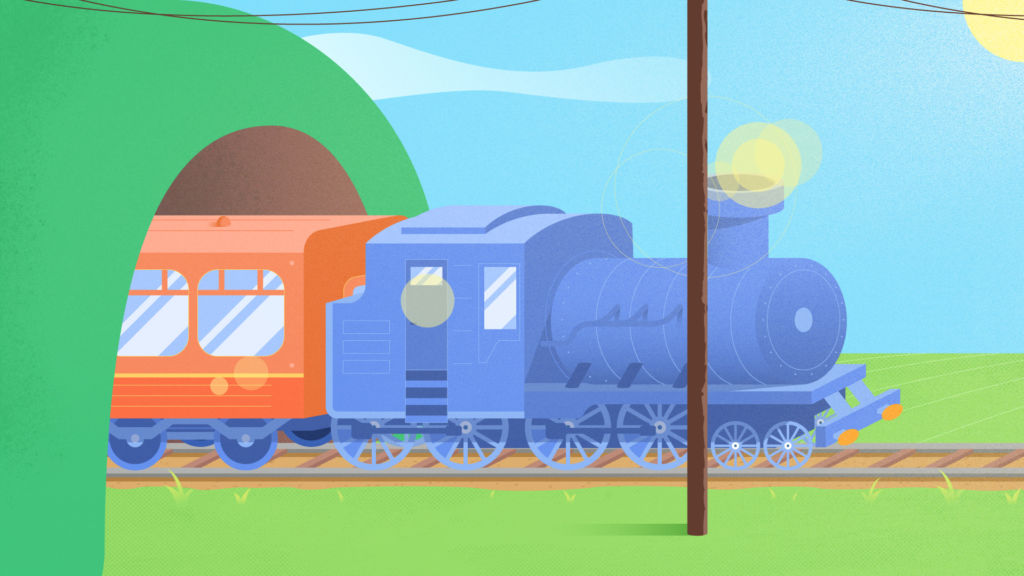
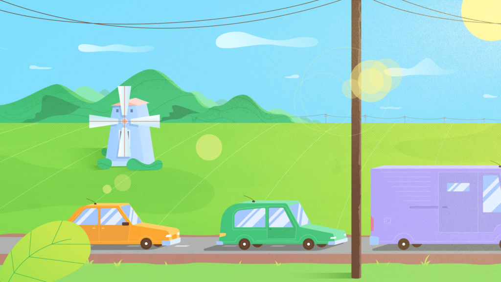


As you can see, the designer chose flat design illustrations which help to keep the balance between the elements of fun and the serious topic of global warming. The bright color palette sets the happy mood of the video showing how the app can make the world a better place.

Motion design
3D
After all the illustrations were ready, the next step was to animate the scenes with a 3D view for the most global parts. They were designed to be catchy and set the emotional and aesthetic links to the viewers. Here you can see the process of 3D animation in three steps, from the schematic to the detailed one.
Animation
The final stage fully relayed on the motion designers. All the scenes represented in the digital illustrations were animated into a united story looking bright and attractive.

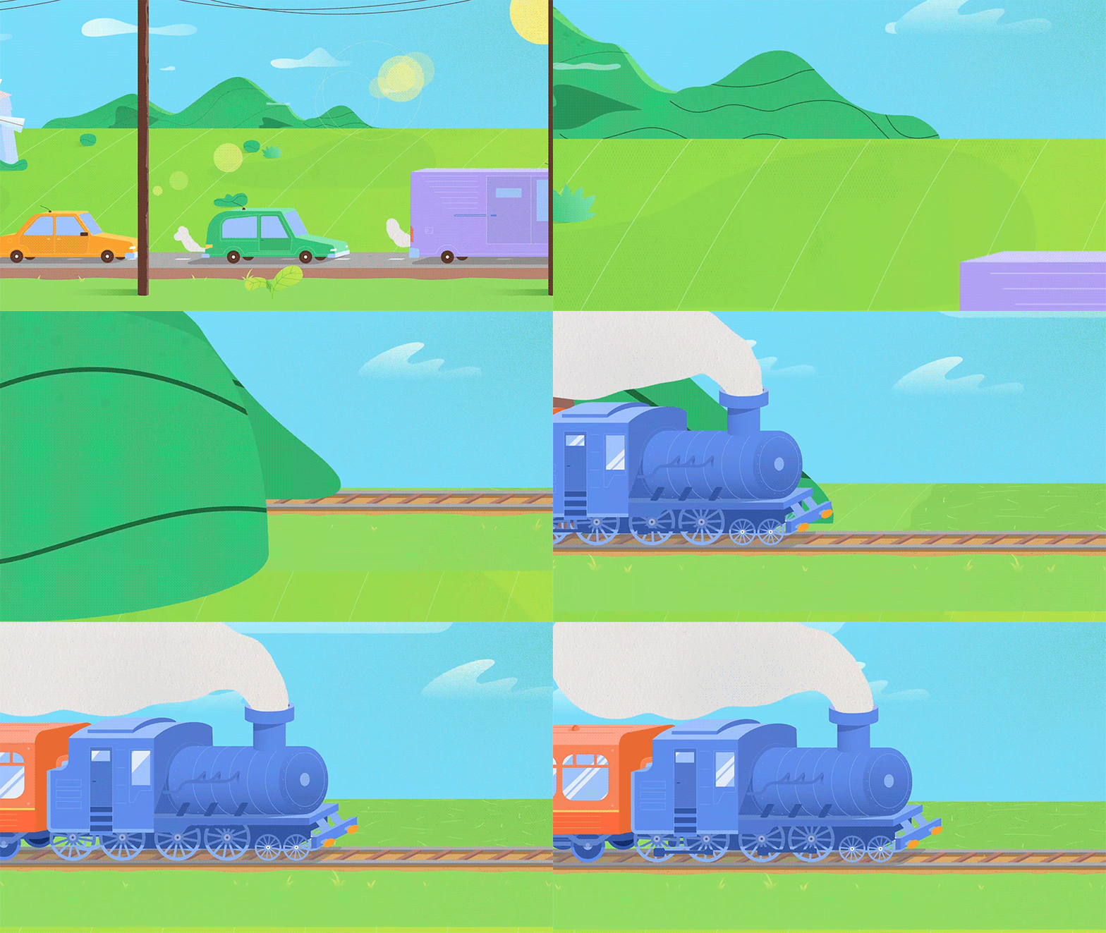


Here you can see a piece of animation workflow made in Adobe AE.
Post-production
When the visual part was created, the client provided the designers with the music and the voice-over made by professional voice-actors. Choosing the voice for a video, it’s important to sure it corresponds to the offer and mood of the video and the tone matches the preferences of the target audience.
After combining the sound with the visual part, an animated promo video for OffCents was ready. Here’s the result.
Useful reading
Step by Step Guide to Custom Promo Video Design
Case Study: Opera. Year-in-Review Video Design
Case Study: Binned. Design for Promo Video Production
How to Create Original Flat Illustrations: Designer’s Tips
Animated Logos: Why, Where, How to Use
Originally written for Tubik Blog
- English
- Ukrainian


