Functional Art: 15 Creative Graphic Design Concepts.
Functional Art: 15 Creative Graphic Design Concepts. The collections of creative graphic design concepts featuring diverse directions of digital art: characters, posters, book covers and illustrations.
Famous graphic designer Stefan Sagmeister said “You can have an art experience in front of a Rembrandt… or in front of a piece of graphic design.” It’s hard to disagree with the expression since there are so many beautiful breathtaking graphic design concepts today. Various modern tools allow designers to create gorgeous graphic concepts that could easily be called artworks. However, graphic design isn’t purely artistic field. In one of our previous articles, we’ve defined graphic design as the sphere of human activity that lies at the crossroads of several directions, first of all, visual arts, communication, and psychology. By means of graphic (visual) elements such as images, types and fonts, pictograms, shapes and sizes, colors and shades, lines, and curves graphic designers do the job of communication. Every visual element transfers the message, so it becomes functional.
Graphic design broadly covers all spheres of human life which deal with visual communication, from books and posters to sophisticated mobile applications or 3D animation. Today’s post presents 15 creative concepts by Tubik which we gathered to show you the diversity of graphic design.
Character concepts
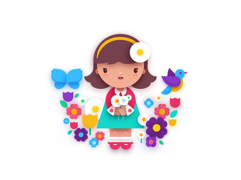
The first concept introducing this set is an illustration of a girl with flowers. The work is a representation of flat design which is seen in the simplicity of shapes and visual elements. Despite the minimalist style the illustration accurately transfers the bright and warm feeling of the springtime. The designer applied the color palette which shows a little girl’s sensitivity and purity. And, the final accent was made via shadows giving the flat picture more vivid look.
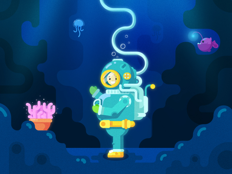
The next concept is a flat design illustration presenting a character of underwater explorer. The designer applied various techniques combining classic and new approaches to flat design. Along with minimalistic shapes, there are noise textures across the illustration which are unusual for the direction. The dark background and bright elements, including the character’s costume, create deep contrast and enhance visual perception. One more detail complementing the illustration is the light lines which are barely seen still they make the picture complete.
Character design is used for different video and mobile games, the reason why designers often need to create more than one character for the particular project. The trick is that all the characters should be made in one original style so that they would be recognizable for gamers. Let’s look at the Wild West set of characters by Tubik.
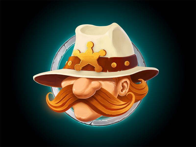
The first character created for this set was a sheriff named Jimmy Foxx. The designer has chosen the unique style of drawing putting accents to the details which transfer character traits. Creating the sheriff personality, the designer aimed at illustrating fearless and fair man with a sense of humor. The prominent mustache makes Jimmy look serious still there might be the smile hidden behind it. The main attribute is the big hat with the star signifying sheriff’s power.
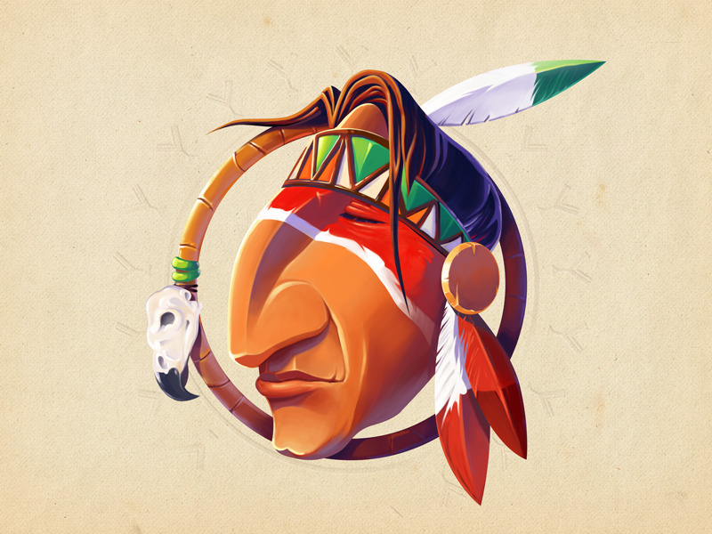
Good stories require the presence of cultural spirit, so the native American character was an obvious choice continuing this set. The designer sticks to the style applied to the first character. The character wears typical attributes such as a feather and a painted mask. His eyes are closed which makes a character look wise. The circle around the character, which by the way is shown in the first illustration too, is decorated with a skull of a bird. Such an item usually serves for magical rituals so the character seems mysterious.
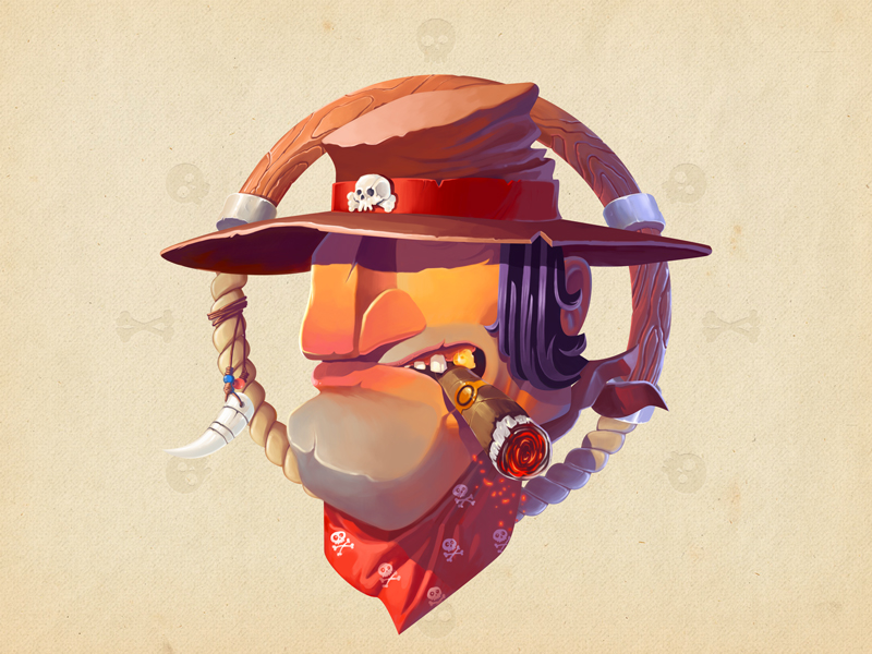
It’s hard to imagine a wild west story without a bandit terrorizing the citizens. The designer presents us a bad guy through the well-thought details. The bandit has a massive chin with a dimple and the dark straight hair. The cigarette and the golden tooth give him a brutal look. The hat and scarf are embellished with the skull signs to show that he’s a dangerous man.
City illustrations
There are many paintings and drawings illustrating the beautiful sights of various cities. Today designers have an opportunity to show cities from a different perspective – as digital artworks. Here is the set of city illustrations by Tubik.
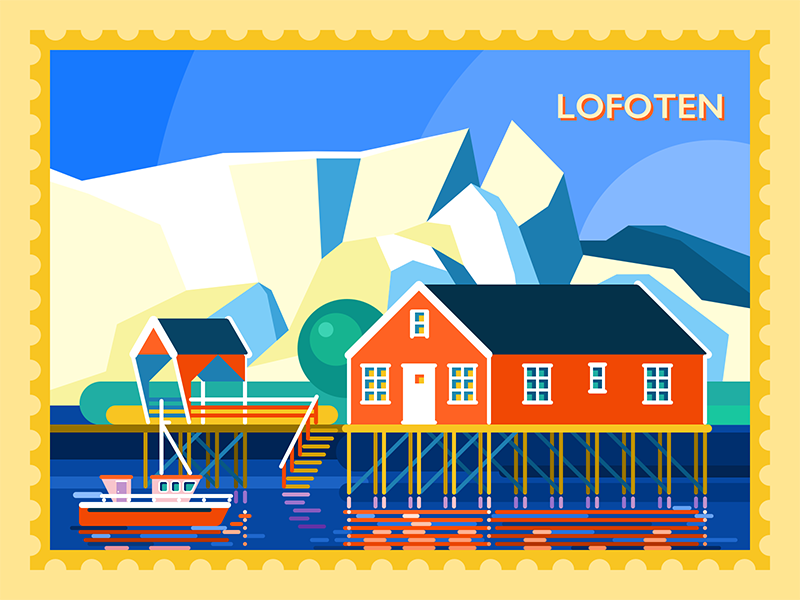
The first illustration presents Norwegian city Lofoten. Beautiful colors, nature, bright buildings and amazing mountains of this city have inspired the designer to create the illustration. The unique idea of this set of concepts is that they are framed like post stamps. The illustration is another example of the flat design which is created with simple geometric shapes. Lines on the water presents the reflection of the building so it feels more natural. Bright colors and various tones transfer the atmosphere of the city.
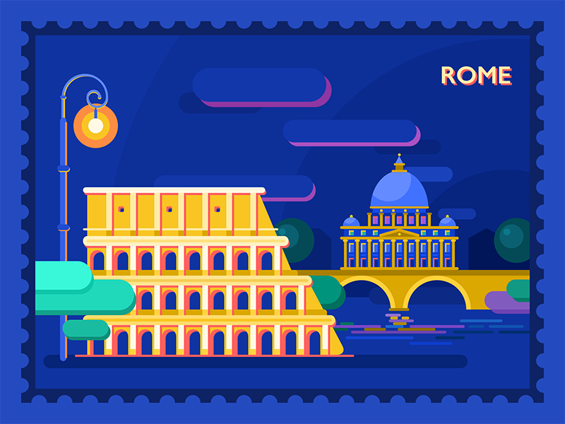
Next city chosen for this set was Rome. The designer applies the complementary scheme of colors mixing blue and yellow, which makes the illustration full of contrasts similar the bright Italian city. Famous buildings are formed with simple shapes so the viewer can easily recognize the city. The designer creates lights and shadows on the landmark via different tones sticking to the minimalistic style.

The last concept of the series illustrates Bavaria. The Neuschwanstein Castle, the nineteenth-century palace known all over the world, is presented as a magical place full of spring vibes. The mild color scheme is pleasant for human eyes enhancing visual perception.
Posters
Nowadays, graphic designers experiment a lot with poster creation following modern design directions such as flat design and applying various techniques. Digital artists design original posters which accurately bring people into the atmosphere of the films, cartoons, and other performances or events.
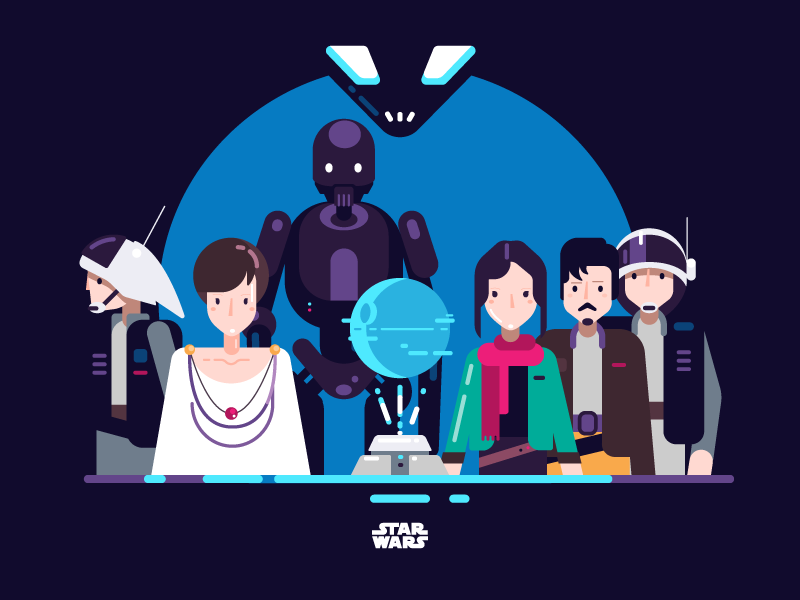
Star Wars Rouge One Illustration
No matter if you’re a fan of Star Wars or not, you obviously know what they are. This graphic design concept is devoted to the recent episode of Star Wars (Rogue One) which inspired the designer to create the original poster. The illustration presents the main characters of the movie in a minimalistic style. They are shown as focused, strong, and brave heroes ready to fight for the better. Dark blue background creates an atmosphere of the deep space. Small but bright details such as characters’ clothes make this poster contrasting and interesting for the viewers.
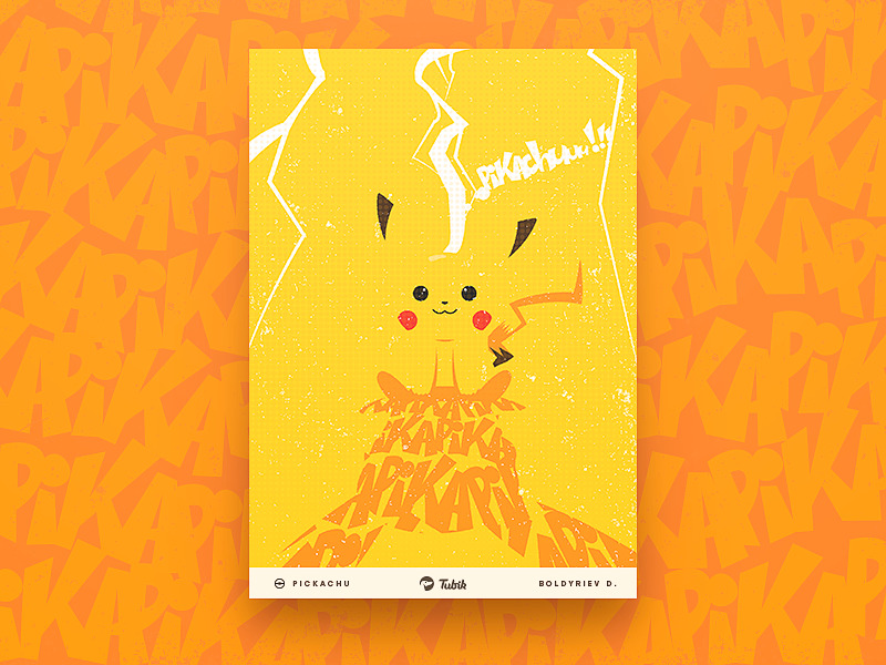
Many people will associate last summer with the hype about mobile game Go Pokemon. Designers couldn’t stay unaffected so there are various design concepts devoted to the topic. Here is graphic design poster featuring one of the favorite pokemons Pikachu. The character’s body isn’t highlighted with lines still people can recognize the pokemon’s silhouette due to face parts and the yellow color of the background. Unusual presentation of the character is complemented with white lighting which is the special power of the little creature. Pokemon’s shadow is performed via repeating a word, “Pika” to be more specific. Such a creative idea will definitely strike a fan right in the heart.
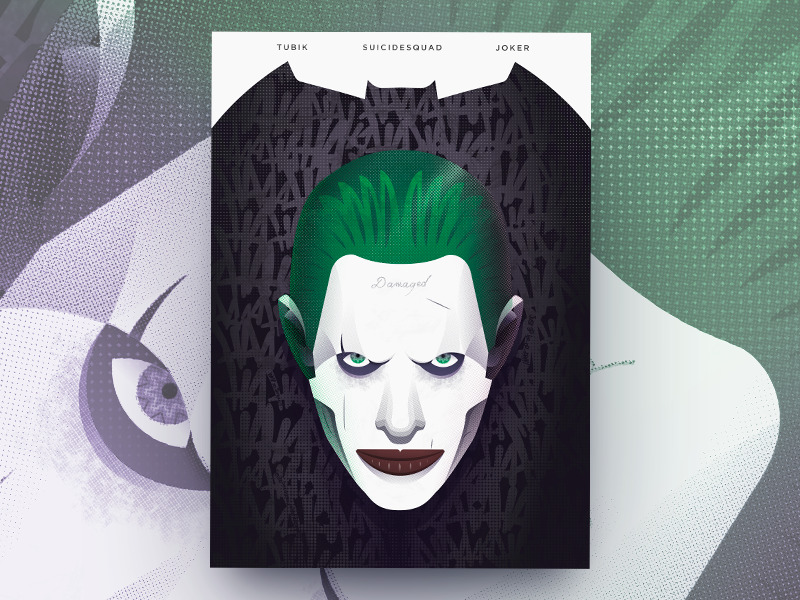
Continuing the topic of the mainstream, here is the poster for Suicide Squad movie. One of the brightest and deepest characters of a film is Joker who’s well-known for all DC comics fans. Creating this poster, the designer tried to catch and transfer the character’s features by means of digital graphics. The poster is dark transferring character’s mood still with the original lettering which presents laughing. Moreover, if you take a closer look at the poster, you’ll find small Joker’s signs hidden everywhere.
Covers
The cover illustration is a substantive art direction which deserves great respect. Graphic designers usually work long and hard to create one single composition that will do its function best. Let’s look at the cover designs by Tubik.
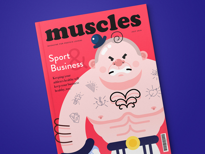
The first example presents a cover page for the magazine devoted to sports and active life. The issue shown here is about relations of sport and business. The idea behind the central illustration featuring the athlete was to immediately introduce the topic and at the same time add some fun and style. Graphic elements fully replace the photos creating the original look for the magazine.
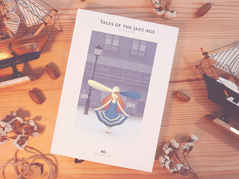
Many graphic designers secretly dream to create the cover design for their favorite book. Here is an interpretation of cover page for a collection of short stories by F. Scott Fitzgerald called Tales of the Jazz Age. The girl on the cover looks like a typical lady of the jazz age setting the right mood for the viewers. The mild color scheme and noise texture are nice to the visual perception.
Stickers
Today stickers are everywhere, printed and digital, especially popular in mobile apps. Tubik designers constantly work on original sticker packs for apps, websites and promotional campaigns.
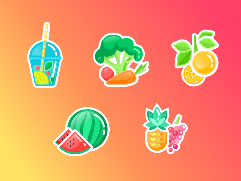

This design concept presents stickers of vegetables and fruit. They are meant to stimulate everyone to follow a healthy lifestyle and add energy to people as well. Bright colors make vegetables and fruit look juicy and yummy so it’s hard to resist the desire of tasting one of them in real life which means the stimulation works well. This flat picture is good for both printed and digital use.
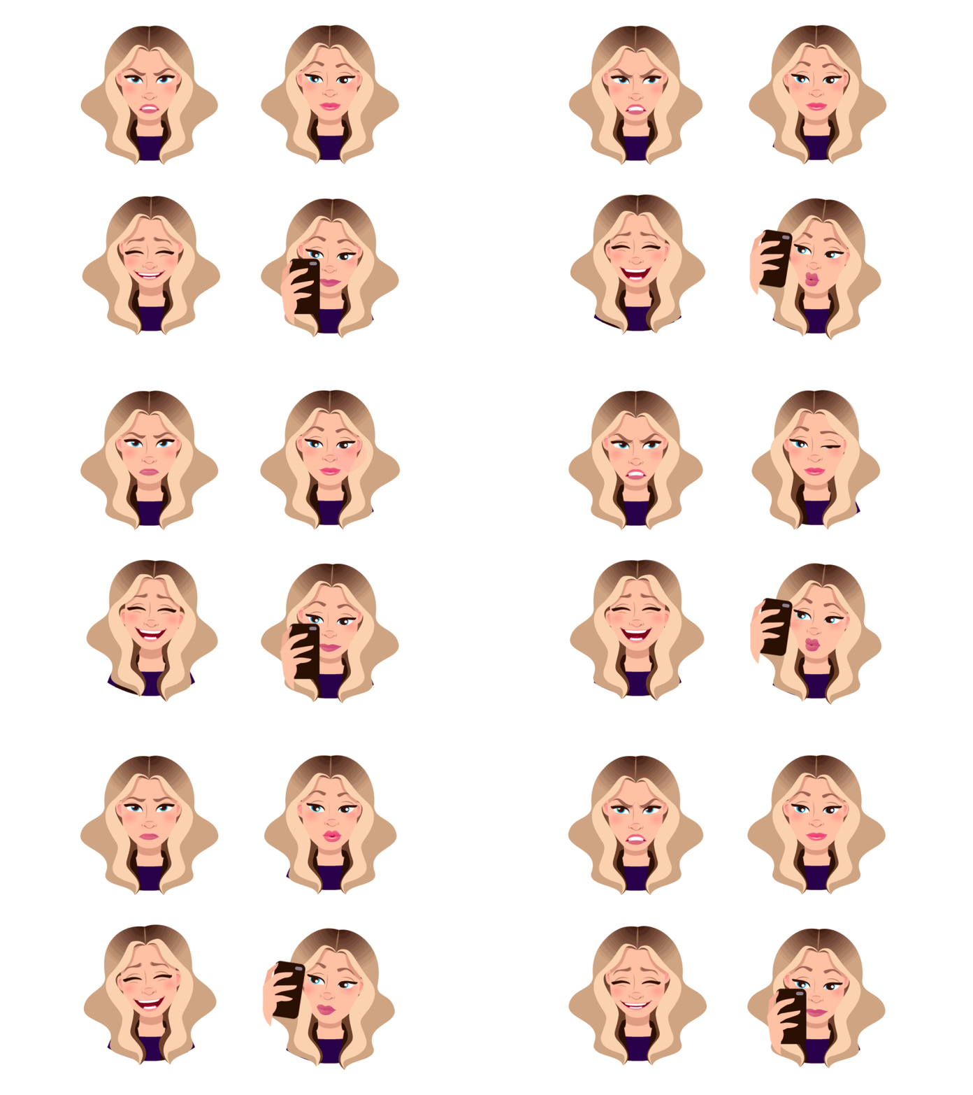
Animated Stickers for Mood Messenger
Today stickers are popular in various messengers. This concept shows stickers designed for Mood Messenger. Each sticker presents a different emotion so that the users could chat quickly showing their friends how they feel. Detailed faces on this concept are able to transfer any emotion clearly. Attractive illustrations can make applications interesting and fun for users setting great benefits for the owners.
Reviewing creative graphic design artworks is always inspiring. These fifteen concepts are only a few examples but there are many more of them waiting for you to look. Stay tuned and get inspired!
Originally written for Tubik Blog
- English
- Ukrainian


