Book Cover Design by Chip Kidd
Book Cover Design by Chip Kidd The design expert of the day - Chip Kidd, famous graphic designer who has created plenty of well-known book covers.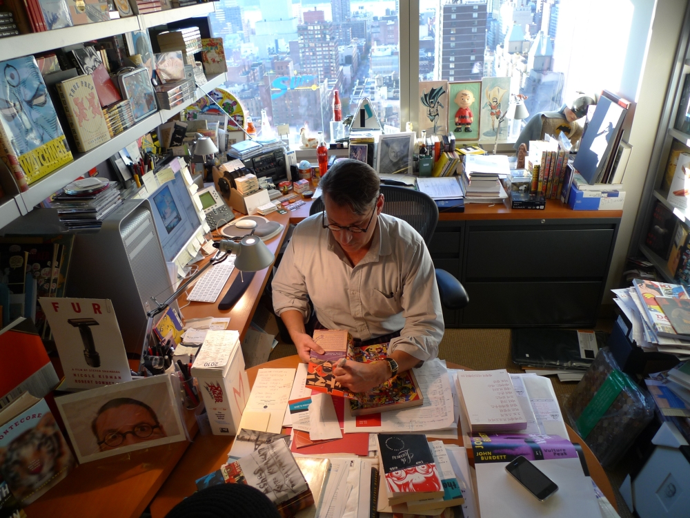
Сontinuity of generations is perhaps the most powerful tool of human progress. In any field of human activity and self-expression, it provides a solid link between past and future, tradition and innovation, knowledge and experiment. Design is no different: it has the same lifecycle. The ability to absorb the experience and best practices from masters is a must-have skill for even the most revolutionary artists.
To support this idea, here at Design4Users, we launched a new section called “D4U Expertise“. It will collect diverse ideas, talks, cases, and tips from expert designers presenting various directions of design to help users. Ultimately, we are going to have here the set of materials that will be helpful and inspiring both for experienced professionals and for those who only start their path in any of the design directions.
This post aims to draw your attention to a worldwide known and recognized graphic designer, Chip Kidd, a person of great talent and amazing humor.

Biography
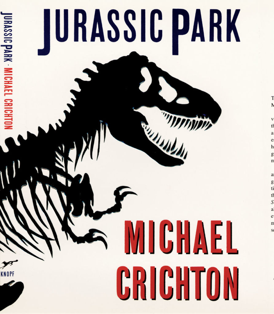
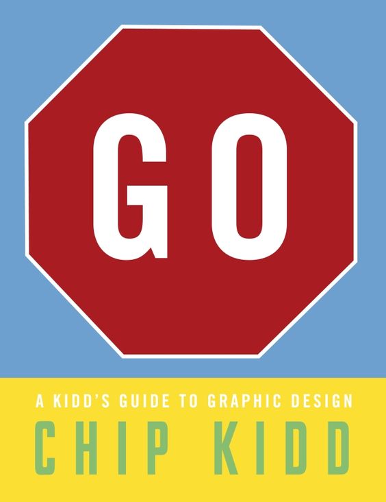
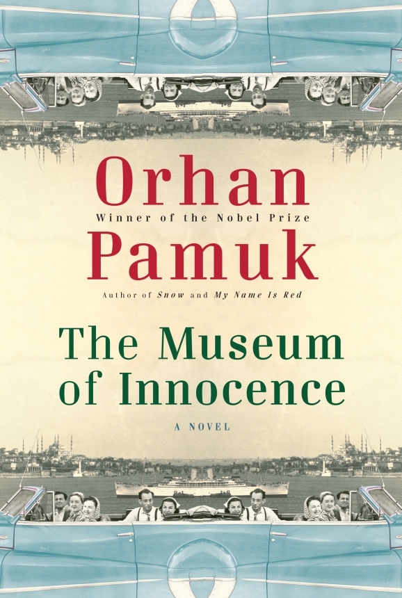
According to his personal website presenting the incredible variety of his works, Chip Kidd is an award-winning graphic designer and writer in New York. His groundbreaking book jacket designs for Alfred A. Knopf have elevated the form for close to three decades. He’s worked with hundreds of writers, including John Updike, Katharine Hepburn, Cormac McCarthy, Henry Louis Gates Jr., James Ellroy, Karen Russell, Michael Crichton, David Sedaris, Sharon Olds, Orhan Pamuk, Paul Simon, Neil Gaiman, and Haruki Murakami. His first novel, The Cheese Monkeys, was a national bestseller. His most recent book, Go: A Kidd’s Guide to Graphic Design, is the first book to teach graphic design to children and has over 60,000 copies in print.
As an editor and art director for Pantheon Graphic novels, he’s worked with and published some of the very best cartoonists in the world, including Chris Ware, Art Spiegelman, Dan Clowes, David Mazzucchelli, Charles Burns, Michael Cho, and Alex Ross. He is the recipient of the National Design Award for Communications, and his TED Talk has been viewed over 1.3 million times.
He has produced so many recognizable graphic design ideas for book covers that plenty of people worldwide know those images, although they have never heard the name of their creator. he deeply believes that the cover is a piece of functional art, the chance to attract readers with a memorable first impression given to the book by the designer. Even more, the book cover should give a mental and emotional message from the very first seconds of its meeting with a reader via its title and cover.
Let’s take a look at some of these famous covers that have become a great blend of art traditions, careful analysis of the book itself, and creative experiments that brought the world new “Kidd’s philosophy” of book cover design.
Book covers by Chip Kidd
The designs, featuring some of the huge collections accomplished by the designer over the years, are presented in random, non-chronological order.

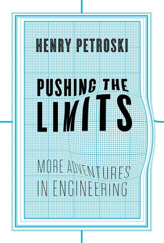
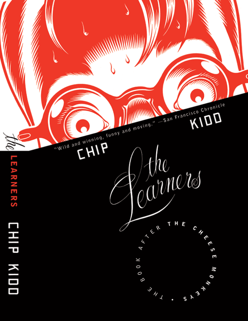
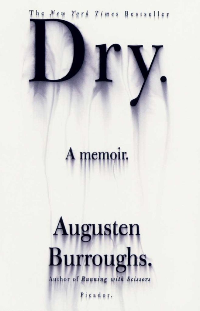

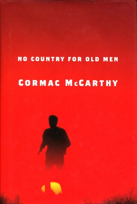
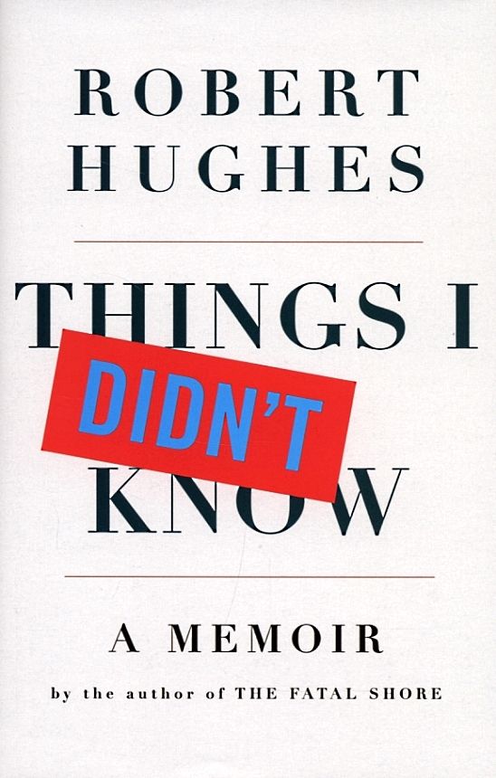

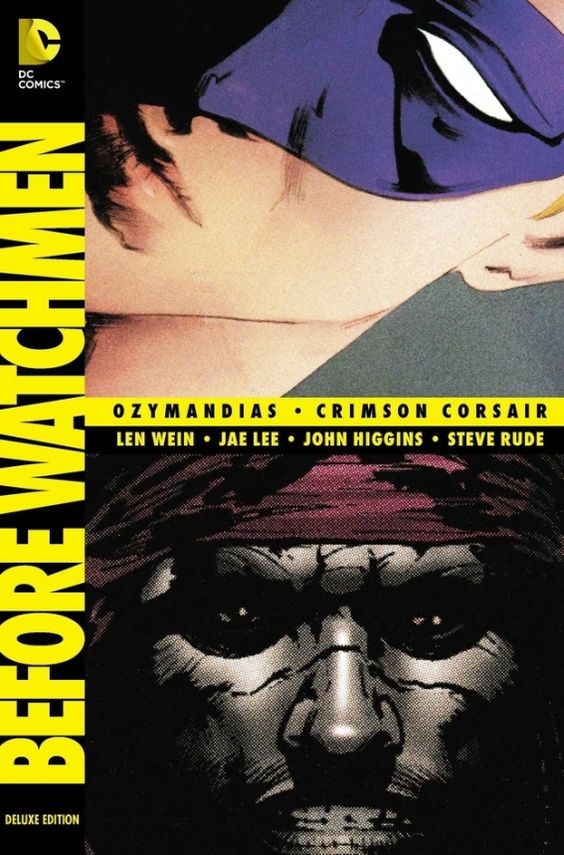
Ted-talks
Ted-talks by Chip Kidd inspire a huge number of artists transferring precious practical tips and personal experience. They definitely differ from usual lectures or public speeches by means of his humor and non-standard performance. However, with him this trick works and the jokes create a good contrast to highly serious messages he transfers to the audience.
This is one of the funniest talks from TED2012, where he shows the art and deep thought of his cover designs and also makes you smile and laugh all the time.
The stories can be anything, and some of them are actually true. But they all have one thing in common: They all need to look like something. They all need a face. Why? To give you a first impression of what you are about to get into. A book designer gives form to content but also manages a very careful balance between the two. (Chip Kidd)
So even though we love publishing as an art, we very much know it’s a business too, and that if we do our jobs right and get a little lucky, that great art can be great business. (Chip Kidd)
In this hilarious, fast-paced talk, he explains the two techniques designers use to communicate instantly — clarity and mystery — and when, why and how they work. He celebrates beautiful, useful pieces of design, skewers less successful work, and shares the thinking behind some of his own iconic book covers.
Clarity or mystery? I’m balancing these two things in my daily work as a graphic designer, as well as my daily life as a New Yorker every day, and there are two elements that absolutely fascinate me. (Chip Kidd)
Lectures and interviews
Here we have also collected several videos giving more insights of Chip Kidds life and professional path and containing a great deal of useful tips for designers based on extensive practice. Enjoy!
Lecture at Hammer Museum
Chip Kidd interview: What the Stories Look Like – Conversations from Penn State
Chip Kidd Insights Lecture
Chip Kidd’s speech at OFFSET 2009
Shelf Life 2: Chip Kidd

Image Credit: Hammer Museum
Get inspired, stay tuned, don’t miss new stories about inspiring experts!
Recommended links:
Chip Kidd’s official website
Chip Kidd: Go Ahead and “Judge This” (interview)
Chip Kidd on Twitter
- English
- Ukrainian

