


Less Is More: Elegant and Minimalist Editorial Designs
Less Is More: Elegant and Minimalist Editorial Designs Get inspired with a fresh D4U collection devoted to elegant and sophisticated minimalism in design for books and editorials.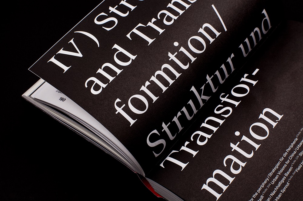
New inspirational design set is ready, and this time it’s all about design for print. Continuing the topic of minimalism in design, which we have already presented for interfaces, today, let’s look through a bunch of examples of how minimalism is applied in modern editorial design concepts.
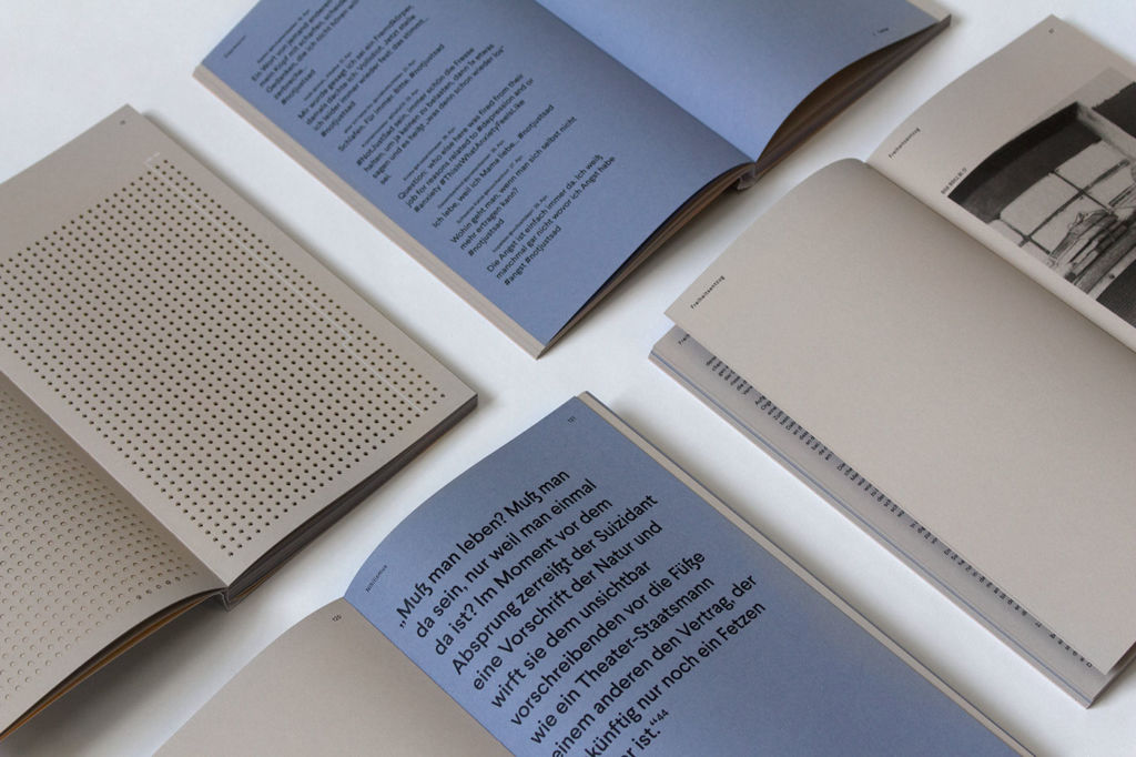
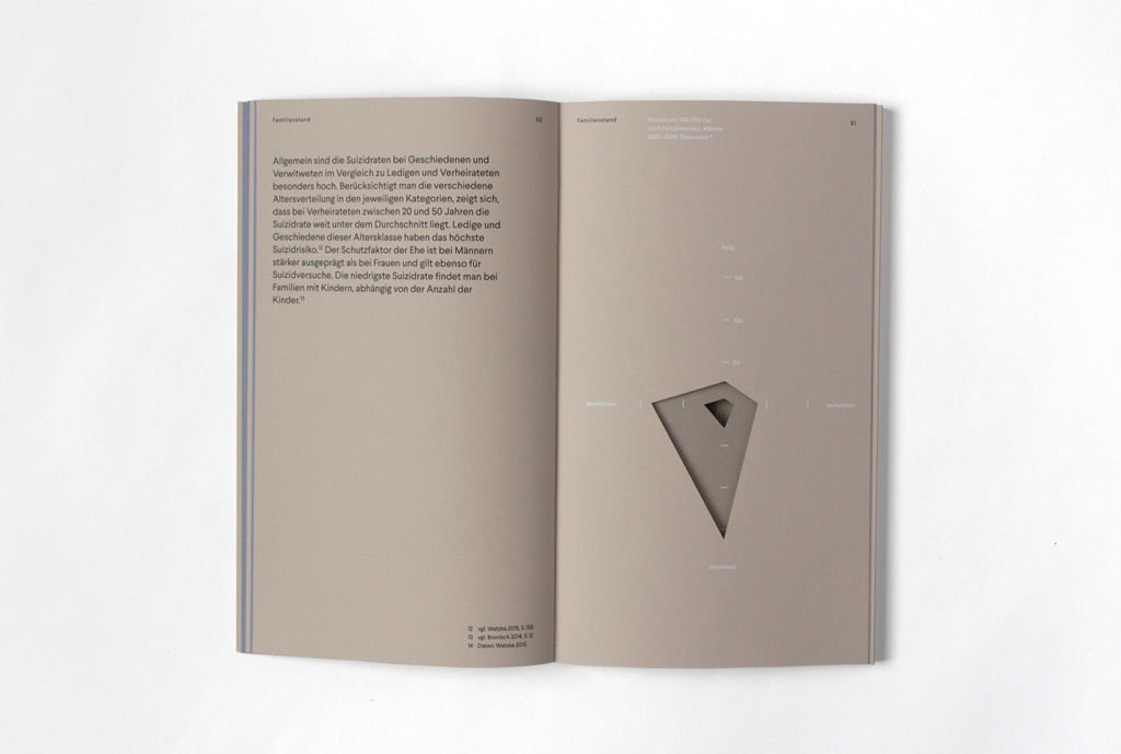
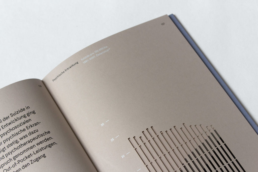
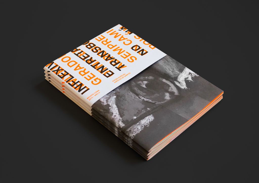
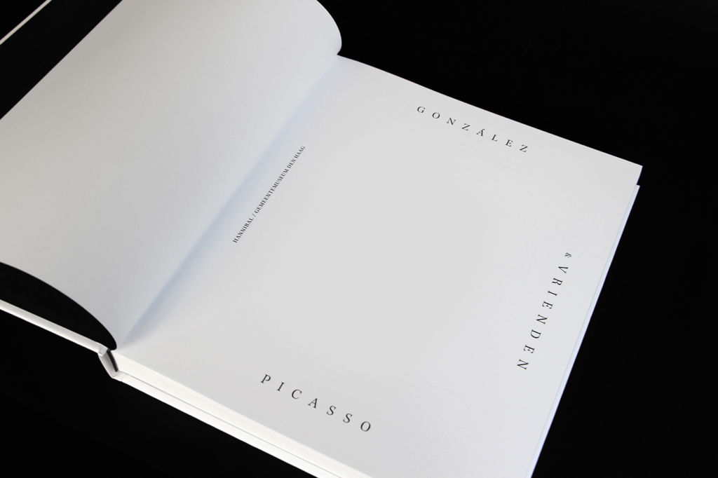
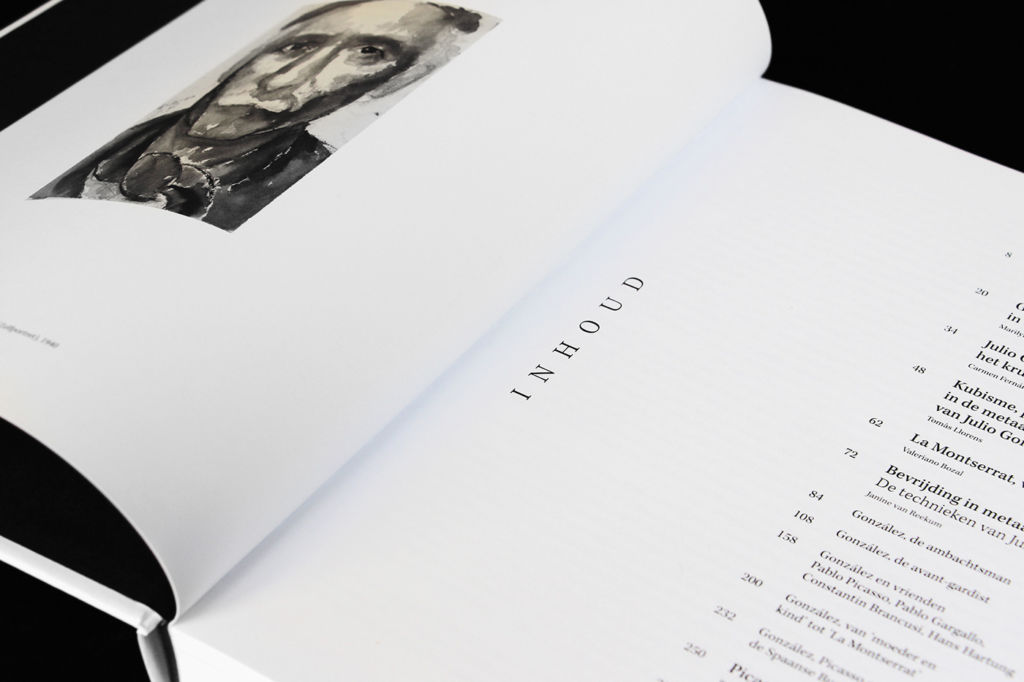
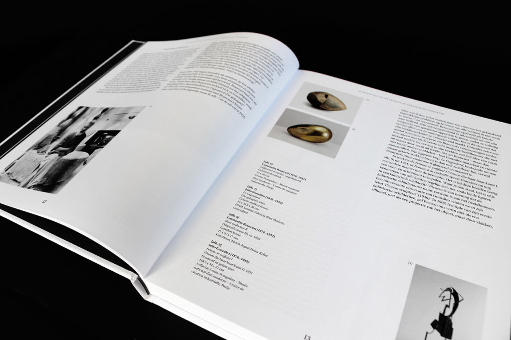
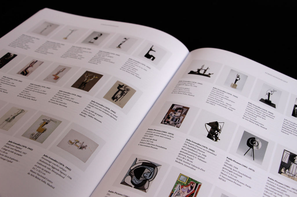
Just to briefly remind, minimalism is a word of broad meaning used in various spheres of human activity. Merriam-Webster dictionary defines it as “a style or technique (as in music, literature, or design) that is characterized by extreme spareness and simplicity”. Being applied to more and more fields, it saves its core traits: meaningful and simple. Minimalism as a direction of visual design got especially popular in the 1960s in New York when new and older artists moved toward geometric abstraction in painting and sculpture. The movement found its impression in the artworks associated with Bauhaus, De Stijl, Constructivism, and so on. In diverse spheres of visual arts, a key principle of minimalism was leaving only an essential part of features to focus the recipient’s attention as well as support general elegance. Lines, shapes, dots, colors, spare space, composition – everything should serve its function being thoughtfully organized. Today we can meet minimalism in a variety of life spheres: architecture, arts, photography, all kinds of design, literature, music, and even food presentation. “A shape, a volume, a color, a surface is something itself. It shouldn’t be concealed as part of a fairly different whole. The shapes and materials shouldn’t be altered by their context”, said Donald Judd, an American artist associated with minimalism. Working in this style, designers seek to make the interfaces simple but not empty, stylish but not overloaded. They tend to use negative space, bold color and font combinations, and multifunctional details making the simplicity elegant. The line dividing simple and primitive is very thin. That is why not all the designers take the risk of trying this direction: some may think it looks too decent, the others don’t find enough ways to show much with fewer elements.
So, welcome to get inspired with a fresh D4U collection devoted to elegant and sophisticated minimalism in design for books and editorials.
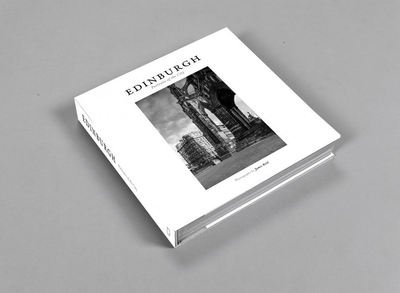
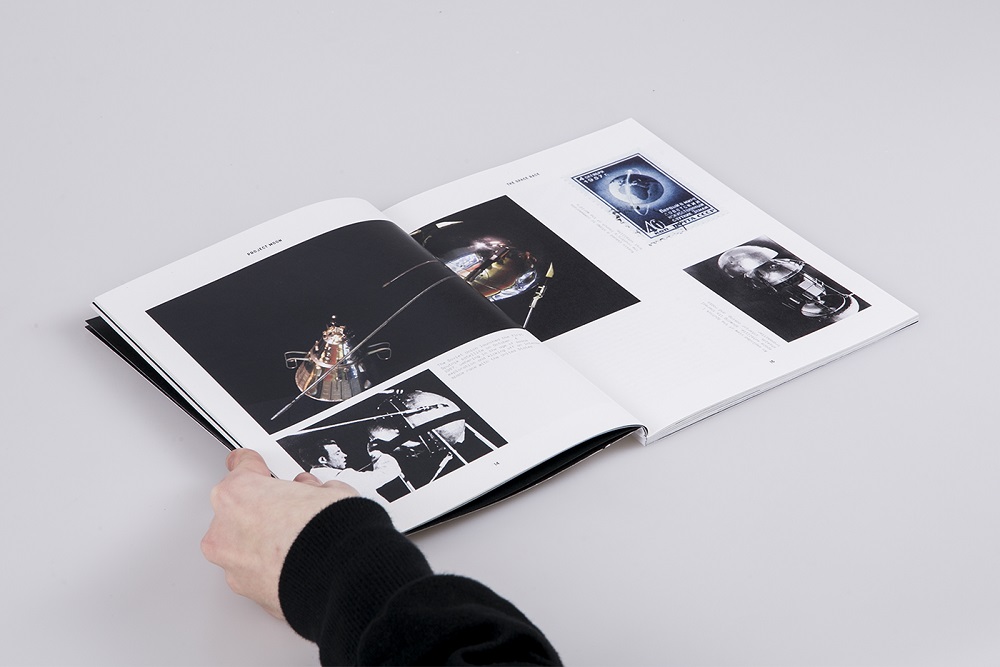
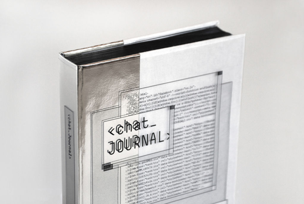
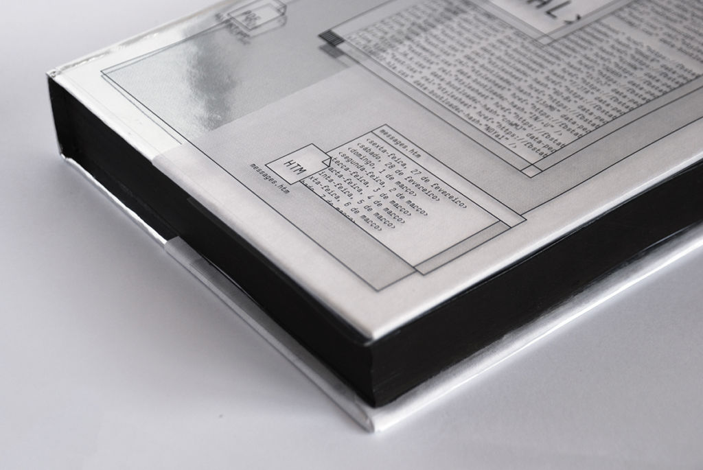
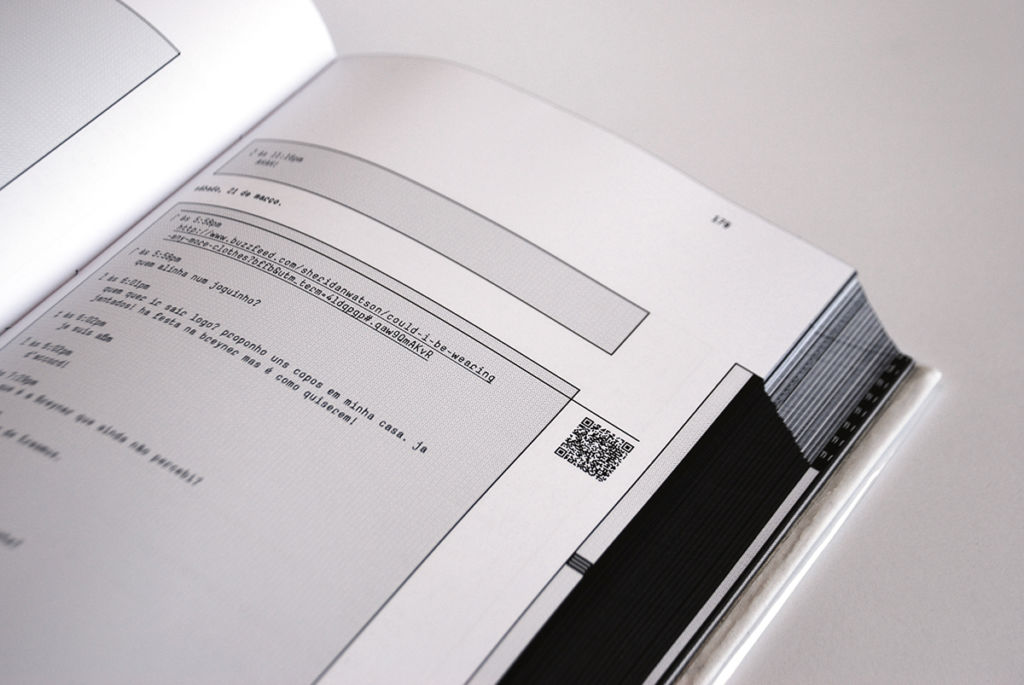
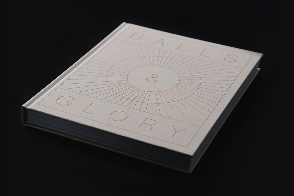
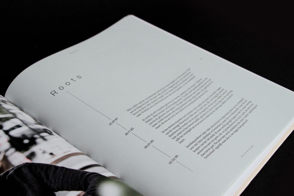
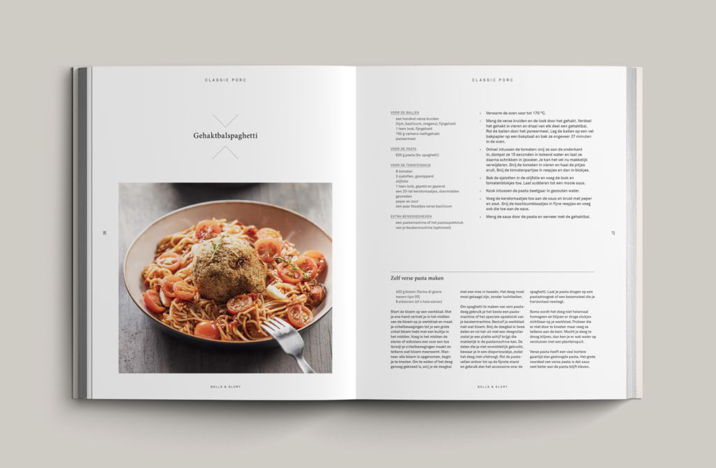
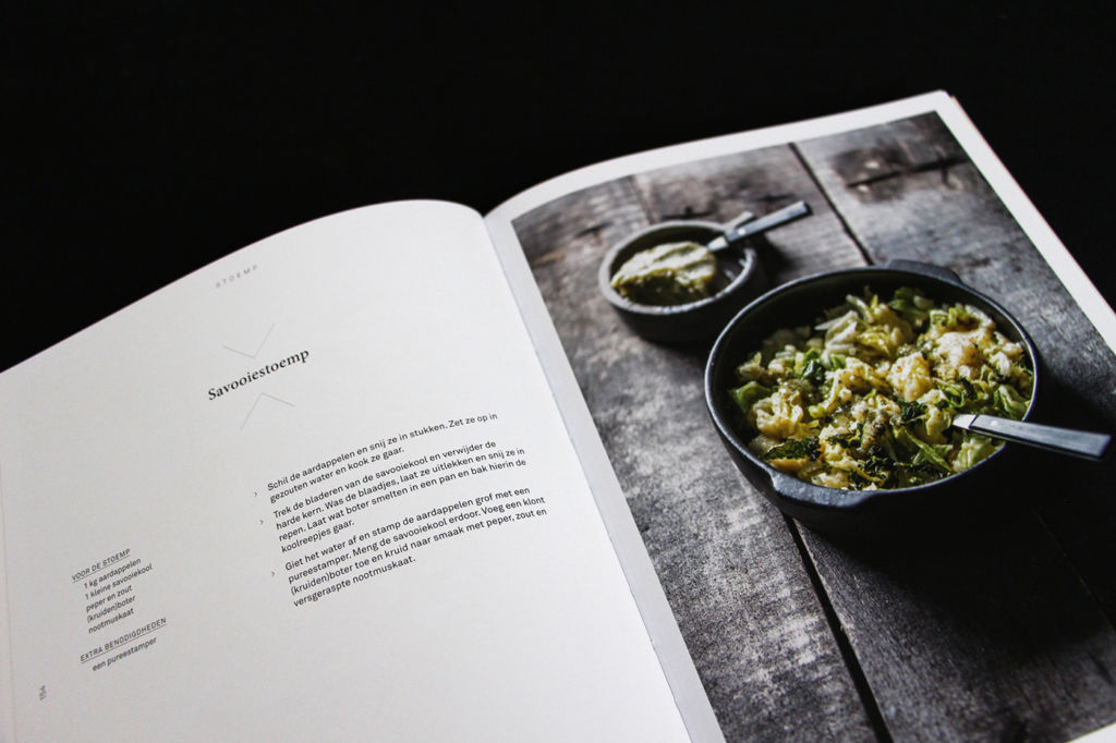
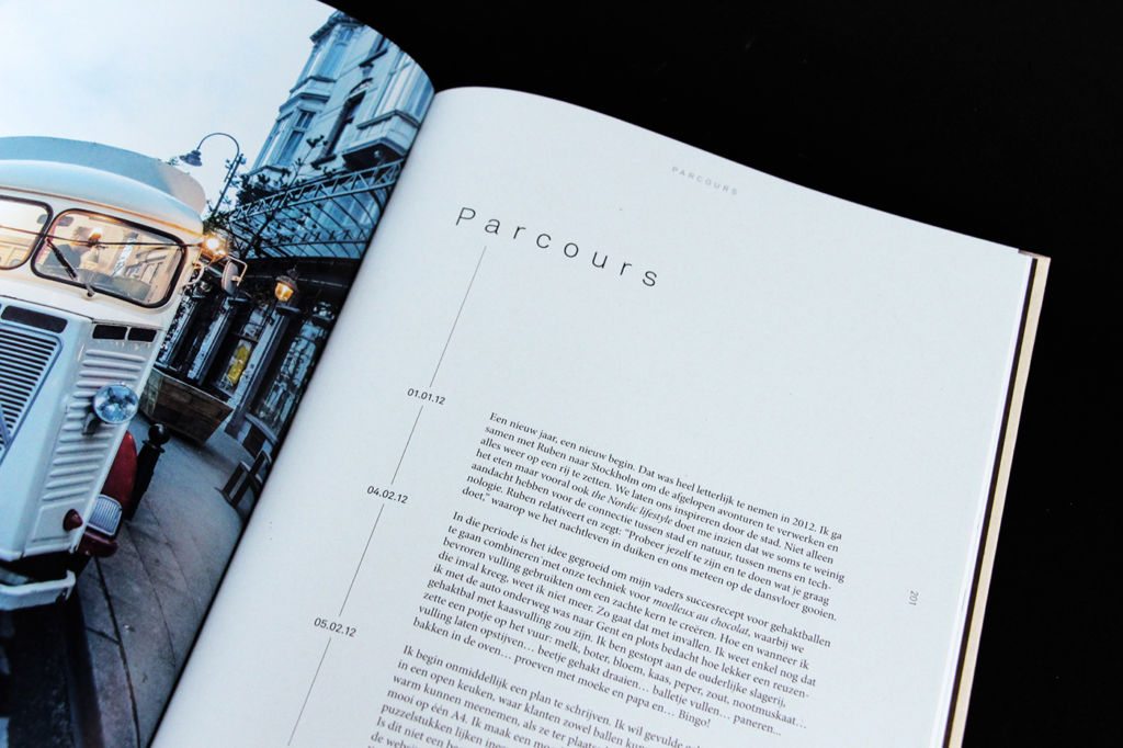
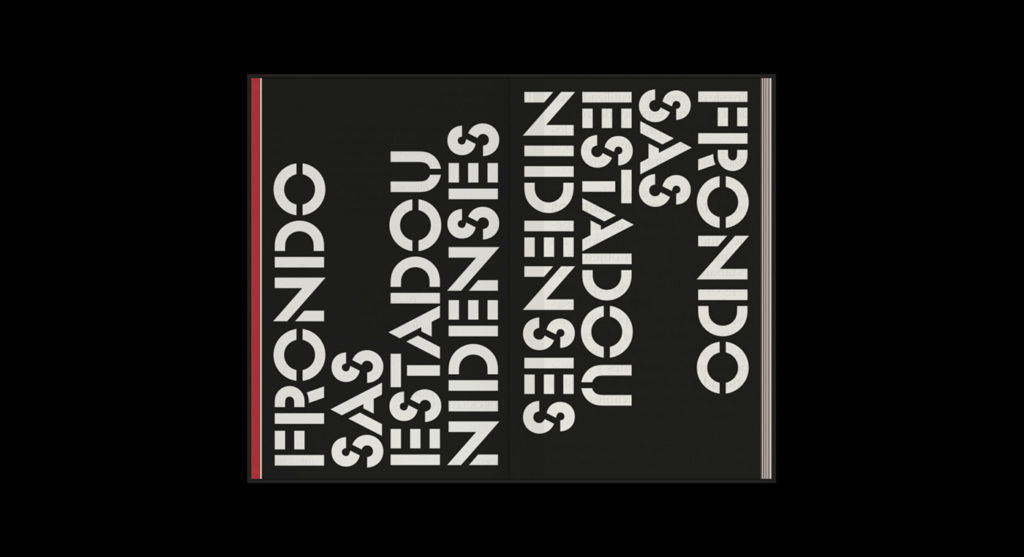
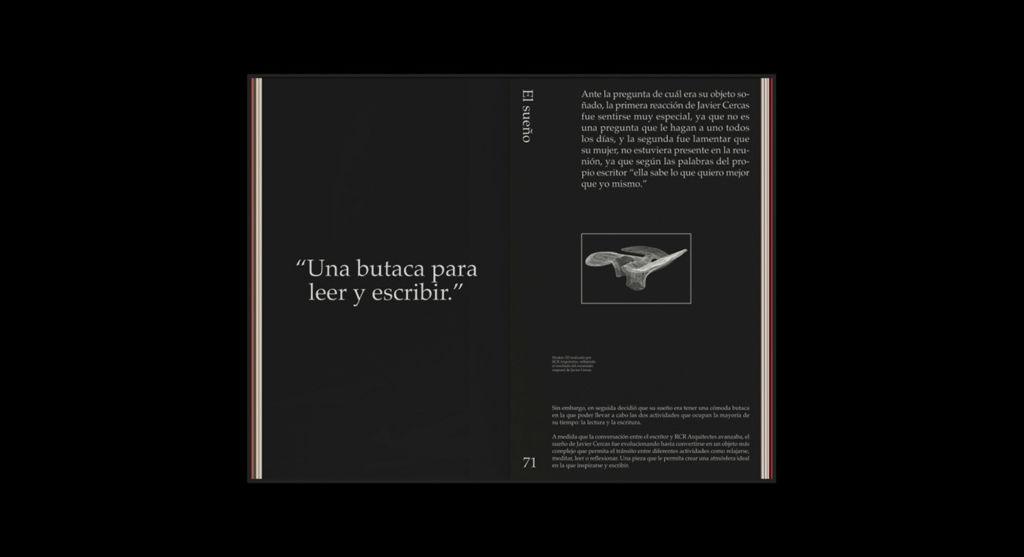
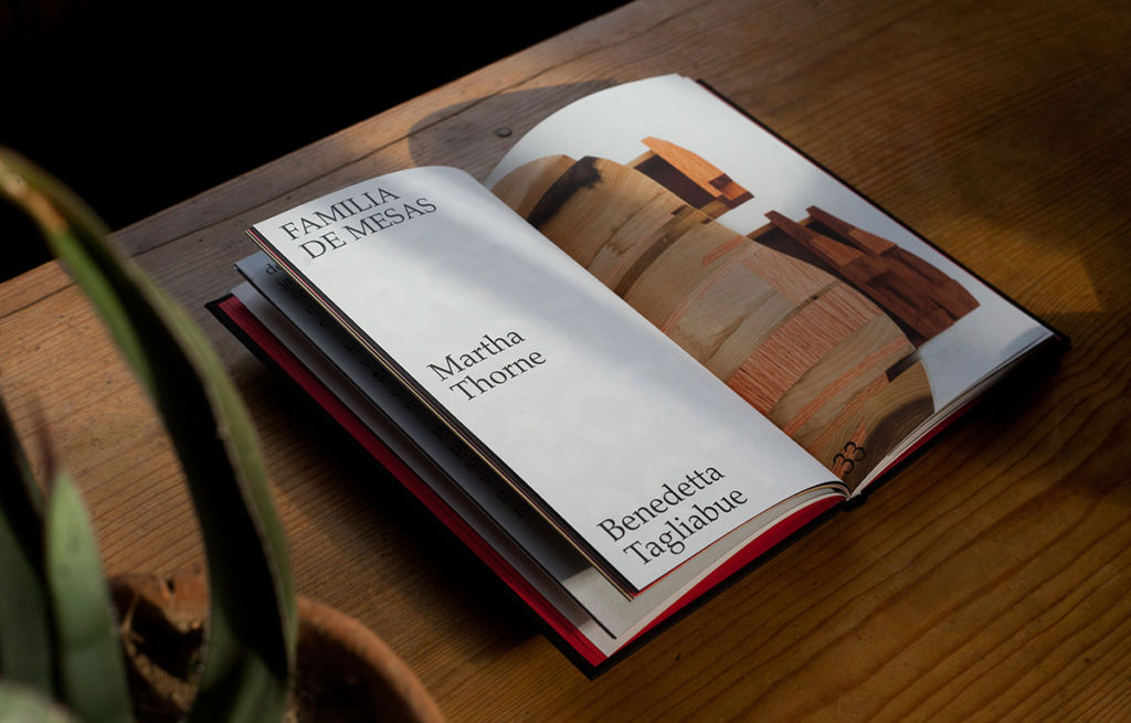
By Oscar Riera Ojeda Publishers
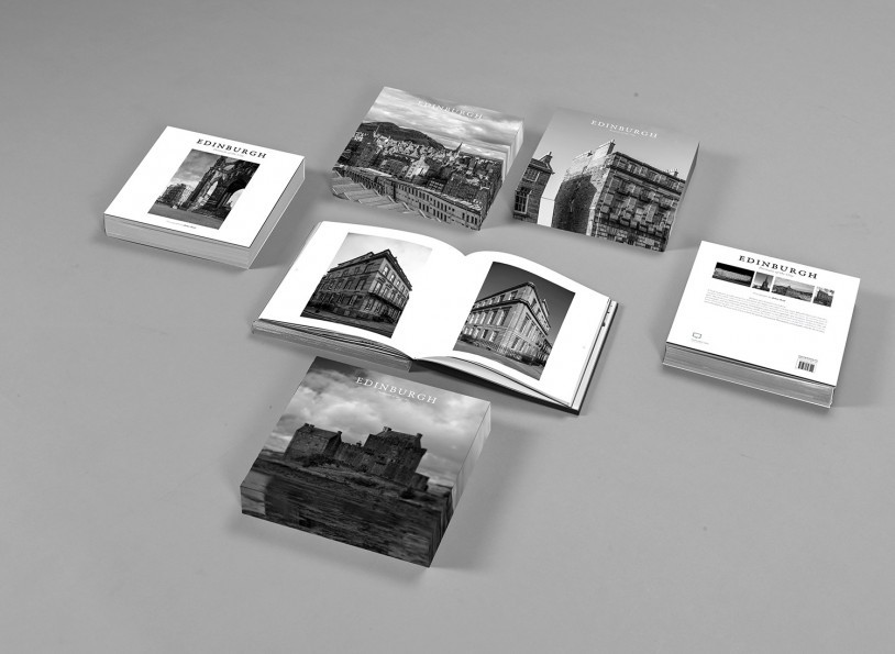
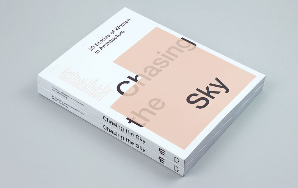
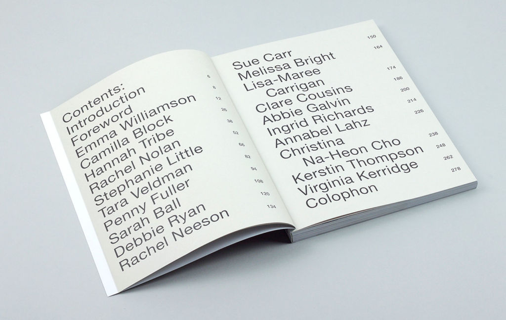
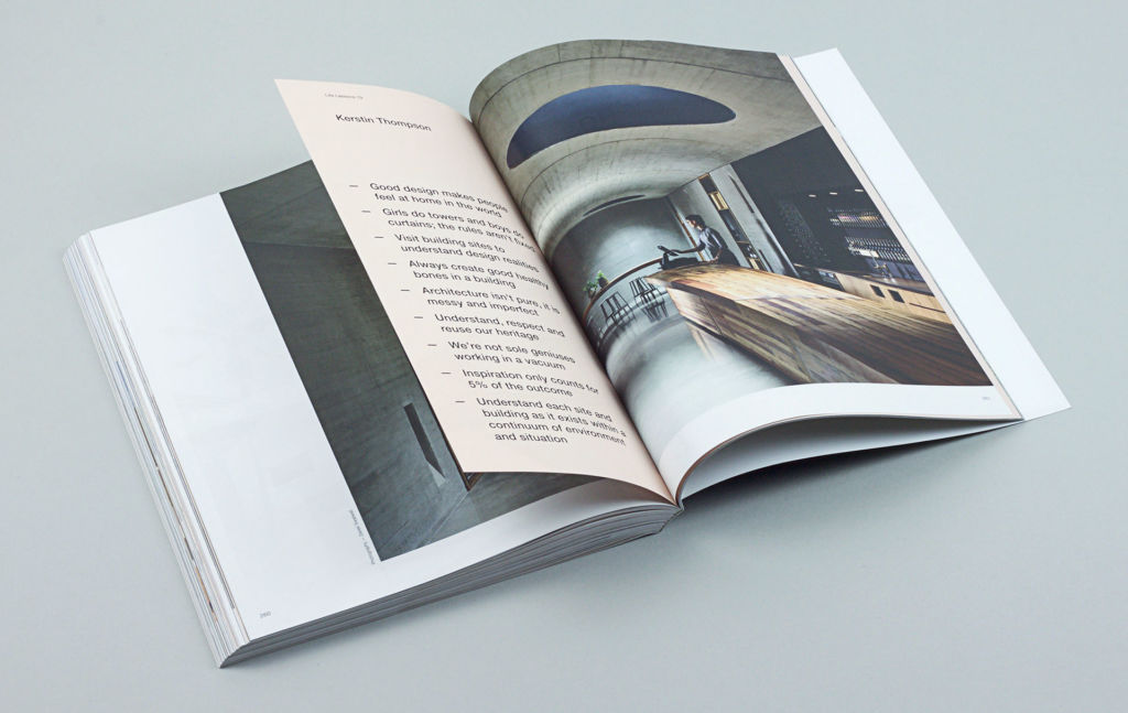
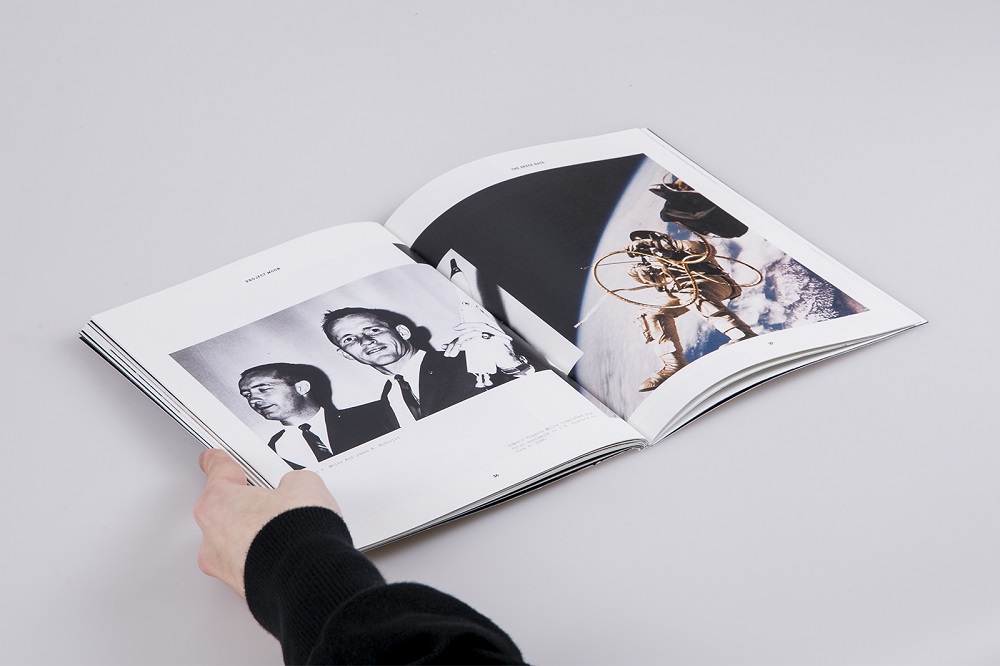
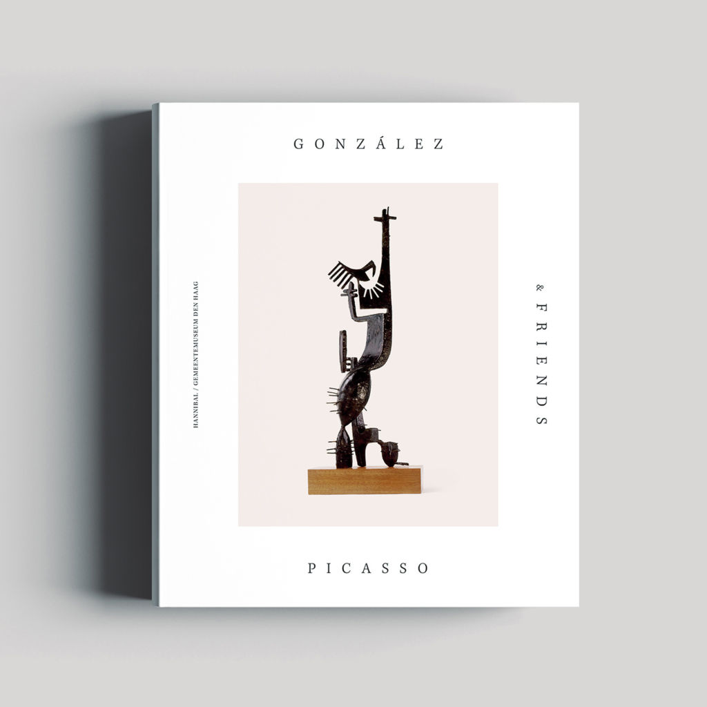
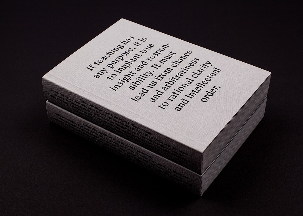
By Oscar Riera Ojeda Publishers
For more inspiration, check other D4U Inspiration posts, for example:
- Drone Awards photos 2021
- examples of awesome wine packaging designs
- impressive food photography and food styling
- realistic 3D portraits,
- logo design examples
- captivating 3D animation concepts
- funny 3D characters
- English
- Ukrainian