


Design Case Study: Echo. User Interface for Music App
Design Case Study: Echo. User Interface for Music App Case study on UX/UI design: creating user experience and user interface for musical social network and its adaptation for web.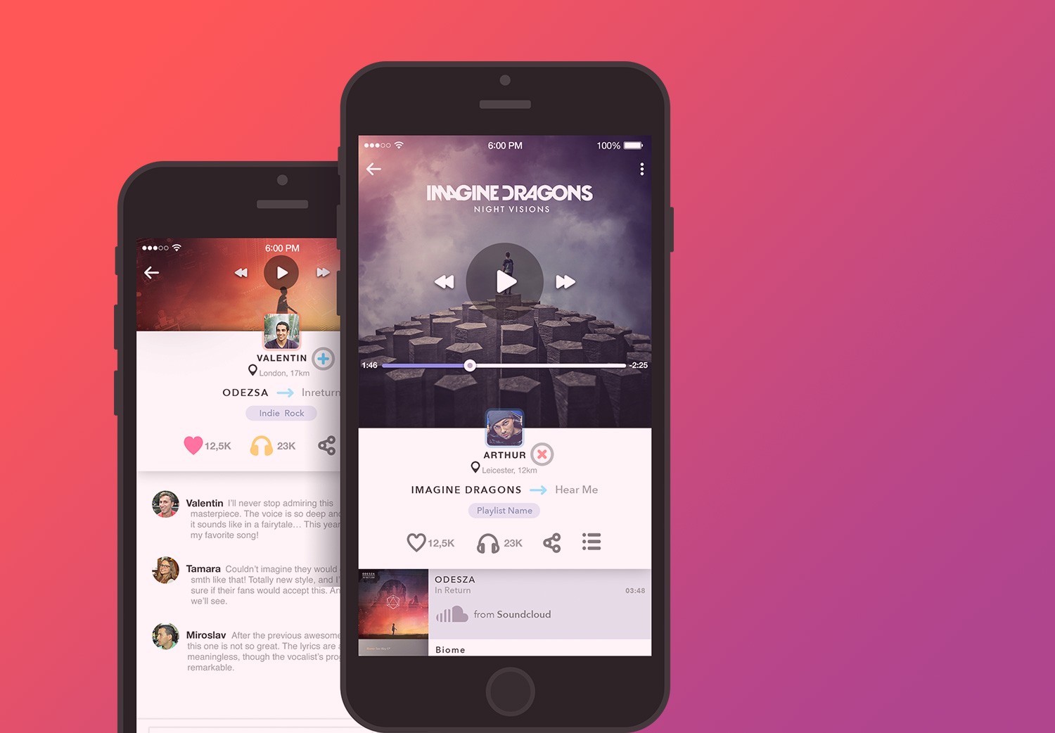
Case study is a great way to share the experience and outline the issues essential to consider while working on projects of different kinds and aims. Today’s post is starting the set of case studies about various projects and concepts Tubik Studio has worked on.
This time we are going to look closer at the Echo project. You could have seen some stages and elements of this work in Dribbble shots by Sergey Valiukh, the head of the Tubik team. Now it is high time we looked through the project in greater detail.
Tools
Pencil sketching, Adobe Illustrator, Adobe Photoshop, Adobe After Effects, Sketch 3.0, Pixate.
Task
The task at hand was very clear and at the same time quite broad: to create the social network enabling users to deal with music on their mobiles and other devices. According to this purpose, there were distinguished the following basic functions:
- To download and synchronize media-files from other online platforms and social networks such as YouTube, SoundCloud, Spotify, etc.
- To upload the files from the desktop library of media files
- To generate playlists in a fast and easy way
- To organize the stream in the image and manner of a radio station.
The author also considered the additional functions, one of which was to enable the simultaneous general streaming from several different devices, for example, when people gather at the party or anywhere they want to listen to music together.
Working on the task, the designer had to take into account two important pre-conditions:
– High level of competition as there are a lot of already promoted and popular music services on the web and app sphere
– The maximum possible level of adaptability and responsiveness of all the versions of the application that was expected to be used on all possible kinds of gadgets. It was vital to provide 100% adaptability of all the features in order to maintain a high usability level.
Process
User Experience (UX)
Music is an integral part of human life, but at the same time, that is not the sphere where people would like to make any additional efforts. For most listeners in most cases music is where a person relaxes or, vice versa gets energy — not the place for hard work demanding elaborate skills. The wider is the target audience of the music service, the simpler and clearer it should be. Everything the user needs here is clear navigation and fast work. However, considering the number of competitors in this market, it’s necessary to think also about something original in design so that the service can stand out from the crowd.
Taking all these issues into account, the designer started the work on the site from the research of existing products and creating the concept of user experience. The decision was made to begin with designing the mobile version which was supposed to be more widely used and simpler for the target users. The next stage of design was going to provide the implementation of the mobile version into the web.
Working out the screens
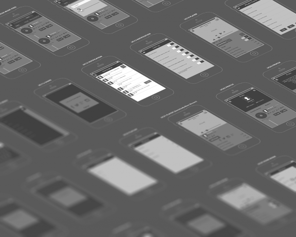
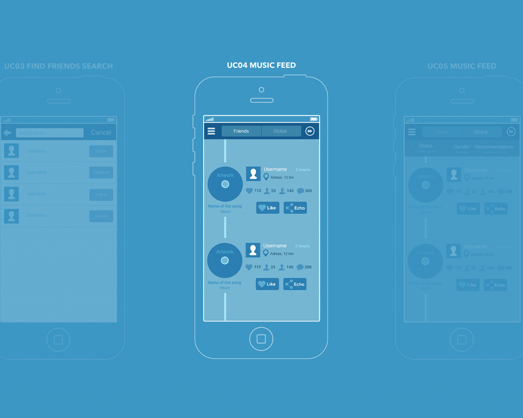
On the basis of the review and analysis of existing social networks, the following screens were planned:
– Launcher screens (educational steps animation)
– Sign-in screen (including login, registration, password recovery)
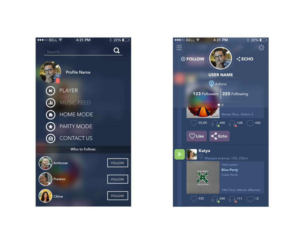
– User main screen (feed, profile, stream creation, audio files addition, search, slide menu)
– Screen of settings and editing profile
Let’s look into details of all the screens mentioned.
Launcher screens (educational steps animation)/ Sign-in screen (including login, registration, password recovery)
Launch of the application started with the slides which were animating while scrolling and the user got the basic description of the service. After the last slide the sign-up/sign-in screen appeared with the basic set of standard operations (e-mail — password — password recovery). The service was integrated into all widely used social networks so it provided direct logging in with the profiles on Facebook, Twitter, Google+, and so on. After registration, the application made it possible to link up all the user’s accounts in social networks to share the streams and see the friends’ streams. Therefore, after the user signs up, he/she is offered to follow the friends from other accounts or find new friends according to musical tastes.
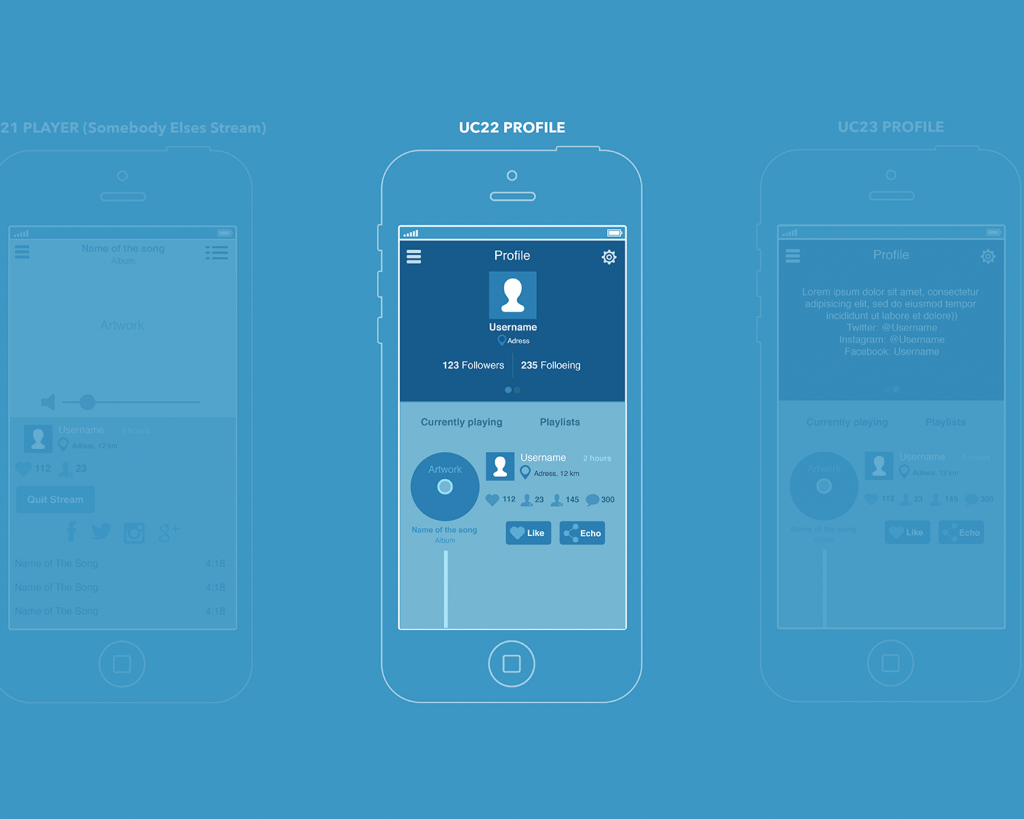
User main screen (feed, profile, stream creation, audio files addition, search, slide menu)
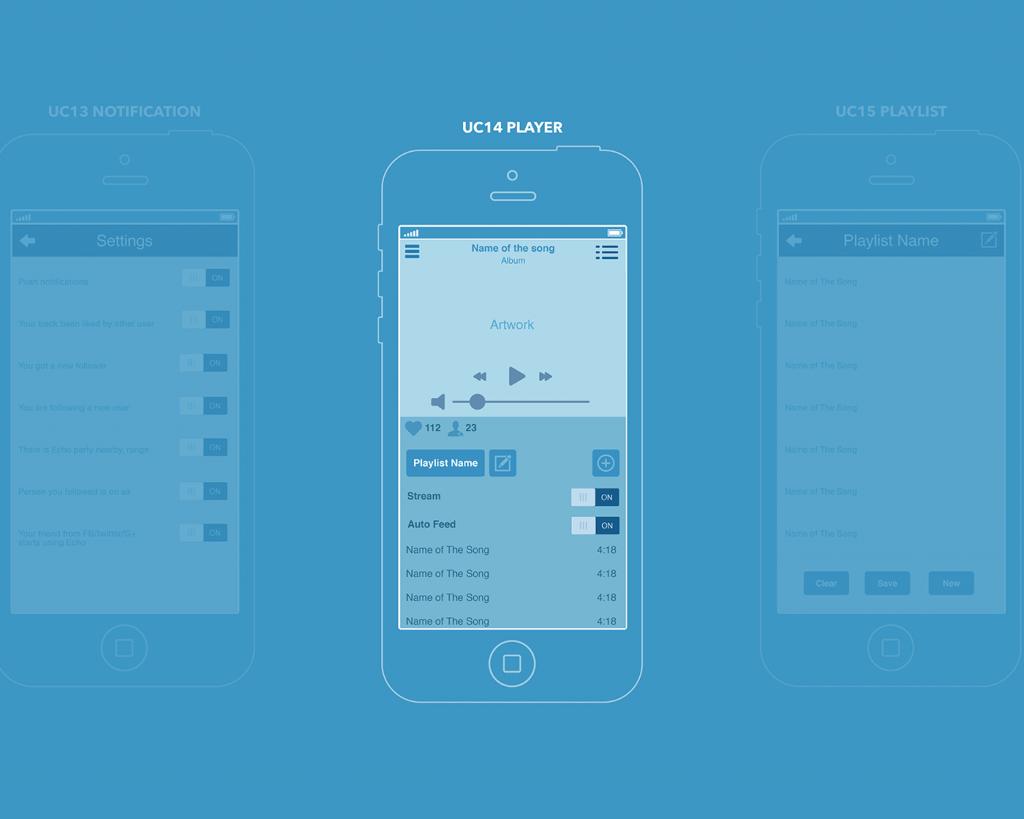
The profile was designed to work in 3 different modes:
– DJ Mode (Party Mode) — allows users to download audio files, create playlists as well as send invitations to listen to the playlists for the limited number of people.
– Home Mode — allows users to play the songs from the playlist remotely on different devices within the radius of a room
– Listener Mode — allows users to download and listen to both own and friends’ playlists.
Screen of settings and editing profile
This screen contained standard settings: connect or disconnect with social networks, push notifications settings, changing the password, deactivation of the account, signing out.
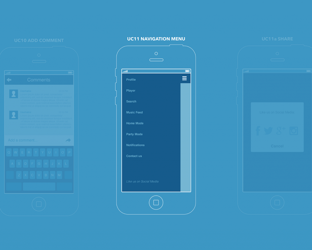
Due to the fact that many screens were required and the convenient transition was needed, the designer chose to construct the application with slide menu. The sandwich button on the left enabled opening the menu panel for the transition to different sections. Also, there was a list of users recommended for following. These recommendations were based on musical tastes, location, circles of friendship, etc. In addition, there was a separate notifications screen that reflected the activity of the followers to the user’s posts in the service or in social networks.
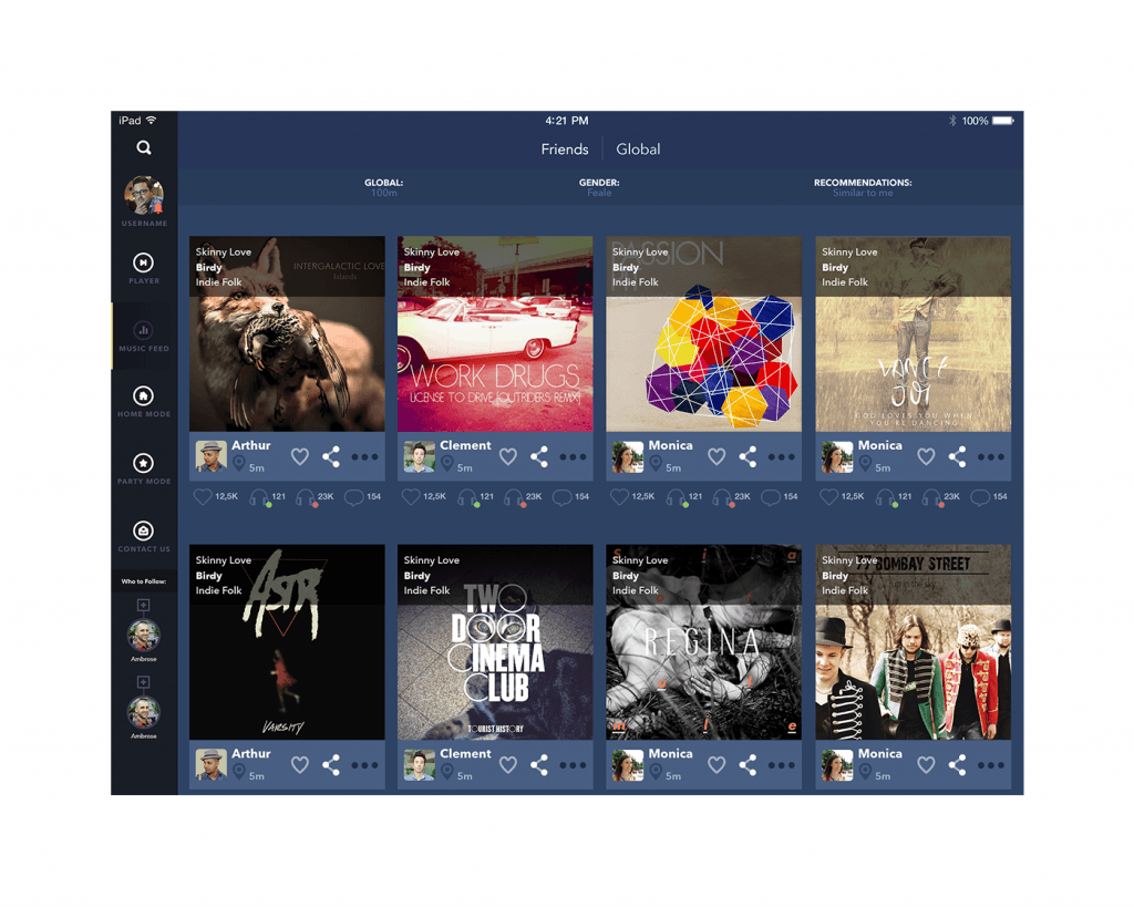
In the iPad version, the split-view was implemented. The sandwich menu and slide menu were set on the left edge of the screen. The size of the posts adjusted to the tablet.
In the mobile application, the difference between Android and iOS is that the design of the upper bar (navigation bar for iOS and action bar for Android) has different functional abilities. In general, action bar for Android, in addition to navigation, includes filters, sharing, data about the current screen. Considering these UI peculiarities of the action bar for Android, the content of slide menus was reflected identically in both versions as the acceptable controller for both operating systems in the aspect of mobile applications. For Android version design was completed according to the guides of material design so the structure of the slide menu was the same as for iOS but the appearance was different.
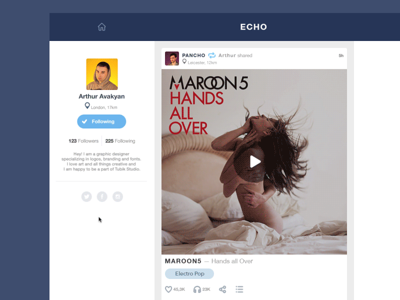
For the web version of the service, the designer used a typical structure when the header and slide menu duplicated the functionality of the application with alterations on the size of the desktop for the web-version. Therefore, there were more posts visible in the feed in case of adaptation of the mobile applications to the web.
Everything mentioned above shows that the designer didn’t make the attempt to experimenting and that was motivated by the desire to provide the highest possible usability and utility level. As it has already been outlined before, the application was created for fast and easy usage in everyday situations, so from the user experience standpoint, any experiments and extreme innovations in the typical scheme of social network could scare users, make them feel the application confusing and result in poor user experience.
So, the main area of designing something original to distinguish the application was UI.
User Interface (UI)
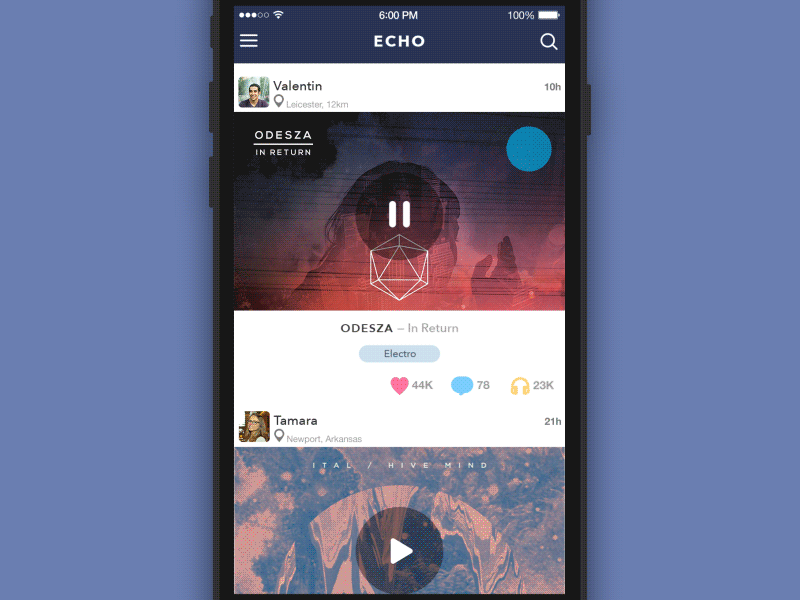
The Blur effect was taken as the basis: the bars with data or statements blurred the background. The following animation was used on the player screen: the basic background showed the artwork, which presented the album cover for the composition playing. The background of the screen was blurred with the round unblurred central part, around which the effect of the rotating playing record was created with typical visual details.
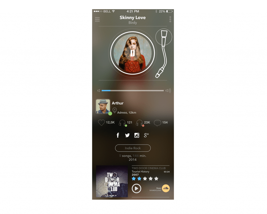
Visual design of the screens was distinctly distinguished according to their functionality. The screens of entertaining character (feed, profile, navigation bar) were designed with wide application of blur effect: it was dimmed out and the text data was presented in white color. However, standard screen such as settings or profile editing were designed in the simple style with light background and dark text.
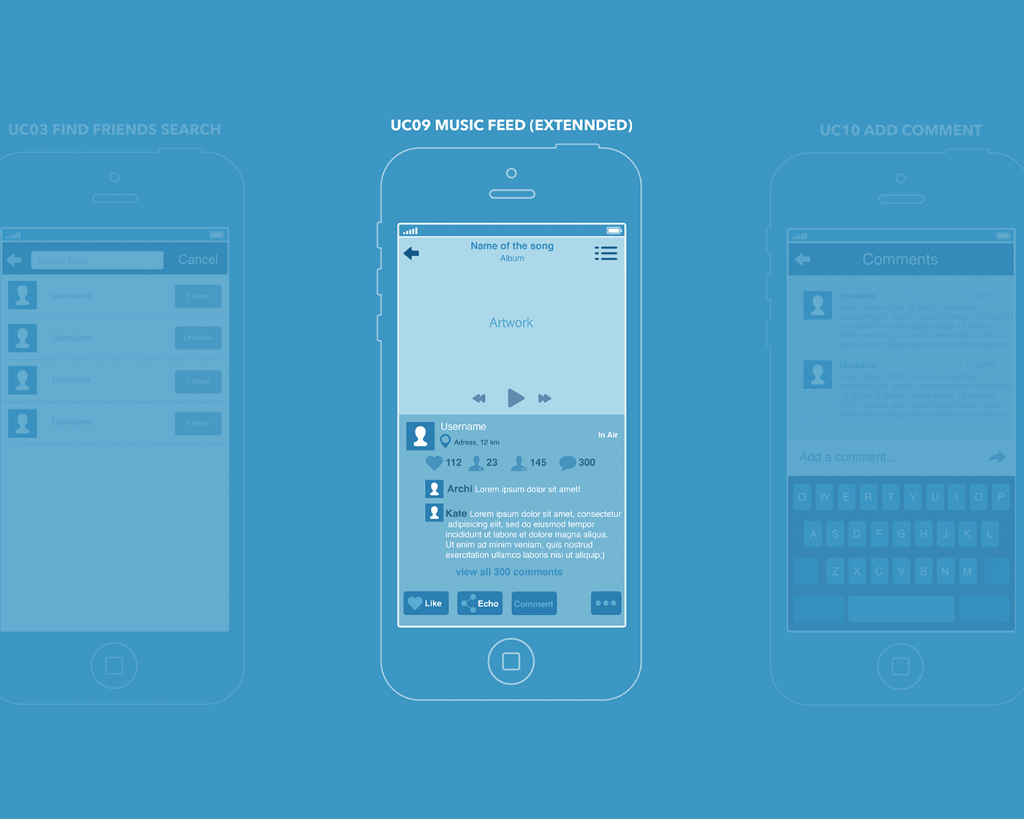
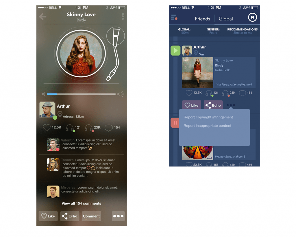
The feed screen reflected the stream of friends and included the artwork being the album cover for the composition playing, the avatar and name of the user whose post is playing, location, the name of the song and the playlist it is downloaded from, the number of likes, views, and online listening.
One more screen designed here was extended feed screen. Tapping or clicking on the stream, the user could obtain extended data including all the information from the feed screen described above together with a detailed review of the comments, opportunity to leave the comment, make a repost or share in any social network linked with the application.
Redesign
One of the most important stages while designing the UX/UI of an application or website is its testing. Practice shows that sometimes ideas, which look brilliant on the first glance, turn out to be absolutely impractical for target users. That happened with the first version of the Echo project described above.
Having analyzed the results of user-testing and having worked with focus groups, the author obtained the information that the original design doesn’t work as it was desired. The thing getting the most negative feedback from users was blur effect in extended feed screen. The screen looked dirty and the text seemed unreadable. Animation and non-standard effects demanded long loading that is unacceptable for such simple operations. The feed screen contained too little body of the stream with overloaded controllers whose functionality was not really essential on that screen.
So, on the basis of user feedback, there was made the decision to change the design of the screens. The solution found for them was the following: the blur effect was totally eliminated because its appearance in PSD was absolutely different from what was seen in real, especially low-resolution screens.

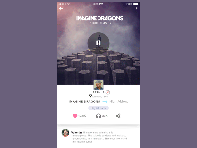
To provide a maximum of cleanness and simplicity, all the screens were designed with a light background, elegant and laconic custom icons. The feed screen contained less data and the posts had a bigger size. Extended feed looked much simpler although saving the idea of animation.
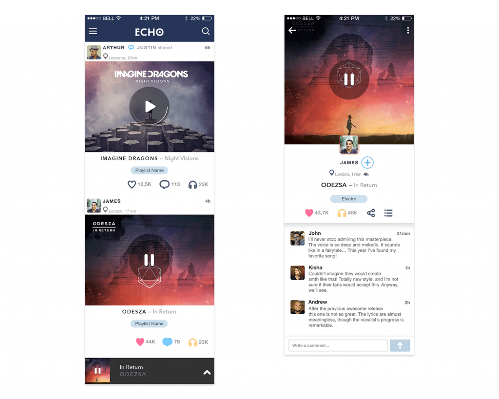
The transition from feed to extended feed was realized by tapping or clicking at the artwork on the feed screen: it was given in smaller size in feed and got bigger while transition proportionally to the whole screen and under it all the information about the post (the avatar and name of the user whose post is playing, location, the name of the song and the playlist it is downloaded from, the number of likes, views and online listening, detailed review of the comments, opportunity to leave the comment, make a repost or share in any social network linked with the application) was shown on the white background. To make it even more convenient, in the case of vertical scrolling of this screen the big image of the artwork hid into the navigation bar leaving the place for the content below.
Web-version was simplified to a one-page site with the functionality of viewing the screens and profile.
Work on this project gave the team valuable experience. It shows that modern UI/UX designer should always consider user’s needs and wishes that are vital in creating a successful experience and therefore provide a high level of desirability. Moreover, the Echo project also proved that a designer should always be ready to update or even redesign his work and this decision has to be based on real testing of the product.
More Design Case Studies
If you are interested to see more practical case studies with creative flows for UI/UX design, here is the set of them.
Watering Tracker. Mobile UI Design for Home Needs
Tasty Burger. Mobile App for Food Ordering
Big City Guide. Landing Page Design
Vinny’s Bakery. UI Design for E-Commerce
Health Care App. UI for Doctors
Slumber. Mobile UI Design for Healthy Sleeping
Kubrick Life. Educational Biography Website
Designer AI. Dashboard and Graphics for Fashion Service
Pazi. UX and UI Design for Vehicle Safety Mobile App
CashMetrics. UX Design for Finance Management Service
Originally written for Tubik Blog
- English
- Ukrainian